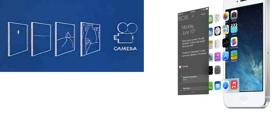
It’s a return to basics. Simple things can remain simple, readable. When clarity is needed, everything goes flat. But it’s a framework that allows for subtle motion and depth without changing what works about the new, content-first flat design. iOS 7’s control center blurs the layer below. The home screen background sits deeper too, as if only the app icons are touching the screen. Photos scroll under the navigation bar.
This is a smart take. Right now, it’s easy to dismiss the new physics and depth of iOS as gimmicks that won’t alter and benefit our daily experience in meaningful ways. But I really do believe that, with APIs for developers, we’ll start seeing interesting new ideas after the summer.
I’d also like to thank Marco Arment for linking to Disney’s explanation of the multiplane camera. The similarities, both in Disney’s description and blueprints, are curious:


