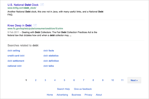
Multiple users are today reporting that Google is trialing a new tablet-optimized Google Search page that merges the recent design changes from the desktop version with a more touch-friendly design for tablets. Digital Inspiration managed to take a few screenshots of the new design running on their iPad which we’ve included above and below the break.
The new look uses just a single column layout, keeping the old sidebar options minimized below the search box instead. The new orange, dark gray and blue color theme is also present in this new design, which certainly feels cleaner with large amounts of white space. The one final design change that is of note is that the rather famous ‘Goooooooooogle’ at the bottom of the page that links to following search pages is gone – instead all that exists is the numbers one to ten.
This new design is currently being tested, and as is normal with Google product changes, is being randomly presented to a certain percentage of users. It may yet be a few weeks or possibly even months before this rolls out to everyone. Jump the break for some more screenshots.


