Since I started using Instapaper in 2008, this app has changed the way I read. Instapaper 4.0, released today on the App Store, will change my reading habits, again.
For those who are not familiar with the concept of Instapaper, it’s a web service that allows you to save web articles for later. But unlike the number of similar solutions that have surfaced since Apple featured the app multiple times (or simply its merits, which have been recognized by millions of average users alike), Instapaper isn’t simply a website with an account, a bunch of text stripped off websites, and a bookmarklet to grab articles. Over the years, Instapaper’s Marco Arment, founder and creator of the service, has managed to build an ecosystem around Instapaper, which is based upon but doesn’t stop at apps connected to the service via an API. Apps that support Instapaper play a big role in the service’s success and Arment even showcases this kind of integration in the new 4.0 version, but what really made Instapaper great is its simplicity coupled with publishers’ support, user adoption, multi-platform nature, and interconnectedness of tools that has allowed Instapaper – once a small indie project churning out a couple of thousand articles per day – to become the most popular way to never miss a good read.
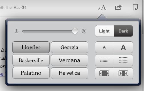
Instapaper works on the web, on the Amazon Kindle with automatic wireless delivery, and on Apple’s iPhone and iPad. The foundation upon which Instapaper works and prospers is the Read Later bookmarklet, a button you can install in your browser’s toolbar to send any webpage off to your Instapaper account. Instapaper, however, works best with articles, as its main goal is to provide users with an elegant way to read the words of an author without seeing ads, graphical elements, or readers’ comments. Just text. In this regard, Instapaper works like magic: you hit a button, and any web article is transformed into an elegant, readable, easy on the eye page that you can customize to your liking with different fonts, pagination and brightness settings, or “dark mode” if you prefer white text on black while reading at night.
And I have been reading with Instapaper at night. Since the original iPad came out last year, pretty much everybody had a feeling the device could turn out to be ideal for reading, but no one really stopped to think about the implications of a device for Instapaper before the iPad’s release. When Apple did release the iPad and a native version of Instapaper was available on day one, it was clear Apple’s form factor and Arment’s UI decisions would play well together in the long term.
I’m not the only one to think Instapaper nears perfection on the iPad. In fact, I’m not even the only one to think the iPad edition of Instapaper has redefined portable web reading since its introduction in April 2010. Amidst the proliferation of social magazines, RSS readers, social news readers and more or less any other variation of the terms “social” and “reading”, Instapaper for iPad provides a unique solution to a seemingly unfixable problem: to create your own collection of web articles, ready to take wherever you want. A collection – or, if you will, a constantly updating combination of inbox and archive – that’s also connected with the articles your friends like and the pieces written by people you trust.
On the App Store, Instapaper started as an iPhone app. The app, featured in a great promotional video with Adam Lisagor, introduced iPhone users to the concept of “saving articles for later” – if you, too, have had too many interesting articles in your web browser and have wished there was a way to take them with you all the time, here’s the app for you. The video made it extremely clear that all you needed was a bookmarklet to hit, and an article would appear later on the web, or even better, on your iPhone. Instapaper for iPhone is a fantastic app; it updates fast, it’s elegant, it focuses on articles as it should be, and it gained a number of cool functionalities over time such as pagination, Twitter sharing, and Evernote integration. Yet, as this 4.0 update suggests, it’s clear Instapaper for iPad has somehow overshadowed its iPhone counterpart, making it the version to use when you can’t access your computer or iPad.
Instapaper 4.0 is a major upgrade to the iPad version with some great improvements on the iPhone and a new universal in-app purchase option. First off, the new paid feature: at $2.99 every three months, Search Subscription gives you server-side search for the full contents of any article ever saved. This means you’ll be able to search for any word inside any article ever saved to your Instapaper inbox, folder, or archive. Instapaper will differentiate with an icon articles belonging to these three sections, and as long as you have a decent WiFi or 3G connection, search is going to be pretty fast. And reliable. I was able to search for the word “Steve” in Instapaper , and the app returned every article that, as you would expect from my Instapaper queue, covered Steve Jobs. Tapping on an article in the search view will automatically open the in-app browser with options to Read Later, again, or open in Safari. Search is a very welcome addition, and it performs reliably. If you think you’d like the possibility to search for anything in your article collection, you should consider subscribing. Otherwise, Instapaper will work just fine without the Search Subscription.
Marco explains the difference between the $1 month subscription for existing Instapaper subscribers and the new Search Subscription in a blog post:
Search is available for all Subscribers in the app today. It will be available on the website next week.
You can also now subscribe via In-App Purchase. It’s called Search Subscription. The website Subscription and the new Search Subscription in the app are the same thing, with the same features, just purchased in different ways: either PayPal or In-App Purchase.
As I mentioned above, Instapaper 4.0 is a big change on the iPad. In spite of the app feeling like the perfect iPad companion for reading alongside a good cup of coffee on your favorite couch, it never really felt like Instapaper was fully taking advantage of the iPad’s software. It surely looked great, but navigation was somehow clumsy. Switching between folders, checking out your friends’ recommendations – those options were there, but somehow buried deep down interface schemes from the old iOS 3.2, the software the original iPad shipped with. And the iPad has changed significantly since version 3.2: for one, there’s an iPad 2 out, which makes it easier to hold the device with one hand for a little more time and even if it’s not dramatically light, it sure allows for more comfortable reading. Second, there’s the software. iOS 5 is a huge leap forward in terms of APIs for developers, user features and new UI standards, and Instapaper 4.0 has been written with iOS 5 in mind.
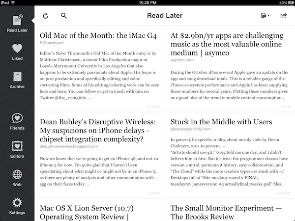
Instapaper 4.0 comes with a new iPad “grid” design. The list interface has been completely redesigned: it’s no longer a list – it’s a grid of articles with a sidebar on the left. And the sidebar isn’t the kind of hidden, unhelpful sidebar you’d expect from, say, Mail.app on iOS 4 – think more Settings.app’s sidebar (one that’s always on screen both in landscape and portrait mode), only narrower and beautiful. With a linen background and nicely designed icons for you queue, liked items, archive, Friends and Editors. The new Instapaper for iPad has this sidebar, in a way reminiscent of recent successes like Reeder for Mac and Sparrow (arguably, both inspired by the original Tweetie for Mac), that’s always on screen no matter if you choose the landscape or portrait orientation. Even Apple figured that users were annoyed by the old-style popover sidebars in iPad portrait apps, and rewrote Mail.app with a new mailbox list that you can swipe from the side. Arment’s sidebar doesn’t slide, but it’s there when you need it. Which may be quite often, if you find yourself checking out your liked items or recommendations from Give Me Something To Read, a web service integrated in the new Editors tab. Arment’s sidebar (a marketing phrase I came up with while reading Instapaper at 4 am this weekend), has two big advantages over the old version: it’s consistent and it immediately tells you which section you’re in.
At the top of the screen, the new Instapaper for iPad has icons to refresh, search, navigate and archive/delete in any section that contains your articles. This means any article in Read Later, Liked or Archive can be deleted, archived or moved to a folder; in these three sections, you can conveniently switch to another folder (or create a new one) from a popover item at the top. In Instapaper 4.0, the archive and delete functions finally peacefully coexist, both in the new Mail-like action menu, and the regular article view. The new sidebar has also an indicator next to each icon, which slides across sections as you tap – think Twitter for iPhone’s tab indicator, only displayed vertically. It’s a very nice touch.
There are a few reasons why I think Arment decided to redesign the iPad’s article list. Besides being more attractive, and admittedly very elegant, the grid view feels more “compact” in that it provides a better overview of what’s in your reading queue. The vertical list view looked simpler and more straightforward, but it implied the iPad had to share the same design rules of the iPhone – which meant buttons were located in an upper toolbar that was hard to reach when scrolling, and navigating between different sections was painful, especially in portrait mode. The iPad isn’t just a bigger iPhone; third-party developers and Apple know this. So why not take advantage of the iPad’s bigger screen to design new interfaces that work better on a device you hold, scroll, swipe differently?
I like the new grid interface. Titles are easier to read and articles’ excerpts feel just right inside their new grid cells. You can swipe on articles to bring up buttons to move, archive or copy (this is supported on the iPhone, too) and, more importantly, the rewritten article list design has allowed Marco to improve the reloading behavior of the entire table, which is definitely faster than Instapaper 3.x and much smoother to scroll through.
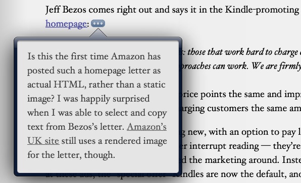
Instapaper 4.0 comes with improvements in the reading view as well, and it fixes several annoyances commonly found in web reading. For instance, footnotes: how many times have you been forced to scroll to a footnote in, say, an article from Daring Fireball or Brooks Review to see what that [1] was referring to? A few months ago, I covered a browser extension that offered a partial solution to the footnote issue. The problem with footnotes is that they were meant for print – when you’re reading a book, you can immediately look down at the bottom of a page and see the footnote. On the web, you have to scroll, and that’s annoying for long articles. So how does Instapaper fix the problem with web articles that have footnotes once they’re processed into the app? Simple: they’re converted to “…” inline buttons that display in popovers. So when you’re reading an article in Instapaper 4.0 and you notice a footnote attached to a paragraph, hit the new “…” button and you’ll be able to read it immediately without scrolling. This is probably my favorite feature of Instapaper 4.0.
Article view has also gotten minor styling improvements, one of which is the website/author/published date information fetched from Instapaper while saving an article from the web. This information isn’t always available (I believe it depends on how Instapaper sees your site), but Arment says availability will increase over time. This is a good change because it gives even more importance to attribution and accountability.
If you find yourself scrolling a long article, Instapaper 4.0 has a new draggable scrollbar that you can grab to quickly scroll a page from top to bottom and vice versa. And if your device’s screen is too bright, Instapaper has now a hardware brightness control available thanks to iOS 5. Instapaper users may remember Marco had to use a software-based brightness control in previous versions – this new control is entirely hardware-based, meaning it’ll stick around even if you quit Instapaper and open another app.
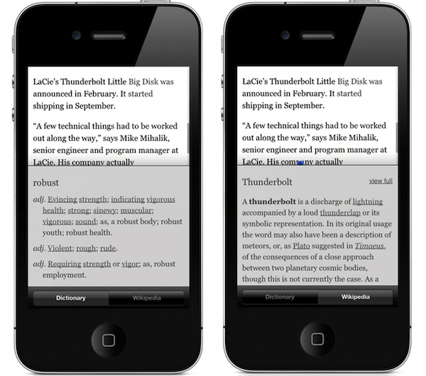
And then there’s the new definition lookup. Instapaper had already implemented a new Define menu with Terminology integration months ago, but for version 4.0 Arment decided to offer two options: you can either enable Apple’s new systemwide dictionary (which is a popover on the iPad, full-screen on the iPhone and it works with every app) or Instapaper’s own linked dictionary, which can beam words to Terminology, pulls data from Wiktionary, and it’s now integrated with Wikipedia as well. If you choose the linked dictionary, a new Wikipedia option will be available as you tap Define on a word, allowing you to see the wiki entry without leaving Instapaper. If you want, you can open Wikipedia’s website with a “view full” button; the regular Dictionary tab also enables you to tap on words and navigate through definitions. Personally, I’ve kept Instapaper’s dictionary because I’m a big fan of Terminology and I find Wikipedia support very useful.
The real improvement of Instapaper’s article view is that it makes reading an integrated experience in a way regular web browsers never will. With pagination settings, dictionary and Wikipedia lookups, floating footnotes and dark mode, Instapaper’s reading environment is a step ahead of browsers because it lets the user choose how to read, without interruption and broken standards, such as the aforementioned footnotes.
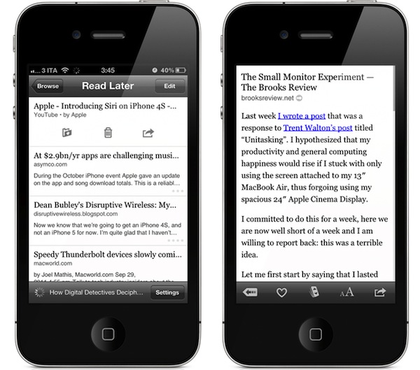
Instapaper for iPhone didn’t go without changes. In spite of the iPad getting the completely redesigned interface, Arment still managed to fit some welcome improvements in the iPhone app (which obviously can’t work with a grid view given the constraints of the iPhone’s screen), such as a more iPad-like black-and-white design, new icons in the main screen for the various reading sections and a redesigned font panel. Instapaper for iPhone gets all the improvements of the iPad counterpart, plus redesigned Twitter, Tumblr, Facebook, Pinboard, and Evernote share forms and the possibility to hide the status bar while you’re reading.
Instapaper for iPhone is the same fine app you’ve come to know and love, now with some new features made possible by the rewritten app engine and iOS 5.
Instapaper 4.0 also improves on several social aspects of the app introduced in version 3.0, and tweaks some options available in the Settings. First off, whilst you can decide to always open links in Safari from the Settings, links from YouTube will always be forwarded to iOS’ YouTube app; YouTube links saved in Instapaper now also get a nice preview thumbnail alongside the title. In the Settings you can fiddle with App Directory, a new panel that lets you browse apps that integrate with Instapaper for saving and sharing articles. The App Directory is really well designed, and notable mentions include Reeder and Flipboard – plus categories for News, Feed Readers, Twitter, To Do, and more. The App Directory is a great way to discover apps that work with Instapaper. If you want to discover articles to save in Instapaper, the Friends tab introduced in Instapaper 3.0 now lets you choose between liked articles and “shared links” – items that your friends have shared on Twitter, Facebook and Tumblr but not on Instapaper. Tapping on an article from the Friends and Editors tab opens the in-app browser, and connected accounts can be configured at any time from the app or Instapaper.com. I’ve always liked the idea behind Instapaper’s (anti)social network – it’s a great way to discover articles from people I know and trust.
–
I could have linked to Instapaper 4.0 in the App Store saying “It’s a fantastic update, and you should get it now”. Indeed, you should. Instapaper 4.0 deserved a proper look at all its new features, as it’s a major update that clearly shows how Marco Arment – who’s working on Instapaper full-time – really believes in Instapaper as the better way to read articles on the web. Everything is better in Instapaper 4.0: design, speed, social features, footnotes and dictionary definitions. Instapaper 4.0 improves on almost every aspect of the previous iPad version, while retaining the same basic concept that made the iPhone app great.
Instapaper 4.0 is a fantastic update. Get it here.


