It’s pre-WWDC speculation time. This year, like most, many people think about what new features and capabilities the next version of iOS could include. After watching some concept videos (including one by Jan Micheal Cart) and reading some iOS 6 wish lists, designer Joost van der Ree also decided to present some of his ideas on how Apple could improve the usability of iOS in a short YouTube video.
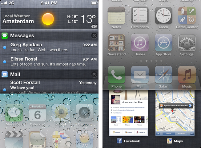
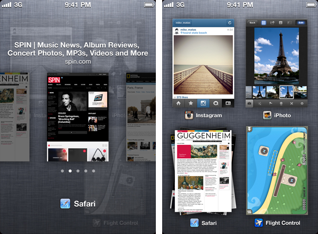
The video includes possible enhancements for four features of iOS: multitasking, app previews, Notification Center and notification badges. For better and more flexible multitasking, van der Ree imagines a mobile version of Mission Control: with a quick swipe from the bottom upwards, a vertically scrollable window with preview images comes up displaying not just the app icons, but also the latest state of the app with a preview. When an app like Safari (or Articles, one which immediately came into my mind) offers multiple tabs, this “new” Mission Control also offers stack browsing through them (think of it as a small gallery view of all opened tabs) to select exactly the tab you want. Van der Ree also suggests a full-screen view in Safari, which is automatically activated when zooming in via double-tap.
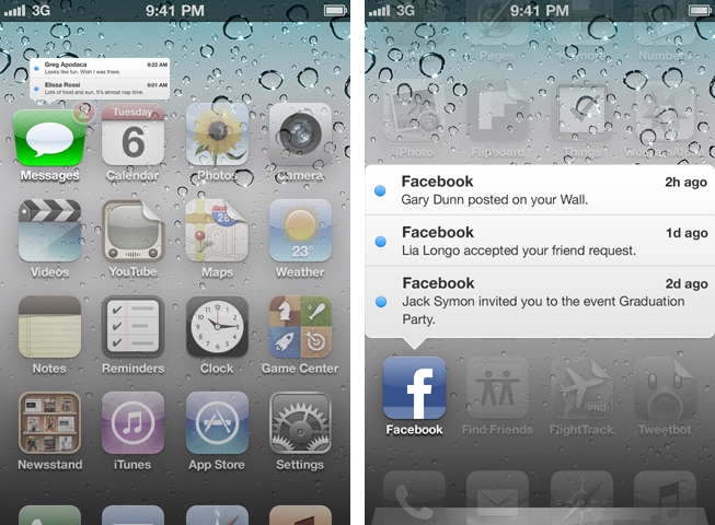
What’s really innovative is the way van der Ree supposes to enhance the notification features. Just like his Mission Control UI, the Notification Center is hidden behind the Home screen. But the real innovation lies within his enhancement of the notification badges, which he calls dynamic badges: when swiping down from an app icon with a badge counter notification (e.g. Facebook or Mail) it bounces to visually respond to the swipe, and a white popup window opens over the Springboard giving previews of unread mail, messages, etc..
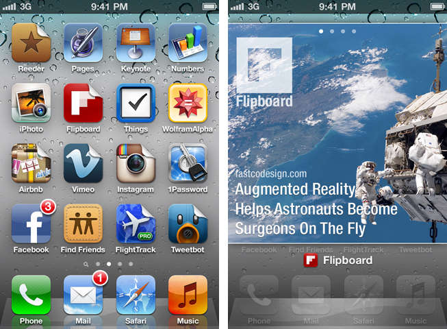
The last enhancement concept he included in the video is called “Flipcons“. It’s a gallery-like Springboard preview of app updates – mainly for news, social, or photography apps. Just like the notification preview feature, it’s also activated via a swipe down. Apps supporting this kind of gallery (Van der Ree imagined Flipboard, iTunes U and Instagram in his video) are indicated with a small “dog ear” in their icon’s top right corner. When you swipe over such an icon, it flips over, and becomes an overlaid gallery, designed like the tabs view in the conceptual Mission Control feature, displaying the app’s newest content.
Overall, this is an impressively thought out iOS UI concept. The features seem very intuitive, and if Apple really adds some of these ideas to iOS with the new version presumably coming next week, iOS could become even more functional. If you’re interested in other works and projects by Joost van der Ree, visit his blog (a design website with some cool in-depth post on design processes and interesting links), his dribbble profile or/and follow him on Twitter as @joostvanderree.
Update: Joost van der Ree himself explains his concept and part of its design process on Not A Lot Of Words.


