Back in 2006, when Apple was still rumored to be working on a revolutionary mobile phone, many wondered if such device would be able to do core tasks like email and messaging as well as RIM’s BlackBerry. Months later, when the iPhone was officially announced at Macworld, the introduction of the device alone led some people to write that it was “already impacting its new competitors” – namely RIM, and its BlackBerry line of phones that had captured a great portion of corporate America. Yet, those people were right: the numbers are speaking for themselves now, and the many issues behind RIM’s poor management and marketing choices can be traced back to the iPhone’s introduction.
At Macworld 2007, a healthy-looking Steve Jobs said: “This is a day I’ve been looking forward to for two and half years. Every once in a while, a revolutionary product comes along that changes everything. […] Today we’re introducing three revolutionary products of this class.
Today Apple is going to reinvent the phone”.
Looking back at that day now, it’s a shared sentiment among those who have been following Apple for the past years that Steve touched his highest point in presentation style and product-unveiling skills with that keynote. Because while Steve may no longer be with us today, his words still resonate stronger than ever. On that day, Apple did reinvent the phone. And as it turns out, the revolution wasn’t just about multitouch and elegant hardware design.
It was about the software.
Later on during that keynote, Steve arrived at the third section of the presentation and iPhone feature set, which was also described as an “Internet communications device”. The first item in that slide was Rich HTML email – “for the first time, really rich email on a mobile device”, he said. Sure enough, the iPhone’s Mail app was demoed on stage to show off its rich HTML-parsing capabilities, which included inline images, rich text, support for phone numbers and web links, and more. When the iPhone went on sale six months later, on June 29, and debuted online to rave reviews from the press, many praised its email capabilities, among other things.
But then something happened in the following months. As Apple kept adding features to iPhone and refining its core apps including Mail, users and developers began wondering when Apple would allow for third-party apps to be installed on the device. For as much as Apple was adding new functionalities and fixes, there are always niches and sub-markets that Apple can’t address in new software releases – corporate email was one of them, as, admittedly, that were still several things Apple wasn’t adding to its email client to please business users from corporate environments. When Apple did confirm its plans to open up iPhone OS and offer an App Store, users wondered if it would be possible, like it still is on a Mac, to install replacements for the “core apps”, such as the browser, email client, or calendar application. In a somewhat unexpected and much criticized turn of events, Apple made it clear to developers that it would not accept third-party apps duplicating the functionality of build-in iPhone applications.
John Gruber has a good recollection of the events from 2008 – case in point MailWrangler, an email app that was rejected at the time.
I have a theory. It is more, well, emotional than logical. But it’s the only theory I can think of that makes any sense at all and fits the available evidence. The theory is that there is an unpublished rule that Apple — and in this case, where by “Apple” I really mean “Steven P. Jobs” — will not publish third-party apps that compete with or replace any of the four apps in the iPhone’s default “dock”: Phone, Mail, Safari, and iPod.
In the following years, in spite of App Store-related controversies showing up every once in a while, developers more or less “understood” how Apple’s approval process worked, and kept working on apps that would be “safe” for sale within Apple’s rules. Publishing a set of guidelines certainly helped in making things clear for everyone, but new apps that belonged to categories not mentioned in the guidelines would still appear in the App Store, forcing Apple to revise its guidelines or impose new limits. This often happens after new iOS technologies are made available to developers – a recent example is the banning of Notification Center utilities. However, one thing has been clear since MailWrangler’s rejection in 2008: full replacements for Apple’s system apps can’t be developed for the App Store. Developers can use the frameworks behind system features to develop third-party apps: Address Book companions, Calendar utilities, photo editing apps – these are all built using APIs and frameworks available publicly. The same has been true for browsers, which have to use Safari’s rendering engine, and alternative mail clients, which haven’t been exactly popular on the App Store, with the exception of Google’s Gmail app – an app that, however, is based on web views.
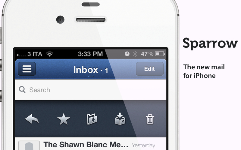
Today marks an important day in the history of the App Store. For the first time, Apple is letting a third-party developer sell a full-featured, custom email client that uses its proprietary email engine to iPhone users. Sparrow, already popular on the Mac and available on the Mac App Store, comes to the iPhone’s App Store today, and it promises to offer a newer, fresh take on email to lure back customers whose only choice since 2007 has been Apple’s Mail.app.
When Dom Leca, Sparrow co-founder, confirmed they were working on an iPhone version of the app back in August 2011, we were skeptical as to whether Apple would approve such app. After all, we had facts to back up our theory: Apple hadn’t been accepting email clients using their own engine – which I’m told Sparrow indeed does – since the App Store opened for business, and it always seemed like a very risky move – business wise – to attempt the App Store’s luck and submit a third-party email client. Today, I think the real question is: has anyone really ever tried since 2008?
If you think about it, Apple isn’t new to change and relaxing restrictions that were previously enforced. Recent cases include in-app subscriptions (initially meant for “publishing apps” only) and the whole iBooks Author EULA brouhaha. Apple may have taken a lot of controversial decisions with the App Store’s approval system in the past, but it seems to me the company hasn’t been afraid of change and evolution and listening to users’ feedback in the past months. Sparrow for iPhone is here to prove it: whereas 2008 Apple would have never approved a third-party email client that is completely independent from Mail.app, 2012 Apple is fine with it. This, I believe, signals a change both in terms of different market size today and overall message behind the App Store and iOS (Apple isn’t forced to ostensibly promote its own native apps anymore, preferring to foster an ecosystem of third-party apps running alongside the native offerings). If both iOS and OS X computers are just devices now, why can’t iOS have the same email client that is sold on the Mac App Store? If this is the case, it will be interesting to see whether more parity between the two systems will be achieved in the future (I’m thinking GateKeeper). For now, what matters is that Sparrow is out on the iPhone.
Before I delve deeper into the feature set of the app, I want to stress two important factors to consider when pondering a purchase of Sparrow. First off, Sparrow isn’t definitely a “fad”, like some suggested, as the developers are committed to keep supporting this app, enhancing it with new features, and, most importantly, charging for it. Just take a look at how much Sparrow changed from the first beta released in October 2010, and today’s latest Mac version. Leca and his team kept refining the app until they were comfortable with a UI that sort-of-reminds us of Tweetie but still has its own unique aspects; they added a slew of functionalities to make switching from Apple’s Mail easier, and then decided to charge for it and continue improving it. We have followed the development of Sparrow closely. I can only imagine that the same will happen with the iOS version.
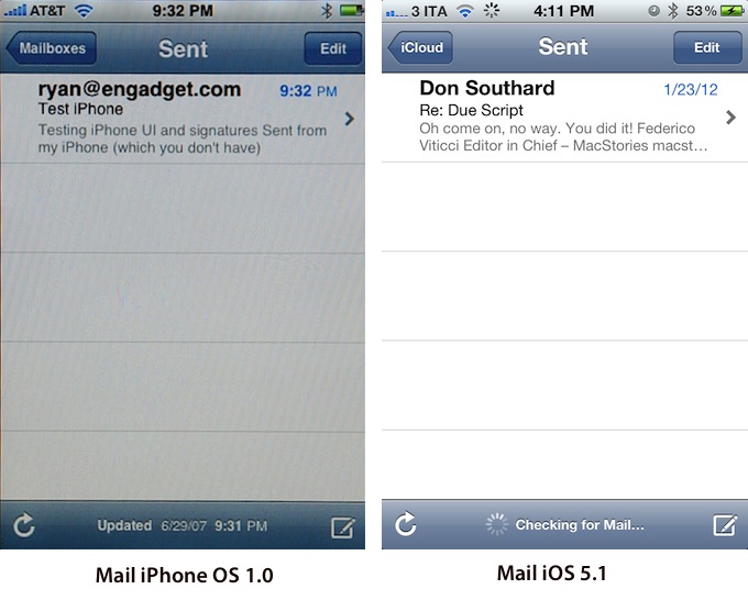
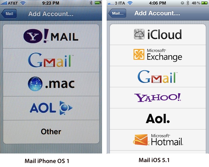
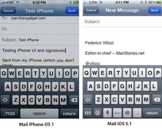
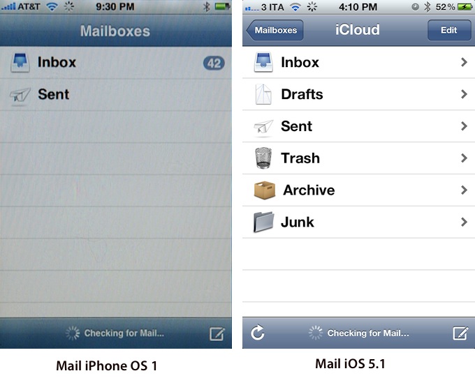
Second, I’d like to point out how Mail for iOS hasn’t been the most innovative software from Apple to come out in the past five years. Whilst the company was busy releasing outstanding versions of iWork and iLife apps completely rethought for multitouch and mobile devices, Mail has been rather conservative in terms of design and fresh ideas and experimentations since version 1.0 – sure, it gained new features, but today’s Mail doesn’t look and act much differently than 2007’s Mail.app for iPhone OS. I have included screenshots – those from iPhone OS 1.0 courtesy of Engadget – to show how Mail got new features and optimizations, but has still the same structure, feel, and workflow we first learned when the original iPhone came out.
Change for the change’s sake doesn’t work on iOS. But maybe there’s room for an alternative email client that does some things differently.
Because Sparrow is completely free from Mail.app, its developers, like they did on the Mac two years ago, had the chance to sit down, calmly look at how people interact with email on the iPhone, and think – “how can we improve this”? The result is an application that shares the same underlying principles of Mail.app (it’s still email, after all), but which brings its unique touch, different layout, view options, and gestures to a market that’s been stagnant for too long.
Some people won’t like Sparrow for iPhone. I want to address the things I don’t like right away, so you won’t be disappointed to find them at the end of this review. Sparrow for iPhone doesn’t support landscape mode, and the developers didn’t build a rich text framework to compensate for the lack of Mail.app’s rich text support. Those of you who type in landscape in Apple’s Mail and are now used to iOS 5’s bold and italic commands (and more) will be sorely disappointed. Frankly, I think the developers could have taken a couple more weeks to implement these features, but I also have to admit I fall into the category of users that don’t rely on them. Furthermore, there is no way to import existing accounts from Mail.app – but this is a limitation of iOS, not Sparrow – and the UI can be confusing for some people, as “there is a lot going on” in Sparrow. The app uses its own custom UI, and has a model for switching between accounts that’s more similar to its Mac brethren than Apple’s Mail. It utilizes a lot of textures and animations, slides and pops and snaps, and those who are used to Mail’s simple but effective horizontal navigation may find not clutter, but an overwhelming difference in Sparrow for iPhone. Personally, I believe the features the app introduces are too valuable to dismiss the issues I mentioned as deal-breakers.
I think liking (and using) Sparrow for iPhone really comes down to how you process email and what you expect from a client on a 3.5-inch screen. So here’s how I do email, for context.
I use Gmail – I have four accounts for different work and personal purposes – and I typically wake up every morning to 50/60 messages waiting in my inbox. These messages are variegate in nature: they can be press releases, conversations with my team or people I’m interviewing, emails from iTunes, Disqus (for the site), and other miscellaneous stuff. I don’t use tags. I don’t use folders. I don’t star messages. I rely exclusively on search, generally remembering people’s names (something I’ve been practicing since I was a kid), and applying a set of three actions to my inbox: delete, archive, or reply. The emails I decide I want to reply to are usually taken care of in a week, depending on my schedule. But I try to reply all the time, even to people who simply email me asking for tips on how to use apps and iOS. The two other actions, delete and archive, are basically more of “state of minds” than actual workflows for me – emails I delete are “stuff I don’t need anymore”, messages I archive are “things I might need again someday”. I rarely empty my Mail’s Trash, and like I said I search a lot. By “a lot”, I mean I use a unified inbox on Sparrow for Mac, and search from there across all my accounts using various criteria such as recipient or subject. I don’t use AppleScripts to process my email. Inbox zero isn’t a way of life for me, it’s just a goal I promise myself to achieve at least every two weeks. I do occasionally save an email in OmniFocus if it’s related to a big project I’m working on, and I forward items to my Evernote account on a daily basis as well. I leave my emails in the Inbox until I’m ready to reply to them. I use search to find old attachments and conversations. Some people who swear by Merlin Mann’s tips and Inbox Zero philosophy told me I’m crazy and that my workflow is insanely unstable. The way I see it, I don’t want to add extra layers of management on top of a simple inbox that stores my messages until I’m ready to type. It works for me.
With this in mind, I’m not saying only folks that use email like me should consider Sparrow. Quite the opposite. I do believe the app is very versatile and can definitely work for many kinds of email workflows and setups.
Panels
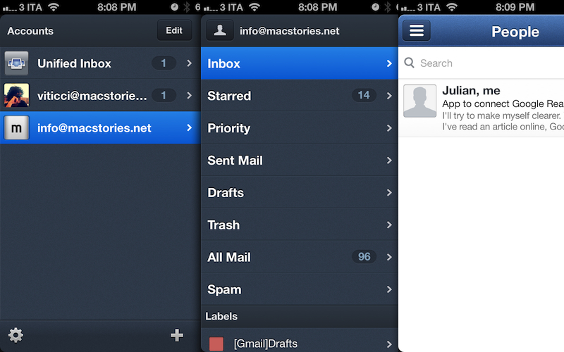
Sparrow works through panels. Three of them are always visible: on the left, there are the Accounts you can configure in the Settings, and the Unified Inbox. The middle panel contains your various mailboxes for a given account – you’ll find the actual Inbox, Starred and Priority items (for Gmail), Sent Mail, Drafts, Trash, All Mail, and Spam in here. This section also contains labels, which, unfortunately, don’t reflect the colors saved on mail.google.com like the Mac version of Sparrow, rendering them, in fact, useless – at least from a color perspective. I hope the developers are working on a way to share the same colors between Gmail and the app, as top-notch Gmail integration should be one of Sparrow’s greatest strengths.
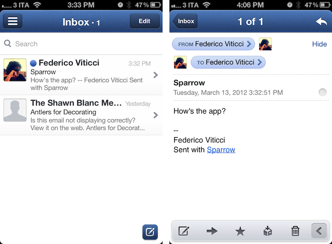
The third panel, the Inbox, contains your incoming messages. Similarly to Mail.app, you can tap on a message to view its full contents, thus advancing horizontally in the overall layout of the app.
Some people are certainly not going to like Sparrow’s highly custom approach to iOS email; the panel-based interface, I think, will be one of the most quoted reasons. Admittedly, there are several factors to consider when breaking down Sparrow’s navigation pattern in this initial release. Whereas on the Mac you can choose to run Sparrow in “minimal” or “extended” mode with icons or tabs in a sidebar that is always visible, the iPhone app obviously needs to show one full-screen section at a time, relying on buttons and gestures to let you easily navigate around between sections.
As we’ve seen with many apps adopting the panel navigation first introduced by Facebook, you can open and dismiss panels with a tap on a button in the upper left corner, or through a swipe gesture to the right. Because Sparrow uses three main panels, the taps required to go back from the Inbox (panel #3) to the Accounts list (panel #1) are two. Same with the swipes, which the app recognizes on the entire area of content: you can swipe anywhere on the Inbox to “go back”, but you can’t swipe inside a message, and this sort of breaks the entire swiping metaphor if you’re thinking it is supported everywhere. Back to the taps: by default, the “panel button” is set to go back to folders (panel #2). Because some people may find it annoying that a tap on the button doesn’t take them back to the “root”, the developers have implemented an option to change its behavior and make it “Go to Accounts”. As you can imagine, I don’t rely on folders, so I’ve set the button to go back to the accounts. While this system works for me, I believe those that do use folders a lot and would like to have the panel button assigned to them will experience some confusion with the fact that the panels are three, as from time to time they might need to hit the button again to open the Accounts.
Perhaps I’m over-thinking this, but I know many people are wired differently than me when it comes to email, and having an additional panel between messages and accounts can cause some head-scratching, especially if you’re coming from Sparrow for Mac, which unifies everything in a single sidebar.
Moreover, once you reach the last panel (Accounts), you’ll notice that you can manually “move it” by swiping anywhere on the screen. This is indeed tied to the way the app handles swipes – you can grab the middle panel, for instance, and slowly bring it back into view yourself. Alternatively, you can tap on an account’s name, and watch a “snap back” animation that will bring the Inbox in the foreground – this is yet another animation Sparrow implies, but I find it quite pleasant to watch.
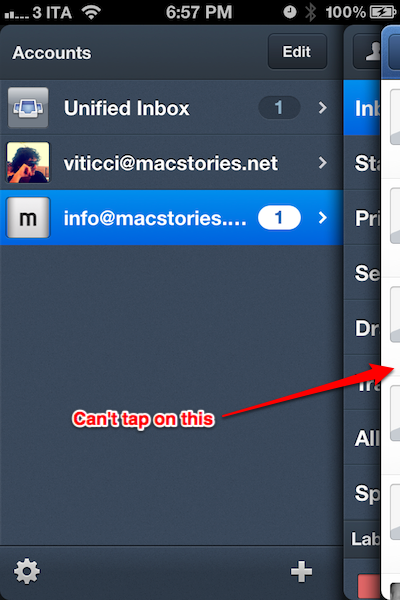
Another possible issue that I find happening for some users – which I’m simply used to now because I had the chance to try the app in the past months – is that while in panel #1, the “stacked panels” appearing on the right may convey the illusion that they’re independent tap areas – that you can tap on those tiny page borders to control the panel that will subsequently launch. It doesn’t work like that. Tapping on the stack simply advances to the mid panel – the Folders – even if you’re careful enough to touch the pixels that belong to the last panel, the Inbox. As a result, what we have here is a stacked UI with a good amount of pixels displayed (it’s not like iBooks’ stacked pages UI, where the pixels don’t give you such illusion of control) – pixels that, however, don’t work as you’d expect them to. Try this: stay in panel #1, try to tap on the white pixels of the last panel. They don’t work. Move a little to the left, and you’ll open Accounts.
Like I said, I’m used to this now, and I actually like the entire panel metaphor a lot, especially with the option I’ve set. If I’m nitpicking small UI and UX details, it’s simply because Sparrow and email in general are such a big deal, and I think pixels, when shown, should always have some kind of feedback. I like the panels UI; I also think it’s not perfect right now and that the team could still come up with ways to work around the constraints of the iPhone’s screen, whilst appealing all kinds of users. I also would like them to use a color scheme different from Facebook for iPhone, and more similar to the colors and tones of Sparrow for Mac (for the panels and blue toolbar).
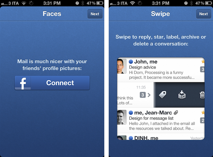
The app’s Preferences and Edit mode reside in the last panel to the left. Here, once you have some accounts configured, you can hit the Edit button to delete them. The cog icon will open the Settings, which contain options to show recent messages (from 25 up to 1000), tweak preview lines, show avatars and Priority Inbox, and select whether you always want to Reply All, Archive and Label, and display reversed threads; you can also change the panel button’s behavior. At the bottom of the Settings screen there’s Facebook Connect, which allows you to connect to your Facebook account to enable profile pictures in Sparrow. I like this feature, as most of my contacts don’t have pictures assigned to them.
There are account-specific settings as well. You can change your avatar, edit the signature, and manage Aliases. You can disable sounds (Sparrow has push notifications for messages, and they use their own sounds effects) refresh contacts, and refresh labels. In Sparrow for iPhone, you can also specify a default account for when you’re sending new messages.
The Inbox
Sparrow’s inbox is different from Apple’s approach with Mail. There are various levels of interaction taking place here, and while some may be a little hidden (albeit the developers did a good job with the first-run tutorial), I’ve come to really appreciate the ones that are more visible and well-presented to the user.
Pull to refresh is now present in thousands of apps, and Sparrow is no exception. If you’re looking for a refresh button, you’ll be disappointed. You can’t tweak the way the app fetches messages, like you can in Mail’s Settings.
Swipes play a big role in the Inbox, too. Whilst swiping to the right gets you to the previous panels, swiping to the left opens a Tweetie-like action bar that reveals buttons underneath a message (and make sure to try this slowly at first to appreciate the animation). There are icons to delete a message, archive it, label it, star it, or reply to it. I think the fact that these actions have been put in here confirms the focus of Sparrow for iPhone – to be able to quickly act on a message (reply, star, label), or get it out of your view to search for it later.
In fact, my favorite feature about Sparrow for iPhone is real, unified, universal search across all accounts right from the Unified Inbox. Simply scroll to the top, reveal the search interface, and you’ll be able to initiate a new search filtering your results by From, To, Subject, or All fields. Search is fast, looks on the server, and it works just like Sparrow for Mac. This is a huge deal to me, as I’ve explained how I rely extensively on search for my email workflow.
An Edit button in the top right corner lets you select multiple messages to move them, archive them, or delete them. When you decide to move or label a message, Sparrow has an animation to load the mid-panel while showing a message (with a badge count if multiple ones) slightly stick out of the Inbox view. Tap your section or label, and the message (or message group) will “fly” over there. Tap the message to cancel and go back. I would like to see a way to undo these actions in a future version of the app.
The title bar in the Inbox has a numeric count and indicator lights to show how many unread messages you have and to let you quickly switch sections, respectively. I think a better job could have been done with both features. While handy, the numeric count has a different font size than “Inbox”, and that kind of bugs me, visually speaking. The indicator lights are too small, but more importantly it’s not clear that you can swipe or tap on them to switch sections (as it is in, say, Tweetbot). Once you know it, I think you’ll find it useful, so hopefully you’ll read this review to know that, yes, there is a way to load other sections from Sparrow’s Inbox panel.
Compose Screen
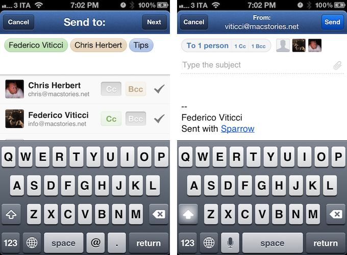
Sparrow’s Compose screen is where I think much controversy will arise in the next weeks. To streamline the process of sending emails and make it, I assume, “more natural”, the Sparrow developers broke down the standard compose workflow into a two-step process. Once you hit the floating compose icon in the Inbox, you’ll be brought to a new screen that asks you “Who are you writing to?”. Here, you can scroll through your contacts, and tap on the ones that you want to put into the To: field. There are standalone Cc and Bcc buttons integrated in this view as well, enabling you to manage all the recipients of an email from within a single screen. Hit Next, and Sparrow will advance to the real editing interface – although you’ll be asked first to “Type the subject”.
I can see why this can be a controversial choice from the Sparrow team. While Sparrow’s process of sending emails is more natural and similar to how our minds initiate these kind of tasks (“I need to tell Chris about the new iPad”), you are, in fact, being forced to pick a contact before you can write an email. Sure, on desktop email apps the cursor is placed by default in the To field as well, but at least you can move it and start typing right away. Here, you have to pick a contact before pressing Next.
Is Sparrow for iPhone trying to boldly reinvent how emails are composed on a mobile device? Maybe. With Sparrow’s implementation, there’s less “manual tapping” as you’re being guided through the interface with visible, large buttons, with the iOS “return” key taking you from the Subject to the body of your email. In Apple’s Mail the process is the same as long as the return key goes, but Cc and Bcc aren’t as integrated with the main view as in Sparrow.
Personally, I have no problem with the app asking me to pick a recipient before I start writing. That’s what I do all the time anyway, and at least here the Cc and Bcc functions are better integrated with the UI. You’ve been warned, though: Sparrow will, in fact, force you to pick a contact before writing a message. In the compose view you can, as you’d expect from Sparrow, easily attach a new image from the Library or take a new one, and change the “people” you’re sending a message to at any time.
Message View & Conversations
Viewing messages in Sparrow resembles Mail.app, because, after all, you can’t reinvent the way text is displayed on a screen. There are, however, a couple of interesting additions. The floating compose button becomes a floating action button while in single-message view – hitting it will reveal a semi-transparent bar to create a new message, forward, star, archive, and delete. This floating button has its pros and cons: while it saves vertical space because it floats above content, for the same reason text doesn’t wrap around it, so you’ll still have those few pixels covered by the button. I think this ultimately goes down to a love/hate relationship. I like it, because I don’t always want to look at buttons while I’m reading text.
What I really like in Sparrow’s message view is the Reply button in the upper right corner. It is just much better to access when it’s the only thing you can tap on…
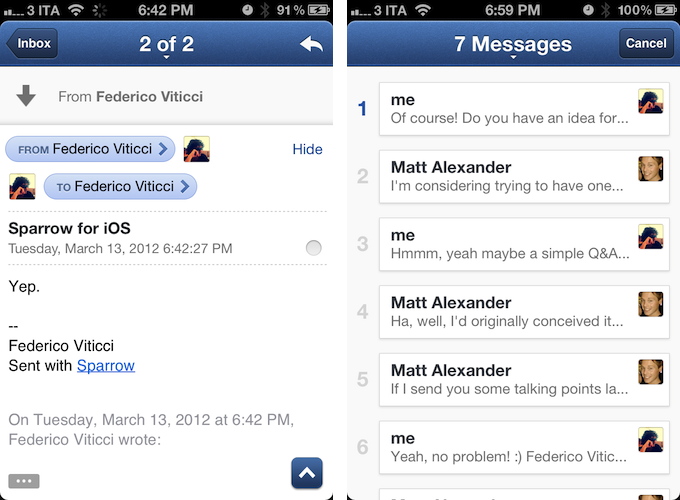
…a statement that would be 100% accurate if reply buttons were the only thing Sparrow placed in the upper toolbar. Besides search, my second favorite feature of Sparrow for iPhone is the conversation view that is displayed when you hit a triangle icon in the top bar of messages that have conversations behind them. Whilst Mail.app uses a simple threading interface to group messages, Sparrow for iPhone uses the Mac version’s “…” button to reveal previous message inline, plus a completely new view that “zooms out” of a message and shows all previous messages as single items you can tap on. If you want to manually load old messages one by one, you can do so by scrolling a message all the way up or down, revealing a loading indicator for the next or previous message.
To me, this is a fantastic way to get a better, sort of bird’s eye view of a long conversation, and it is the icing on the cake that sums up the kind of design process that went into Sparrow quite nicely.
The New Email
I have been using Sparrow as my new email client on the iPhone for the past months, and I haven’t looked back to Apple’s Mail. The way Sparrow puts the focus on quickly archiving and replying to messages, its search capabilities, the design, the photo attachments – these are all features that have contributed to my decision of replacing the app I used for more than four years to manage email on my phone. Sparrow works for me. It makes me faster and more efficient at managing email. But not everyone is going to like Sparrow.
Sparrow 1.0 isn’t perfect. There are some arguable design decisions that could be refined; the lack of rich text and landscape mode can be felt throughout the app, and, obviously, there’s still no iPad version on the App Store. If you prefer the cleaner layout of Mail.app and don’t like the extra UI layers I illustrated above, Sparrow for iPhone won’t likely make you switch. It’s also worth noting that, because this is a third-party client, iOS apps that embed mail views will still fall back to Apple’s Mail – the same that happens with third-party browsers.
Still, unless you’re firmly convinced that no other email client can exist outside of Apple’s Mail, I recommend you check out Sparrow on the App Store. It does some things exceptionally well, it’s got some intriguing ideas and features, and I definitely look forward to future updates (which are said to bring landscape mode, built-in browser, and, I assume, the push notifications that were pulled from the 1.0 public version, see correction below).
Like it or not, Sparrow is an important milestone for the App Store ecosystem – full-featured third-party email clients for iOS are now technically possible, and I believe there is also a market for them, not just among power users. That seemed unthinkable in 2007.
Sparrow is propagating in the international App Stores right now. You will find it in the US App Store in a few hours. (Link to UK App Store)
Correction: the public version of Sparrow doesn’t support push notifications yet (see: Dom Leca’s tweet). Beta versions I tested while writing this review, however, did (and they worked very well). The Verge says the developers were forced by Apple to remove “push”, as they were using a technology that only VoIP apps can use (that is, the app runs all the time in the background, “listening” for new messages). Personally, I can live without push on my phone (I can always use Boxcar to receive important notifications), but the lack of this feature certainly adds to the reasons why some people won’t switch to Sparrow.
Update: Sparrow is now live in the US App Store at $2.99.


