Three days ago, Beats Music released a 2.0 update to their iOS app with native iPad support. As part of my ongoing experiment with multiple music streaming services, I installed the app on my iPad to see how the service had improved since January and check out the new iPad design.
Beats Music for iPad is, essentially, a larger version of the iPhone app with few surprises. The app has retained the swipe-based navigation on the main screen to move across Just For You/The Sentence/Highlights, and the Now Playing screen is accessible as a large, tappable bar at the bottom of the screen that has now become a de-facto standard in several music players for iOS. There’s nothing revolutionary about Beats Music’s design on the iPad, but that’s not necessarily a bad thing.
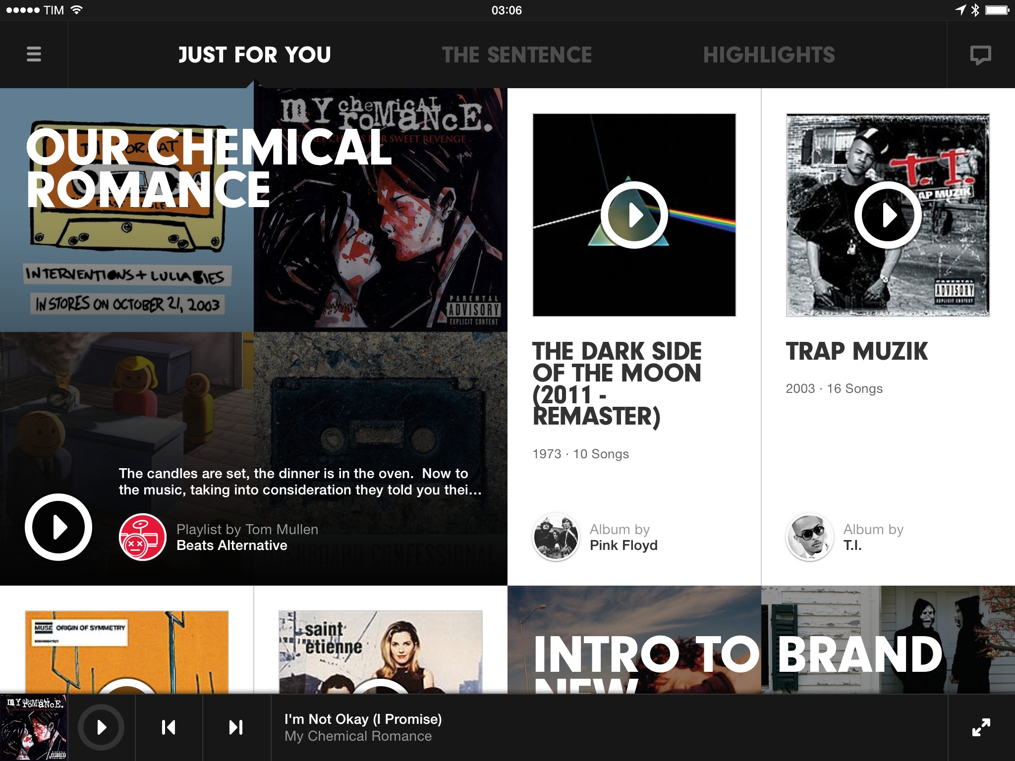
Touch targets are comfortable and easy to tap, and the larger screen allows for more tiles to be displayed at once (at an increased size), making for a visually appealing mosaic of music recommendations and artist information. This is especially evident in the initial Just For You screen, which displays a variety of curated and algorithmically-generated suggestions that are visualized as widgets of varying sizes with bold typography and play buttons. While there is a lot going on in Just For You on the iPad, the app does a good job at breaking the layout’s density with a ratio of two small tiles every one big item, giving the app the feel of a digital magazine that can’t be achieved on the iPhone.
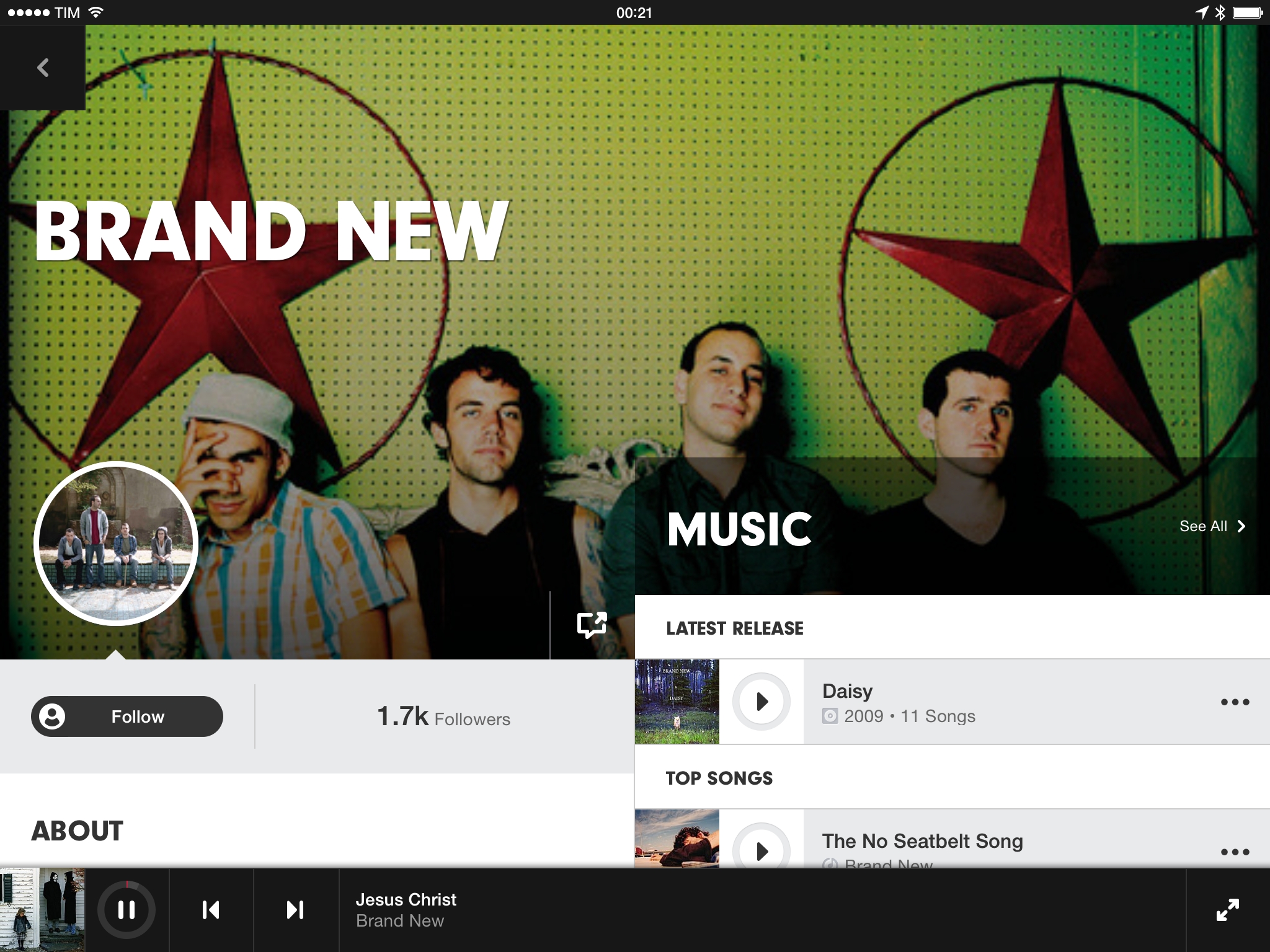
Similarly, the iPad’s canvas allowed Beats Music to split artist/playlist information and the song list in two separate columns. The way these columns present artist biographies or playlist details isn’t different from what Beats Music offers on the iPhone, but at least the app takes advantage of the screen better than other music players that simply blow up an iPhone’s track list to fill a single view.
For instance, when reading in the left column and scrolling past the big headline at the top, the title drops down as a smaller text label sitting next to the omnipresent Back button, serving as a context indicator as well as a shortcut to quickly scroll back to the top.
Speaking of the Back button, it cleverly changes appearance depending on how it’s being used by the app without requiring different placements in the UI. In navigation, it lets you go back; in the full-screen Now Playing, it turns into a chevron that dismisses the view pushing it downwards; in the root level of navigation, the button becomes a familiar hamburger that opens a sidebar for further navigation across sections.
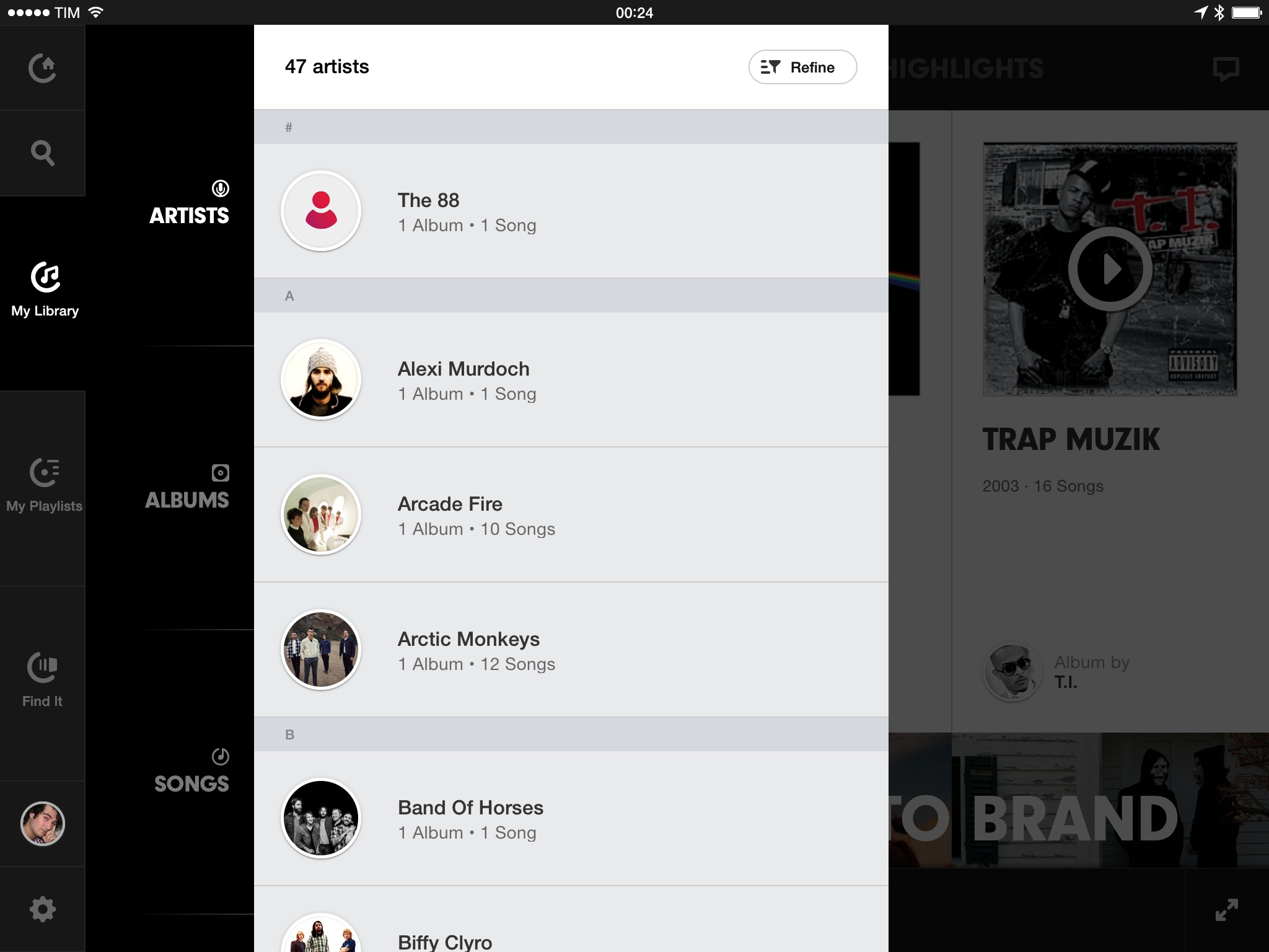
I’m equally impressed by the cleverness of said sidebar. Instead of directly mimicking the basement approach of hundreds of iOS apps, Beats Music used large buttons and tap areas that are placed exactly where your thumbs would be when holding the iPad. It’s easy to switch from Playlists to the Library, and I like how sub-sections are grouped under (or, in this case, next to) the parent sidebar element.
In terms of editorial curation and app features, Beats Music hasn’t changed much from January, which is both good and, to a certain extent, disappointing. The curated playlists and suggestions are solid, thoughtful, and built with attention to relevant music news and events.
Computers and algorithms, in spite of modern advancements in data extraction and parsing, don’t understand things like artistic influences, song meanings, subtle references, or the “mood” of a song. Computers can’t compute emotion. They can’t understand what’s behind Dave Grohl’s “Best of You” at Wembley or why Death Cab For Cutie’s Transatlanticism is an album about long distance love. Computers don’t have the human touch, and I believe that they will never be able to fully, empathically replicate the ability to appreciate music as an artistic expression.
The good news is that, three months into Beats Music, the service is still focused on human-picked playlists aided by an intelligent automatic recommendation system. However, the app’s Just For You dashboard is still showing me the same “Intro To” and “Deep Cuts” collections that it was offering me three months ago, whereas I would like to see a higher frequency of rotation and new playlists come into the mix as I grow familiar with an artist’s discography.
The app still heavily relies on a teaching mechanism based on liking a song (Spotify, on other hand, simply learns by seeing what you actually listen to without manual voting), and problems I first reported in January persist to this day. Often-used sentences can’t be saved as presets, forcing you to create a sentence from scratch every time; there still isn’t a general New Releases section that’s easy to find and updated regularly1; interesting playlists and recommendations are usually hidden in the Highlights page, but they would make a lot more sense if promoted to Just For You.
As far as performance goes, after initial issues following the public launch, the iOS app has gotten faster and more reliable, but I’m still presented with a loading indicator every time I switch from another app to Beats Music’s Just For You page, which gives it a web app-y feel that I don’t want to see in a native app.
It Still Matters
What I first wrote about Beats Music still holds true today: the focus on editorial curation matters and I believe is what will further differentiate music streaming services going forward. With more services (including iTunes Radio) expanding their curation features, Beats Music’s editorial team needs to iterate faster and push to have their work more visible in the app’s front page. There’s still a lot of friction to assemble Sentences, and playlists that would be suitable for a quick Hit Play are oftentimes buried into navigation, reducing the likeliness of being discovered and enjoyed.
As an app, Beats Music for iPad looks fairly obvious but there are interesting details worth paying attention to. As I experiment with different music streaming services and the company nurtures a developer ecosystem, I’m going to keep an eye on Beats Music’s evolution in the next few months.
-
Where by “regularly” I mean “on the same day every week”, like Rdio. ↩︎


