Those who have been following MacStories in the past months know that I switched from Reeder for iPad to Mr. Reader for my daily RSS feed consumption and management. I have reviewed Mr. Reader on multiple occasions, and as I wrote I was particularly impressed by its attention to a clean interface and integration with services such as Send2Mac, Evernote, and Pinboard. Yesterday Mr. Reader also received a major update that brings themes and several optimizations to the app.
In spite of Mr. Reader gaining a well-deserved spot on my Home screen, I’m always looking for new apps that offer a fresh take on the (much discussed) subject of RSS and Google Reader. Such app is Reader X, released today on the App Store, which brings a minimal yet highly visual approach to RSS that shouldn’t disappoint those who are looking for a new and easy way to quickly scan headlines.
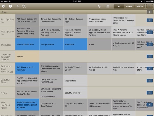
Reader X, in fact, doesn’t let you browse feeds by folder, or manage subscriptions, or scroll unread items vertically as you would expect from a standard RSS client such as Mr. Reader. Well, technically you can sort by folder and scroll vertically, but the implementation of Reader X is entirely different: the app displays feeds as a “mosaic” of news, a list of articles organized in horizontal stripes that represent the websites they belong to. This huge “wallpaper of news” syncs with your existing Google Reader account, and is capable of fetching unread and starred items, folders and all items from a single subscription. Upon firing up the app for the first time, the software will sync with Google Reader and get the latest entries for every subscription in your account; you can tell the app to pre-fetch webpages in the background, and show a badge on the Home screen.
The way news are visualized on screen is functional to what Reader X tries to achieve – that is, trying to offer a more scannable interface for items you’d have to manually scroll with your mouse (or fingers) in a list. Items in the wallpaper are color-coded: unread items are blue, starred entries are yellow, everything else is gray. Newer items have a more saturated color, whilst older entries are gradually fainted as you scroll back in time. Recent headlines are displayed on the left next to a website’s name, and you can also choose to “zoom in” a single subscription (such as MacStories) to browse the most recent articles from that source.
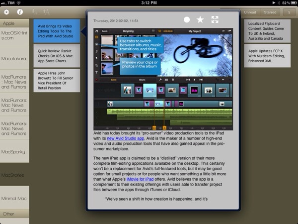
Holding true to its premise of quickly peeking into your RSS items, when you tap on an article headline in Reader X you’re not immediately taken to a full-screen web view. Instead, the app loads webpages in a popover window that, however, still allows you to enter full-screen mode and share a link on Twitter, Pinboard, Instapaper, Tumblr and ReadItLater. You can also share via email, or forward links to Safari.
I like the super-simple and straightforward interface design of Reader X, but I can’t help but wonder how this thing would look like with a bit more polish, especially in the popover and sharing menu design. I’m all for avoiding complex interfaces and over-designed applications, but Reader X feels like it could use some extra pixel love in some areas, so I am looking forward to future updates. I would also like to be able to change the default font of the list, though the one the app currently ships with isn’t too bad.
Reader X won’t replace my main Google Reader client. I do believe, however, that there is room in my workflow for a different take on RSS consumption – a companion app – that allows me to quickly skim through headlines in a visual way that doesn’t get in the way and can make me save precious time when going through RSS feels like a chore. Reader X isn’t perfect, but it sure takes advantage of the iPad’s screen and it’s a promising 1.0 version. You can get the app at $1.99 on the App Store.


