In 2009, reading news on the iPhone was different. The App Store was only one year old; Twitter wasn’t the information network adopted by mass media and millions of users we interact with today; there was no iPad, no universal apps, and no Flipboard. In 2009, reading news on an iPhone meant having to choose between few decent Google Reader clients, some Twitter apps, and lots of “mobile optimized” web apps.
Then in late 2009, Reeder came around. Created by Swiss developer Silvio Rizzi, I remember writing one of the first public reviews of Reeder for iPhone, which unlike the majority of contestants in the space at the time, sported a highly custom “sepia” interface that would later went on to define Reeder as a brand. Crafted with care and an eye for speed, Reeder not only stood out because it was beautiful to look at – the app was fast, visibly more responsive than Byline and NetNewsWire, easy to navigate in spite of its new UI paradigms, and focused on letting the user easily share links on other networks and services. Reeder 1.0 wasn’t perfect; version 2.0, released a few months later, fixed some glaring omissions of its predecessor (namely, lack of saved state), and introduced an even faster syncing engine and more link sharing options.
Reeder took off. The success of the iPhone app allowed Rizzi to become one of the most well-known names in the indie iOS developer community, redefining iPad RSS readers with a brand new version of Reeder, and then again capturing a large portion of the OS X market with the highly-anticipated Reeder for Mac.
In spite of its obvious merits, it is hard to pinpoint the exact reason behind Reeder’s rise to the top of Google Reader clients. There are hundreds, if not thousands, of Google Reader apps on Apple’s App Store now. Rizzi isn’t the “fastest” developer around (Reeder for iPhone was last updated in November 2011), and many valid RSS clients have been released in the past two years, some of them combining traditional RSS functionalities with deeper social integration to offer more compelling, modern alternatives to standard Google Reader syncing and browsing. Yet Reeder has managed to maintain its top position as the go-to Google Reader client for millions of iPhone users.
That’s not to say, however, that Reeder’s constant success and popularity don’t have to account for the profound change in news reading habits that occurred in the past two years. Sometime around 2010 – and I tend to associate this shift with the release of the iPad – a new breed of apps begin grazing the surface of established mobile news reading trends and conventions. Flipboard turned the world of RSS aggregators upside down with embedded discovery and direct integration with social feeds; Twitter clients got more capable, leveraging mobilizers and read-later services to provide a better experience with URLs; Zite brought automatic and intelligent curation to a platform based on RSS, while popular news organizations like CNN and NYTimes kept improving their own iOS apps.
In 2012, people don’t find their news exclusively through Google Reader anymore. That wasn’t true in 2009 either, but the growth of the App Store has certainly catalyzed the process: news travel fast, on a variety of channels, on multiple aggregators, in real-time and in multiple forms. We have become news gatherers.
Reeder 3.0, released today, holds true to its roots of a Google Reader client, but tries to modernize the overall approach and feature set with support for a new service, improved Readability syncing, more sharing options, and a refreshed look. In the first major rewrite of the app since 2010, is Reeder still relevant?
In spite of bloggers clamoring its premature death, the truth is that RSS is very much alive. The problem I see with the recurring obituaries for the technology Dan Libby dreamed up more than a decade ago is that many people don’t understand RSS was never meant to gain mass traction and become the new Google or Facebook. Rather, as a standardized backbone of blogs and online content, RSS has provided us with a powerful, reliable way of structuring information on the Open Web. Google Reader is only a service that has used certain aspects of RSS to build a platform for syncing news across devices; Reader may have failed as a social network or revenue source, but it is still used by millions. We ought to distinguish between the many flaws of Google Reader and RSS the technology, as RSS is the engine behind apps and services that we use every day. Flipboard, Zite, Instacast, Pulse, MacHash – they are all based on RSS feeds. Saying that “RSS is dead” is a facade for the need of easy page views.
Still, Reeder has to cope with the somewhat tarnished reputation of Google Reader after the last redesign, and the fact that people may be using RSS, albeit without knowing, but in other popular (and free) apps.
Reeder 3.0 is interesting, as it still appeals to people who understand the concept of RSS, feeds, and syncing subscriptions. Reeder 3.0 is still a Google Reader client, made for Google Reader users. In version 3.0, the app gains support for Shaun Inman’s Fever, a web-based RSS reading application, and improved syncing with Readability, the free read-later service. I have been testing Reeder 3.0 for the past months, and below I’ll focus on my experience with using the app with the two services I rely on: Google Reader and Fever.
Fever
Developed by Shaun Inman, Fever is a $30 self-hosted web application to read RSS feeds. In 2010, Cody and I wrote a review of the app (and the defunct iPad client, Ashes) that, for the most part, still reflects many of Fever’s features and downsides; we also wrote a how-to guide to install Fever in 10 minutes (it still works); more recently, Macdrifter reviewed Fever and shared some tips to get the most out of it (I especially like his Keyboard Maestro macro, which I installed and run every 10 minutes on my Macminicolo).
Fever can be used like Google Reader – it’s got groups and “unread items”, and it lets you import subscriptions as OPML from other services – but its strength is truly revealed when used as an RSS application that serves a different purpose than Reader. Revolving around the idea of “hot links”, Fever works best when used on a daily basis as a tool to catch up on what’s being actively discussed online without having to read through dozens of similar articles. With an algorithm that scans popular links and sources in the background, Fever’s Hot Links provide an overview of the hottest material (hence the Fever name) that is being written online on a given day, week, or other time interval. When combined with Kindling items (your regular subscriptions) and Sparks (“less important” websites that you’re not interested in reading, but only contribute to the scanning process for hot links), Fever can become a quite powerful solution to catch up on RSS or dive into it depending on what you’re looking for.
In Reeder 3.0, Fever sits right below Google Reader in the Add Account screen. Tap on it, and you’ll be asked to enter a server name, email, and password to access your Fever installation. Once configured, you might want to open the dedicated Fever settings (Reeder 3.0 has in-app Settings) to further tailor the syncing and archive preferences to your needs. Reeder can sync with Fever every time on start, and optionally trigger a refresh on the server. Because my Fever automatically refreshes via curl every 10 minutes, I disabled Reeder’s Refresh on Server; the implementation is solid, but it’ll take a few extra seconds on both WiFi and 3G than “normal” syncing (and obviously Google Reader sync). Sync times depend on the actual speed of your Fever installation and number of RSS subscriptions; I found mine (hosted on NearlyFreeSpeech) to be fairly responsive. Syncing of Hot Links can be disabled, as well as the Archive functionality, which allows you to keep read items available for 1 day up to 1 month. Other options in Fever’s settings include image caching, “mark as read” behavior, and slide gestures on the Hot Links view.
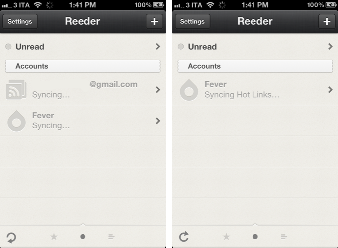
Syncing with Fever for the first time reveals one of Reeder’s changes – the app doesn’t display its syncing status in the iOS status bar anymore. Either heavily appreciated or criticized, one of Reeder’s characteristic visual cues used to be the syncing icons and status messages displayed in the status bar of an iPhone or iPod touch. With Reeder 3.0, sync status is displayed below each account in the main Reeder screen, or in the black navigation bar in a single service’s main view. I was a fan of Reeder’s status bar sync, but I have to admit the new interface is less obtrusive and more consistent with other iOS apps.
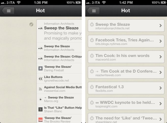
In typical Reeder fashion, a service’s main screen is organized in three tabs at the bottom (starred, unread, all) and sections at the top. For Fever, starred items correspond to Saved items; Unread displays unread articles from your Kindling subscriptions (which are also available as groups); and Hot visualizes the most relevant news of the day, grouped by source.
For Fever users, the Hot Links section is likely the most accessed one, and the reason Fever was purchased and installed in the first place. Admittedly, the algorithm that determines most discussed news is what sets Fever apart from the competition; a third-party client like Reeder, however, built atop of the Fever API, can’t control the engine behind Hot Links. Rather, Reeder is an interface for Hot Links.
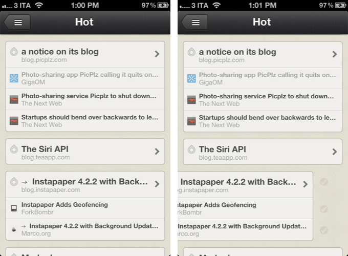
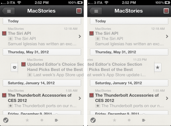
Reeder’s Hot Links share the same underlying structure of the Fever web app, only they are wrapped inside Reeder’s color scheme and interaction patterns. After a refresh, a Hot Link is displayed as a “card” containing the most linked article at the top, and related links below it. A card can be swiped away to be marked as read, or you can click on single items to open their article view. It’s a really simple implementation. While scrolling through Reeder’s Hot list, you’ll find yourself swiping away cards, or tapping around the most compelling and clickworthy headlines. Once marked as read, links will be displayed as smaller tappable entries displaying only the original source.
Unfortunately, Reeder’s version of Fever’s Hot Links doesn’t offer the same kind of control found in another iPhone app for Fever, Sunstroke. The “temperature” of items isn’t displayed, and you can’t modify the time interval which Reeder has to use to pick Hot Links from Fever. I’d argue, however, that Reeder’s version is incredibly more polished and visually intuitive than Sunstroke, which sacrifices a clean layout for more organizational features.
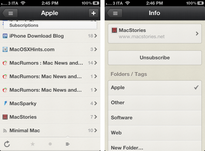
As a Fever client, Reeder 3.0 is far from perfect, but it’s a good first step. The interface is completely native and responsive; the presence of dedicated Subscriptions and All Items sections makes it easy to use Fever as a “regular” RSS app, but I’d love to see more options added to the Hot Links view, which is the core of Fever and needs all of the features seen in the web app. Multiple Fever and Google Reader accounts are supported in the app.
Google Reader
As a Google Reader client, I believe Reeder 3.0 is now close to perfection. Everything that was great about Reeder 2.0 and Google Reader has been refined, enhanced, and streamlined to offer an experience like no other on iOS.
Reeder 3.0 is fast. I have tried several Google Reader clients in the past years, and none of them compares to Rizzi’s app in terms of performances and overall responsiveness, even with hundreds of subscriptions. The Settings, Reeder’s own Achille’s heel in the past versions due to an overly complex design, have been simplified and included in the app. Reeder now makes a distinction between App Settings, Accounts, and Sharing Services. Account-specific options reside within an account’s own window – here, you’ll find controls for archive, sync, unread and starred items, and image caching. In the new App Settings window, Reeder displays: options to choose whether folders should be opened as a list of feeds or articles; descending and ascending sorting options for unread articles; a new confirmation dialog to “Mark All as Read”; and last, updated slide right/left gestures to quickly send an article to read-later services, or mark it as read/starred. I use “slide right” to send to Pocket, and “slide left” to quickly mark as starred.
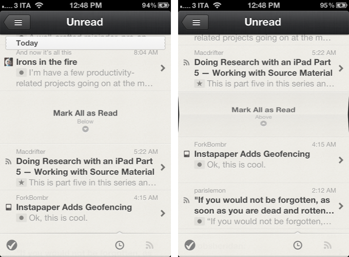
Reeder has always fit my Google Reader workflow, and version 3.0 improves upon the existing Reader-specific feature set in almost every way. Starting in Unread mode, a full list of most recent unread items is a tap away at the top of the screen; a scotch tape-like Subscription divider subtly separates unread items from folders, which are displayed using an “inbox” icon similar to Reeder for Mac. Tapping on the Unread section reveals the same tap-like dividers, only used for date or feed depending on your preferred grouping option (group by date or group by feed).
Slide gestures let you save interesting headlines in an instant, whilst tapping on an item will open Reeder’s completely revamped article view.
Article View
I tend to skim through my Reader subscriptions, but sometimes – especially for starred items – an article is worth reading in its entirety. With a Readability option first introduced in version 2.3, Reeder 3.0 lets you fetch an article’s full text when unavailable, or jump straight to a web view with the built-in browser. No matter what you pick, the article view is the starting point.
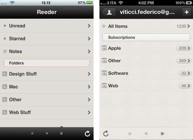
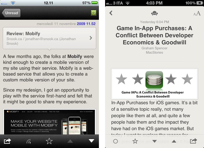
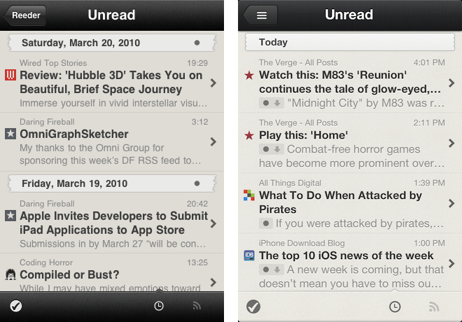
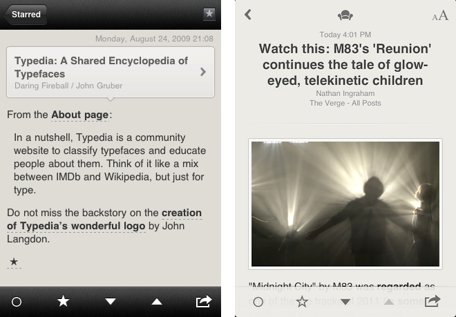
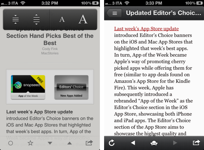
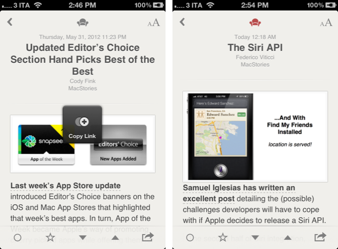
In terms of UI design, Reeder 3.0 plays down the whole sepia color scheme a little, embracing a semi-full screen article view with no top navigation bar and an “integrated” bottom bar. Below, two screenshots comparing the original Reeder 1.x to Reeder 3.0.
Reeder 1 (left) vs. Reeder 3 (right)
Reeder 2.3 (left) vs. Reeder 3 (right)
In moving between article lists and a single entry, you’ll immediately notice the new sliding animation that loads an article as a “panel” sliding into view from the left. This animation isn’t just eye candy: it’s functional to the app’s navigation, as it then allows you to go back to list view with a swipe to the right. It feels natural and I am now addicted to the gesture. I wish Sparrow for iPhone implemented it in its single message view as well.
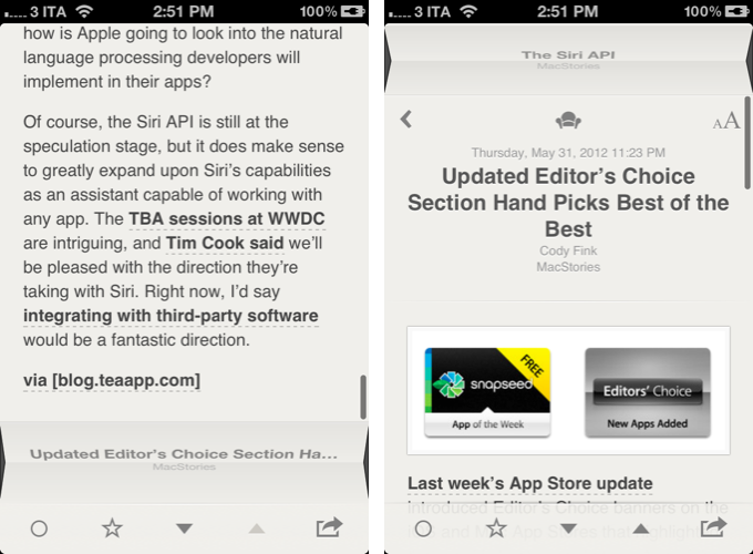
When in article view, you can peek at the previous/next item with a gorgeous 3D, accordion-like animation that progressively reveals an article’s title and feed as you keep swiping up or down. You can also navigate with the arrows in the bottom bar.
The same 3D animation is used to mark articles as read with a new two-finger swipe gesture. Depending on the direction of the swipe, articles will be marked as read “above” or “below”, with an ensuing animation that “sweeps away” items.
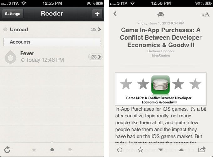
Readability’s sofa icon, available above an article’s title, will take a few seconds to pull the full text, and it will turn red when complete. Unfortunately, the app doesn’t let you specify to open certain feeds always in Readability mode. The Readability mobilizer is also available in the web view; Readability can also be activated with a pinch-to-toggle gesture.
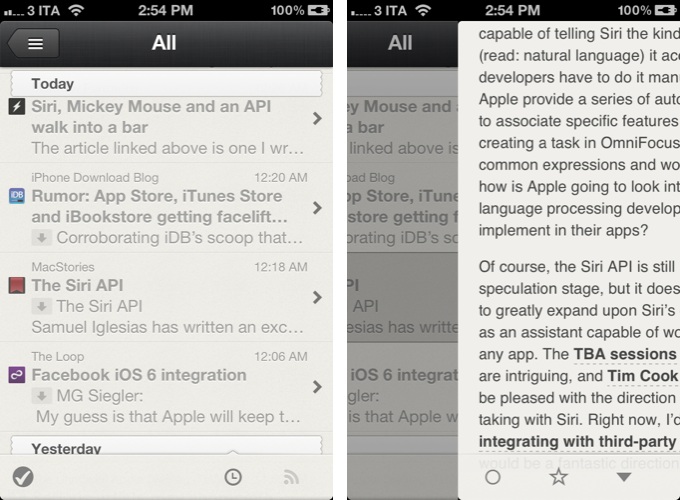
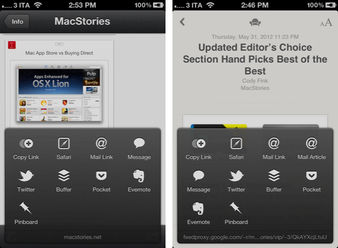
The real star of Reeder’s new article view is the redesigned popup system. In previous versions of the app, Rizzi used a white sharing panel that would slide up from the bottom to reveal options for Twitter, Facebook, and so forth. In Reeder 3.0, the app uses dark floating popups to bring up sharing options from the dedicated icon and any link you tap & hold.
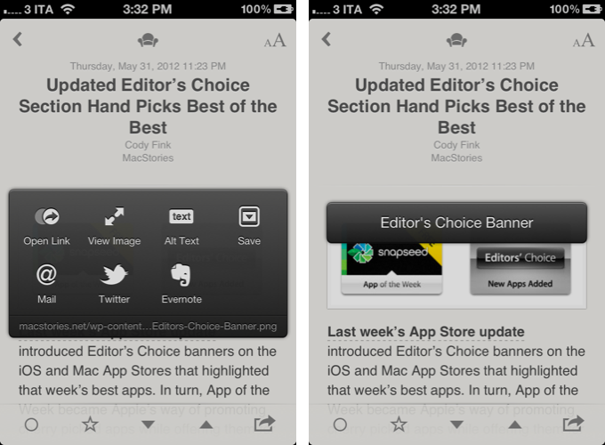
You can tap an article’s title to open the web view, or tap & hold it to open the sharing menu containing the services you activated. I keep Twitter, Evernote, Pocket, Pinboard, Message, Mail, Safari, and “copy link” because that’s how I use Reeder, but there are new additions such as Quote.fm and Buffer available (plus existing ones). You can also tap on any link inside the article to open a contextual sharing menu, with the selected link included at the bottom. You can also select text and only share your selection, or tap on images to reveal more specific options such as Save, Alt Text, Open Link, and View Image. You can’t swipe between multiple images displayed in full-screen mode – a feature I hope Rizzi will consider for a future update. However, you can pinch-to-zoom on images.
The new sharing menu works with any link in the web view as well, and the classic sharing button is available in the bottom toolbar either in article or web view. You can’t swipe back from web view to article view, but the opening animation (try to tap on an article’s title) is incredibly satisfying – you can only swipe left to open the in-app browser. The same dark look is used for the font size control panel, which also lets you modify line height.
I find Reeder’s new sharing menu to be a great improvement over the old version. It looks better, it’s fast, and it’s contextual. Twitter sharing now supports iOS 5 integration, and if I had to nitpick, I’d say the sharing menu could use a simple “Copy Title” option. Otherwise, the new article view and sharing menu address all the issues I had with Reeder’s old UI – they make the app feel fresh again, and, more importantly, they work better. Combined, gesture navigation, design, and sharing make Reeder 3.0 a fantastic Google Reader experience.
Reeder 3.0
In 2012, iOS users read news differently than they did in 2009. Today, breaking news don’t necessarily come from a website’s feed anymore, and when they propagate through Twitter, a dedicated client may not be the interface we use to browse links and status updates. News is decentralized: with RSS and social as the new backbone, the experience of discovering and reading news is now deeply personal and app-centric, yet, in a way, always connected to a bigger ecosystem.
Reeder 3.0 tries to modernize itself with support for Fever and better Readability sync, but it remains an app built for people who understand Google Reader and the idea of “managing subscriptions” (subscription management options are Google Reader-only for now), and who are familiar with navigating folders and tweaking sorting options. While Readability is emblematic of Rizzi’s decision to appeal to a broader audience, support for Fever reinstates the app’s original focus on users who want a better way to sift through their RSS feeds.
Reeder 3.0 feels faster than Reeder 2.0, looks cleaner, and has better sharing. The elements it changes and moves around aren’t just pretty – they contribute to providing a fluid and more powerful experience.
Three years later, Reeder still is the best Google Reader client for iPhone, now with support for more services. Get it from the App Store for $2.99.


