Tweetbot is, by far, the iPhone app that I use the most on a daily basis. It’s not just that I keep Twitter open essentially all day to check for news, talk to friends, or post GIFs: since I got the first beta of the original Tweetbot three years ago, the app has become so ingrained in my workflow that I wouldn’t be able to switch back to any other client that doesn’t have the same capabilities. What started as a moderately advanced take on Twitter clients by Tapbots has evolved with time into a powerful app that spans three platforms and that comes with dozens of unique features and a solid engine that, for me, has no equal. I don’t say it lightly: because of Tweetbot’s feature set, I have been able to reliably communicate with other people (via DM or Mentions), reference tweets for articles, or build complex workflows that have allowed me to be more efficient, faster, and generally happier with Twitter.
That’s why I take major changes to Tweetbot’s overall structure and design, such as Tweetbot 3 for iOS 7, very seriously. Tweetbot 3, released today as a new app sold at $2.99 on the App Store (launch sale), is many things at once: it’s Tapbots’ first foray into the iOS 7 design aesthetic, which marks a radical departure from the small studio’s former visual style; it’s a profound reimagination of Tweetbot’s looks, animations, and sounds, which had gone largely unchanged since 2011; and it’s a confirmation of Tweetbot’s existing feature set with changes aimed at further enhancing the app’s functionality and making room for future additions. It’s iPhone-only, with a new version for iPad coming next.
I have been using Tweetbot 3 every day on my iPhone 5 for the past couple of months. I think that I have a good understanding of the decisions behind the app’s redesign, feature changes, and complete embrace of iOS 7’s visual and hierarchical approach to building interfaces. With version 3.0, Tweetbot, the robotic toy for your Twitter stream, eschews its mechanical roots and graduates to a modern, fluid, and fun assistant that, in the process, is still Tweetbot. I wouldn’t be able to go back to the old Tweetbot now, but I also think that getting used to the new app will take some time.
New Bot
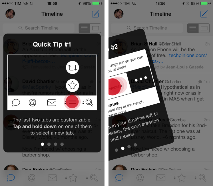
Tweetbot 3 is different. The fact that something has changed is immediately clear from the app’s initial walkthrough: what used to be a swipeable gallery of screens is now a carousel of translucent cards that bounce and rotate as you flick them off the screen. As usual, these cards offer a handy summary of Tweetbot’s most peculiar features such as customizable tabs and tap & hold actions.
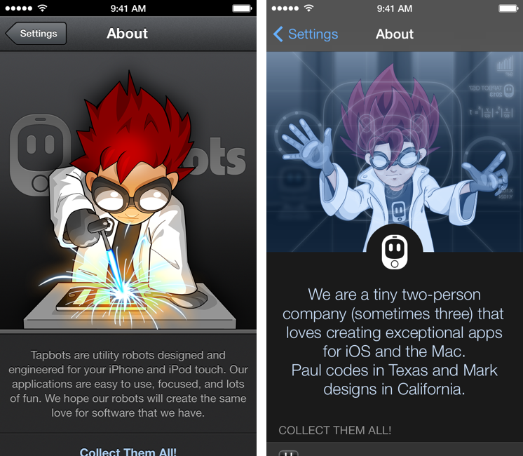
Even more than first-run quick tips, though, the app’s About screen provides a concise and clever summary of Tapbots’ new focus and philosophy: the young scientist who operated a welding gun to craft the original Tweetbot is replaced by a grown-up version that, Minority Report-style, calculates the proportions of the new app icon on a floating, transparent display. The tone is more serious – futuristic, perhaps – and, if you’ll allow me a manga comparison, it almost feels like going from Dragon Ball to the GT saga.
And yet, even the artwork itself doesn’t tell the whole story: the description of the app does.
The old Tweetbot used to say:
Tapbots are utility robots designed and engineered for your iPhone and iPod touch. Our applications are easy to use, focused, and lots of fun. We hope our robots will create the same love for software that we have.
Whereas this is how Tapbots describe themselves in Tweetbot 3:
We are a tiny two-person company (sometimes three) that loves creating exceptional apps for iOS and the Mac. Paul codes in Texas and Mark designs in California.
The app’s new About screen serves as a declaration of intent from Tapbots: the robots may be gone, but the love for software is still here.
“Human” is a term that is often overused in the iOS 7 world, but, for Tweetbot 3, it’s absolutely fitting.
The original Tweetbot, released after much anticipation and a long beta-testing process, was deeply invested in the company’s preference for robots as software utilities: every part of Tweetbot’s interface had been designed trying to imagine how a machine would display a vertical stream of text, switch between tabs, or respond to user interaction with sound. When you swiped horizontally on a tweet, Tweetbot would play a very machine-like sound effect and push the interface to the side with a precise, snappy transition; buttons were shaped as buttons with pressed states and borders; every interaction had been modelled after the idea that Tweetbot was a robot for tweets, and you were in charge of operating it. Tweetbot was a playful appliance and it was gorgeous to look at because it was unique.
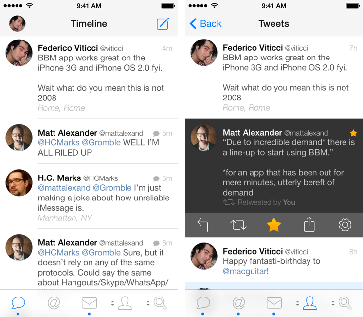
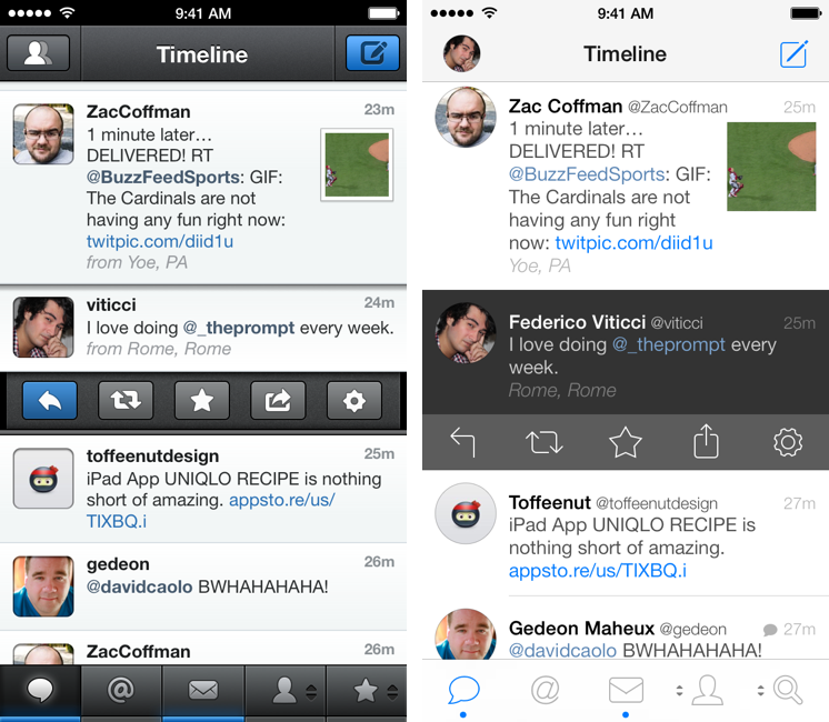
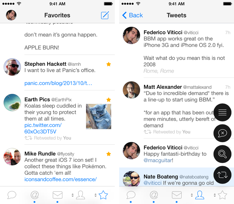
By comparison, Tweetbot 3 doesn’t look so unique if your judgment of the app is limited to a first impression based on two screenshots of the main timeline. The app makes conspicuous use of white space, avatars are now circular, and icons are thinner.
While the basic layout is the same, the old design has been torn away and replaced with a new airy look that puts less focus on buttons and custom UI elements. If you don’t look any closer, you’d almost be disappointed by Tweetbot’s lighter, machine-free approach. Tap on a tweet, however, and you’ll see what’s changed.
Tweetbot 3 is all about custom animations, transitions, physics effects, and layers. “We wanted to stay unique and fun”, Tweetbot developer Paul Haddad told me in an email exchange about the new app. “With the new frameworks and tools added in iOS 7 we were able to add that fun factor in by using physics and custom transitions”, he added. This is fairly standard terminology for the iOS 7-savvy user, but, in Tweetbot 3, it has a practial consequence on the user experience that is beneficial to the app.
The tweet drawer was one of the old Tweetbot’s marquee features in that it enabled users to easily access shortcuts to reply to, retweet, fave, or share a tweet. The problem with the drawer was that, because Tapbots had built a triple tap gesture to quickly act on a tweet without showing the drawer, the app had to understand whether the user had tapped just once or was about to tap more times on the screen to trigger the triple tap behavior. This resulted in a small but perceptible delay in tapping the screen and showing the drawer. It wasn’t a major issue, but it was noticeable.
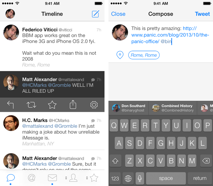
In Tweetbot 3, Tapbots has removed the triple tap gesture and made the tweet drawer the only way to display tweet actions in the main timeline. As a result of the removal, the app doesn’t have to think about the number of taps anymore, as it knows that if you tapped once, you want to open the drawer – which appears immediately after you tap on a tweet. And here’s where Tapbots’ new skills are revealed: when you tap, a tweet turns dark gray and the drawer folds down from “behind” the tweet and into the timeline with a delightful 3D transition that I still can’t stop looking at.
While the core aspect of the tweet drawer has stayed the same, the fact that it now opens immediately after you tap is a huge improvement in my opinion. I haven’t missed the triple tap actions because the tweet drawer makes it easier to access a wider set of shortcuts; the new animation retains the old app’s idea of “pushing down” tweets below the drawer, but it also reinforces a new kind of physicality that feels less like a robot and more like an object you’re directly manipulating. It’s an abstract idea and it doesn’t come across well enough in screenshots and text descriptions, but it’s there.
Tweetbot 3’s superior single-tap recognition is also well demonstrated by the simple act of switching between tabs at the bottom of the screen: in the old Tweetbot, there was a small delay between tapping a tab and viewing its timeline; in Tweetbot 3, that delay is gone and the app changes between tabs instantly. Try the new tweet drawer and tap-switching mechanism in Tweetbot 3, go back to Tweetbot 2, and the app will feel slow and clunky. A robot, indeed.
Every part of Tweetbot has been refreshed and, in my tests, I couldn’t find a single pixel that had been ported over from the old app. From the main timeline and borderless buttons to table views (now edge-to-edge) and the status bar (white and unified with the title bar), everything in Tweetbot 3 is at the same time new and familiar.
I have been thinking deeply about this: Tweetbot 3 still works like the old Tweetbot did, but the things that have changed – they have changed for the better. The app has lost two features (that I could find) in the transition to iOS 7[1], and, in the process of applying a new design language to it, Tapbots enhanced the fundamentals of Tweetbot to make the app faster and more fluid. It would be easy to form an opinion after five minutes of testing. For Tweetbot 3, I believe that it’s important to consider the tiniest details and every feature to understand how the new version will result in an improved experience on a daily basis.
Structure
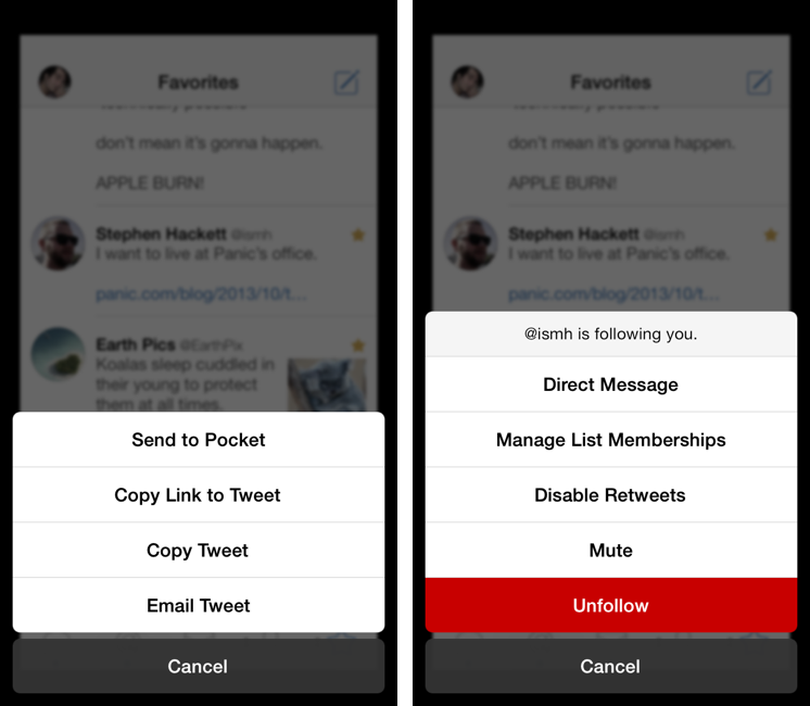
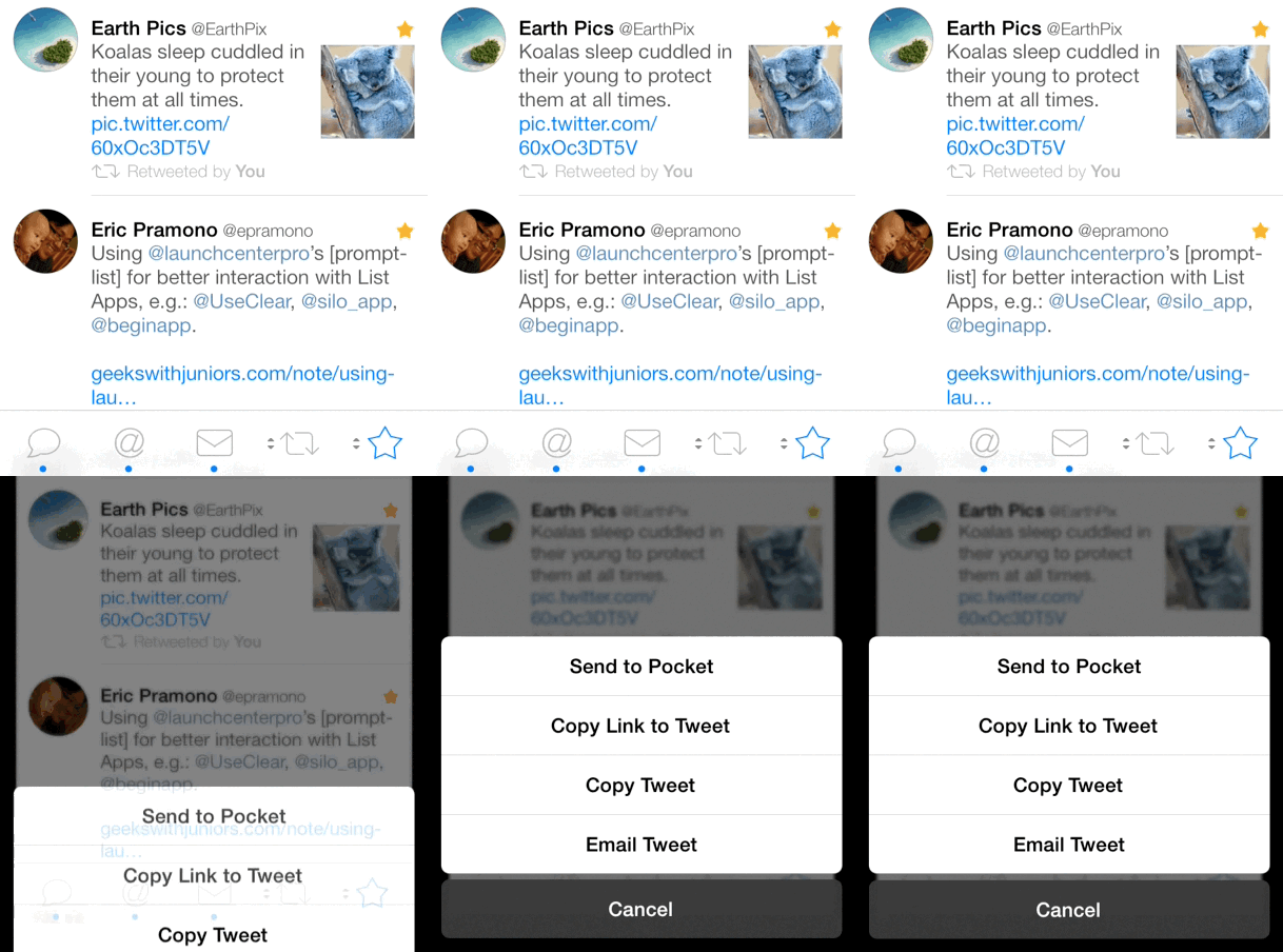
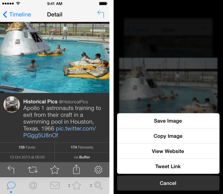
The custom physics engine developed by Paul Haddad makes Tweetbot feel more natural and flexible. Take, for instance, the app’s new tap & hold menu: traditionally, tapping & holding a tweet or a URL would have slightly dimmed the background of the app and brought up a glossy contextual menu with buttons to, say, copy a tweet or a link to it. In Tweetbot 3, this is what happens when you tap & hold a tweet:
The main view is pushed in the background and blurred, and the contextual menu comes up from the bottom with simpler white buttons and a gray Cancel button that bounces against the main menu as it fully comes into view. Overall, the animation is slightly slower than Tweetbot 2, but it feels right at home on iOS 7.
Something that always struck me as unique to the old Tweetbot was how fun it was to look at the app’s button-y look or custom pull to refresh spinner, and how that fun didn’t grow old over time. It always felt new and whimsical…until iOS 7 came around and it started feeling oddly out of place on the new OS. Tweetbot 3 feels good on iOS 7, and, more importantly, it retains the fun factor – it’s just used in other areas, and I believe with equal craftsmanship and willingness to delightfully impress and entertain the user.
In Tweetbot 2, you could tap & hold the last two items in the tab bar to show a popup menu to switch between other tabs and assign them to the bar bar. It was a sweet, fun, efficient alternative to Apple’s default tab customization UI, and it worked well with Tweetbot’s design.
In Tweetbot 3, the feature is still there, and it still works in the same way, but it is animated differently: when you tap & hold a customizable tab, circular icons spring into view, tied together by Haddad’s engine that makes them bounce and stop after they’ve been revealed. With your finger still down on the tab, swipe up and down anywhere on the screen and tabs will be quickly highlighted in blue with a subtle fade in/out effect that is gorgeous to look at. The overall transition speed was slightly faster in Tweetbot 2, but once I got used to the new app’s physics and highlight effect and the fact that you can swipe anywhere on the screen to activate a tab, the old Tweetbot’s menu felt overly robotic.
Tweetbot 3’s strongest demonstration of physics, though, is in the new picture viewer. In terms of functionality, it’s unchanged from Tweetbot 2: thumbnails shown in the timeline can be tapped to enlarge a picture, which can be tapped to dismiss the preview and return to the timeline. In Tweetbot 3, however, the floating preview (which, as you can guess, blurs the content behind it) is bound by some form of gravity to the tweet it belongs to, so, if you don’t flick the picture away with enough speed, it’ll bounce back and return to the original position. Pictures can be flicked away in any direction, and they also “fly away” differently depending on how fast you throw them away with your finger. It feels like a mini-game within Tweetbot.
When Rene Ritchie wrote about the gamification of the iOS 7 interface, I think that something like Tweetbot 3’s picture viewer is exactly what he meant: natural, perhaps even a bit quirky, but undeniably fun and obvious when you get it.
One more thing about inline pictures: like iOS 7, Tweetbot is defined by its very own hierarchy of layers and levels of interface that are progressively shown to users as they interact with an app. If you tap & hold on a picture that has been enlarged from the timeline, you’ll see that, unlike Tweetbot 2, the first layer (timeline) will be more blurred and pushed back further than the picture that’s now also blurred and pushed back to show a contextual menu as Layer 1. It’s not something that will directly increase your productivity in Tweetbot, but it is a detail that shows how Tapbots has deeply considered their approach to iOS 7 and chosen to stack layers of the user interface on top of each other.
Given the aforementioned changes to the app’s structure and layout, it only makes sense that tabs are now independent from each other, with their respective nested levels and views no longer taking over the whole app. In practical terms, this means that every tab can open its own web view or navigate into a user’s profile without preventing you from switching to other tabs.
In the old Tweetbot, when you followed a link in a tweet, a web view would open, forcing you to either read the page and share it, or go back to the timeline. Similarly, tapping on a user’s profile would show a new set of tabs at the bottom to view all tweets from that user, mentions, faved tweets, and lists; to make things more confusing, you could also view all tweets from a user by tapping on “Tweets”, which would show a full-screen list of all tweets in reverse chronological order. The entire navigation stack has been changed in Tweetbot 3.
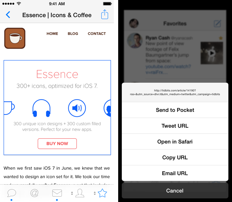
Now, whenever you follow a link, a web view will be opened and confined to the tab it’s been launched from. If you open a link from your timeline, you can switch to the Mentions tab and do something else; if you open a link from a DM, you can go back to the timeline and read tweets while the page is loading.
This change to the app’s navigation makes for an incredibly more convenient workflow for people who, like me, deal with links every day and found it cumbersome to be forced to wait for a page to load, act on it, then close it. The “multitasking” experience inside Tweetbot is much improved because of this change and, in comparison, the old app’s way of handling web views looks silly now. For me, this has been particularly handy when receiving DMs: I get a lot of direct messages every day, and with Tweetbot 3 I’m no longer forced to close a webpage I’m reading if I have to reply to a DM immediately.
If I had to nitpick, I’d say that it’d be cool to show an indicator for an open web view in the tab bar: while the active tab is highlighted in blue and there’s the usual blue dot for new tweets, there’s no way to tell whether a tab has an open web view unless you switch to it.
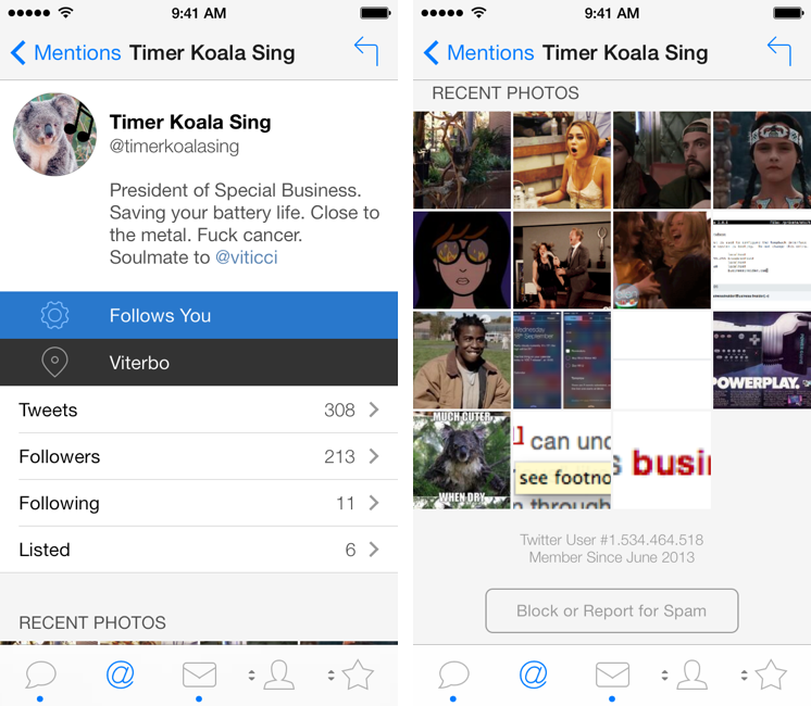
For user profiles, Jardine and Haddad have simplifed and enhanced the app’s functionality with an elegant solution. A user profile now shows avatar and cover photo at the top, but, unlike Tweetbot 2, name, username, and bio are overlaid on top of the cover photo, which is blurred in the background; swipe down and the text is dimmed, revealing the cover photo. If you don’t care about this trick, you can just tap both photos to view them. But this isn’t the main enhancement I’m excited about.
At the bottom of a user profile, you’ll see that there are no standalone tabs for navigation anymore; tap Tweets, and the app navigates into a view that shows a segmented control at the top to switch between that user’s Tweets, Mentions, and Faves; while viewing these, you can freely switch back to any other tab in the app.
Profiles now show Recent Photos: gathered from your own tweets and retweets, Tweetbot 3 can’t load all photos from your profile, and, in my tests, it generally displayed between 6 and 9 recent photos, but sometimes even less (a limitation that I believe is part of the Twitter API). While this is a nice addition, the fact that it’s not a full grid of all media uploads doesn’t make it much useful to me – and, worse, there is no way to view the original tweet associated with a photo to have more context. Recent Photos feels half-baked right now, and I would love to see Tapbots exploring this idea further in the future.
With Tweetbot’s new structure, the ability to load a Twitter list in the main timeline is gone from version 3.0. Lists get their own tab now, and, while I’m sure that many will miss what was one of Tweetbot’s most unique features, I believe that the trade-off for increased navigation and multitasking is worth it.
Another addition that I really like is waking up each morning to new tweets already waiting for me in Tweetbot. Thanks to iOS 7’s Background App Refresh, Tweetbot 3.0 can fetch tweets in the background while maintaining your scrolling position; launch the app, and you’ll see blue dot indicators for new tweets without having to wait for a refresh. It’s a minor feature, but it’s handy and I don’t want to live without it anymore.
Single Tweets and Compose
As I mentioned above, the swipe from left gesture has been removed, leaving room for a swipe from right that opens a tweet’s Detail view, which has been completely redesigned in Tweetbot 3.
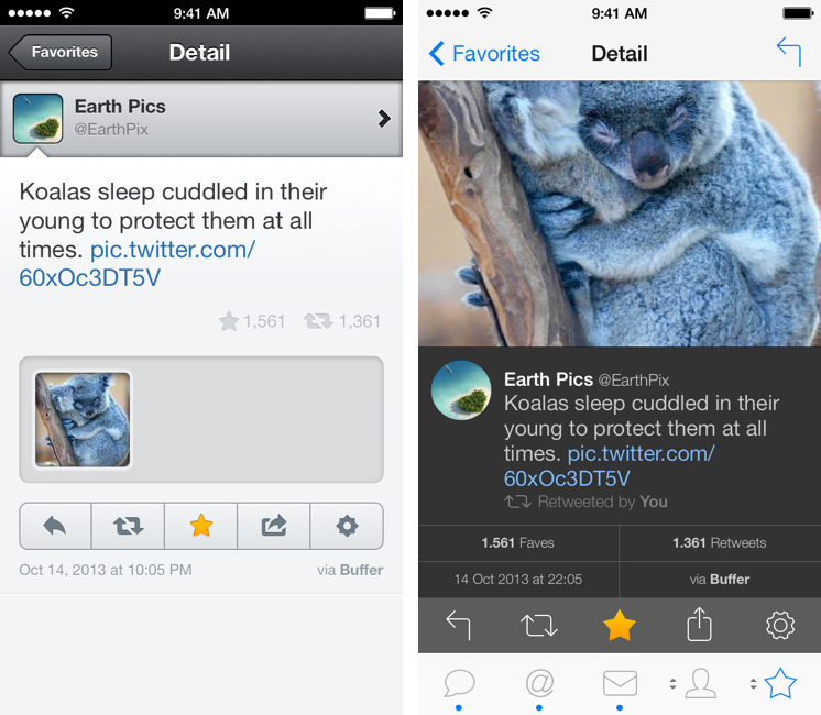
In the new app, the Detail view is dark and it shows additional buttons to view people who faved or retweeted a specific tweet. For those who need their daily ego boost in the form of fave and retweet counters, this addition is welcome. Replies and conversations are shown above and below the tweet and the app no longer displays attachments in a separate box for tweets with pictures, adopting a beautiful inline visualization instead.[2] As a result, tweets now display more information, gestures have been simplified, and inline pictures get the treatment they deserve.
I’m still not sure on how I feel about the dark detail view and the gesture to open it. In Tweetbot 2, swiping to the left would quickly switch from the timeline to the Detail view with a seameless transition accompanied by a sound effect. In Tweetbot 3, as you swipe left an icon with three dots is progressively revealed next to a tweet and, if you keep swiping, the entire cell is pushed to the side by a color block, which then disappers to show the Detail view. I was a fan of the old Tweetbot’s transition, and I think that the new one feels unfinished, unnecessary, and slow. In the Detail view, there is a lot of contrast between the dark background of the tweet and the white tab bar at the bottom, something that is exacerbated by tweets that have an inline picture and therefore push buttons to the bottom of the screen. The tab bar’s design was changed in the final betas of the app, and it’s possible that, with time, Tapbots’ decision will grow on me.
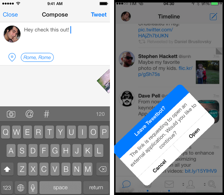
An aspect of tweets with dark background that I like is how they show up when replying to someone. In Tweetbot 2, when you hit the Reply button and wanted to see the tweet you were replying to, you had to swipe down on the Compose area; in Tweetbot 3, when you hit Reply in the tweet drawer and the Compose screen comes up, the previously selected tweet (or conversation) appears immediately below the text field you’ll type into. While the tweet doesn’t appear at the exact same vertical position after the Compose transition has completed, this new UI has a nice continuity between the timeline and the Compose screen that increases the context of a Reply. Extra points to Tapbots for choosing the iOS 7 dark keyboard instead of the default light one; in my opinion (and The Doctor agrees with me), the dark keyboard offers more contrast, key legibility, and, overall, it’s more usable than the light keyboard. The fact that it fits better with Tweetbot’s dark gray color for selected tweets also helps.
One of Tweetbot 3’s minor touches that I feel deserves its own dedicated paragraph is “syntax” highlighting in the Compose screen. Thanks to iOS 7’s new APIs for text detection and layouts, Tweetbot 3 can turn a link blue or a hashtag gray directly when composing a tweet, and not just after the fact when viewing the tweet in the timeline. Try it yourself: copy a link, create a new tweet, paste the link, and it’ll be recognized by iOS 7 and turned blue immediately; same for usernames and hashtags (try with #cleanmyke). There are some bugs with scrolling in the Compose area unfortunately[3], but, in general, highlighting bits of text recognized as special by Twitter helps creating a more consistent, discernible writing experience that’s far superior to Tweetbot 2.
The Little Things
It would be strange to have a new version of Tweetbot that doesn’t come with charming details and little touches we’re used to seeing from Tapbots. Thankfully, Tweetbot 3 retains all the capabilities that made Tweetbot a powerful Twitter client and adds some new things that, in the beta, stood out to me. As usual with my reviews, here’s a list of all the little things I noticed in no particular order of importance.
- Saved drafts are now shown with a blue page curl in the Compose screen which quickly animates soon after you hit the Compose button from the timeline. Tap it, and a list of drafts comes up in full-screen. You can swipe to delete drafts or tap one to put it in the Compose screen again.
- The About screen supports iOS 7’s new parallax effect. Try it.
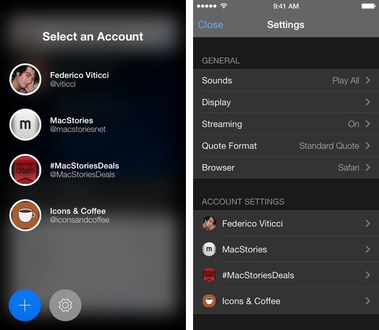
- The “Select an Account” screen fades into view (blurring the content below) with a sweet animation that makes avatars bounce off the left edge of the screen.
- When you remove an attached photo from the Compose view, the thumbnail falls off the screen. Same for modal URL dialogs (such as iTunes links that ask you to leave Tweetbot) when you hit Cancel on them.
- The app shows a blue checkmark next to profile pictures of Verified users, in case you need to remember that they’re important. In the beta, it also showed a blue bot next to the avatars of Paul Haddad and Mark Jardine.
- Tweetbot 3 supports iOS 7’s system-wide Dynamic Type to tweak text size. If you want to make Tweetbot’s text really huge, you can in the Settings app.
- The animation for when you tap into the search bar at the top is one of my favorites in Tweetbot 3. The new auto-complete bar for usernames and hashtags is also a contestant, though.
- You can now email a URL directly from a web view. A sweet touch: the URL is inserted in the body of the message alongside a link to the original tweet.
- If you tap & hold a long URL in the timeline, the contextual menu will intelligently resize the URL’s text to make it smaller so that you’ll be able to read the full URL without cut-off parts.
A word on the new sounds.
Besides a strong visual personality, Tweetbot has always had a prominent aural identity in the form of sound effects created by Tapbots. Tweetbot 3 replaces all of the app’s sounds with new versions that are less “mechanical” and somewhat more natural and joyful. I like them – especially the new pull to refresh one – but I’ll save my final opinion for the future as the new sound set was added in the last beta before App Store submission. Something that I have noticed is that the app no longer plays a sound when switching between tabs or tapping the back button or swiping a tweet to open the Detail view – and I’m not sure I like this change.
Human After All
“I don’t want to say we are moving away from the robot metaphor just yet. It really works best with our more utilitarian apps and so only time will tell what happens on that front. As far as Tweetbot goes, we wanted to shake things up a bit. Paul and I always talked about potentially building another Twitter client that was visually very clean and focused more on content and less on the UI. Token caps obviously killed that idea, but iOS 7 gave us a chance to pursue that idea. That’s not to say that Tweetbot 3 is a completely different app with the same name. Tweetbot 3 feels like a hugely upgraded version of Tweetbot. The functionality and soul of Tweetbot is still there and I think that’s what is most important.” – Mark Jardine
True to the About screen, Tweetbot 3 is an exceptional Twitter client and it doesn’t feel like a robot. With iOS 7, the robot metaphor and heavy interface is gone from Tweetbot, leaving Tapbots with a powerful app that’s been redesigned with color and depth in mind, augmenting animations and transitions to make the app feel unique and fun in a new way.
For me, Tweetbot’s feature set is still unparallaled and the additions that have been brought to version 3.0 make the app even faster and more reliable when it comes to loading timeline gaps, opening web views, or using the URL scheme. Tweetbot 3 is the most powerful Twitter client I have on my iPhone.
If you don’t like iOS 7, I don’t think that you’ll like the new Tweetbot. While the original Tweetbot was, in many ways, a departure from the default/Tweetie look of most Twitter clients in 2011, Tweetbot 3 is very much in line with the current design language of iOS 7. The old Tweetbot was the culmination of Tapbots’ years of experience with utility robots applied to a Twitter client; Tweetbot 3 is a new start for the company, which has to prove they can still make fantastic utilities that are easy to use and powerful, fun and packed with features.
Tweetbot 3 doesn’t come with breakthrough new functionalities, which, according to Tapbots, will follow with future updates. The app’s sharing department could use some additions (there are no new supported apps/browsers and Pocket doesn’t use the new SDK to handle user authentication)[4] and tweets that match mute filters aren’t automatically removed from the timeline after you create a filter. Tapbots wanted to get the app ready for iOS 7 first, then iterate on the product to add new features that will be made possible by iOS 7. I can understand this decision, and I have absolutely no problem in paying $2.99 again for an app that I have been using several hours each day for the past two years.
Tweetbot 3 isn’t a Twitter client that adopts Apple’s default new iOS 7 look without making its own adjustments to the interface and feature set: Tweetbot 3 is already full of subtle and more visible details that contribute to giving the app a very peculiar feel and flow. The animations and transitions that Haddad and Jardine implemented are elegant, apt, and playful; the core features that have been changed, such as web views in tabs and text highlighting in the Compose screen, make for a more flexible Tweetbot that outclasses the rigidity of Tweetbot 2. Tweetbot 3 is a better app because of its layout and design changes.
A lot will be written today about Tweetbot’s new design and Tapbots’ adherence to iOS 7’s principles of content, color, context, and clarity. Tweetbot 3 is a fantastic iOS 7 app; its new design, animations, and navigation improvements will be instrumental to Tweetbot’s future on the platform.
Tweetbot still has personality. It’s just grown up.
- Text Upload and swipe from left to right are gone. ↩︎
- Same for locations: there’s no dedicated “map box” anymore. You can just tap on a location’s name to open a built-in map view. ↩︎
- An issue that seems to be common with many other iOS 7 apps at this point due to lingering bugs in the iOS 7 SDK for developers. ↩︎
- And you still can’t keep Pocket and Pinboard active at the same time. ↩︎


