Unread, developed by Jared Sinclair, is my new favorite RSS reader for iPhone. Unread is on my Home screen, on the same spot that Reeder held since late 2009 when I first reviewed it. Unread provides a fantastic mix of elegant typography, intuitive gesture-based, one-handed navigation, iOS 7 features, and modern sharing tools that, in my opinion, make it the best RSS reader for iPhone today.
The Sound Of Settling
I’ve been using Reeder for over four years, and the app hasn’t changed much. It received interface refinements through the years and support for more RSS services was added after Google Reader’s demise in 2013, but it’s no secret that, for months, Reeder stagnated, with no updates to reassure users that Silvio Rizzi still had big plans for the app. Not that the lack of updates was a problem per se: Reeder was a great app and it always kept working, but seven months without updates on the iPhone and the removal of the iPad and Mac versions from the App Store didn’t suggest that Reeder was on track for major changes.
In September 2013, just a week before iOS 7, Rizzi released Reeder 2, a new app for iPhone and iPad. Reeder 2 brought a completely new UI for the iPad and an evolution of the iPhone’s one, leveraging new animations and transitions for navigation inside feeds and articles. My review wasn’t completely positive: while I lauded the app’s speed, elegance, and familiarity, I also stressed that, in the age of Mr. Reader, Reeder for iPad was too little, too late for my workflow. I concluded by saying that Reeder was a “beautiful and familiar app that could have taken bigger risks”. In spite of the fresh(ish) coat of paint, I couldn’t shake the feeling that Reeder 2 wasn’t exactly new or advancing the basics of the app in meaningful ways.
Especially if you’ve been waiting for an update to Reeder for iPad, maybe a redesigned Reeder that doesn’t go crazy with new features but that instead brings a cleaner reading and syncing experience is exactly what you wanted from Rizzi. Reeder 2 is a fine piece of software – it certainly looks and works better than the majority of RSS clients on the App Store – but my hope was that Rizzi would include new functionalities in the sharing and browsing departments. I guess that, with Reeder 2, I was expecting the same impact that Reeder 1 had in 2009, whereas what I found was a beautiful, solid, but familiar (and trite, in some areas) take on the same app.
I was hopeful that the new foundation would give Rizzi time to regroup and evaluate how Reeder could add new iOS 7 features without losing its nature in the process, but, four months and a 2.1 update later, things haven’t changed much. That’s not necessarily a bad thing – good software takes time, especially when you’re an indie developer – but, as a user, I was curious to see whether other RSS readers could satisfy my news-reading needs better.
Hence, Unread.
Why You’d Want To Read Here
I’ll admit that when I first heard of Unread, I thought it was one of those “minimal” apps with a focus on elite typography and other contemporary design trends that I never fully understood. I was happy with Reeder, and I read this:
Let Unread be an opportunity to break away from your old reading habits. Let Twitter or App.net be the place for loud, busy feeds.
And this:
I made Unread because I wanted to get back to a more deliberate style of reading. I designed it for times of quiet focus. With warm typography and a sparse interface, it invites me to return to the way I used to read before I fell into the bad habit of skimming and forgetting.
I didn’t know Jared, and I assumed that Unread would end up becoming a niche, probably attractive way of reading RSS that, however, wasn’t for me. I do subscribe to a lot of feeds (more than 100) and I tend to scroll past most of the headlines I see on a daily basis. I don’t have to read everything, nor do I want to. RSS remains a convenient, open technology to subscribe to interesting blogs and passively receive new articles; in the age of Twitter streams and “curation algorithms”, I stick with it. Based on the public pitch, I thought that I wasn’t the target audience for Unread.
A couple of weeks later, my partner in crime Stephen Hackett asked me if I had seen Jared’s teaser of Unread. I replied that I did, but that I wasn’t interested. He told me that the app had a lot of potential and that there were some unique ideas worth checking out, and on the same day I received a beta of the app. The following day, I deleted Reeder and put Unread on my Home screen. I’ve been using it every day since.
Feed Wrangler is my RSS service of choice. I subscribe to about a hundred feeds and I organize them in four Smart Streams. I stay on top of RSS all day: I open my reader in the morning, when I usually find about 70 items waiting for me; during the day and until I wrap up work, I get hundreds of other articles that I either skim or read inside my RSS reader, starring some of them for later. I wouldn’t say that I read RSS in “quiet times of focus” – more like “busy times while everything is happening”. Could Unread work for me?
The beauty of RSS is in portable, personal, and private decision-making: I can skim headlines or tap an article that piques my interest and spend 30 minutes reading it. I’m not forced to publicly “like” or “broadcast” an article. I can star it, forget about it, and go back to it later. I can check for articles while I’m buying pasta and RSS won’t judge me.
Unread
Unread supports Feed Wrangler, Feedly, and Feedbin. If you use any other service or prefer to read RSS with no sync, you’re out of luck. It’s iPhone-only, $2.99 at launch, and it supports iOS 7 background fetch.
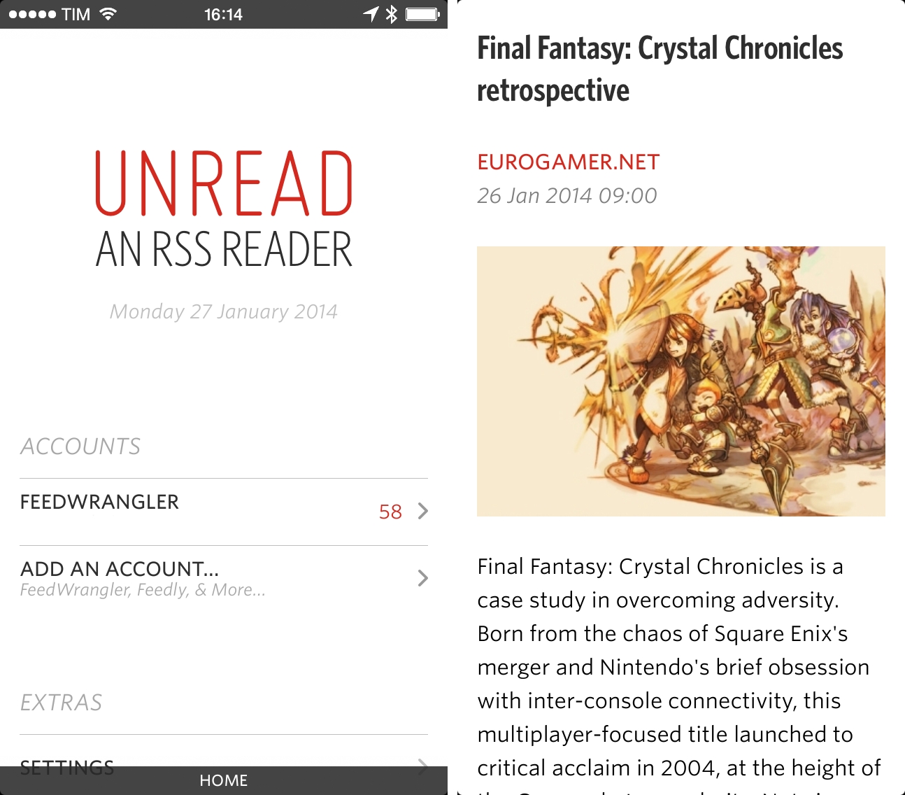
The initial screen of the app is a home page that shows the app’s logo, the current date, accounts, and Extras such as settings, a tutorial, and a description of the app’s philosophy (an in-app version of Jared’s aforementioned pitch). The addition of the date in the dashboard is a seemingly trivial choice, but it contributes to setting the tone for Unread: “here’s what you have today”, as opposed to “here’s what we just synced back from a server”. I obsess over subtleties, and I like this one.
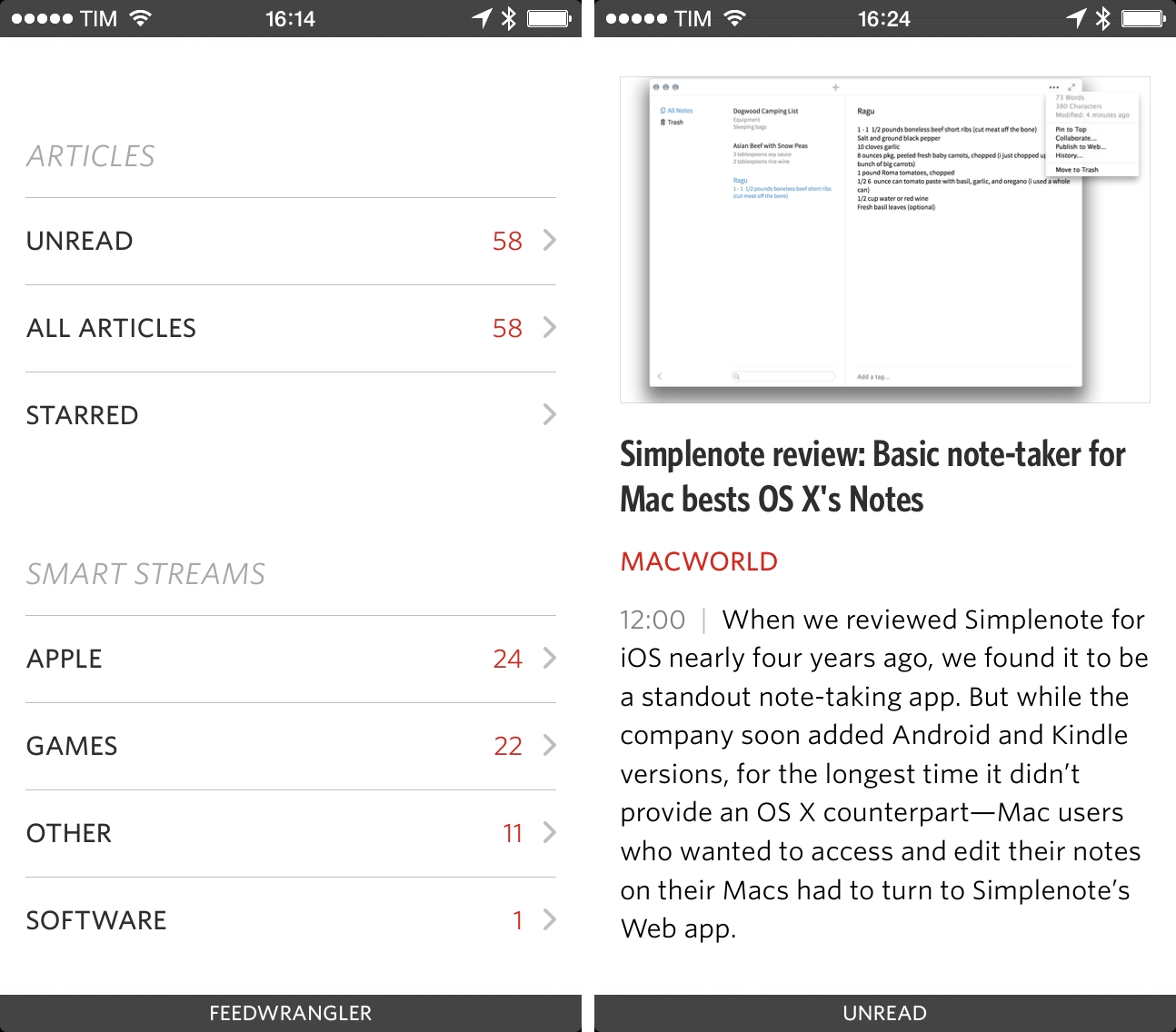
The basic flow of the app is business as usual. There are buttons to view Unread, All, and Starred articles; for Feed Wrangler, you get Smart Streams immediately below articles, followed by individual subscriptions. Articles are displayed vertically with titles, excerpts, time stamps, and feed name. Tap an article and you’re in reading mode, where you’ll start noticing Jared’s choices for the app.
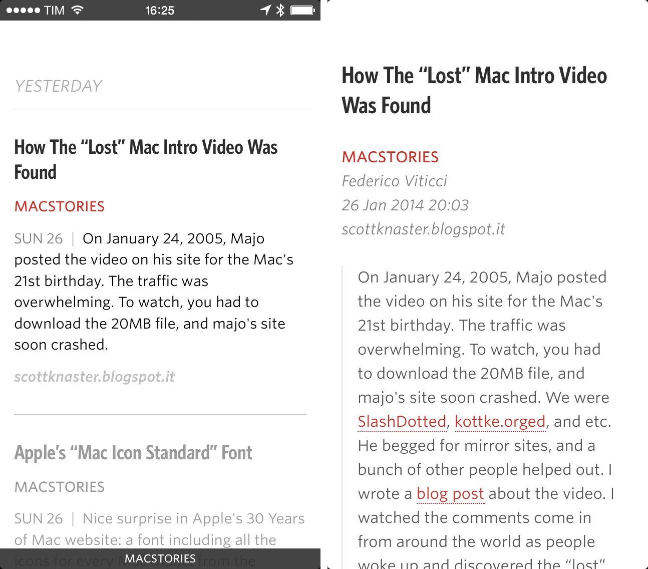
There are no toolbars in Unread. The app is based on the premise that Mail-like layouts aimed at putting feed management in your face shouldn’t take away from content, which is a very Apple-like way of thinking. Articles take over the entire screen, and the app is adorned by beautiful typography that visually differentiates titles (condensed, bold) from feed names (red), author name and date/time stamp (italic, light gray) and body text (regular weight, black). Articles you’ve read are dimmed and hyperlinks are highlighted in red. The app has support for themes: by default, it comes with Day (my pick) and Night themes, and while more can be unlocked (with a system similar to Clear), they’ve all been balanced for the reading experience, making content understandable at a glance.
Unread uses the excellent Whitney font by H&FJ, and it’s strikingly different from most RSS readers, which tend to rely on system fonts provided by Apple. Whitney is sophisticated, but not arrogantly so; even as a type newbie, I found it to be a great choice for both skimming and reading.
The downside is that Unread leaves no room for user customization: you can’t change the default font, only the size (which is done in the app, not in iOS’ Dynamic Type settings).
Initially, I wasn’t sold on the idea of removing toolbars completely: I understand the desire to prioritize content and color, but buttons are handy. As I kept using Unread, though, I realized that I wasn’t missing unified status bars or toolbars full of buttons, and I started adapting to Unread’s other core concept: gestures. Unread can be always used with one hand and every action can be conveniently activated with taps, long taps, and swipe gestures.
And why not? With iOS 7, Apple added the possibility to navigate back and forth between views of an app by swiping from the edge of the screen – a feature that I’ve grown to like immensely on a day-to-day basis as I highly value one-handed operation of my iPhone and I sometimes struggle to reach out to the Back button in the upper left corner of the screen.
Sinclair took the idea a step further and eschewed the Back button completely, opting for a gesture-only approach that makes navigating Unread a pleasure. Navigation in the app is fast: using Apple-provided APIs for physics recognition, Sinclair wrote Unread’s stacked navigation from scratch, which means that when you swipe to go back and forth, screens move around quickly and smoothly. This is one of my favorite details of the app: quick swipes equal really quick “push” for the app’s screens[1], which, in practice, makes Unread responsive and snappy. You can swipe anywhere (not just at the edge) on the screen to navigate back/forward, and I find Unread’s gesture-based navigation well done and satisfying. It’s fast.
Gestures are also used to trigger pull to refresh, article options, and sharing – and that’s where I believe Sinclair hit it out of the park with this 1.0 version.
First off, refresh: you don’t have to. Thanks to iOS 7, Sinclair built support for background refresh in Unread, thus allowing the app to fetch articles in the background, letting iOS figure out a proper schedule for updates. Like other apps that use this technology, the frequency of updates depends on various factors such as how many times you tend to launch an app during the day, network conditions, and battery life – in other words, Unread can’t tell iOS to, say, “refresh exactly every 5 minutes” and everything should “just work” thanks to iOS 7.
If you’ll start using Unread a lot, iOS will learn your usage patterns and refresh feeds in the background at a higher rate. In my experience, Unread displayed new articles in the morning after I woke up, and refreshed every 15–30 minutes during the day. Like Tweetbot 3, background refresh is a fantastic addition: it’s great to be able to wake up to new items already downloaded and ready to be viewed, and it’s the kind of feature that saves a few seconds on each session that add up over time.
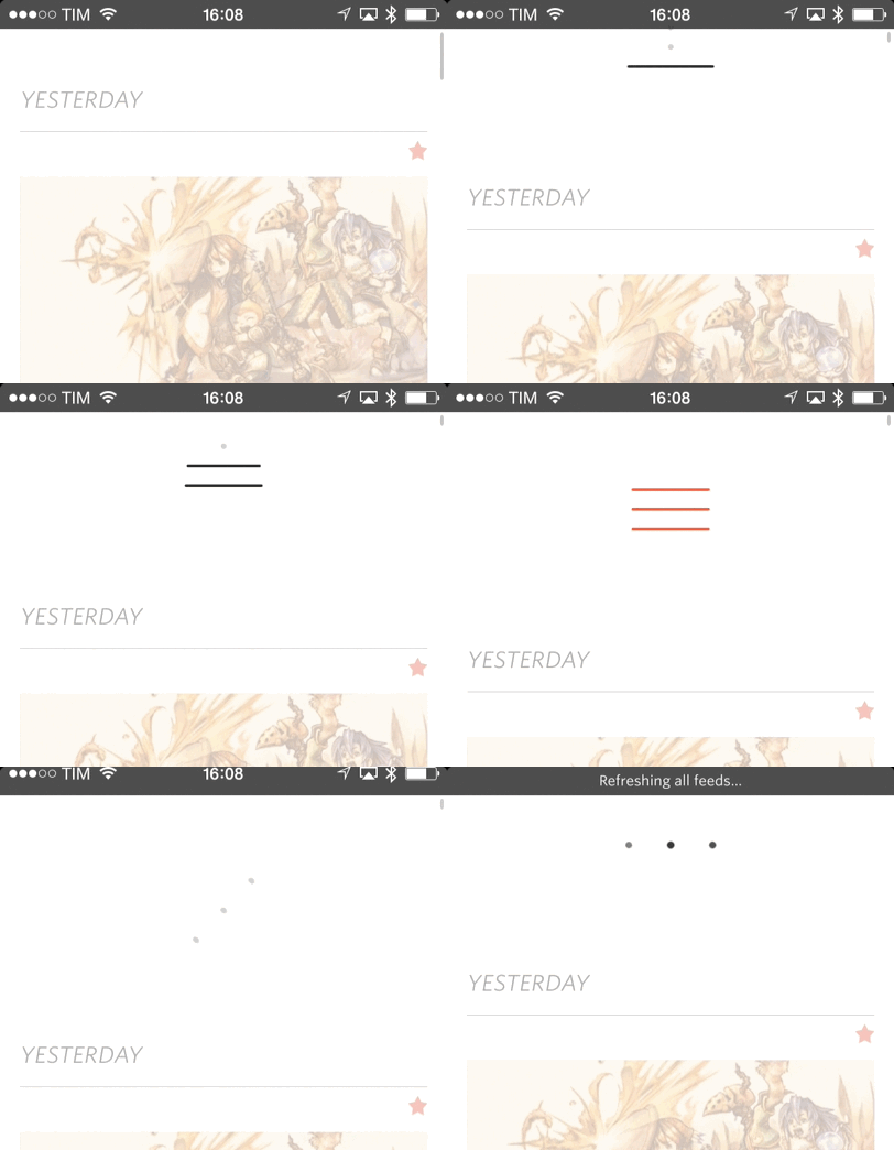
Instead of adopting Apple’s default pull-to-refresh mechanism, Sinclair built a custom indicator that is best explained with an animated GIF. I love it.
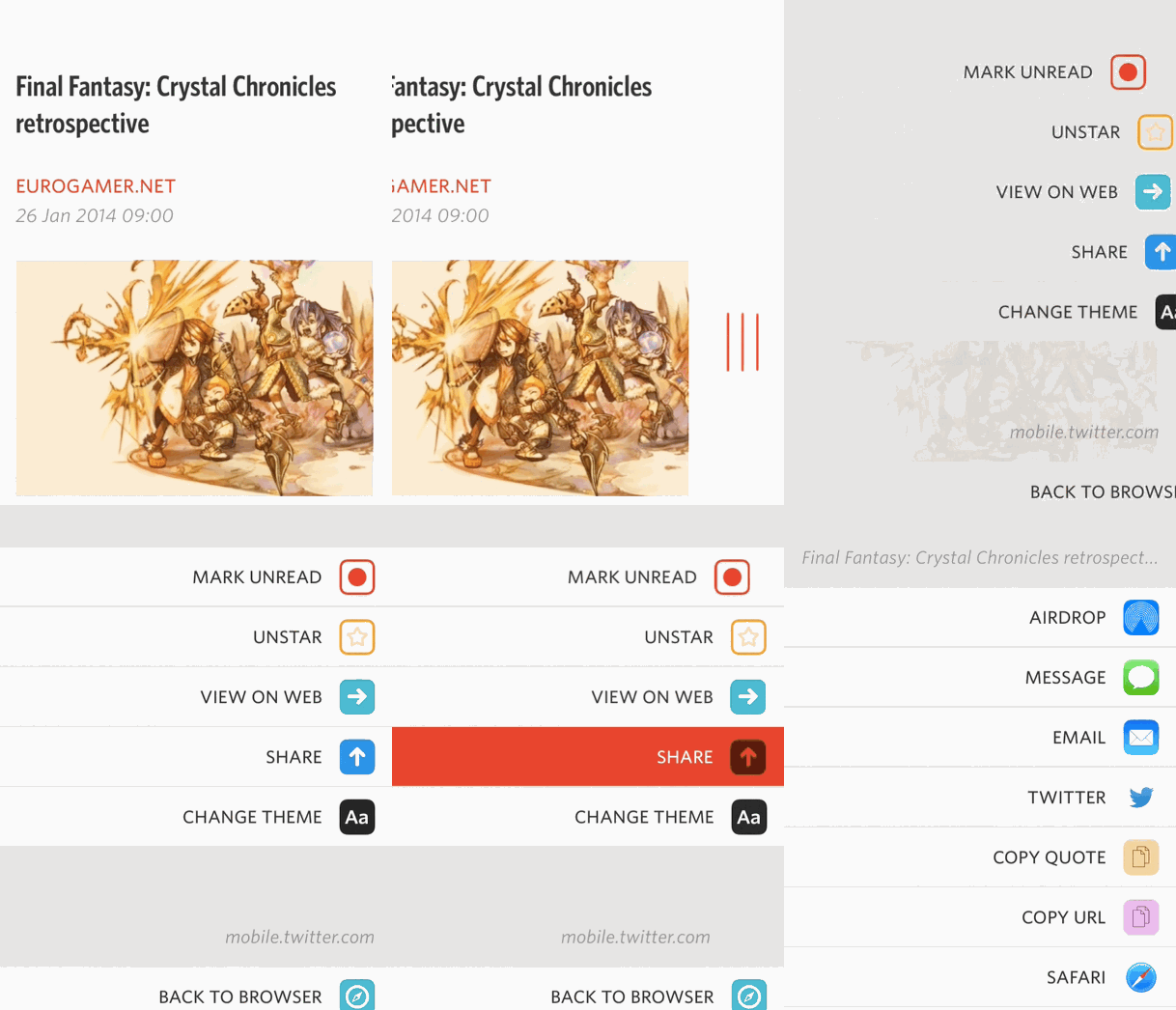
The same pull-to-refresh technique is used in a pull-to-action context for the action menu, another of my favorite touches in Unread.
Anywhere in the app, the menu can be activated by pulling from right to left on the screen; depending on the screen you’re currently viewing, the menu will yield different options.
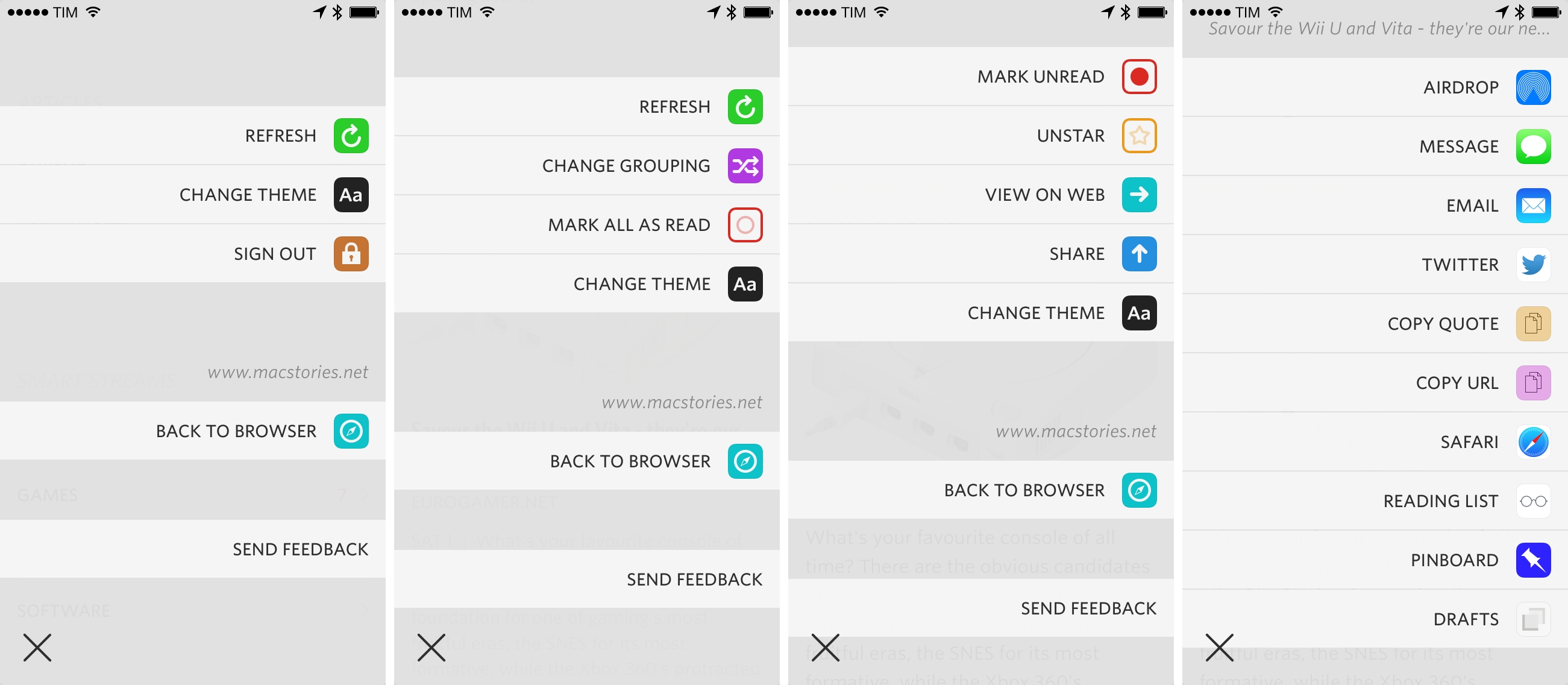
In the main Articles/Streams screens, pull to action brings up a menu with options to sign out, change the theme, refresh, and go back to the browser (more on this in a bit). The menu pops up from the right with a fast animation and can be dismissed by tapping on the “x” button (or inactive areas). If you’re viewing a list of articles, the same menu will give you options to change grouping (by feed or date) or mark as read. Inside an article, you’ll get options to mark as unread, star, view on web, and share.
There’s an argument to be made about discoverability of gestures: they need to be learned and they’re hidden from view unless you know where and how to swipe. The problem is mitigated by a welcome tutorial that Sinclair created to instruct users on how to work with gestures in Unread, and I believe that the app’s target audience will easily adjust to a buttonless, gesture-driven interface.
When taken all together, the fast transitions, large touch targets, and action menu make for a solid one-handed experience that doesn’t require me to stretch my thumb across the screen to perform actions or navigate. When I want to share or star an article, for instance, I can swipe in the middle of the screen to quickly reveal the action menu, then tap on the share/star cell – not the icon itself all the way to the right – to activate that specific action. It’s a small detail, but it makes the app faster and easier to use. Unread is a pleasure to operate because it’s fast, accessible, and clear.
The action menu can also be activated by tapping & holding an article in the list; in this way, you’ll be able to mark items above or below the selected article as read, which is a nice shortcut. Alas, Unread’s full-screen reading mode (which can be turned off in the Settings), doesn’t allow you to automatically jump to the next article as you reach the bottom of the current one. I liked this feature in Reeder.
Sinclair is the co-creator of Overshare, a third-party sharing menu that can be used by other developers in their apps. It’s no surprise that Unread ships with a good selection of built-in services and apps that can receive text and URLs from your RSS accounts. Unread currently supports:
- App.net
- Instapaper
- Readability
- 1Password (browser and search)
- Pinboard
- Drafts
The app also has other system integrations:
- AirDrop
- Messages
- Safari Reading List
- Copy Quote
- Copy URL
Unread has a good collection of sharing services and it’s better than most news apps for iOS 7. Notably, it integrates with Drafts, which can act as a hub to send text to any other app. However, there’s no native support for Evernote; you can’t turn articles into todos with Reminders[2], and, though Unread’s menu looks nice, it’s not as advanced as Dispatch in terms of built-in functionality.
Support for Drafts makes for a handy stopgap solution until more native sharing services and apps are added, and I only have minor quibbles about the sharing menu. I’m not a fan of how articles are sent to Drafts, and I also don’t like that you can’t control how articles are saved to Pinboard and how Unread automatically adds an “Unread” tag to them. Having a flexible sharing menu without overwhelming the user is tricky, and Sinclair is on the right path.
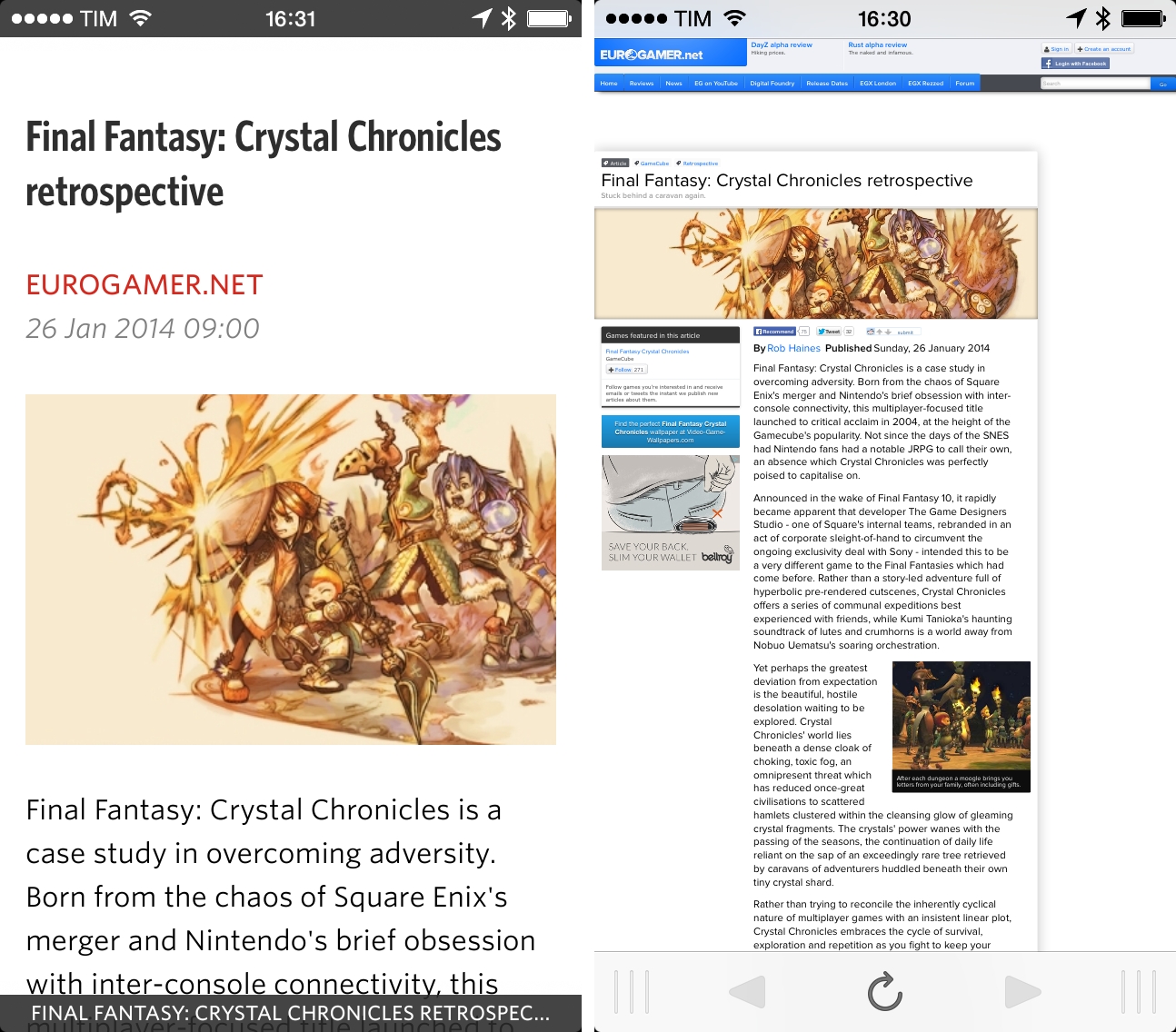
One of Unread’s peculiarities is the browser view, which acts separately from the feed view and that is restored every time the app is launched. Articles can be opened in the browser by tapping on their title, but a “View on Web” option is also available in the action menu; you can go back to the browser at any time by tapping “Back to Browser” in the same menu. The browser retains history navigation (so you can navigate back and forth between articles you’ve decided to view on the web), and it comes with its own sharing menu and optimized reading view.
The browser is great for multitasking within the app. Unread’s browser doesn’t prevent you from going back to reading articles in the regular view: you can tap an article, open it in the browser, leave it there, and return to reading other feeds. Whenever you want to read that link you opened in the browser, you can swipe and you’re in the browser again. The browser has drag indicators at the bottom to suggest that you can swipe over the toolbar to switch views and trigger sharing, and, overall, it’s well done and useful.
Details, Settings, And More Minor Complaints
I love analyzing an app’s smaller details and understanding why they’re there. Unread is no exception.
- Unread supports footnotes powered by bigfoot with Feed Wrangler. Two of the sites I’m subscribed to that use them, Marco.org and And Now It’s All This, render bigfoot popovers nicely in Unread.
- A nice touch that I like is that, when sharing an article, its title is displayed for additional context above the various sharing options; however, if you select text in the article, that selection will be shown at the top of the sharing menu.
- For sites that have linked articles such as Daring Fireball and MacStories, Unread will show the destination domain right within the article list and reading view.
- The app has a custom Twitter sharing view that lets you pick accounts and shorten links with Bitly.
- You can long-tap links when reading an article or inside the browser to bring up the sharing menu.
- In the Settings, you can tweak various preferences such as max sync count, image caching, feed order, and full-screen reading. Disabling the latter will show a gray status bar. Unread doesn’t use iOS 7’s unified status/title bar, and I think the decision fits well with the app and iOS 7. Eschewing the unified title bar allows Unread to display multi-line titles, which look good in full-screen mode. Even if the status bar is not shown, you can tap at the top of an article in full-screen to scroll up.
- In the Settings, you can choose to use Unread Counts as buttons: doing so will let you tap on a count to view only unread items (by default, the app shows all items for Smart Streams/categories/tags). A secondary settings determines what the app does for folder rows (tags and categories; Smart Streams don’t support this) – if it should open feeds or articles. Personally, I keep this setting turned off.
- As you scroll the article list, a translucent date indicator quickly appears at the top of the screen to show which day you’ve reached.
I have a few additional minor complaints about Unread. Alongside the obvious lack of an iPad app at this point, I couldn’t find a way to add/remove subscriptions from the app or create and manage Smart Streams without switching to the Feed Wrangler website. There is no search, and I would like to see a shortcut to “View This Feed” to open all articles from a specific source without navigating back to the main screen.
In my experience, I found these to be unimportant shortcomings that don’t compromise the way I use Unread on a daily basis. An iPad version would be welcome, but I’m not sure if it could convince me to move away from Mr. Reader.
The New Reader
I approached Unread thinking that it was an app designed for people who subscribe to a handful of feeds and just want to read a few articles every day. What I found is an app that works exceptionally well with hundreds of feeds, that has great custom typography and interface choices that don’t look out of place on iOS 7, and that tastefully implements modern gestures, sharing controls, and iOS technologies.
For me, Unread provides a better reading, syncing, and sharing experience than Reeder. While it lacks some of the features that Reeder gained over the years, Unread’s debut shows an app with focus, flexibility, attention to iOS 7, and the capability of scaling from dozens of unread items to several hundreds articles. Some people will complain about the lack of a compact mode to disable article previews in the main list; combined with thumbnails, I realized that this feature helps me pay more attention to articles in my RSS feeds.
After four years of Reeder, it feels good to have a different RSS reader that brings new ideas. For a limited time, Unread is available at $2.99 on the App Store.
- For the technically inclined, the speed of your flick tells the app how fast you were swiping on the screen, which triggers a push behavior to apply a specific “force” to the screen. These are all iOS 7 technologies and it’s really fun stuff to know more about. ↩︎
- And I’m not just referring to the typical use case scenario of someone like me, who would turn articles into todos for his blog, but I’m thinking of people who would recommend an article to a friend or loved one by putting into a shared Reminders list. ↩︎


