When Evernote for iOS 7 was released in September, the app received a fair amount of criticism: the company had once again completely redesigned the app after users were still learning their way around the previous major redesign, there were bugs with sync and the note editor, plus several other minor issues that, together, didn’t provide a smooth upgade experience. Evernote listened and started working on iOS updates aimed at fixing problems reported by the userbase, which had resulted in low ratings on the App Store.
A few weeks ago, an article by Jason Kincaid highlighted some of the troubles he had with the Evernote apps, which prompted CEO Phil Libin to publicly address his complaints and, in the process, commit to making 2014 the year of prioritizing fixes and improvements to the existing Evernote experience instead of more complete redesigns and big feature additions. In January alone, Evernote has completed the transition to a new sync infrastructure that made sync four times faster for all users, and, today, released version 7.3 of the iOS app, which I believe shows a good thinking process by Evernote.
It’s no secret that Evernote’s growth and willingness to redesign has led to apps that felt confusing, bloated, and prone to errors. I criticized Evernote 5 when it first came out, and just when the company had finally reached some sort of stability and cohesiveness, they threw that design away and stumbled across iOS 7 bugs and other new design inconsistencies. Just in the past year alone, Evernote added image and PDF annotations, reminders, shortcuts, Post-It notes, business card scanning, and highlights to their iOS app. Concerns about feature creep are legitimate, and I’ve always been fascinated by how Evernote – a company that wants to stress how much they depend on their own product internally – tackles design problems and feature requests.
At this point, the Evernote experience can be so variegated, I wouldn’t be able to write a complete review. I don’t use features like reminders and business card scanning; I have just over 2200 notes in my Evernote account, but I know of people who keep more than 10,000. Rather than a feature-by-feature review, here’s how Evernote fits in my workflow and why I like the changes in version 7.3.
I use Evernote to take notes for articles I’m researching: when I’m working on a review, I create an “App Review” note and I collect all kinds of thoughts, screenshots, and URLs in it. The possibility to create notes that contain different types of rich media is one of Evernote’s greatest strengths: I could research in Markdown, but it wouldn’t be as convenient and contextual as Evernote, which has support for inline images (with annotations), tappable URLs, and rich text formatting. All my reviews start in Evernote with a collection of thoughts and reference material. Lately, I’ve also started using Evernote to collect references for The Prompt: my show notes and images for episodes 30 and 33 were both Evernote notes that I was constantly accessing to drop text in.
I also use Evernote for larger projects that require their own notebook or that are shared with my girlfriend. I have notebooks for MacStories Ideas and Icons & Coffee. I love that I can quickly drop notes into a shared notebook and that they sync automatically across devices. Thanks to Evernote’s email feature, I often find myself sending links from interesting webpages I find in Safari for iOS to my Inbox.
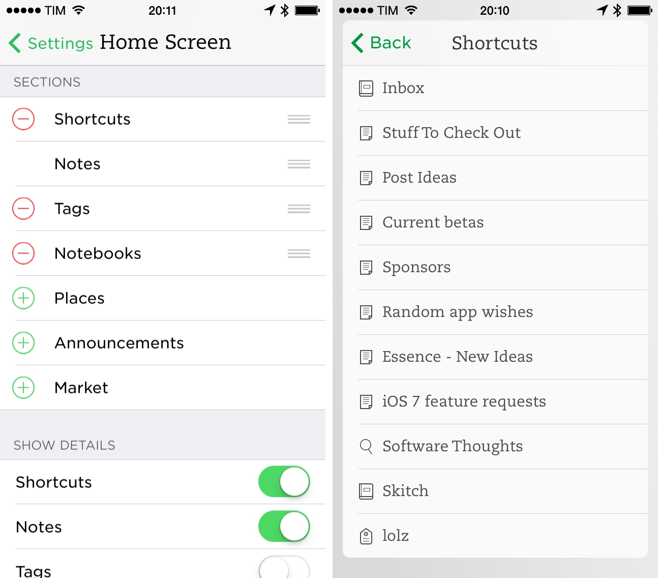
I have notes that I edit on a daily basis: Stuff To Check Out (where I append links for…stuff I want to check out later) and Post Ideas (where I save names of apps I want to review or other article ideas). These two notes are in my Shortcuts, and I use Drafts actions to quickly append text to them. Also in my Shortcuts: a note to keep track of sponsors; notes to organize team coverage for MacStories; a note for current betas I’m testing; links to saved searches for my Evernote account.
Evernote is part of my paperless system: every time I scan a receipt or save an invoice as PDF, I have a Hazel rule that takes the file and adds it as a new note in Evernote with specific tags and inside a specific notebook. With saved searches, I can quickly filter these documents and sort them by date so I can easily export them and send them to my accountant.
I have an IFTTT action to save all my Pinboard bookmarks to an Evernote notebook because I find it easier to search for them in the Evernote app than the Pinboard website. My GIF archive also lives in Evernote with a special tag that I use to view all my reaction GIFs. I have a total of 52 tags and 23 notebooks; I tend to be extremely careful when creating tags because I want to keep a set that I can remember, otherwise it would defeat the whole point of using tags.
Last, two uses of Evernote that I’ve started to appreciate lately are gameplay note-taking and public sharing. For the latter, last week’s Workflow Requests have been a nice example: instead of posting those bits of text as blog posts somewhere (or worse, as a series of multiple tweets), I created Evernote notes and shared them with a public URL. Of course, the process is entirely automated because I want to save time. I like that, once shared, I can go back to an individual note in my Evernote, make changes, sync, and the shared version will be updated accordingly. As for game notes, this has been a revelation for me: when I’m playing a game on my Nintendo 3DS or Xbox 360, I keep my iPhone next to my chair and jot down everything I can think of. I also take pictures of the screen with the iPhone’s camera and add them to that game’s note. This will be important for a new project I’m working on.
There are other minor uses cases for Evernote in my workflow, but these are the primary ones. I’m a very visual person when it comes to organizing notes and reference material, and Evernote’s combination of rich text and images helps me better organize my work and digital life. With search, tags, the API, AppleScript on the Mac, and sharing features, I can rely on Evernote for more advanced features and filters.
How does Evernote 7.3 fit in all this?
7.3
The new Home screen completes the iOS 7 redesign. In the original Evernote for iOS 7, I thought there was the seed of the idea of a Home screen with good potential for growth and refinements. That first iOS 7 redesign didn’t feel fully realized, with a questionable use of translucency effects, non-customizable sections, and a green background that was hard to parse.
In Evernote 7.3, you can now choose between three backgrounds: Light, Dark, and Classic. The latter is the default green one and I think it’s still the most difficult one to work with because of how buttons and panels blend with the green color. The Light and Dark ones, on the other hand, offer great contrast, legibility, and, overall, elegance. I personally prefer the Light Home screen because it’s more consistent with the rest of the app; green buttons and labels stand out against the light gray background; white panels pop out more.
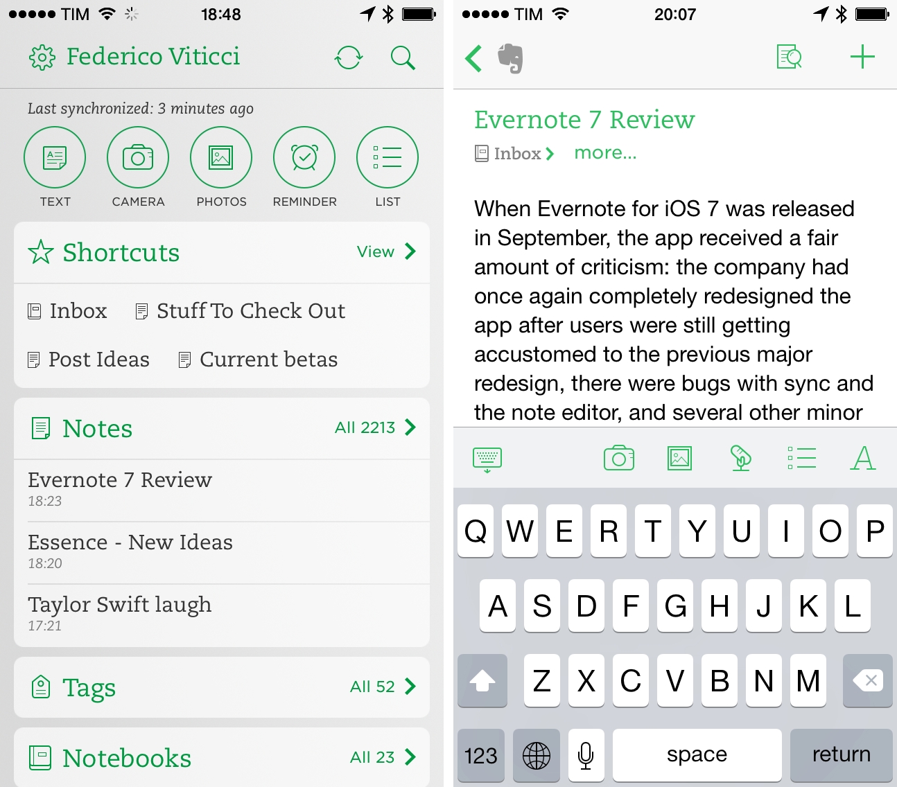
I’m a fan of the new quick note buttons at the top of the screen: it took me a while to get used to the new layout (previously, they were placed at the bottom of the Home screen), but now I like how they mirror Control Center’s hardware toggles. The first three buttons – Text, Camera, and Photos – are my most used ones.
Home screen customization is a big deal for my workflow. I depend on Shortcuts to speed up navigation, and now I can put them at the top of the Home screen, immediatlely followed by Notes an Tags, as pictured above. And not only can I rearrange widgets vertically, I can choose to show previews for them too. In this way, I can show a list of my top shortcuts in the Shortcuts widget, display recently modified Notes, and hide previews for Tags and Notebooks, which I rarely use as a browsing system.
The new Evernote Home screen packs a lot of information but it’s readable, it’s got nice motion effects, and, more importantly, it can be customized to show sections that you care about. It’s been a solid improvement for my workflow.
I wish the Dark theme stuck through the entire app. Right now, the Dark background is limited to the Home screen – you don’t get a dark note editor or dark toolbars in the rest of the UI. The effect can be quite jarring when you quickly move from a Dark Home screen to a white note editor, and I’d love to have a real night mode in Evernote.
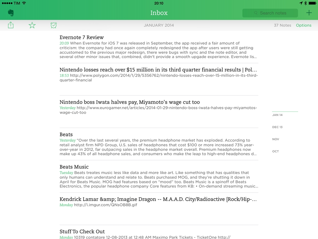
The note editor is faster and less buggy. As a test for the final public version, I’ve typed this entire article in Evernote 7.3 (instead of Editorial) and, with iOS 7.1 on my Retina iPad mini, I observed no delay between typing text and seeing it appear on screen (what used to be a common problem in the old Evernote). Inserting images, selecting text for formatting, tapping URLs – every editing feature has been smoother and faster for me and I’ve experienced no crashes or issues with duplicate notes while testing Evernote 7.3. Even better: the note editor has no problems with animated GIFs.
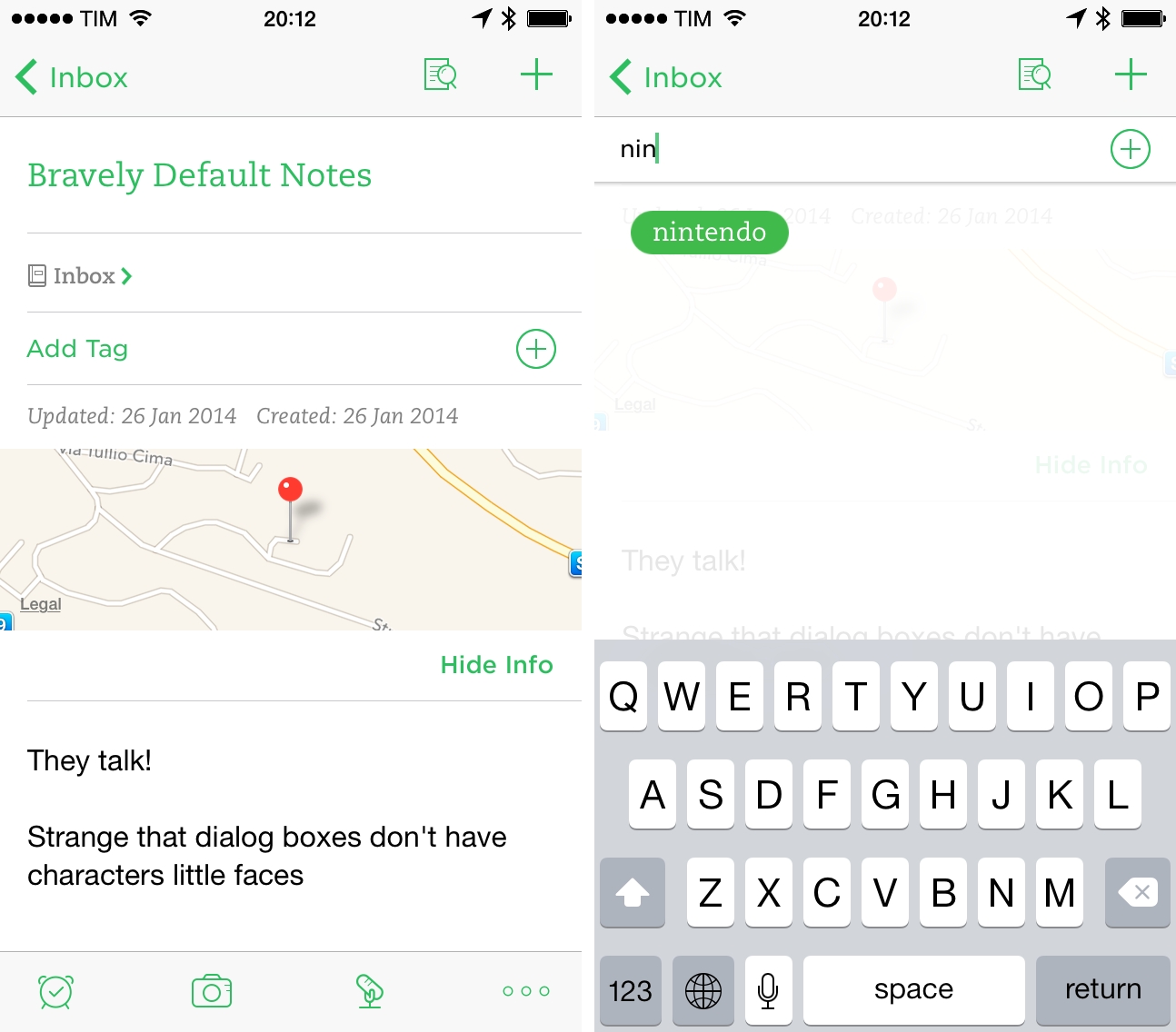
Note details are too hidden. This is a surprising oversight on Evernote’s end. On the Mac, you can click on the Notebook and Tag fields of the note editor and start typing to filter existing notebook names and tags you can add to the current note. On iOS, you have to tap a “more…” button to show a dedicated panel with information about creation date, location, and tags. It takes too many taps to just add a tag to a note, and I’d prefer to have a separate Tag field where I can tap or type right away.
The app still lacks bulk editing. This is the reason why I don’t like doing serious organization of my Evernote notebooks on iOS: I can’t select multiple notes at once and assign tags to them or move them into another notebook. Each note has to be edited individually, which is a slow and tedious process.
I can’t do browser-based research in Evernote for iOS. This is, in my opinion, the feature that’s missing from Evernote for iOS and that version 7.3 doesn’t fix: there’s no Evernote web clipper on iOS.
When I get serious about research, I have to use Evernote on my Mac because the iOS app doesn’t have any research functionality to clip content from the web. In fact, there’s no browser at all: while tapping links will open an in-app web view, there’s no dedicated browser view to open webpages and save content into new or existing notes. This is the biggest Mac feature that Evernote still hasn’t ported to iOS, and I wonder if a widget on the new Home screen may be a solution at this point.
Sync is a lot faster, but background sync is still spotty. Evernote’s claims of faster sync have been accurate in my experience, as sync now only requires a few seconds to complete. However, I’ve never been able to get Background Refresh to work properly with the app: I’m using Evernote every day, so iOS 7 should have been able to understand my usage patterns, and yet every time I open Evernote I don’t see changes to my notes and I have to wait those extra seconds for sync to finish. Other apps like Mr. Reader and Tweetbot have been working well with Bakground Refresh, and I hope that today’s 7.3 update will fix this particular issue.
Evernote’s 2014
As a heavy user of Evernote, I see version 7.3 as the culmination of what the company started in September. The app is smoother, sync is faster, and the Home screen is better organized and provides handy customization options. I really like how the app makes it easier than ever to create new text/photo notes; Shortcuts available at the top of the screen have been a great timesaver.
Looking ahead at the next few months, I suspect Evernote will work on further improving the app’s speed, the editor’s performance, search for large accounts, and sync. In terms of features, browser and bulk editing are the ones I’m looking forward to being able to use on iOS someday – perhaps alongside support for external keyboard shortcuts and a URL scheme to quickly trigger specific searches from other apps.
Today, I find Evernote faster and more pleasant to use than the old, pre-iOS 7 app, and even if it took a couple of months to get the update right, I think the results are paying off.


