Design
A theme that’s been raised in recent years for each version of iOS is Apple’s thinly veiled intention to dial back some of the design decisions made in the iOS 7 era. From the progressive embrace of larger, bolder typography to the quiet return of sparingly used drop shadows, rounder UI elements, and more obvious buttons, we’ve spent years wondering why Apple hasn’t caved to the pent-up demand for another system redesign, choosing to keep iOS’ design in a constant state of flux instead. And perhaps the answer is that we’ve been looking at this from the wrong angle all along.
There’s a responsibility that comes when the platform you’re maintaining and developing is used by over a billion people: redesigns are inherently costly, and that cost doesn’t only get absorbed by designers and developers who have to rewrite software for a new design language – it falls primarily on the users. With iOS 7, users had to spend several months – if not years – re-learning interfaces and interactions they had been mastering since the original iPhone. iOS 7 was a disruptive change for the design community (which is a separate discussion I can’t get into in this review), but even more so for the general iPhone and iPad user base. At the time, Apple felt that the cost was worth the risk as a new design language could provide them with a platform to scale their ecosystem; arguably, they were proven right with the launch of watchOS, new iPad screen sizes, tvOS, shared design and development resources, and a roster of services.
Today, I believe Apple feels a responsibility to foster their ecosystem without disrupting it again. If that’s the case, the cost of a sweeping redesign may be too high to justify: user patience, goodwill, and loyalty – key components of a service-oriented business – are too precious a resource to jeopardize every few years. Plus, what if most users – those who make up the “billion pockets” – don’t actually like having to learn a radical new design every few years?
I may be wrong, but in considering how judiciously Apple has iterated iOS design in recent years, I think their trajectory fits this different mindset. iOS 7 was, in many ways, a bitter medicine that set Apple up for the next several years, but it overshot some design principles in the name of aesthetic purity. As a result, Apple has used the last five major releases of iOS to refine what worked in iOS 7 and rethink what didn’t. iOS 13 follows the same playbook: the string of refinements continues throughout the OS with changes aimed at taking advantage of OLED displays, making UI elements more intuitive or ergonomic, and extending the functionality of menus and share sheets. But it doesn’t fundamentally disrupt the experience.
Dark Mode
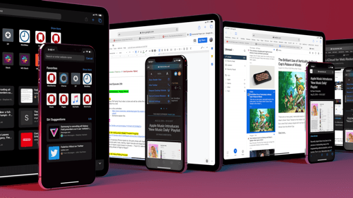
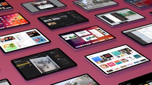
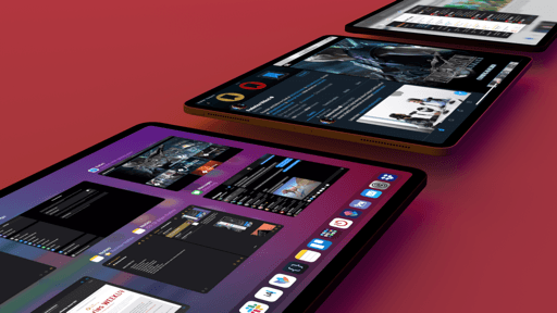
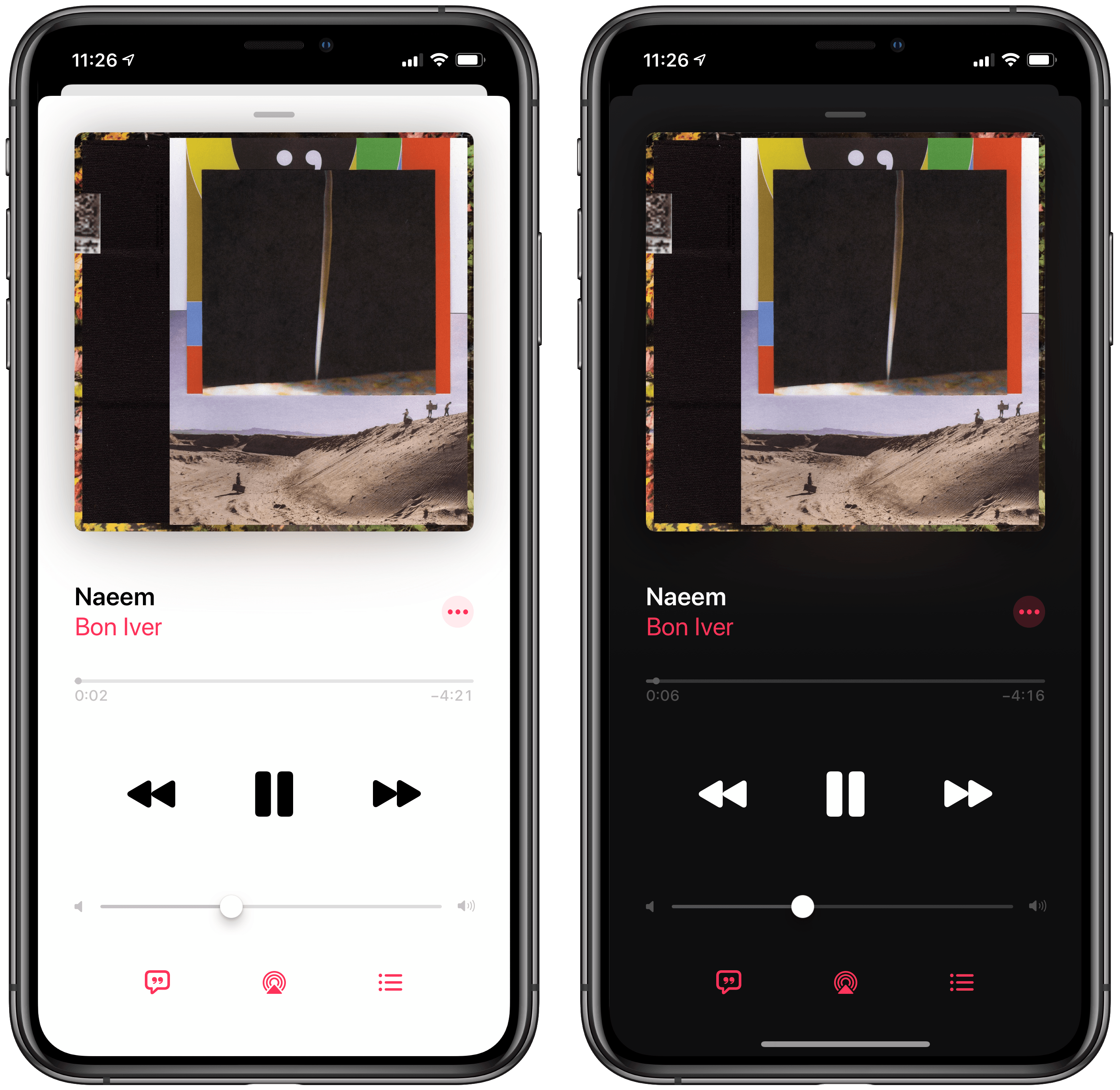
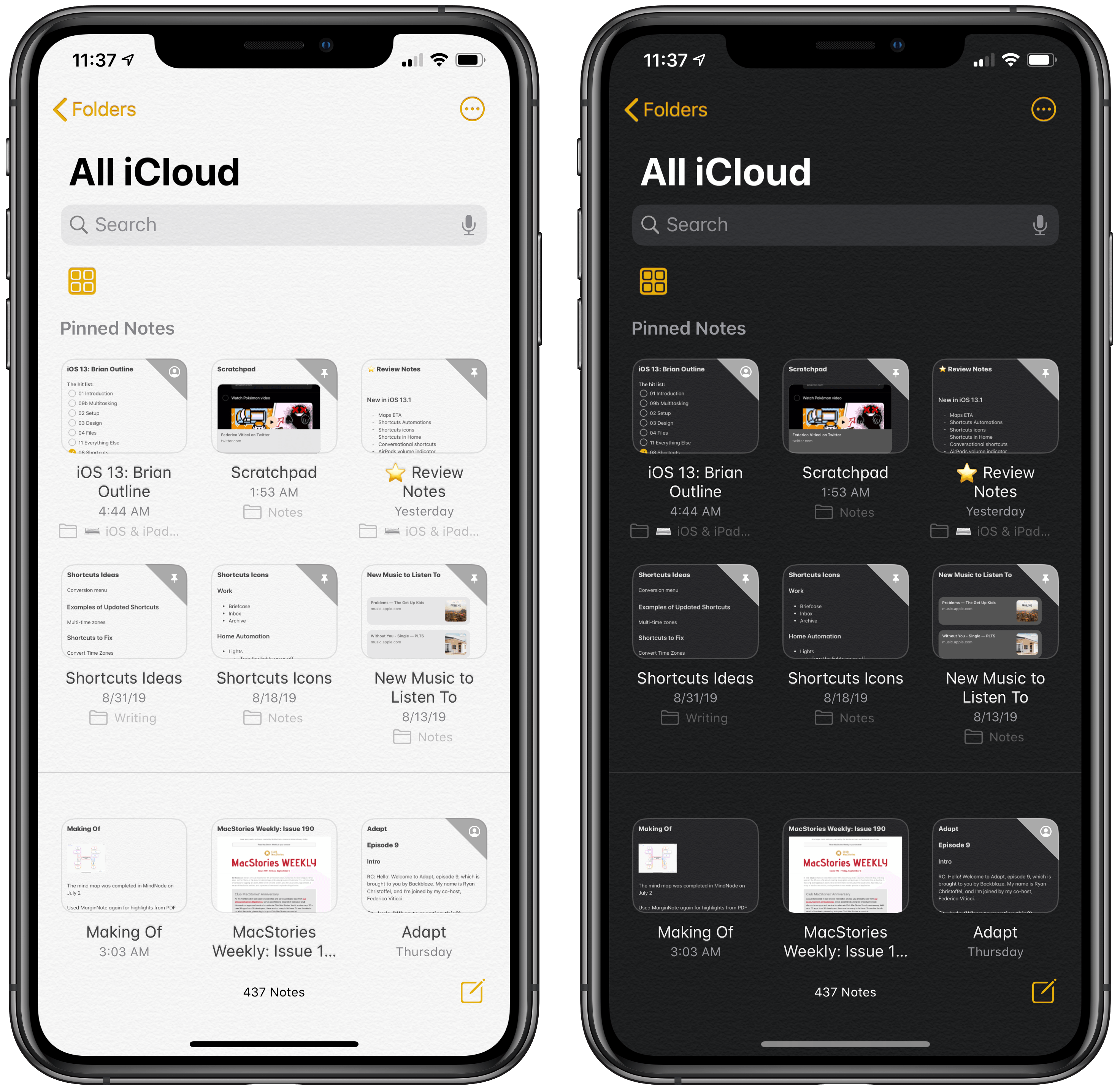
We all saw it coming: following last year’s debut in macOS Mojave, iOS 13 offers a system-wide dark mode that favors blacks and dark grays in lieu of iOS’ classic high-contrast black-on-white interface. The result is somewhat predictable, but it’s not uninspired, and a lot of consideration went into designing dark mode for different displays and multitasking conditions.
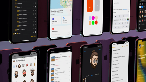
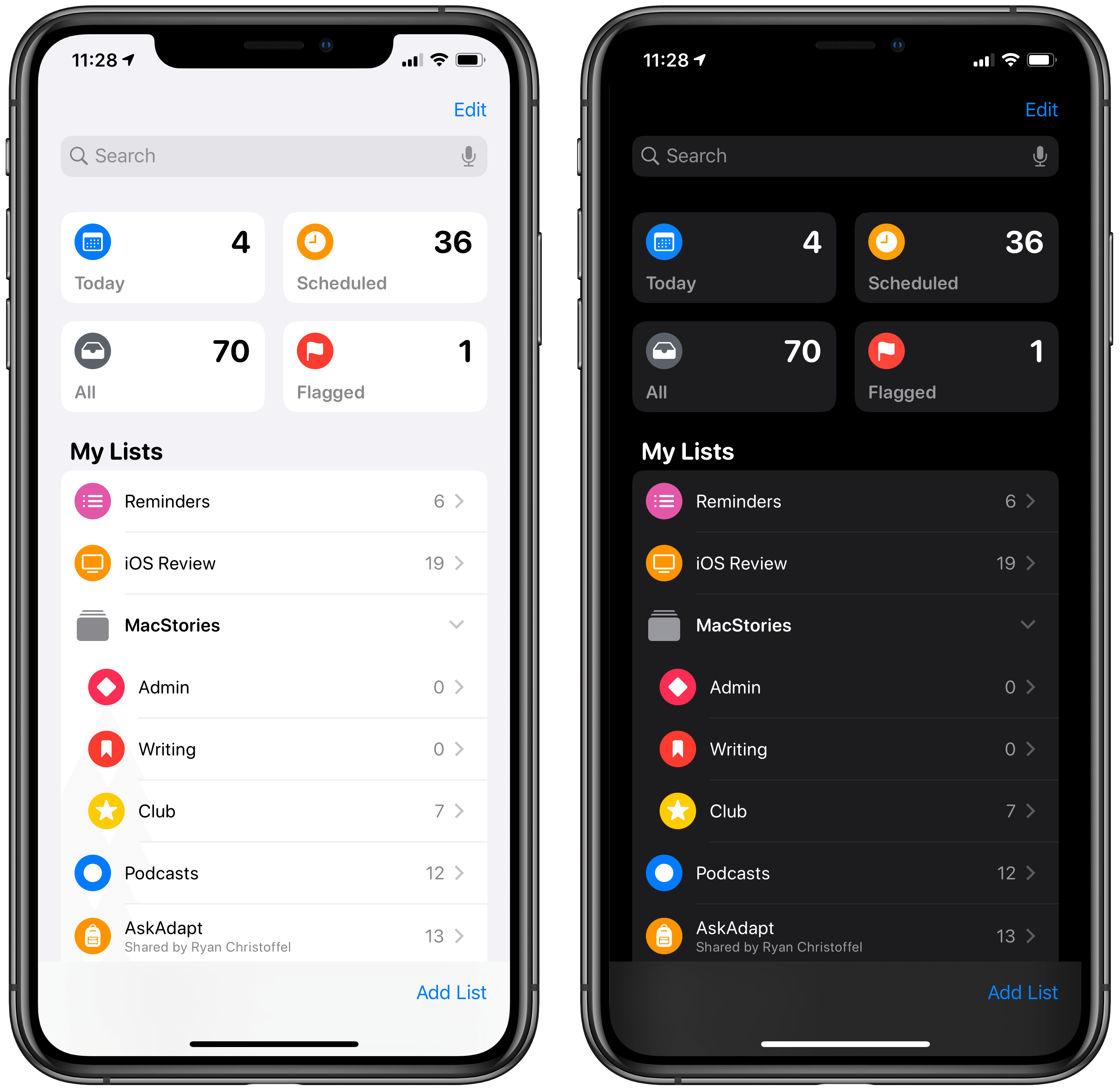
Let’s start with the basics. Dark mode is exactly what you’d expect from this option: it can be enabled manually or on a schedule; like on macOS, apps automatically react to the system’s appearance change and dynamically switch their UIs from light to dark; third-party developers can query the system’s appearance status and let their apps’ UIs invoke light or dark modes accordingly. Dark mode is supported by default in all of Apple’s apps; obviously, the advantage of dark mode being a native OS feature is that all kinds of system UIs – from context menus to popups and notifications – can follow the setting too.
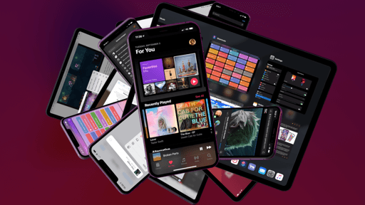
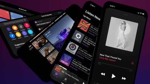
Music.
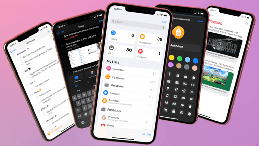
Reminders.
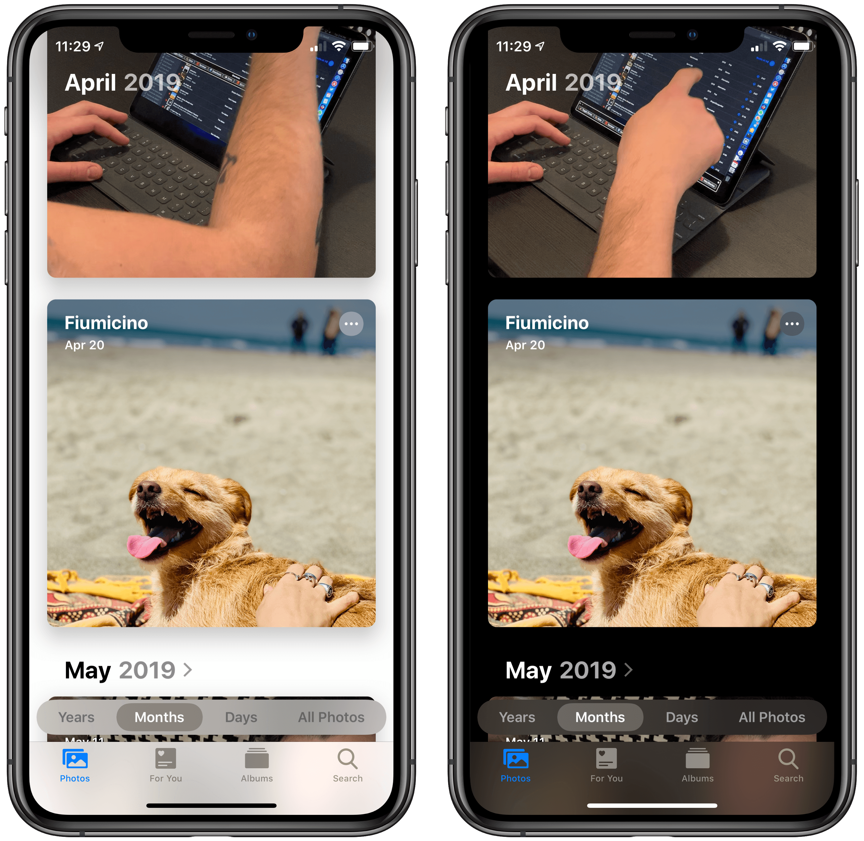
Photos.
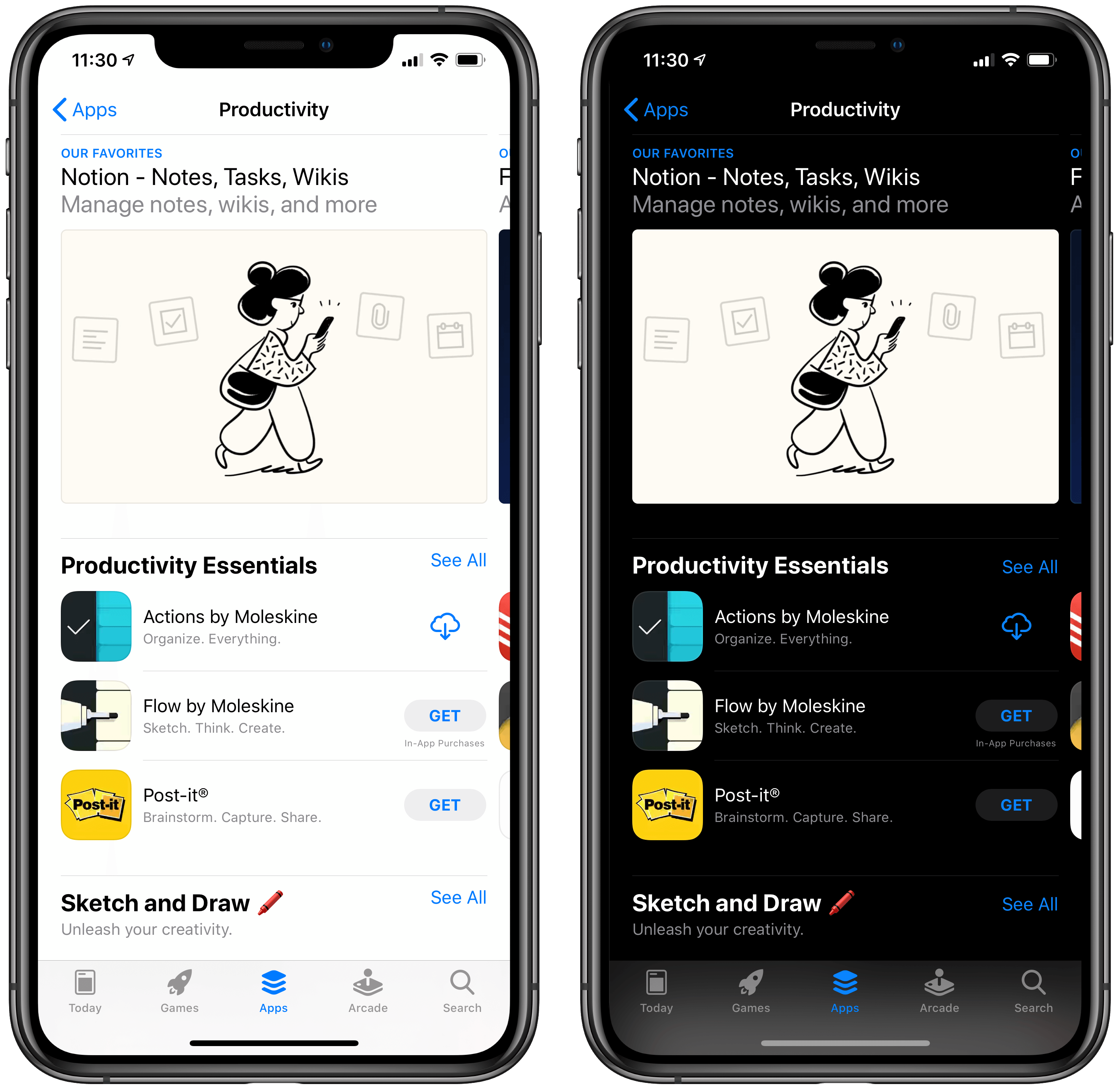
App Store.
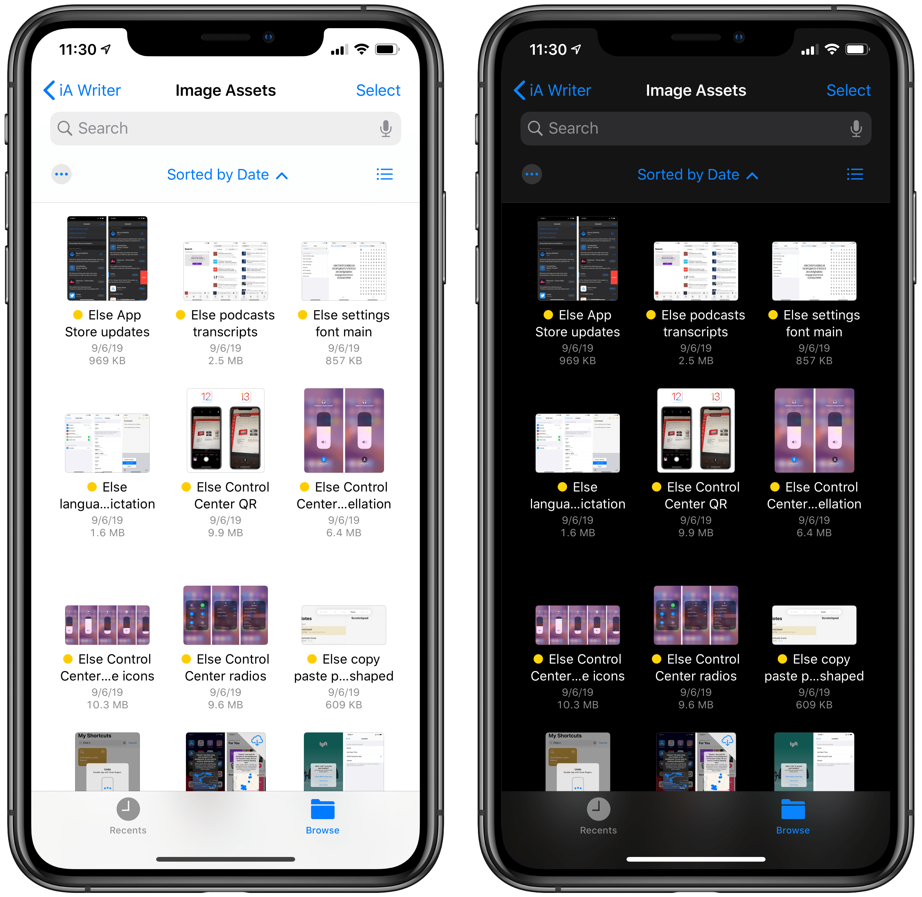
Files.
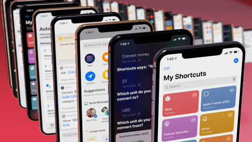
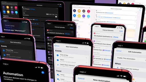
Shortcuts.
Calendar.
Podcasts.
Messages.
Notes.
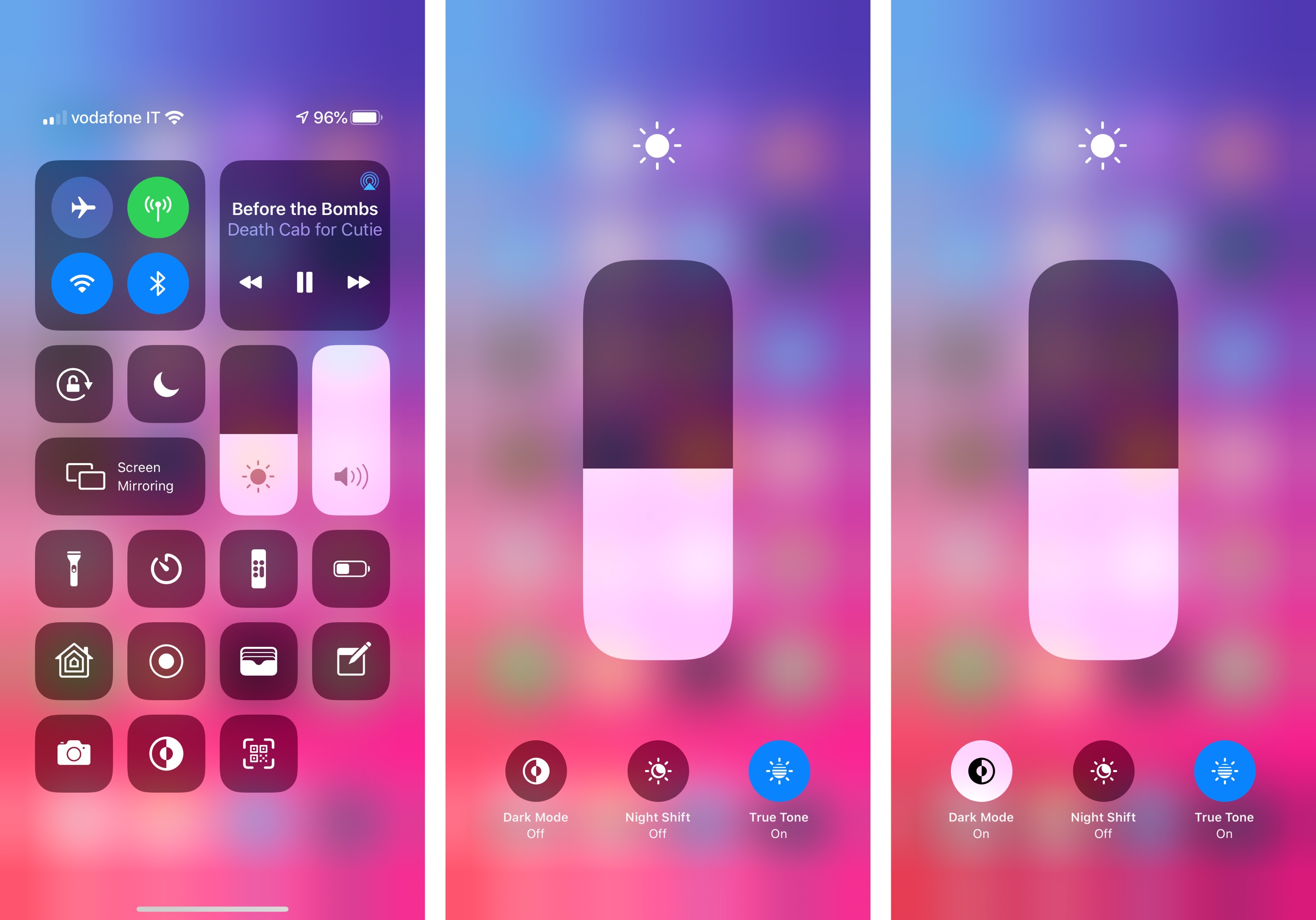
There are four ways to enable dark mode manually. The fastest (and most logical) is a new Control Center button that toggles between light and dark mode with a single press. I’ve installed this shortcut in Control Center on both my iPhone and iPad, and it’s quickly become one of my most used controls. I particularly appreciate how you can see apps’ interfaces alter their appearance in the background behind Control Center’s blur with a subtle transition.
Enabling dark mode from Control Center.Replay
You can also toggle dark mode on and off from Control Center by pressing on the Brightness tile to expand it, and toggling between ‘Dark Mode Off’ and ‘Dark Mode On’ in the bottom left corner.
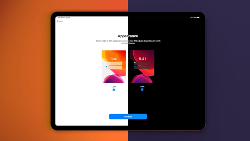
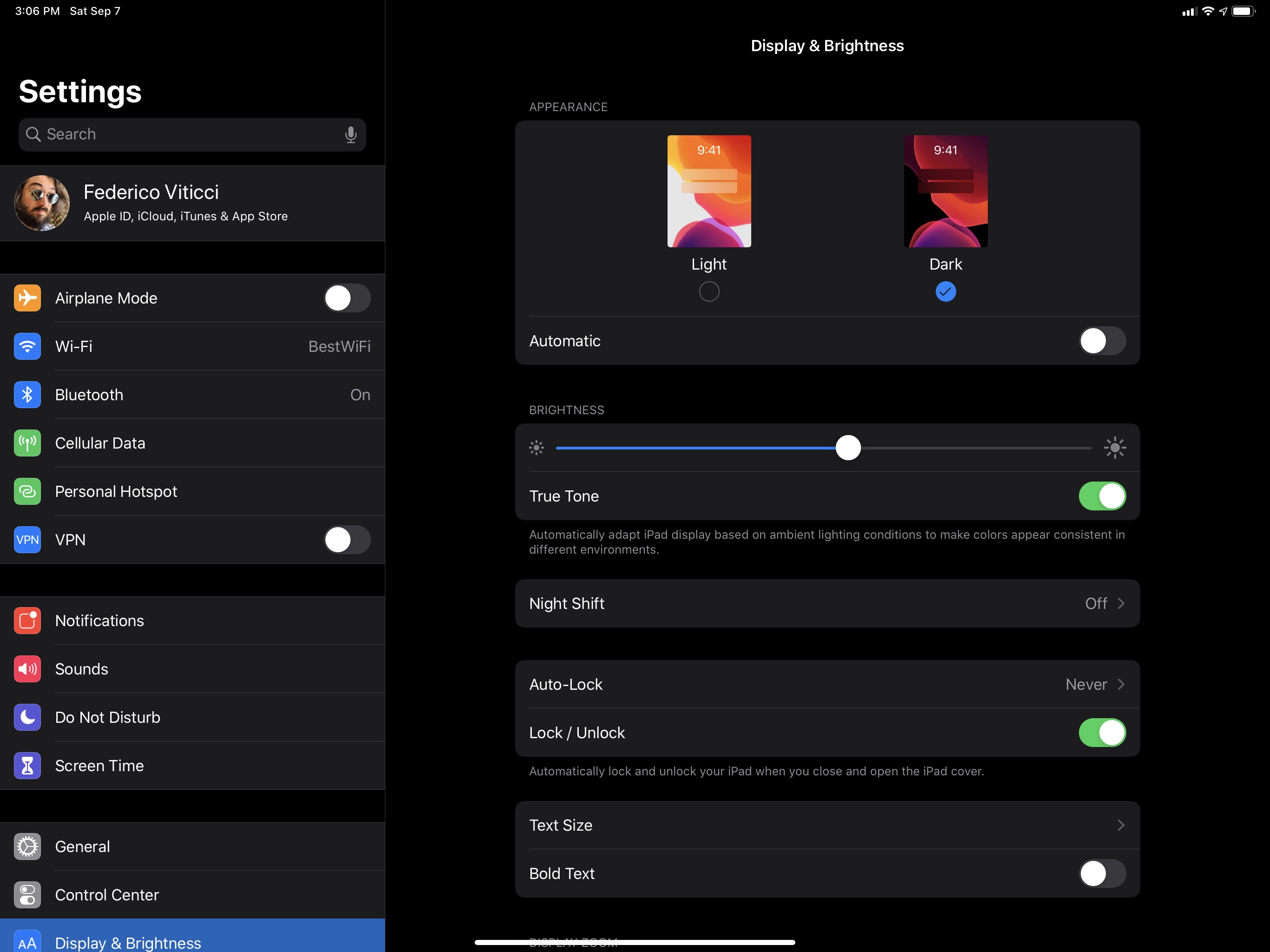
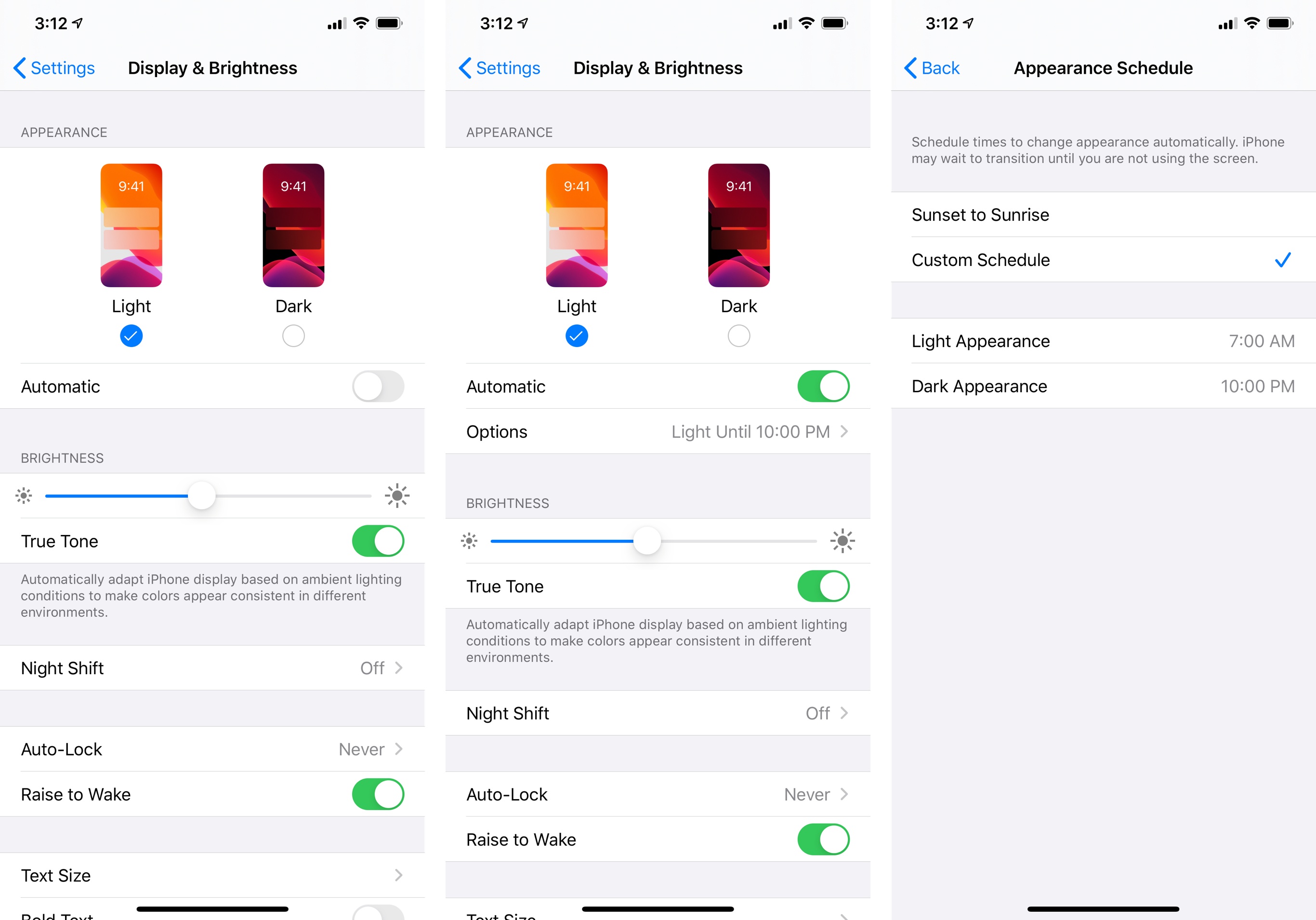
Similarly, you can manually toggle dark mode in Settings ⇾ Display & Brightness:
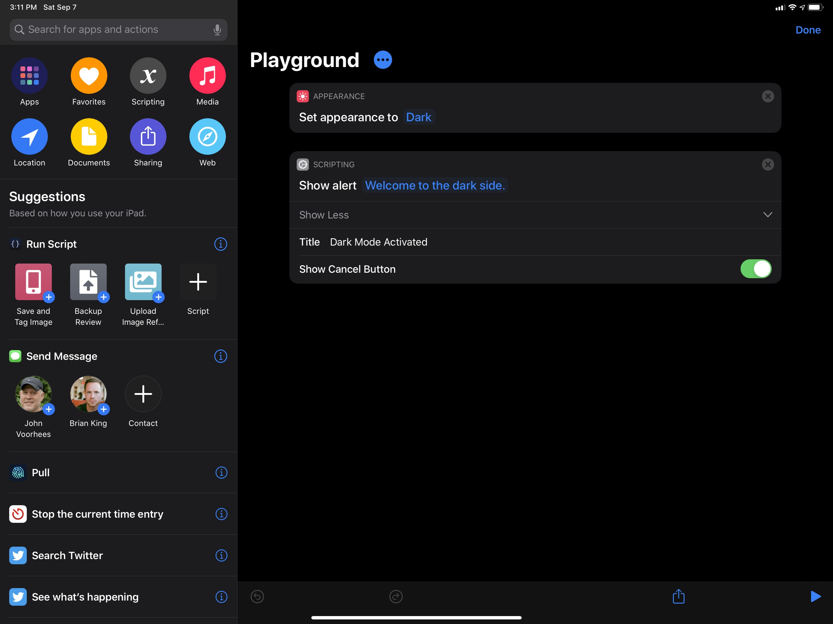
And last, you can enable dark or light mode using the new ‘Set Appearance’ action of the (now built-in) Shortcuts app. As I’ll describe later, Shortcuts doesn’t offer actions to toggle between different appearance statuses (you can either enable light or dark mode), but this action makes it possible to enable dark mode from a widget or, thanks to automations, on a schedule, or when you arrive at a specific location.
Speaking of schedules, it makes sense to see dark mode as a preference located under Settings ⇾ Display & Brightness, but I was somewhat surprised by how Apple designed its automatic activation. By flipping the ‘Automatic’ switch in Settings, iOS 13 reveals an additional ‘Options’ page where dark mode can be configured to activate on two different types of schedule: from sunset to sunrise (which uses your location to determine sunset times) or with a custom schedule. The latter option lets you pick which times you’d like the device appearance to transition from light to dark, and vice versa.
What’s missing from dark mode’s automatic activation is what Apple’s Books app has offered for a few years now: activation via ambient light. If you, like me, prefer to keep light mode always enabled, even after sunset, but switch to dark mode in apps only when you’re using an iPhone or iPad in bed without disturbing your significant other, you’ll be out of luck with dark mode in iOS 13. The absence of Books’ ‘Auto-Night Theme’ option for system-wide dark mode is surprising; I suppose it would make for a welcome addition in a future point release of iOS 13.