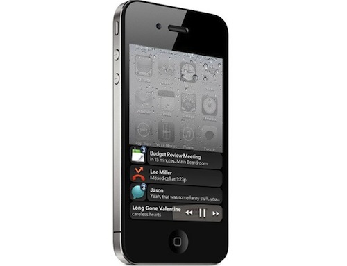
With today’s rumors about Apple considering the purchase of a third-party developer to improve the notification system of iOS, I thought I should explain why, in my opinion, Apple really needs to focus on this, developer buyout or not. The problem: iOS notifications get in the way, interrupt one’s workflow or media consumption and once they’re gone, they’re gone. In my usual setup, these are the apps that send me notifications: Twitter (replies from users I follow, DMs), Messages, Facebook, Calendar, Skype / IM, Appshopper. I think most of these apps are used by several iPhone and iPad owners.
But back to the problem. iOS relies on a single setting panel (inside the Settings app) that manages notifications. Specifically, this panel handles the apps that can send badges, alerts and sounds to the device. Messages get their own management and customization options into Settings->Messages. As you know, iOS notifications don’t have “quiet times”, which is annoying because you can’t set the iPhone to not get any notification (and thus, possibly, a sound) at night. Some 3rd party developers have deployed a quiet time option server-side.
The lack of settings, however, is almost nothing compared to the execution. Especially after trying Android’s or webOS’ implementation of notifications, iOS alerts are risible. The biggest issue with notifications on iOS is that they pop up in the middle of the screen, putting on hold whatever you’re doing and they won’t go away unless you tap on “View” or “Cancel”. You must act on notifications to dismiss them or view them. As far as I know, notifying someone doesn’t mean he has to do something. A notification should be what the term is: a notification, an incoming notice that doesn’t get you away from what you’re doing. Real life notification: your wife tells you dinner is ready while you’re at the computer. But she tells you, and you can hear it. She doesn’t come at your desk, grabbing you by the shirt and asking you if you plan to get off your MacBook in the next 5 seconds. Because that’s what happens with those alert boxes on iOS. Once they’re in the foreground, they’re there. And if you’re annoyed and you quickly dismiss one – sorry, it’s gone. On iOS, you must do something. It shouldn’t be this way.
I believe people don’t like notifications on iOS because they need action, and quickly. What I would like to see in iOS 5 is a smart notification system that doesn’t stand in your way, yet it’s entirely accessible from the statusbar or the multitasking tray at any time. In the statusbar, Apple could put a single icon for notifications (unlike Android) that blinks for 10 seconds every time a new notice comes in. Tap on it, and a translucent menu slides down revealing the 5 most recent notifications, with the first one in a different color. When you tap on a notification you’re taken to the app, but you could also reveal a fullscreen log of your previous notification history à la Boxcar. The problem with full logs is that Apple might need to delete notifications related to items no longer on the device (emails) to prevent confusion. I don’t see an app like Boxcar happening on iOS 5 as it is now, but the underlying concept (all notifications from a variety of apps and services) is great. Apple would also make such a menu / app / list elegant, minimal and beautiful. Like I said it could also go into the multitasking tray, which is Apple’s current (and most favorite) way to let you do things (terminate an app, switch, adjust volume, control AirPlay) without leaving the app.
As for the multitasking tray, the problem is that it’s not always visible. The status bar is visible all the time – Apple would just need to figure out a solution for games and apps that run in full-screen mode. We also need to consider that Apple has already put two extra sections in the multitasking tray, and I don’t see it getting larger to accomodate notifications. But, an idea could be that of letting the user expand the tray vertically. A thin bar at the bottom informs you that you have notifications, you swipe up and the tray becomes bigger to show you notifications. Still: you’d have to double click the Home button to do all this. Not good. And don’t forget the status bar could have a problem with this, too: currently, tapping on the status bar scrolls a list to the top. Apple would need to make a status bar icon that’s tappable but doesn’t trigger the iOS “scroll to top” behavior.
When Apple redesigns its notification system, I think the focus will be on “notifications that are unobtrusive, but always accessible”. I don’t see a standalone notification app or dedicated Springboard page for notifications happening on iOS 5, but Apple could use the technology of an app like Boxcar to build something that’s truly integrated with iOS and connected to the web.


