There was a time when I thought that I needed a powerful GTD app to be productive. Over the years, I’ve come to realize that all I need, really, is just a list of things to remember and some calendar events. I’ve been using Apple’s Reminders and Calendar with iCloud as my primary todo systems for over a year now, and my schedule hasn’t been disrupted by a cataclysm of missed appointments and overflowing todo lists.
It’s with this mindset that I approached OmniFocus 2 for Mac, released today as a new version of The Omni Group’s popular GTD software: fundamentally, I don’t need the app. But as an old OmniFocus user who switched over to Apple’s less flexible Reminders and stayed with it in spite of its (sometimes disarming) simplicity, I thought it’d be interesting to evaluate OmniFocus 2 with a fresh pair of eyes and a genuine curiosity for the work put into this new version.
Perhaps it’s the fact that I’m fortunate enough to have a straightforward work life, or that when I was using OmniFocus on my Mac and iOS devices, I spent more time organizing tasks and fiddling than actually doing stuff. I was a heavy OmniFocus user: I set up my own syncing system on a dedicated Mac mini server, used scripts to visualize my task library as a mind map, and tweaked the iOS app to sync more often. I don’t need to create ten projects for MacStories and organize them in folders with contexts and start dates because, in reality, what I do for this website doesn’t have many ramifications or strict deadlines. I manage my team’s assignements in a plain text note and chat with them on a messaging service; I “track” my articles with research material in Evernote and I publish them when they’re ready; for my personal life, I go grocery shopping with my girlfriend because it’s one of those moments when I can take my mind off work.1 But I loved tweaking and playing with OmniFocus, even though I knew that my life was simpler than the app.
Since switching to Reminders, I’ve spent time writing, reading, and playing videogames rather than tweaking my todo systems, which feels good. Thanks to Fantastical’s frictionless experience with natural language input, I’ve found myself dictating reminders and events on a more frequent basis so I never forget what’s coming up. Apple’s built-in sharing feature for Reminders has been a nice plus, and I like the fact that I can rely on Siri to quickly save todos when I’m driving and can’t type. Last year, I came to the conclusion that OmniFocus was too complex for my needs, and I’m okay with it.
That doesn’t mean, however, that I can’t be curious about OmniFocus 2 or ponder, from a user interface and experience standpoint, the decisions taken by The Omni Group for their desktop follow-up to the complete iOS 7 redesign launched last September. To some people like my friend Stephen and thousands of others who manage teams, work on multiple projects, or generally have different requirements than mine, OmniFocus is an absolutely invaluable tool with its start dates, notes, attachments, contexts, quick entry, and more.
Hence, this is not a review of OmniFocus 2: rather, take it as a collection of notes and points from someone who hasn’t played with OmniFocus in a while but who used to really, really like it.
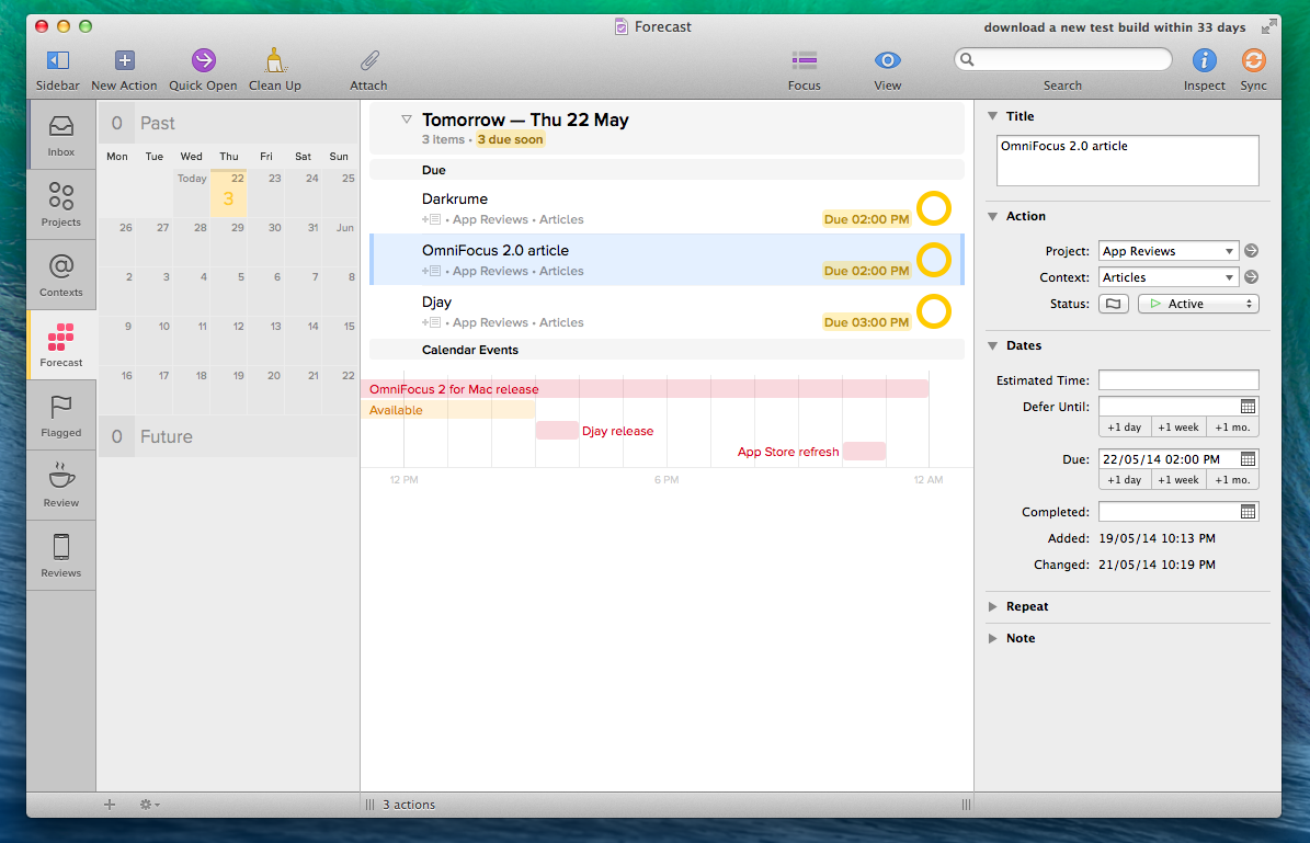
Clean new look and fast navigation. OmniFocus 2 sports a modern and cleaner design with a new sidebar on the left, an integrated Inspector as a panel on the right (reminiscent of Apple’s latest iWork suite), lots of popovers, retooled layouts, and “checkcircles” in lieu of checkboxes.
I like the new design: OmniFocus was feeling outdated, but personal taste aside I do believe the sidebar-Inspector combo makes for a faster, more intuitive way of navigating OmniFocus. Icons in the sidebar are large, easily tappable, and highlighted with color when they’re selected or contain due items; the layout for Projects, Actions, and Folders isn’t dramatically different from before, but the sidebar organization, new Inspector, and little tweaks (such as understandable View options and simpler Perspective creation process) make the app easier to navigate and less intimidating.
Information density seems worse. With the new look, though, come concerns about information density and the way lists of actions are presented, and I wonder whether The Omni Group will eventually offer settings for this.2 Specifically, I think that moving checkboxes3 to the right is a wrong choice as it requires the cursor to be moved all the way to the side to check off a task, which can be uncomfortable. You can mark tasks as done by hitting the space bar, but there’s a certain tactile satisfaction in tapping inside the circle to see the checkmark appear that is now made slightly more inconvenient by separating a task’s name from its completion marker. I do like the way checkmarks and flags have been combined, though – that’s a smart idea.
My second doubt is about the row of metadata that has been added to each action for notes, contexts, projects, and dates. It used to be easier to quickly scan lists of actions, whereas now my eyes need to move from left to right to parse completion status and vertically to weigh task names differently from the metadata row. It’s a minor annoyance and there’s a novelty effect at play here, but I noticed it and I can imagine how it could be worse for people who rely on OmniFocus for large teams and projects with hundreds of items.
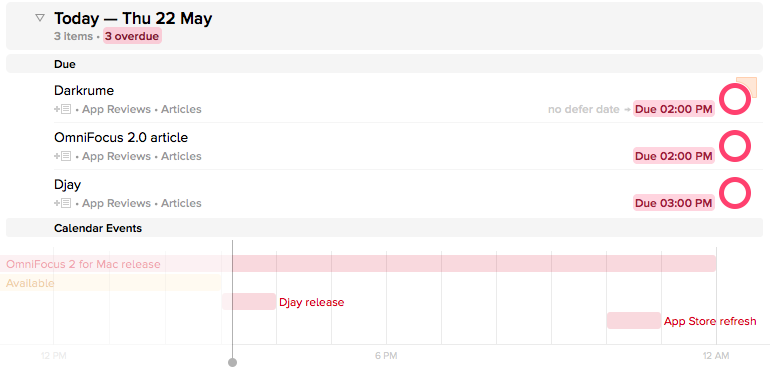
The Forecast view is glorious. One of the big additions of OmniFocus 2 for Mac is the Forecast view, finally brought over from iOS and implemented tastefully on the desktop. It’s just as good as you’d expect: the Forecast provides a visual breakdown of your upcoming week by collecting due actions, deferred items, and calendar events, grouping everything by day and type. Thanks to the widescreen layout, you can jump to a specific day or view items due in the past/future from a date widget on the left.
I spent most of my time using OmniFocus 2 exclusively in the Forecast view: it’s the closest I could get to Fantastical as it coalesces actions and events in a handy list that gives me all the information I need. For calendar events, I like how the app lets you click one and open it in the Calendar app with a popover shortcut.
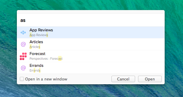
Quick Open is great. Another tent-pole feature of version 2.0, Quick Open is OmniFocus’ own Spotlight: by using ⌘O (or clicking the Quick Open button), you can type and jump to a specific perspective, context, project, or folder by name without leaving the keyboard.
Quick Open supports fuzzy searches and results are displayed in real-time as you type with icons and highlights for matched queries. Quick Open is a fantastic way of navigating OmniFocus and one of those features that makes you wonder why The Omni Group didn’t think of it sooner.
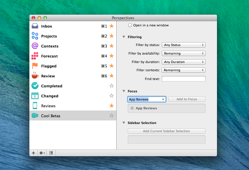
Perspectives are easier to create. Perspectives are now easier to create from scratch thanks to some additions in the Perspectives window.4
OmniFocus makes it clear what’s a perspective’s focus and it lets you use the current sidebar selection as “source” for a perspective; perspectives can be pinned to the sidebar for quick access and you can assign them keyboard shortcuts, too. The sidebar helps in making perspectives an essential aspect of OmniFocus 2’s navigation, and I wish that the iPhone app let you pin perspectives to the dashboard.
Still a lot of terminology to learn. In spite of a new first-run experience, OmniFocus still has a steep learning curve for those coming from more accessible todo systems like Reminders. OmniFocus revolves around David Allen’s GTD time-management method, and every aspect of the app requires a basic understanding of the various parts that compose the system: soon after launching OmniFocus for the first time, you’ll be asked to differentiate between projects and contexts, folders and perspectives, attachments and notes. Changes in version 2.0 make OmniFocus easier and more approachable, but its GTD foundation is inherently tough to comprehend.
It’s not meant for sharing. To paraphrase gaming, OmniFocus is still a singleplayer experience. There’s no built-in sharing to collaborate on projects or lists of actions with other users; OmniFocus can’t replace your synced grocery shopping list that you share with your significant other, which is a big advantage of Apple’s Reminders and iCloud.
The sidebar could be more flexible. The new OmniFocus sidebar is one of my favorite aspects of the app, but it could use tweaks to be more customizable in terms of shortcuts and navigation. For instance, only perspectives can be added to the sidebar, while I was initially under the assumption that any item (such as an individual project or context) could be turned into a sidebar shortcut.5
The new Inspector. Inspired by Apple’s new iWork apps for the desktop, OmniFocus’ new Inspector nicely blends in with the app’s main view, providing additional information about a selected item without covering the UI. It feels modern and part of the app rather than an external accessory, but I wish the amount of information displayed inside it was more clear and organized with color and visual weight.
There’s a lot going on in the Inspector between text labels, buttons, dropdowns, and segmented controls, and I find it hard sometimes to quickly parse text or understand how the Inspector relates to the selected item in the main view. I’d also like the Inspector to remember my preferences for hidden/shown sections across relaunches – right now they don’t stick when you quit and reopen the app.
Clipper and Quick Entry still rock. When I’m using Reminders or Fantastical on OS X, I miss the ability to easily clip rich text from Safari or other apps and have my todo app create a new task with clickable links and formatting in the Note field.
OmniFocus’ quick clipping system doesn’t feature the amazing natural language support found in Flexibits’ calendar client, but when it comes to capturing rich text from other OS X apps and files from the Finder, it absolutely eclipses any other todo software I’ve tried.
OmniFocus 2.0
After a week of OmniFocus 2, I remain convinced that OmniFocus is no longer for me, but I also think that, overall, the new app is an improvement over the old version, with some reservations.
Forecast, Review mode, Quick Open, the Inspector, the new sidebar, and pinnable Perspectives make OmniFocus easier to use and navigate; for users who manage dozens of projects and hundreds of actions each week, these new features are clear improvements that speed up OmniFocus and bring it on par with the feature set offered on iOS. Forecast and Quick Open are especially well implemented and useful.
The new design modernizes the app, but I feel like usability and legibility have been sacrificed for good looks in some areas of the interface. I’m skeptical about the decision to separate action titles from the checkcircles, and long lists of actions can be difficult to scan quickly. This appears to be a problem in common with many other designs inspired by iOS 7, and I would like The Omni Group to tweak some of their decisions and offer user-configurable settings. Time (and more user feedback) can fix initial missteps.
OmniFocus is a professional project management tool that’s not meant for people like me who are fine with Reminders. While the new app does make things easier, there’s still friction caused by longstanding limitations (lack of sharing, complicated settings for views and perspectives). I don’t need to switch from Reminders and Fantastical to OmniFocus, but that’s just me.
If you’re an OmniFocus 1.0 user, the benefits brought by version 2.0 outweigh the few quirks I found in this new release, and I recommend the upgrade.
- Plus, I don’t need an app to tell me where the nearest grocery store is with a geofence because Viterbo is small and there isn’t much of a choice to begin with. ↩︎
- Which is already possible with a hidden URL scheme. ↩︎
- I struggle to use the word “checkcircle” seriously. ↩︎
- Custom perspectives are one of the features available in the Pro version of OmniFocus 2, which costs $79.99. ↩︎
- For that, you’ll need to create a custom perspective focused on the invididual project, which is unnecessarily intricate. ↩︎


