In my watchOS 9 Review last year, I spent the introduction reminiscing on the more exciting days of watchOS yore. Those early years were full of whimsy and foolishness, with many wild and ambitious new features that failed far more often than they succeeded. By my count, it took until watchOS 4 for Apple to find its footing, and by watchOS 6 the predictable pattern of iteration that I laid out last year had begun.
As I said last time, it’s hard to argue against the slow and steady march of watchOS. This software joined with the Apple Watch hardware has resulted in a years-long market domination that shows no sign of stopping. Yet, market be damned, I couldn’t help but feel disappointed. Health and fitness features were flourishing, but the rest of watchOS never quite felt fully baked.
As it turns out, Apple seems to have agreed.
In watchOS 10, for the first time in years, the iterative update pattern is broken. Rather than the usual handful of minor app updates, new watch faces, and health and fitness features, Apple has instead dropped another major rethink of Apple Watch interaction methods. The side button has been reassigned, the Dock has been demoted, apps have a new design language throughout the system, and widgets have made their Watch debut.
This is the largest year-over-year change to watchOS since version 4, and I am here for it. Let’s jump in and see if Apple has hit the mark this time, or if they’ll be back to the UI drawing board again in the years to come.
Table of Contents
- The Dock and the Side Button
- Control Center
- Smart Stack
- New Systemwide Design Language
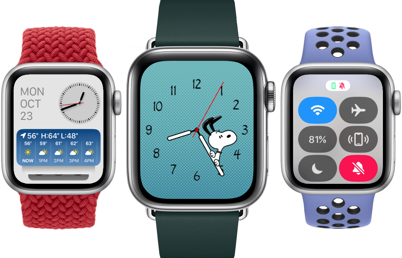
- Watch Faces
- Health and Fitness
- Miscellany
- Conclusion
The Dock and the Side Button
Where better to start than a hardware button reassignment? Across all of Apple’s products, a change to the software functionality of a physical button is a rare thing to see. The last time it happened was back in 2016, when Apple reassigned this same button in watchOS 3.
At that time, they were dumping the ignominious Friends interface in favor of the then-new watchOS Dock. Now, after a seven year run, the Dock is out too. Taking its place, for some reason: Control Center.
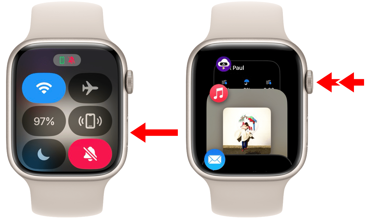
A single-click of the side button now opens Control Center, and a double-click of the Digital Crown now opens the Dock.
I really can’t say why Control Center is on the Side button. A hardware-bound Control Center does not match the pattern of any other Apple device. Even after months of using watchOS 10, I still look in the wrong place every time before remembering to press the button. I don’t think it’s a natural fit at all.
It feels like all of the core watchOS UI features decided to play a game of musical chairs. The new widgets interface sat down where Control Center used to be, Control Center snagged the seat by the Side button, and the Dock was left standing.
While it may have lost its seat, the Dock hasn’t left the party. It’s still hanging out in the back, now buried behind a double-click of the Digital Crown. Adding insult to injury, it has also lost half of its previous functionality. Despite retaining the name “Dock”, it’s now only a list of your most recently opened apps. The setting to manually choose a list of static “favorites” has been removed.
In this sense, the watchOS Dock is now far more akin to the iOS multitasking interface, right down to the Digital Crown double-click mirroring the old Home button double-click when opening these views. While I’m not sure why Apple is still bothering to title it “Dock”, I otherwise find this to be a fine place for the interface to land. I never used it enough to justify its prime position on the Side button, and based on this change, I’m guessing few others did either.
One complication associated with the Dock’s new position is that double-clicking the Digital Crown already had a behavior in watchOS. This action has long been used to automatically swap back and forth between two apps, or between an app and the watch face. I suppose that feature was the true loser of the musical chairs game, because it no longer exists at all. That said, the Dock is at least a logical successor here: if your muscle memory has you double-clicking the Crown to swap to the last app you used, then now you simply have an extra tap to complete the process of opening it.
I do wish Apple would make the watch face itself accessible from the Dock. In the old system, if you opened a single app and then wanted to hop right back to the watch face, the Digital Crown double-click action would make that happen instantly. Without the watch face showing up in the Dock though, the only method we’re left with is to press the Digital Crown, wait a few moments to make sure you aren’t going to register a double-click, and then press the Crown again. To me, that forced delay feels worse than it would to find the watch face in the Dock interface and tap it.
Control Center
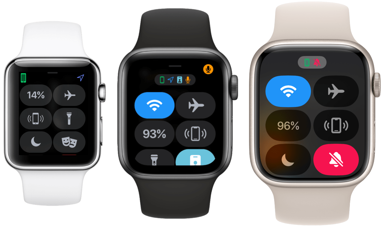
Alright, we have to talk about Control Center. This interface, despite being elevated to the wildly excessive honor of direct hardware access, is entirely unchanged from last year. Not only that, but because Apple has been content to mostly ignore it for its entire existence, it continues to maintain the exact same set of flaws that I admonished it for seven years ago when it was first released. Since nothing has materially changed here, let me just quote myself from my watchOS 3 review in 2016:
Overall, I find Control Center for Apple Watch to be supremely underwhelming as a whole. In the last three months of using watchOS 3, I have only opened it two times with real needs for its functions. Both times were to make my iPhone ring when I couldn’t remember where I had left it in my house.
I’m not against the idea of the upward swipe being tied to Control Center at all, but what surprises and annoys me about the change is that the Now Playing screen is not a part of the new interface.
After seven years, I still only use Control Center to occasionally ring my lost iPhone. I’ve mostly left this interface alone in my last several reviews since it seemed like Apple was uninterested in improving it, and I didn’t feel the need to make the same argument over and over again. However, based on this year’s promotion, Apple has made it clear that they think Control Center is great exactly as it is. Moreover, they think it’s so good that it deserves an even more prominent position than the one it already had. I am here to disabuse them of that notion.
As far as user interfaces go, Control Center is totally fine. It’s a grid of nicely sized buttons that toggle various controls or execute useful utilities. Nothing fancy, but nothing problematic either. My problem with it has not changed since watchOS 3: it just isn’t useful enough to deserve the valuable real estate that it has possessed. If this was the case when said real estate was a swipe up from the watch face, it’s an order of magnitude more true when Control Center ascends from the user interface entirely and takes the throne of a hardware button.
It is such a rare and beautiful opportunity to get to assign a hardware button on an extremely popular device. Apple could have done anything here, including giving non-Ultra Apple Watch users access to the extremely cool customizable Action button. In that case, Apple Watch Ultra users would get two Action buttons, so everybody still wins. But, no, we’re all stuck with Control Center.
I also would have been fine with this change if Apple had done any work to improve Control Center in a way that made it deserving of its new station. Take the extremely obvious idea that I’ve been calling for since watchOS 3: put the Now Playing screen at the top of Control Center. I would love it if I could tap the Side button on my Apple Watch at any moment and immediately control playback of whatever is playing on my iPhone or other nearby devices. Every other Apple platform includes playback controls in their respective Control Centers, but watchOS — despite now having the most easily accessible Control Center of all platforms — does not.
Another quick and easy suggestion: add HomeKit controls to Control Center. Tap the Side button on my Apple Watch and instantly set a lighting scene in my home? Yes, please! How about an Apple TV remote, or buttons to set timers or alarms? I am not having original ideas here, I’m just opening Control Center on my iPhone and looking at what’s there.
For the time being, the Side buttons of all Apple Watch users will be wasted for at least the next year. I guess the good news is that the Side button was already being somewhat wasted on the Dock, and before that it was wasted on the Friends interface. Perhaps someday Apple will show us a good reason for why they even put the Side button on these devices in the first place.