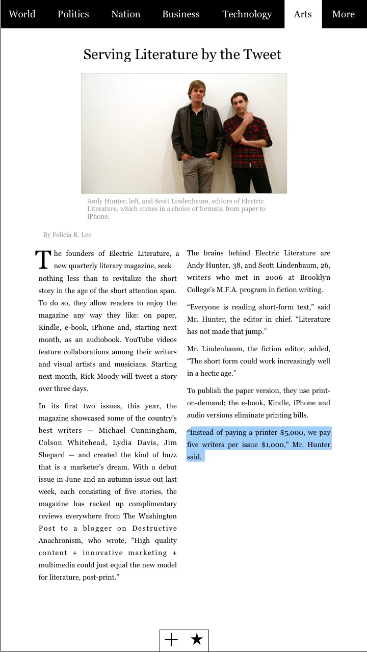
This is one of the most interesting “I would make the Apple Tablet like this” post I’ve recently stumbled upon. Kyle Baxter from TightWind shares his thoughts about what he would like to see most in the tablet: newspapers. But instead of just converting the current newspapers layouts to the tablet screen, Kyle designed two mockups which show a revamped interface for the NYT, made of a top toolbar for easy navigation and a very few UI elements. I personally don’t think the Apple Tablet will be exclusively focused on saving the press industry, I believe there will be a built-in News.app, which will actually save both the press and RSS industry.
And if there’ll be a News app, I’d like to see a similar interface.
“Rather than adopt the typical newspaper layout to the tablet screen, which would likely require zooming in on each article to read it, each article is perfectly readable without zooming.
[…]
I want the application to be just as simple for jumping to a new section, so you can move to one easily from anywhere in the application. Rather than make a navigation screen, it has a permanent bar at the top which gives you immediate access to any section.
When you want to read one of the articles, you just tap on it, and it opens it in the article view.”


