I read a lot on my iPad. Either with Instapaper, Read It Later, Flipboard or iBooks, there’s lots of content to consume and these apps made specifically for the tablet are a real pleasure to use. I don’t reckon I read as many articles saved from the web or discovered through social media on the iPhone as much as I do on the iPad. But of course, Instapaper and Twitter aside, there’s another category of apps I’m constantly going back to: RSS readers. Both for work and personal purposes, RSS plays a huge role in my workflow that requires me to stay on top of news, save items for later, and forward them to my colleagues. Google Reader is my RSS service of choice.
On the iPad, there’s no doubt Silvio Rizzi’s Reeder has become the most popular RSS app currently available on the App Store. I love Reeder, and I use it on the Mac and iPhone as well. Reeder is beautiful, fast, stable, has lots of options and syncs with Google Reader. Ever since it came out on the iPad last year, I haven’t looked back. But you know I’m always curious to try out new things and alternatives, because you never know what might be coming out from the minds (and Xcodes) of thousands of iOS developers out there. Mr. Reader, an iPad app released last week in the App Store, is a new Google Reader client that I’ve been testing for the past 3 weeks. I was impressed by the quality of the app, so I took it for a spin on my homescreen.
User Interface
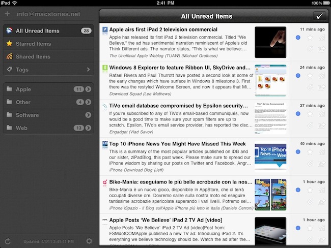
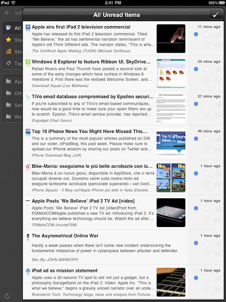
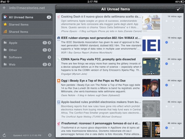
Unlike Reeder, Mr. Reader takes a standard user interface approach with a large sidebar on the left that collects your unread items, sources and tags and, overall, a design that reminds me of Cultured Code’s Things for iPad in some ways. Mr. Reader’s design is the first thing you’ll notice: you can switch between three different themes (more on this in a minute), the app has a general darker look than Reeder’s sepia background, and more importantly, displays news in a standalone “floating panel” that can cover the sidebar in portrait view, but slides on to the right section while in landscape mode. I’d like to say a few words about Mr. Reader’s implementation of this panel before I delve deeper into its feature set: in portrait mode, you can swipe on the news panel to reveal the full headlines, thumbnail images and sharing options on the right. When you do that, however, Mr. Reader won’t automatically adjust the contents of the sidebar to show only the icons for unread items / shared and starred items / tags and so forth – instead, the news panel will overlay the full sidebar as you can see in the screenshots below. What I’d like to see, and what I guess the developer is working on for a 1.1 update, is a “smart resizing” mode where the sidebar in portrait view only shows icons for Google Reader items and favicons for websites once the panel slides to the left. Kind of like how Reeder for Mac beta can switch to “icon mode” when you manually resize the sidebar. For the sake of comparison – and because Silvio Rizzi’s software has been my default RSS reader for months – the concept of a “sliding panel” is very similar to Reeder’s way of getting unread items out of the user’s view when you tap on an article in portrait – but in Mr. Reader this has been implemented for “all unread items”, rather than single entries. Once you get how you this panel works, and how it adjusts to show the sidebar in landscape mode (again, check the screenshots), it’s time to move on to analyze all the other functionalities and interactions provided by the app.
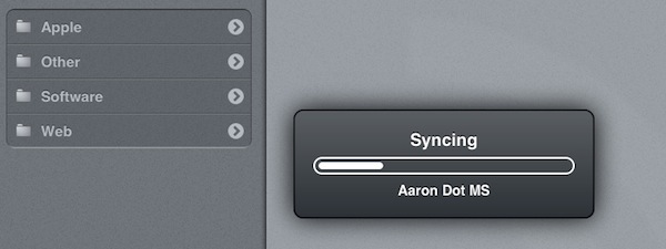
Once you’ve logged in with your Google Reader credentials (both regular and Google Apps accounts are supported), you’ll notice that Mr. Reader doesn’t sync new items and settings in the way Reeder does. Whilst Reeder displays the sync status in the menubar (iPhone) or through a spinning icon in the bottom left corner (iPad version), Mr. Reader will bring up a modal window to show progress for the items, preferences, and tags that are being synchronized with Google Reader. It looks sexy, but it’s got one major downside: you can’t interact with the app during an ongoing sync. Similar to how you can’t use iTunes while an iPhone is being restored and the app displays a modal popup window on top of the UI. I wish the developer will change this in a future version, as waiting for the app to finish sync can be pretty annoying when you’re on a 3G connection (I learned this the hard way this weekend with Personal Hotspot as my one and only connection at home during an ISP change). Even if it’s just 3 seconds of modal window and waiting for the app to sync, being unable to tap and scroll and interact breaks one important standard of the iPad and iOS multitasking: everything should be ready to go as soon as you launch it or switch to it. So, overall, it’s not that Mr. Reader’s modal sync popup looks bad – it just seems unnecessary. I’d like to be able to use the app – even see and scroll through old entries for a second – during sync. As far as speed goes, Reeder is still a little faster (we’re talking milliseconds here), but it’s worth mentioning that Mr. Reader also syncs tags back to Google Reader. Reeder doesn’t offer this option.
(modal sync with Berlin theme)
Reading & Sharing
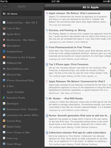
Like I said above, Mr. Reader displays a column containing unread items, starred items, shared articles, tags and folders on the left. Folders have an arrow next to them that allows you to navigate to another view that shows all the websites you’re subscribed to (and check out their latest RSS items), and the Tags tab provides a similar functionality by letting you “browse by tag” and view posts you’ve assigned a specific keyword to. Depending on your settings, you can also browse old read items within each folder.
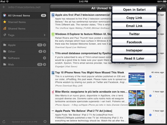
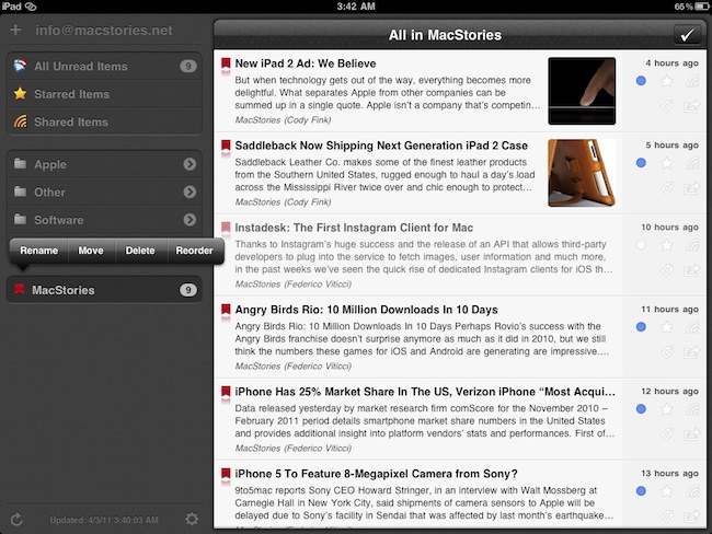
So how does the Unread Items section look like? Pretty good, I say. There is a button in upper right corner to mark all items as read (even without confirmation, adjustable in the Settings), and the main list is very clean. Favicons and headlines are displayed, as well as a thumbnail preview for the first image of a post (if any) and a 3 line excerpt of the article. One thing I love about Mr. Reader is that it also puts the author’s name below the excerpt – makes for great attribution and gives articles a sense of “personality”. On the rightmost section of the unread list, there are some icons that allow you to mark a post as read / unread, star it, share it on Google Reader, tag it or forward it to another service like the supported Twitter, Facebook and Instapaper. Everything happens inside standard iOS popovers, and almost every action has “sound feedback” thanks to some really cool effects the app lets you choose from in the settings. Sound effects might seem like a nice option and nothing more, but trust me when I say they add a whole new layer of customization to the Mr. Reader. Personally, I’ve assigned a weird laser-like firing sound to the sharing action and I love to hear it every time I send an article off to Twitter. Makes me feel powerful.
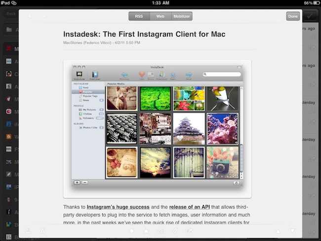
What happens when you tap on an article you want to read is interesting, too. Instead of opening another view in fullscreen mode, Mr. Reader brings a large popup in the foreground containing the RSS view of a post (that is, text + images + occasional breaks the website might have implemented) plus buttons along the top to switch to web view or Instapaper Mobilizer, all within the same popup. There’s a button to increase / decrease font size, arrows to navigate between articles and the same sharing panel from the unread list. The sharing panel’s position can be modified with an icon that, once tapped, can place the sharing options at the bottom, on the left or right. This is a very nice touch, especially if you’re left handed. You can dismiss the popup by tapping on “Done” or anywhere outside of the article, but I’d still like to have an option to enter fullscreen mode (for better focus) and the possibility to swipe between articles (like Reeder does on the iPad).
The sharing options offered in Mr. Reader are solid and well implemented. From the settings, you can enable the following services: Twitter, Facebook, Delicious, Pinboard, Zootool, Instapaper and Read It Later. There’s no support for Readability yet. You can also share an article via email (both link and full content), copy the link to your iOS clipboard, log in with bit.ly and j.mp credentials or set up a custom URL shortener that has an API endpoint. You can open articles directly in Safari with the tap of a button, too. When you share an item on Twitter, there are two buttons to quickly insert the article’s title and link, but you can add your own comment if you want. Sharing on Facebook allows you to enter a personal note alongside the thumbnail preview and excerpt that will be shared with your friends, whilst bookmarking on Pinboard lets you enter a title, notes, tags and mark an item as private. I look forward to being able to use Readability with Mr. Reader, as it’s a great service that needs to be supported by RSS apps nowadays (again, Reeder has this feature).
Settings
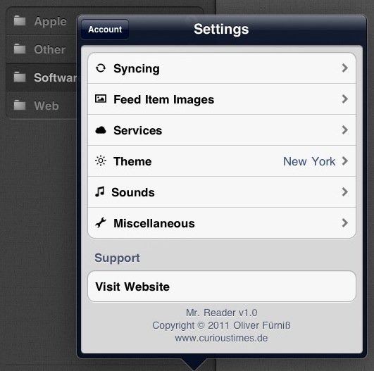
There’s a lot of stuff to play with and tweak in the Settings. First off, you can switch between multiple themes: I usually don’t like the idea of an app offering themes (makes me think the developer couldn’t come up with a final decision about the best design to use for his app), but I have to admit two of the three themes that come bundled with Mr. Reader are pretty good. I don’t like “Paris By Night” because it makes everything too dark and unreadable, but “New York” and “Berlin” are very nice. The Berlin theme is the default one, but I use New York. It’s not too dark, and it makes the icons in the sidebar really shine. Plus, it keeps the main unread list white with black headlines – which I prefer over Paris By Night.
Themes aside, Mr. Reader has several other options to customize the behavior of syncing, image loading and unread items. In the Syncing tab, you can decide to “always sync on start” or on “WiFi only”, but you can also tweak the sync button itself to only fetch new items from Google Reader or all RSS articles. By tapping and holding the sync button you’ll be able to switch between the two without going back to the settings. The app can download read items as well, and keep them for a certain amount of time from one day to one month. The process of downloading images and thumbnails can be personalized in the “Feed Item Images” tab: you can choose the size of thumbnails, dim images on read articles (nice effect) and keep a local cache of images for offline reading. You can cache unread, starred, shared and tagged items. Again, an option to download images will be placed in the sync button’s popover menu. Sounds can be customized and deactivated if you don’t like them; the Miscellaneous tab enables you to show an unread badge in the homescreen (which I don’t), select a date format for the feeds’ timestamp, choose the order of unread items (descending for me) and turn off confirmation for “mark all items as read”. Overall, I think Mr. Reader comes with a very solid selection of settings that, with the future updates, should gain the possibility to log in with Readability and set a default view for items opened in the popup window (I’d love to automatically open articles with the Instapaper Mobilizer).
RSS management
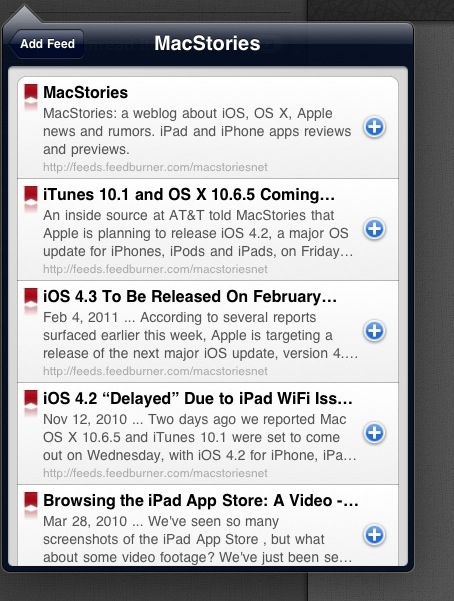
One of Mr. Reader’s biggest advantages over its competitors is full management of feeds and folders within the app. In Mr. Reader, you can subscribe to a website or unsubscribe without having to open the Google Reader web view; you can rename, move, delete and reorder folders or subscriptions with a few taps from a copy & paste-like menu that feels just right and works as you would expect from iOS. Entering a new subscription is easy: from the + button in the main page, you can paste a feed’s URL and hit “Add” to save it to Google Reader (automatic detection of clipboard contents à la Delivery Status Touch would be great) or manually search for a website. The search results are most likely parsed from Google, and it’s definitely the best way to add a website’s RSS feed into the app (and directly on Google Reader thanks to sync) if you don’t have the direct URL. Both websites and folders can be renamed, reordered and deleted, and you can also move subscriptions between folders using a popover menu. You can create new folders and tags in Mr. Reader as well. This kind of full RSS management turns Mr. Reader into a complete RSS app for iPad that doesn’t require a PC (or an external web browser) to be fully functioning and customizable.
Wrap-up
Mr. Reader is a fast, intuitive RSS client for iPad that got many things right on its first release and still has a huge room for growth. The app has great sharing options, support for Instapaper Mobilizer, powerful feed management and dozens of additional touches that make this an exceptional 1.0 release – quite possibly one of the best the iPad has ever seen. There are some issues to work out: the app has occasionally crashed on my iPad 2 and the modal window for syncing needs to be replaced by an unobtrusive notification system for sync information; I would also like to see an option to load “all read items” (not just inside a single folder) and the possibility to sort articles by feed. That said, for the first time in months I don’t feel uncomfortable switching from Reeder to another RSS app. Reeder still has a slightly faster engine and more features (especially when it comes down to loading articles from Google Reader and specifying how many unread items you’d like to keep), but Mr. Reader is a truly fantastic alternative that I won’t be afraid to keep on my homescreen for the next weeks and rely on for my daily RSS consuming.
At $2.99 in the App Store, Mr. Reader is the hot new RSS client for iPad everyone should check out right away.


