When Co-Founders Mike Matas and Kimon Tsinteris set out to change the world of digital publishing, not many would have guessed that Al Gore would be at the forefront of their first title until Our Choice was demoed as a TED Talk, where the workings and interactions of the first title built using the new platform were revealed. Today, Our Choice is available at an introductory $4.99 on the App Store for the iPhone and the iPad, delivering rich interactive content via a completely custom app built on a native backbone. The Push Pop Press platform is seeking to revolutionize how content is published and made interactive, and my initial impressions with Our Choice can validate that cause. What’s at stake isn’t just the future of the new digital platform, but a complete rethinking of the traditional digital magazine or newspaper. The App Store is flooded with projects traditionally based on Adobe technologies, and while it was a good first attempt, the content we view needs to be intuitive, interactive, but most importantly fluid and un-static. Push Pop Press is the ideal platform to revolutionize how we think of traditional media, and Our Choice is the launch title proving that this new vision for content is a clear winner.
Interacting with Content
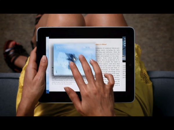
The current state of digital magazines isn’t a pretty one. Even The Daily suffers from a tutorial problem, and an interface that’s somewhat confusing to navigate between a myriad of different views, scrolling cards or popups, and article views that leave you dazed and confused as you figure out when it’s appropriate to scroll up and down, or left and right. Magazines are big culprit of this problem, as navigation is often dictated by some janky toolbar which feels appropriate for a PDF viewer. In Our Choice, you simply pinch out. Not only are we familiar with the concept of pinching out to overview the whole of our content (think pinching out of a single photo to see all of them), it’s a fast gesture that’s not encumbered by a toolbar. Your place within Our Choice is instantly recognizable, and you simply swipe left or right on headers that are bold and beautiful. Navigating Our Choice is intuitive, and while Al Gore offers a brief video tutorial on how to use the app, its not necessary to the experience. Whereas you have to learn how to use a PDF viewer, Our Choice is designed to be finger friendly. You are constantly encouraged to touch things, and you don’t feel like you’re going to break the app or lose your place in the process of discovery. Subtle queues point you in the right direction, but no instructions are provided on these otherwise intuitive focus points. Nothing ever shouts at you to “touch this” or “grab that,” because you already know you can. Certainly to view graphs there are some tips to help you reveal content, but these only appear as you start interacting with the content, and it’s never intermixed distastefully with the words displayed on the page.
Just as Reeder is smart between touch and tap actions, Our Choice implements the same for pictures and other content. You can either pinch to open or simply tap certain items to interact with it - the gesture implementation is thoughtful and ideal. Combine this with the kind of fluidity and responsiveness that no one else has yet achieved, and Our Choice feels like it’s running on a next generation iPad. The touch experience is out of this world.
Loading Done Better-ish
My battle cry to these digital publishers is to severely limit how large these magazines are at the first download. Our Choice starts at 50 MB, and grows as you access content for the first time. It’s smarter about how it gets content from the web, grabbing the chunks you want to read at the time you want to read it. I believe it tries to get content as you start to access it, but jumping through the table of contents the first time brought up lots of loading bars on individual chapters. The first chapter is already downloaded, thus you can read while the remains of Our Choice load in the background. With the amount of media embedded into Our Choice (both audio and video), this is going to be a challenge for future publishers as well.
Linearity
Part of the reason why Our Choice is so intuitive is because the app relies solely on swipes to navigate across chapters. But what if you want to jump from Chapter 1 to Chapter 8? You can only swipe between chapters right? Not exactly. You can scrub across the chapter indicators (what looks like a series of dots) to speed to your desired chapter. This particular component may have been better off with a different style as the “scrubbing” isn’t apparent, however, the approach removes the need for a long table of contents or grouping sections together. It’s a smarter approach, and avoids confusion since there’s only two things you can do: swipe left or swipe right. There is no spinning light table or a jump list mashed together, and there is no confusion about where and how you can find content.
Playing to Win
Push Pop Press isn’t just a fancy new engine for content, it’s a fancy new engine super-charged to outrun the current offering of authoring tools and digital platforms that have content in a vice. If anyone can prove that content can be interactive, emotional, and beautiful, Our Choice will lead the way in proving this concept and revealing just how magical the iPad can really be. I hate to say iBooks has some stiff competition, but metaphors occasionally need to be bypassed to work with our way of thinking, and not against it. You can show me a book on screen and try to trick me into thinking it’s a book, or you could push the pages into a PDF viewer and depersonalize the experience with sharp edges and unnecessary UI. What’s really important is that you make content work with the iPad (which is the book), and work elegantly with the gestures and actions we’re familiar with to present content in the way that Our Choice has. It may not be perfect, but it’s certainly 99% closer to what we deserve than what’s being offered in cookie-cutter fashion.
As for Our Choice itself, the amount of research and intelligence Al Gore has put into his project is outstanding. I could think of no better way to educate people on the issues surrounding a green planet, and I highly recommend that you spend the $4.99 to learn and experience the research (which is more powerful than simply consuming it) first hand.


