Notification Center is one of the key features of iOS 5, one that will profoundly change the way iPhone and iPad users approach the incoming stream of data and notifications on mobile devices. There is no doubt Notification Center is among the most anticipated new functionalities to land on iOS, but before we delve deeper into its advantages over the old notification system of iOS 4.x and its (very few) shortcomings, here’s a bit of background history that should better put Notification Center into context.
Looking at Notification Center now – and playing with it for at least a day – it’s clear the system is indisputably better than what we used to have on our devices in the pre-iOS 5 era. Criticized both by the tech press and average users alike, the old notifications had, really, one main problem: they became annoying with time. And by “became” I mean that they began to show their utter nature of a system built for non-connected applications as soon as the App Store turned into a platform for the always-on individual who’s constantly connected, even when he plays Angry Birds or is eating a new meal at a restaurant a friend suggested.
The old notifications were built for a different set of apps.
As the App Store changed and, ultimately, led Apple’s growth in the mobile app ecosystem, the notification system built by Apple in 2007 with the original iPhone started to not only show the proverbial signs of time, but to annoy users as well. And annoyed users are not engaged users. So Apple came to the point where notifications needed to change.
The old notifications were modal and disruptive. Apple was actually pretty proud of the modal nature of notifications – a dialog box would pop up on screen without covering the main view (an app, the Springboard), thus allowing the user to keep seeing what was going behind the alert. This happens on the Mac every day: dialog boxes ask us to confirm file deletion, mounted DMGs – they even inform us of upcoming Calendar events. But on the Mac, alerts and dialog boxes aren’t really push notifications, and they’re easily dismissible or ignorable. Plus, iOS is not the Mac and, if anything, OS X had to learn a few things from its little iPad brother with Lion.
On mobile devices, being interrupted by a notification is annoying because you can’t look away and ignore it. It’s there. The app you were previously interacting with, in fact, “stops working” the moment you receive a modal notification. Which, by the way, forces you to immediately confirm an action that’s usually only given “OK” and “Cancel” options. You can’t save a pre-iOS 5 notification “for later”. You can’t get a list of “past notifications”. If you unlock your iPhone after a few hours and you have multiple notifications, they’re not “grouped”. They are multiple boxes to dismiss one after the other. And after that, they’re forever gone.
Notifications should alert, not interrupt. A mobile OS should keep notifications accessible and contextual, not invisible and disconnected.
Ultimately, it became an app problem. The notification system Apple built with iPhone OS 1.0 couldn’t keep up with the evolution of apps and the data streams created by developers over time – these days, we have apps that send us notifications for new tweets and text messages – fairly average alerts you might argue – but we have notifications for missed video call invitations and breaking news, too. There are apps that alert us of new podcast episodes, and utilities to connect the Mac with iOS devices through Growl and push notifications. And it’s not like Apple didn’t notice the explosion in popularity for push notification-based features in third-party apps: at the WWDC in June, Apple’s Scott Forstall said that over 100 billion push notifications had been sent to date.
With such a huge market for push notifications and apps that can integrate with them, the frustration of users annoyed by the modal alerts associated to notifications started to resonate with Apple. Either by proving that iOS was still the best mobile OS on the planet, or because of an effective personal need for something better among Apple executives themselves, Notification Center was born.
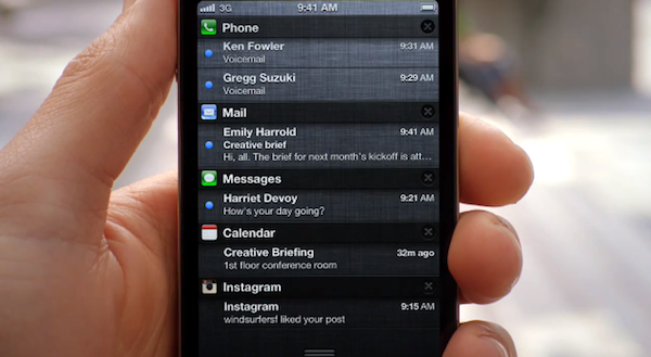
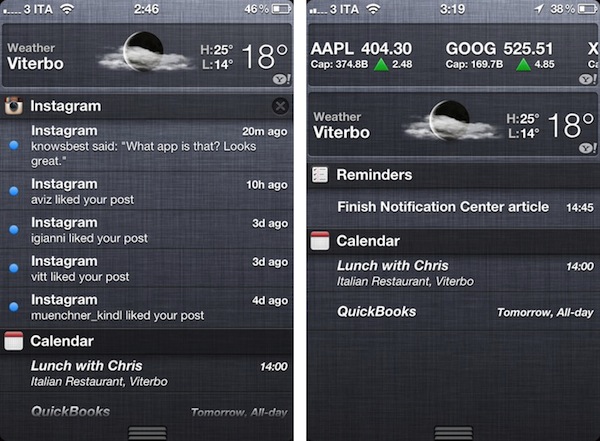
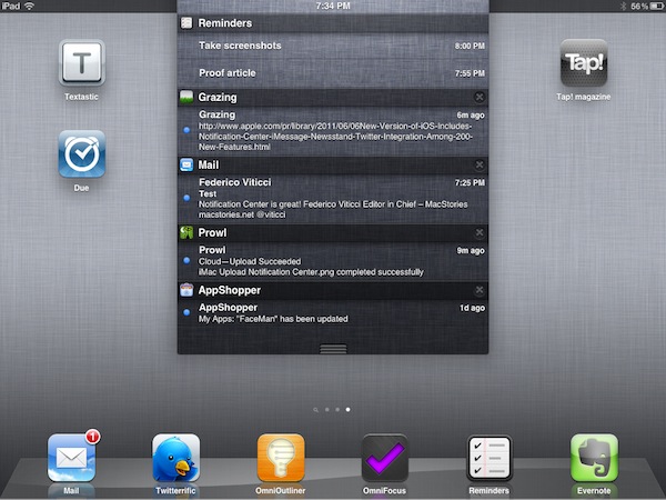
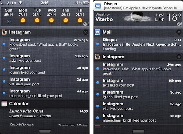
Notification Center lists all you alerts, in one place. Both on the iPhone and iPad, all you have to do to access Notification Center is swipe down from the top of the screen; this will reveal an overlay (full-screen on the iPhone and iPod touch) that displays and keeps track of all your missed notifications. Notifications are grouped by app, sorted by time, and you can tap on them to jump back to the original application. You can dismiss groups of notifications – but not single ones – by tapping on the “x” button next to an app’s name. Apps with unread notifications are displayed inside a translucent “cell” in Notification Center, which also contains the icon of the app.
The list of notifications can be scrolled; Notification Center is based on Apple’s “linen” texture that the company has made popular in previous versions of iOS, and OS X Lion.
This, in short, is how Notification Center works. It’s a list of missed notifications that can be conveniently accessed with a single swipe from anywhere on the operating system. There are, however, a few features and tips to get the most out of Notification Center that epitomize Apple’s usual attention to detail.
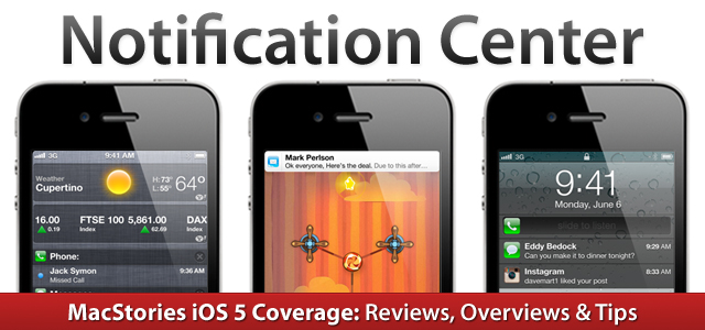
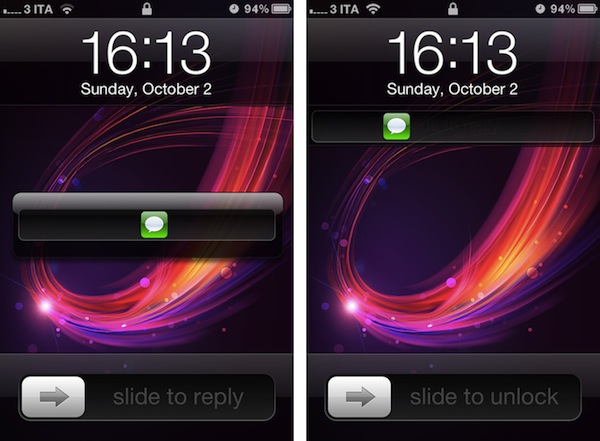
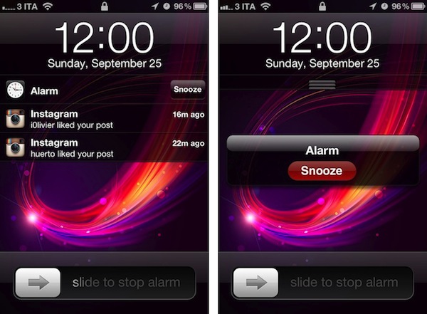
Notification Center doesn’t simply live in the iOS status bar, ready for you to swipe down and get a list of missed items. Apple listened to its users, and improved notifications in the Lock Screen as well. This was done in order to provide users that haven’t checked an iPhone or iPad in a few hours with a quick way to see what’s up without fully unlocking a device, which in some cases might even require entering a passcode. Notifications in the lock screen are stacked on top of each other inside a translucent black interface that, similarly to the “regular” Notification Center, displays the alert alongside the app’s name and icon. There is a fundamental difference in how users can interact with notifications on the lock screen though: they can swipe on a single notification to unlock a device and bring the related app directly in the foreground.
An iMessage notification on the lock screen as soon as it’s received (left) and after the phone has been unlocked (“stacked notification”, right). A swipe on it will launch the Messages app.
So, let’s say you’ve got a new iMessage from Chris. You pick up your iPhone, see a preview (or not, if you disabled the functionality in the Settings), and decide that you want to respond to it. With the new notifications, you can swipe on the little green iMessage icon to start an unlock animation that won’t bring the iPhone’s Springboard in the foreground, but the Messages app with Chris’ text instead. This is a quick and natural way to let users jump directly to a notification’s context or screen without disrupting the workflow they’re already familiar with (swipe to unlock). It works with any app. Of course Apple hasn’t completely replaced the standard “slide to unlock” command, which is still there at the bottom to allow you to just take a look at notifications, but launch the Springboard.
With Notification Center, Apple isn’t simply enhancing the way alerts are grouped and tracked over time. With the introduction of “banners” instead of modal alerts, the company has also found a way to avoid the disruption and interruption of one’s workflow when a new notification is received.
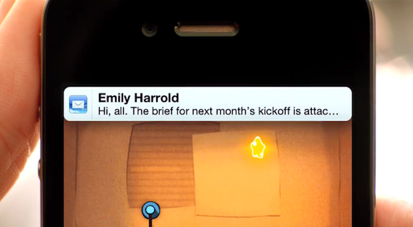
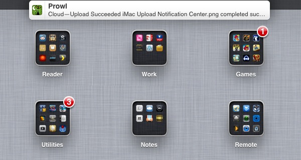
On iOS 5, notifications appear briefly and disappear quickly. This means that in any app, in any screen, a new notification is displayed as a subtle banner that slides down from the menubar without “pausing” an app. The banner contains the icon of the app that sent the alert, and a preview of the notification. The banner will stay on screen for a few seconds, then automatically go away with a neat closing animation. Users can either ignore a banner and just read what it says, or tap on it while it’s active to respond to a notification. This banner-based system – largely similar to an unofficial notification tweak developed by Peter Hajas, later hired by Apple – allows users to keep doing what they’re doing without giving up on the convenience of a notification overlay that cleverly displays an alert on the top of the screen.
Multiple banners for simultaneous notifications won’t stack on top of each other – they’ll quickly follow one after the other. And whilst on the iPhone and iPod touch banners take up the full width of the status bar, on the iPad they’re displayed in the middle of the screen.
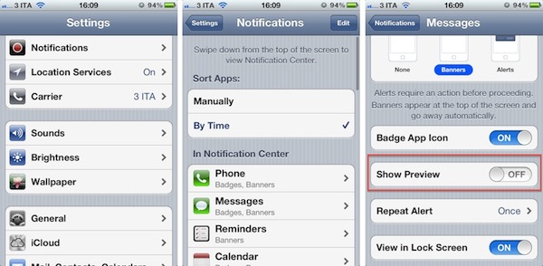
Banners, however, can be disabled in the Notifications settings, which also happen to feature a slew of options to further modify the behavior and contents of Notification Center. As with previous versions of iOS, users can disable an app’s notifications entirely by choosing whether they want it to play a sound, or have a Home screen badge; in iOS 5, users can also choose to display an an alert or a banner. In iOS 5, it’s possible to revert back to the old alert-based system on an app-by-app basis, as well as choose to exclude an app from Notification Center, but display its notifications in the Lock Screen. An app can send sounds and have a badge but lack alerts or banners; alternatively, you can choose to disable notifications in the Lock Screen but keep an app in Notification Center.
An app configured with Notification Center can be customized to show 1/5/10 most recent items; on the iPad, apps can show up to 20 recent items in Notification Center.
Some applications have specific settings attached to them: Messages can show a preview, and repeat an alert at two minute intervals up to 10 times; Mail messages have a preview option to show the first lines of a new message when a notification is received.
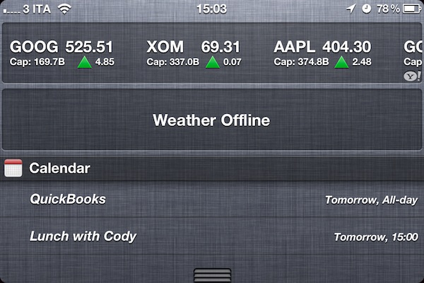
From the Notifications settings, you’ll notice it’s possible to sort apps manually or by time, and hit the Edit button to change the order of apps in Notification Center. Perhaps more importantly, this screen shows support for Widgets, which Apple has implemented in iOS 5 inside Notification Center as Weather and Stocks tickers. These two widgets can be disabled in Notification Center, and are not available on the iPad edition of iOS 5. On an iPhone or iPod touch, Weather and Stocks widgets display data obtained from their Home screen counterparts – the Weather and Stocks apps that can be set to display different forecasts and stock options, respectively. The stock widget will display an animated ticker of stocks fetched from Yahoo! Finance, and tapping on the widget will bring you to the Stocks app.
The weather widget is different in that it will only display the first location configured in the Weather app, or local weather if activated through the iPhone’s location settings. The weather widget displays an icon for the current conditions, temperature, location, high and low temperature, and a 6-day forecast (you’ll have to swipe horizontally on the widget to see it).
Overall, widgets offer a quick way to check on real-time updating information like weather and the stock market without really cluttering Notification Center’s UI. Apple is not allowing third-party developers to build their own widgets to inject into Notification Center, but a number of jailbreak tweaks surfaced in the past months have shown that writing unofficial widgets for iOS 5 is technically possible. Personally, I think it’d be great if Apple decided to offer two more “official” widgets: a “Now Playing” music banner, and a Twitter ticker for the most recent tweets from a specific user. Many speculate Apple could open up to developers in the future and let them create widgets to sell in the App Store, but the company hasn’t confirmed any of these rumors.
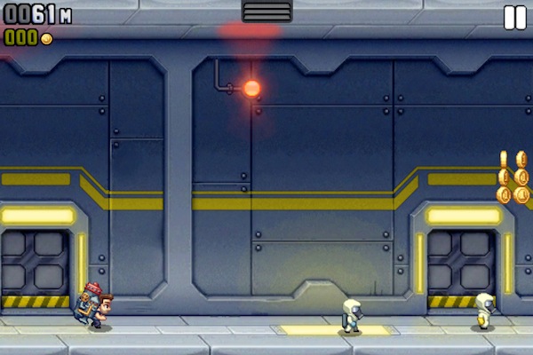
There are some interesting implementation details worth reporting about Notification Center. First and foremost, full-screen apps. On iOS, the majority of apps don’t run in “real” full-screen mode, as a status bar is displayed at the top with indicators for current time, battery, carrier information, and more. Notification Center can be seen as an extension of the status bar – especially if you consider how time and other status bar items are visualized in the same order and position, only on top of Notification Center’s background. Some apps, however, do run in full-screen mode. They don’t display the status bar and they take up the whole screen; usually, this happens with games and apps that play video.
Above: two full-screen apps with Notification Center’s “handle” partially revealed.
Notification Center fully revealed in a landscape full-screen app (iPhone).
To make up for the lack of a status bar (which provides a visible “starting point” for the Notification Center animation) and perhaps avoid accidental swipes that would pause a game when Notification Center is fully activated, Apple tweaked the system’s behavior to require an extra step. In a game, or when a video is playing in full-screen mode, try to swipe down from where the status bar would be. A “handle” will appear first, and you’ll have to keep dragging it down to fully reveal Notification Center.
There are other minor details worth mentioning. Notifications have been redesigned and customized for some system apps like Clock, or alerts like “No SIM card installed” and iCloud storage. However, some system messages are still modal-only like battery status and expiring provisioning profiles. Notification Center can be dismissed with a swipe or the Home button, and you can activate the multitasking tray while you’re viewing notifications. Also, for some reason, Apple decided not to include a “clear all” button in this first version of Notification Center.
When Scott Forstall took the wraps off iOS 5 at WWDC, he said they wanted to make iOS more powerful by adding new functionalities, without sacrificing usability while keeping the entire experience fun and intuitive. Notification Center feels like a step in the right direction: it’s intuitive and easy to use, and it adds a whole new layer of information and accessibility to iOS. Notification Center changes the way iOS users manage and keep track of notifications, because now they don’t have to.


