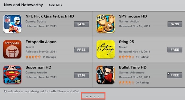
Earlier today Apple rolled out a very minor, yet important change for the App Store’s homepage on the iPad. Previously, “New and Noteworthy” and “Staff Favorites” sections in the iPad App Store could be viewed by hitting an arrow button that scrolled the various pages inside these sections. Now, users can swipe to navigate between pages of apps listed in the sections, with page indicators similar to the iOS’ Home screen available at the bottom to indicate a user’s position.
More importantly, this little tweak has been implemented in the “Release Date” tab of the iPad App Store as well. Browsing by release date is very convenient for two reasons: it lets you see every iPad app ever approved, and it displays the total number of available iPad apps in the Store. It used to be that, because of clunky navigation, moving between pages in “Release Date” view was slow, and the iPad would often lose its position after scrolling dozens of pages. With the new swiping method, the whole view is faster, and also appears more reliable at going back and forth between results.
Here’s how “Release Date” used to look:
And here’s how it looks now, with no buttons:
At the moment of writing this Apple is still using button-based navigation in the Purchased area, and we wish changes will eventually make their way there, too.
Today’s update to the iPad App Store (Apple also updates the App Store homepages every Thursday with new Featured apps) is minor, but as the company’s attention to detail often proves, minor tweaks can incredibly improve the user experience.


