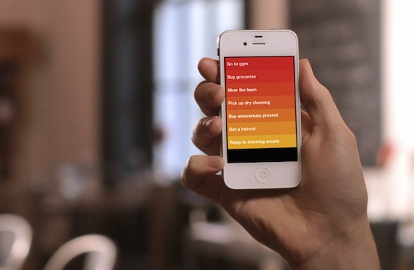
When Phill Ryu (MacHeist team member) emailed me a few days ago to give me a preview of his upcoming iPhone app, Clear, I immediately said “yes” and eagerly started waiting for a TestFlight email to hit my inbox. I know Phill: he has good taste in design, knows that I like great apps, and he’s an overall nice guy that I had gotten to work with multiple times in the past for MacHeist. Phill hinted at the particular nature of the app; yet when the beta came, I felt the kind of surprise and delight in using Clear I hadn’t experienced, I believe, since the original Tweetbot beta. Clear is one of those apps that redefine interaction schemes and navigation patterns: like Tweetie’s “pull-to-refresh” and Tweetbot’s “swipe-to-load” before it, I’m sure Clear’s gestures to move between lists and add new tasks will change the way developers imagine todo list apps.
Clear is a simple todo list app. Without spoiling too much now – you can check out the app’s webpage here, and promo video below – let me just say that the way Clear handles task creation, completion and list management has been uniquely and cleverly built around the iPhone’s screen and the way we can interact with our devices. In fact, I don’t think Clear would be possible on any other platform – when Clear comes out in the next few weeks, you’ll understand why you often hear of things such as “iPhone features the smoothest animations” or “fastest scrolling”. Everything in Clear is delightfully tappable, scrollable, responsive to your fingers with visual cues and sound effects. Yet it’s so simple. I’ll leave my thoughts about the app for a proper review.
What’s also intriguing about Clear, interface aside, is the team behind it. Take a look at the studio’s page: those who have been around long enough in the Apple Community will instantly recognize names like David Lanham and Dan Counsell; Impending’s webpage also reveals Ted Bradley, Jay Meistrich, Raphael Mun, Jeremy Grosser and Josh Mobley worked on Impending’s debut. Clear itself was co-created by Phill Ryu, Dan Counsell and Milen Dzhumerov. That was enough to trigger my curiosity radar, and ask Phill to sit down for a (virtual) coffee to discuss Impending and Clear.
Check out my interview with Phill Ryu and Clear’s promo video after the break.
- Why did you guys decided to start Impending now? What’s the goal for Impending in the long term?
Well, really it’s about time. David and I have been working together for years on a number of projects, and every time we just escalate things further. The next step was starting Impending together.
David and I are both day dreamers, and at a basic level Impending is about taking the best ideas trying to fight their way out of our heads and bringing them into existence in the best way we know how. We definitely have some long term plans and ideas for Impending, but we’ll have to take it one step at a time.
- Clear looks fantastic. Will this partnership with Realmac continue for future versions of the app? For instance, on the iPad…
It’s a little early to talk about future plans with Clear, it’s not even out! But we have some ideas for how it’d work great on iPad. I’ll leave it at that.
- What was the process behind Clear and why do you think people need something like this? There are plenty of todo list apps in the App Store after all.
There are probably thousands of todo apps already on the App Store, but 99.9% of them all suck in the exact same way. They don’t get out of the way and just help me get things done, they ask this and they ask that, and if you want tags or if you want to schedule a reminder. They crowd the screen with buttons and switches and little decisions to make.
I get how these things can be useful, sometimes, but most of the time all you really need is a pencil and notepad.
So we started there. We had more complex initial mockups, but we pretty much erased almost everything and started over. Every feature was questioned, and we basically required a unanimous vote for any feature to make it in the app. We knew the way we were designing this, we pretty much had no room for error.
We think the result is something pretty different. It feels frictionless, and flexible, and satisfying. It’s insanely quick to enter tasks or manage multiple lists. It just feels great.
Honestly, that was just a really long way of saying we spent a lot of time and effort getting rid of the bullshit. As it turns out, this is what a todo app looks without crap all over it.
- Thanks for taking the time to answer these questions. Should we look for more Impending apps soon?
We sure do, but that’s for another day. Thanks for having me.


