Last night’s release of Paper, a new drawing and sketching app for iPad (The Verge has a good review and interview with its developers), got me thinking about a trend I’m seeing lately in several high-profile iOS apps from third-party developers and, to an extent, Apple itself. That is, drifting away from the forced skeuomorphism of user interfaces to embrace a more balanced approach between imitating real-life objects to achieve familiarity, and investing on all-digital designs and interfaces to benefit from the natural and intuitive interactions that iOS devices have made possible.
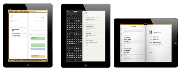
John Gruber says that the tension “between simplicity and obviousness” can be seen in developers getting rid of UI chrome (buttons, toolbars) to make simpler apps, and Apple, which has adopted UI chrome – often, in the form of skeuomorphic elements – to bring obviousness and familiarity to its applications. iCal’s bits of torn paper and Address Book’s pages are obvious, but are they simple?
The subject is complex, and the scope of the discussion is too broad to not consider both ends of the spectrum, and what lies in between. Ultimately, simplicity vs. obviousness brings us to another issue with user interfaces: discovery vs. frustration.
Apple’s (and many others’, with Apple being the prominent example) approach is clearly visible: familiar interfaces are obvious. Everybody knows how a calendar looks. Or how to flip pages in a book. People are accustomed to the physical objects Apple is trying to imitate in the digital world. But are they aware of the limitations these objects carry over when they are translated to pixels? As we’ve seen, this can lead to frustration: why can’t I rip those bits of torn paper apart? Why can’t I grab multiple pages at once, as I would do with a physical book? And so forth. Interfaces that resemble real-life objects should be familiar; it is because of that very familiarity, however, that constraints become utterly visible when pixels can’t uphold the metaphor.
On the other hand, a number of applications are trying to dismantle the paradigm of “skeuomorphism mixed with buttons” by leveraging the inner strength of the iOS platform, and in particular the iPad: the device’s screen. Impending’s Clear, for instance, famously avoided buttons and toolbars to focus its interaction exclusively on gestures. Paper, for as much as its name implies a real-life feeling of actual paper, is the least real-life-looking (and behaving) sketching app of all: sure it’s got paper and a tool palette, but there are no buttons and navigation elements when you are drawing. In Paper, you pinch to go back one level (like Clear); you rotate two fingers on screen to undo and redo your actions. I assume the developers had to use standard sharing and “+” buttons only because they couldn’t come up with a significant breakthrough in associating these commands with equally intuitive gestures.
Which brings me to the downside of simplicity: discovery. Pinch to close and rotate to undo make for a pretty demo and elegant implementations for the iOS nerds like us, but are they discoverable enough by “normal people”? Would my dad know he can pinch open pages and rotate an undo dial? Are these gestures obvious enough to avoid confusion and another form of frustration? Intuitive software shouldn’t need a manual.
There are several ways to look at this debate. For one, we could argue that Apple was “forced” to use skeuomorphic elements to get us “comfortable” with these new devices, easing the transition from computers by imitating other objects and interfaces we already knew how to use. With time, they have realized people are now familiar with the previously unfamiliar, and they are now slowly introducing elements that subtly drift away from real-life interactions. Like the full-screen mode in iBooks, or the sidebar in Mountain Lion’s Contacts app. But there are still some graphical elements decorating Apple’s interfaces that don’t have a clear functional purpose: the leather in Find My Friends, the green table in Game Center, the iPad’s Music app. I think there is also a tension between functionality and appearance, and I believe Apple sees some skeuomorphic UI designs as simply “cool”, rather than necessary means to convey interaction: it’s branding.
The “simple and elegant” interfaces, though, reside in a much wider gray area that’s still largely unexplored. Clear and Instapaper, by foregoing real-life resemblances of any sort, have dodged the bullet of frustration by creating their own standards. You can be mad at Clear’s use of gestures, but you can’t be frustrated because its paper doesn’t act like paper. There is no faux paper in there. The “frustration” this new breed of iOS apps generates can be traced back to the novelty of their interfaces and interactions, not to their legacy. But then there’s a certain selection of apps, like the aforementioned Paper, that are still somewhat bounded to their real-life counterparts and, partly because of technological limitations and established UI patterns, aren’t completely distancing themselves from the familiarity of real objects.
We’re at a point in software history where balance is key. Balance between simplicity and obviousness, discovery and frustration, innovation and familiarity. We’re using software that wants to remember where it came from, but that also strives to touch the emotional cords of a natural extension it didn’t know was reachable: us.
As iOS devices and the ecosystem of apps and developers around them mature and evolve, these dichotomies will increasingly define the interactions of today, and the software of tomorrow.


