Every time I think that there are enough stock and weather apps for iOS, I find a new one. And every time, I think something like “Please, let this one be cool”. Of all the apps that I regularly check out as a possible new topics, just 1% of them is usually worth a try. The rest is rubbish. When it comes to weather and stock apps, though, that rubbish part is also somehow twice as large. It’s as rare as an edelweiss in the Sahara that a new app with such purposes can offer a unique concept. Change by Jon Wheatley, however, is a perfect example of uniqueness and simplicity applied to stock UIs on the iPhone.
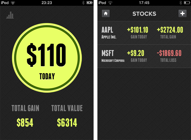
Wheatley reduced his app’s feature set to the question any stock owner always asks himself: have I gained or lost money with the stocks I own? Nothing more, because let’s be honest – more data is typically for the intellectual academics who call themselves stock analysts when reviewing iOS apps. Change is divided in two parts: a main information window, and a detailed list view to add or delete stocks you own. No preferences, no graphs, no predictions – just the current situation of your investments.
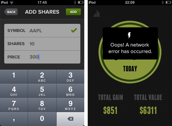
After the first launch, you have to enter the information about the stocks you own. Adding new ones afterwards is just a tap on the top right + button away. In the second panel, you have to type in the amount of stocks you own, the price you paid for them, and the stock symbol (like AAPL) of the respective company. Although the developer kindly implemented number fields for the first two panels, he did not manage to implement a search feature for the symbols, something which is totally common and useful, and definitely needs to be added in future updates.
What follows is an easy calculation in the background. The overall difference (all entered stocks are included in the main window) between your stocks’ value today and the time you bought them is then displayed in a large circle in the center of the screen. If it’s red, you lost money; if it’s green, you gained some. Additionally, you get your total gain (or loss) over time and the total value of your stocks via smaller numbers below the circle.
Tap on the diagram button in the top left corner, and you get to the mentioned list view where you can also add new stocks you recently purchased. Here, a more detailed look at single stocks is provided: you can see which part of your portfolio was more profitable today and over time.
Besides the fact I had to restart Change the first time I tested it (it crashed when I refreshed the calculation by tapping the circle), Change ran flawlessly on my iPod touch 3rd Gen. The simplicity in functionality can also be seen in the app’s UI. There are no distracting tones except for the aforementioned red and blue colorization of the circle. This way, nothing is distracting the user from the app’s purpose: easily displaying changes in stock value. The rest of the app is monochrome and easy to overview – this is mainly the case due to the very tastefully chosen sans-serif typefaces in which the headlines and information are set, and the subtle, but unique background texture.
Change takes the area of stock surveillance into a whole new direction: simplicity. And another great decision Wheatley made with Change is the app’s price: you can get Change for free on the App Store.


