A History of Skeuomorphism In Apple Interfaces
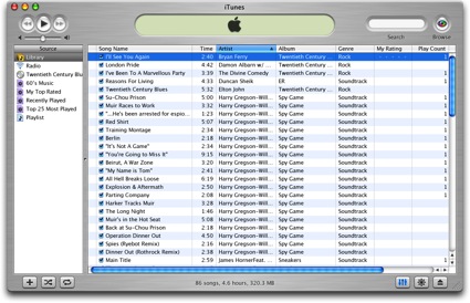
Thomas Brand has published a detailed overview of Apple’s past skeuomorphic designs in applications for classic Mac OS and OS X. As he notes, the trend towards designing apps that resemble real-life objects didn’t start with iOS at all.
As time progressed, the Aqua interface has evolved to reflect the changes in Apple hardware. Gone are the over the top transparencies, deep drop shadows, and distracting pinstripes. Subtle grays, mute reflections, and soft gradients now fill the retina displays of Apple’s latest portables. Some might say that Aqua is not a skeuomorphic interface because it does not resemble a specific real world object. To them I say Aqua is a mirror reflecting back the design decisions that have made Apple’s hardware so appealing over the last 10 years.
In his article, Thomas mentions old software such as Sherlock, the Appearance Manager of Mac OS 8, Apple CD Audio Player, and the Classic Calculator that Steve Jobs famously designed himself with a “build your own” kit created by a former Apple engineer. iOS may not have reinvented skeuomorphism in software per sè, but it surely gave this way of designing apps a whole new meaning and set of interactions thanks to screen constraints and multi-touch.
Check out Egg Freckles’ article for the full list of apps that influenced Apple’s skeuomorphic interfaces.
Image via TUAW


