Since I started to write about UI design and iOS apps again 5 months ago, I became more and more disappointed with the native music player on my iPod touch. During my research, I found many innovative modifications of the iOS table view, and I often wished that Apple will integrate some of them into their system apps, especially their music player. But since Apple is a company that believes in radical minimalism and coherence throughout its ecosystem, this never happened and also won’t likely happen in the future. I tried out many alternatives like GoodMusic, but no app was able to satisfy both my design and usability needs on my iPod touch. Until yesterday. Yesterday, Pixiapps released Ecoute for iOS.
Ecoute for Mac has been the app Pixiapps focused on during the last years. It is a minimalist, easy to use iTunes replacement with iconic UI and many cool hotkey and playback features. I’m still an iTunes guy, because I need a reliable solution for managing my over-1100-record digital music collection. But Ecoute for Mac was the first app which really made me think about switching my desktop music player. And now, Ecoute debuts on the iPhone. Although the app is promoted as “Ecoute for iOS”, there is no iPad version available yet. For me this is not really a problem — I like the semi-skeuomorphic design of the iPad music player very much and was never seriously thinking about replacing it. But when I opened up Ecoute on my iPod for the first time, I immediately knew that this was exactly what I’ve been searching for. I basically want three things in a mobile music player: easy navigation, intelligent gesture integration for flawless in-app movement, and a focus on album artwork. Except for some flaws in terms of navigation, Ecoute measures up to all these requirements.
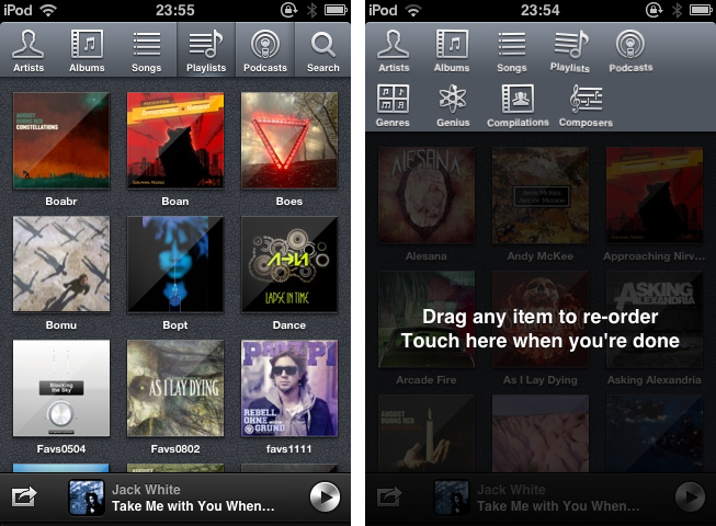
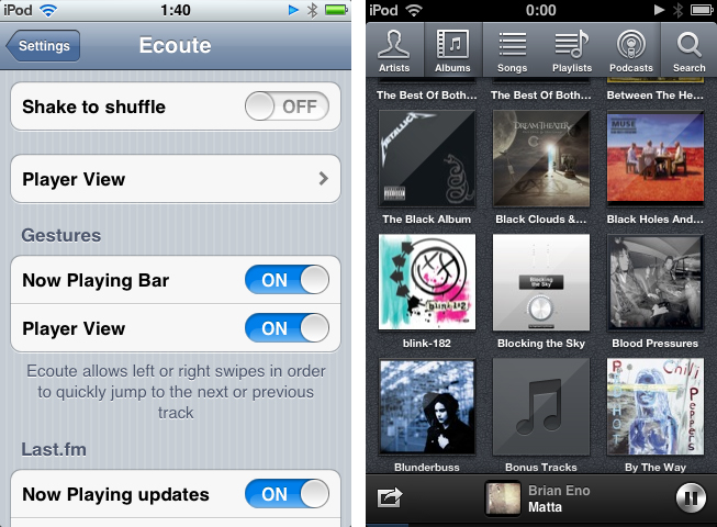
The navigation concept of the app is a good starting point; from here I will move on to the design decisions concerning gestures and artwork integration. Ecoute is designed in a single-screen layout, different from the iPod music player. It fetches all the tracks and information from your synced music library in the system music player, from genres, artist, or albums to playlists and even podcasts. These filter options are available through the top navigation bar. The bar can be scrolled horizontally, making all filter options available with one single tap. This is a significant change when you compare Ecoute to the native app, where you need to customize the bar to get access to you favorite filter options. You need to go into “More” and choose them (besides your four favorite ones permanently displayed in the bar) there. In Ecoute for iOS, you can rearrange the order of the filter icons by tapping and holding one. A black button-pop-down menu comes up, which either lets you play or shuffle the files in the respective category (which basically means playing back all tracks) or rearranging them. The wobbling icons in the rearrange view look nice, but due to the large unused screen space below the enlarged nav bar, the whole UI looks a bit incoherent in this part of the app.
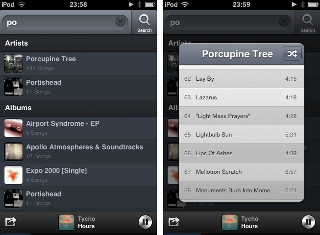
Ecoute enables you to have five different favorite options in the always visible part of the nav bar. Since this end up in one bar element more than in default navigation bars, the icons are designed a bit smaller — but they remain large enough to easily tap on them. In addition to these filter options, Ecoute also offers a search feature. Instead of placing it at the very top of the list view in the main screen area, you’ll find it located permanently in the top right corner. The live search works pretty well — the only problem I have with it is that it solely searches through the currently active filter section. This means you can only search for all songs of an artist when you’re in the artist section, but you cannot go to a specific record of the artists directly form the search panel. Luckily this also has an advantage: with this setting you can easily shuffle through all the songs of an artist. So there are pro and cons with the search feature, you just have to get used to it, and it will work fine.
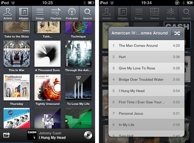
These are all the filtering options, now let’s move on to the really exciting part: the list views of the individual sections. These list views are the main reason why I almost instantly chose Ecoute as my main music player. Its album and artist view just look amazing. When you tap on “Albums” in the nav bar, you get a list of large album covers, not a list view with small previews of the covers and large text. There are three covers in each row, and each of them is overlaid with a rather rough, gloomy visual effect. They are labeled with their title in small letters, so that the artworks is the center stage and the main way of navigating through your music. This is a feature the guys at Pixiapps may have taken from the iPad music player, and they implemented it perfectly onto the iPhone. As I already said, Ecoute is designed in a single screen layout: when you tap an album, you’re not sent to a whole new screen view, rather, an overlay menu smoothly slides in from the bottom which shows you the tracks on the album and gives you a shuffle option in the top right corner. This menu can easily be dismissed by tapping any free space left, right, above or below it. I promise you will never accidentally play a song you didn’t want to hear as there’s so much space to tap on. A very important feature on such a small screen solved perfectly here. The playlist, compilations, composers, and podcast filter options work the same way. Speaking of podcasts, Ecoute is able to display how many episodes of your subscribed shows you haven’t listened to yet, even when you sync them with Apple’s new Podcast app.
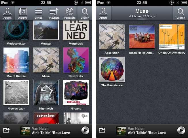
Obviously, the song filter looks different compared to the album view. Here the developers couldn’t avoid to use a “classic” list view. Although this is widely considered as a design pitfall, they made the individual list elements a bit smaller to fit more songs onto the screen to avoid a lot of scrolling. To me this is a welcomed decision here since it makes browsing through a large song library easier. Browsing through artists and genres works a bit different too. To firstly browse artists or genres, and afterwards the albums of the respective selection, you need a second view between the main list and the tracks, displaying multiple albums. When you tap on an artist, the new view appears, supported by a stunning zooming transition which smoothly crossfades the two viewing areas. The top nav bar changes and now displays the artist, including how man records and tracks you can choose from. In the main viewing area you get a list of the albums you can listen to. From this point on the interface works just like the album view: tap one and you’ll get a track list sliding in.
However, one feature is still missing, right? You guessed it: the “Now Playing” window. This part of the app is my second personal highlight, because of very cool gesture integration. When you select a song, it obviously starts playing. Since Ecoute “only” plays back your system music library, you can still use the system-wide controls for volume, back/forward, and play/pause in the multitasking bar. In the app’s settings, located in the system preference panel, alongside options to set up sharing features, you’ll find the settings for supported gestures (I’ll come to those features later), and the “shake to shuffle” feature.
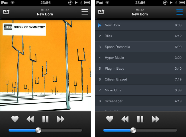
Ecoute has two different player views: a full-screen one just like the system player and a stripped down version of it in the bottom nav bar. Remember, this space got free because the filtering options have been moved to the top. In default mode, only the bottom nav bar changes when playing a new song, so you can immediately continue browsing. You can also activate the “classic” full screen player view to be activated when you tap on a song.
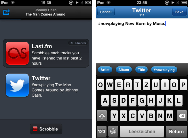
It makes more sense when you see it but both players include more or less the same features. In full screen mode, everything works as expected: in the bottom you find the play/pause and back/forward buttons, volume control, and AirPlay settings if available. Additionally you can set up two social network sharing options: last.fm and Twitter. If you connect Ecoute to last.fm, the app automatically scrobbles all the tracks you listened to every 2 hours in the background. You can also instantly like a track using the heart next to the main controls. To tweet about a track, tap the share button in the top left corner, and a new menu slides in. The Twitter integration connects to all your accounts available in your system settings. You can switch between them using the “linked”-button in the top right corner of the Twitter list element. Using the settings button in its lower right corner, you can modify your tweet in a nice custom view, including auto-fill-in of information like the artist, track title or the “#nowplaying” hashtag. Then tap tweet and all your followers know what you’re currently listening to.
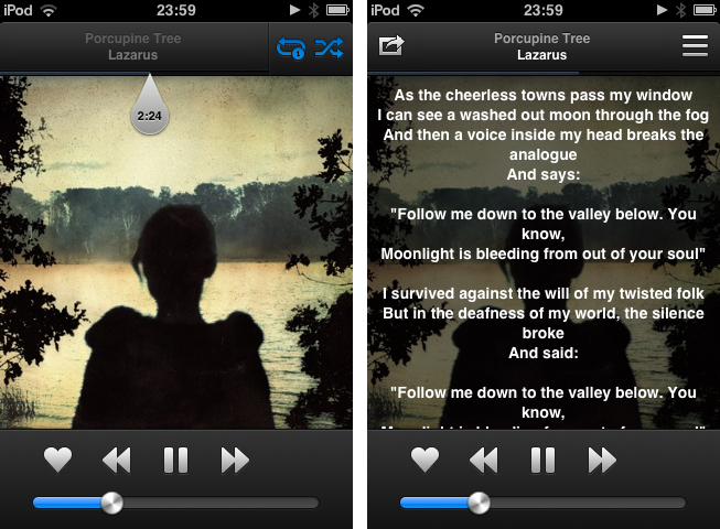
Below the title bar, you’ll find a (in my opinion a bit too small) blue song progress indicator. To scroll to a specific point in the track, tap the track information in the middle of the bar once. It slides a bit to the left and reveals a large, grey, scrollable time indicator plus two buttons to toggle shuffle and repeat modes. If your song information contains lyrics, Ecoute can display them by tapping on the cover. And if you want to switch to a certain track on the album, tap the list button in the top right and the cover will turn, just like in the system music player, revealing the album’s complete track list.
So, about those gestures… When you’re using the full screen player, you will notice that one thing is missing: a back button. Instead of this standard element, you find the sharing options in the top left corner. So, how do you get back to the main music window? The answer is as simple as it is great: with gestures. Just swipe down, and the player will slide down, becoming the mentioned player interface in the bottom nav bar. The sharing button, the progress bar, and the song title will stay the same. You can also still tap on the information to bring up the progress indicator and the shuffle/repeat buttons. But the list button has changed to a gorgeous-looking, stainless steel play/pause button. This nav bar player interface stays there wherever you are in the app, so you won’t need to tap twice to pause a track like in the system player with the black “Now Playing” button. Plus you can still switch between tracks. Just swipe left for the next and right for the previous track. These gestures also work in the full screen track view. Believe me or not, they feel even better with the nav bar layout, because they just work, even though the interface you have to execute them on is so small. You can browse your music library, and do not have to interrupt your flow to change or pause the track you’re listening to. And you will not accidentally tap on that “Store” button like in the system music player when coming back from the “Now Playing” window since Ecoute doesn’t have one.
And let me say this again: the UI this is all packed into is so awesome. Besides the quite obvious cool design elements like the album view, the custom pictograms in the top nav bar, or the unique, flawless transitions (e.g. when activating the search field or when dragging the music player down), you have to look at all the small details. Take your time to look at the almost invisible LED indicators on the activated filter element, how the grey time indicator changes shape when reaching the outer edge of the screen, or the custom alphabetical scroll option which just appears when you really need it to quickly go to a song. And look at the indicators for unplayed podcasts. Then look at that gorgeous icon. This is what caring about good UI is really about. Thinking about what level of playfulness is healthy for the user experience, how it can serve the user and how it can make his day. Thinking about how you can mix simplicity with aestheticism. And really, fellow iOS nerds at Pixiapps, you not just made my day, but also my week, and maybe even my month. This is the best music player for iOS I’ve ever came across!
From now on, Ecoute for iOS is my new default music player for iOS. Its UI features every design decision I ever wanted to have on my iPod touch. Plus, it eases up changing and pausing tracks while browsing through your music library, something I often do while I’m on the go. I can’t wait to see this thing on the iPad as well. If you’re a music and design enthusiast like me, or just dislike the system music player on your iPhone or iPod touch, you have to try it out. Ecoute is available for $2.99 on the App Store.


