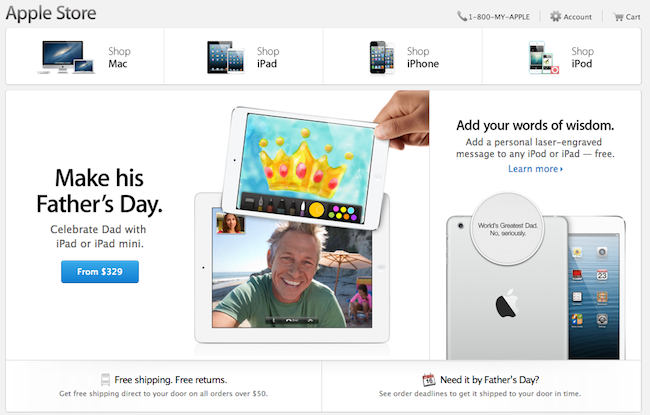
Apple rolled out a series of design changes to its online Store overnight, bringing a cleaner, more subdued style for graphical elements and larger, image-centric spots for products and accessories.
The most notable change is the front page of the Store, which now eschews a sidebar to present a full-size view of products with varying sizes. The old design featured evenly-spaced thumbnails for Apple products and third-party accessories with two sidebars with additional navigation options and information; the new one employs larger images, retaining navigation for the main “Shop” sections at the top and in the footer. Interestingly, in the refreshed homepage launched today, the only image showing a Mac is the “Shop Mac” link at the top.
Design tweaks have also been rolled out in several other areas of the Store, such as the Accessories page. The old design relied on a main product list with small thumbnails and a sidebar containing clickable links on the left side; the new one takes a more visual approach with a landing page featuring larger tiles of products, a new sidebar on the right, and a larger grid for accessories in each category.
The Apple Store follows a series of recent design tweaks Apple brought to some of its products and services – notably, the company sent new iTunes promotional emails with a cleaner look and more focus on content yesterday.
For comparison purposes, we have captured screenshots of the old online Store design using the Internet Archive. You can view the full-size images by clicking the links below.


