Reeder had a rough transition to the post-Google Reader world. Following the shutdown of Google’s RSS reading service on July 1 (something that Google had announced in March), Reeder – one of the most popular, if not the most popular Google Reader client for iOS – received an update to add support for Feedly and Feed Wrangler on July 2, but developer Silvio Rizzi couldn’t ship updates to the iPad and Mac counterparts in time. For this reason, after making Reeder for iPad and Mac free downloads, Rizzi was forced to remove them from the App Store, promising that they would come back, eventually, with support for new RSS reading services.
A household name of the iOS third-party scene, I first reviewed Reeder 1.0 back in 2009 and followed the app’s evolution as Rizzi found himself developing a client used by hundreds of thousands of Google Reader users. Rizzi, an indepedent developer from Chur, Switzerland, has always maintained a fairly slow pace of updates and releases, taking his time to bring Reeder to the iPad (the app wasn’t ready on April 3, 2010) and to the Mac. After a lack of updates that endured seven months, Reeder for iPhone made a comeback last year with Reeder 3.0, which started moving away from Google Reader – possibly prescient of disruptive changes coming to the service – with support for Shaun Inman’s Fever. And yet, after version 3.0 hit the App Store, Reeder went silent again, leaving many wondering as to whether it would ever see substantial updates again.
Reeder 2, released today at $4.99 on the App Store, is a new app that aims at making Reeder ready for the new era of RSS readers but that, at the same time, keeps one foot in the past with familiar interface choices and functionalities.
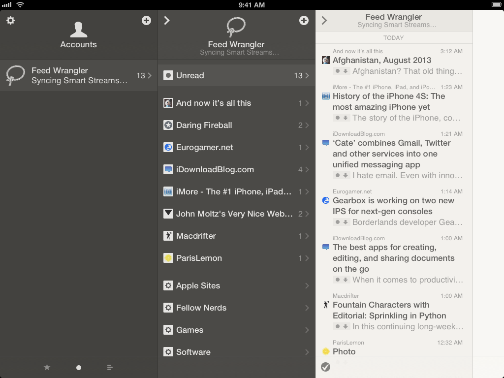
Reeder 2 is a Universal app for the iPhone and iPad. Like the old Reeder, it supports Readability, Fever, Feedbin, Feed Wrangler, and Feedly as reading and sync services, plus local RSS subscriptions with no syncing. With this update, Reeder adds support for Feed Wrangler’s Smart Streams and can now open links in Google Chrome (using Google’s implementation of x-callback-url to easily go back to the app). And this is exactly my main issue with the new Reeder: aside from a few, and relatively minor, new features, it’s still the same Reeder.
The app has received a fresh coat of UI paint, which is most notable on the iPad version: prior to today’s release, Reeder for iPad had largely remain stuck on a design that Rizzi first crafted in 2010, and which was starting to show obvious signs of time. In fact, the new Reeder released today started as an iPad-only update, but Rizzi liked the new design and structure so much he decided to bring it to the iPhone as well.
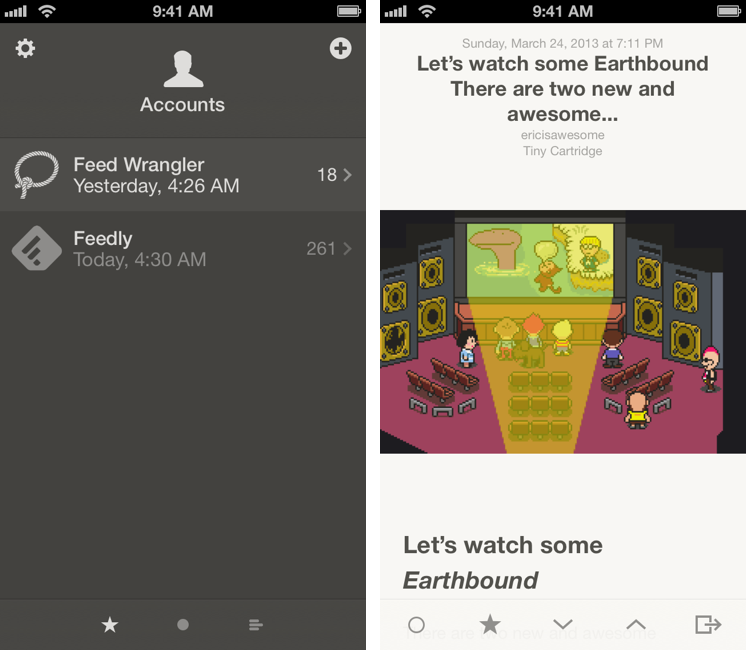
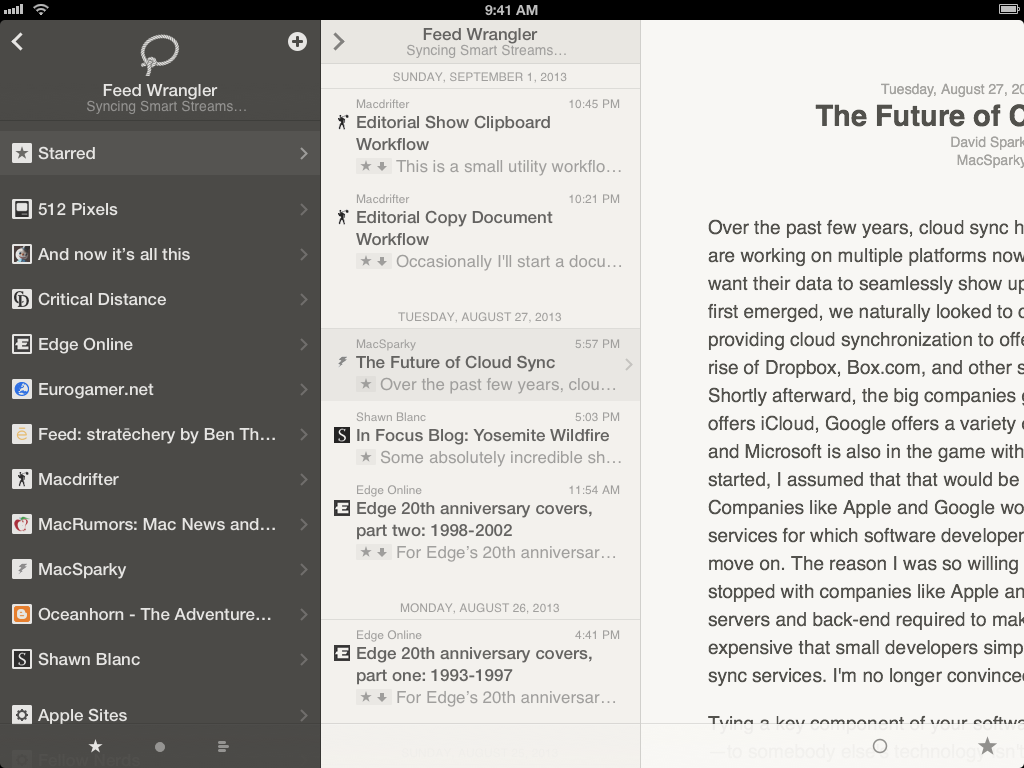
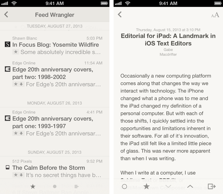
Admittedly, the new Reeder is quite beautiful to look at. Ahead of iOS 7’s release, Rizzi has gotten rid of all faux leather and paper textures that used to adorn Reeder but kept the app’s basic design scheme, subtly transitioning it away from a sepia theme and onto more subdued light and dark gray tones. Tab bars are now semi-transparent, and certain elements of the UI are delightfully animated with bouncy physics and effects that not-so-subtly hint at making Reeder an app that fits with iOS 7’s general aesthetic. Reeder is an iOS 6 app for now, but it doesn’t look out of place on iOS 7. The interface is lighter and more neutral, but Reeder hasn’t lost – in terms of interaction and visual appearance – the unique playfulness that distinguished it since 2009. If anything, there’s even more of it.
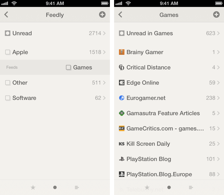
The app’s main screen is now a dark gray list of all your configured accounts that shows Reeder’s typical Starred/Unread/All Items filters at the bottom. A change that immediately stands out is how, in this new version, tapping on the tab bar filters displays a quick animation that briefly shows the name of the filter before going back to only showing the icon. It’s a small touch that, however, is part of Reeder’s collection of characteristic small touches.[1]
A change that isn’t equally immediate to understand is the new pull to refresh mechanism: eschewing Apple’s default implementation of pull to refresh, Reeder 2 lets you pull down the entire content area or the top navigation bar to start a refresh. I like how pull to refresh works in Reeder, and the fact that the title bar can be dragged to cover content below is somewhat reminiscent of iOS 7’s focus on hierarchies and layers as well. From a functionality standpoint, the best part is that individual sections can be refreshed with a pull gesture, so you’ll be able to, say, update a single a Smart Stream or website’s feed depending on the section you’re viewing. To go back to the main Accounts screen – another new gesture of Reeder 2 – you can tap & hold the Back button in the upper left corner, a choice that reminds me of similar shortcuts in Twitter clients like Tweetbot and the old Tweetie.
The way feeds and items are organized has stayed the same. Each account can be browsed by Starred, Unread, and All items, and each section will show all feeds or tappable website names and folders/streams. Tap on an item in a list of feeds, and you get a reading view; tap on the headline, and you’re taken to a built-in browser. The basics are unchanged. For Feed Wrangler, Smart Streams are shown below websites – a decision that I don’t like as I prefer having streams as top-level items I can easily access rather than folders tucked away at the bottom of the screen. For folders, a new option lets you choose to open them as a list of websites or items with a swipe gesture.
There are some new design and interaction aspects to consider in Reeder 2. Reeder is now entirely based on a panel navigation that lets you swipe from the edges of the screen to go back and forward in the app. Inspired by Apple’s new Back gesture for iOS 7, you can swipe from the right edge to move into a section – like from Unread feeds back into the browser – and from the left edge to discard the current view and go back. This works especially well on the iPad thanks to the device’s larger bezels, and it contributes to making the app feel like a modern version of Twitter for iPad (one of my all-time favorites).
Reeder has its distinct “weight” for animations and physics: you can tell that the app was built with iOS 7 in mind, but it also feels different than Apple’s apps on iOS 7. To me, it’s sometimes “heavier” in terms of how panels bounce and stack on top of each other, but also fluid and more responsive than most iOS 7 apps I’ve tried to date. And, again, Rizzi built this on iOS 6, with old APIs – but it shows that iOS 7 is now making developers and designers think in a different way about their apps and how their interfaces move, slide, fall, and open up.
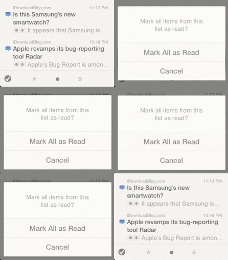
Reeder has always been a champion of polished design and focus on content, but, today, all the pieces just seem to make more sense: the way the “Mark All As Read” dialog unfolds and pops up, or how the quick toggle gestures bounce off the edges of a list and display a small banner at the top, or how switching between articles quickly slides content up and down in the right panel – everything feels more “real”, the various parts of the design better connected together. Of course, I can’t tell with absolute certainty after two weeks of testing if these animations and custom transitions will have their novelty effect wear off over time, resulting in an annoying experience such as several parts of iOS 7. For now, I can say that they look fast enough and they give Reeder a unique personality that can’t be expressed in static screenshots. Now more than ever, the App Store should allow developers to post quick videos of their apps alongside screenshots.
Perhaps the biggest UI-related new feature is the new sharing panel, which can be activated by swiping from the right edge of an article or browser view. The panel contains sharing options such as Twitter, Chrome, Mail, and Pocket, and it can also be opened by tapping an iOS 7-inspired sharing button. The gesture, though, is faster than reaching out to the button, and it can be activated, both on the iPhone and iPad, on any portion of the right edge of the screen.[2]
But the sharing panel is also the reason why I can circle back to my initial thoughts, and note how, design polish and tweaked animations aside, Reeder 2 hasn’t changed much from Reeder 1. In the age of fully customizable sharing menus, Reeder 2 still comes with a few options that include things like Zootool and Delicious; the way feed items are organized has stayed the same, with Rizzi not experimenting with new ideas such as popular posts or search; the app looks great, and I’m glad I can now open links in Chrome and browse Smart Streams, but I don’t think it would be too absurd to call the debut of Reeder 2 a fancier Reeder 1.
And maybe that’s a good thing for you. Especially if you’ve been waiting for an update to Reeder for iPad, maybe a redesigned Reeder that doesn’t go crazy with new features but that instead brings a cleaner reading and syncing experience is exactly what you wanted from Rizzi. Reeder 2 is a fine piece of software – it certainly looks and works better than the majority of RSS clients on the App Store – but my hope was that Rizzi would include new functionalities in the sharing[3] and browsing departments. I guess that, with Reeder 2, I was expecting the same impact that Reeder 1 had in 2009, whereas what I found was a beautiful, solid, but familiar (and trite, in some areas) take on the same app.
Personally, I am using Reeder as my RSS app of choice on the iPhone, but I am keeping Mr. Reader on the iPad. In spite of Reeder’s design and animations, the iPad is where I get my work done on a daily basis, and, being RSS a big part of my link discovery and posting workflow, I need to have an efficient, powerful app like Mr. Reader. It doesn’t look as good as Reeder does, but it allows me to read and share items faster[4] and more conveniently. This is why you should consider what you want from an RSS app for iOS, and not follow my advice blindly.
I believe that the best thing Rizzi has done with Reeder 2 is giving himself a new foundation to build upon. Reeder 2 may not be significantly different from Reeder 1 for now, but the interface choices and focus on gestures bode well for future updates aimed at a) making the app feel at home on iOS 7 and b) enhancing the app’s functionality to move beyond the feature set of Reeder 1. Of course, you shouldn’t buy apps based on what they may become with updates, but it’s an aspect worth considering.
The importance you give to the fact that Reeder hasn’t changed much depends on whether you think Reeder should have changed in the first place. On the iPhone, I welcome Reeder’s new version as I think it’s still the best RSS reading experience available on the App Store; the app’s new fast animations and one-handed gestures make Reeder for iPhone a great way to quickly check and manage RSS feeds. On the iPad, I am going to stick with Mr. Reader.
I am also conflicted because, if you consider the app’s new gesture and design direction, Reeder’s overall experience could be considered the fundamental feature of version 2. I can’t stress enough how the app’s transitions, animations, one-handed operability and details contribute to making Reeder a pleasure to navigate, especially on the iPhone. But, speaking from my personal experience, I still find myself wishing there was more. Imagine if Apple simple decided to redesign iOS 6 and add animations to it without enhancing it with powerful new functionalities such as Control Center and background refresh, and you get my concerns with Reeder 2: it’s new and pretty, but it also feels the same.
Reeder 2 is, visually speaking, ready for iOS 7, and I hope that it will start receiving iOS 7-specific features soon after the OS’ release. Looking ahead to Reeder’s future, it’ll also be interesting to see if Rizzi will have his own “back to the Mac” moment with Reeder 2 for Mac, expected to have a public beta. If Reeder’s iPad-inspired past is of any indication, I’d start getting used to Reeder’s new iPad UI.
Today, Reeder 2 is a beautiful and familiar app that could have taken bigger risks.
Reeder 2 is available on the App Store.
- Another one: I love how, on the iPhone, swiping down to move to a higher article makes the top navigation buttons slide off the screen and a Control Center-like arrow slowly appears to move to the previous item (it’s the same when you swipe down to move to the next item). It’s such a lovely detail, Shawn should consider it. ↩︎
- The same side-panel is also used for displaying an image’s contextual menu and the font settings. Surprisingly, Reeder still doesn’t come with an option to tweak margins (which I find to be too large on the iPad for my tastes). ↩︎
- Evernote and Pocket sharing doesn’t even use the new authorization systems for iOS apps that integrate with the services. ↩︎
- For me, Mr. Reader is also faster than Reeder at fetching Smart Stream items from Feed Wrangler. Reeder also gets regularly stuck with “syncing Smart Streams”, which often don’t display the same sets of articles as Mr. Reader, ReadKit, or Feed Wrangler’s website. This needs to be improved. ↩︎


