Earlier today, Apple released an update to the official Remote app for iPhone and iPad that brings an iOS 7 redesign and support for the latest version of iTunes. While I wouldn’t consider myself a heavy user of Remote, I like to keep it on my iPhone for those times when I have friends over for dinner and my MacBook is playing music in the background. The new app doesn’t come with groundbreaking new features but it’s got some iOS 7 design decisions worth pointing out.
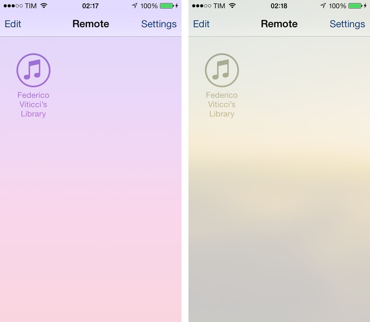
First, the main Remote screen. Available after an initial setup process that lets you pair an iPhone or iPad with a Mac, this screen lists all available devices and libraries you can connect to. In Remote 4.0, Apple uses the user’s Home screen wallpaper as background, which can lead to interesting color combinations as shown below.
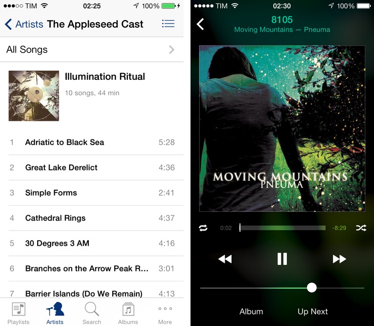
The iPhone’s Now Playing screen is interesting as it shows a series of iOS 7-inspired UI choices that make it, in my opinion, superior to the same screen in the Music app. Navigation between remote sections is fairly similar to Music: there are tabs at the bottom for Playlists, Artists, Search, and Albums, and you can tap the More tab to drag & drop other sections. Items are listed vertically with thumbnails, and albums are grouped inside each artist. There’s nothing revolutionary here.
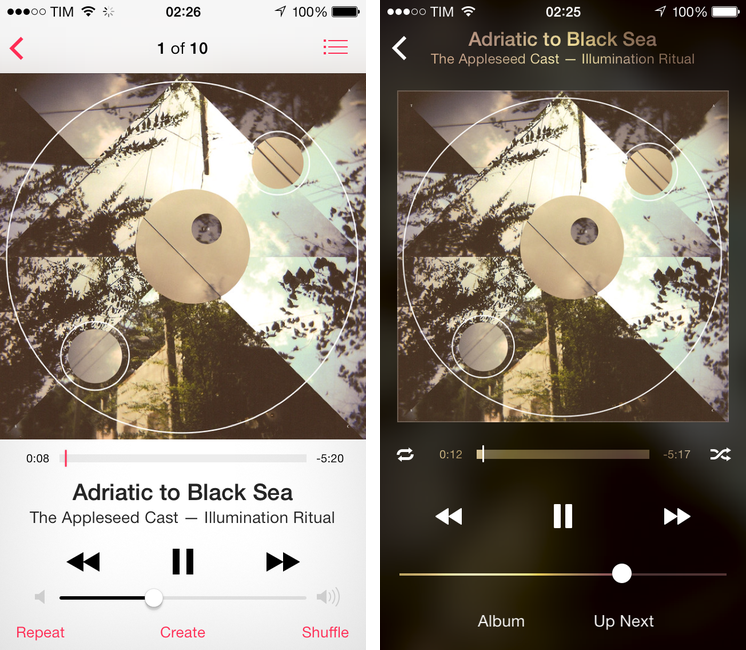
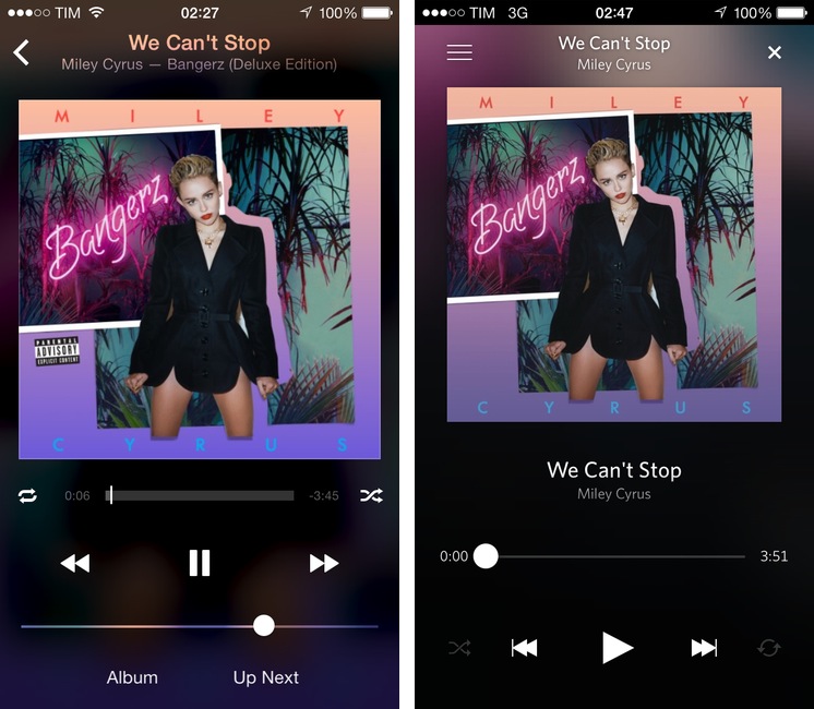
When you tap a song to make it play on a remote library/device, however, you’ll notice that the Now Playing screen eschews the Music.app design and embraces blurred album artworks and transparencies.
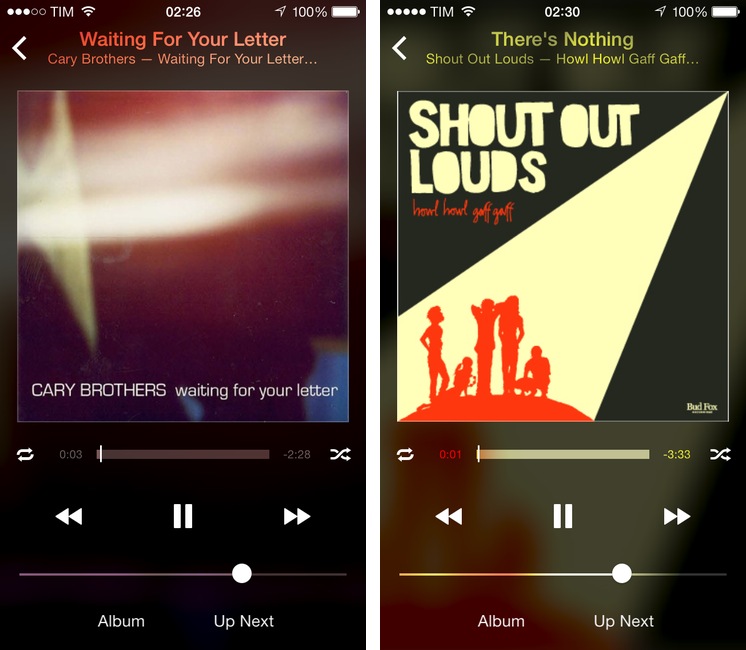
Artworks are front and center, with a song’s name going up in the title bar (replacing song order) leaving controls below the artwork. Tap it, and the song name fades to show rating controls. At the bottom, there are buttons to access an album’s entire list of songs and Up Next. Every non-button element (song name, volume slider, progress bar) uses transparency to show what’s underneath; the entire background of the Now Playing screen is a (zoomed in) blurred album artwork that, through color, affects what’s above.
I’m a fan of the use of color in iOS 7 to provide context to the user, and I think that Remote’s Now Playing screen offers a mix of form and function that is visually intriguing and nice. The more I look at it, though, the more it reminds me of something else.
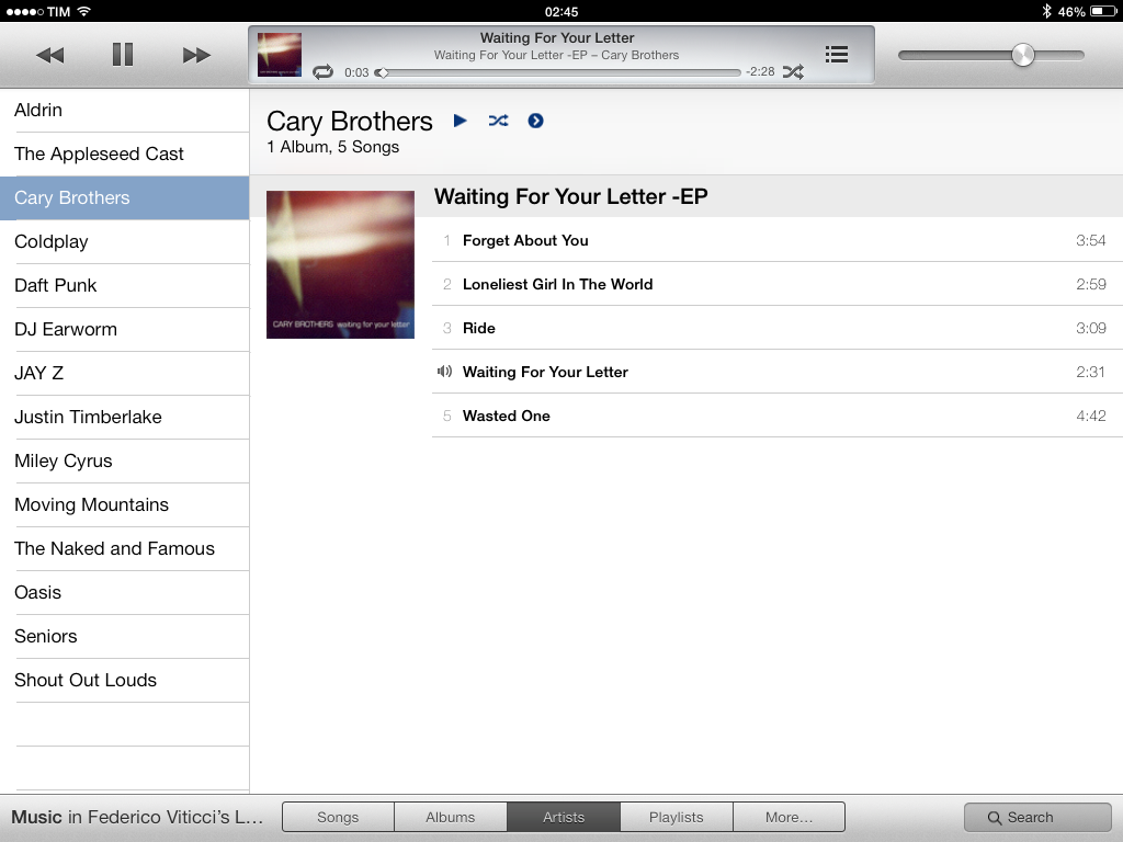
The iPad app is weird. Aside from sloppy bits of UI (try tapping on the More tab and look at the popover on an iPad mini), it awkwardly mixes desktop metaphors with iOS 7 ideas that can’t live together.
The app is a mini iTunes for Mac inside an iPad screen, but the Now Playing screen is an enlarged version of the iPhone’s one. The main window is reminiscent of the iTunes window on OS X, but the tabs at the bottom are flat and they open iOS 7 popovers when tapped. The app isn’t bad per se, but it feels unfinished – something that isn’t uncommon on iOS 7 for iPad.
iOS 7 must have been a massive undertaking for Apple designers and developers, and I’m glad that most of the company’s apps have been updated for the new OS.1 While I like that Apple is experimenting with different UIs across their apps, it also feels like teams inside Apple are still finding their voice for iOS 7 design, producing user interfaces that are often enticing, generally rough, and occasionally just downright ugly. The new Remote app is a good example.
-
Notably, iBooks still isn’t iOS 7-ready. That is strange. ↩︎


