Released today on the App Store, Dropbox 3.0 is a complete redesign that gets the app ready for iOS 7.
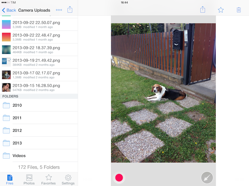
Two months after the release of iOS 7, the new Dropbox shows the work of designer Tim Van Damme, who left Instagram to join the Dropbox design team earlier this year. “Dropbox 3.0 is all about your content. We stripped out as much branding as we could, just so you can focus on what’s important”, Van Damme told me. Noting how several functionalities and interactions have been simplified in this update, he mentioned how, for instance, documents and photos are easier to enjoy in full-screen: “On your iPad, it used to take two taps to see a photo full-screen. Now, a single tap will let you enjoy your photo full-screen, and this also works for most other file-types”, Van Damme added.
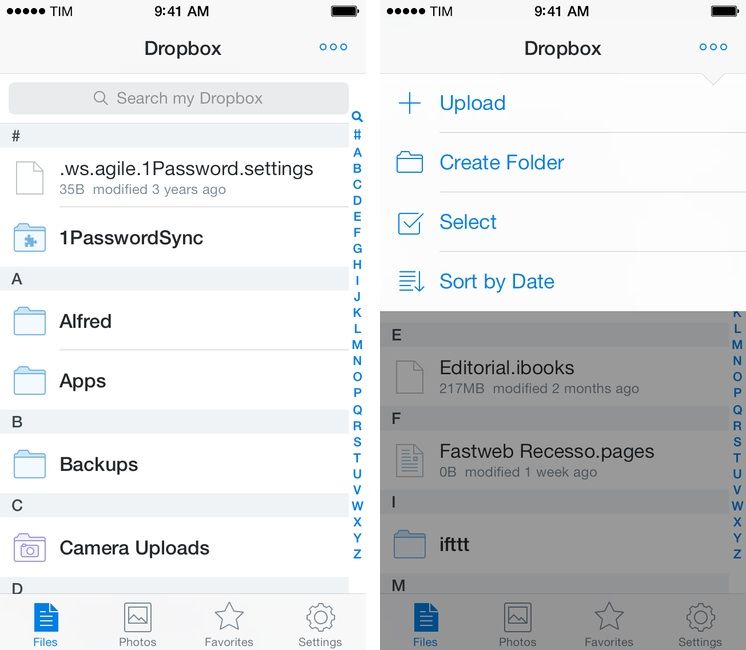
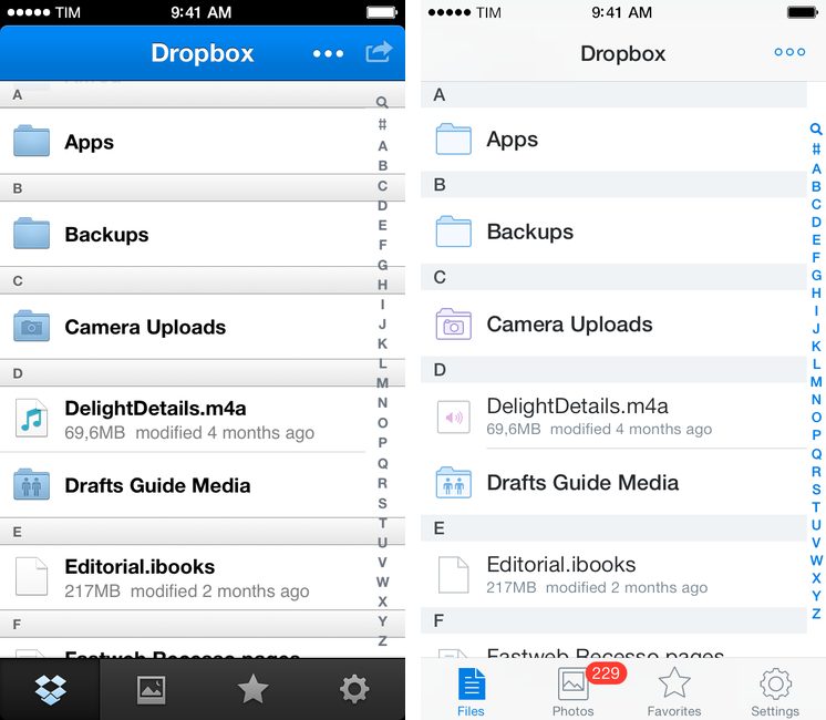
The basic structure of the app is unchanged, with four tabs at the bottom to navigate your files, view photos, open favorites, and access the app’s settings. The new Dropbox still works like the old one: you can swipe files and folders to bring up an action bar with sharing options and move/delete shortcuts, you can upload items from your device’s media library, and you can sort your list by date or name. The features are the same, but each area of the app has been redesigned with crisp new icons for folders or file types that fit with iOS 7’s aesthetic but still are uniquely Dropbox-y.
One of my favorite details of the app is the menu to upload files and create folders: in the old Dropbox, there used to be a popup and separate buttons to sort and select files; in the new app, everything’s been unified in a single dropdown that slides down from the top of the screen. The use of other popular iOS 7 visual techniques, like transparencies and custom transitions, is sparse, but effective.
There is, indeed, a noticeable focus on content (your documents and folders) rather than heavy toolbars, highlights, or textures in Dropbox 3.0. Like many other iOS 7 app updates released to date, the app almost seems to disappear into the OS thanks to light navigation bars and lists, leaving room for document icons and thumbnails. “We wanted to clean up a bunch of stuff, and make sure the app is a solid foundation for all the new features we’ll be shipping in the next couple of months”, Van Damme told me, noting how support for personal and business accounts (announced last week and coming soon) is a good example.
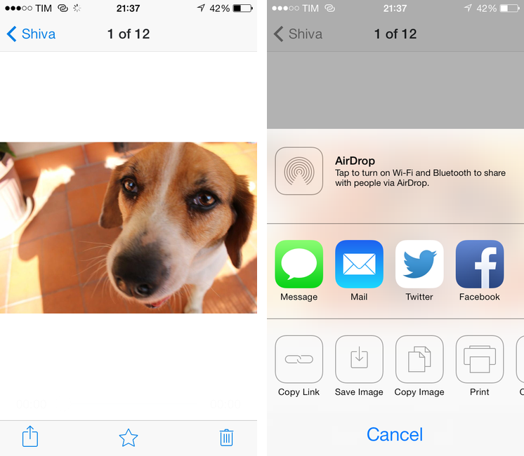
A small addition that I like is that the app now uses native iOS share sheets instead of a custom list of buttons for things like “Open In” and “Copy Link” – the menu is consistent with other iOS apps and it’s easier to use.
Dropbox 3.0 doesn’t revolutionize the app, and if you’re looking for a more powerful client with advanced functionalities, Boxie still gets my recommendation. For everyone else, Dropbox 3.0 is a nice update that is faster, looks good on iOS 7, and prepares the app for future additions. You can get it on the App Store.


