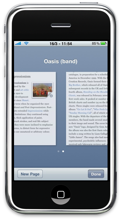
I’ve always wished there was a decent Wikipedia client for iPhone. A well designed, feature rich, clean, simple, fast Wikipedia client, not that crap they sell for 3 bucks and it’s dubbed as “The Ultimate Wikipedia Client for iPhone, It Will Make You Smarter!”. I wanted something with a great typography, focused on readability, that could remember my position at every launch but, most of all, that would allow me to keep multiple entries open at the same time.
Thank God I wasn’t the only one who wanted the perfect Wikipedia app, and I believe we couldn’t ask for any better, considering the developer who realized it. Sophia Teutschler from Sophiestication.com (developer of Coversutra, Tipulator and Groceries - no, you couldn’t ask for anyone better than her) has just released her new application called Articles which is hands down the new, best Wikipedia client for iPhone.
Why? Read on to find out why and get your credit cards ready.
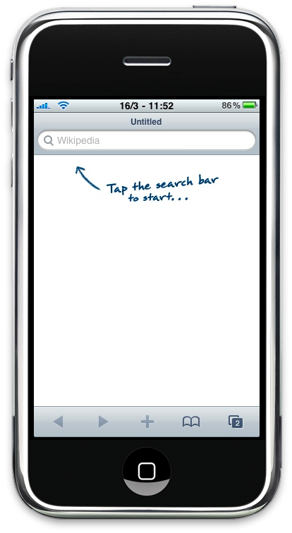
Articles’ purpose is that to provide the best way to browse Wikipedia on your iPhone, period. No frills, it just works - somebody would say. Sophia aimed at making Wikipedia look better and feel better on the iPhone, and she got it right at first shot. With Articles you can access all the Wikipedias out there, obviously including the English one powered by over 3 millions of articles; but anyway, if you feel so brave to read the Turkish one, you can. (For the record, I’m using the English version as it’s way more accurate than the Italian one). There are no settings to play with, everything is inside the app, and if you want to change language you just have to start a new search and tap on the version you want. It’s that easy.
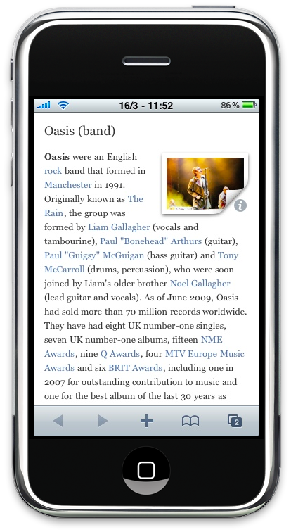
Indeed, there’s no much to talk about how it works, not as much as how it looks and what it does. Fist, Articles looks great. From the toolbars, to the menu icons and pages, everything is kept clean and crisp, just as Apple itself designed the app. The top and bottom toolbars actually reminded me of the iPad UI (probably because of the “snowy” color) and I can’t help but loving them. As for the reading experience, Sophia opted for a serif rendering, which really helps in reading long paragraphs or entire entries, at least for me. You can of course increase and decrease text’s size by zooming and pinching, and the process is quite fast. From the article view is also possible to lock and unlock the orientation of your device with a “pull to” menu similar to what happens in Tweetie 2.
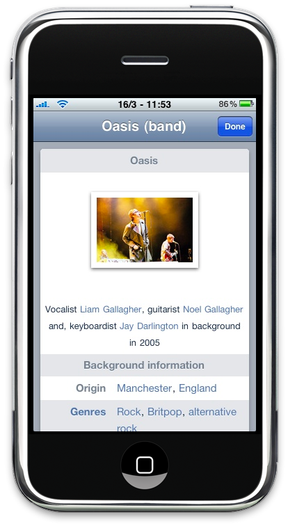
But what about articles that contain images? The implementation is clever here as well. If there’s an image (or more) inside an article, just tap on it and the app will focus on the image bringing it on top, loading it at full res and, lastly, it will let you copy it or save it to your camera roll. Perfect. I wish there was some kind of gallery view to browse multiple images within the same entry, and perhaps that’s coming with an update in the future. You might also notice that some images have a little “i” next to them and, indeed, those are the images included in the “sidebar view” of Wikipedia.com, which has been successfully ported to the iPhone. Tapping on that kind of image will open the “sidebar”, with all the clickable links inside and, of course, the original image you wanted to see.
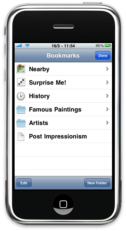
The other great features of Articles lie in the bookmark button you can see in the sidebar. From here you can access your history, nearby entries (uses Geo location and Google Maps), create bookmarks and folders, be surprised with random articles. Also, you can create folders within folders, thus making possible to reach the perfect level of Wikipedia organization, if you’re that kind of reader that saves everything for future reference.
Articles is the best Wikipedia app for iPhone, period. It’s beautiful, fluid, feature rich, clever and focused on high readability. Available at $2.99 in the App Store iTunes Link, it’s one of those purchases you won’t regret. And if you’re a daily Wikipedia reader, you can’t ask for anything better right now.


