Soon after WWDC ended in June, I wrote a piece for MacStories in which I briefly summarized all the new features Apple added to Accessibility in iOS 8. Since then, I’ve spent a lot of time with the iOS 8 beta builds over the summer, and have found several features and little touches – even some things that aren’t specific to Accessibility – that merit a more detailed look. What follows are my personal impressions of such.
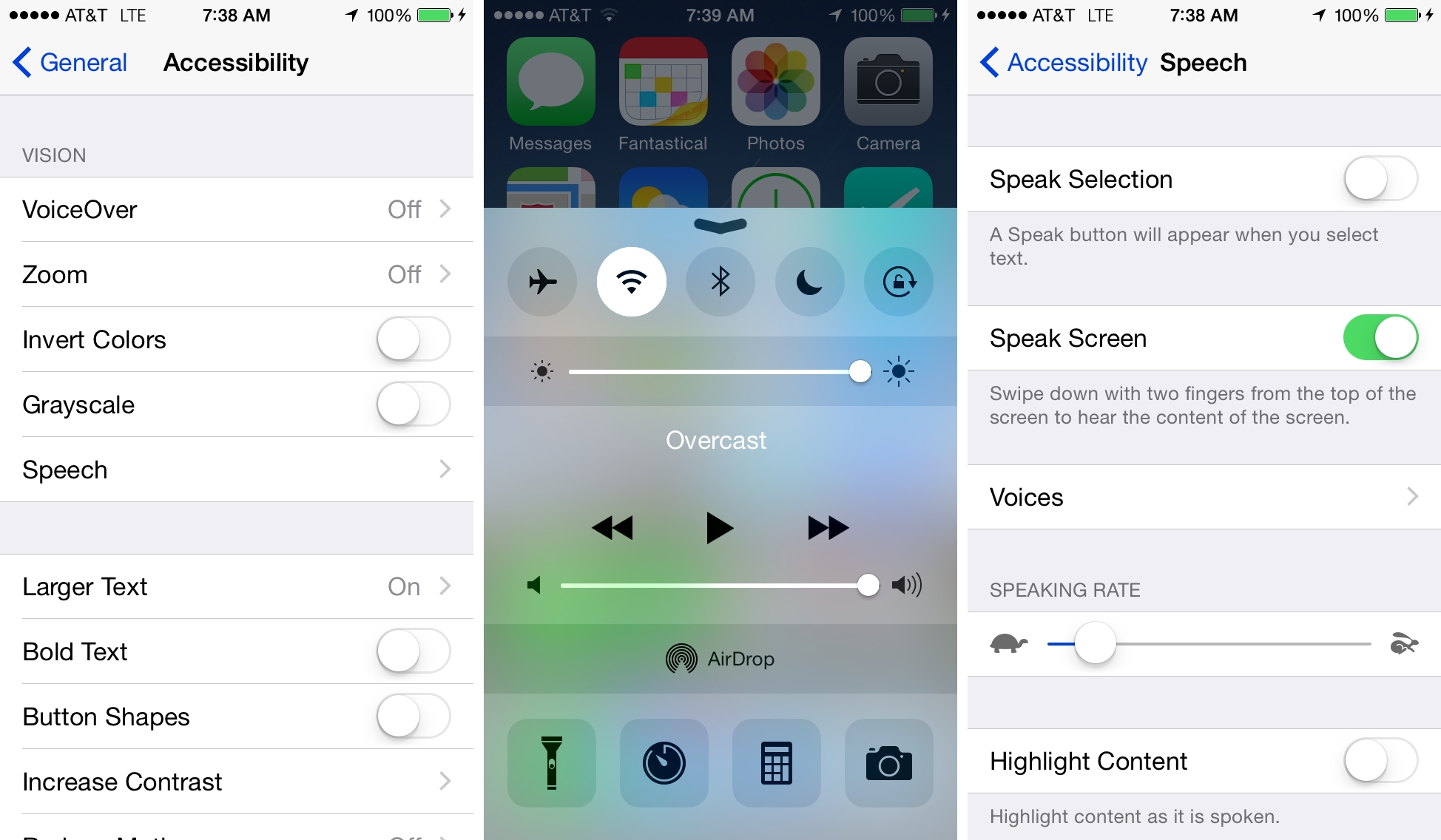
Speak Screen. As I wrote in my overview, enabling Speak Screen will, as the name implies, speak whatever is on screen. After turning it on in Settings, a two-finger swipe from the top of the screen will bring up an overlay that looks like this:
From this interface, you can control the speed of the voiceover (tortoise for slower, hare for faster), as well as pause, rewind, and fast-forward playback. Tapping the chevron in the top-left corner will minimize the window, while tapping the X In the opposite corner will close it. You can also reposition the window by dragging it up or down to wherever is most comfortable. The overlay is nicely done: Apple’s use of the tortoise/hare icons for speed is a clever nod to the classic Mac’s iconography, and the touch targets of the buttons are big enough to comfortably see and tap.
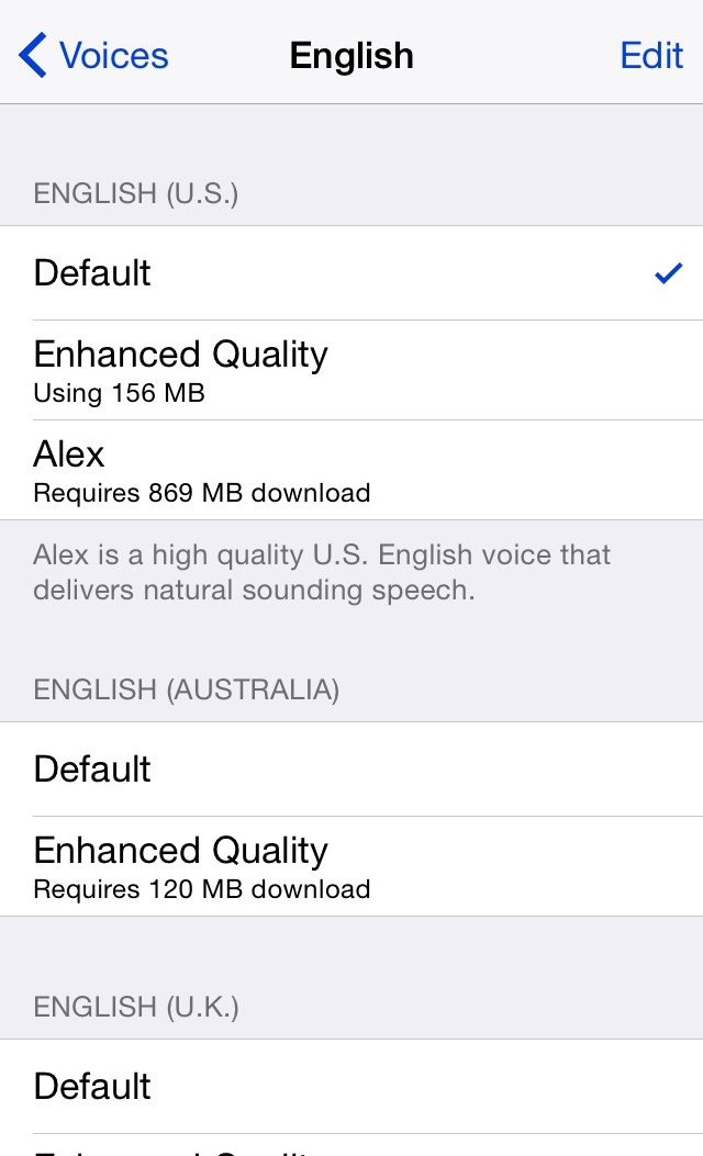
Alex. In iOS 8, Alex replaces the robotic-sounding voice that controls VoiceOver, et al, and the result is a much more pleasant and understandable voice. Like with the Dictation system on the Mac, Alex requires a download – in this case, 800MB. It was a little surprising at first to learn that you needed to first download Alex in order to use it, but download I did and it was fine. (In fact, all of the voices in various languages have an “Enhanced Quality” version that requires a download.) In addition, users can adjust the speaking rate of Alex by dragging the slider left or right for slower or faster, respectively.
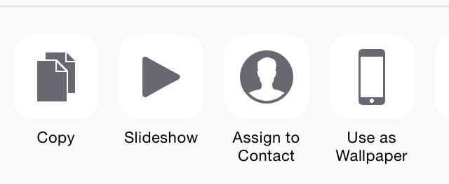
Share Sheets. One of the problems, visually, with iOS 7 is the icons on the Share Sheet, specifically the bottom row where one can set wallpaper, print, and more. The glyphs are too thinly-drawn and abstract, making it hard for me to discern which command does what. In my iOS 8 wishes piece on accessibility for Macworld, I wrote that I hoped that Apple would modify the Share Sheets so that the glyphs would be darker and higher contrast so that they would be easier to see. Much to my delight, the company did just that:
These icons are so much better than iOS 7’s; they’re exactly what I hoped for. The text and glyphs are much darker and much higher contrast, which makes them instantly recognizable and makes them almost jump off the screen. No longer do I have to squint in trying to figure out which button does what, and I’m very pleased with this change. It’s a minor detail in the grand scheme, but these little things matter much more when you’re visually impaired like me.
Predictive Type Keyboard. One of the hallmark features of iOS 8, the new predictive type keyboard is an additional row atop of the standard system keyboard. Much to my surprise, the interface for the suggested words is very readable: the white-on-gray color scheme provides nice contrast, and the font size is big enough for me to comfortably see which word I want to choose. As with the Share Sheet design, it’s but a small blip on the iOS radar overall, but again, you tend to pay more attention to UI minutiae when every pixel of a design either makes or breaks the user experience when your eyesight isn’t the greatest.
Control Center. Truth be told, I’ve never thought of Control Center in iOS 7 to be a liability, Accessibility-wise. I use it often, and find that the Calculator and Flashlight shortcuts to be particularly handy. From a design perspective, Control Center’s buttons are better than those of the general interface insofar that they have borders, which makes (a) higher contrast; and (b) easy to recognize and tap as a button, instead of trying to figure out whether a piece of text is just text or is actionable.
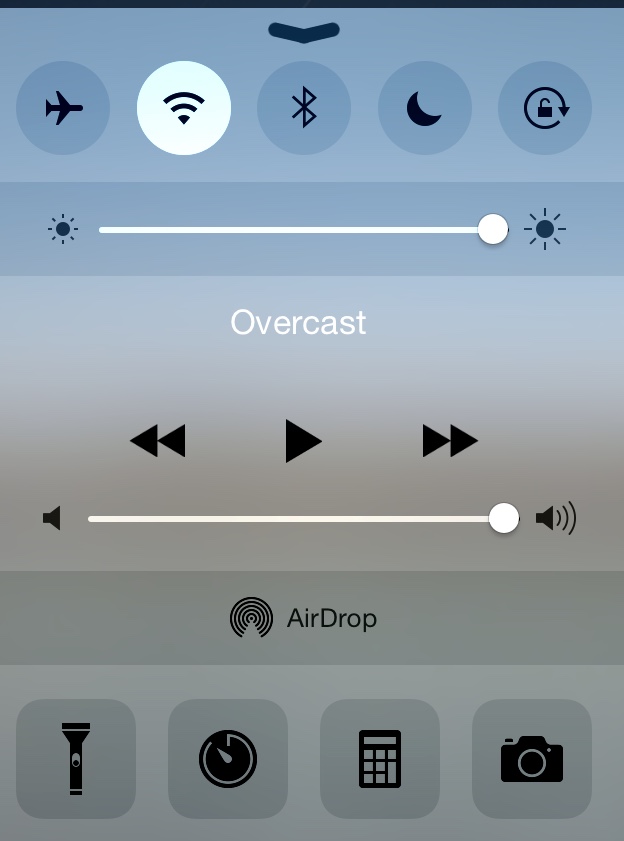
Then in late July, Mark Gurman of 9to5Mac reported that in iOS 8 Beta 4, Apple had completely redesigned the look of Control Center. It was surprising, but a pleasant one all the same. Control Center now looks like this:
The translucency of the menu has been toned down to give it better contrast, but also the buttons themselves have been completely redrawn so that they look like real buttons, akin to the iOS 6-style design. This makes the buttons much easier to tap. In addition, the glyphs of each icon are bigger and darker, making them easier to identify as well.
All in all, changing Control Center was unexpected, but it makes using the menu better.
I’ve been using the iOS 8 betas on my personal iPhone 5s for several weeks, and have found the new version of the operating system to be stable and work reliably. From a user interface perspective, not much has changed since its predecessor, and I’ve gotten used to the look despite not being thrilled with some of Apple’s design decisions.
That said, there are still issues with accessibility (not the options) on iOS. I still very much question Apple’s choice to go with text-only buttons; even now, after a year with iOS 7’s new paradigms, I still at times have trouble determining if a piece of text is simply a label or is a tappable control. The Button Shapes toggle, added to Accessibility in iOS 7.1, is certainly better than nothing, but it is nonetheless an inelegant and ugly hack. In my opinion, Apple would do well to redo Button Shapes to better match the look of the stock user interface.
Further, I also feel the “grab handles” for cut, copy, and paste could be much bigger. I have trouble seeing the grab points to move the blue highlight. Additionally, I’d love to see Apple add options for an enlarged loupe and cursor. As it stands today, moving the cursor to edit text is literally a pain for me, as squinting so as to find the insertion point and move it puts severe strain on my eyes. To be blunt, it sucks.
On a positive note, I cannot emphasize enough just how wonderfully Apple has designed Accessibility in iOS. As I have stated time and again, Apple truly cares deeply about empowering everyone, including users with disabilities; there is no doubt whatsoever in my mind that Apple’s work in this realm is true innovation.
This is a fact that, I think, goes overlooked by the mainstream technology press. But that Apple is leading the industry in this regard is a prime example of the company’s ethos at making products for everyone, and their mission to advance humanity as a whole. Sentimental and trite though these words may be, as a disabled user who uses Accessibility every day on my devices, I truly believe in the difference Apple makes.
iOS 8 is more proof that, for people with disabilities, Apple’s OS is head and shoulders above the competition.


