The iPad is set to be available in 5 days, but I bet you guys have been watching the latest guided video tours on Apple.com for the entire afternoon. Someone at least 5 times, I guess.
What’s interesting, though, is that the quality of these videos is so high that they provide us an easy way to look at the interface of the device and spot little differences and elements from the screenshots we’ve been provided so far. Actually, I’ve spent some time today analyzing the videos (yeah, I’m one of those nerds) and I’ve noticed some interesting touches Apple has applied to the UI.
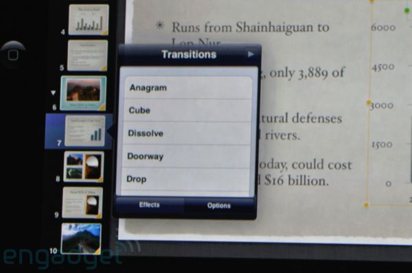
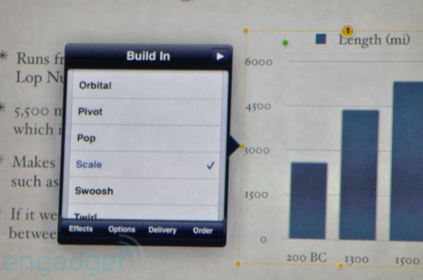
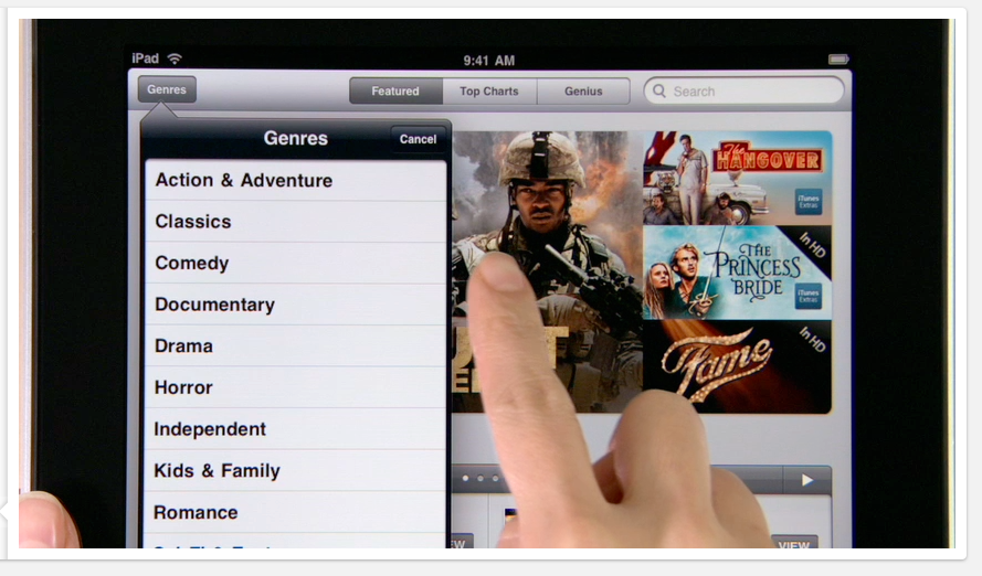
First, while watching the videos I’ve got the overall feeling that Apple has gone darker with the interface. I mean, the iPad UI already had many black / dark elements before, but it looks like the designers at Cupertino have refined some stuff to..make it darker. Things is, as you can see from the screenshots we’ve collected from various sources, the popovers used to look a little bit different back in January.
Popovers are one of the most important graphical innovations Apple introduced in the iPad, as they offer an easy and unobtrusive way to get more information on screen, without having to navigate through windows. Like I said, there are some thing that have been modified, and popovers are the first example.
Take a look at how they were presented:

(image courtesy of Cocoia)
The situation was quite strange: they either used to have a dark blue tone (Keynote), or they simply seemed based on the same glossy color scheme of iPhone OS (Mail). No doubt they weren’t unified and consistent. Now, let’s take a look at the screenshots I took from the guided tours:
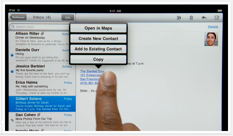
They’re different. They’re darker. More black has been ported to the interface, and we can say now the interface looks more consistent throughout different apps like Mail and Keynote. Also, Apple.com stills shows different versions of Mail’s popover.
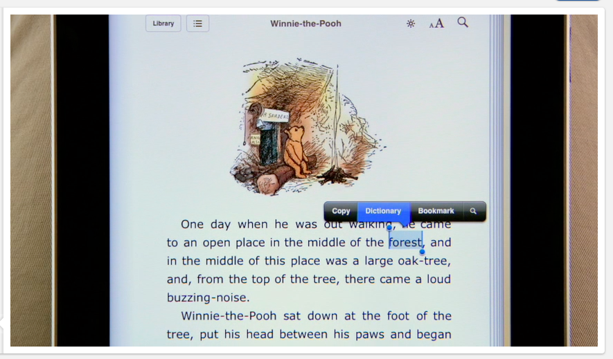
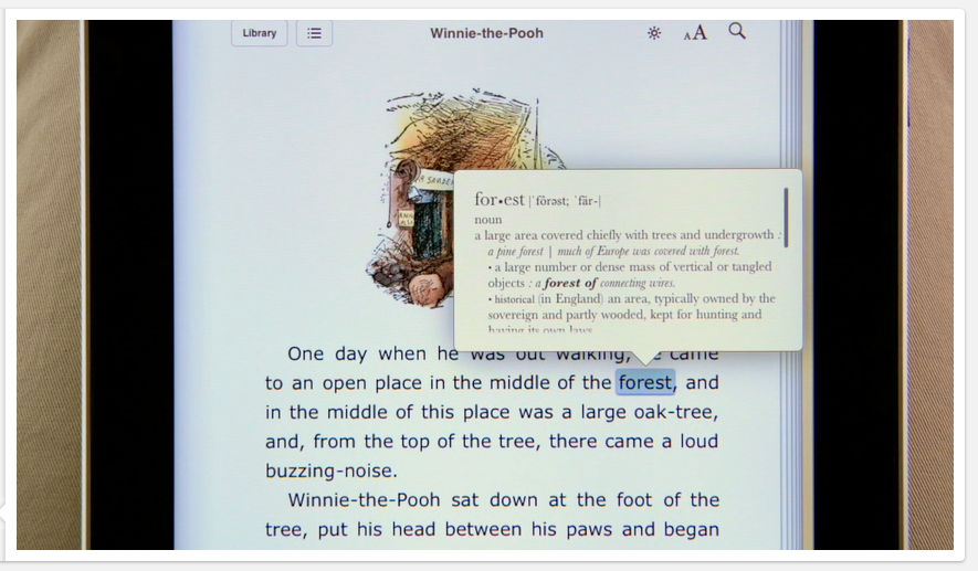
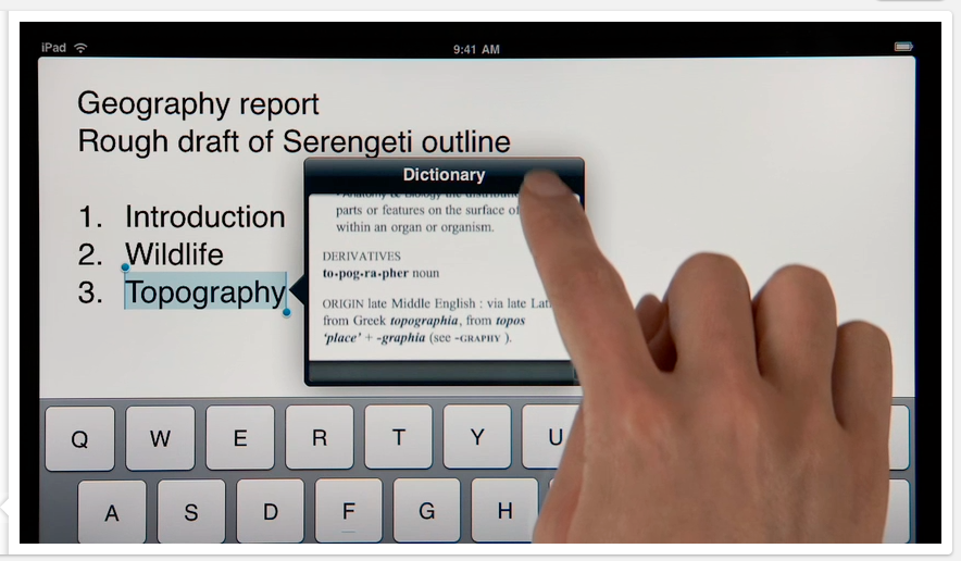
Dictionary, Definition
I’m very pleased to see the Dictionary in action. From what I saw in the videos (and read on Twitter), the Dictionary will be system wide, allowing us to lookup for a word anywhere on the iPad, but application-aware, meaning that it looks different depending on the application. Here are some screenies:
Please note that a brightness button have been added to iBooks, in top toolbar.
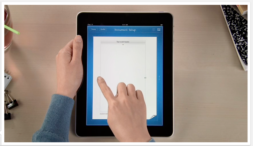
Document Setup
The Document setup window, I haven’t seen this before.
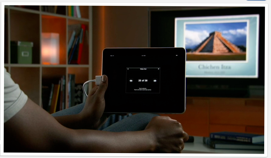
Monitor Connection
Here’s what happens when you connect the iPad to an external monitor (in Keynote). So black.
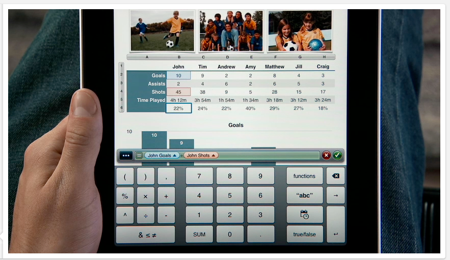
Numbers Keyboard
Another thing I haven’t seen anywhere else before, is this version of the context specific Number’s keyboard. Glossy.
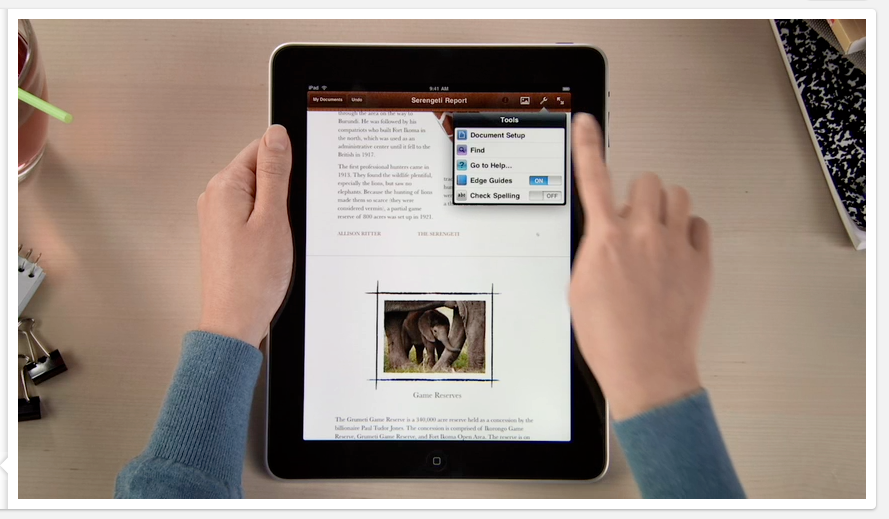
Tools menu
Pages’ Tools menu, sporting a dark popover with icons in cells:
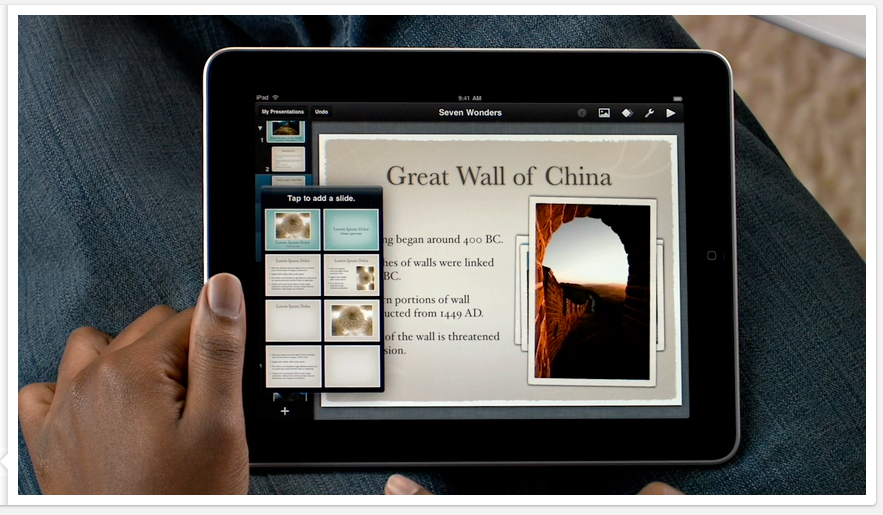
Keynote Highlight Color
A very subtle change, Apple has updated the highlight color of selected slides in Keynote:
Before:
After:

All in all, I like the changes Apples has made to the interface. It looks more solid, coherent and stylish. Great job.