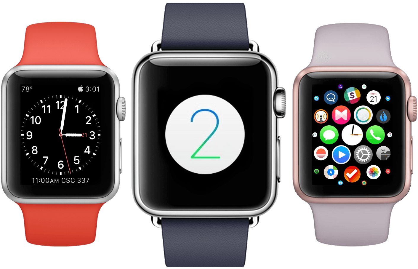
On September 9th, 2014, Apple CEO Tim Cook took the stage at the Flint Center for the Performing Arts in Cupertino. This was the very same stage on which, 30 years earlier, a young Steve Jobs had introduced the original Macintosh to the world. The Apple of 2014 was a very different company. Loved and hated, famous and infamous, indomitable and doomed. The only statement about the tech giant that might avoid contestation was that it could not be ignored.
The 9th would be a rubicon for Tim Cook. The late Steve Jobs had helmed the company through every one of its unparalleled series of epochal products. This was the day on which Cook would announce the first new product to come out of Apple since Jobs’ passing. A product that media pundits everywhere were sure to use as a scapegoat to prove or disprove the quality of his leadership.
The words “One More Thing…” overtook the screen, met by raucous applause from the expectant audience. Uncontrolled excitement burst through Cook’s normally calm demeanor as he presented the introduction to his hard work. “It is the next chapter in Apple’s story,” Cook boldly stated before leaving the stage. The ensuing video gave the world its first look at the Apple Watch.
Throughout the next hour, Apple would weave the story that they wanted to tell about the Apple Watch. They called it the most personal device they had ever made. Three different lines were revealed: one aluminum, one stainless steel, and one 18-karat gold. A series of beautiful bands were announced in a variety of colors and materials. Every millimeter of the hardware was described in lavish detail.
They also discussed software. The hardware and software on the Apple Watch were developed together, with full knowledge of each other. The tight integration between them was designed to blur the lines between the two paradigms. Spin the Digital Crown and see the software move in tandem with your turns. Just like an iPhone, you can touch the display to move and tap on content, but push the display on Apple Watch and the content will shrink back as if you pushed the software itself.
Software defines the Apple Watch as much, if not more so, than the hardware which embodies it. But as well designed and integrated as the first iteration of the Apple Watch’s software (aptly named, though questionably capitalized, watchOS) was, it wasn’t perfect. Some might argue it wasn’t even acceptable. Third-party apps were underpowered and massively handicapped by long load times; when disconnected from its iPhone, the Watch was rendered useless for almost anything except telling the time; and with no Activation Lock, stolen Watches could be reset and resold with ease.
Enter, watchOS 2.
Apple announced this new version of the Apple Watch operating system a mere two months after the device was first released to consumers in April. To many, this underscored the belief that the Watch’s initial offerings had not been ready. Maybe this is true, as many of the changes in the update seem like the way things should have been from the start. Regardless, they’re here now, and they’ll be all that the vast majority of Apple Watch users will ever know.
watchOS 2 brings no dramatic visual change from its short-lived predecessor. The platform remains young, and has a long way to go before it reaches any significant modicum of “maturity”. Questionable choices such as the honeycomb Home screen layout, assignment of the hardware side button to the Friends interface, and lack of support for third-party watch faces all remain. But under the hood, in the areas of connectivity, performance, power, and system and hardware level access, watchOS 2 makes major leaps forward.
While the operating system may remain in its infancy, many of the changes introduced in watchOS 2 are beginning to look precocious.
Table of Contents
- Introduction
- Interaction
- The Watch Face and Complications
- Glances
- Notifications
- Apps
- Third-Party Apps in watchOS 2
- Communication
- First-party Apps in watchOS 2
- Conclusion
Interaction
The Apple Watch is a completely different category of device than those that we are used to dealing with every day. Smartphones, tablets, TVs, and PCs are all pieces of technology which constantly jostle for our time and attention. They are sirens, tearing us away from our physical lives for the seductive impunity of our digital ones.
Time and attention are the two most precious resources in the world today, and of all of the devices in our technological ensembles, the Apple Watch is the only one which seeks to return them to us. Perhaps such a lofty goal betrays hubris, but let’s face it, Apple has been accused of less fitting hamartia.
This intention is reiterated in the Apple Watch Human Interface Guidelines:
Apple Watch was designed for quick interactions that make the most of the display and its position on the user’s wrist. Information is quick and easy to access and dismiss. The best apps support fast interactions and focus on the content that users care about the most.
These interactions can be categorized into four main interfaces, all of which are now available to third-party apps on the Apple Watch. Each progressive type of interaction requires slightly more of the user’s time and attention, though none of them should seek to take up a significant amount of either. Organized from least-to-most attention seeking, these are: the watch face (for third-parties, complications), glances, notifications, and apps.
The Watch Face
The watch face is the most important visual aspect of the Apple Watch. It is the first thing users see every time they raise their wrists 1. Prior to watchOS 2, the watch face was also the most locked down part of the Apple Watch.
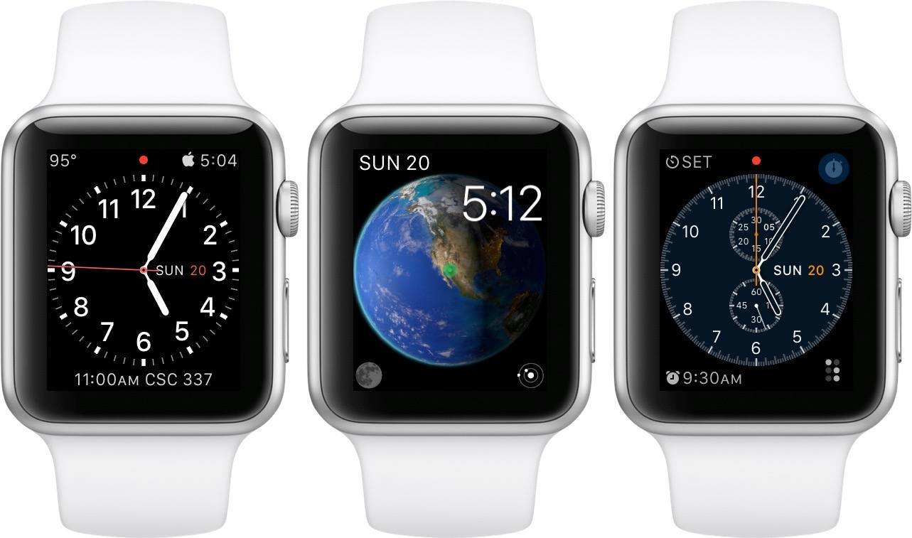
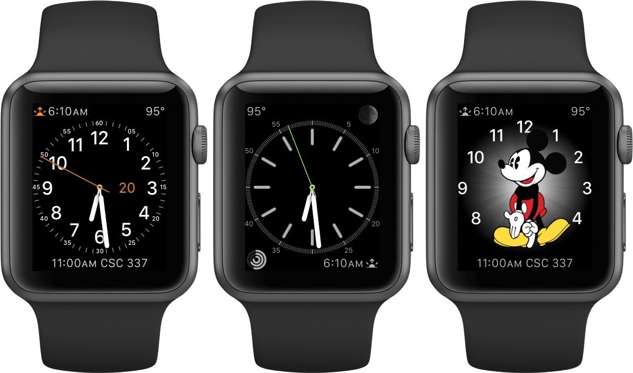
While this iteration of the OS still does not allow for third-party watch faces, it does open up the space more than it previously was by introducing third-party complications. Complications are extra interface elements incorporated into certain watch face designs alongside each face’s depiction of the time. These connect to apps loaded onto the Watch – or to servers in the cloud – to display content.
In watchOS 1, the only complications were those made by Apple. These included the current weather at your location, your next upcoming calendar event, the time in various cities, and more. With the update, third-party developers have access to these frameworks as well, and while they are still limited to a fairly small set of complication layouts, the power comes from the now unlimited sources for a complication’s content. In demos, Apple has exemplified complications which display the current scores in live sports events, weather forecasts from third-party weather apps, and in/outbound flight times, among others.
Recently, I’ve been testing out a great new app called Streaks. The iOS 9 update for Streaks also includes a watchOS 2 complication that I’ve been enjoying, and is a great example of the new possibilities created by third-party complications.
Streaks is a “to-do list that helps you form good habits.” Basically, you can create up to six “habits” in the Streaks app on your iPhone. These are things that you want to do every week, and you can specify how many times per week you want to perform each task. For instance, I’ve set up a habit in Streaks to write at least four days out of each week. Each day, the circle for my writing habit starts unhighlighted. If I do any writing that day, I can open the Streaks app and tap and hold on that icon to mark that I’ve written. I can then look back at my stats later to see how well I’ve been doing, what my best “streak” of regularly performing each habit is, etc.
The biggest problem faced by an app like Streaks is in getting users to remember its existence. I’ve tried a lot of todo list apps and I always seem to try them for a few days and then forget about them.
Most such apps, Streaks included, have ways of reminding you to check back in. This generally comes in the form of red badges on their app icons, or push notifications at regular intervals. I find both of these modes of “gentle reminders” to be anything but, and generally turn them off immediately. Not surprisingly, I then quickly forget about the app and never come back. Eventually it might get deleted, or just shuffled off into the multi-page “Utilities” folder to never be seen nor heard from again.
I have been astounded at how using the Streaks watchOS 2 complication has solved this problem for me. Streaks’ complication is an exceedingly simple grid of dots. Each dot represents one of my streaks, and will be gray if the Streak has not yet been completed that day, or white once it has been. The tiny complication sits in a corner of my Apple Watch. When I complete a streak, those little white dots glow triumphantly the whole rest of the day. Uncompleted streaks remain dormant. They’re not at all bothersome, but rather, the first truly gentle reminder that I have experienced on a digital device.
While you can’t interact with complications directly on the watch face, every complication acts as a button to open its app. In this case, when I’m ready to complete a streak for the day, I tap on the tiny dots on my Watch to launch the Streaks app, choose the streak I’ve completed, then force touch to bring up the “complete” button 2. Upon returning to the Watch face, another little dot glows happily.
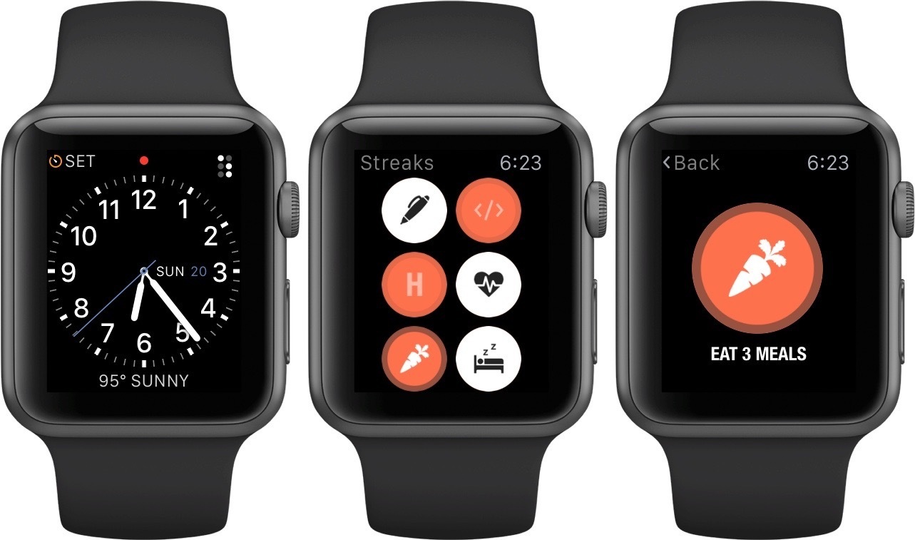
If you’ve ever been a college student, you’ll understand why “eat 3 meals a day” is a streak I’m trying to maintain.
While third-party complications are objectively a win for developers, the true pipe dream for many still lies in designing an entire custom watch face. No one outside Apple knows if they will ever allow this, though I’d bet a lot of money that if they ever do, those custom faces will go through extensive review before being allowed into the wild. The reasoning for this is fairly obvious: these designs are quite literally the face of Apple Watch. As we discussed earlier, Apple has taken great effort to merge the hardware and the software of the Apple Watch into one cohesive unit. They highlight this directly in the aforelinked Apple Watch HIG:
Apple Watch was designed to blur the boundaries between device and software. For example, Force Touch and the Digital Crown let users interact seamlessly with onscreen content. Your own apps should enhance the user’s perception that hardware and software are indistinguishable.
Poorly designed watch faces would be an excellent way to break that seamlessness, as well as to widen the possibility of any bystanders who see Apple Watches in the wild to form a negative opinion of them. Sure, on an infinite timescale it’s hard to imagine Apple not eventually making the feature available to all developers, but I bet they’ll hold out on making that feature truly open for as long as they feel they reasonably can.
Developers may have had a momentary rush of excitement when Apple’s design partnership with fashion company Hermés, announced last week, included a custom Hermés watch face. Unfortunately, this line from the Apple Watch Hermés page on Apple.com probably killed that buzz (emphasis mine):
With leather straps handmade by Hermès artisans in France and an Hermès watch face reinterpreted by Apple designers in California, Apple Watch Hermès is a product of elegant, artful simplicity — the ultimate tool for modern life.
Apple doesn’t even trust a high profile fashion brand to do any more than inspire their watch faces.
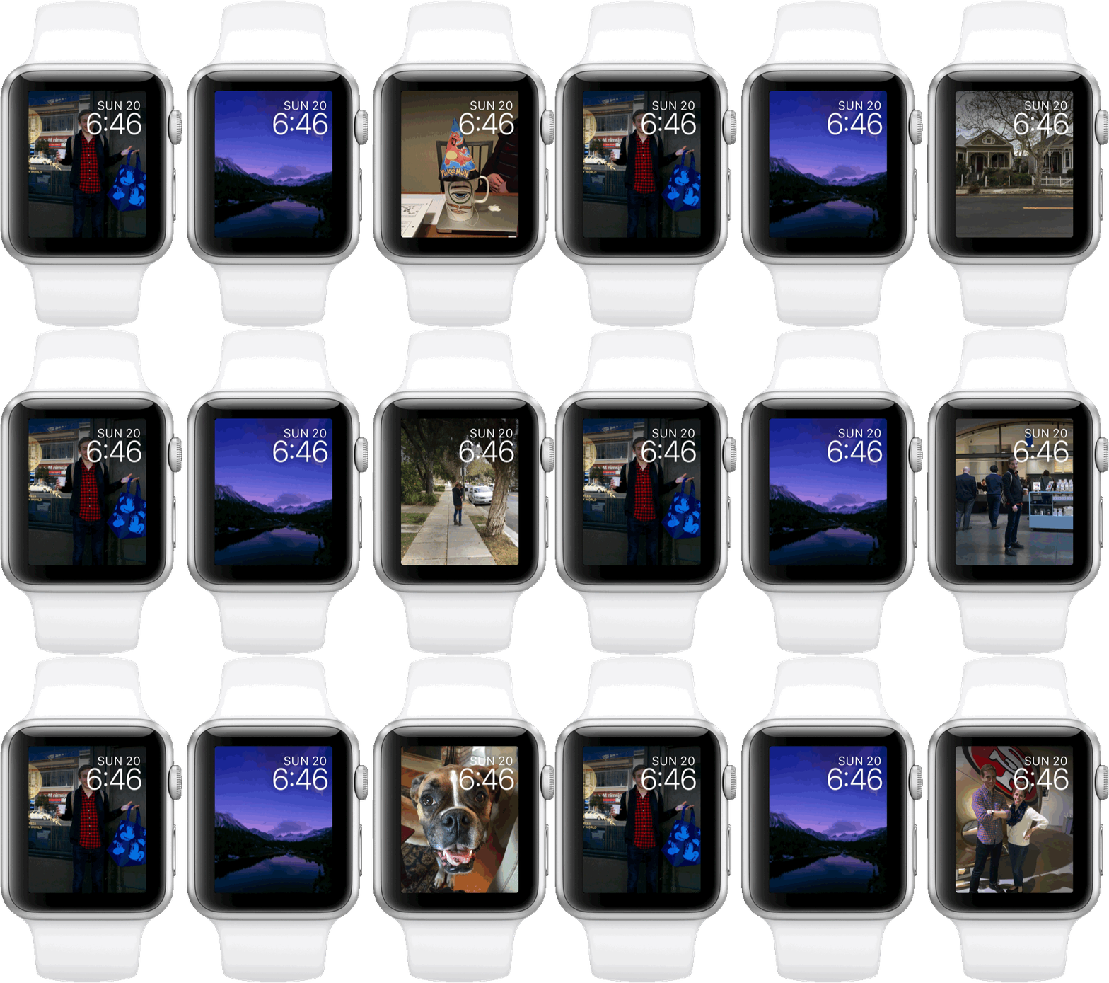
Looking on the brighter side of this topic, Apple does at least seem committed to regularly bringing new watch faces into the mix of options. With watchOS 2, we’ll be seeing a series of photographic watch faces join the ranks. These include a time-lapse watch face with six different time-lapse images to choose from, a customizable watch face which will display a digital time and date on top of any photo in your Favorites album, or the same time and date overlay while the entire Favorites album shuffles through in the background (the image will change each time the watch face sleeps and then wakes again).
The time-lapse faces have a nice touch in that they show different time-lapses based on the time of day that it currently is in your area. When you look at your Watch at night you’ll see a corresponding nighttime time-lapse of Hong Kong, London, Paris, Mack Lake, New York, or Shanghai. If you look during the day, the time-lapse will be of the same chosen area during daylight hours.
What disappoints me most about the new photographic watch faces, is that not one of them has support for any complications. I understand that overlaying complications on top of pictures would be problematic since you wouldn’t be sure what color would show up underneath, and that making the images square and leaving blank space at the top and bottom to fit the complications could look ugly. Still, I feel that they could have found some way to make a customizable photo face that is both well designed, and that supports complications. It’s a shame that there is not a single photographic watch face with that option.
If you’re not sold by the design argument, think about this: Apple is listing complications as one of the four main avenues of interaction with the Apple Watch, and yet a full 50% of the available watch faces do not support any complications at all 3. Why are they forcing users to choose between some of the most beautiful watch faces and the powerful utility of the complication interface?
If you’ll allow me to teeter on the edge of nitpicking for a moment, the subject of complication layout and availability is an even wider point of contention for me. I find the seemingly arbitrary variation, and complete lack of customization for the layout and number of complications amongst even the watch faces which do support them to be quite frustrating as well.
For instance, my favorite watch face, design-wise, is the Utility face. However, I much prefer the four-complication layout of the Simple watch face over the three-complication layout of Utility 4. These two faces have the exact same proportions for their timekeeping sections, so it baffles me why there isn’t one further page of options in the Customize section for these watch faces that allows me to change the layout of their complications.
This would only need to show layouts that fit inside of the chosen watch face (it wouldn’t make sense to give the option for the giant complications of Modular on the far more space-constrained Utility), but that could still surface enough of a variety to make the extra page of options worthwhile. As an example, Utility could have the option of a four-complication layout with one in each corner, a three-complication layout with the Large Flat complication at the bottom (this is its current layout), a three-complication layout with the Large Flat at the top, and even an option to have no complications for those who might just want a clean watch face (someone in Cupertino is designing all those complication-free watch faces, so I have to assume there are some people who aren’t interested in them).
Stepping back from my criticisms, the new addition of third-party complications to the watchOS platform is indeed a great step in the right direction. I guess we’ll have to wait to get some photographic and complication-laden watch faces (here’s to hoping it’s in watchOS 3). In mean time, I’ll be sticking with my three-complication Utility face.
Time Travel
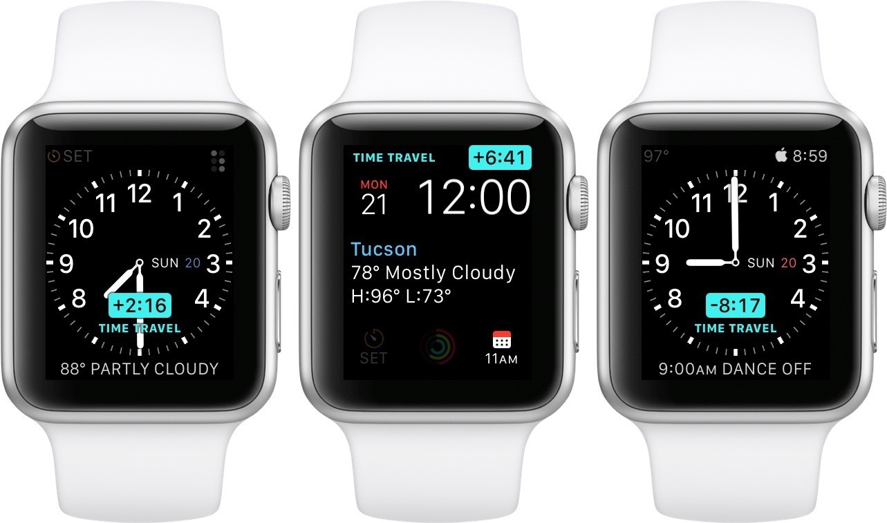
Speaking of the watch face, watchOS 2 introduces another cool new watch face-related feature, which Apple is calling “Time Travel.” Time Travel can be activated at any time by simply spinning the Digital Crown on a watch face that supports it 5. Time Travel allows you to peek forward and backward to see what complications will/would have been showing at different times other than the present. The depiction of the time on the watch face will move forward and backward as you spin, along with a little pop-up box displaying how many hours in the future or the past you have “time traveled to”.
For some complications, Time Travel doesn’t make sense. Or maybe it only makes sense in one direction. For instance, Time Traveling a live sports score complication isn’t going to show you what the scores will be in the future, but it can show you all the score changes that have occurred within the last half hour, including the order of those events. The Calendar complication, on the other hand, can be very useful when Time Traveled to show you what item is on your calendar at a certain time later in the day. When you’re Time Traveling in a direction that a complication on your watch face doesn’t support, that complication will just be grayed out until you return to the present time by either pressing the Digital Crown or lowering your wrist to turn the screen off.
Time Travel, and in fact just the general reality of existing front and center on the watch face, has an interesting impact on the implementation of complications for developers. In order to give a good user experience, the state of a complication needs to be shown with absolutely no latency at all times. The moment a user raises their wrist, which could happen at any moment, the complication should be ready with relevant and valid information.
Apple’s answer to this problem is to have complications be created in the form of timelines of information. Apps which have fairly predictable past and future timelines (such as a calendar complication) can present this data pushed out a whole day into the future. That way not only is the complication always up to date for the present time whenever the user looks at it, but when Time Travel is activated the complication can show its state at any time in the past or future without making the user wait for that data to load.
Developers will have two options when it comes to pushing updates to the timelines of their complications. They can either use a scheduled update to get refreshed data at various scheduled times throughout the day, or a high priority push notification which will be delivered immediately to the Apple Watch so that the complication can update its state.
Scheduled notifications are recommended for Apple Watch apps that can predict the timing of updates, such as a weather complication which may only need to refresh its data once per hour. It’s important for developers to know that their requested intervals are only considered a “hint” to the system, not a guarantee. If the system is busy or the power conditions are determined not to be ideal, a scheduled update might be delayed.
For users, this means that their complications may sometimes end up with stale data, or no data at all. Hopefully they won’t give developers too much grief if their complications not updated at all times, because that behavior is probably outside the developer’s hands.
With that caveat in mind, I’ve been running watchOS 2 for months now, and there have only been a handful of times when I’ve glanced at my weather complication to see a “–˚” rather than the actual temperature. Users will likely see this kind of behavior sometimes, but they should not expect to see it often enough to affect their average interactions with a complication.
The other way to update complications, using a high priority push notification, is for apps that cannot predict the frequency of updates. The best example of this is the sports score complication I mentioned earlier. Every time there is a change to the scoreboard in a live game, the Apple Watch complication should be updated immediately. I haven’t been able to test any apps that use this method of updating, but I would expect it to work pretty reliably, as this is basically the only situation in which third-party data updates are allowed interrupt the system at will (more on this later).
All in all, I think the implementation of complications is definitely far past the “good enough” line while Apple is still fighting to balance performance and battery life so carefully on its first-generation hardware. I’m excited to see what developers come up with to make use of all the features at their fingertips with their new access to the watch face through complications.
Glances
Glances didn’t get much love in watchOS 2, but it seems apt to mention them since they’re another of the four main mediums of interaction with the Apple Watch.
From what I can tell, the only noticeable change to glances is an update to the UI of the Now Playing glance. This first-party glance continues to do incredibly useful things which completely break the rules that all third-party glances are forced to follow. Namely, this is the inclusion of tappable buttons on the glance (these can also be found on Apple’s battery and Settings glances).
Apple’s Now Playing glance, in fact, has seven buttons. The top third of the glance acts as a launcher to open the Music app on the Apple Watch. The center third has a large pause button, flanked on one side by a skip backward button, and on the other by a skip forward button. In the bottom third are three more buttons, the left one to “love” a song that is playing, and the right one to add a song to your iCloud Music Library. The bottom center button, when tapped, actually expands out to create a volume slider with two more buttons, for volume up/down. The volume slider can also be controlled by the Digital Crown, and has a nice new circular interface which shows how high the volume is based on how filled in the circumference of the circle is (note that the Now Playing glance lays out differently depending on the content that you’re playing, so if you’re listening to a podcast then you’ll be seeing the old interface still).
I don’t know why Apple is only allowing its Now Playing app to have access to these awesome features. The Now Playing app is virtually the only glance that I ever use, and that is because all of its buttons and volume slider make it extremely useful. I’m intrigued by what ideas third-party developers could come up with to create dynamic glances like this one. It’s too bad Apple isn’t allowing them that opportunity.
Perhaps the new connectivity changes in watchOS 2 (more on those later) will enable even the current implementation of glances, which can only have one button (the entire glance is a button) to be more useful. All of the watchOS 1 glances I’ve used thus far have consistently been unbearably slow to load their content. The only watchOS 2 glance I’ve tested so far is that of Agile Tortoise’s Drafts, which doesn’t actually display any data. As such, I can’t speak with absolute certainty here, but if we assume that Apple delivers on the promises it made with watchOS 2, then the new glances should be far faster. This will be because, most of the time, they will have loaded their content in the background before you even open them to look.
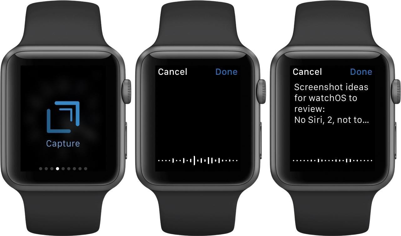
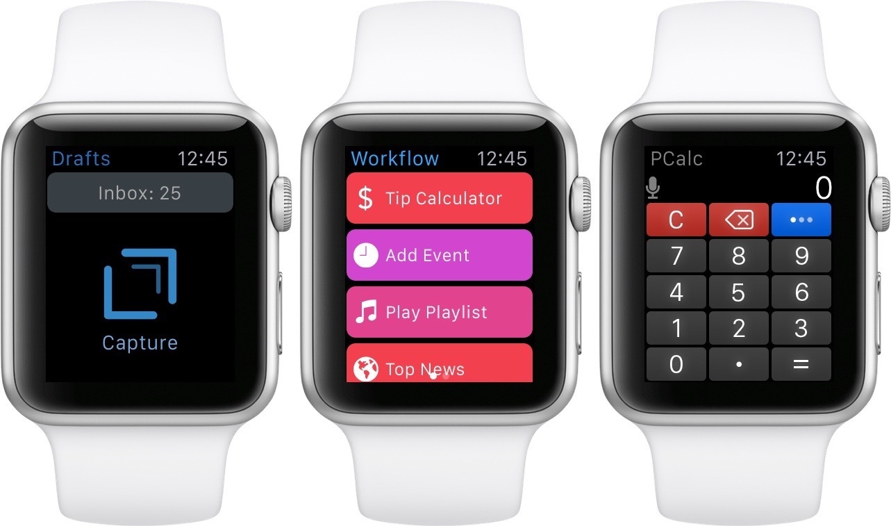
Speaking of Agile Tortoise’s Drafts, it supports an Apple Watch glance which I’ve found quite useful and different than most others. Drafts embraces the fact that the glance is just a giant button to launch the app. The Drafts glance consists simply of a large, pulsating “Capture” button. Tapping the button not only launches the Drafts app on the Apple Watch, but also then automatically activates the Capture interface. This uses the microphone to let you dictate text which is then saved as a new draft when you tap “Done.” A great idea which in my experience has worked super quickly and reliably on watchOS 2. (If you don’t have it already, you can download Drafts on the App Store.) 6
Notifications
The third of the Big Four, notifications are the only Apple Watch interface to be given the ability to interrupt you at will. A simple tap on the wrist from the Apple Watch’s Taptic Engine lets you know that content is waiting. Raise your wrist or touch your screen within a few seconds of the tap and the notification will pop into view.
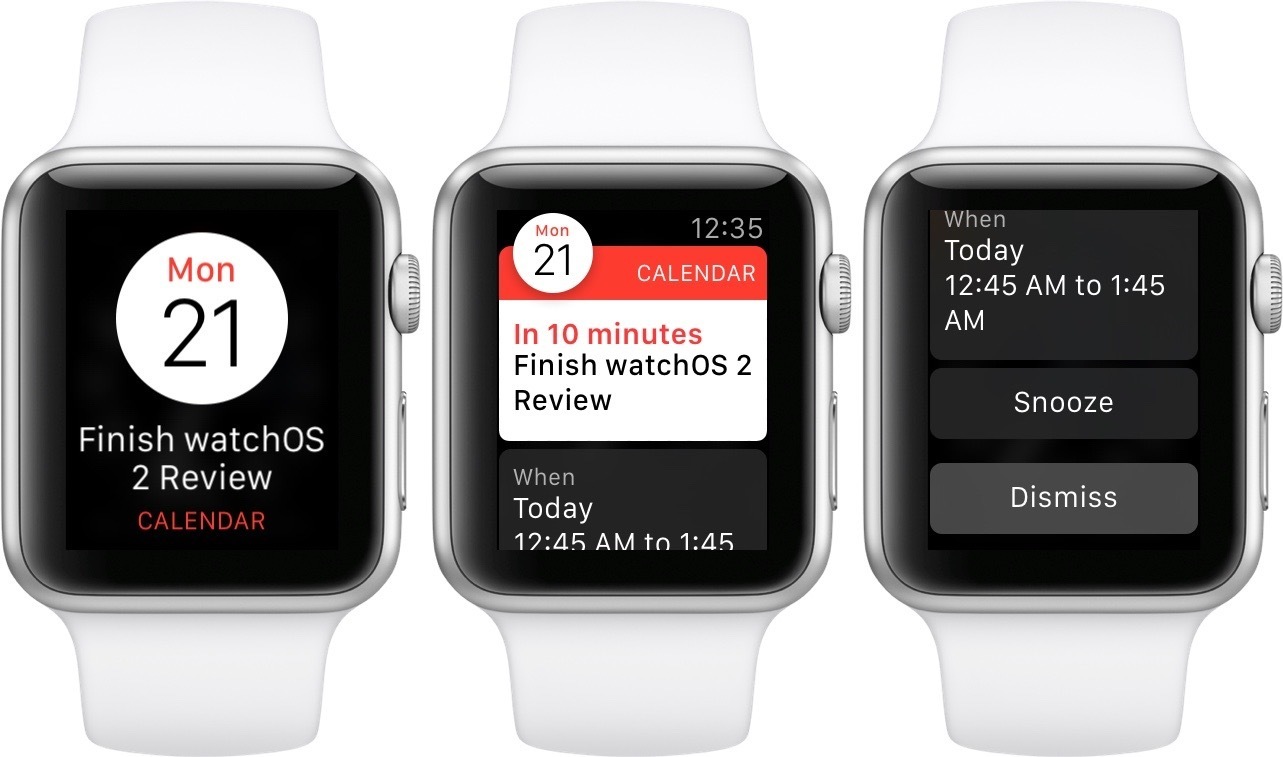
Notifications on the Apple Watch have two stages: the short look and the long look. The short look is that initial view that you see pop up as soon as you activate the screen after being tapped. Short looks are meant to quickly convey the sending app and the notification’s subject. If you determine that you aren’t interested in viewing the notification at that moment, simply put your wrist back down and the notification will be dismissed.
Keep your wrist raised, and the short look will move out of the way to reveal a long look. Long looks provide the rest of the details from the notification. If it was a message, the long look might display the content (or at least some of it, depending on how the notification was configured by its app’s developer). If it was an event, the long look might show the date, time, and sender. Long looks can also contain up to four custom buttons to immediately allow the user to act on the notification.
While notifications may seem to be the most disruptive of interactions between user and watch, I would actually argue that they are the number one way in which the Apple Watch comes through on its objective to return some of our time and attention rather than consume more of it.
It starts with the tap. If you haven’t felt it before, the Apple Watch’s signature tap is one of the device’s most unique and interesting capabilities. Gone are the phone vibrations that have bothered us all for years, alternating inexplicably between so noisy that everyone around notices, and so subtle that we don’t even feel the movement in our pockets.
A tap is subtle, yet unmistakable. It’s a feeling which conveys an idea that everyone implicitly understands. Taps are not urgent. They simply say, “if you have time right now, I have something you might be interested in.” This is what the Apple Watch offers us – a physical interface to let us know that we’ve received a notification.
If you can’t look at the moment (maybe you’re in a meeting; maybe you’re on a date; maybe you’re with your family), then no one is the wiser that you ever even considered it. If you can, simply raise your wrist to get the short look. It will instantly let you know if this is something you feel like worrying about right now. If not, a drop of the wrist and the notification is gone. But if so, then hold for a moment (or just tap the short look) to open the long look.
In the long look you get the details of the notification. This is where most of the updates to notifications in watchOS 2 are manifested. Up to four buttons can be displayed beneath the notification’s text, along with a dismiss button to send the notification away without taking any action on it (you can also dismiss a long look straight from the top by simply swiping it downward when it pops up). As of watchOS 2, one of these actions buttons for third-party apps can activate the quick reply sheet, allowing users to dictate a text response for the notification to reply with. If the app supports it, you can even use this sheet to reply with the Apple Watch’s custom animated emoji, which send as gifs.
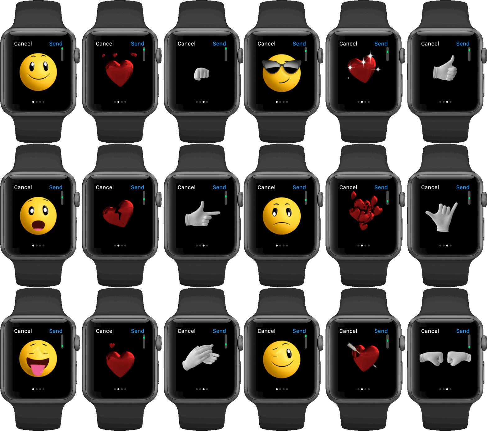
A quick aside: those animated emoji have actually received a significant update themselves. You can now pick from even more of them, including a sick emoji, emoji wearing various styles of sunglasses, emoji that are confused, surprised, frightened, heartbroken, knocked out, injured, sleeping, and more. There are also some new two-handed animated emoji in the third page of options. These include a fist bump, clapping, and raising the roof. It really is quite an update. Particularly with some of those emotions that are hard to express quite right with the standard Unicode emoji, these Apple Watch animated characters could actually start to fill a more useful role. I still don’t understand why the only color options are yellow or bright red, though.
Getting back to the main topic here, long looks in notifications can have entirely custom UIs designed by the developers of their corresponding apps (though these interfaces do have a maximum capacity of four action buttons). Long looks can allow you to quickly deal with notifications which may previously have sucked you into an iPhone app to distract you even more. With each new notification, you can choose to deal with it right away via an action button, or dismiss it to send it to the notification queue (accessed by swiping down from anywhere on the watch face).
Between the subtle Taptic Engine, quick short looks, and actionable long looks, the Apple Watch notification layer in watchOS 2 provides a great arsenal of weapons to either fend off or quickly dispatch digital interruptions without letting them suck us into our devices. We can live our lives; the Apple Watch neither needs nor wants our attention.
Apps
To be frank, third-party Apple Watch apps on watchOS 1 haven’t been good. This is no fault of developers, who have written some interesting and intriguing Watch apps which I would love to have been enjoying for the last several months. Instead, third-party Watch apps have been compromised by unbelievably long load times. Launch a third-party app on watchOS 1 and you will be greeted by a blank screen with a loading spinner. The little white dots circling around and around, often so long that the Apple Watch’s screen turns off. Sometimes they won’t load at all until you’ve tried several times.
Regardless of whether it takes thirty seconds or six seconds, if apps are, on average, still loading when the screen turns off, that is enough to be considered an unacceptably long load time. This problem has made third-party apps unusable to me. Sometimes they work alright, but the excruciating delays occur frequently enough that I rarely even bother trying anymore.
Third-party Apps in watchOS 2
All this changes with watchOS 2. The new OS features a major revision of the architecture of third-party apps, finally allowing them to run “natively” on the Apple Watch. This is a huge win for developers and users alike. Developers will get greater access to the system, including to hardware sensors and I/O mechanisms. Users will see apps open and run far faster, as well as gaining more powerful and useful features.
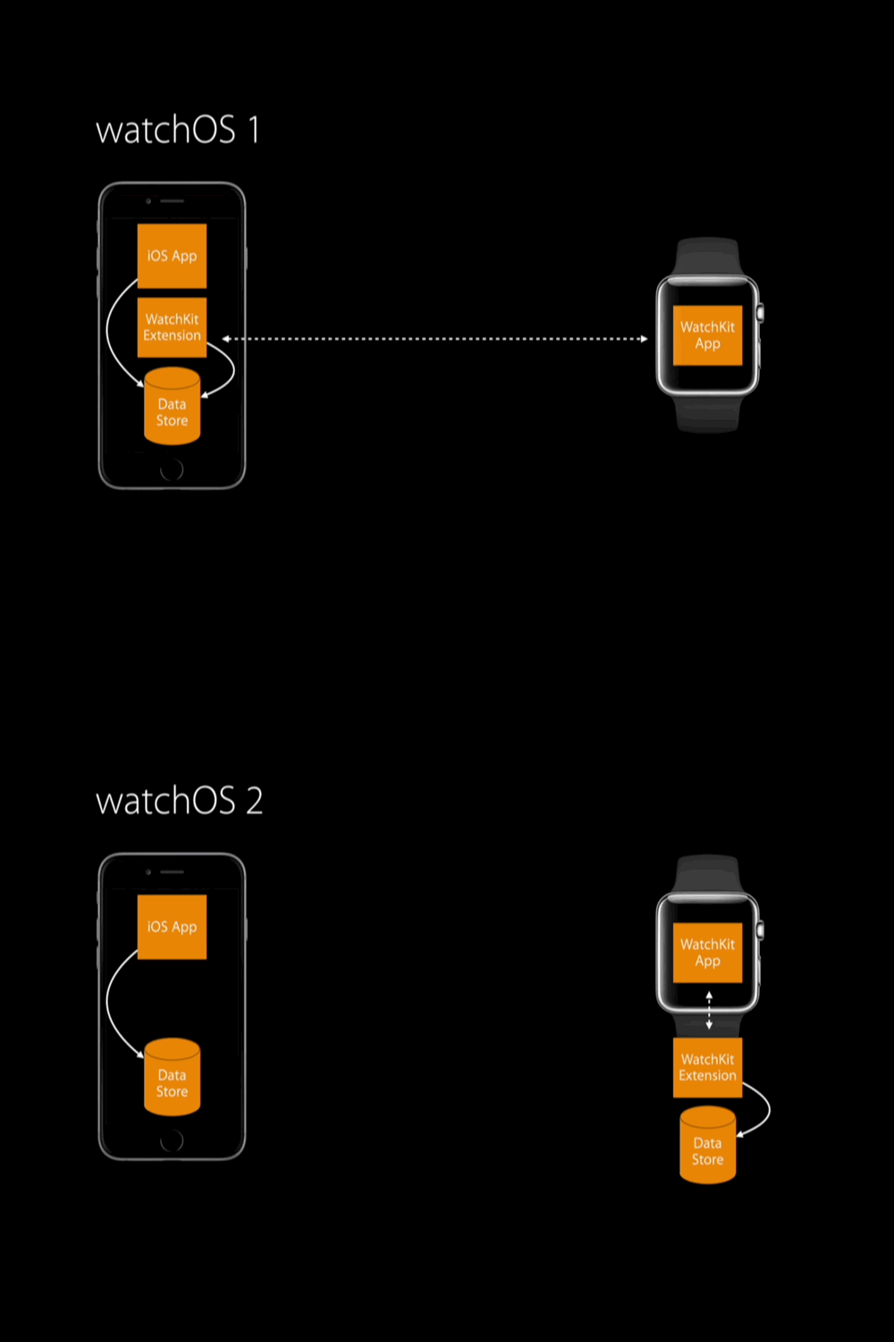
watchOS 2 apps do still need to have an iPhone app counterpart, and in fact the pieces of the apps behind the scenes are largely the same. The basic structure of a watchOS 1 app is as follows: a user interface constructed by a storyboard runs on the Apple Watch. Powering this user interface is a WatchKit extension, which runs on the iPhone (WatchKit is the framework on which all Apple Watch apps are built). The extension also has access to a data store to and from which it can store and draw whatever data is used by the app. The iPhone side of course runs the iOS app as well, which can also send and receive data to and from the data store.
With watchOS 2, this structure is shaken up. The WatchKit extension now runs directly on the Apple Watch (this is referred to as running “natively”) alongside the WatchKit app (the user interface). There is also a new data store that exists directly on Apple Watch for the extension to store and draw the app’s Watch-specific data to and from. This means that the iPhone side now only holds the iOS app counterpart, and the old data store used by the iOS app.
This structure is more easily shown graphically, so check out the images below from one of Apple’s WWDC presentations.
The WatchKit extension is where all of the “brains” of the operation occur. It’s where the app actually runs code to perform the actions associated with the buttons that are tapped in the UI. Since the WatchKit extension is now running natively, every interaction with a watchOS app no longer needs to make a round trip to the iPhone to determine what you want the app to do, and how it needs to respond to that. This vastly improves the speed and responsiveness of apps, as well as allowing Apple to open up all the hardware features of the Watch to third-parties (previously third-party apps couldn’t utilize any of the hardware except taps and force touches, not even the Digital Crown).
So if all Apple did in watchOS 2 was move the WatchKit extension from the iPhone side to the Watch side, what was stopping them from doing that in the first place with watchOS 1? Well, “moving the extension from the iPhone to the Watch” is a deceptively simple way to phrase a much more complicated problem.
When the extension was running on the iPhone, it could always be assumed that an app’s data would be accessible. As long as the iPhone was in a state where the iOS app could access the requested data, the WatchKit extension could access that, too. Furthermore, the WatchKit extension was much more free from power considerations, as the iOS platform has had years of experience iterating on the best ways to run processes in the background to conserve battery life, not to mention that the iPhone’s battery has multiple orders of magnitude more juice than the battery on the Watch. In this scenario, the Watch itself is just a “dumb” display, doing nothing except showing the data that it was sent from the iPhone. That simplified the entire system immensely.
Moving the WatchKit extension over to the Watch means that it is now cut off from the source of its information. This meant that the way the extension interacts with the iPhone, and with the Watch itself, needed to be redesigned. I imagine that Apple probably could have done this in a simpler and more straightforward manner, leaving the way the extension works exactly the same and just making it snag its information through Bluetooth instead of directly from the iOS app and iPhone data store. However, not only would that approach have had much less of an effect on responsiveness (abstracting the latency to a different part of the Watch app process isn’t going to remove it), but it would also likely have had tremendously negative effects on Apple Watch battery life. The Apple Watch does not have nearly the same amount of power as the iPhone, so any processes running on it need to be completely reimagined to function within the tiny device’s power constraints.
If this sounds vaguely familiar, you might recall that Apple faced similar problems getting background processes to run on iOS devices while conserving battery several years ago. This is a problem which Apple is not only good at, but which I believe they probably relish. A brand new platform allows them to use everything they’ve learned from building their previous platforms to create their best visions of how to implement certain aspects on the new one. Apple could have rushed this new architecture out before it was ready, but this may be the only chance they ever get to design the layer of connectivity between the iPhone and the Watch without having to care about maintaining backwards compatibility with massive amounts of legacy code.
Apple took advantage of this same kind of opportunity when they first released the iOS App Store. Back then, Apple had very little control over Mac apps, because they could be sourced from anywhere around the entire Internet. The App Store made the new iOS platform a completely walled garden, entirely controlled by Apple. They could then, and still can, feel free to grip it with an iron fist, enforcing harsh guidelines and sometimes making inexplicable rejections. Since iOS has always been like this, there’s nothing anyone can do about it 7, and complaints can be easily ignored without backlash.
On the other hand, as we’ve seen in the ensuing years of the Mac App Store and Gatekeeper, when Apple attempts to make a fundamental change to a platform that started off another way, it’s a massive uphill battle. Sometimes they can pull it off, like in the transition from Power PC to Intel, but even then they generally have to do a lot of work to maintain some amount of compatibility with the legacy code (hence, why they had to build Rosetta.
With all that in mind, it’s no surprise that Apple wants to step carefully as they build out the infrastructure of the Apple Watch platform. Maybe they should have held back third-party apps entirely until a suitable solution had been developed. I’m sure that that was a hot point of debate internally before watchOS 1 was shipped. Regardless, my bet is that no one is going to care two months from now. New Watch owners will never know the difference, and the several million people who owned Apple Watches running watchOS 1 will move on and forget that third-party apps were ever as broken as they once were.
The only thing that’s certain is this: there was no way Apple was going to rush to ship the solution that they knew they really wanted until it was ready. This was the best opportunity they’ll ever have to freshly design the interface of connectivity between Watch, phone, and the internet. Apple wasn’t going to squander that, nor did they. Let’s dive into the truly sweet solution that they’ve developed for third-party apps on watchOS 2.
- Technically, this truth can be broken, but only by a few very specific exceptions. Mainly, incoming notifications and workouts. It can also be completely broken by changing the default behavior to wake the screen to whatever the previous activity was rather than to the watch face, but I predict very few users are going to enable that (it can be changed on the Watch via Settings > General > Wake Screen > Resume To, if you want to experiment with it). ↩︎
- This interface is actually my main complaint with Streaks. I wish I could just tap on one of the six streaks in the grid view of the Apple Watch app and have it be completed. The touch targets are easily big enough, and a second tap could un-complete it if I had mistapped. Force touch for the sake of force touch is just a waste of time. That said, it's a minor complaint for how well I think the rest of the app's implementation is. ↩︎
- Since no one has actually gotten their hands on the line of Hermés watch faces yet, I can’t tell for certain that they don’t have complications, but none of the product photos for those watch faces show any, and it appears to me that they did not leave big enough margins for any complications to fit. If the Hermés watch faces don’t have complications, then that’s even less than 50% of all watch faces that support them. ↩︎
- Yes, I realize there's technically four complications on Utility, but the one in the middle can only be the date or nothing so I just count that as part of the watch face itself. ↩︎
- None of the watch faces without complications support Time Travel. This does seem to make sense, seeing as how the main feature of Time Travel is to see the complications at different points in time, but it's still just another example of a headline feature that 50% of watch faces can't make use of. I could easily see at least an entertainment value, if not an informational one, in spinning the crown on complication-less watch faces and seeing a butterfly flap, a time-lapse change from day to night, or photos from an album quickly shuffled through in the background. ↩︎
- Update: Unfortunately, Apple rejected Drafts' Glance because it did not show any information, which was exactly what I liked about it. Another example of Apple's excellent and always reasonable and fair App Store review guidelines. ↩︎
- Of course, someone always eventually jailbreaks each iOS release, breaking the walled garden open "for the good of everyone," but jailbreaking will never be done by more than a tiny fraction of iOS users. ↩︎


