In 2013 Apple left behind the decade old big cat naming scheme for major releases of its flagship desktop operating system. It set its sights instead on inspirational places in California. Beginning with Mavericks, a California surfing spot, OS X then moved on to Yosemite, the beloved national park. In this year’s new release, Apple eschewed another big move in exchange for seeking greater heights within the bounds of last year’s stomping ground.
Since the introduction of Yosemite last fall, Apple has faced some rough times in the press. While the company is well adjusted to the doomsday chicanery constantly tossed about by the mainstream tech media, this year the calls were coming from inside the house. Well known developers and tech bloggers who have historically been accused 1 of ingratiation with the Cupertino company, were stepping out to bring attention to a growing feeling of dissatisfaction in its software.
Software is a field which has classically been one of Apple’s strong suits. Shave off ten seconds on startup and save a dozen lives. Yet recent years have brought debacles such as Apple Maps in iOS 6 and discoveryd, as well as many smaller issues such as random crashing in iOS, lost music files, and stingy iCloud storage.
The consensus that seemed to be reached when these issue came to a head this January was a plea to Apple to just slow down. While Apple’s hardware division has proven themselves capable of firing on all cylinders year after year, their software division has not quite been keeping up. They could use a year to regroup, focus on existing features, and hold off on any major leaps forward. In essence, a Snow Leopard kind of year.
Thankfully, in what seems to be establishing itself as a pleasant trend of late, Apple has been listening.
discoveryd was reverted in the final update to Yosemite, Apple Music has some homework to do, and Apple Maps has picked up the last of its major missing features. Siri is getting faster, iCloud storage prices have gone down, and Notification Center widgets which launch other apps are being allowed into the App Store.
With the difficult, but necessary changes seen in iOS 7 and 8 and OS X 10.9 and 10.10 out of the way, Apple may finally have a chance to take advantage of some breathing room and address the features they’ve been neglecting.
With all this in mind, it’s no surprise that OS X 10.11 is named after a mountain which can be found inside Yosemite National Park.
El Capitan marks an end to Apple’s relentless march forward, opting instead for a calm retrospective on the applications and underlying frameworks which have been the keystones of the operating system for years. Portentous in its own restraint, 10.11 canonizes those small but significant features that enrich the OS X experience in daily use. Shaving off seconds and bandaging cuts, El Capitan is the operating system we’ve been looking for.
Table of Contents
- Introduction
- Experience and Performance
- Search
- Window Management
- First-Party Apps
- Force Touch
- Internationalization
- Performance
- Xcode 7
- Developer Program Changes
- Swift 2
- Security
- Conclusion
Experience and Performance
With OS X El Capitan, Apple focused on two main areas of improvement: experience and performance. Experiential upgrades include advancements in search, window management, and first-party apps. Performance improvements include Metal for Mac and system-wide speed boosts in app launching and switching. Developers also got a lot of love in the update, receiving new APIs and powerful new features in Xcode and Swift 2. There are also some changes regarding security, and as always with OS X, these are going to be a bit controversial.
Search
One of El Capitan’s headline features is natural language searching. Natural language processing is a method of parsing input that comes in a similar form as to how we might speak or write it if we were giving the command or making the query to another human. This technique, when done right, has several huge advantages over more classic methods of processing commands.
The first advantage is convenience. It’s much easier to type in a command or a search term in the way that your brain thinks it than it is to toggle a bunch of switches, pick items from lists, and generally set a bunch of separate options. User interfaces are powerful tools, but sometimes it’s easier to just write (or speak, in some cases of natural language parsing) what you want to do in the way it comes to your mind, rather than translating what your mind is thinking into manipulating an interface.
An even bigger advantage of natural language processing is that it can open up powerful and complex commands to the everyday user. Think about how most users use Google search: rarely do they open up the “advanced” search terms when they don’t find what they’re looking for right away. Instead they just change their search to something different and see if that gets them any luck. The concept of searching or triggering other actions in the way that they come to your mind rather than through an interface is an extremely powerful one. In El Capitan, Apple is looking to bring powerful natural language searching capabilities to the Mac in the form of improved Spotlight, Mail, and Finder searches.
In El Capitan, you can hit Command-Space to open Spotlight search, then type something like “show me all documents from last year” to see all of the files on your computer that were created or modified in the last year. This is the sort of search that, without natural language processing, would require a much more complicated interface involving picking start and end dates from a date or calendar picker, selecting the file types that count as “documents,” etc. With natural language searching, users can just type it the way they think and the system will understand and respond accordingly.
This new search feature also exists in Finder and Mail search. For instance, searching “unread mail from MacStories” in Mail will surface any issues of MacStories Weekly that you haven’t gotten around to reading yet.
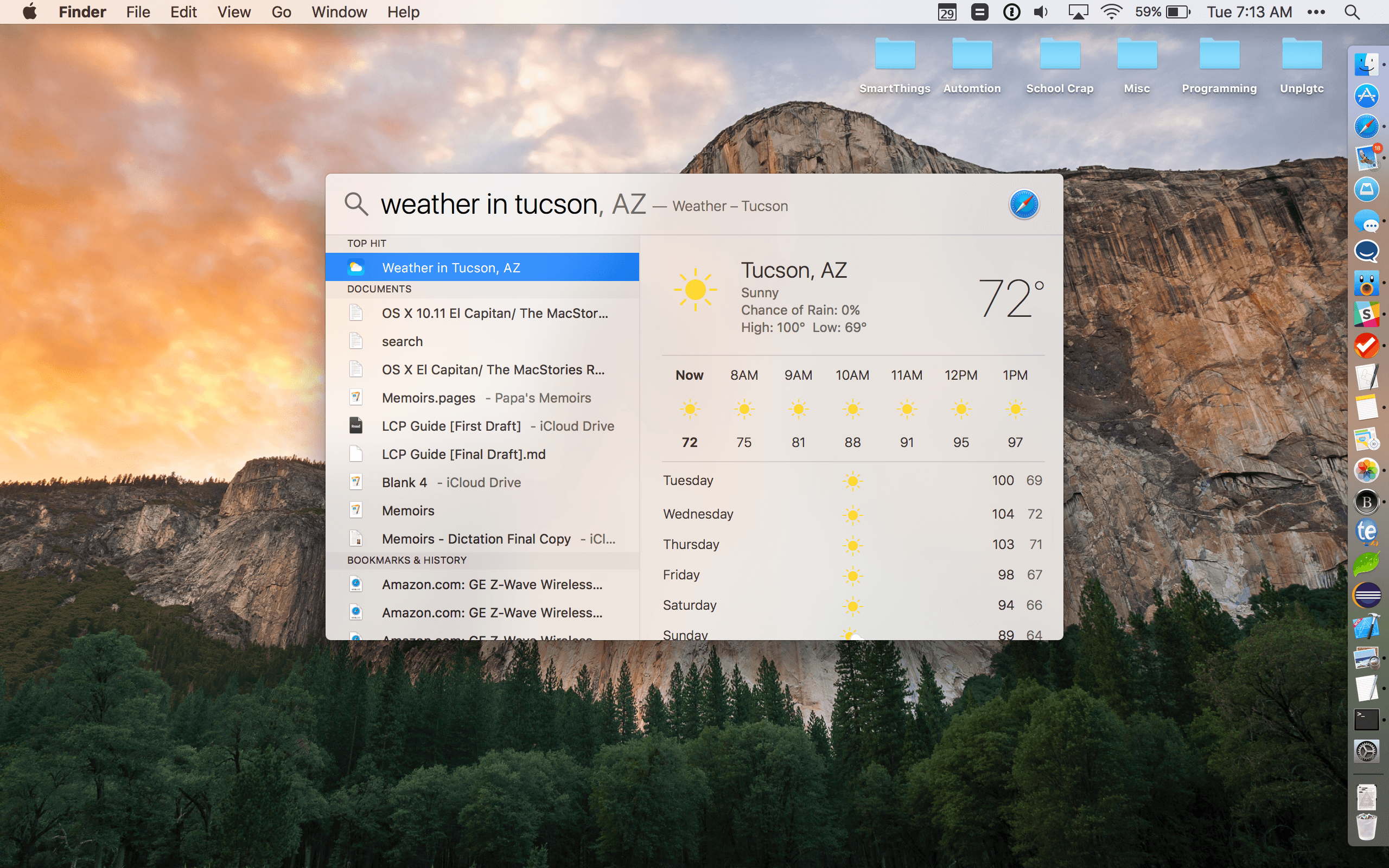
Spotlight also connects to various external sources of information to put even more quickly accessible data at your fingertips. Search Spotlight for “weather in Viterbo” and you can see if Federico is going to need an umbrella today. Search for “weather in Tucson”, and you can find out if I’m currently able to cook an egg on the sidewalk. You can also take a look at current stock prices (“AAPL”), sports scores (“Manchester United game”), or search for web videos (“funny cats”).
This kind of intelligence is not new to Apple’s ecosystems, but rather is exactly (the general idea at least, if not the underlying code) what we’ve been using to talk to Siri for years. As such, it probably won’t come as a surprise to anyone that the feature isn’t particularly versatile. It’s easy to confuse, and even worse, there is no indication of whether it understood any commands, so you can’t always tell if your search actually worked. As an example, the natural language search doesn’t seem capable of processing searches for tags. If I type “files with the tag MacStories” it shows me a list of files. While many of these files are tagged with my MacStories tag, they aren’t all tagged with that. This is because the search didn’t actually work (because you can’t search for tags), but I have no indication of that whatsoever. What the search is actually showing are files that include the word “MacStories” (as well as, probably, files that include the word “tag”).
What would improve this a lot (other than just making the feature more versatile so it could handle most things people might throw at it) would be to create some sort of visual indication that a search has correctly understood every keyword. An excellent example of this kind of feature in action is the natural language processing engine on the calendar app Fantastical. As you type a command for a new event into Fantastical, it graphically moves any event creation-related keywords you type into their corresponding positions on the interface. This shows you when it has recognized data such as dates, start and end times, and more.
Spotlight search is of course a bit more complicated since it has to handle much more than just calendar event keywords, but I think it could still do something similar even with simple highlights for certain keywords. Then at least you could tell that it didn’t recognize “tag” because the word would not be highlighted.
Overall, I think Apple’s ideas for Spotlight are in the right place. The feature just needs to grow and gain more abilities. As Apple builds it out over time, I’m sure we’ll see some of the more obvious gaps in functionality be filled. I would love to see those highlights though, or at least something along those lines.
Window Management
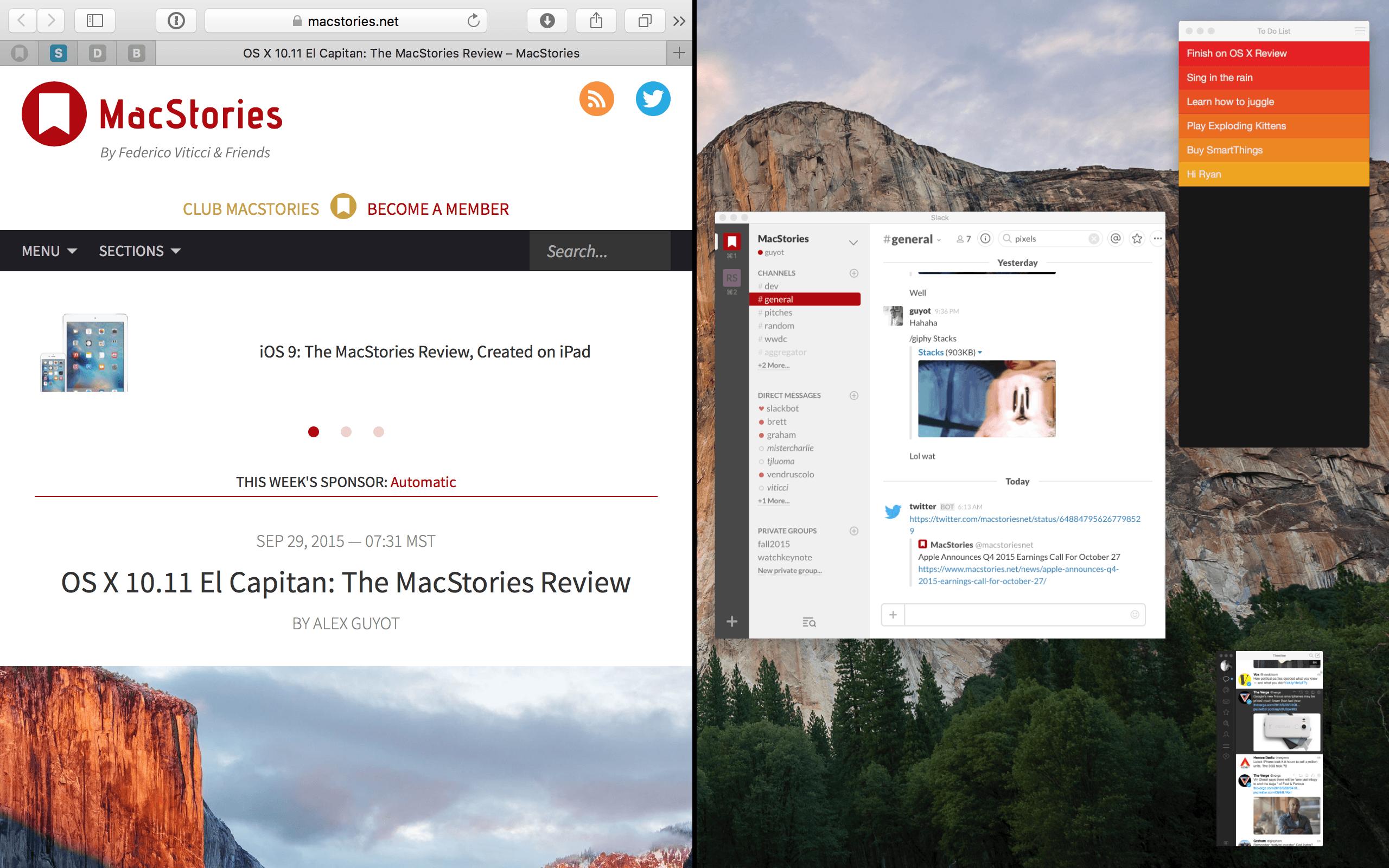
The most hyped aspect of the new window management feature is Split View mode. If you’re familiar with Split View in iOS 9, then you’ll already understand its OS X implementation. Apple has taken the Full Screen mode that has been present in OS X since Lion, and added the ability to run two apps in that full screen mode side by side on the same Desktop space. Once two apps have been established in this view, you can drag items between them and interact with both in pretty much the same way you would if they were regular windows that were just filling the whole screen. You can also grab the narrow margin between the two apps and drag it one way or another to grow/shrink the two apps and make one take up more of the screen than the other. The limit of how thin you can make an app seems to be at the discretion of the developer.
There are several ways to start Split View. The green button in the stoplight at the top left of every window in OS X, which made the change last year from the maximize button to the Full Screen button, has now taken on even more responsibilities. Clicking and holding on this button in El Capitan will slightly shrink the window and highlight half of the screen blue. You can then drag the window to one side or the other (whichever side you move to will get the blue highlight). When you let go, the app you dragged will grow to fill that half of of the screen, and the rest of the apps that you have open on the same Desktop will be shown in Exposé on the other half. Pick one of these apps2 and it will fill the open side to form one screen filled with two apps. The rest of the apps will remain on the same Desktop, while the two (now Split Viewed) apps will be given a new Desktop.
The other way to set up two apps in Split View is to enter Mission Control and drag an app from the Desktop you are viewing to the Desktop thumbnail of an already Full Screened app. You can move it to either side of the thumbnail to pick which side it will be split onto. If you don’t want to open Mission Control before moving an app onto a Split View, you now also have the option to drag a window from the normal Desktop view up to the top of the screen to open Mission Control (in my testing, I’ve found that you really need to “bounce” the window against the top of your screen – as in touch the top edge, then pull back, then touch it again). You can then drag that window straight onto another Full Screen app to Split View them, drag it between Desktops to make it Full Screen on its own, or drag it to the Desktop thumbnail in the top corner to place it on its own new Desktop (not in Full Screen mode).
You can do this with any app when Mission Control is open as well. Just grab an app’s window and drag it where you want it to go and it will move there, adjusting for whether that move will put it into Full Screen or Spilt View, or create a new Desktop for it. The one bone I have to pick with the new Mission Control (other than the bug where entering Mission Control from a Full Screen app displays a different Desktop of apps, which I’m sure will eventually get fixed – even though it made it through every beta revision) is that by default it minimizes the Spaces bar at the top which shows Desktop thumbnails. Almost every time I open Mission Control it is because I want to interact with different Spaces, not just see the apps in the Space I’m using. As such, the Spaces bar being minimized when the interface opens is a constant annoyance. All you need to do to make it show the thumbnails is move your mouse onto it, but this is just an extra motion that I now have to perform every time I open Mission Control. Prior to El Capitan that bar was never minimized, so this is a step backward for the interface. Shave seconds Apple, don’t add them.
My big problem with Full Screen mode, which extends to Split View as well, is the way the Menu Bar is handled. I don’t mind the bar being hidden, but I find myself constantly accidentally moving the mouse to the top of the screen, which immediately drops the Menu Bar down in front of whatever interface element I was actually trying to click. Once this happens I have to move the mouse back and wait a moment before the Menu Bar slides back up again. This delay annoys me to no end, and is the main reason I rarely use Full Screen mode and instead opt to just use windows that fill my screen but don’t hide the Menu Bar or Dock.
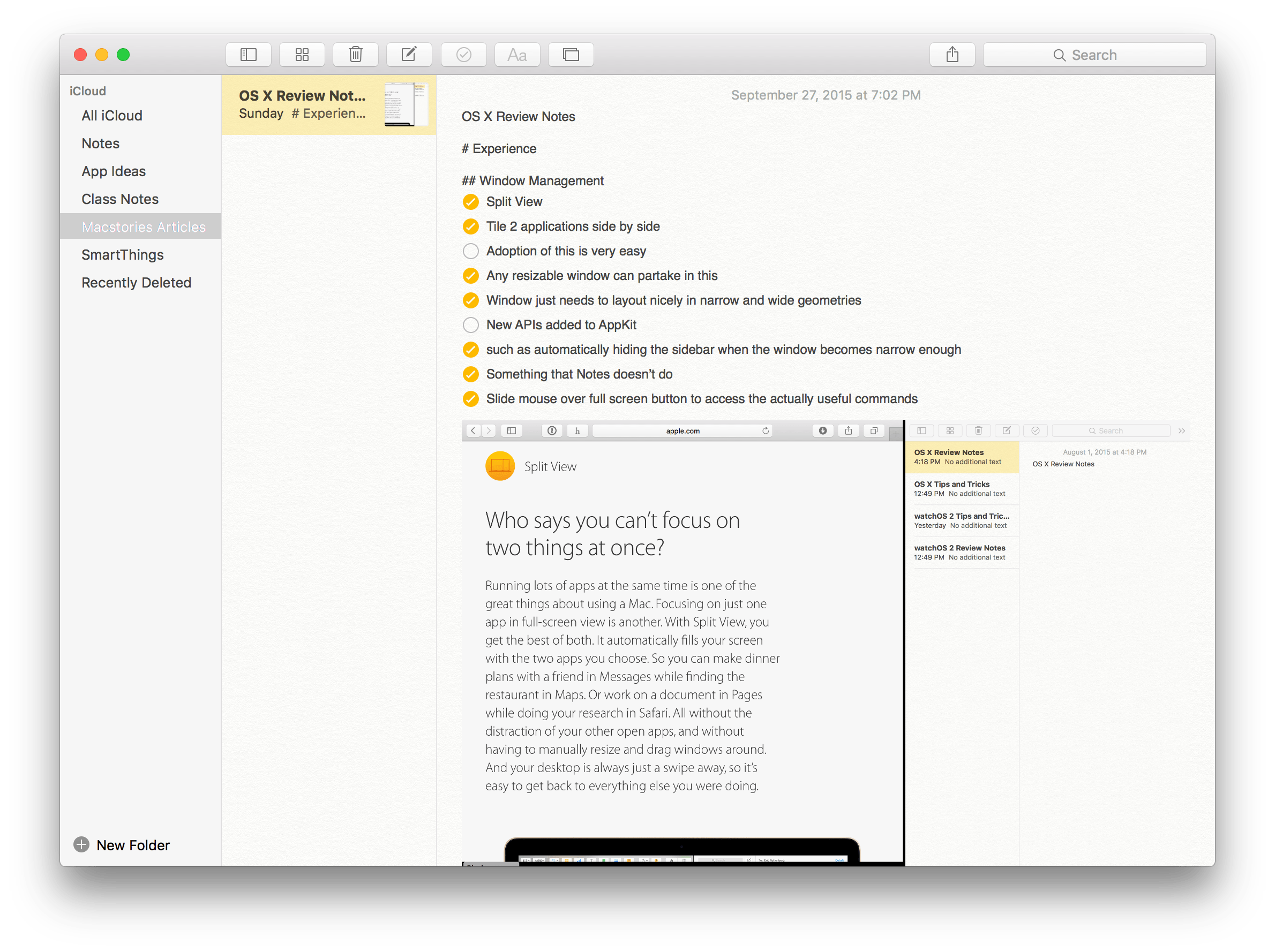
The final Split View-related annoyance I will mention (although this is really more of a Notes annoyance, I suppose): according to Apple, they’ve added APIs to allow developers to specify slightly different layouts for their apps in Split View. Mainly, they can choose to hide their app’s sidebar when the app is squeezed to the side, which sounds great. Apple’s own Notes app, however, does not support this. It will squeeze down the view of the actual note you’re trying to read, but the list of all your other notes in the active note’s folder will not shrink past a certain level, nor disappear entirely. This greatly hinders the usability of Notes if you want it visible as reference material while in Split View. Which is what I was trying to use it for while writing this review, but oh well 3.
First-Party Apps
Apple’s own first-party apps are the next main area of experiential improvement in El Capitan. Though each individual update may be fairly minimal, together they go a long way toward capturing El Capitan’s general target of improving the system in meaningful ways for everyday use.
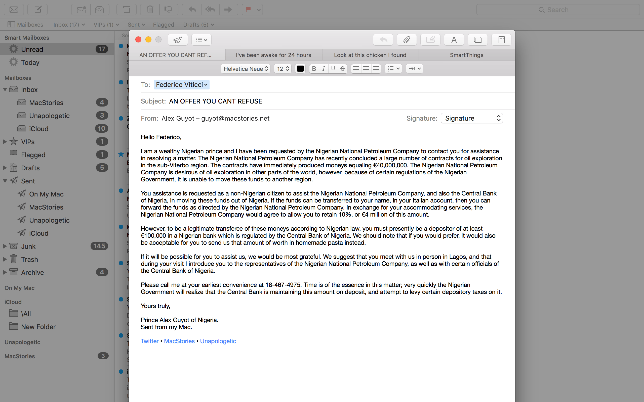
Many of Mail’s upgrades involve running the app in Full-Screen mode (note that for all apps, anything that is true of them in Full-Screen mode is also true in Split View). Mainly, compose windows will now pop up as a floating view on top of the Full Screened app rather than becoming a separate Full Screen window themselves, as they did in previous iterations of OS X.
These compose windows can also now include tabs, so you can work on multiple email replies in the same Full Screen floating window, switching between tabs to edit different messages. Tabs are only available when the app is running in Full Screen mode, and new tabs are created automatically each time you start a new message, reply, or forward.
New tabs are not created by the classic Command-T, but rather by starting a new email with Command-N, or by clicking the New Message, Reply, or Forward buttons. This was a bit confusing at first, but once I realized that these are not tabs in the sense that other apps use tabs, but rather are just Apple’s way of organizing multiple windows within the same full Screen app, it made more sense.
While using tabs in Mail, clicking anywhere outside of the tab window will send the window sliding down past the bottom of the screen. Only the title bar of the compose window will be visible, leaving you free to maneuver around the Mail app without exiting your unfinished message. If you find something you’d like to add to your message, such as an image or another attachment, you can drag it onto the title bar at the bottom to bring the compose window back up and drop the attachment into the message.
The final change in Mail is the addition of the iOS-style swipe commands for the messages list. Swipe to the right on a message preview to mark it as read, or swipe to the left to send it to the trash. A short swipe will just bring up the option for you to click it, while a long swipe will automatically trigger the action without further input.
Photos
The Photos app, introduced for the first time last April, has received some expected updates. Most of these should probably have been there from the start, but better late than never.
First off, Photos now supports third-party editing extensions. This feature has already existed in Photos’ iOS counterpart since iOS 8, but now makes the leap to the Mac. Third-parties can now integrate their editing controls directly into the built-in Photos app to give users more options. I haven’t been able to test out any of these extensions, but I’m hoping that some of the first-class image editing apps for Mac will bring a few of their features over to the Photos app. It would be great to have access to more advanced editing controls without having to export images into another app and then import them back when finished.
Apple also says the Photos app has had a general boost in speed and performance, and includes enhanced organizational tools. One of these is that you can now manually change or add location data to your pictures – an obvious feature that was inexplicably absent in the first version of Photos. I’ve also noticed that the Faces interface now allows the manual selecting and dragging of more than one suggested face at a time. This greatly speeds up the process of sorting faces, although the extremely slow animation still remains if you choose to hit enter and type the name of the faces rather than drag them to their respective circles.
For iPhone 6S and 6S Plus users, the updated Photos app also supports Live Photos. Just click to expand a live photo in the viewer, then hover over it to see a small “Live” icon show up in the bottom left corner. Hover the mouse over that icon and the Live Photo will play for you.
Safari
Safari remained largely unchanged, but did gain a few minor new features. Tabs can now be pinned to the left side of the tab bar. This can be done in any Safari window by dragging a tab to the left until it collapses into an icon view. These icons are not the site’s favicon, but a different type of image that each website’s owner can upload. If no image is uploaded, Safari will place the first letter of the site’s title in a box and use that for the icon.
When the pinned tab is active, the icon will be highlighted. Depending on how the developer implemented their icon, it can highlight in a color of their choice. The default icons will highlight in a color that Safari draws from the site’s favicon, although I’m not completely sure how it chooses when there are multiple colors. In my tests, it generally made a good choice, and I have no complaints about the decision to pick a color rather than just highlight everything in grayscale.
Pinned tabs will persist across window and app closings, so even if you close the window that you have pinned tabs in, just open another and they’ll be back (new windows don’t show any tabs, but just hit Command-T to make a new tab and the pinned tabs will show up). The pinned tabs will only hold URLs from the domain of the website that you pinned there: if you click an external link within a pinned tab, it will open in a new tab rather than loading within the pinned tab itself. Similarly, closing the last non-pinned tab in a window will close the whole window, rather than just switching the focus to one of your pinned tabs like the standard tab behavior would.
If you try to close a pinned tab (with Command-W), the tab will remain pinned in your tab bar, but your view will move to the first open standard tab. I like to move through my tabs with Control-Tab and Shift-Control-Tab, so this can be useful to know if I want to move through all of my pinned tabs right away. Rather than Control-Tabbing multiple times, I can just hit Command-W once to exit the pinned tabs, then go back to Control-Tabbing through the standard tabs.
To remove pinned tabs for good, drag the tab’s icon back to the right side of the tab bar. When you pass the last pinned tab, the one you are dragging will expand back to standard tab proportions and lose its special properties.
The next Safari addition is a volume icon that shows up in the Smart Search bar whenever a tab is playing audio. For anyone who’s ever forgotten which tab a video is playing from (or had one of those horrible video ads play unexpectedly from an unknown tab), you can now mute all audio from every tab in the window by clicking the new volume icon. Clicking again will unmute the tabs. The volume icon will show as a mute icon when you have mute enabled, a filled-in volume icon when sounds is coming from the tab you currently have open, or a hollow volume icon if sound is coming from a tab other than the currently open one.
You can click and hold on the volume icon to display a list of all tabs currently playing audio. Choose an item in this list to open that tab, or if volume is coming from tabs besides the one you have open, pick “Mute All Tabs” to turn on mute. If the volume is coming from your open tab, you’ll see options here to mute the current tab or mute all other tabs. You can also tell which tabs are playing sound by looking for the volume icon that will appear on the tabs themselves, but if you have enough tabs open, even this can get lost in the chaos.
The final change to Safari is the introduction of AirPlay for individual video frames. Prior to El Capitan, if you wanted to AirPlay a video to your Apple TV, you would have to AirPlay the entire screen and then Full Screen the video to make it take up all the space on the TV. Now, AirPlay mimics the functionality of iOS: rather than AirPlaying your entire screen (though this is of course still possible), you can instead click the new AirPlay button that will show up in supported video players to AirPlay only that video to your Apple TV. The rest of your screen will remain unchanged, so you don’t have to deal with the annoying screen resolution change, nor do you have to worry about those around you glimpsing other information on your computer when all you want to do is share a video with them on the big screen.
The only unfortunate part of this approach, which is not really Apple’s fault, is that many non-standard video players will not support the feature. Specifically, only HTML 5 video players support it, but even then those that use a custom control scheme will need to be updated by their developers if they wish to work with this feature. Not surprisingly, the set of players that don’t work with the feature includes many cable network and sports website video players, as well as Facebook videos. I could perhaps see Facebook updating to add support, but I wouldn’t hold my breath for the former two content sources. Thankfully, some of the most popular video sites such as YouTube and Vimeo do support the feature without changes.
Maps
The only new feature in Maps is the addition of public transit info. Just as with driving or walking directions, you can now look up directions for public transit routes and then send them to your iPhone or iPad to take with you on the go. I rarely use Maps on the Mac, opting instead to just look directions up right on my iPhone, but it’s good to have these features anyway just in case.
Also, as I mentioned earlier, transit was the last of the major features that Apple Maps was lacking which Google Maps had. Despite Apple Maps’ rough start a few years back, the service continues to improve, and now is fully up to par as a mapping service that could work for anyone. The only issue to watch for is how well your town is covered, but poor mapping coverage is a problem faced by Google as well (albeit a reportedly less prominent one).
The point is that Apple and Google are now facing the same set of problems with their respective mapping services. Both are seeking to improve the features they already have, rather than Apple scrambling to offer a particular feature in any capacity at all.
Notes
The Notes app has received the biggest update of Apple’s first-party applications. The app has been rebuilt from the ground up to include a number of new features and improvements. If you’re familiar with the Notes app on iOS 9, this is the Mac version of essentially the same app.
With the new Notes app, you can create checklists directly inside your notes by selecting the lines that you want as checklist items and clicking the check button in the toolbar. Clicking the button again will remove the checks. Once items are part of a checklist, you can check them off when ready by clicking the circles next to each item, which will fill the icon with yellow and a white check4.
Notes also now supports live previews of various content types. Drag a website URL from Safari into a note and a box will appear with the website’s title, URL, and tag line. This also works for locations dragged in from Maps, audio files, documents, and photos and videos – which will show up full width within the note.
If you’d rather not drag items all over your computer, you’re in luck. In El Capitan you will find a new Notes option in share menus for supported types of content. This is the Notes extension, and it’ll allow you to append the content, along with some optional text, to the bottom of a note of your choosing (or as a new note).
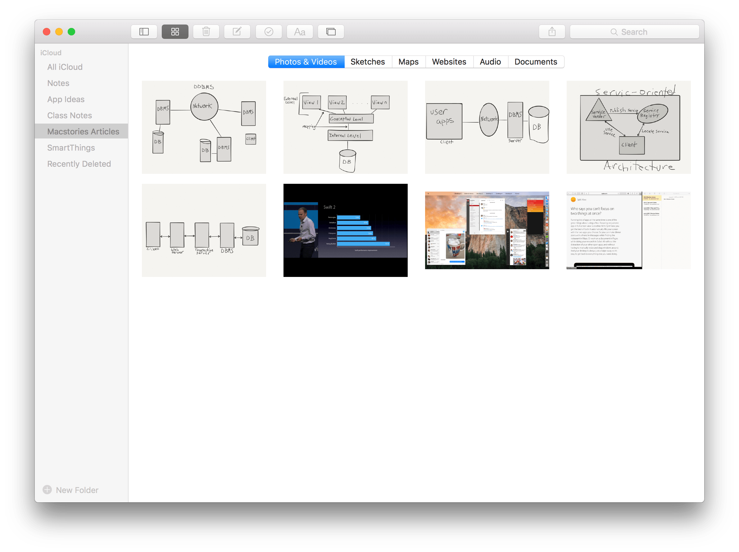
For all of this new special content, the Notes app also includes an Attachment Viewer. Click the icon with the grid of boxes in the toolbar to activate this, at which point you can switch between tabs for different classes of items to see those that you have stored in your notes. I’ve found this viewer useful when I want to open a particular note and I know I’ve placed a certain picture or URL inside of it. It’s often faster to open the attachment viewer and find the attachment than it is to find the textual note header amongst all my other notes. When you find the attachment, just right click it and choose “Go to Note” to open its container.
Within the Attachment Viewer you’ll find a “Sketches” section which contains any sketches that you’ve made in Notes for iOS. For some reason the sketches feature didn’t make it to OS X Notes, so while you can view your sketches if you make any on your iPhone or iPad, there’s no way for you to create or edit them via your Mac.
Finally, syncing. If you’ve tried to use Notes on multiple devices in the past, you may have noticed that the syncing was often slow and unreliable. This was because previous iterations of Notes synced over IMAP, the email protocol. Basically, it created a hidden email folder where it kept your notes, and when you opened Notes on a different device, it would pull in whatever was synced across to the email folder. In theory this sounds like it should work, but for whatever reason I’ve never had Notes sync well, and certainly not in real time, while it was using this approach.
Thankfully, Notes sync has finally made the jump to iCloud. In my usage of Notes over the past few months, I’ve found syncing to be excellent, and almost always pretty close to real time. I still yearn for some sort of refresh button to manually push/pull changes on the rare occasions when syncing is a bit slow5, but the new iCloud sync back end is far past the line of being “usable,” whereas the old IMAP sync never was.
- Without merit, but accused nonetheless. ↩︎
- The only limitation here is that the app has to support Full Screen mode. Some third-party apps do not support that right now because it would not previously have made sense for them to (most notably, Tweetbot for Mac). Hopefully, once El Capitan is released these developers will drop a quick update to enable that. ↩︎
- I took all of my notes in Notes, but I'm using Byword to write the actual review. I wanted to refer to my notes in a Split View as I wrote, but the sidebar issue made it take up way too much room. For a while I had them in normal mode with Notes' sidebar just shoved off the edge of the screen, but I ended up just opening Notes on my iPad and putting that next to my Mac, then Full Screening Byword. Writing is one of the few situations in which I actually prefer using Full Screen mode, because I never need to move the mouse and thus will never activate the Menu Bar unless I mean to. ↩︎
- Unfortunately, the Notes app is still keeping its ugly sticky-note-yellow theme color, which is displayed proudly on several interface elements within the app, as well as its app icon. Also, of course, the light gray textured background continues to persist, imperious to years of modern interface design. ↩︎
- This issue is not unique to Notes, I would really like a button like that everywhere. iCloud is much better than it used to be, but there are still some occasions when my devices go out of sync and I have no recourse except to wait patiently for whenever the next time they request new data is. Or more likely, do lots of random things in an attempt to force that refresh (force close and restart the app, add some unneeded data to try to make it sync again, etc.). ↩︎


