I almost can’t believe there was a time when the iPad didn’t have Split View. Or that, for years, I thought Apple would never bring split-screen multitasking to iOS.
More than any other iOS update before, iOS 9 has fundamentally reinvented the role of the iPad in my computing life. As I’ve written in my iOS 9 review and look at the iPad one year after my decision to stop using my Mac, iOS 9 and its multitasking improvements have catapulted the iPad away from the old limitations of iOS into a different league.
With iOS 9 and the iPad Pro, the list of tasks I can’t perform on my iPad is down to a single item.
I’ve never been happier with an iOS device and operating system than I am with the iPad Pro and iOS 9. Getting my work done is faster; using apps in Split View is a treat compared to iOS 8; and the software keyboard (despite some problems) continues to impress me with the addition of trackpad mode and the Shortcut Bar. The iPhone 6s, too, has been a pleasant surprise thanks to its superior performance and 3D Touch.1
There’s never been a better time to be an iOS user. But that doesn’t mean that everything’s perfect. When it comes to iOS, happiness is often a fleeting moment – a temporary satisfaction with the current state of things before the inevitable longing for something deeper. Such is the constant pursuit of the future.
Every year, I put together a list of the changes I’d like to see in the next version of iOS. I’ve been doing this for several years now. This year, I wanted to prepare something bigger. The tenth version of iOS due to be released later this year will be a major milestone for Apple and iOS users. It only felt appropriate to celebrate the occasion with a different take on my annual iOS wish list.
For the past few months, I’ve been collaborating with Sam Beckett (author of a fantastic Control Center concept we linked to a while back) to visualize my iOS 10 wishes with a professional concept video and static mockups. Sam and I discussed my ideas for a couple of months, and he was able to visualize2 what I would like to have in iOS 10 – both for the iPhone and iPad – with a style and attention to detail I’m extremely happy with.
Below, you’ll find a collection of my iOS 10 wishes, organized in tentpole features (the ones also shown in the video) plus additional sub-sections. Some of these wishes have been on my list for years; others are a consequence of the features Apple shipped with iOS 9.
Let’s get started.
Club MacStories Exclusive: iOS 10 Concept ‘Making Of’
Coming exclusively to Club MacStories members later this week, we’ll offer a Behind the Scenes look at our iOS 10 concept video in the MacStories Weekly newsletter. We’ll cover our approach to this year’s annual iOS wish list, the making of the video, the tools we used, and more.
Club MacStories offers exclusive access to extra MacStories content, delivered every week; it’s also a way to support us directly.
You can subscribe here or by tapping the buttons below.
More details on Club MacStories are available on our FAQ page.
Concept Video: iOS 10 Tentpole Features
(Note: for the best viewing experience, watch in 1080p/4K on the YouTube website or mobile app.)
Customizable Control Center
Swiping from the bottom edge of the display is the gesture I use the most on iOS. I love Control Center. I use it daily to control music playback, turn on Do Not Disturb, and launch the camera. But the core functionality of Control Center has been virtually unchanged since iOS 7, and it’s time for an upgrade.
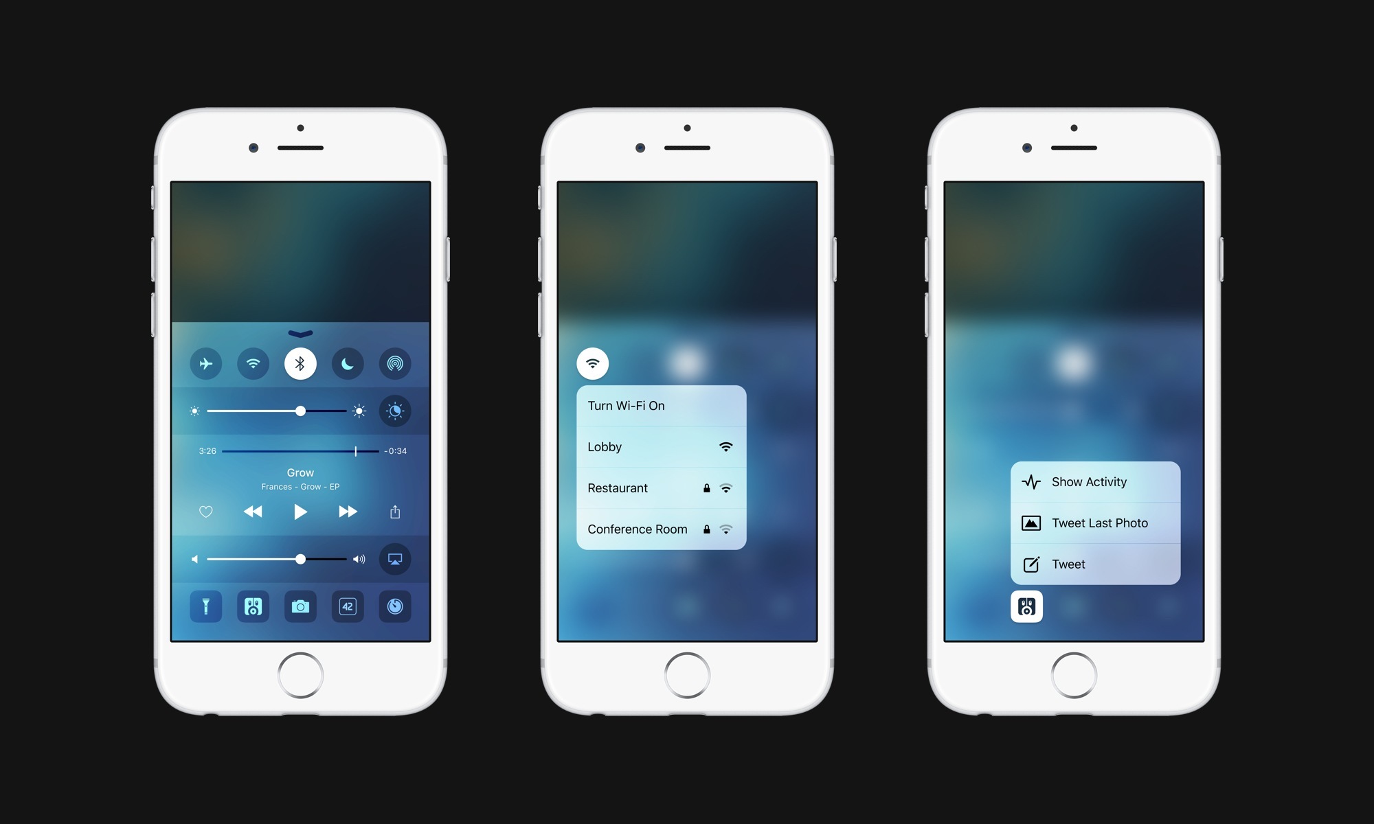
Control Center is the perfect candidate for a refresh focused on user customization and 3D Touch shortcuts. In iOS 10, Apple could expand Control Center to let users swap default toggles (the top row on the iPhone) with other settings they frequently access. The bottom row of app shortcuts (including the flashlight) could also be made customizable by letting users pin their favorite apps to Control Center.
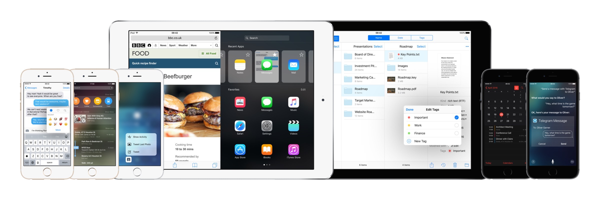
Thanks to 3D Touch, the modernized Control Center could also offer deeper access to settings by pressing on toggles without actually going into the Settings app. A light press on the WiFi toggle, for example, could bring up a list of known WiFi networks to connect to; pressing on the Bluetooth toggle would show a menu to re-connect to an accessory that a device was previously paired with.
As for app shortcuts, developers would have to provide an icon glyph to use in Control Center; ideally, they could also define a default behavior for an app when launched from Control Center.3 The 3D Touch quick actions available for apps in Control Center, on the other hand, would be the same ones available on the Home screen.
As our devices and OSes get more powerful and complex, Control Center remains a harbor of convenience and speed. By opening Control Center up to user customization and 3D Touch, Apple could considerably reduce the time we spend fiddling with settings and launching apps on a daily basis.
System Dark Mode
Over the past year, Apple has been thinking about how to improve color reproduction and viewing comfort on iOS devices. Night Shift and the True Tone display are steps in the right direction – after iOS 7’s massive redesign, it’s clear that the predominance of white-based interfaces doesn’t play well in different lighting contexts or at night.
In iOS 10, it’s time for Apple to step up its game and build a system-wide dark mode.
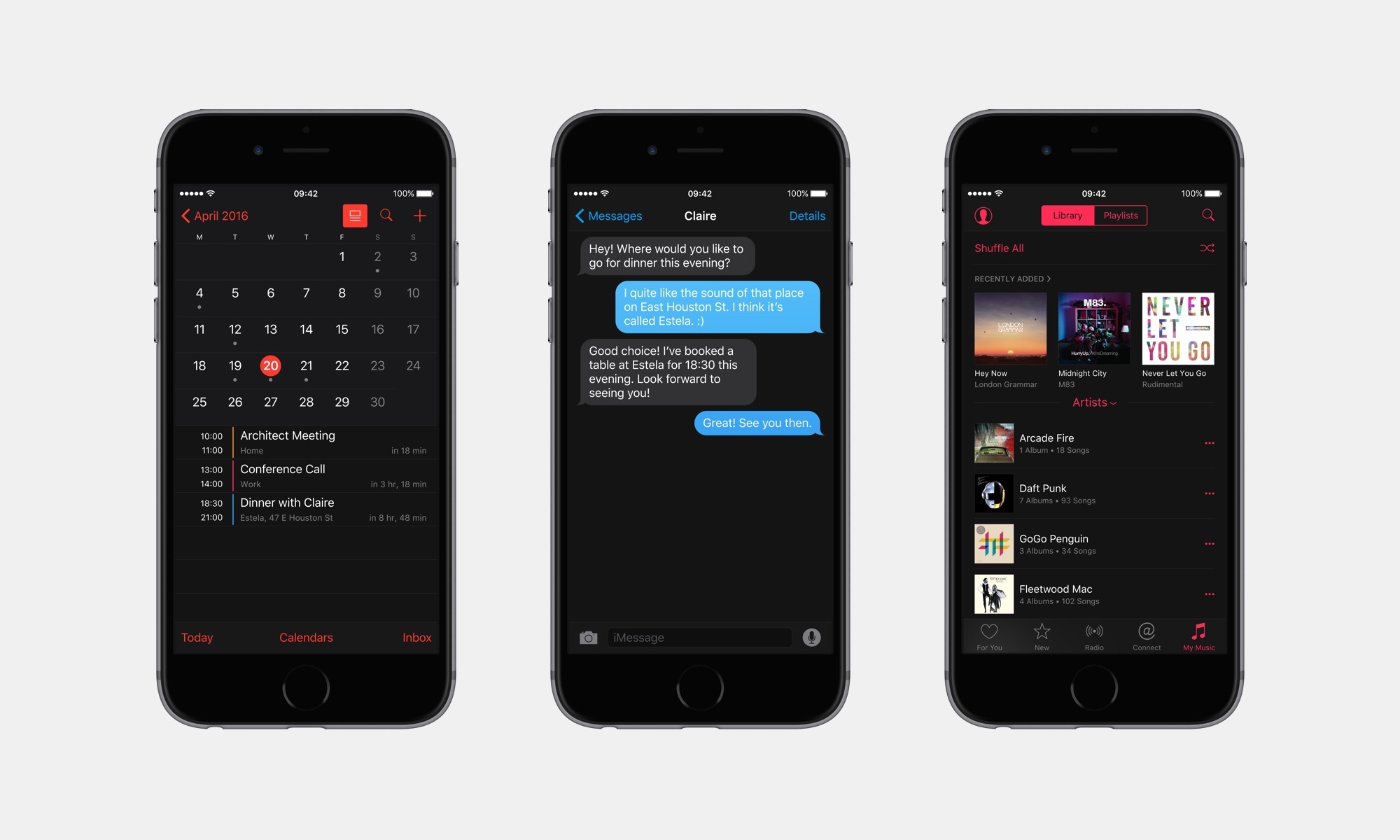
An iOS Dark Mode would be modeled after what Apple has already done with the Apple Watch app for iPhone and dark themes in iBooks, not to mention excellent third-party examples such as Ulysses, Tweetbot, Drafts, and OmniFocus.
Dark Mode would live under Settings > Display & Brightness, and it would be activated like Night Shift – either manually or on a schedule. Developers would be able to see if dark mode has been enabled on a device and program their apps to automatically switch to a built-in dark interface. Additionally, developers would also be able to opt out of dark mode if an app doesn’t require it (say, an app that already has a dark UI or a game).
The benefits of a system-level dark mode – increased contrast and higher legibility – would fit with Apple’s recent additions to iOS’ display settings, and they would be a boon for accessibility as well.
Revamped Messages
Apple’s Messages may be the most used app on iOS, but it saw the last major changes two years ago, and the messaging landscape has changed profoundly since 2014.
There are plenty of options Apple could explore to refresh iMessage and the Messages app:
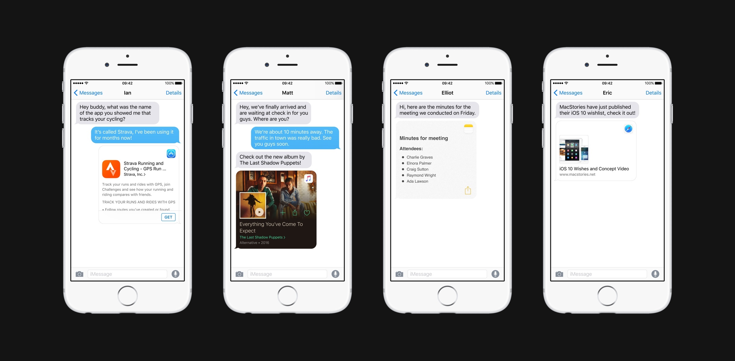
- Message extensions. Provide developers with new extension points (similar to Facebook’s Messenger) to share a variety of media or data types in the Messages app. Imagine sharing a tweet with a native preview in a conversation, or attaching a GIF from a dedicated GIF app without using the clipboard or saving to the photo library first. A new extension framework for the Messages app could take iMessage sharing to the next level.
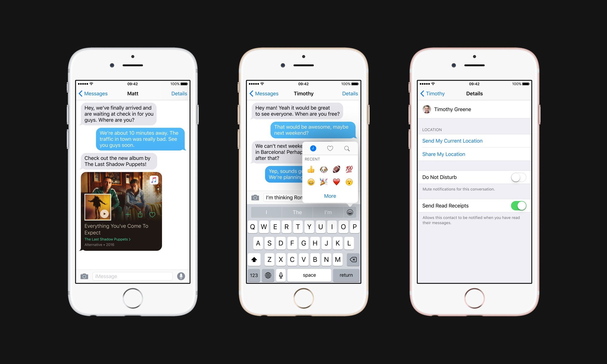
- Richer previews. Every modern messaging app offers richer previews for links shared in conversations. Even Apple does this in their own Notes app. Web links shared in Messages should offer more context; while they’re at it, all sorts of documents and data shared in Messages should come with unique previews (see above). For instance, imagine the ability to share an Apple Music playlist that shows artwork and a play button in iMessage, or an individual note from the Notes app that retains styling and interactivity.
- Faster emoji input. Emoji have become the modern language used by billions of people every day. Inserting emoji on iOS is slow and cumbersome, and Apple should come up with ways to speed up emoji insertion. In our concept, we imagined a panel activated from the QuickType bar with the ability to view recent emoji, pin favorites, and search for an emoji by name (search should also be available in the full emoji keyboard).
- Granular read receipts. One of the most antiquated aspects of iMessage needs a revamp in iOS 10. Users should be able to assign read receipts on a per-contact basis: you may want your significant other to know you’ve read their message, but you may not want the same for friends or colleagues.
- Share anything in conversations. This follows messaging extensions and rich previews: users should be able to share anything in a conversation, whether it’s a document, an image, a video, or a map. Why is there no document picker in the Messages app? Why is the camera roll the only source for embedded media?
- Web access and reliability. As services like Messenger and Slack have shown, giving users the ability to log in and view their messages from any web browser helps make a service sticky and ubiquitous. In addition to a full-featured Messages app on iCloud.com, Apple should fix whatever still makes messages disappear when viewed on the Mac, or display them out of order, or not be delivered at all. iMessage – especially in group conversations – still isn’t as fast or as reliable as Telegram and Messenger. This needs to change.
When Apple introduced iMessage five years ago, its unification of SMS and free messaging heralded a new era of mobile messaging. Five years later, iMessage’s legacy SMS support is largely a liability, holding the service back in terms of innovations Apple could bring to the platform.
Competing services such as Messenger, WhatsApp, Telegram, or LINE have created communities of hundreds of millions of users and they’re pushing the boundaries of mobile messaging, turning it into a platform in its own right. It’s time for Apple to re-establish iMessage as the leading messaging service – not just through numbers and security, but with innovation and reliability as well.
Improved iCloud Drive and Document Picker
When they were introduced in iOS 8, iCloud Drive and the document picker promised to bring desktop-like qualities to file management on iOS. Two years later and with a barebones iCloud Drive app (a poor man’s Finder) the only meaningful addition in iOS 9, the document picker still shows a lot of potential, but it’s hindered by slowness and a lackluster execution.
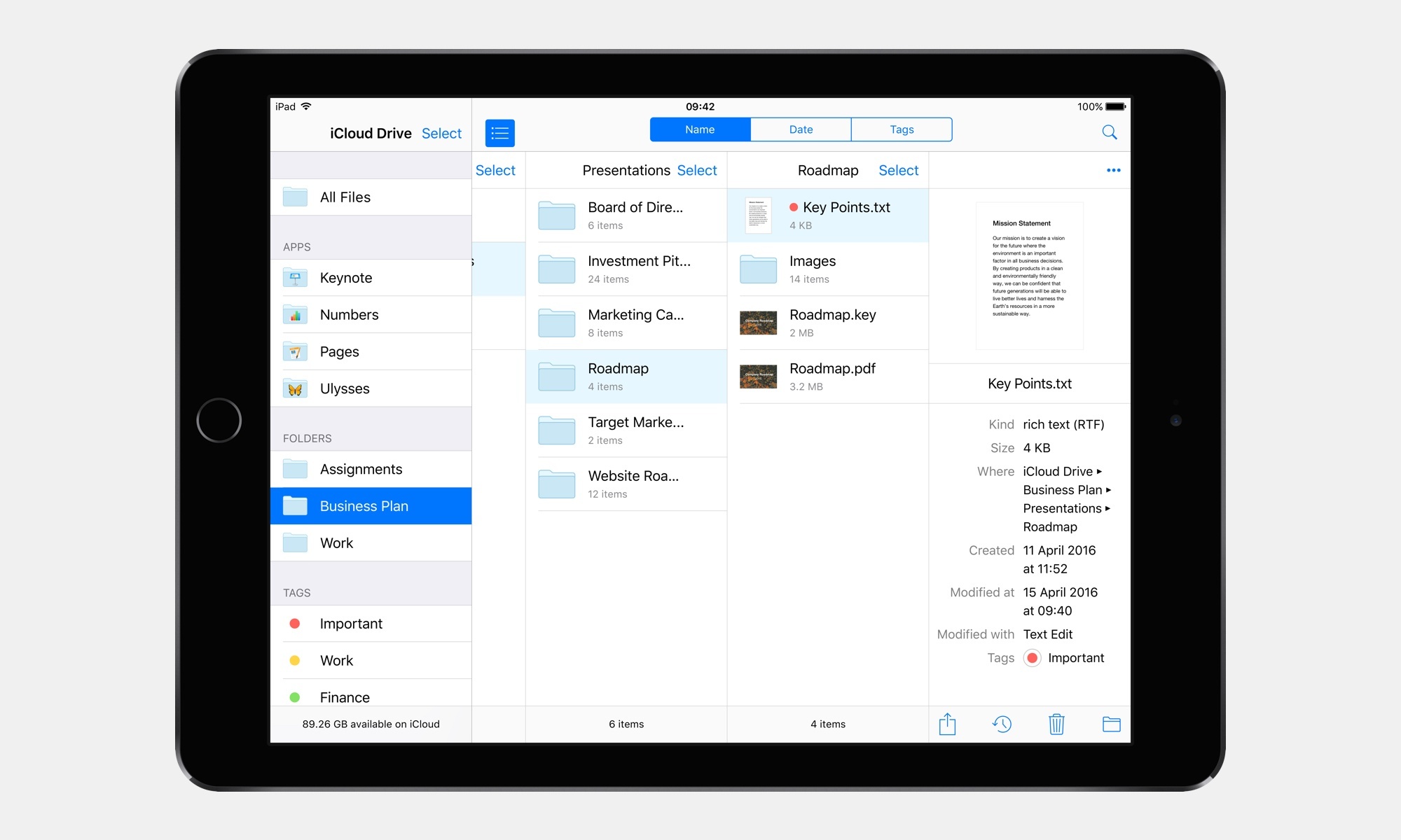
The file management features of iCloud Drive still pale in comparison to the Finder on OS X. At this point, it’s not too absurd to think that iCloud Drive on iOS should borrow a few features from its much more capable Mac counterpart:
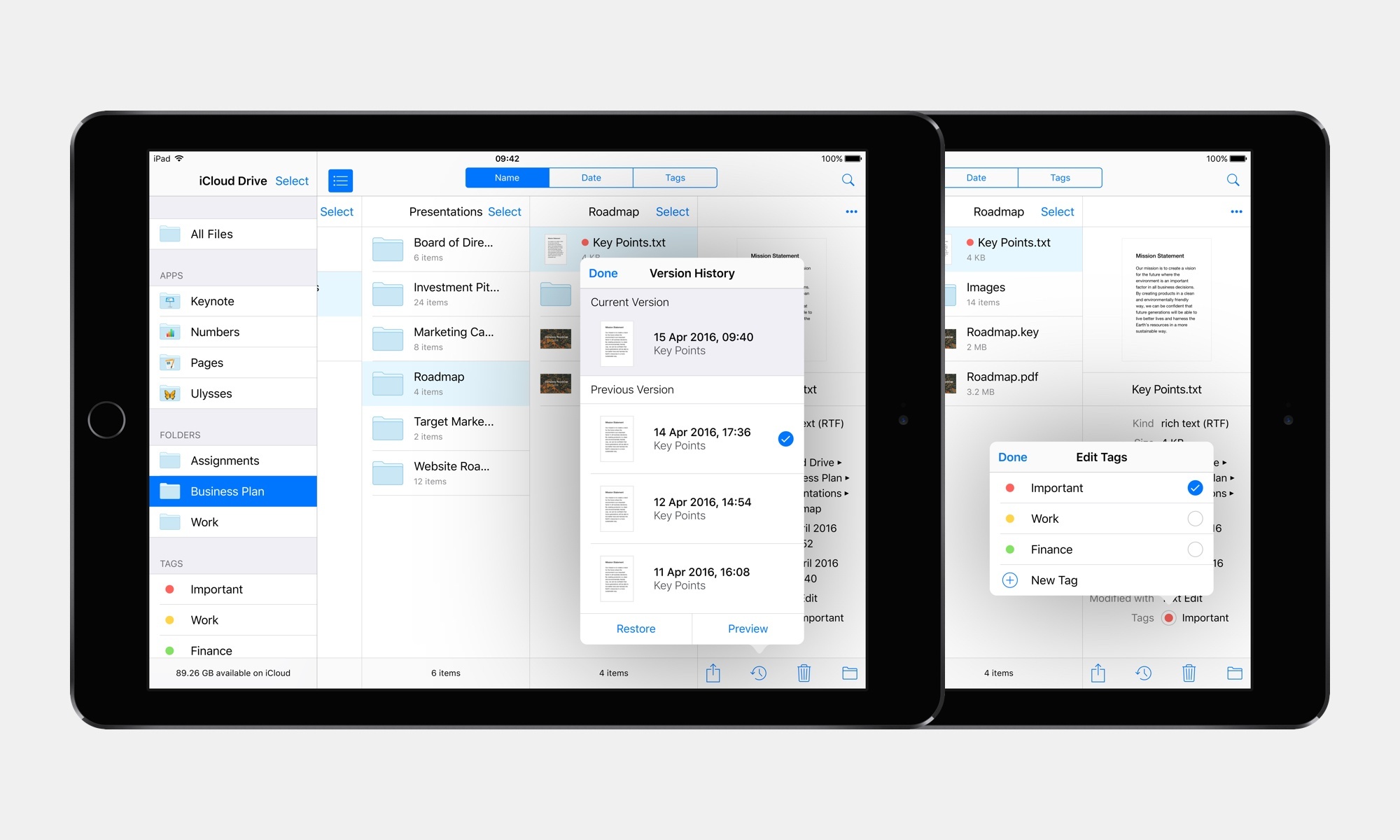
- A column view on the iPad;
- The ability to view and restore versions of a file (available for all document providers);
- Tagging and browsing by tag;
- Restoring deleted files (currently only available on iCloud.com);
- A new ‘Open In’ menu with support for multiple files, so that it’d be possible to move multiple files between apps with a single command.
I don’t believe Apple should move away from the app-based model of file management on iOS. However, both document providers and iCloud Drive ought to be faster to operate, more transparent, and as versatile as they would be a on desktop computer. Apple can do this.
Improved iPad Multitasking
A couple of months into iOS 9, it was clear that Apple rolled out split-screen iPad multitasking with two glaring oversights: a terrible app picker and lack of drag & drop between apps in Split View.
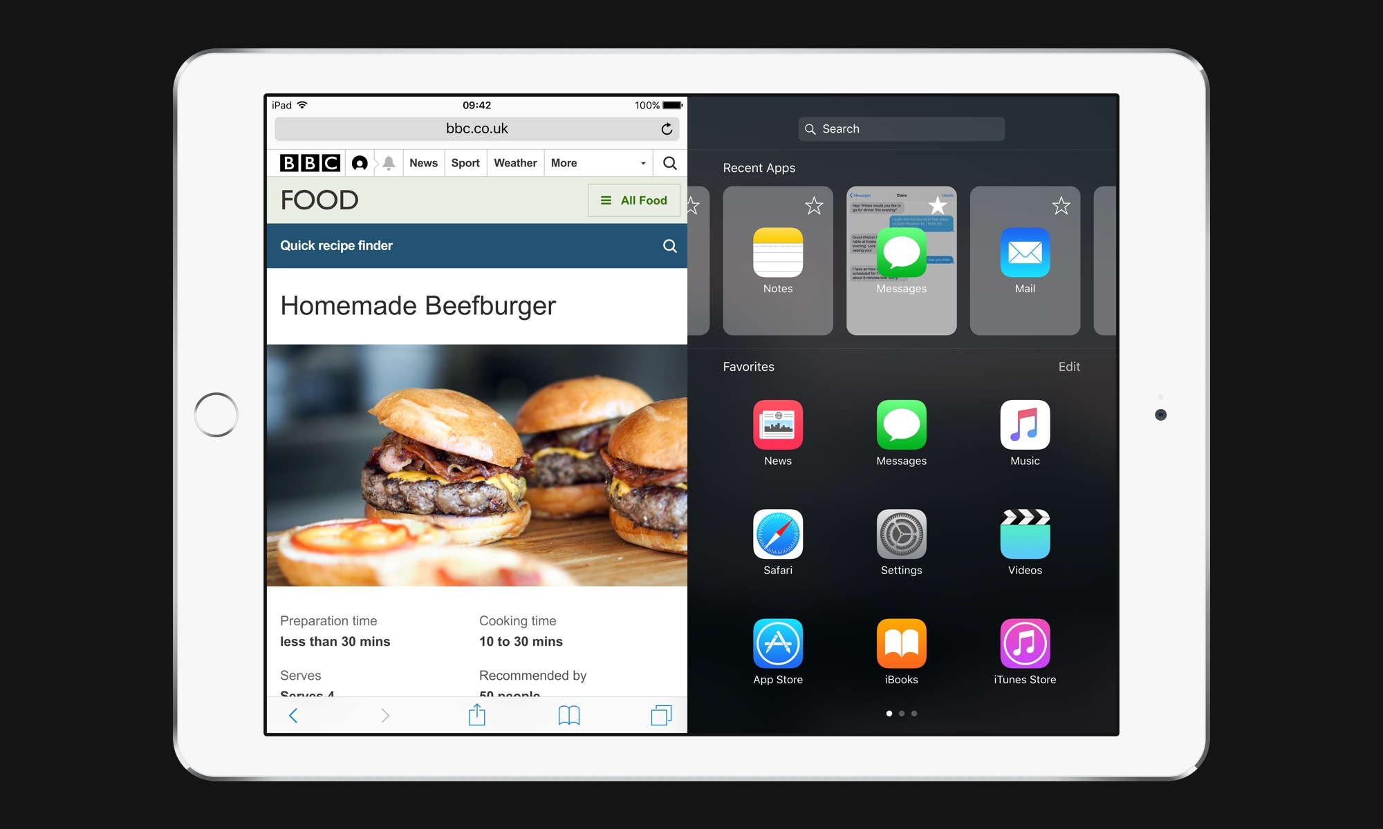
The Slide Over app picker is the iOS 9 feature that has aged the worst since September. Finding apps to put in Slide Over and Split View is a tedious process, and a layout with low information density and lacking a search box doesn’t help in picking apps. Any kind of redesign would be welcome: a tighter presentation of app icons, the ability to search, and even a way to pin some apps as persistent favorites would do wonders.
In our concept, you can see how a search bar would be displayed above a scrollable list of recent apps (similar to the system multitasking tray), with a 3x3 grid of user favorites below. I think these additions would mitigate some of the frustrations with switching between multiple apps in Split View.
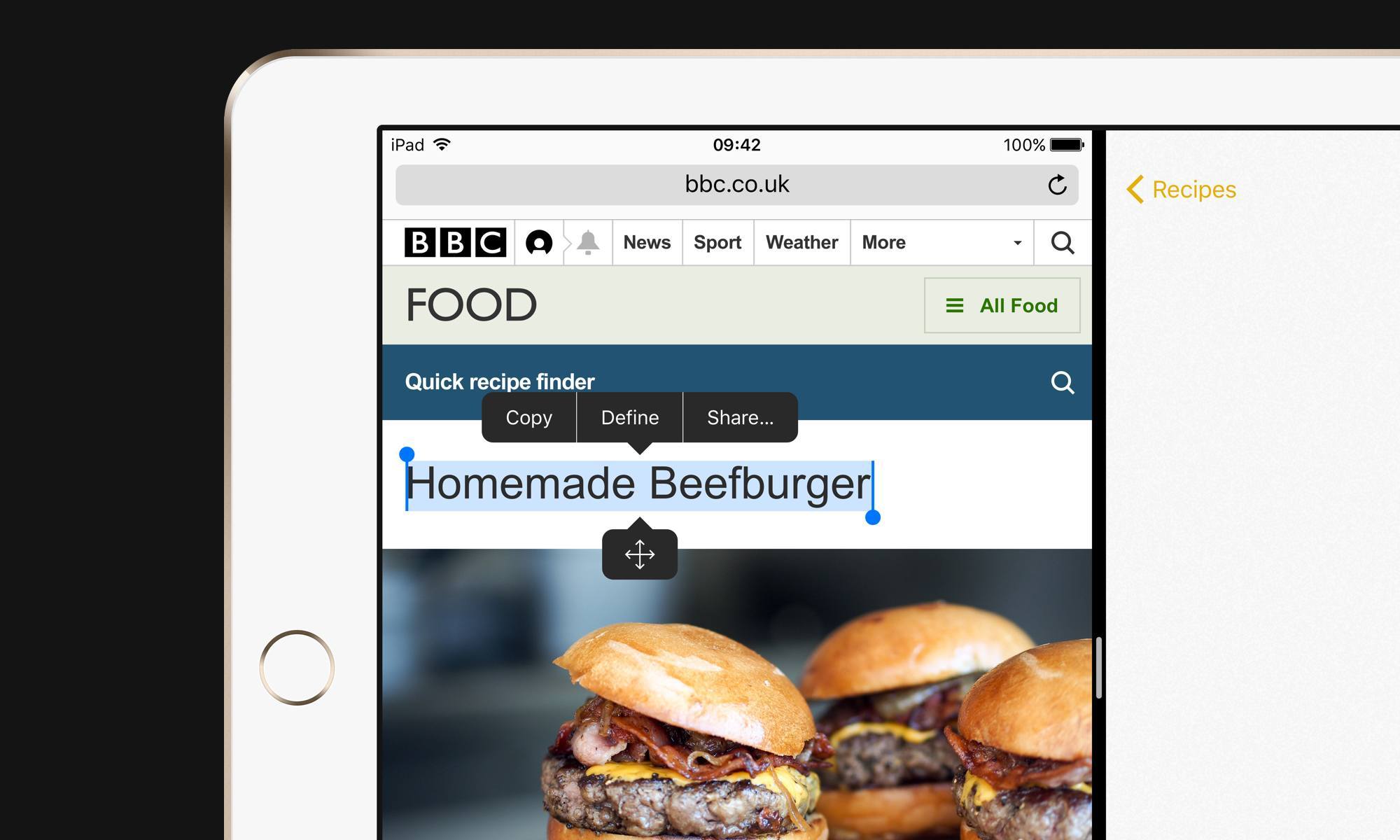
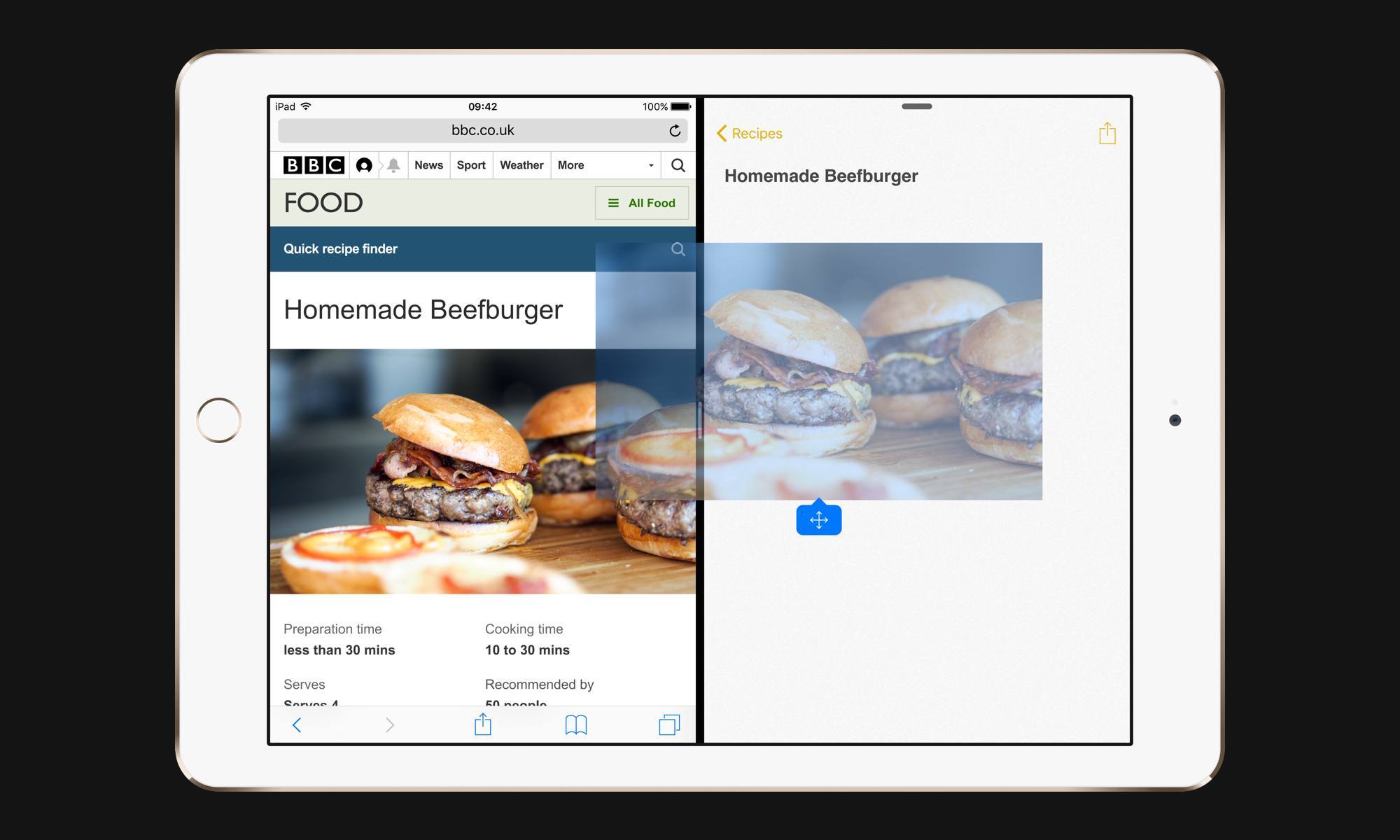
Drag & drop is a trickier one. To provide a way to select content – any content, be it text or images or documents – and transport it from one app to another, Apple would have to come up with a model that can coexist with the copy & paste menu (if they chose to rely on traditional selection) or 3D Touch, or both. To provide a visual cue for draggable content, perhaps there could be a “drag handle” users could hold to drop selected content elsewhere.4
The fact that the system clipboard is still the fastest bridge between two apps is inelegant and archaic in 2016. Drag & drop would play to iOS’ strengths thanks to multitouch, and it’s the logical next step for iPad multitasking.
Siri API and Textual Siri
Google Now/Voice Search and Amazon’s Alexa are outclassing Siri in three key aspects of digital assistance: intelligent speech recognition, third-party app integrations, and the ability to type requests without speaking. I think Apple should tackle all these areas to move Siri forward.
Leaving voice recognition aside (a problem that should be fixed at scale with new tech/better or more microphones/superior understanding of a user’s context), a Siri API and textual conversations are two features I’ve wanted to have in Apple’s assistant for a few years now.
In 2016, the digital assistant landscape is more competitive than ever: Amazon has set its eyes on pervasive assistants for the home, third-parties are entering the stage with impressive tech, and the trend of smart and flexible chat bots is continuing at fast pace. If Apple has been paying attention, they should know app integrations and the ability to text with Siri are obvious moves.
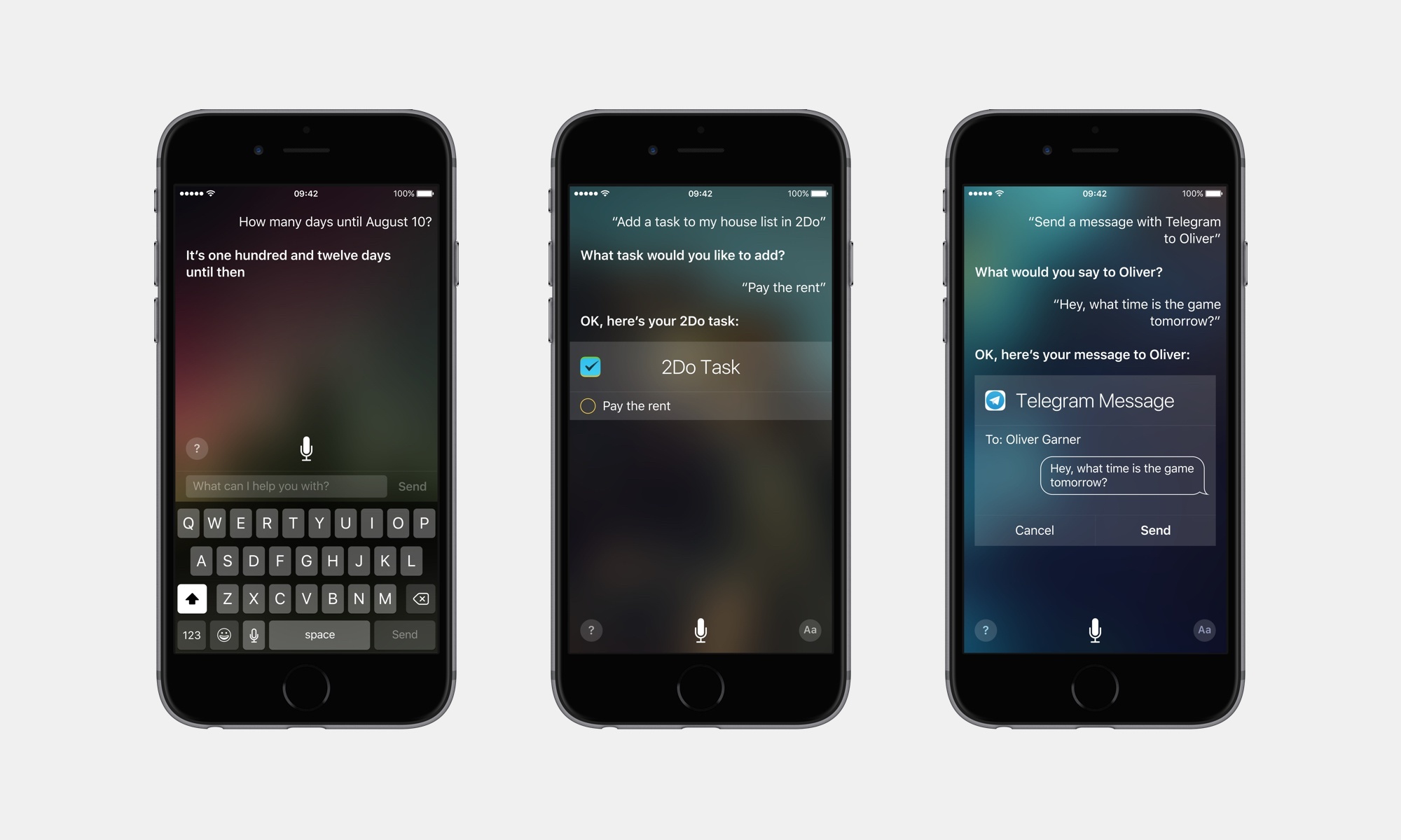
A Siri API wouldn’t only make the assistant more powerful on iOS – it’d also dramatically improve the capabilities of the Apple Watch with a way to quickly retrieve information from any app. And with a way to converse with Siri silently, it would become more convenient for situations where voice activation isn’t an option, such as public transit or other places.
Just think about the possibilities: you could ask Siri to create tasks in 2Do or OmniFocus; if you’re on the bus and can’t talk, you could text Siri5 and ask her to bring up the best Italian restaurants within a price range; or, Siri would know how to load your favorite workout from the fitness app you’re using. And so on.
Siri has long been envisioned as the fourth interface of iOS. By opening it up to millions of apps and the convenience of texting, Siri in iOS 10 could become a new pillar of interaction on the iPhone and iPad.
Smarter Proactive Page
One of the tentpole features of iOS 9, the returning Search page with Proactive suggestions, has turned out to be an underwhelming effort at intelligent shortcuts intermixed with general news and events.
There’s plenty of ways Apple could improve this page without giving up on their respect for user privacy and data collection. Based on current location and time of the day, iOS should provide suggestions for the next calendar event such as directions, traffic conditions, or transit times (as opposed to widgets, which simply list all upcoming events and tasks). New music releases from artists you follow could be summarized with buttons to start playing on Apple Music right away.
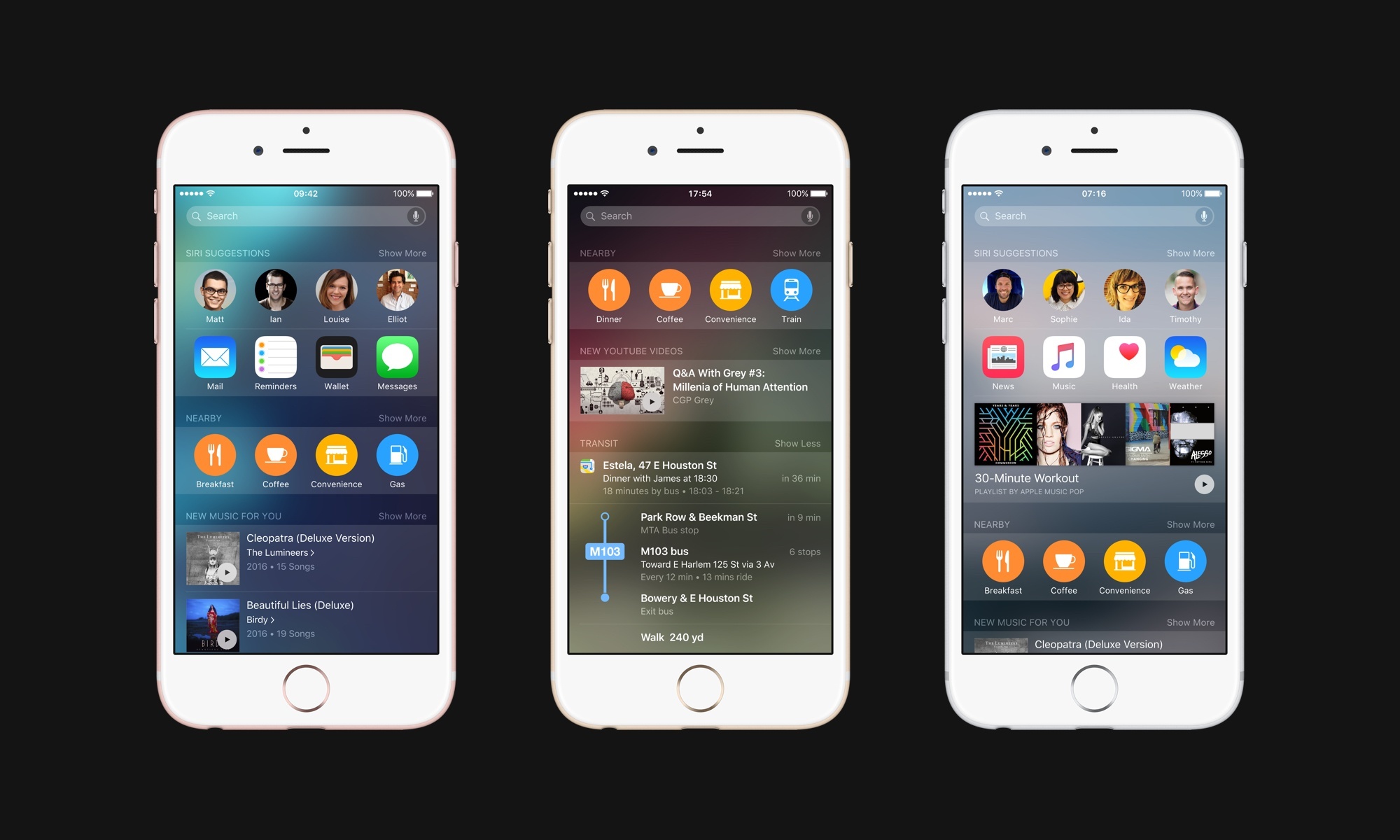
New Proactive suggestions for new music releases, YouTube channels (via Proactive API), transit directions, and Apple Music playlists.
Based on user patterns and current location/context (e.g. at home, at the office, in the car, running, on public transit, etc.), iOS could surface relevant emails (newsletters you read at night, or a meeting-related message when a meeting is coming up), documents, workout playlists, or messages you haven’t replied to. And by opening up Proactive to third-party developers, apps would be able to suggest relevant content that iOS could consider for inclusion in the page at appropriate times.
If taken to the extreme, Apple’s hard stance on privacy will ultimately prevent them from building a useful Proactive page. It would be like building a Ferrari and only driving it to 20mph. With a combination of local processing and anonymized user profiles, Apple should come up with ways to let iOS devices be smarter without being creepy.
Everything Else
On the next page, you’ll find a collection of every other feature I’d like iOS 10 to bring. Think of it as those slides with dozens of additional features Apple puts up on stage at the end of each WWDC keynote – some of these are big changes, while others are minor improvements to the iOS experience.
- I use 3D Touch heavily every day. Peek previews for tweets and links in Tweetbot, Home screen actions, keyboard cursor control, and channel shortcuts in Slack are gestures I intuitively perform daily. ↩︎
- He was also very patient. As you can imagine, I sent him a lot of ideas and comments before signing off on the final version. I can't recommend working with Sam enough. ↩︎
- A Twitter client could always open in compose mode, for example. ↩︎
- The drag handle, of course, would only appear when two apps are in Split View. ↩︎
- In our concept, text mode in Siri would be activated by tapping the 'Aa' button in the lower right corner of the Siri interface. ↩︎


