Overcast, Marco Arment’s popular podcast app for iOS, is defined by an interesting dualism: its essence has remained remarkably consistent with the original version released three years ago; at the same time, Arment has periodically revisited Overcast’s design, features, and business model to build a superior listening environment for a larger audience.
The same judicious iteration permeates Overcast 3.0, launching today on the App Store. With improvements to episode management, visual changes aimed at modernizing the interface, and an evolution of the existing subscription-based model, Overcast 3.0 is another thoughtful combination of new ideas and old tropes, which converge in a refreshed yet instinctively familiar listening experience.
Overcast 3.0
While Overcast 3.0 may not look drastically different from version 2.5 (launched in March), there are several visual tweaks meant to transition the app’s design language from iOS 7 to iOS 10.
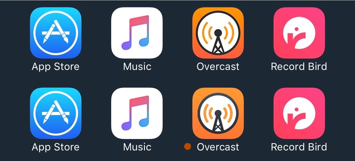
It starts with the app icon, which has been redesigned to host a smaller circular shape. The change is subtle, but it’s in line with other modern iOS apps.1
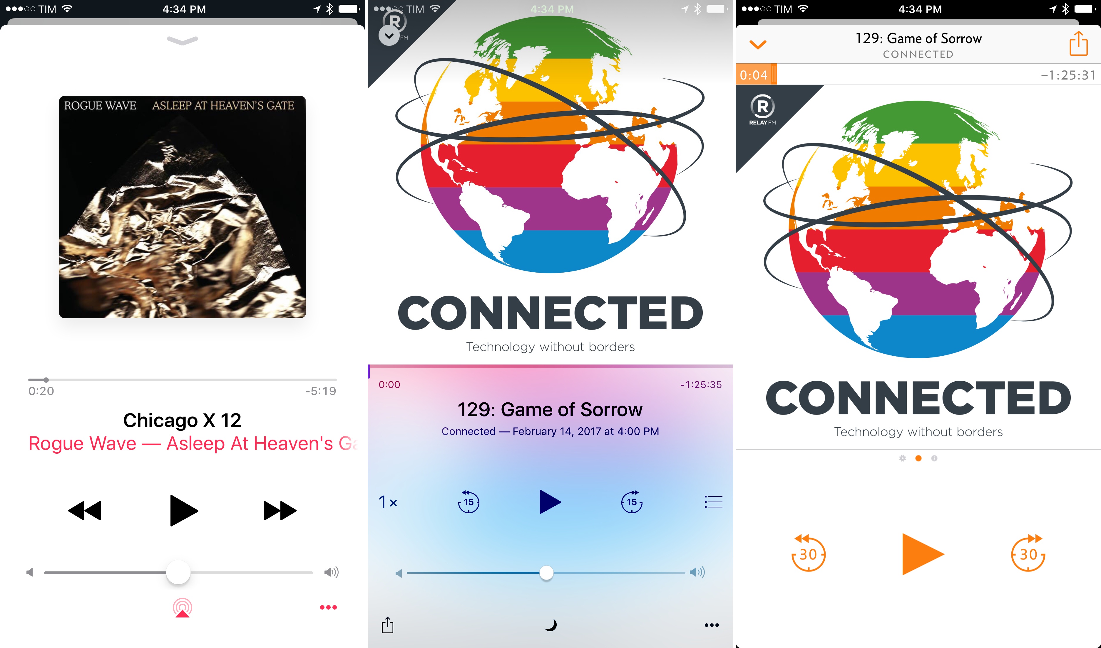
More importantly, Overcast’s flow has been rebuilt around the concept of cards in lieu of nested screens. Following Apple’s implementation of stacked views in Apple Music and the iMessage App Store for iOS 10, Arment has adopted a similar approach for every non-list page in Overcast 3.0: the Now Playing screen, settings, downloads, and recommendations now appear as cards that slide up from the bottom of the UI while the previously viewed screen recedes in the background and is detached from the status bar.
As I wrote in my iOS 10 review, I’m a fan of this card-like appearance, and I was hoping more developers would use it in their apps. In many ways, Arment’s take on stacked cards is preferable to Apple’s: while still not interruptible, the animation has a shorter execution time and the card can be dismissed with a downward swipe or by pulling from the left edge of the screen. As a result, Apple Music and Overcast may share a similar Non Playing view, but Arment’s version feels snappier and more comfortable to use.2
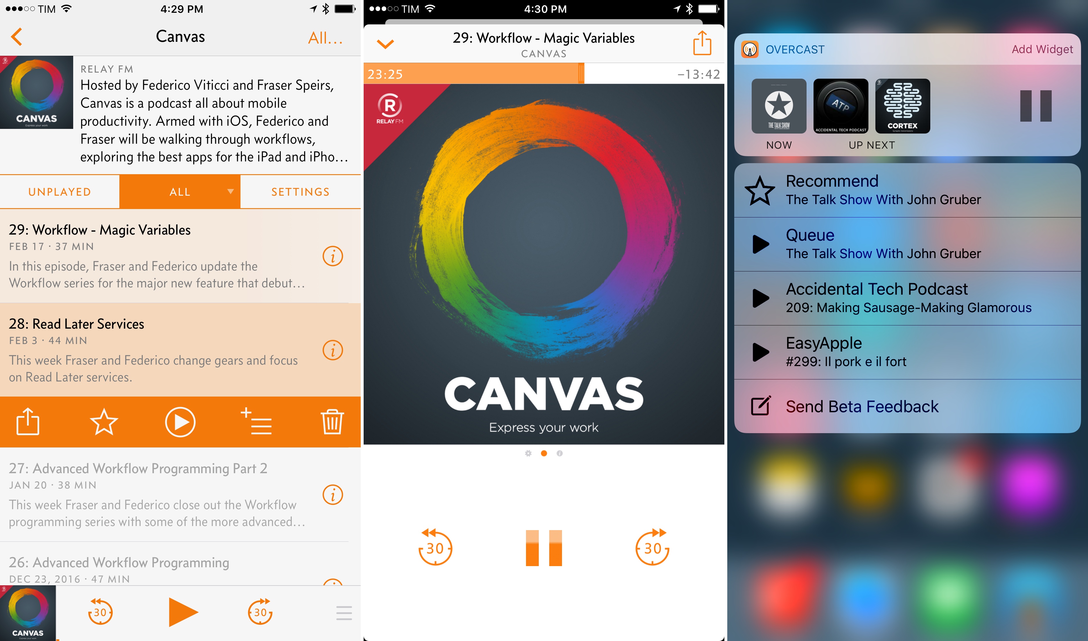
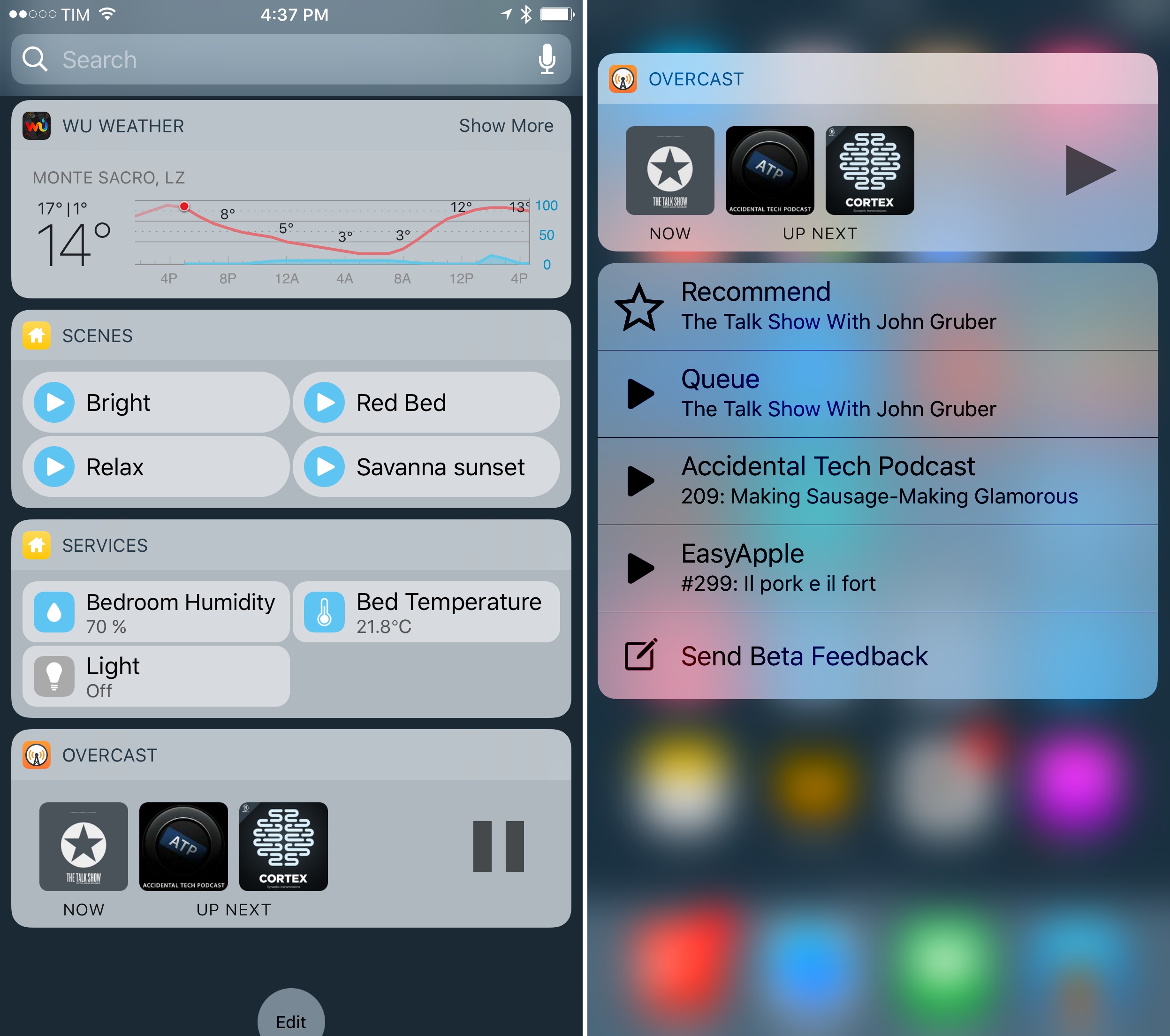
Other functional improvements are poised to make Overcast a better iOS 10 citizen, too. Overcast 3.0 has a widget, which allows you to see what’s playing, resume playback, and keep an eye on upcoming episodes from your Up Next queue (more on this below). The widget’s design isn’t too imaginative, but it gets the job done; it’s nice to have more controls on the Home screen.
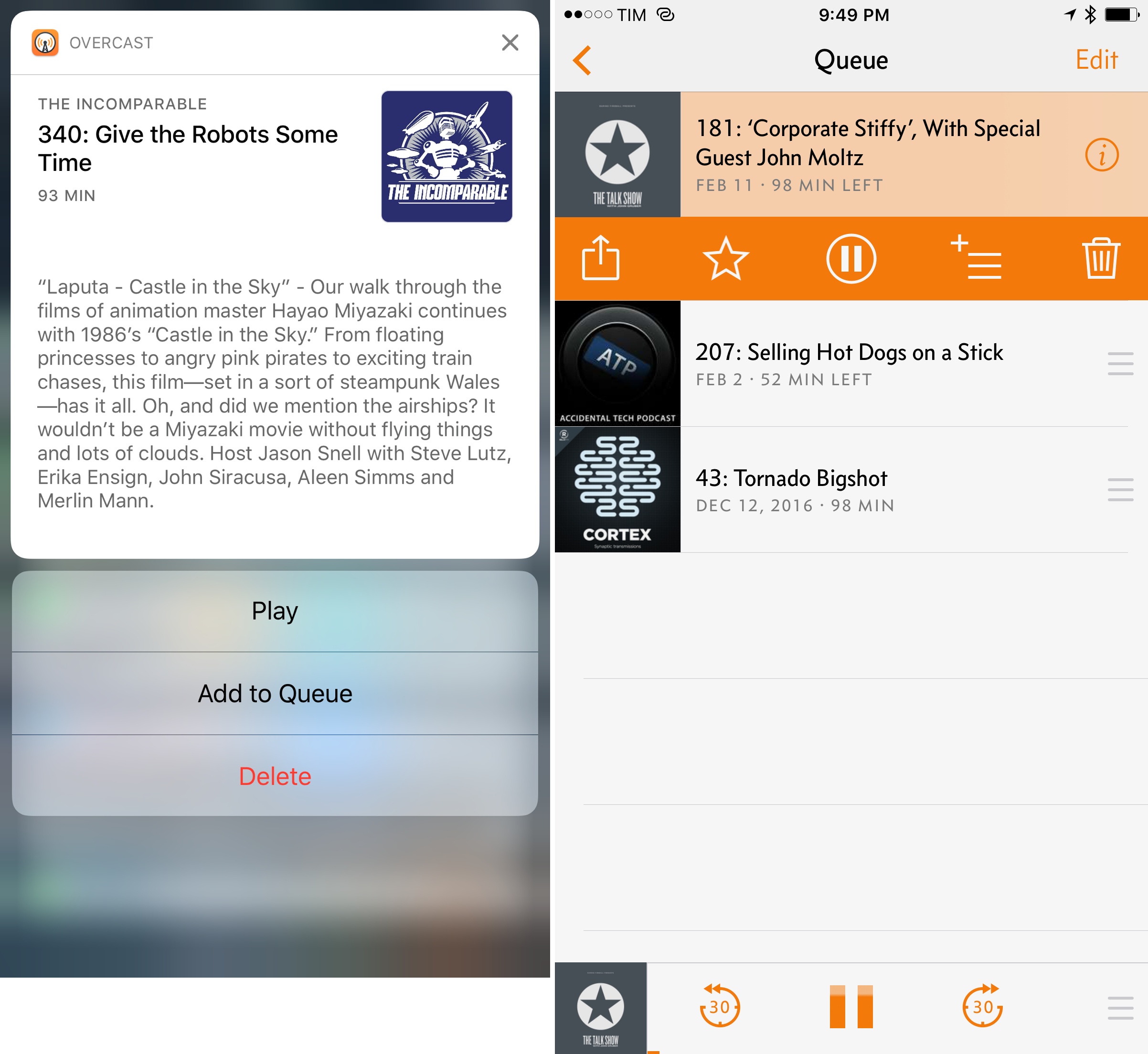
When scrolling a list of episodes, you can now peek and pop an episode’s description and show notes with 3D Touch. I’ve long wished for an easier way to quickly preview the contents of an episode, and this is it. Plus, by swiping the peek card vertically, you’ll access shortcuts to play an episode or delete it.
There’s also support for rich notifications in iOS 10: when a new episode from your subscriptions comes in, you can expand its notification to reveal the show’s artwork, episode information, and actionable buttons to play the episode or add it to your queue for later.
I interact with Overcast primarily by browsing the app; I dislike enabling notifications for podcasts, but I can see why others will appreciate the increased interactivity of episode alerts.
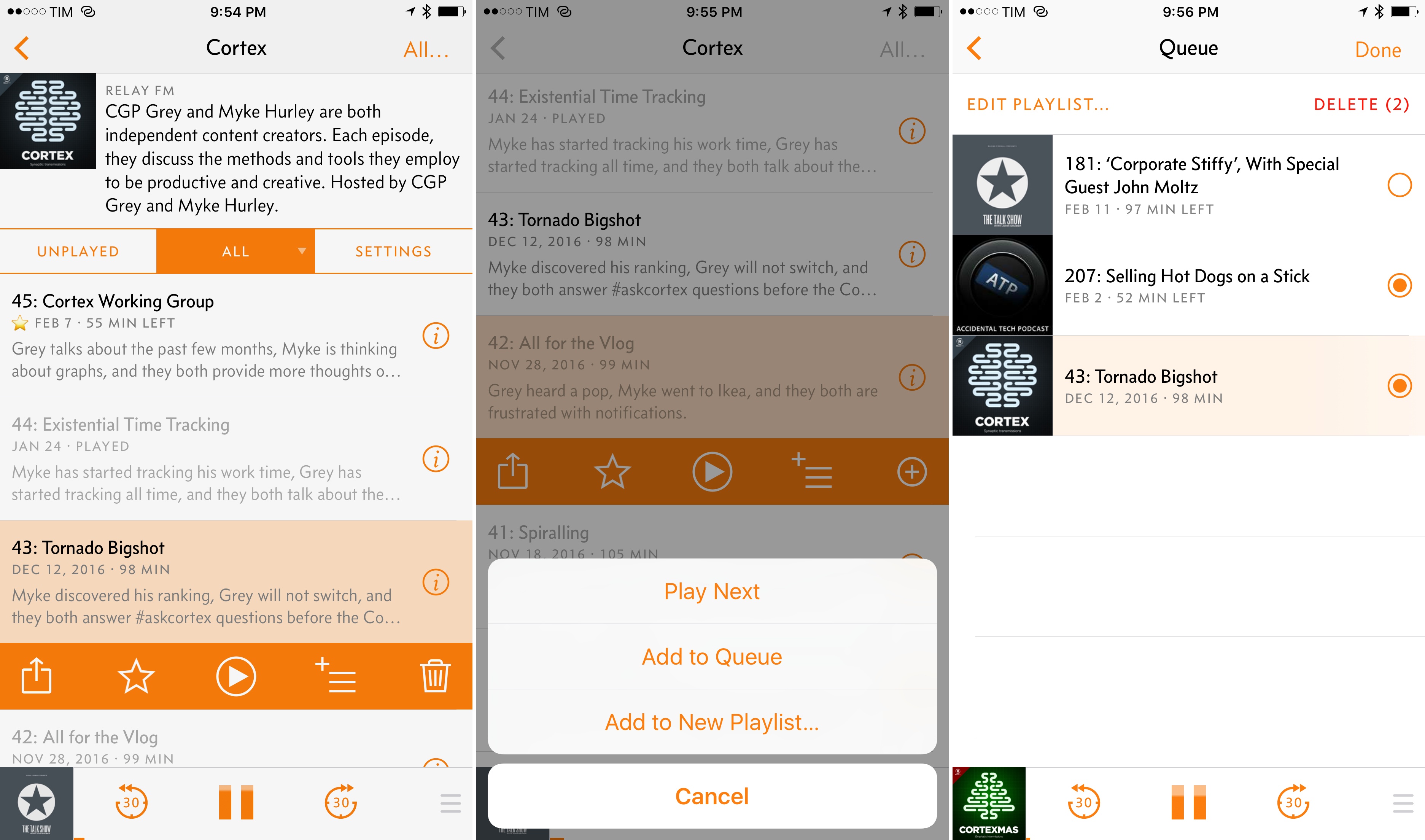
The most notable visual and practical change in Overcast 3.0, however, is the new episode action tray. Inspired by Tweetbot’s tap-to-reveal action drawer in the timeline, Overcast’s action bar groups and simplifies actions that were previously hidden behind swipe gestures or other menus nested in an episode’s page. Upon tapping an episode in a list, Overcast will display buttons to share, star, play, add to queue, and delete the selected item.
The tray’s animation doesn’t have the same polished 3D effect of Tweetbot, but it’s just as convenient as a gateway to oft-used actions. By switching the tap behavior on an episode’s cell to unfold a contextual menu, Arment has also eliminated much of Overcast’s old UI anxiety: accidentally tapping an episode no longer interrupts what you’re listening to without a chance to cancel. This two-stage interface adds another step to Overcast’s interaction scheme, but it also better signals the user’s intention and removes a lot of complexity from the app.
Directly tied to the action tray are Overcast’s new queuing and playlist management features. In Overcast 3.0, you can add an episode to Up Next (which will immediately play after the current one) or save it to the bottom of the queue. Both Up Next and Queue are options available in the playlist button of the action bar; the Queue playlist is automatically created by Overcast upon queuing an episode for the first time.
Overcast’s new queuing features don’t act as the defining characteristic of this update; unlike Castro 2, which revolves around a novel concept of triaging and queuing, Queue and Up Next in Overcast are just options integrated with the app’s more traditional approach to browsing and managing episodes. However, I’ve enjoyed Overcast’s unsurprising but functional implementation of queuing (particularly thanks to actions in rich notifications), and I feel like I’ll spend most of my time listening from the app’s Queue playlist going forward.
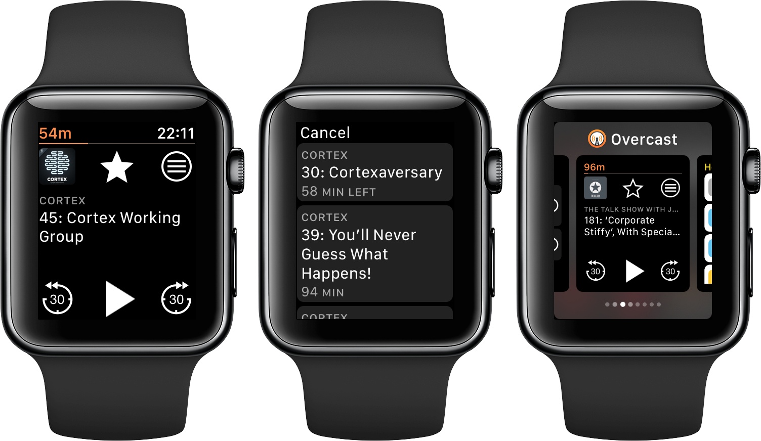
Speaking of which, reordering episodes in a playlist is easier in Overcast 3.0 thanks to always-visible drag handles next to each episode. The ability to quickly reorder episodes in a playlist is especially useful in conjunction with Overcast’s faster Watch app.
Overcast has been rewritten for watchOS 3 (it starts up in a second on my Apple Watch Series 2) and there’s a button to view upcoming episodes from the currently active playlist (whether it’s the queue, a playlist, or a show’s individual episode list).
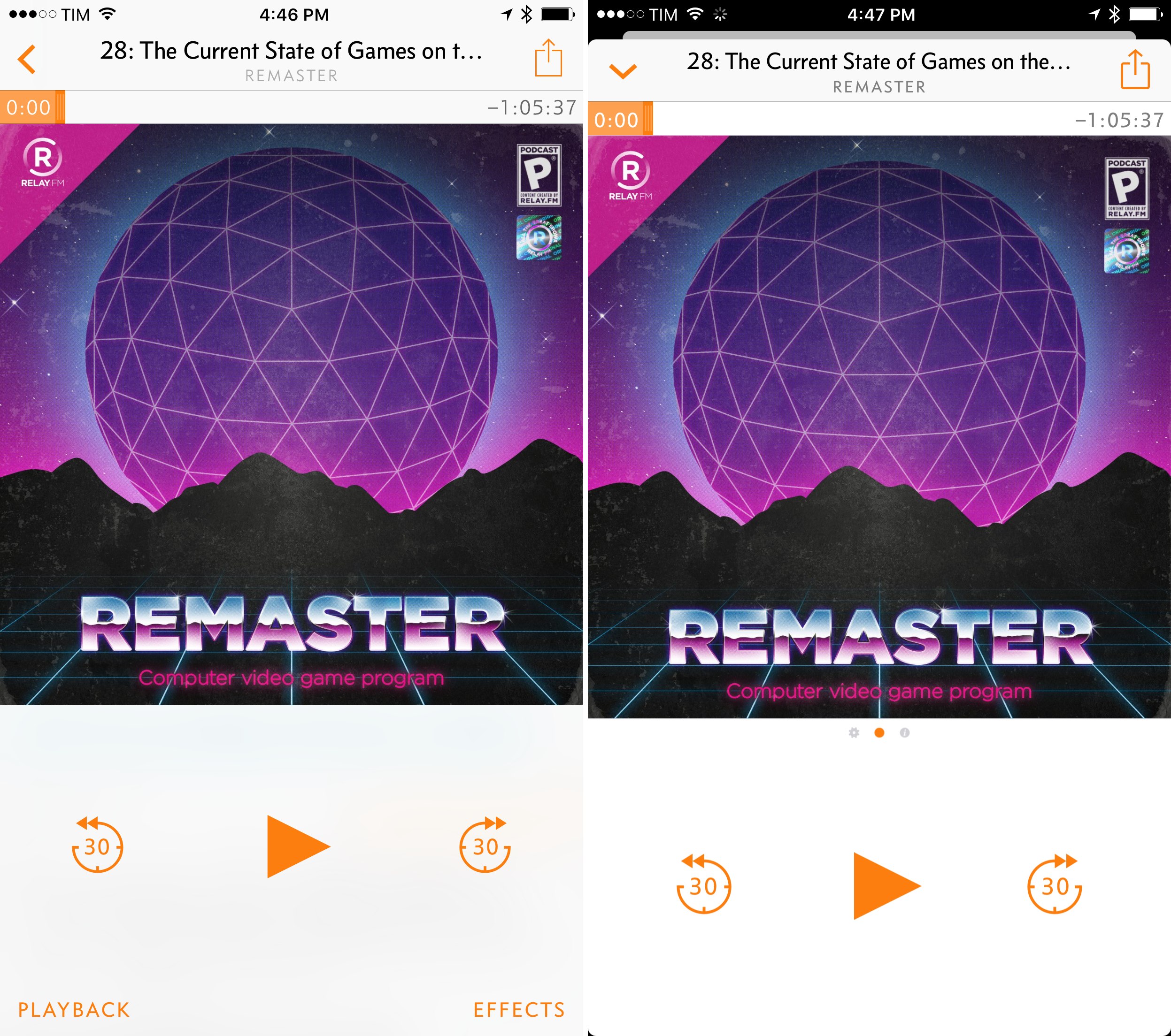
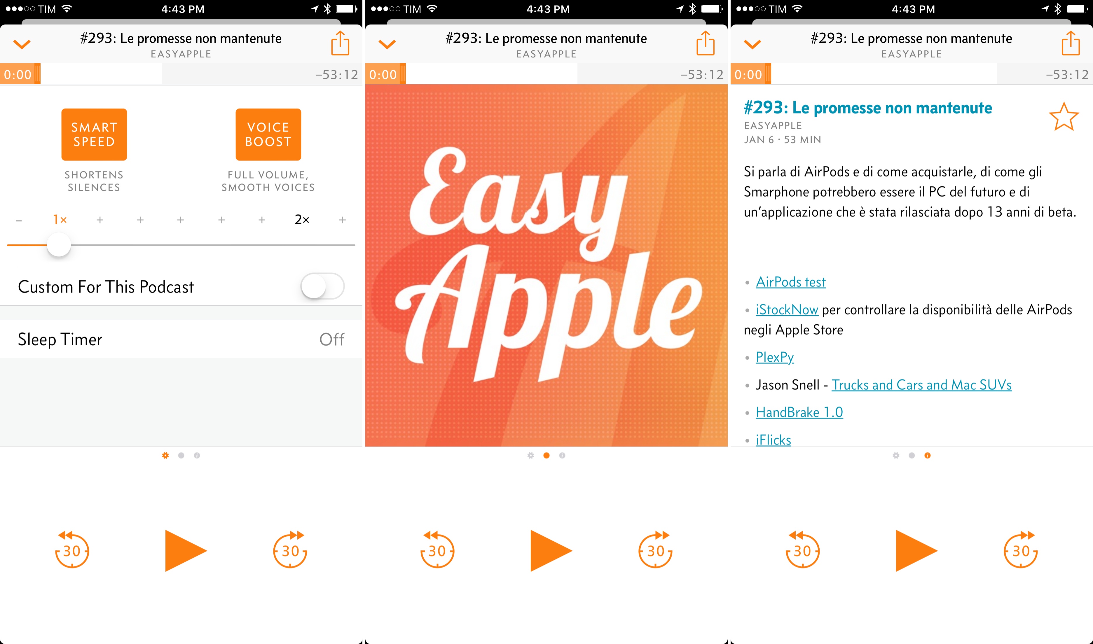
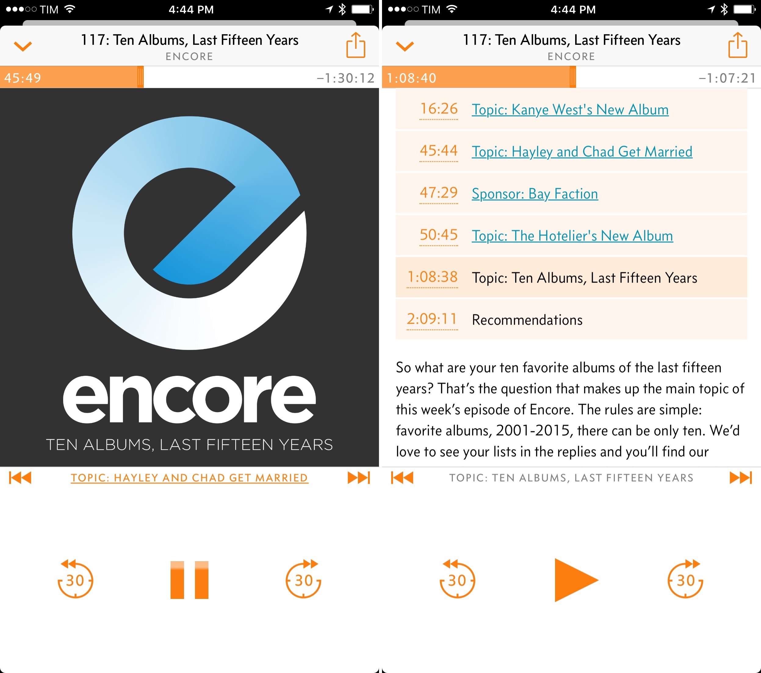
Finally, Overcast 3.0 features a redesigned Now Playing view with pagination in the top half of the screen. Vertical scrolling in the Now Playing page is gone; now, you swipe right to tweak audio settings and swipe left to view episode descriptions, show notes, and links to embedded chapters.
I see the refreshed Now Playing screen as an overall improvement – it splits up controls and text content in dedicated areas and it allows a sloppy vertical swipe to always dismiss the Now Playing card, which feels nice.
I have one reservation, though: while episodes without chapters hint at pagination through page indicators below the show’s artwork, these indicators aren’t displayed if an episode contains chapters. As chapters continue to gain popularity among podcast producers, I believe some users will be confused by the design change as they won’t be able to discover the Now Playing pages at all. Page indicators should always be displayed for consistency and discoverability.
Overcast 3.0 may not come with the same number of major additions as version 2.0 (which brought support for chapters and streaming), but it’s a better iOS 10 app that fixes longstanding shortcomings and makes everything easier and speedier. If you didn’t like Overcast before, version 3.0 likely won’t change your mind. But as someone who’s used the app every day since it first launched, Overcast 3.0 offers solid improvements that continue to make it my favorite podcast app for iOS.
Overcast 3.0 is available on the App Store.
In writing this story, I had a chance to ask Marco Arment a few questions about the evolution of Overcast’s business model, ads, and integration with iOS 10. You can find the interview below.
A Brief Interview with Marco Arment
Federico Viticci: We discussed the switch to a patronage model when you launched Overcast 2.0. Then in September 2016, you shared some numbers about the performance of the patronage model and explained why you decided to try ads. How has the change gone so far? What have you learned since implementing ads in Overcast?
Marco Arment: Ads with a subscription to remove them has been Overcast’s most successful business model. I finally have what I’ve been looking for: everyone getting all of the best features, while providing healthy, sustainable, and growing income over time.
Overcast’s customers are also happier with this model than my previous ones. People who don’t mind ads are fine with them, and people who don’t want to see them are happy to pay for the subscription instead.
FV: With Overcast 3.0, you’ve removed Google ads in favor of your own solution. What drove this decision, and what kind of challenges do you see ahead?
MA: In order to make much money from the big mobile ad platforms, you need to be willing to embed multiple closed-source ad libraries in your app, you need to permit lots of questionable ads, and you need to design the app such that users are seeing and tapping on the ads a lot.
My Google ads in Overcast 2.6 were successful primarily because they drove people to subscribe — the ads themselves made very little money, in part because of poor placement and in part because I kept disallowing high-paying ad categories that I thought were inappropriate.
Finally, with the recent worrisome shifts in U.S. political and surveillance areas, I decided that I was no longer comfortable embedding anyone else’s closed-source ad library into Overcast. For my customers’ safety and privacy, I want knowledge and control of every line of non-Apple code that my app is running.
Since Google’s ads weren’t making much for me anyway and subscriptions made up the bulk of the revenue, I realized I could run pretty much any ads in the app, so I made my own and am trying to sell them directly. I don’t have to sell many of them to match the previous ad revenue, they’re completely under my control, and only the bare minimum data for accounting is collected (number of clicks per ad, etc.).
It’s more work this way, but I believe it’ll be worth it.
FV: One of your original goals with moving Overcast 2.0 to a free model was to make the app easier to use in its full feature set in an increasingly competitive landscape. Did the move to free (and thus to a larger audience) bring any downsides you were not expecting? Is it necessary to offer free apps with ads if you want to achieve any meaningful scale and revenue today?
MA: It depends on your app’s market. For mass-market entertainment apps, especially when Apple includes a competitor for free, it’s important to remove as many barriers to trying your app as possible. Free-up-front with some sort of in-app monetization is the best balance I’ve found between marketshare and revenue.
For Overcast, I haven’t found any major downsides to a large, mostly-free audience. I’ve built the business with marketshare in mind, so I’ve kept costs low and engineered the server-side components to scale inexpensively. It achieves neither explosive growth (which needs funding and large expenditures) nor extreme profitability (which probably needs a paid-up-front app, at the expense of marketshare and competitive vulnerability). I’m satisfied with the middle ground.
FV: Finally, iOS 10. The latest version of iOS brought, among various consumer changes, support for rich notifications and an iMessage SDK. You’ve added rich notification support to Overcast, but haven’t shipped an iMessage component for the app. Do you find iMessage apps to have a limited appeal? And what else would you like to see in the future of iOS for audio apps like Overcast?
MA: Overcast’s top sharing destination is Messages, but there hasn’t been much demand for an Overcast Messages app. I think iOS users mostly think to share from the source app using the iOS share sheet, which I already offer, rather than finding a corresponding app in Messages and trying to share directly from there.
There are plenty of interesting uses for Messages apps, but I haven’t come up with a compelling one for Overcast yet.
My biggest platform feature request for Overcast is Siri support. Adding a Siri intent for audio services isn’t easy, which is probably why it didn’t make it into the initial Siri API in iOS 10 – in addition to basic playback commands, it would probably need a system to index each app’s library of available content. Whenever we get more Siri API intents, probably with iOS 11, I hope that’s one of them.
- Some examples: TwIM, Record Bird, Google. It takes some time getting used to the different shape on the Home screen (particularly compared to the guidelines followed by Apple in their apps), but I like Overcast’s icon better now. It feels fresh. ↩︎
- I wish a light thud played through the Taptic Engine when the Now Playing screen is swiped to the bottom, though. I also would have liked to see the chevron in the top left corner (in the episode’s title bar) dynamically change its shape as the card is pulled down, like Apple Music does with its pulling indicator in the Now Playing card. ↩︎


