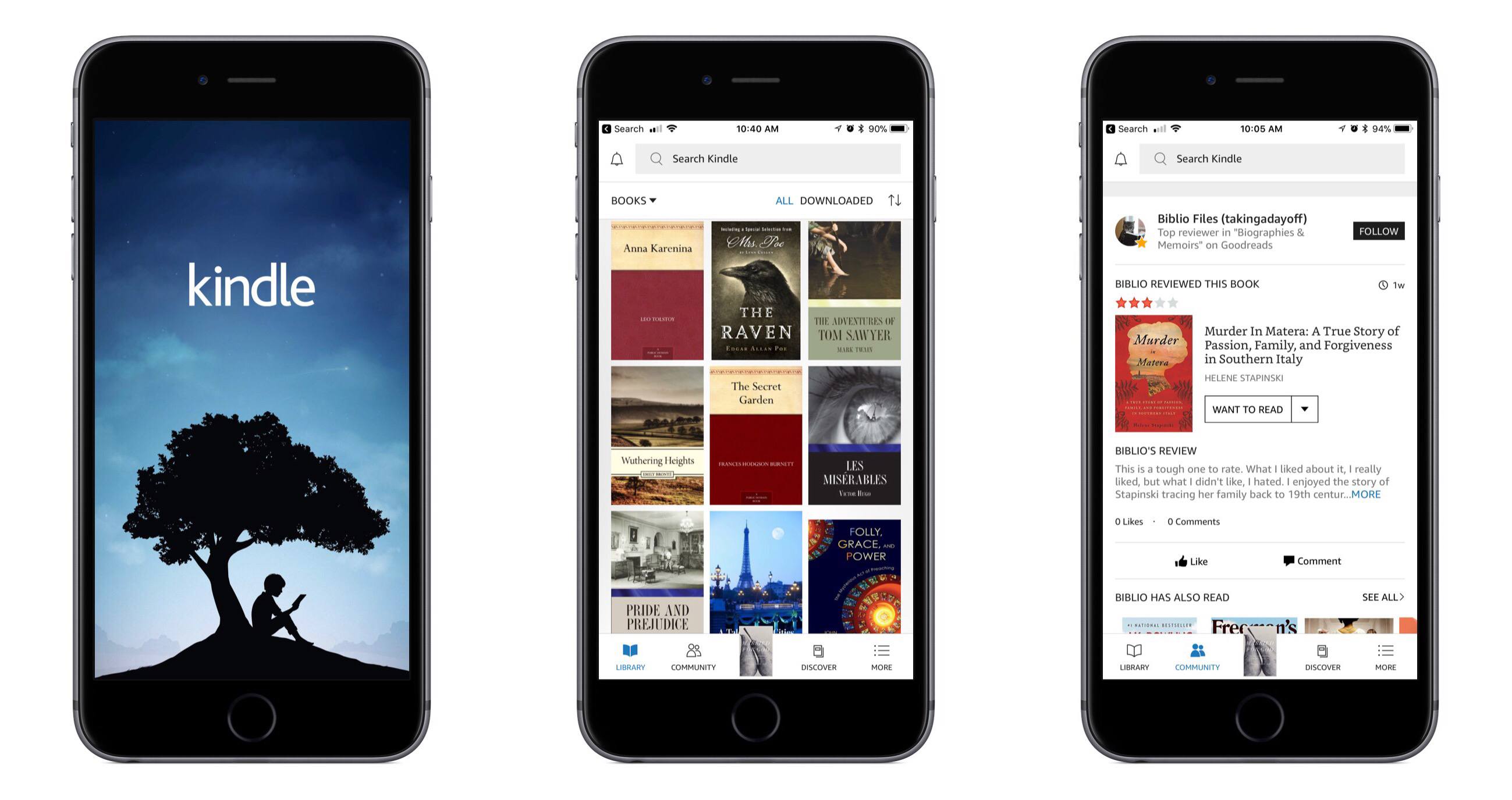
Amazon’s Kindle app for iOS received a major update today, bringing redesigned navigation tabs, a new light theme, and more. The change that excited me most, small as it may be, is the greatly improved app icon – it includes a beautiful new illustration, and the word Kindle has been removed.
The Kindle app now feels more at home on iOS, with a familiar navigation tab layout lining the bottom of the screen. The first tab, Library, is essentially what the main interface of the app was before – all your books are found there. The Library tab is cleaner and simpler now, as several options it formerly contained have been assigned to other areas of the app. The Goodreads and Discover pages, for example, now live in the main navigation bar as Community and Discover tabs, respectively. Extra items like settings and sync have been moved into the navigation bar’s final tab, More. There’s also now a search bar at the top of the screen that’s accessible from nearly anywhere in the app. Overall, these layout changes make the app easier to navigate and less cluttered than before.
Joining the app’s original dark theme, you can now turn on a light theme for the app; this navigation theme is separate from the reading theme, which has long had dark and light options. The light theme looks nice, and I plan to keep it turned on. Another change is that while reading, it’s easier to get back to your library – the upper left corner contains a down-facing arrow that instantly closes your book.
I do nearly all of my book reading digitally, and I’ve long preferred reading in iBooks over Kindle due to it having the superior app in my mind. Today’s update fixes several of the issues I’ve had with Kindle, but unfortunately there’s one big problem outstanding: Kindle still doesn’t support Split View on iPad. Once Amazon adds that to its app, I’ll have less reason to always go with iBooks.


