Philips has released an update to Hue, the companion app for its line of smart lightbulbs. The user interface will be familiar to existing users, but the update introduces a refreshed design that looks better than the prior version and surfaces features that used to be harder to find. Philips has added a bunch of new built-in lighting scenes too.
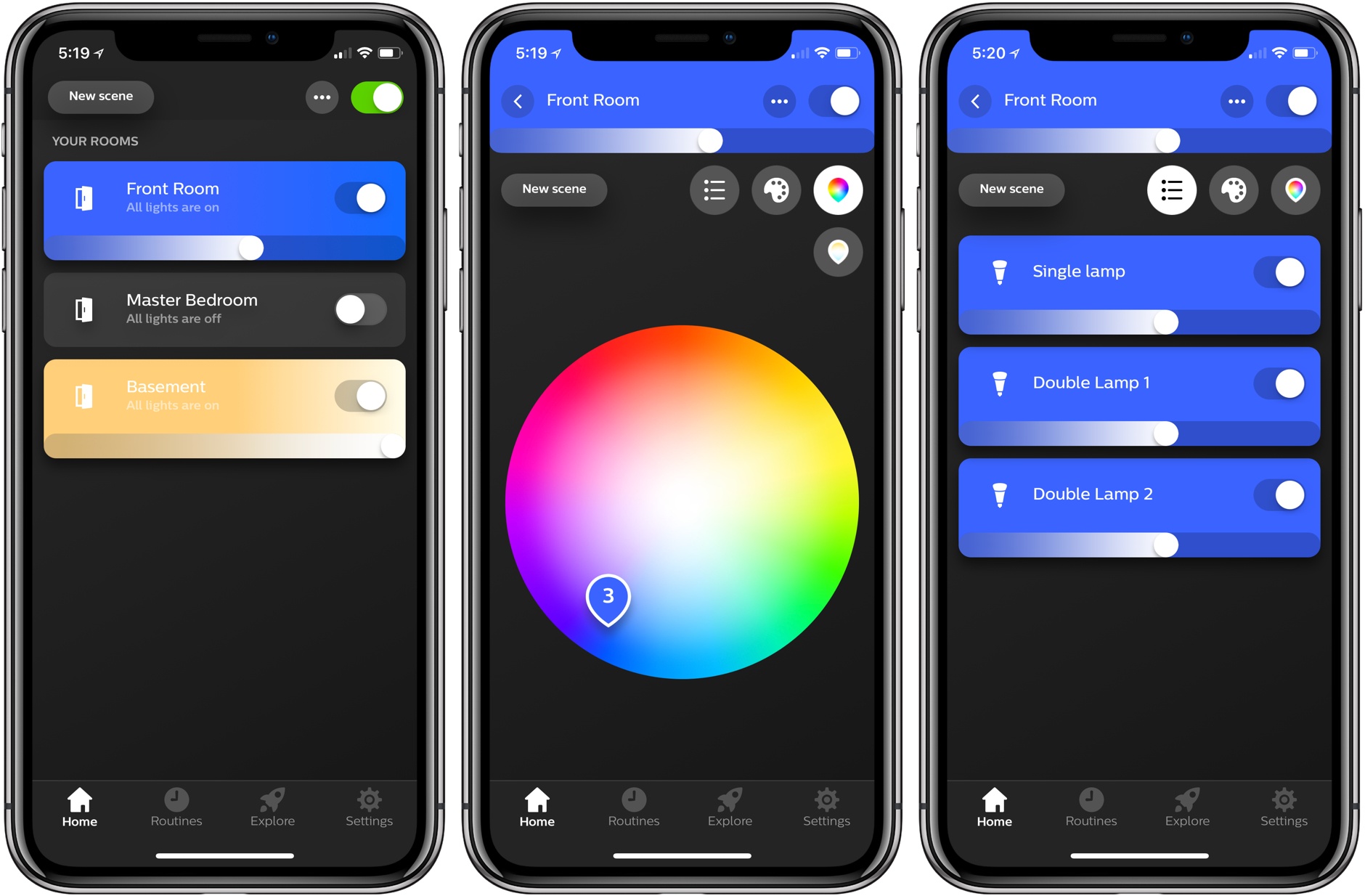
Hue is divided into four tabs. The first, Home, lists each of the rooms you’ve set up with Hue lights. Each room is a separate button that opens a detail view when tapped and includes an on-button brightness slider and on/off toggle, just like the prior version of the app, though the design has been updated with rounded corners and more depth that makes the slider and toggle stand out better. There’s also a satisfying little haptic bump when you move the slider to full brightness.
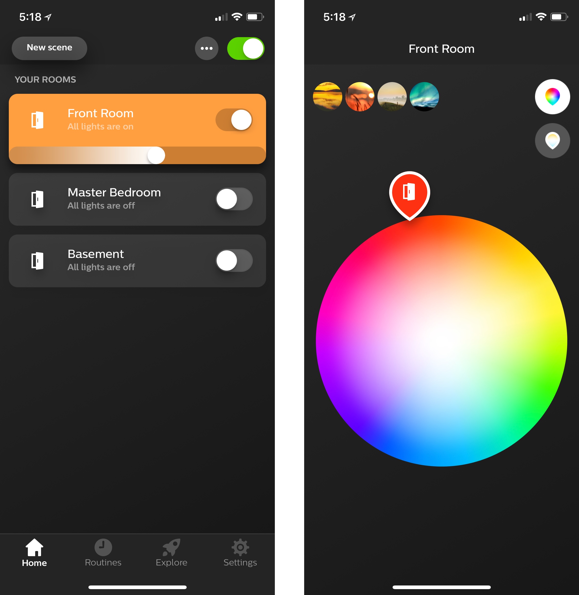
Brand new to the Home tab is a quick-adjust gesture. Tapping and holding any of the room buttons opens a view with a color picker, your four most recently used scenes, and an area where you can switch between the color wheel and different shades of white. Hue ambient white bulbs only display the shades-of-white picker.
The quick-adjust gesture took a little getting used to at first. While tapping and holding, you adjust the colors by dragging your finger around the color picker. The color transmitted by the bulbs does not, however, change as you drag your finger. It changes on release, which makes it harder to dial in a color with the precision that I’d like.1
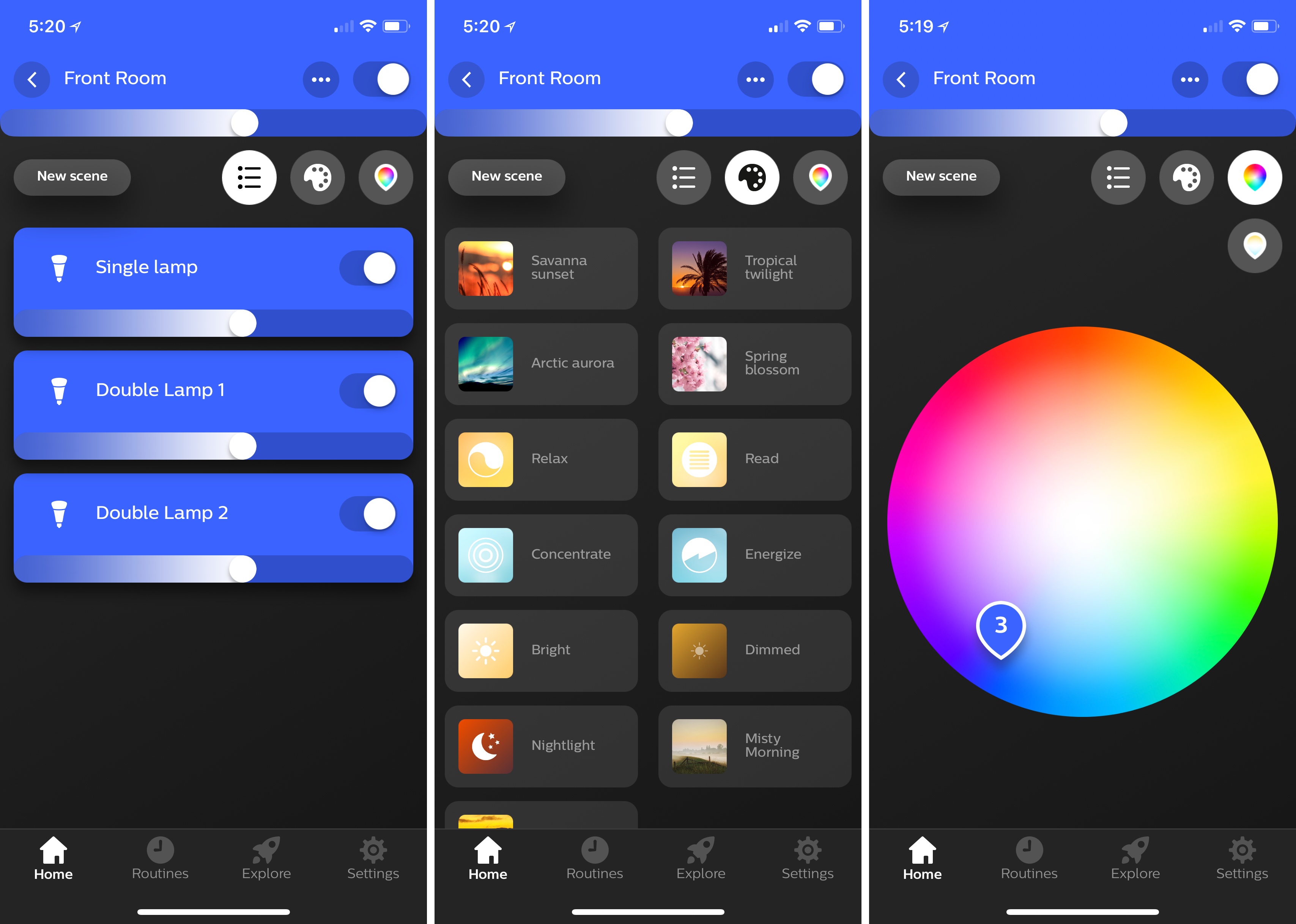
Tapping a room’s button opens a detail view that’s divided into three parts. The top section replicates the controls found on the button you tapped. The middle part includes a button to create a new lighting scene as well as buttons that switch between a list of the lights in that room, a list of your saved scenes, and the color pickers.2
Each Hue light in the lights list can be separately controlled with an on/off toggle, brightness slider, and quick-adjust gesture, just like a room’s lighting is controlled. Tapping the scenes button opens a list of previously-saved scenes, which can be reordered via drag and drop.
Like the quick-adjust gesture, the color picker allows you to drag your finger around to dial in the light color you want, but it has added functionality in rooms with multiple lights. Sitting above the puck that you slide around to pick a color for your lights is a number in a circle. Tap it, and it spreads into a bigger circle ringed by each of the lights in that room. Each can be dragged away from the circle with a haptic bump on supported iPhones to ungroup that bulb from the rest, at which point it’s color can be set separately from the rest of the lights. Regrouping bulbs is as simple as dragging them back onto the number indicator.
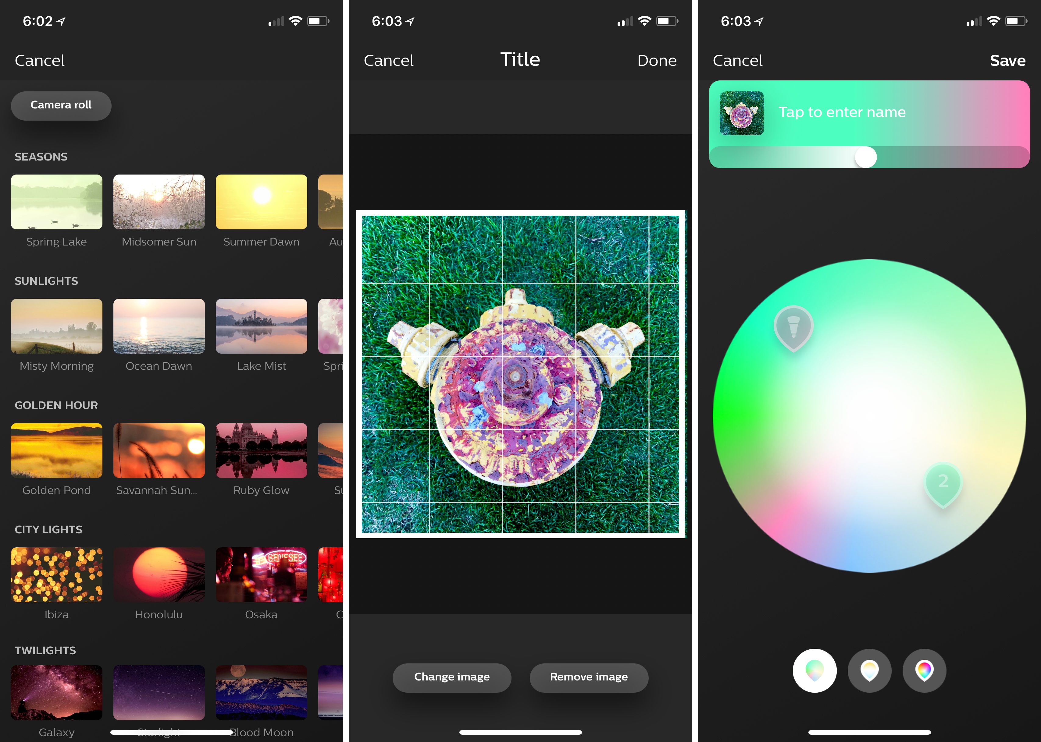
New scenes can be set up with the ‘New scene’ button.3 With the update, Philips has introduced 30 new pre-built scenes, which it says are hand-picked by lighting designers. I’ve played with several of the new scenes and like them. I expect most people will find at least a few they enjoy, though if you don’t, you can also create your own, combining the color picker and brightness levels or create scenes from a favorite photo.
Both the main Home tab view and detail view also have a new three-dot button that opens a menu of setup options that are available elsewhere in the app too, but are much easier to find thanks to the new menu. From the main Home tab, you can access room, light, and accessory, while the detail view’s three-dot button takes you to ‘Edit rooms or move lights’ or ‘Add lights or edit names.’
The remaining three tabs of Hue – Routines, Explore, and Settings – have received some cosmetic updates, but no substantive changes.
The design changes to Hue make it much easier to use. Although it took some getting used to, the new quick-adjust gesture makes changing my lights much easier than in the past. I also appreciate that common setup actions are easy to access from the Home tab behind the three-dot button. Hue’s Settings tab remains a little dense, but that’s less of a problem now that commonly used actions are available elsewhere.
I generally control HomeKit devices using the Home app because despite its design flaws, Home is usually better than most manufacturer’s apps. However, one of Home’s greatest flaws is how difficult it can be to make fine-grained adjustments lights. With Hue, Philips has built an app that is better than the vast majority of other manufacturer’s apps, making it worth another look for Hue owners.
Hue 3 is available on the App Store as a free download.
- I suspect this part of the Hue app may work this way due to the perceptible lag that occurs as Hue lights communicate with their hub, which might result in a worse user experience. ↩︎
- Previously, the color picker could only be accessed by tapping the icon of the light associated with a room, which was not easily discovered. ↩︎
- For the record, the lack of title casing on Hue’s buttons drives me a little nuts. ↩︎


