Over the course of a year, the MacStories team tries hundreds of apps. We test them, live with them, poke, prod, and break them, and then we write and talk about them. Collectively, it amounts to thousands of hours of thought and analysis that on a macro level seeks to answer the question: what makes a good app? There’s no single factor or simple formula; if there was, nearly every app would achieve greatness. But after evaluating as many apps as we have, each of us has a fine-tuned instinct for standout apps when they come onto our radar.
We write about lots of terrific apps, but every year a handful stand out as exceptional. The precise quality that sets an app apart is often harder to identify than the app itself. Some are apps that push the boundaries of Apple’s OSes into new territory, while others are fresh takes on old problems. Despite the millions of apps on the App Store, every so often an app emerges that is truly inventive and opens up a whole new category of apps.
This year, we’re starting something new to celebrate those apps that stand out from the pack with a new feature we call MacStories Selects. For this inaugural year, we are covering three app categories: Best New App, Best App Update, and Best New Game. Along with a top pick for each category, we have selected runners-up that also stood out from the crowd. Before the end of the year, we’ll reveal two other components of MacStories Selects as well:
- Federico’s App of the Year, which will be published as part of his annual Must-Have iOS Apps of 2018; and
- Picks for our favorite new hardware accessories of 2018.
In making today’s app picks, we only looked at titles released in 2018. In addition, for Best App Update we evaluated each stand-alone update independent from any others, as opposed to aggregating updates from throughout the year.
Selects is something new for us here at MacStories that we expect to grow over time. We hope you enjoy. Now, on to our picks…
Best New App
Agenda
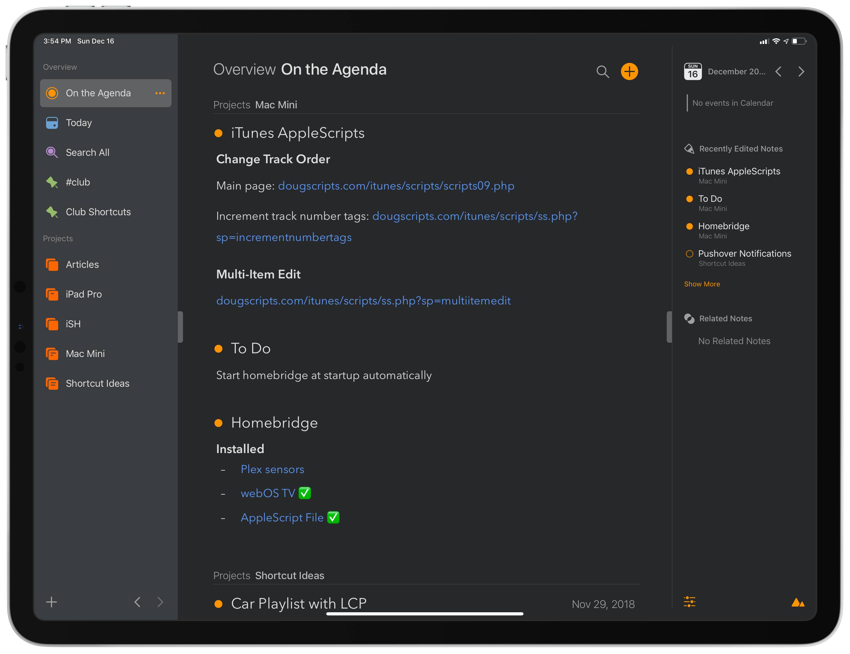
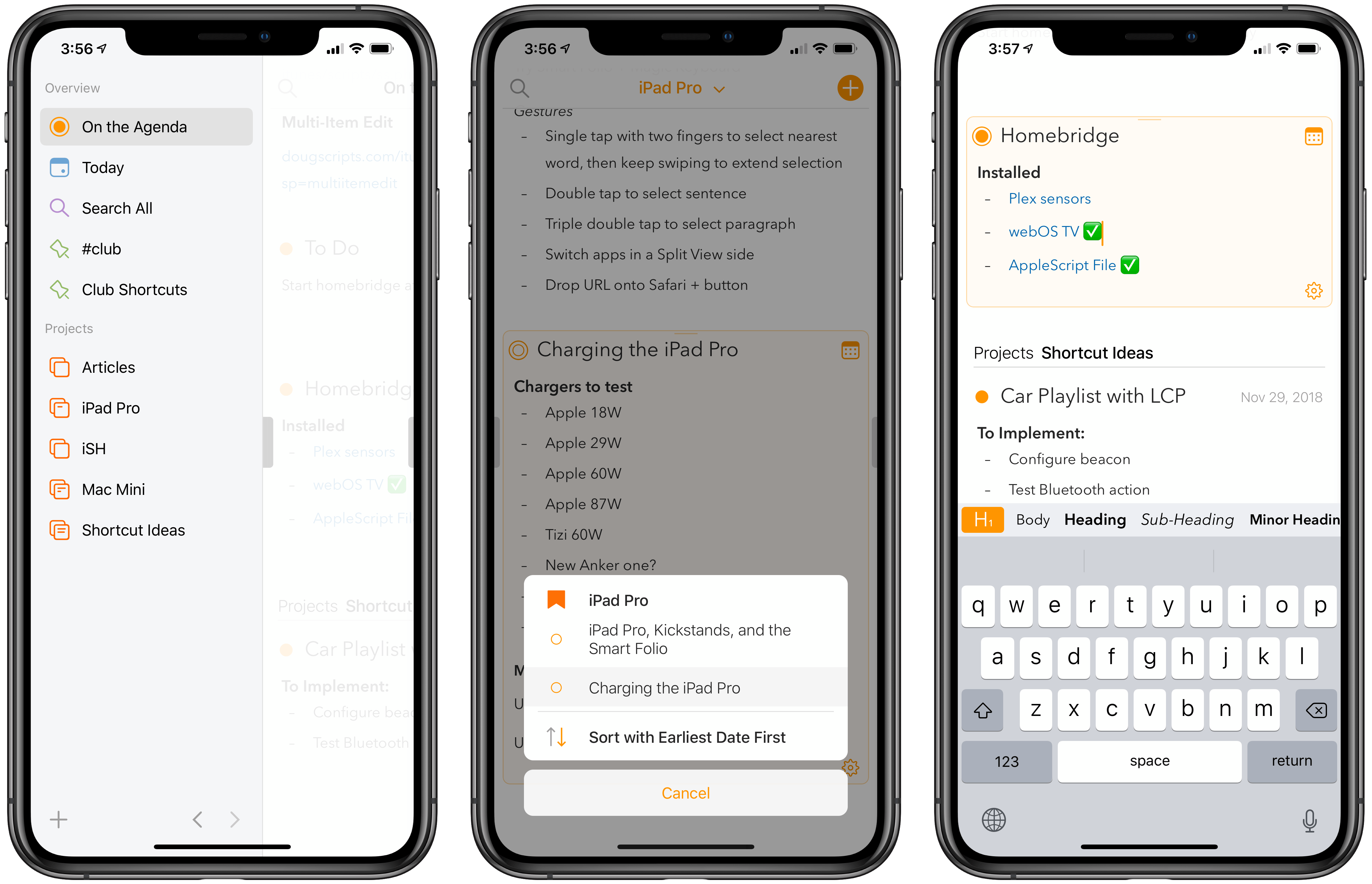
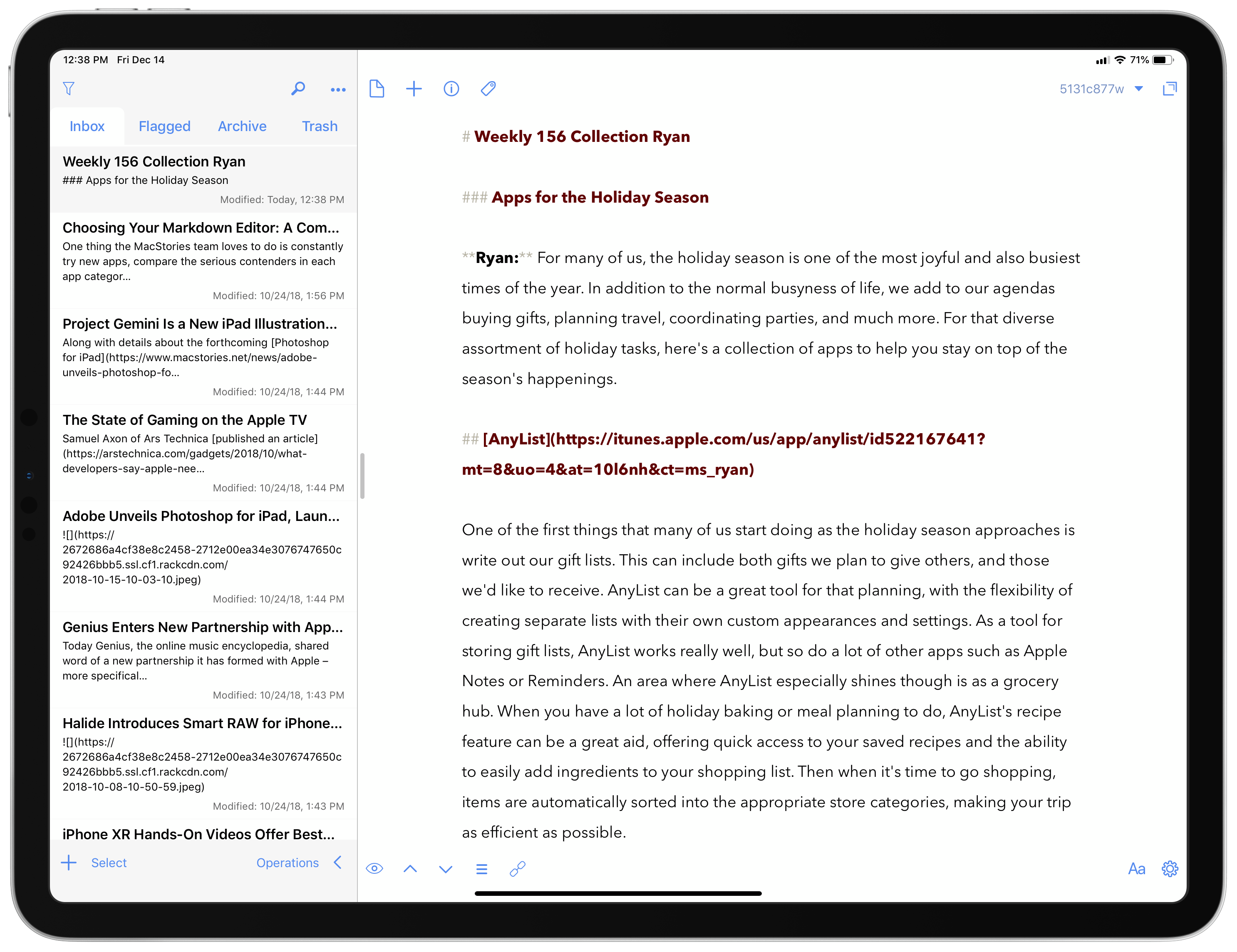
Federico: Agenda is not an easy app to understand at first. On the surface, it works like a regular note-taking app – it lets you create projects for notes, which can be assigned tags and formatted with a Markdown-like plain text syntax. You can attach files and images to a note (the app even supports x-callback-url automation to do so from Shortcuts), it integrates with keyboard shortcuts on iPad, and it syncs your notes with iCloud across iOS and macOS. At first glance, Agenda looks like a fairly traditional notes app, one perhaps with fewer bells and whistles than alternatives like Bear, less feature-rich than the power user-oriented Drafts, but more flexible than Apple Notes.
Where Agenda steers away from the conventions of the many note-taking apps for iOS – and where most users may be initially confused – is in its unique blend of notes and dates. In Agenda, you can schedule notes. Each note can either be assigned a due date or marked as “on the agenda”, a special filter that will cause an individual note to be listed in a top-level section of the app. Additionally, notes from Agenda can become calendar events: by creating an event for a note, not only will you be able to assign a date to it, but you’ll also gain the ability to include a link to that note in the event itself, giving you the ability to easily reopen the note when the event is due. But why would you want to assign dates to notes, and what makes Agenda so unique that it’s our favorite app debut of 2018?
It’s right there in the name of the app: Agenda is a date-focused note-taking app that turns the genre on its head with a timeline-based approach to notes organization rather than a classic folder-based one. Agenda is a new spin on notes, and it takes a while to understand where it can fit in your workflow because no other note-taking app works like it. While most apps simply give you a place to write and, in some cases, add attachments, ultimately tasking you with the job of giving notes an actionable due date, Agenda incorporates these aspects in a single, integrated, beautifully designed package.
I’ve been using Agenda in different ways over the past few months. I record 3-4 podcasts each week, and each show has a unique topic that requires research and planning. With Agenda, I can create outlines of formatted text, add links to them, and mark the note as due for recording day so that, when I’m at my Mac to record a podcast, the note will show up under the ‘Today’ section of the app, ready for me to reference while I talk. Another example: I created a ‘Shortcut Ideas’ project in Agenda and have been saving notes for different shortcuts I want to work on either for MacStories or the Club. With Agenda, I can give a due date to a note and it’ll show up in my calendar (and in my task manager, GoodTask, thanks to its calendar integration) when it’s time to build that shortcut. All of this is possible with other note-taking apps, but Agenda removes a crucial step from the process (manually turning a note into a todo) and as such it becomes a seamless way to move projects forward by giving a time and place to each note. If you, like me, organize your big work projects by taking notes for everything, the ‘On the Agenda’ and ‘Today’ views of the app will turn into essential companions for your task manager.
There are tons of other useful and delightful touches in Agenda besides its date and calendar integrations. In the latest 4.0 release, the app gained support for attachments, letting you easily intermix images and files with text in a note. The app is pretty and elegant, and it’s a pleasure to write in thanks to its inline formatting controls and external keyboard support. Notes can be rearranged in a project with drag and drop, and you can quickly jump back to notes you’ve recently worked on thanks to an additional sidebar on the right. Notes can be tagged, and these extra bits of metadata can become filters to create saved searches for easier access to a subset of notes from the left sidebar. You can add notes to Siri as shortcuts, export text in various formats, and choose between a standard light theme and a gorgeous dark one – there’s even the ability to change accent colors for the UI within the app. And I’ve barely scratched the surface of what you can do with Agenda on iOS as well as its (also excellent) Mac counterpart.
It’s rare to find a note-taking app that reinvents such a crowded market with genuinely useful ideas that aren’t gimmicks, let alone one that manages to improve upon its foundation with multiple major updates in the span of a year. But Agenda does it all, and for this reason it deserves to be our favorite new app of 2018.
- Agenda website
- Agenda for iOS
- Agenda for macOS
- MacStories review of Agenda for macOS
- MacStories review of Agenda for iOS
Best New Apps: Runner-Up
HomeRun
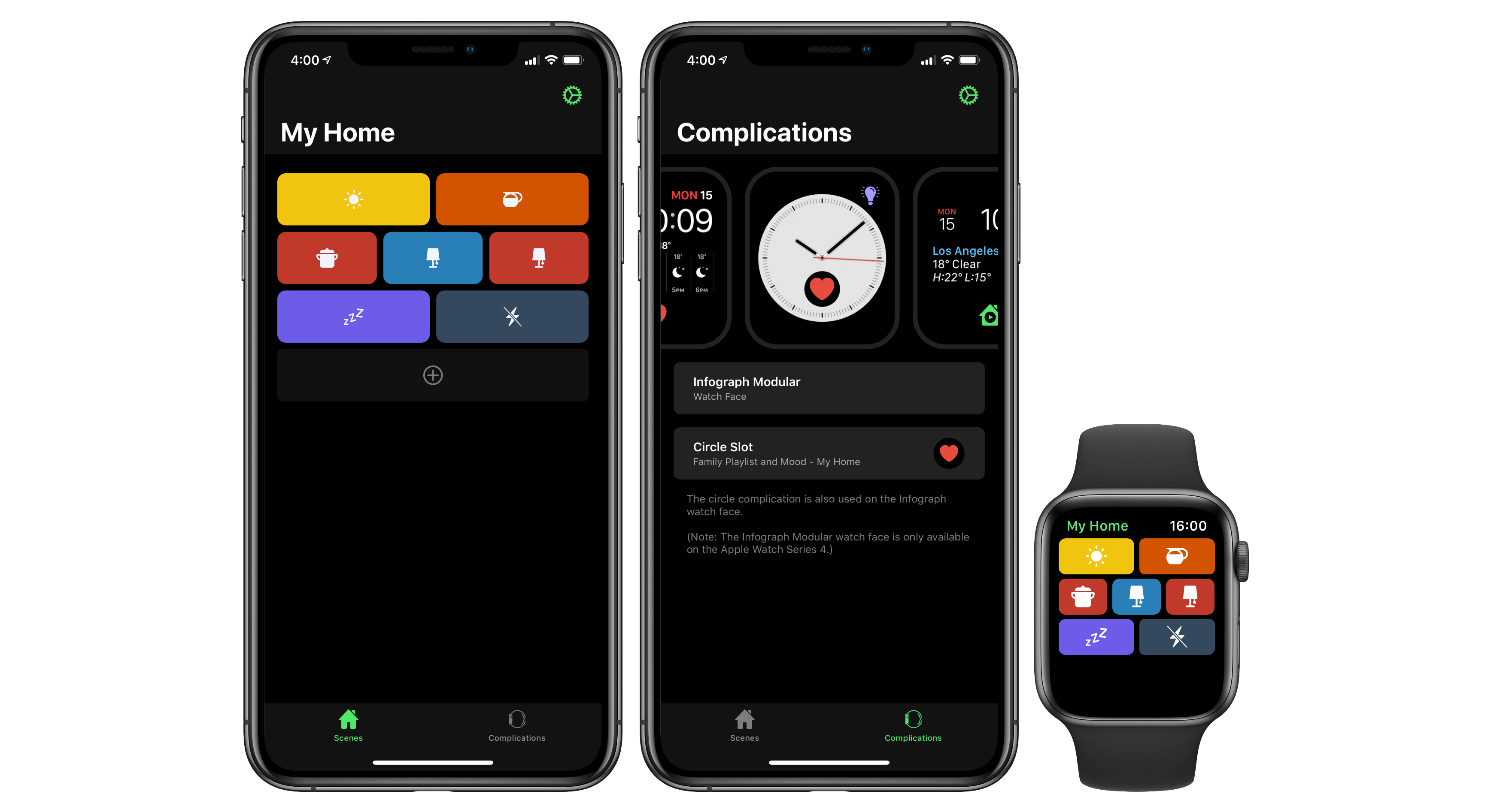
Federico: If you’re into home automation and are a fan of Apple’s HomeKit platform, there’s a good chance you’re not fully satisfied with one aspect of the ecosystem: its barebones Watch app, which makes it almost impossible to quickly trigger specific scenes. HomeRun, the latest creation of HomeKit app developer extraordinaire Aaron Pearce, fixes this with a simple, but effective solution: a Watch app that features a grid of tappable HomeKit scenes so you can execute them with one tap.
HomeRun is one of those apps you’ll wonder how you managed to live without once you’ve used it for a few days. On the iPhone, HomeRun lets you create the grid of scenes that you’ll later see on the smaller Watch screen; scenes are automatically imported from the Home app, and each one can be assigned a custom color and icon pairing from a selection of hundreds of assets. HomeRun’s scene grid doesn’t feature any text labels, but the combination of colors and descriptive glyphs is enough to identify scenes at a glance and run them. Furthermore, the grid layout is flexible, so you can decide to fit up to three buttons on the same row, two larger ones, or a single rectangle.
On the Watch, the HomeRun app launches quickly and scenes are executed instantly upon selecting one. With the latest 1.1 update, however, Pearce has outdone himself with the ability to create custom complications that carry the same color and icon previously assigned to a scene on the iPhone. With custom complications (which are also supported on the new Infograph faces for the Apple Watch Series 4), you get fast access to a specific HomeKit scene as soon as you raise your wrist: just tap the icon, and the HomeRun app will open, automatically running the scene that’s paired with the complication – no further tapping necessary. In our experience, this feature has turned out to be a huge boon to HomeKit automation – now with just one flick of the wrist, changing the color of your lights, turning on smart plugs, or, if you’re brave enough, triggering specific Homebridge plugins become easy tasks to perform on the Watch without talking to Siri.
HomeRun is the perfect example of an app that does one thing incredibly well: it makes HomeKit more powerful and enjoyable for Apple Watch users, and it’s among our favorite app debuts of 2018.
- HomeRun website
- HomeRun for iOS
- MacStories review of HomeRun 1.0 and version 1.1
Best New Apps: Runner-Up
Scriptable
Federico: Created by indie developer Simon Støvring, Scriptable is a JavaScript IDE for iOS that builds upon one of the original concepts of Pythonista – scripting native iOS features with code, JavaScript in this case – but modernizes it for the age of Files, iCloud Drive, and Siri shortcuts.
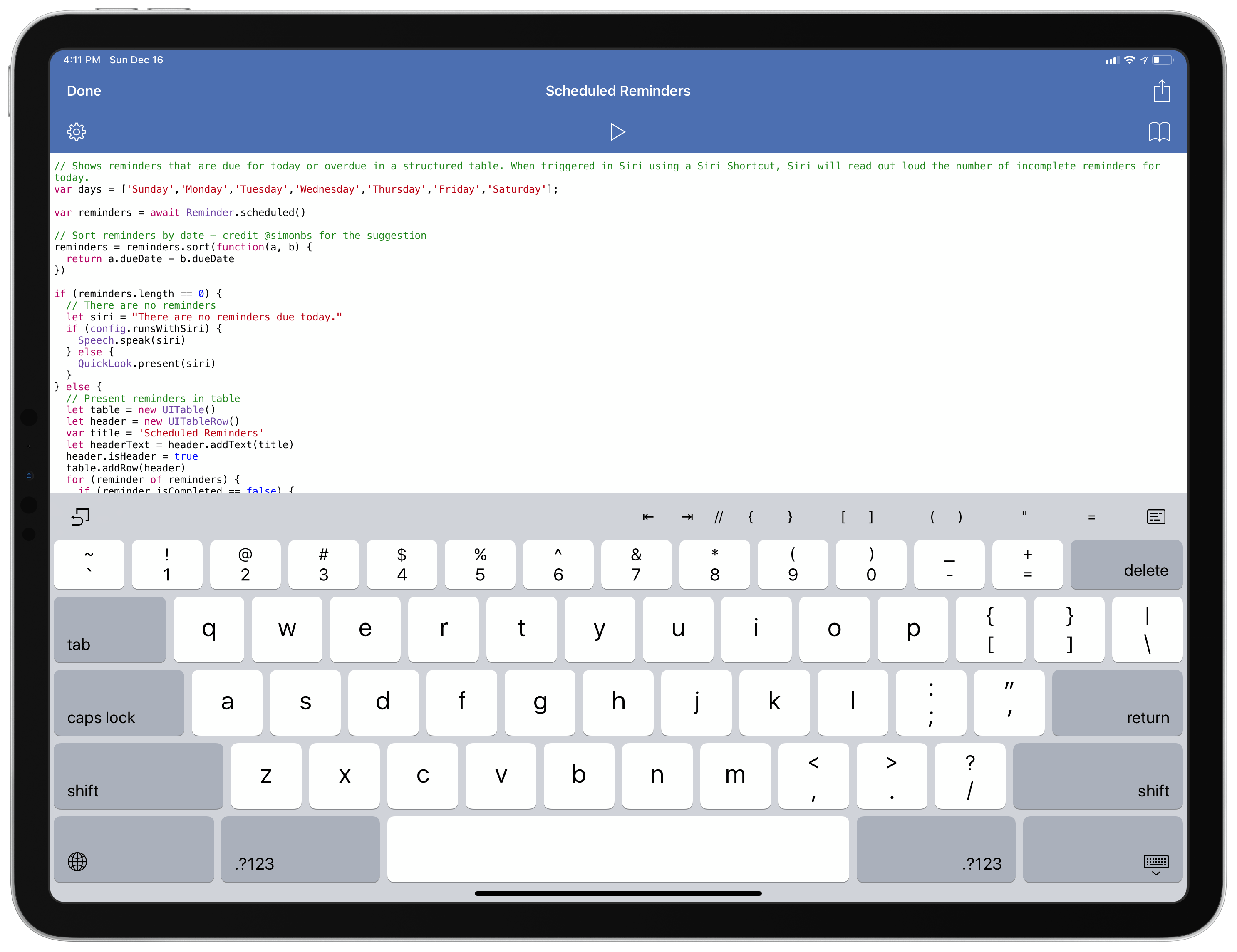
At a basic level, Scriptable lets you write and execute JavaScript in a sandboxed environment on an iPhone or iPad. It’s not the first app to do this, but it does so with an elegant code editor that supports auto-completion and syntax highlighting. In Scriptable, you have access to most of JavaScript’s standard library so you can perform text manipulation, work with dates, issue web requests, and output everything to a built-in console. What sets Scriptable apart is how it’s been designed to integrate with native iOS frameworks such as Files, Siri, Reminders, Mail, Photos, and many more. In addition to writing “classic” JavaScript code, in fact, with Scriptable you have access to bridges for iOS features that, as the name suggests, allow you to script objects that aren’t normally part of JavaScript, but which you can control by giving Scriptable permission to access them via iOS’ native permission controls.
Ever since Scriptable came out in September, I’ve used it to show me custom overviews of my upcoming reminders and calendar events, for example, or to pick a file from its iCloud Drive container and move it somewhere else. I wrote scripts to load a QuickLook preview for a specific document or photo, or to pick a screenshot from the Photos app, upload it to our CDN, and copy its URL to the system clipboard. There is an extensive list of native iOS bridges in Scriptable – from alerts to QuickLook and the share sheet – that grant you the freedom to program your own additions to iOS, which is something I hadn’t seen done so well since Pythonista came out in 2012.
But even better than that, Scriptable can present the output of a script directly inside Siri or the Shortcuts app thanks to Siri shortcuts in iOS 12. That image that you want to recall multiple times a day? Write a script that fetches it from a folder in Files, give it a Siri phrase, and preview it with the assistant. Want to expand Siri with results from a web service that isn’t natively supported by Apple? Just write your own program to contact an API in the background and Siri will bring up a customized response after uttering a personalized phrase. And so on for dozens of integrations and APIs that you can program in Scriptable and make available system-wide thanks to shortcuts.
For an app that launched three months ago, Scriptable is incredibly powerful and feature rich, and it inaugurates a new era of iOS automation where scripting can coexist with visual shortcuts and URL schemes rather than replace them. Scriptable is a remarkable app debut, and an app to watch closely over the next few years.
Best App Update
Things 3.6
Ryan: When it comes to software, 2018 was an off year for the iPad in many respects. The major leaps forward of iOS 11 did a lot to satisfy the desires of iPad power users, but they also, in some ways, just whet our appetites for more. While the debut of Shortcuts this year brought a lot of added capability to Apple’s tablet platform, there remained an overall lack of iPad-focused advancements in 2018.
In considering third-party app updates for the year, there were a lot of top contenders. However, the update that stood out most to the MacStories team is one that accomplished something apps seldom do: push the iPad forward in a meaningful way.
Things 3.6 launched in late May as part of a rapid succession of strong updates for Cultured Code’s popular task manager. It was the first of those updates, however, to focus solely on the iPad. And it did that by tapping into the power of the external keyboard.
With many iPad apps, keyboard shortcuts are regarded by developers as an unnecessary luxury. If they’re present at all, they’re often very limited in scope. You may be able to speed up some actions with shortcuts, but before long you’ll find yourself needing to reach out and touch the iPad’s display to get something done. Things, however, is different. More than a mere supplement to touch input, keyboard shortcuts in Things 3.6 became a true alternative to touch. Our own Federico Viticci put it best:
With version 3.6, Things has the best implementation of external keyboard support I’ve ever seen in an iPad app.
On paper, a keyboard-focused update isn’t the flashiest or most exciting. In fact, before Things 3.6’s release I had heard that an iPad-focused update was on its way, and found myself disappointed initially when it turned out to only bring improvements to keyboard navigation. However, after putting the app to use, I quickly discovered how much of a difference it makes when an app offers keyboard shortcuts for some things versus providing full keyboard control over everything.
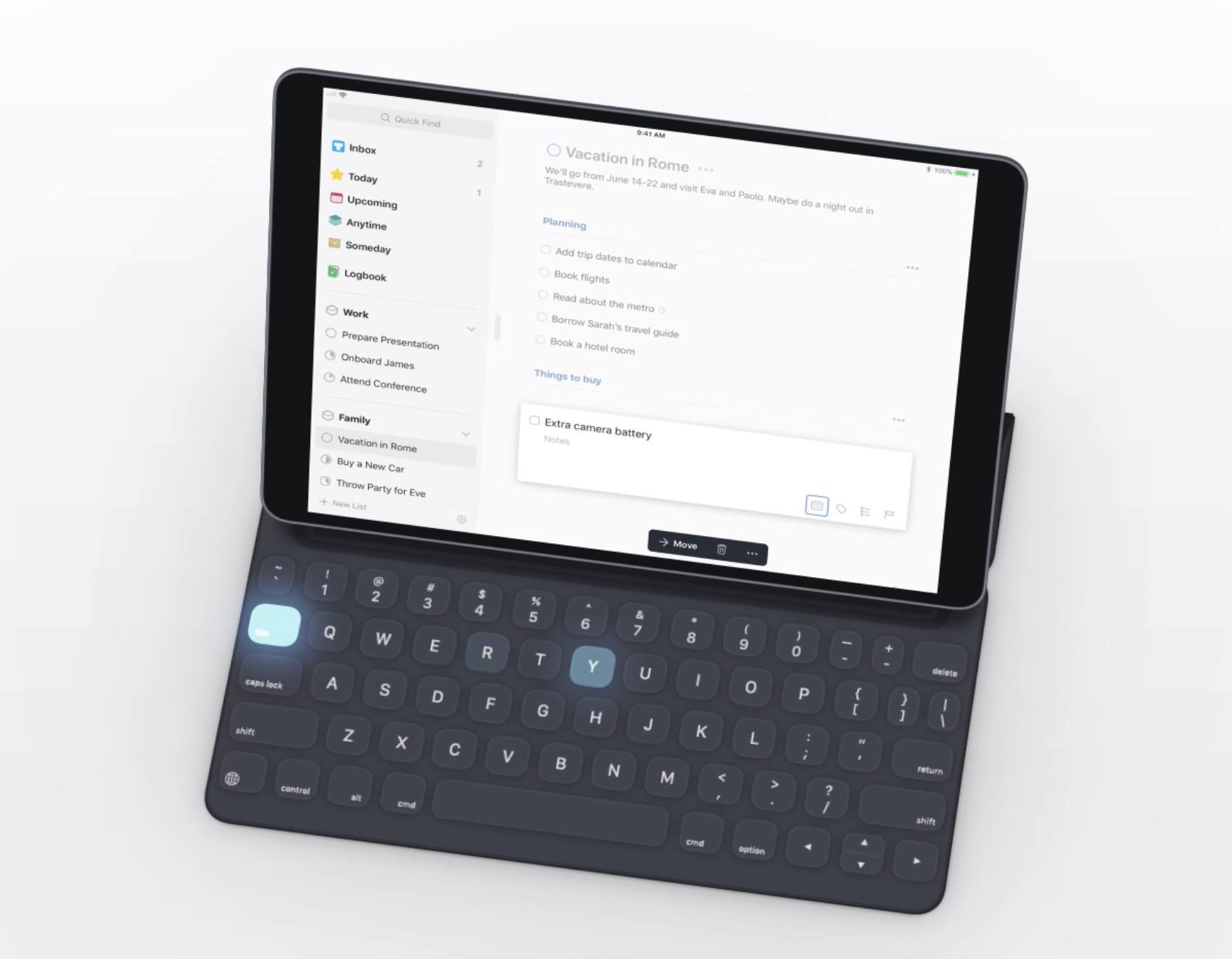
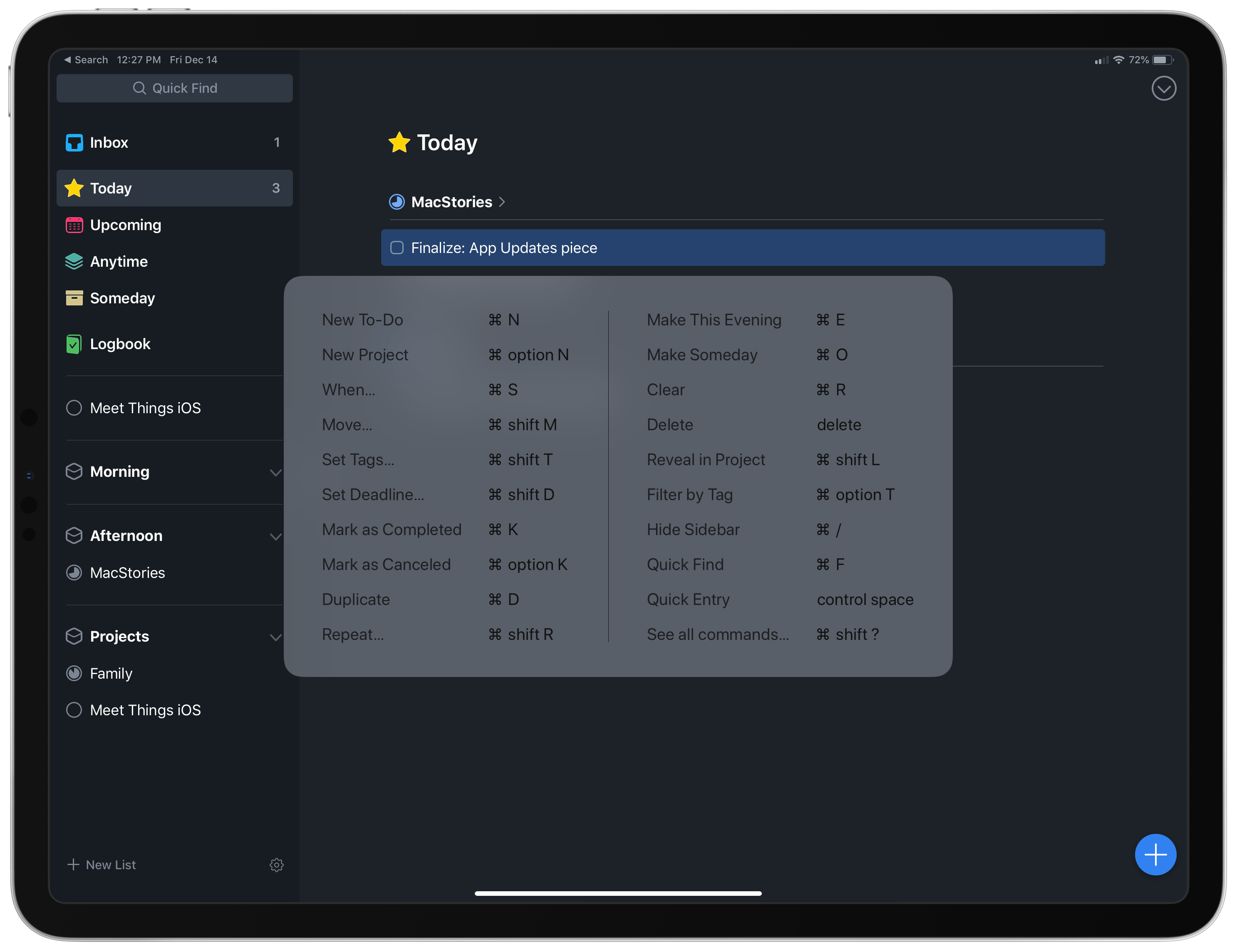
When using Things for iPad with an external keyboard, you can navigate nearly every interface of the app using the keyboard’s arrow keys. At any time while the app is open, a tap of the up or down arrow key will bring into view a blue highlighter box, which indicates that a task has been selected. From here, you can use Enter to open a task’s detail view, with its title, note, and checklist fields all navigable via arrow keys; hitting Enter a second time takes you back to your task list. When a task is highlighted in blue you can also use ⌘K to mark the task complete, ⌘S to schedule its due date, ⌘T to add it to your Today view, ⌘E for This Evening, ⌘N to create a new task, and on the list goes. The full list of shortcuts is available here.
In addition to its comprehensive support for keyboard shortcuts, Things 3.6 also brought the Mac version’s Type Travel feature to iOS. Type Travel enables you to search the entirety of the app without the need to ever open a search field – simply start typing, regardless of what part of the app you’re viewing, and Things’ search box will open and instantly fill with your query. Eliminating the need for manual activation of the search field may not seem like a big deal, but in practice it makes for a much smoother, frictionless experience. I wish iOS’ own system-wide Search function worked like this.
Things 3.6 set a strong example of comprehensive keyboard support that, unfortunately, no other iPad apps I know of have matched. But the potential is clearly there. If app-wide navigation via keyboard became standard practice on the iPad, I have no doubt it would be transformative for the platform’s power users.
- Cultured Code website
- Things 3 for iPad
- Things 3 for iPhone
- Things 3 for Mac
- MacStories review of Things 3.6
- MacStories review of Things 3
Best App Updates: Runner-Up
Drafts 5
Ryan: It’s rare to see a years-old app undergo the kind of powerful revitalization that Drafts experienced in 2018. It’s even rarer for that to happen in the context of a move from a paid up front business model to that of a subscription. With the transition from Drafts 4 to Drafts 5, however, developer Greg Pierce found success on several levels and thus inspired a new following for the app.
One of the exciting new directions Drafts 5 took was that of leaning further into the role of a proper Markdown editor. While the app has long been technically capable of being used as a primary Markdown editor, its identity was rooted more strongly in the concept of being a place where text simply began, not where it would ultimately live. That identity stretched though thanks to the introduction of new tools to organize your drafts: workspaces and tags. Armed with these additions, Drafts 5 enables creating custom writing environments made up of only the drafts and actions you need for different types of writing work; Tim Nahumck refers to these setups as modules, and they make the app a valuable tool for a diverse set of needs.
Another key aspect of Drafts’ revitalization has been the reception of Drafts 5’s subscription model. Unlike most apps that have adopted subscriptions, there seemed to be little public uproar over the change, and in contrast most users have seemed happy to offer ongoing support of the app. I think this positive reception has a lot to do with the way Pierce divided free features from those enabled via subscription. Much of the app’s basic functionality is available in the free version, while features geared toward power users – such as action editing, workspaces, and enhanced automation – are restricted to Drafts Pro subscribers. I suspect that users who get the most out of Drafts recognize the value found in the app, and thus are happy to pay for what they’re getting.
One final element I’ll highlight that I think has made Drafts 5 such a success is the app’s aggressive development pace. Since version 5 first debuted in April, it has received a very consistent mix of both major updates and bug fixes. The promised Mac version has also come a long way in its development, and is currently available in beta form to all Drafts subscribers. The app’s strong development pace ties in well with users being content paying for subscriptions, because it’s been so evident how recurring revenue has enabled Pierce to pour as much time as possible into further evolving the app.
Heading into 2018, Drafts was an App Store veteran, yet Drafts 5 was able to bring it to a whole new set of users. If the app continues receiving its current level of development attention, it seems primed to have another successful year in 2019.
- Drafts website
- Drafts 5 for iOS
- MacStories review of Drafts 5
Best App Updates: Runner-Up
Obscura 2
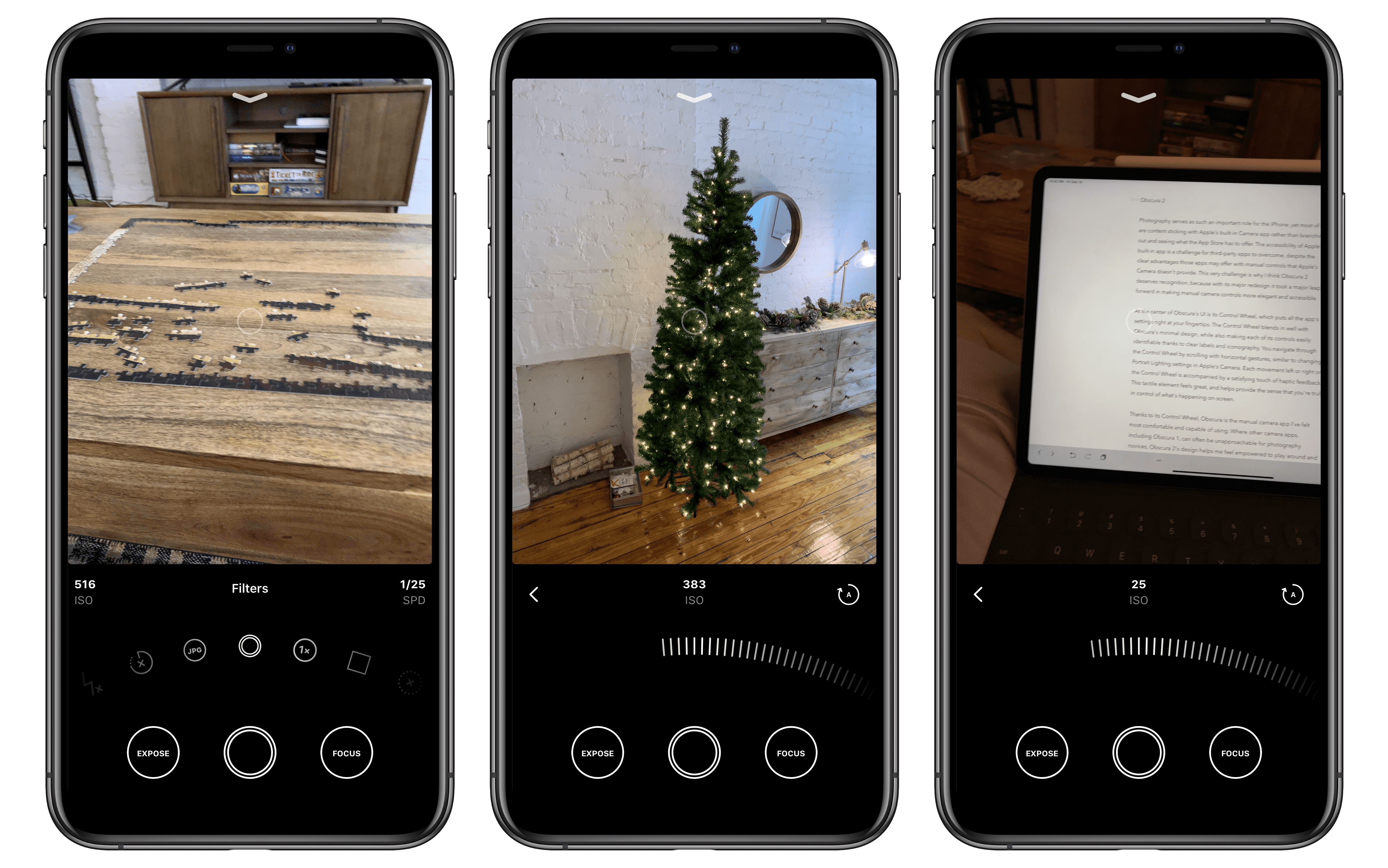
Ryan: Photography serves as such an important role for the iPhone, yet most of us are content sticking with Apple’s built-in Camera app rather than branching out and seeing what the App Store has to offer. The accessibility of Apple’s built-in app is a challenge for third-party apps to overcome, despite the clear advantages those apps may offer with manual controls that Apple’s Camera doesn’t provide. This very challenge is why I think Obscura 2 deserves recognition, because with its major redesign it took a major leap forward in making manual camera controls more elegant and accessible.
At the center of Obscura’s UI is its Control Wheel, which puts all the app’s settings right at your fingertips. The Control Wheel blends in well with Obscura’s minimal design, while also making each of its controls easily identifiable thanks to clear labels and iconography. You navigate through the Control Wheel by scrolling with horizontal gestures, similar to changing Portrait Lighting settings in Apple’s Camera. Each movement left or right on the Control Wheel is accompanied by a satisfying touch of haptic feedback. This tactile element feels great, and helps provide the sense that you’re truly in control of what’s happening on-screen.
Thanks to its Control Wheel, Obscura is the manual camera app I’ve felt most comfortable and capable of using. Where other camera apps, including Obscura 1, can often be unapproachable for photography novices, Obscura 2’s design helps me feel empowered to play around and learn more about the controls it puts in my hands. Plus, if I don’t feel like tweaking a myriad of controls myself, that’s where Obscura’s strong set of built-in filters comes in handy.
Obscura 1 was a good app, but Obscura 2 is a great one, and that’s why it belongs on this list.
- Obscura website
- Obscura 2 for iOS
- MacStories review of Obscura 2
Best App Updates: Runner-Up
Overcast 5
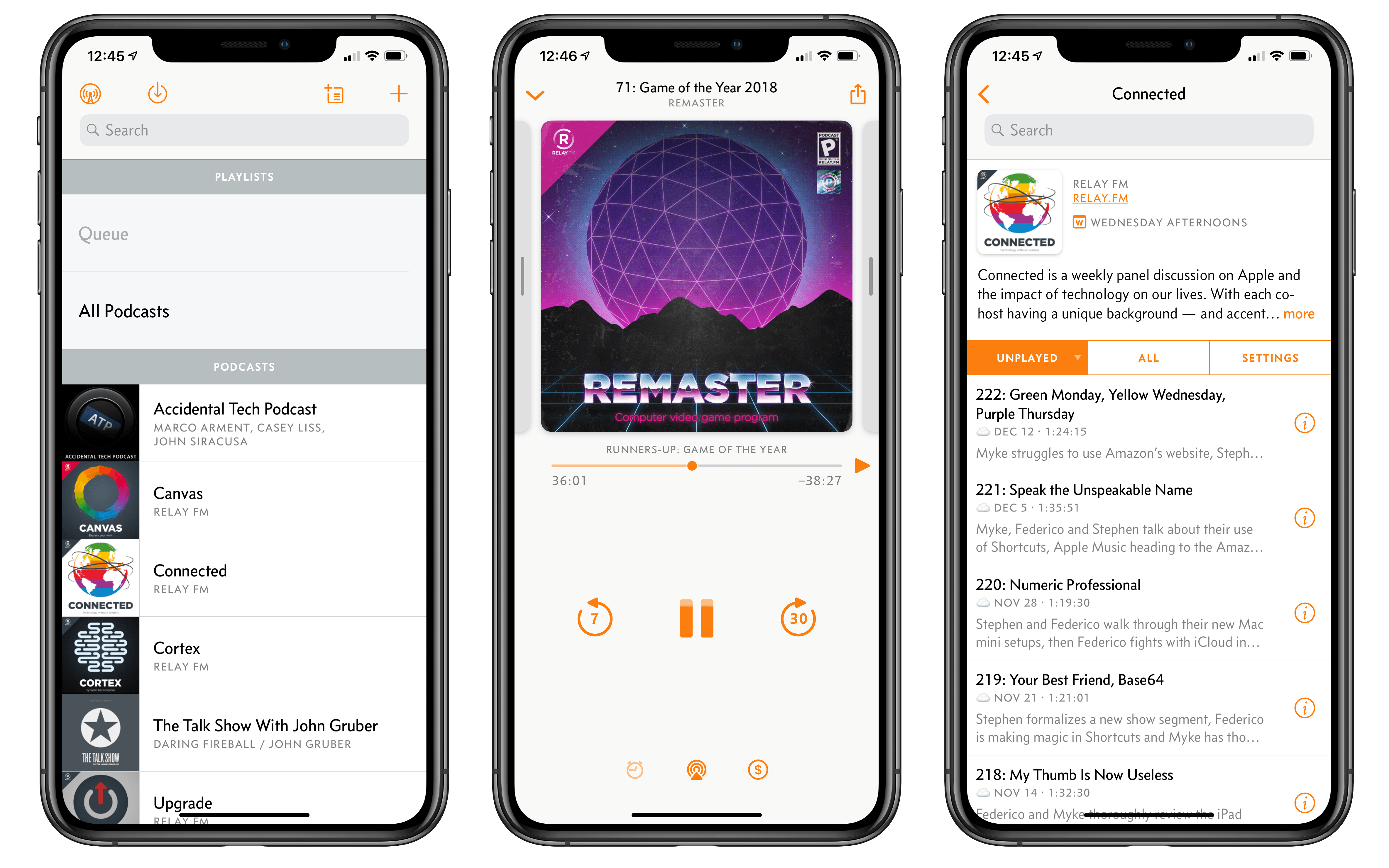
Ryan: Since its debut over four years ago, Overcast has consistently earned its position as one of the premier podcast clients on iOS. The app’s launch was bolstered by innovative audio features like Smart Speed and Voice Boost, but in the years since its debut, Overcast’s creator Marco Arment has consistently brought thoughtful reform to the app’s interface and feature set that keep it from growing outdated or behind the competition. Overcast 5 launched this fall as the latest major version of the app, introducing a strong mix of new features and UI improvements that make the app better than ever.
Extensive Siri shortcuts support is one of the feature highlights of the update. Overcast uses iOS 12’s new media shortcuts to enable voice control of many aspects of the app, including for skipping chapters, turning Smart Speed or Voice Boost on and off, and of course the very important function of starting playback of your Queue or another playlist you’ve created. These options greatly diminish Apple Podcasts’ advantage when it comes to Siri control. Now the podcast actions you would most commonly want Siri to perform are fully accessible via custom Siri shortcuts.
Overcast 5 also brought major improvements to its Apple Watch app, re-enabling the offline Apple Watch playback that was formerly removed from the app due to limits in watchOS. The improved Watch app also added volume control via the Watch’s Digital Crown, another significant low-hanging fruit that watchOS limitations formerly made impossible. Finally, Overcast 5 added two smaller features that I never would have known I needed until the app added them: show-specific search and podcast frequency details. The former means Overcast can search an episode’s title, description, and show notes to help you find any older episode you might be looking for. Frequency details are a handy addition that tells you when new episodes of a show are generally released. I like working certain shows into specific time slots in my schedule, so getting that information up front is a nice touch.
On the UI front, Overcast 5 brought a redesigned Now Playing screen to the app that makes things like audio controls and show notes more discoverable and close at hand. Haptic feedback was also implemented throughout the app, a delightful addition for those with recent iPhones. These improvements, combined with Siri shortcuts and an upgraded Watch app, made Overcast 5 one of the strongest updates of the year.
Best New Game
Alto’s Odyssey
John: Alto’s Odyssey succeeds by embracing the constraints of mobile devices and refining every aspect of the endless runner genre to create something that transcends the sum of its parts as well as its predecessor, Alto’s Adventure. Many of the elements of Odyssey have been done before, including by Team Alto itself in Adventure. What’s different about Odyssey though is that it takes what made Alto’s Adventure a success – everything from the game mechanics to the artwork and sound design – and fine-tunes it to shape a deeper experience that’s more fluid and immersive.
What Team Alto has accomplished was no small feat. Alto’s Adventure already stripped the endless runner genre to its core and rebuilt it into a beautiful and engaging experience. As Federico explained in his review of Alto’s Odyssey last February, the way you top a game like Alto’s Adventure is:
you start from the “more of the same” approach and make every single aspect of the Alto universe more beautiful, more peaceful, more challenging, and, ultimately, more fun.
In other words: you make the template better.
The first hint that you’re in for a familiar, but different experience is the visuals. Odyssey opens at dawn with hot air balloons rising over a desert landscape, a setting about as different from the snowy mountains of Adventure as you could imagine. As the game progresses, players are in for even more treats. Beyond Odyssey’s desert world full of sand dunes lie jungle ruins, streams, and rocky outcroppings. Combined with day and night settings, rain, and stunning color palettes, the artwork of Odyssey puts it head and shoulders above the vast majority of iOS games.
A similar refinement is evident in Odyssey’s gameplay. Through new mechanics like riding rock walls, boosts from mini tornados, and bouncing off the tops of hot air balloons, Odyssey has added greater depth to the combos available to players. They’re additions that serve to keep the game interesting to fans of Alto’s Adventure without complicating the gameplay in a manner that would turn off newcomers.
With some games, part of the fun is their twitchy, stress-inducing nature. Odyssey couldn’t be farther from that sort of game. The artwork and gameplay, along with the soothing soundtrack, make playing Odyssey a meditative experience that’s simultaneously absorbing and calming.
When I first heard that Team Alto was working on a follow-up to Adventure, I was skeptical that they could replicate what made that game special, let alone top it. Odyssey, however, did much more than simply copy a hit formula. Odyssey is a natural extension of Adventure, a rare sequel that builds on the success of its predecessor without leaning too heavily on it; it’s an artful realization of what an iOS game can be.
- Alto’s Odyssey
- Alto’s Odyssey website
- MacStories review of Alto’s Odyssey
- AppStories Interviews with Team Alto:
Best New Game: Runner-Up
Grimvalor
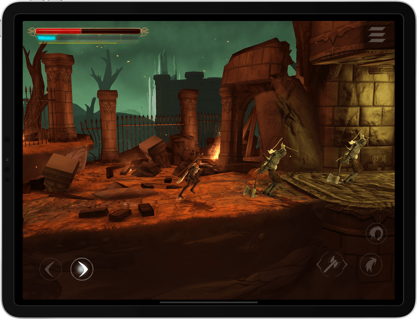
John: The App Store is full of games featuring heroes swinging swords at monsters. Grimvalor has those common elements, but it would be a mistake to write it off as more of the same, because it’s not. Grimvalor, from Finnish game studio Direlight, is a Dark Souls-inspired adventure game that does more to realize the genre on mobile than any other title in recent memory.
As the hero of Grimvalor, players are dropped into a dimly-lit world overrun by monsters. As you progress through the game, defeating evil hoards, leveling up your character, and collecting items, you’ll find yourself periodically hunted by more powerful foes. You’ll need to decide to run, or stand and fight. Of course, there are also boss battles, which are very tough to win.
There’s a lot to be said for Grimvalor being paid up front too. There are no ads to interrupt the fun and no waiting periods or other mechanics to tempt you to buy In-App Purchases. Instead, players get a deep, engrossing experience where the only way to succeed is to try, fail, and try again – which doesn’t seem like it should make the game an instant classic, but it does in a largely free-to-play world.
Unlike many iOS platformers, Grimvalor has excellent onscreen controls. There are buttons for moving forward and back, jumping, dashing, and attacking, and all work well onscreen. But Grimvalor really shines when you pair it with a MFi controller. Direlight has done a fantastic job making the entire UI of Grimvalor navigable with a controller, including the menu system and inventory management. This makes the game much more enjoyable as a lean-back experience played on a big-screened iPad or connected to an external display and speakers, where the artwork and sound design are showcased.
Direlight isn’t finished polishing Grimvalor either. Just today, it released an update that takes advantage of the new iPad Pro’s full screen, something few other games have implemented yet. That same update ups the frame rate to an astounding 120 frames per second on the new iPad Pros for some of the smoothest graphics rendering available in any game. Add to that the ability to swap positions of the onscreen dash and jump buttons and it’s clear that Direlight cares deeply about Grimvalor’s audience.
There’s a lot to explore in Grimvalor. Each level comes with unique challenges and cleverly hidden treasures. It’s a design that along with the excellent artwork keeps the game interesting and fresh as you battle your way from boss to boss. However, it’s the obvious care and attention to detail that went into making Grimvalor that has created a one-of-a-kind experience making it a delight to play and a rare gem on the App Store.
Well, that’s it for our inaugural edition of MacStories Selects. We hope you enjoyed it. To hear more about our picks this year, be sure to check out this week’s episode of AppStories. In episode 92, Federico and John discuss the selection process and the thinking behind each pick. Also, if you have a category you’d like us to consider for Selects in the future, please feel free to get in touch with Federico, John, or Ryan. We’d love to hear from you.


