Evernote is still alive. The popular note-taking app celebrated its tenth birthday last summer, but the last few of those years haven’t been easy, with two CEO transitions and sizable layoffs at several points. Still, the core product keeps pushing forward.
I last reviewed Evernote in early 2017, when version 8 of its iOS app launched as a major redesign. I concluded then that one of the service’s greatest strengths, particularly when compared with competitors like Apple Notes, is that Evernote strives to be more than just a note-taking app. It’s a solid way to take notes, but it also aims to make those notes easily accessible, to create connections between notes, and ultimately serve as a valuable aid to productivity.
Though Evernote has retained a large user base all these years later, and in fact became cash flow positive nearly two years ago, there are a lot of former users who left the service long ago and haven’t looked back. Personally, while I’ve kept an eye on Evernote over the years, I never put its recent updates to the test – until recently, that is, when I set out to revisit the popular note-taker.
As part of checking back in on Evernote, there were three core features I wanted to focus on evaluating: Templates, Context, and Dark Mode. These are some of the major developments Evernote has touted in its last few years of work, and they make for an interesting case study on the company’s future direction.
Templates
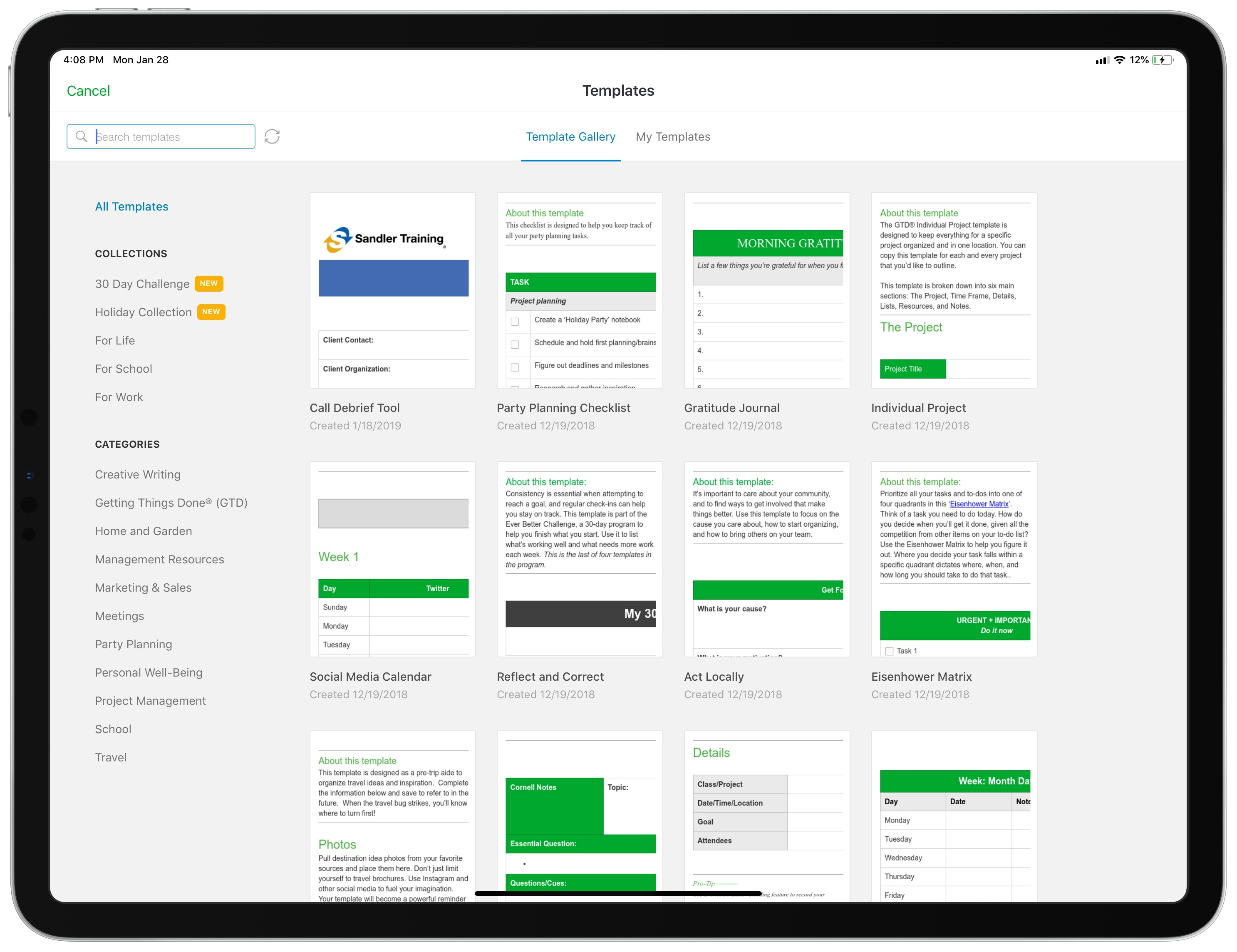
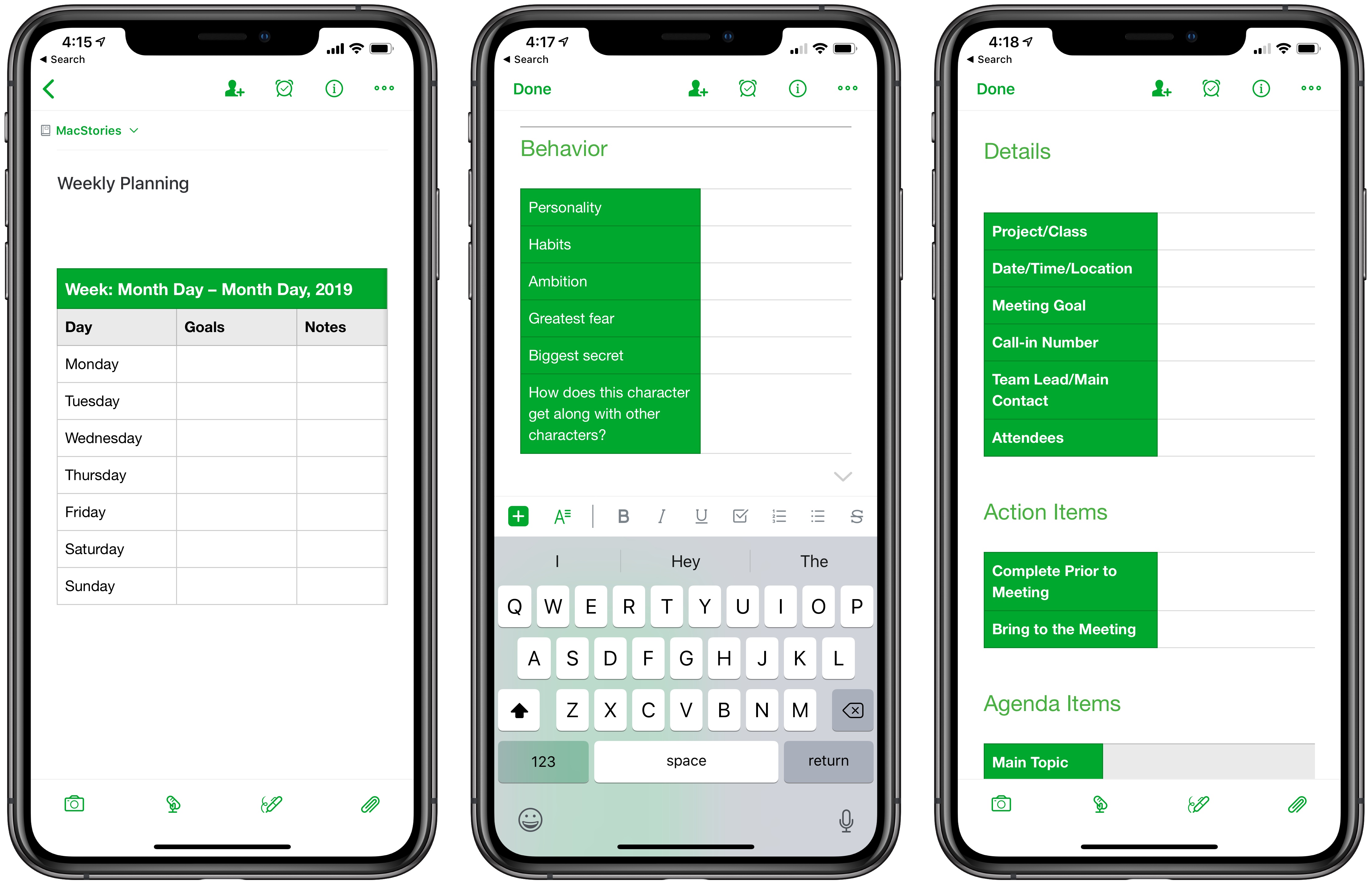
Templates aren’t an altogether new concept to Evernote, as the service has promoted unofficial templating methods for years, such as saving template-style notes to a particular notebook, then copying those notes when you need them. However, last fall Evernote debuted a new, user-friendly template feature across all its platforms. Now, whenever you create a new note, you’ll see an option in its body field to choose from an existing set of templates. Evernote has its own gallery of templates to choose from, with options spanning from checklists to journals to calendars, meetings, and more. Selecting one of these templates automatically applies it to your note.
Where templates get really exciting is in user customization. If you’re an Evernote Premium or Business user, you can customize any of Evernote’s existing templates or create and save your own from scratch. To do this, while viewing a note simply open the options menu in the top-right corner (denoted by three dots) and choose ‘Save as Template.’
Templates are a true power user feature: the average person will probably never use them, but for those who take the time to customize templates to their needs, they can be a productivity boon. Templates are a big time saver for common types of notes, and they make consistent formatting of your notes – something I care a bit too much about, perhaps – completely effortless. I’m surprised that more note-taking apps don’t offer customizable templates.
Context
Context, a Premium- and Business-exclusive feature, debuted to a host of controversy all the way back in late 2014. The feature was originally touted by the company as a major development, but many perceived it as a form of advertising or even an invasion of privacy, and it never really caught on. These days it takes some work to find any mention of Context on Evernote’s website, though the feature does still exist. From a support article with a broken YouTube embed, here’s how Context is described:
Based on intelligent indexing of your notes, Context means your related notes, people, and high-quality articles are shown to you when you need them most.
Our goal is to show you information that will help you improve the quality of your work, without you having to think about searching for it. It’s like having a super smart research assistant always by your side.
I’m late to the game giving Context a try, largely because Evernote’s iOS app had the feature stripped from it when version 8 debuted, and it was only re-added this past year. However, I think it has the potential to be really powerful.
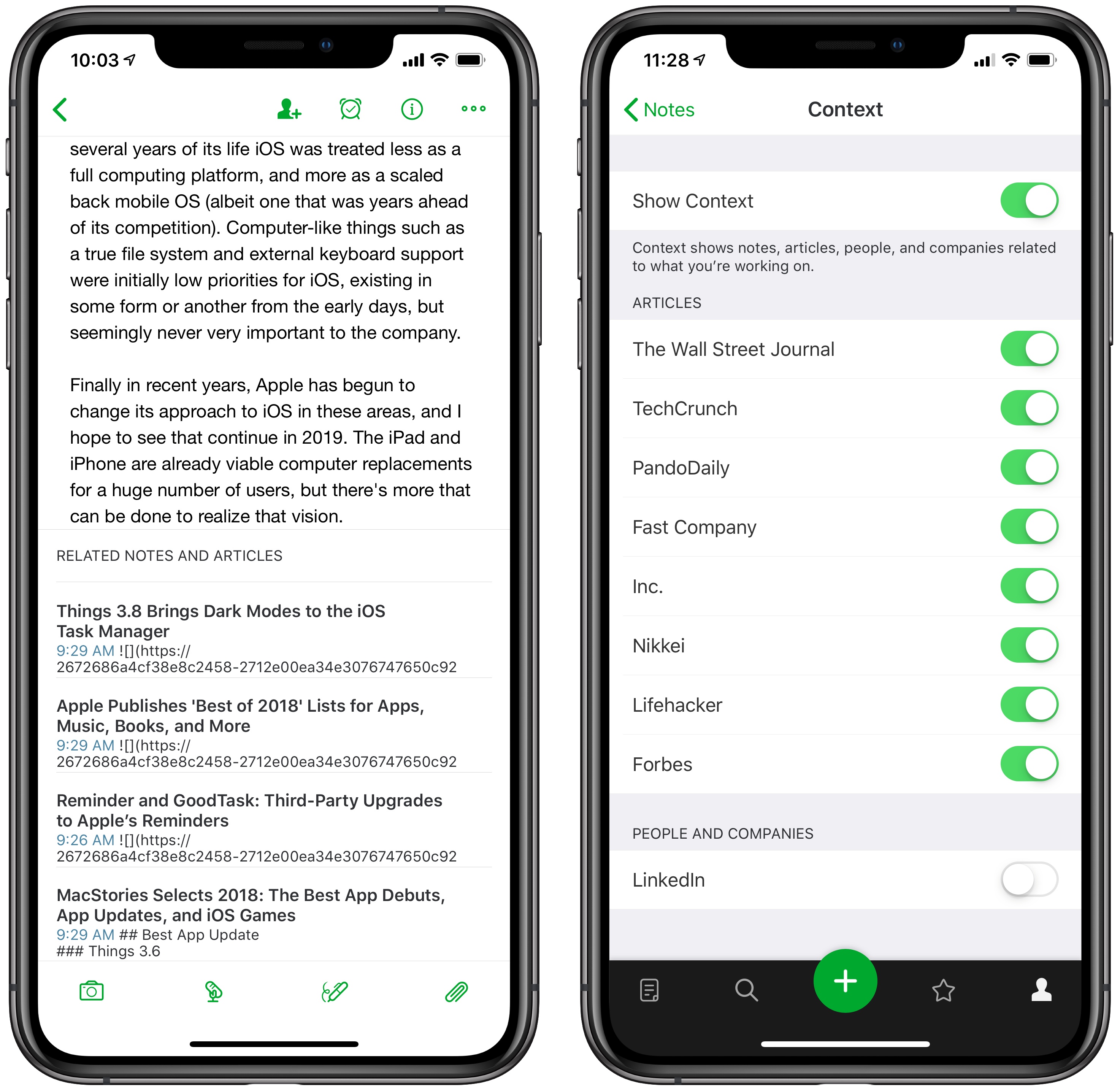
Research is an essential part of every writer’s workflow, and Context seeks to streamline the research process by intelligently suggesting articles or notes so that the information you need is close at hand. Its aim is to remove the need for searching the web or your own notes to obtain research material, because Context will do that work for you and suggest its findings at the bottom of each note.
In concept, Context is a game changing idea. In execution, though, while it can be great at times, it can also be frustrating. When irrelevant article suggestions clutter up your workspace, it’s easy to see Context as a nuisance. Surfacing truly intelligent suggestions is a hard feat to accomplish; that said, the potential gains make it absolutely worth pursuing.
Currently, Context’s web sources are far too limited in scope to make meaningful article suggestions to all Evernote Premium and Business users. It would take a lot of hard work to change that, but it’s work that can and should be done. For now at least, I’ve found that Context’s biggest benefit for me in everyday use lies elsewhere: in its related note suggestions.
Let me share a real-life workflow comparison from my use of Apple Notes and Evernote. When I’m jotting something down and need to reference a related note, here’s what that process looks like in each app:
- Notes: Hit the back button to return to the note list, then in many cases hit back again to return to the folder list, then find the right folder, find the right note, read what I need to, and do the whole exercise over again to get back to my original note.1
- Evernote: Tap the note suggested by Context, then hit the back button when I’m done reading what I need.
This dance between different related notes is a very common practice for me, and Evernote is the clear winner. Not only does it make the process of switching between notes seamless, it also surfaces related materials that, from a collection of ~1,200 notes, I may not even have realized I had.2
I realize that this example would be less of a problem in a world where Notes on iOS supported tabs and keeping multiple notes on-screen at once, but in our present reality, with those features sadly nonexistent, it makes clear what a practical aid Context can be.
Evernote wants to be your digital brain, and every digital brain should have features like Context. In fact, I wish Context-like features were a part of every document-based app. Every app doing its own version would be a mess, but something resembling Context feels like it’d be a perfect addition to iOS’ existing ‘Siri intelligence’ feature set. With a heavy iOS focus on machine learning and Siri features already, ‘Related suggestions’ could be a great new system framework for document-based apps. It would be cross-app, baked right into the existing Files system, and as with Apple’s other ML initiatives, it would take user privacy seriously. Apple, make it happen.
Dark Mode
Dark mode is one of those features that’s been asked for since the very beginning, and that Evernote’s team continually ignored demand for. Maybe it was on the roadmap, but it was so far down the bottom of that list that it seemed like it would never come to fruition.
Because of that history, I was entirely shocked when Evernote’s iOS and Mac apps were updated with dark mode late last year. Out of all the (non-Apple) apps I thought would never get a dark mode, Evernote may have been number one. It felt surreal that after so many years without it, suddenly in late 2018, dark mode would come to Evernote. But it’s here, and it’s pretty great.
Evernote’s dark mode uses varying shades of black and grey to effectively divide sections of its interface. Unlike in some dark themes which turn everything a single grey or black color, you never lose a sense of space and layout in Evernote because its diversity of shades informs your eyes as to exactly what they’re seeing at all times. On iOS the darkest shade belongs to the navigation bar, with the note browser a touch lighter, and the editor even lighter.
Dark mode may not be a productivity enhancement the way templates and context are, but it’s a great feature to have and one that the heaviest users will benefit from most.
Productivity has always been at the core of Evernote’s DNA, but the company seems to be doubling down on that focus as a differentiator for its product. Templates and Context both serve power users in very intentional ways, and even dark mode is a particularly valuable feature for those who spend all day in a digital writing environment. From a PR perspective, Evernote has expanded its productivity-geared push through a new ‘Focus Culture’ podcast and regular blog posts. There’s a theme here that’s undeniable.
If I could highlight one other recent Evernote feature, it would be Spaces, the collaborative workspace for teams that launched last year. Unfortunately it’s exclusive to Business accounts, which limits its appeal significantly; it also has received surprisingly little improvement since first debuting. However, Spaces serves as yet more evidence of this focus on productivity.
There’s real opportunity here for Evernote. Where apps like Apple Notes and Bear are positioned as tools for the mass market, Evernote can be a product that uniquely equips users to get things done more effectively and efficiently than before. The service, and even the very features I’ve mentioned, still have lots of rough edges – which new CEO Ian Small will maybe remedy? – but there’s potential for the future.
Evernote can be a productivity aid today, but what I’m most excited about is what it may grow into in the coming days. Perhaps the next time I revisit it, I’ll find a service compelling enough to go all-in on once more.
- Alternately, I could hit the back button to return to the note list, then pull down and access the search field to find the note I’m looking for, then do the same when I’m ready to go back to my original note. The problem with that is it requires me to remember the titles or other significant search terms from each note that will help me find what I’m looking for through search. Those are details I don’t naturally remember. I’ll remember where a note’s filed, but it takes some conscious mental effort to think of what search terms to use to find a note, and my efforts aren’t consistently reliable either. Browsing the folder structure, while time consuming, is more automatic for me. ↩︎
- Another example of Evernote making note-switching workflows better is its Shortcuts screen, where the app lists recently accessed notes so you can easily return to them with little effort. ↩︎


