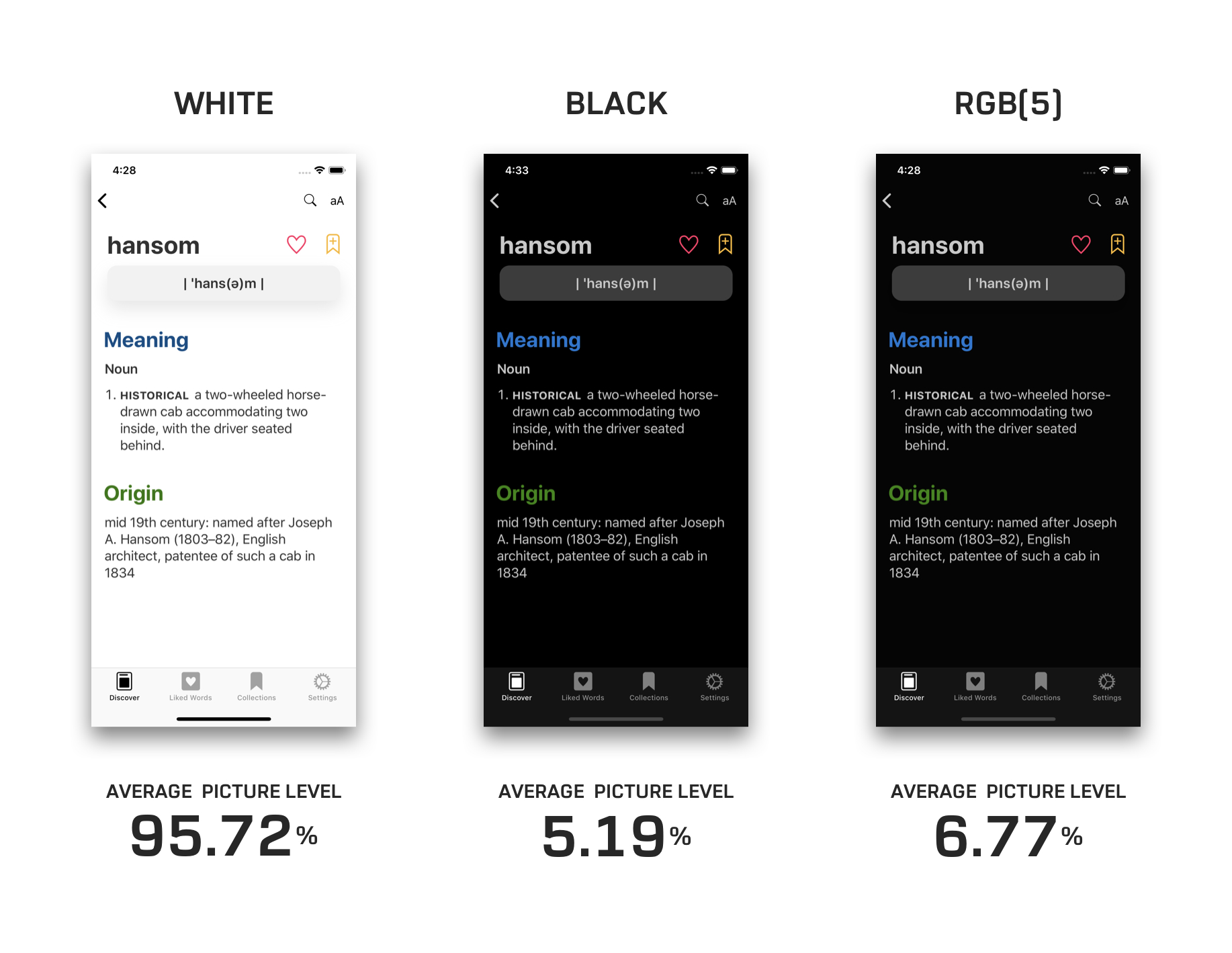
Vidit Bhargava, UI designer for the excellent LookUp dictionary app, details in a Medium post how implementing an OLED-friendly dark theme in an app is more complicated than one might think. For example:
When an interface that uses a black theme for its background starts displaying content on the screen, the pixels needs to switch on before they can display the content. So, when you’re scrolling through the content in a black background, the pixels find it hard to keep pace with your scrolling, resulting in a smear on the screen.
Bhargava uses the following tweet from Marc Edwards to illustrate this smearing issue.
What does OLED black smearing look like? In this example, the dark grey square seems to be lagging behind the light grey square, but they’re locked together. (Needs to be viewed on an OLED screen.) pic.twitter.com/WYFEXKAvsG
— Marc Edwards (@marcedwards) October 20, 2018
The solution utilized in LookUp was making its black theme not entirely black, but a dark enough grey that it appears black in use.
The rest of the post outlines the impact of black, dark grey, and white themes on a device’s battery life, along with the readability challenges inherent to black themes. It’s a fascinating read, and goes to show that a quality OLED-optimized dark theme requires a lot of thought and care to achieve.


