Grocery has come a long way from its origins as a simple list-building app for the iPhone. The app has evolved to include a terrific Watch app, an iPad app, and support for meal planning, recipes, and inventory tracking. Whether you only use Grocery’s core list-based features or its more advanced features, today’s addition of widgets and a new iPad design enhance the experience of using the app for everyone.
I’ve covered Grocery in depth before, so I won’t retread that ground here, except to encourage readers who haven’t looked at Grocery in a while to try it out. At its core, the app is all about building intelligent grocery lists. No other grocery app I’ve used makes it as easy to add and manage lists as Grocery, through a combination of smart design and dynamic sorting which is based on the order you check items off as you shop. On top of that, the app includes meal planning, recipes, inventory management, and list sharing, extending its usefulness well beyond the grocery store.
Today I’m going to focus on Grocery’s new iOS and iPadOS 14 features. Grocery includes four types of widgets that come in various sizes: All Stores, Meal Plan, Cooking, and Specific Store. Although I don’t expect most people will use all four widget types, I appreciate the variety. Grocery’s widgets have been thoughtfully considered, so they will appeal to many different users. As a result, I expect there’s something here that will work for just about anyone.
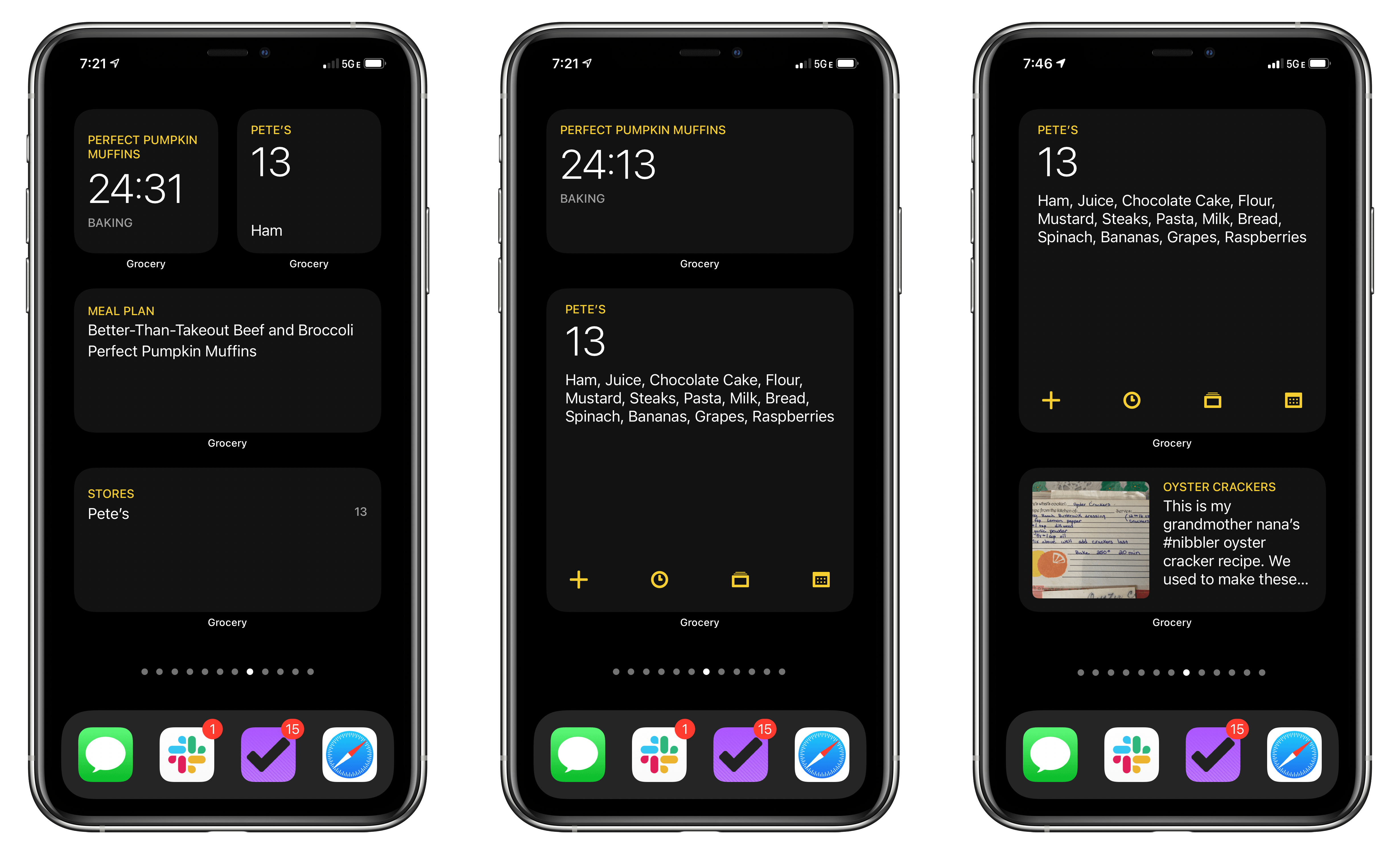
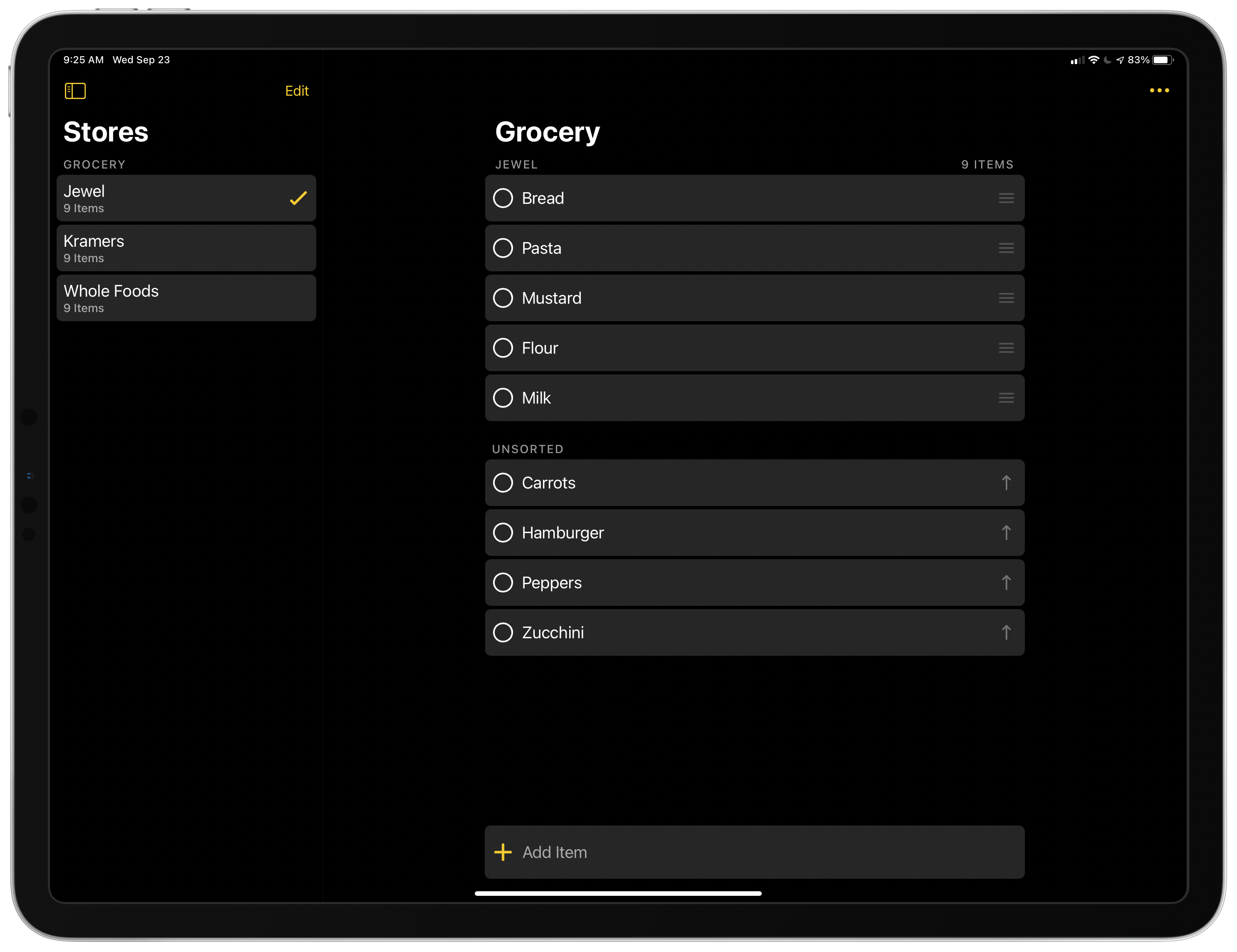
My two favorite Grocery widgets are the large Specific Store and medium Cooking widgets. Grocery lets you create separate shopping lists for every store you visit. The Specific Store widget comes in all three sizes, all of which show the last store you used by default. However, you can long-press on the widget, select Edit Widget, and pick a specific store instead.
The small version includes the store’s name, the number of items on your list, and the first item on that list. The medium-sized widget eliminates the first item in your list, which is replaced by four buttons that allow you to add an item or access your purchase history, recipes, and meal plans. What makes the large version my favorite, though, is that it uses the extra space for a comma-separated list of the items on your list. Unless you have a very long list, it’s a terrific, glanceable way to shop.
The Cooking widget is one of the most interesting widgets I’ve seen in any app. Usually, it displays the next dish in your meal plan, including its name, a description, and an image if it finds one in your recipe. When you begin preparing a dish, any timers you start in the app are displayed in the widget and count down live. If you’re using Grocery to prepare meals, having access to running timers from the Home Screen is a big plus. The reason I prefer the medium-sized version of this widget is that the numbers on a timer can sometimes get cut off in the small version of the widget, and the large version doesn’t add much given the space it uses.
The other two widget types are All Stores, which lists each of the stores you frequent and the number of items on each list, and Meal Plan, which lists the recipes on your meal plan. Tapping either takes you into the related section of the app’s UI. Both widgets are available in medium and large sizes, and the one that works best for your circumstances will largely depend on how long those lists are.
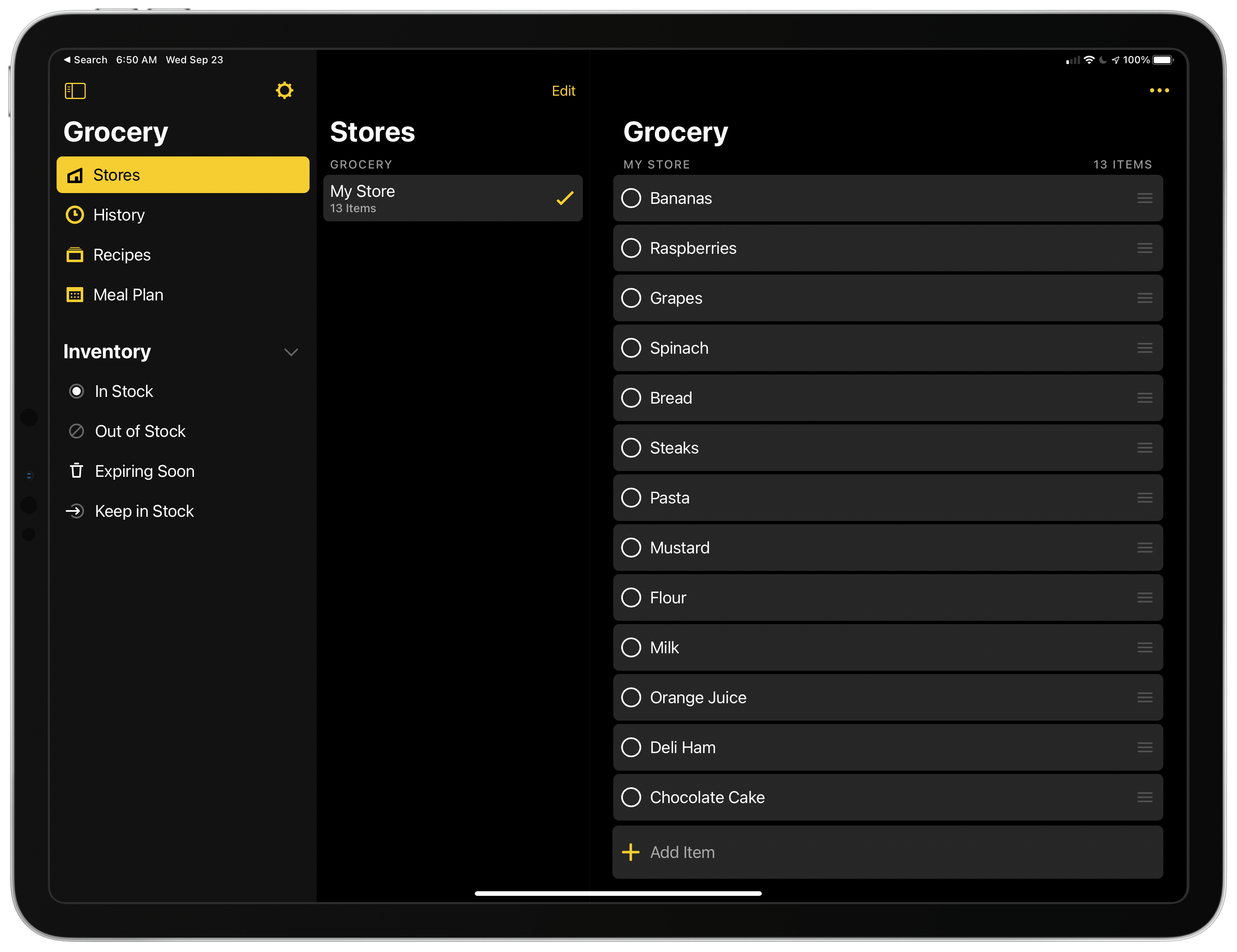
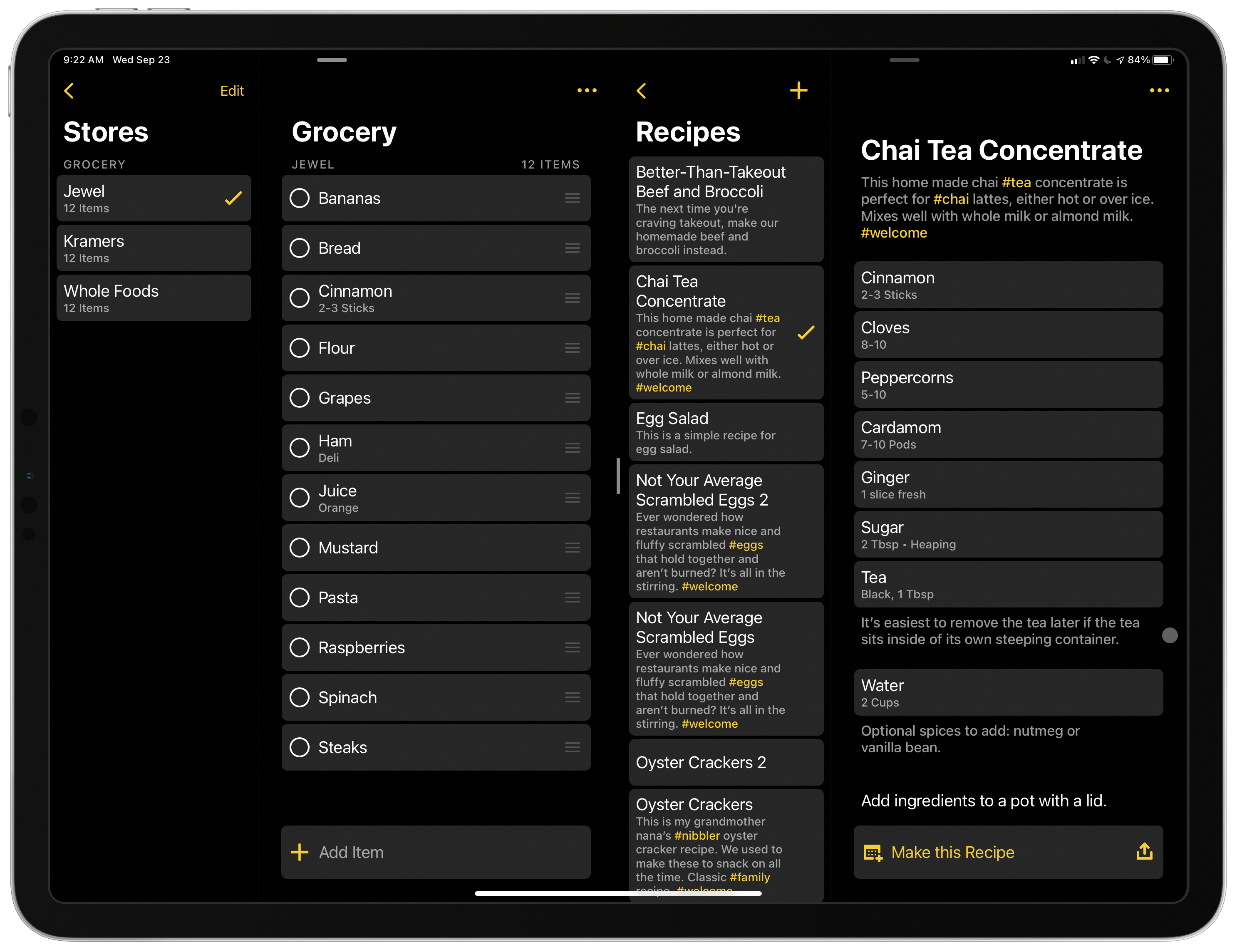
The other significant addition to Grocery is the new iPad design, which features a three-pane layout. The left-hand pane can be hidden with a two-finger swipe on a trackpad, tap of the dedicated button, or keyboard shortcut and provides access to your Stores, History, Recipes, Meal Plans, and Inventory, which is collapsable. The middle pane includes a list view for each section of the app, and the right pane is a detailed view for your lists, recipes, and other content. In addition to the new three-column design, I also appreciate that Grocery supports multiwindowing, Split View, and Slide Over. However, I wish I could simply drag items between lists or windows, which is not currently possible. You can, however, use multiwindowing to consult one section of the app while viewing another.
It’s worth noting too that Grocery makes extensive use of context menus. Formerly, the app relied heavily on modal action sheets. I like the switch to context menus much better. I also like that access to the app’s sections is across the top of the screen on the iPhone version of the app. That’s a little unusual, but it makes complete sense for Grocery where you want the ability to add items within easy reach at the bottom of the screen.
My grocery shopping habits have changed a lot since the spring when the pandemic drove most of my shopping online. That caused me to abandon Grocery for a while, but with a new shopping routine in place and more meal planning and cooking happening at home than in the past, I’m experimenting more with Grocery’s many features than ever before. If you haven’t taken a look at Grocery in a while, it’s definitely worth revisiting.


