I’ve been following Ben McCarthy’s journey with Obscura since the app first launched in 2015, watching the app as it has evolved alongside changes to Apple’s camera hardware. Camera apps pose unique design challenges, especially for camera apps like Obscura, which has consistently aimed to deliver pro features that can be used one-handed on an iPhone. Those challenges have only continued to multiply since I wrote about Obscura 2 and its innovative Control Wheel.
With Obscura 3, which is a brand new app, McCarthy and the Obscura team have taken a new direction with the app’s design that’s better suited for the capabilities of Apple’s modern camera hardware. It’s a direction that remains true to the app’s historical design aesthetic and user experience while making changes that I expect will provide greater flexibility to quickly adapt to future camera innovations.
I’m going to focus on Obscura 3’s design because I haven’t tested every possible combination of features the app offers. It’s winter in the Chicago area and not the best time for photo walks. Still, I’ve spent enough time with the app to know that the new design works well, allowing users to step through its myriad of features with ease, so let’s take a closer look.
Obscura 2’s Control Wheel is gone. I’ll miss it, but I also understand why it’s gone. As camera hardware has evolved, software features have become increasingly dependent on the mode in which you’re working. The Control Wheel was a fantastic affordance with an analog in the world of physical cameras, but it imposed constraints that weren’t easily adaptable to the new photo and video modes that Apple has introduced.
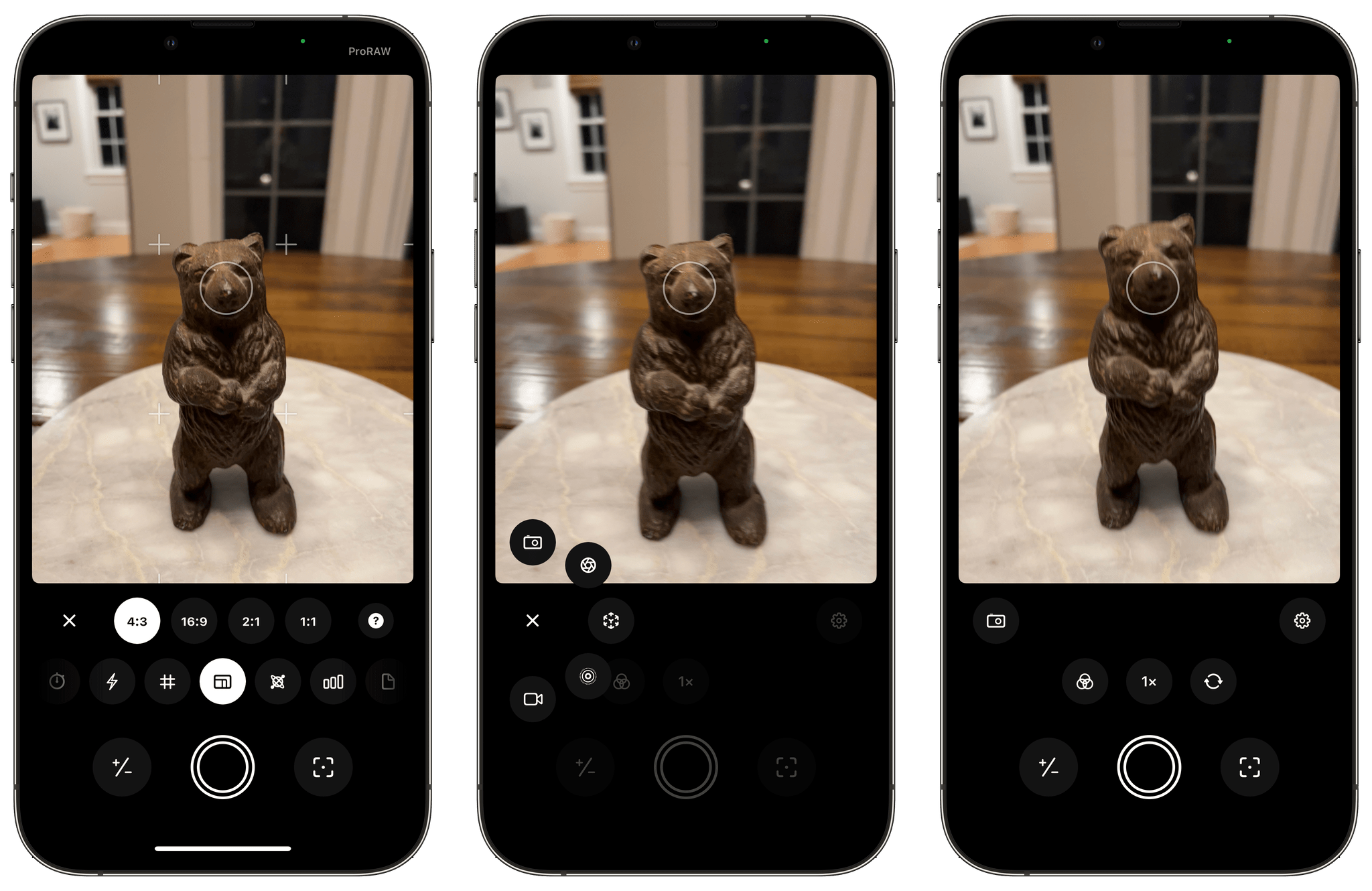
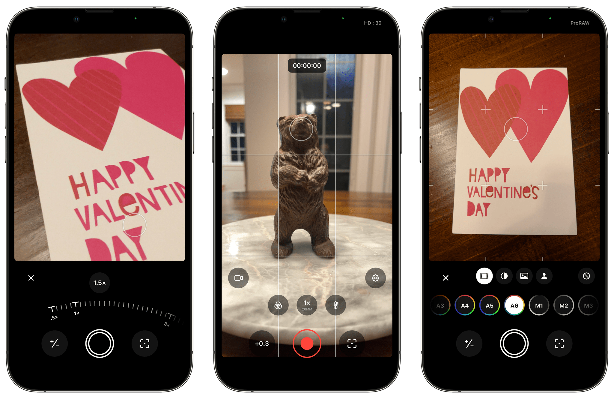
Obscura 3 addresses the modality of Apple camera hardware directly with five modes of its own: Photo, Pro Photo, Depth, Live Photo, and Video. Each modes has a variety of shooting options, which benefit from the separation of one set of features from the others.
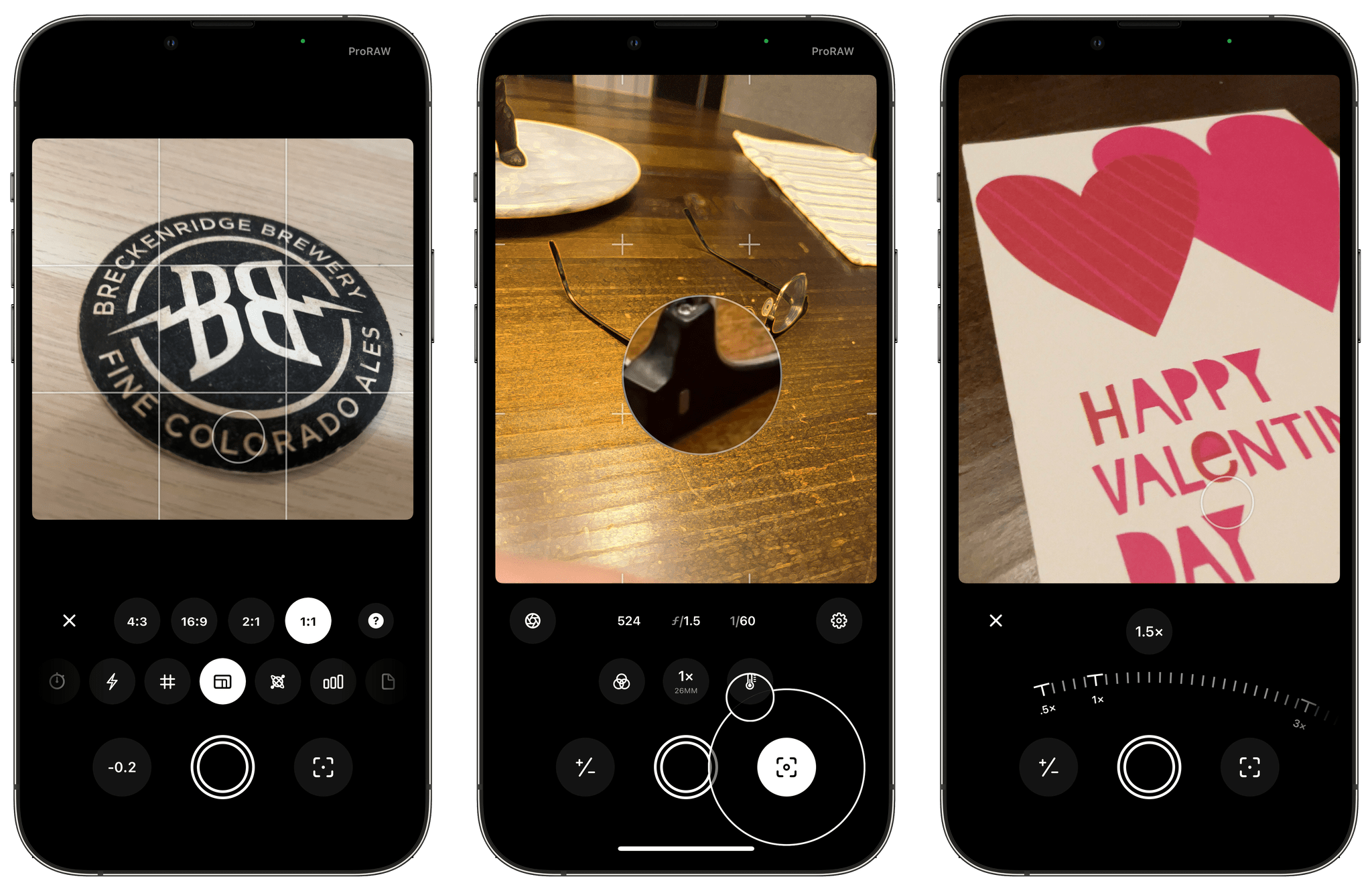
Despite the modal shifts, Obscura 3 manages to remain easy to use by sticking to a consistent interaction model. Once you pick a mode, tapping the gear button on the right side of the view displays a long list of horizontally-scrolling shooting options just above the shutter button that vary depending on the mode you’re using. If the option you pick has multiple settings of its own, those appear just above the list of shooting options. To back out, just return to where the shooting mode’s button has been replaced by an ‘x’ that takes you back to where you started. That pattern of drilling into a shooting mode’s options and returning to the ‘x’ button is repeated throughout Obscura 3 and is a big part of what makes the app easy to use.
When the gear button hasn’t been selected, Obscura includes just three buttons above the shutter button for picking a filter, zooming in or out, and flipping between the front and rear-facing cameras. As with the shooting mode options, backing out of a filter or zoom level is accomplished by tapping the same ‘x’ button described above.
The shutter button at the bottom center of the view is flanked by exposure and focus buttons. Tap and drag away from the exposure button, and it expands into a circle around which you can rotate your finger, dialing in a precise exposure value. The focus button behaves similarly in Pro Photo mode, but in standard Photo and the other modes the button enters a focus peaking mode while pressed.
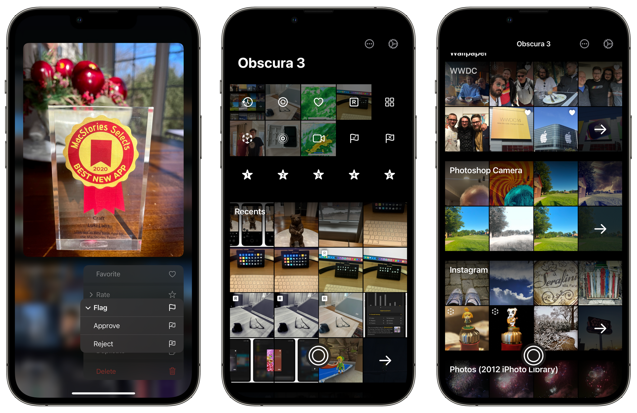
Obscura 3 has also improved its photo library. Swiping down on the camera UI reveals a set of pre-built albums, including flagged and star-rated images, which can be applied as you swipe between your images. The image viewer also includes options to apply filters, review image metadata, and share your photos. To return to the camera UI, just tap the button that looks like the app’s shutter button, which is a feature carried over from Obscura 2, but with a new design.
Also, you can access Obscura’s app-wide settings from the gear icon in the top right corner of the library view. Here, you’ll find information about your iPhone’s camera hardware, settings to tweak the app’s camera controls, preset options for each shooting mode, and more. The app also offers three themes, a wide variety of icon choices, and light and dark modes.
My one quibble with Obscura’s settings is that they’re hard to find. The app opens, as you’d expect, in camera mode. When I went looking for the themes and app icons, I tapped on the gear button in the camera view, assuming that they’d be available among the many options available for each shooting mode. Instead, you need to be in the app’s image library to access app-wide settings. It’s an easy mistake to make and one that might confuse people, given how many options are packed behind that camera view button.
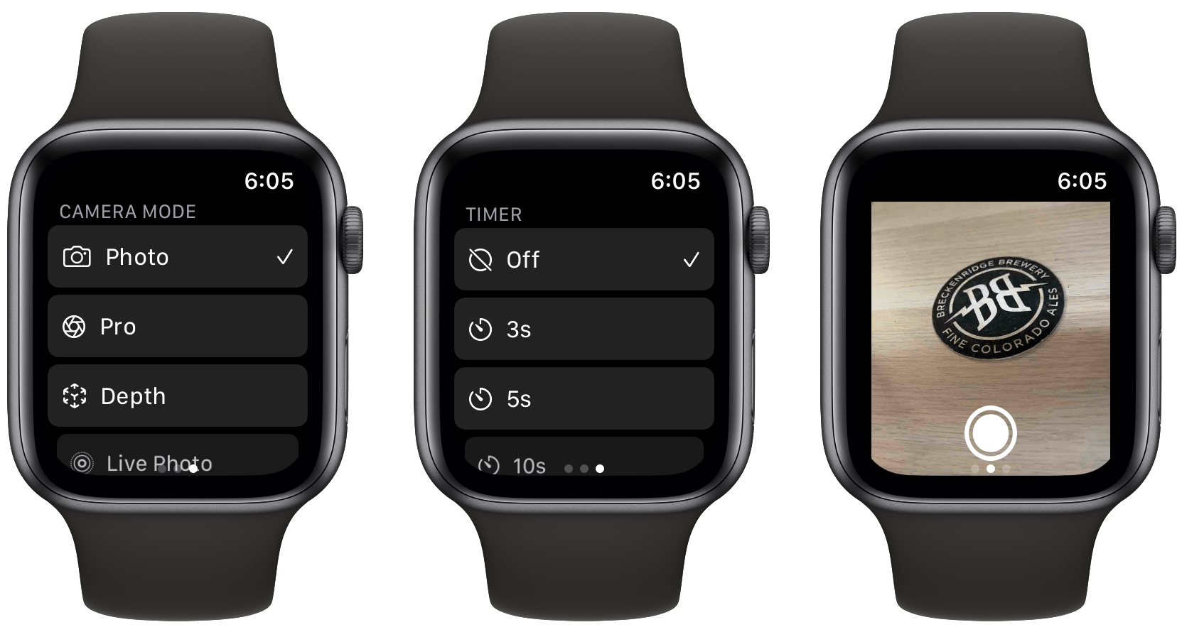
I should mention, too, that Obscura 3 includes an excellent companion Watch app that can be used to trigger the app’s shutter remotely, set timers, pick the front and rear cameras, select the app’s shooting mode, and assign the Digital Crown to adjust exposure or capturing a picture. I’ve only used the Watch app a little, but I was immediately impressed with its responsiveness and depth of features.
Stepping back from the details, it’s fair to say that I like Obscura 3’s new direction a lot. The app is easy to use one-handed, it’s full of delightful animations and other small touches that make the experience of navigating through the app feel fluid and natural, and there’s a depth of features to explore that will satisfy any iPhone photographer. If you haven’t tried Obscura in a while, now is a good time to give it another look.
As I mentioned at the top, Obscura 3 is a new app, which is available on the App Store for a one-time payment of $9.99. Unlike version 2, there are no In-App Purchases. Instead, the app’s filters and everything else are included in that one-time price.


