This article wasn’t supposed to go like this.
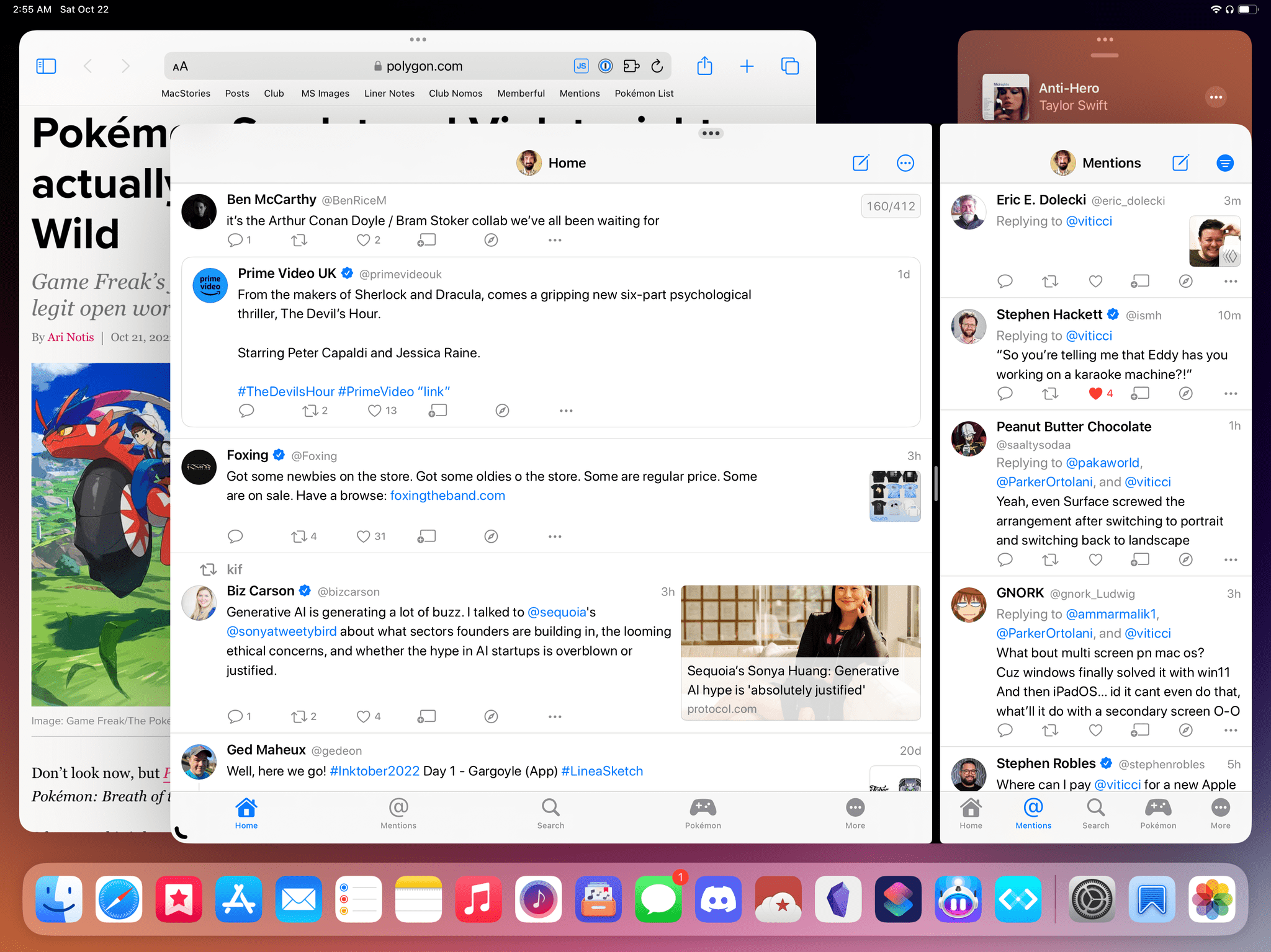
iPadOS 16 is launching to the public today, and it carries a lot of expectations on its shoulders: for the first time since the introduction of the original iPad in 2010, Apple is embracing a Mac-like windowing system that lets you use up to four windows at the same time on the iPad’s screen. You can even resize them and make them overlap. If you’ve been following the evolution of the iPad for a while, you know that’s very unusual.
But the reason this story was meant to be different isn’t to be found in Apple’s design philosophy for iPadOS 16. Typically, MacStories readers would expect a full-blown ‘The MacStories Review’ to go alongside a new version of iPadOS. That’s what I’ve been doing for over seven years at this point, and I don’t like breaking my writing patterns. When something works, I want to keep writing. That’s precisely why I had to stop writing about iPadOS earlier in the summer and until last week.
Stage Manager, the marquee addition to iPadOS that lets you multitask with floating windows, started crashing on my M1 iPad Pro in mid-July and it was only fixed in early October. When I say “crashing”, I mean I couldn’t go for longer than 10 minutes without iPadOS kicking me back to my Lock Screen and resetting my workspaces. And that was only the tip of the iceberg. For nearly two months, I couldn’t type with Apple’s Magic Keyboard or use keyboard shortcuts when Stage Manager was active. Before it was pulled by Apple and delayed to a future release, external display support in Stage Manager was impossible to rely on for production work. The list goes on and on and on.
Normally, I would use the introduction of my iOS and iPadOS reviews to tell you how I’ve been living and working with the new operating system every day for the past three months. I’ve always tried to publish annual OS reviews that are informed by practical, consistent usage of a new operating system which, I hope, has led to highly opinionated, well-researched stories that can stand the test of time. That kind of story hasn’t been possible for me to produce with iPadOS 16 yet.
Effectively, I’ve only been able to sort-of use iPadOS 16 with Stage Manager on my M1 iPad Pro again for the past two weeks. Before that, it’s not that I didn’t want to use iPadOS 16 and Stage Manager because I hate progress; I literally couldn’t unless I was okay with my iPad crashing every 10 minutes. So, at some point over the summer, I made the call to revert to Split View and Slide Over – which are still the iPad’s default multitasking mode in iPadOS 16 – and I’d check back in on Stage Manager on each beta of iPadOS 16. It was only around two weeks ago that, despite some lingering bugs I’ll cover later, I was able to finally leave Stage Manager enabled and go back to where I was when I published my iPadOS 16 first impressions article in July.
Think about my position this way: there’s a hole from early August to early October in my typical “reviewer summer” during which I couldn’t use the biggest addition to iPadOS 16 at all. The fact that Apple delayed, slimmed down, and kept iterating on Stage Manager until the very last minute seems to suggest I wasn’t the only one desperately trying to make it work.
I started using iPadOS 16 and Stage Manager again two weeks ago; what kind of “review” should this be?
It’s important for me to offer this context upfront for two reasons: this is not the complete MacStories review of iPadOS 16 I wanted to publish today; and, equally important, I also know that the majority of people haven’t been testing Stage Manager for nearly five months like I did.
See, this is the tricky part for me here: despite the many design flaws of Stage Manager, its plethora of technical issues, and in spite of the features that were cut from it, when I had to get work done over the past two weeks on my iPad Pro and Stage Manager performed as intended, windowing on iPadOS felt nice. I felt like I was back in July, just before the public beta of iPadOS 16 came out, and I – ever the optimist – looked at Stage Manager as the beginning of something new that Apple would surely refine and polish over the coming months.
All this to say: I’m fully aware that many of you are going to upgrade to iPadOS 16 today, use it for 10 minutes, think it’s mostly okay, and wonder “why was Viticci so upset about this”?
That leaves me with two options. I could tell you how bad Stage Manager was this summer, how testing it and repeatedly running into bugs and roadblocks nearly drained my enthusiasm for the iPadOS platform, and how much feedback I reported to Apple about it. But that wouldn’t be an interesting or useful story. Or I could just accept the hand I was dealt and write about the experience I’ve had with Stage Manager (again) for the past two weeks – bugs, missing features, flawed foundation, and all.
I chose the latter: it’s in my nature to optimistically look forward at what’s coming next without dwelling on the past; I also think it’s the more nuanced and useful approach that, hopefully, MacStories readers will appreciate.
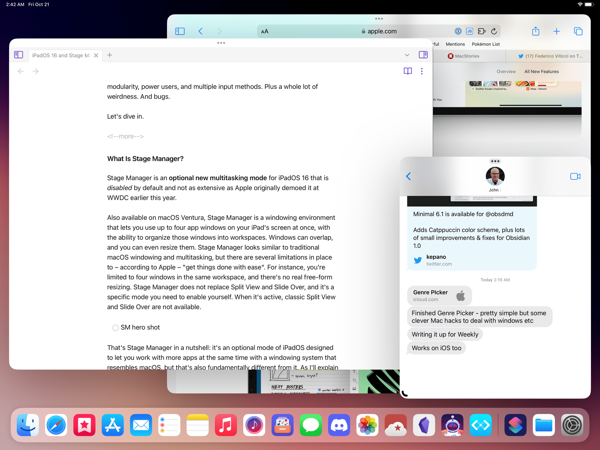
For better or worse, Stage Manager is showing us the trajectory Apple has chosen for the future of the iPadOS platform, and it’s one designed for modularity, power users, and multiple input methods. Plus a whole lot of weirdness. And bugs.
Let’s dive in.
Table of Contents
- What Is Stage Manager?
- Working with Stage Manager
- The Strip’s Failures
- Stage Manager’s Flawed Design, Bugs, and Litany of Missing Features
- A Shaky Foundation Meets a Rushed Launch
What Is Stage Manager?
Stage Manager is an optional new multitasking mode for iPadOS 16 that is disabled by default and not as extensive as Apple originally demoed it at WWDC earlier this year.
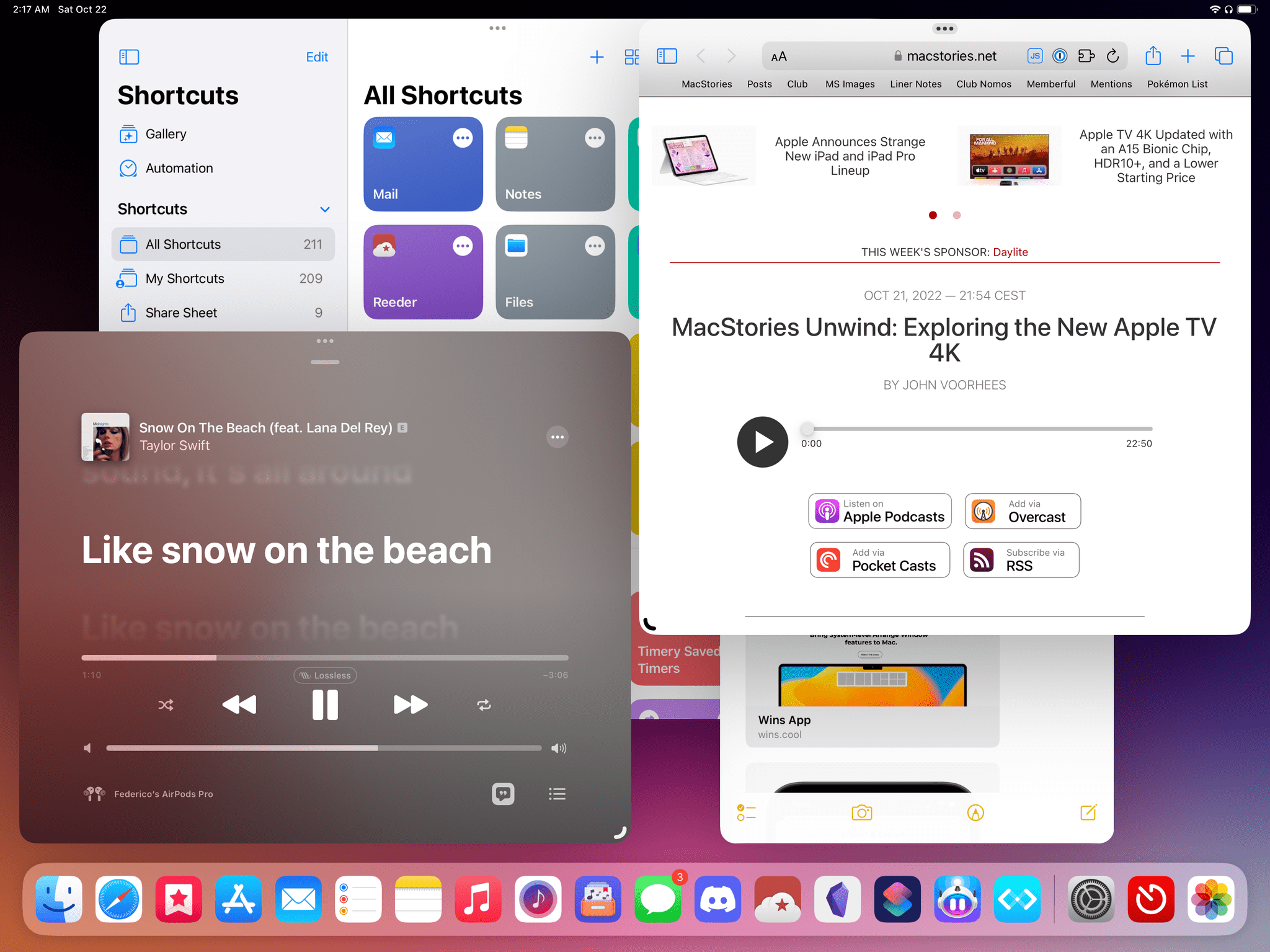
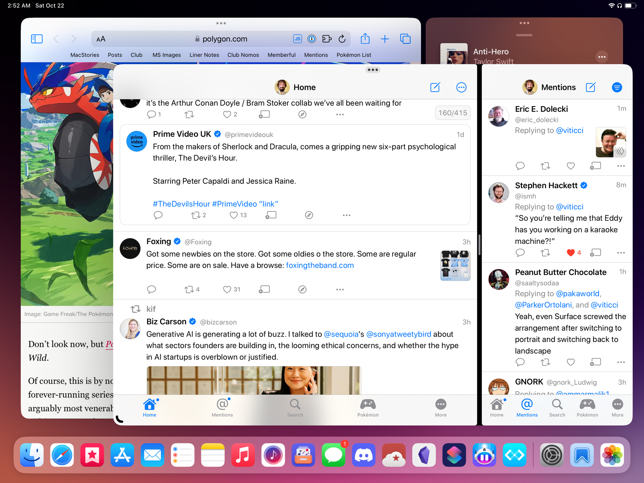
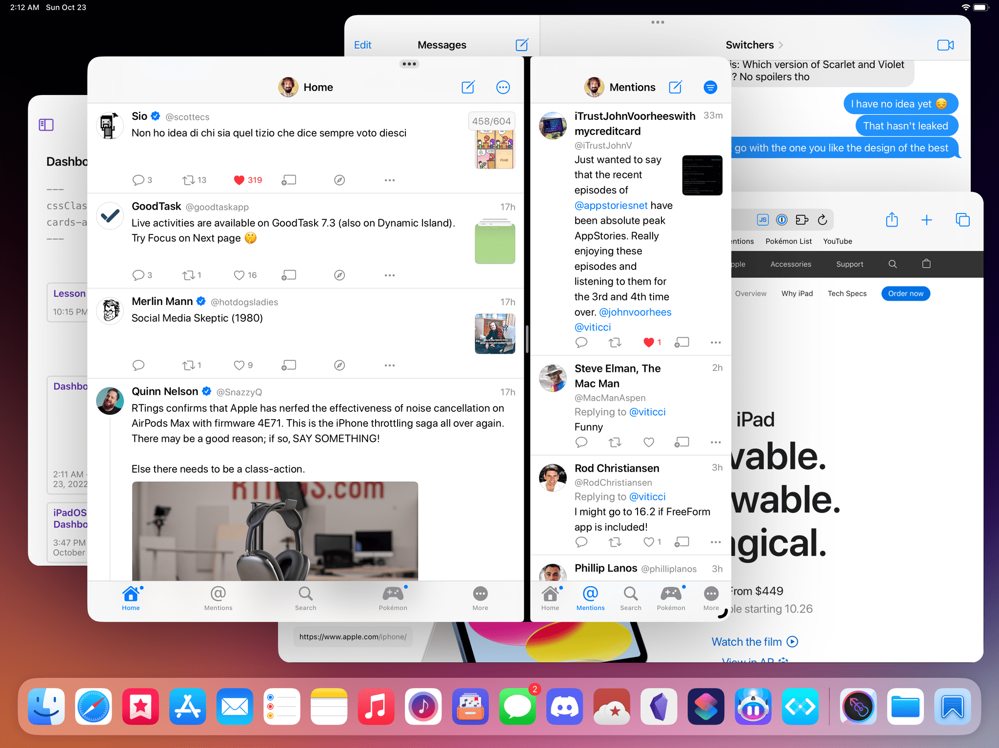
Also available on macOS Ventura, Stage Manager is a windowing environment that lets you use up to four app windows on your iPad’s screen at once, with the ability to organize those windows into workspaces. Windows can overlap, and you can even resize them. Stage Manager looks similar to traditional macOS windowing and multitasking, but there are several limitations in place to – according to Apple – “get things done with ease”. For instance, you’re limited to four windows in the same workspace, and there’s no real free-form resizing. Stage Manager does not replace Split View and Slide Over. Instead, it’s a specific mode you need to enable yourself, and when it’s active, classic Split View and Slide Over are not available.
That’s Stage Manager in a nutshell: it’s an optional mode of iPadOS designed to let you work with more apps at the same time with a windowing system that resembles macOS, but that’s also fundamentally different from it. As I’ll explain later, depending on what you want from a laptop that supports windowing, this approach has its long list of pros and cons.
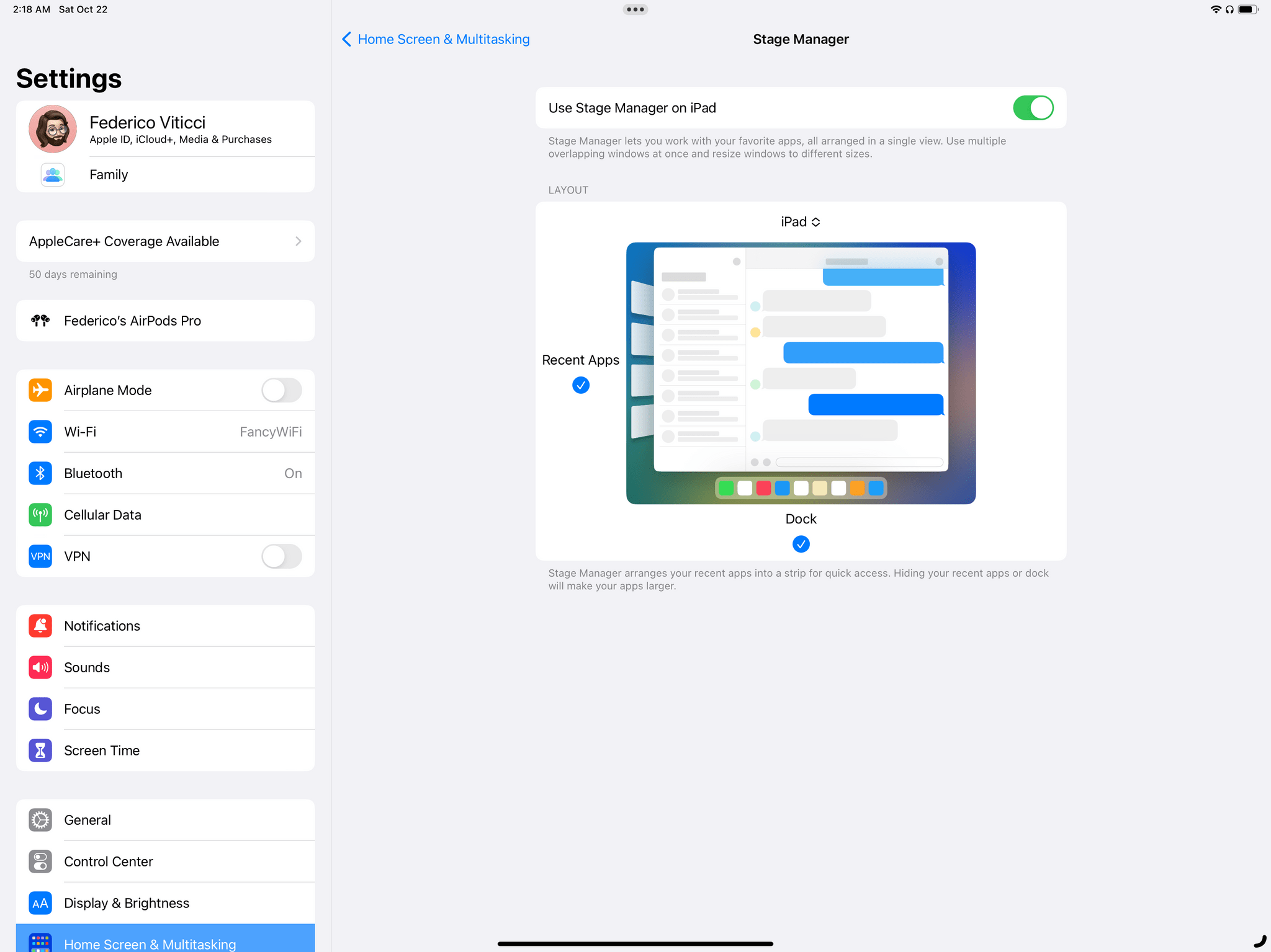
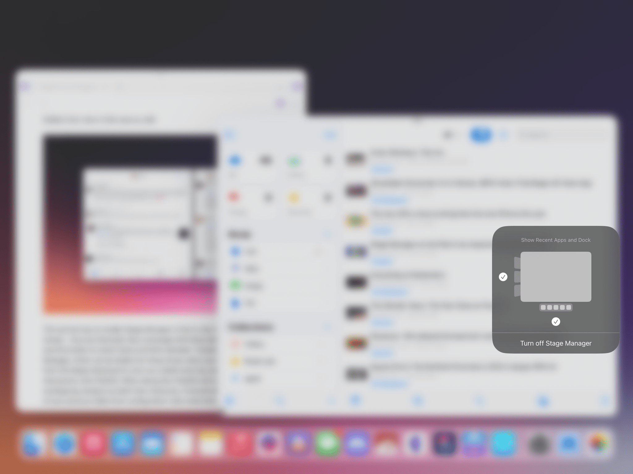
You can activate Stage Manager in two ways. The first is to head over to Settings ⇾ Home Screen & Multitasking and flip the Stage Manager switch under the Multitasking section. Opening this section immediately reveals the structure of Stage Manager with a preview of a sample workspace that shows you two elements you can customize.
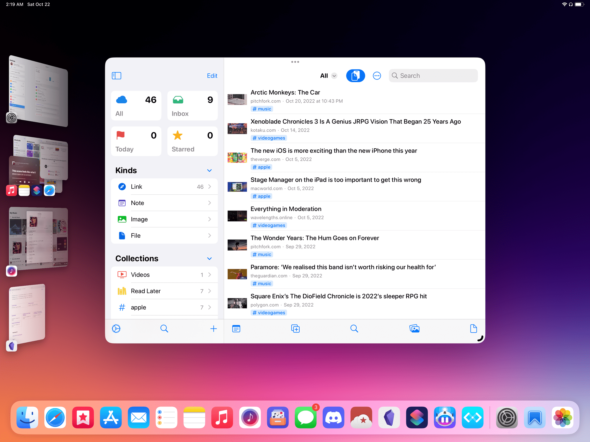
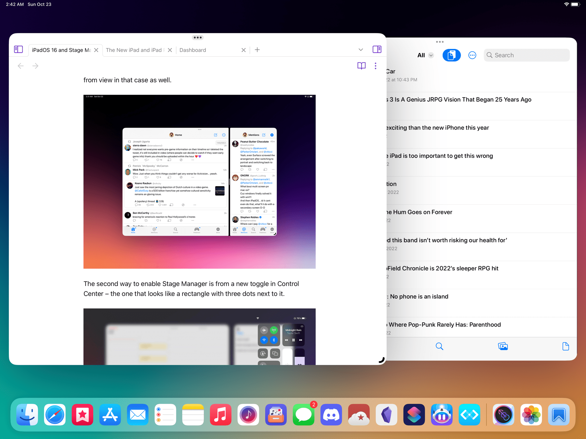
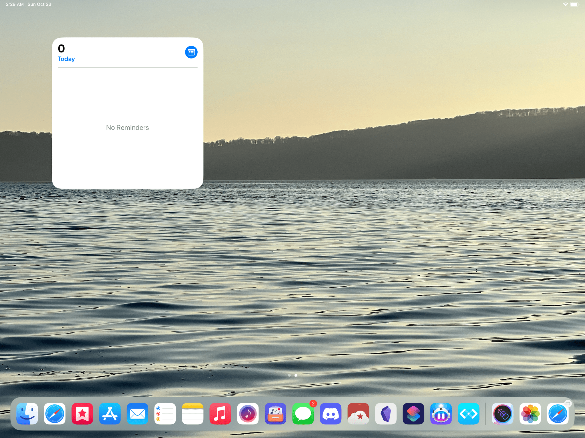
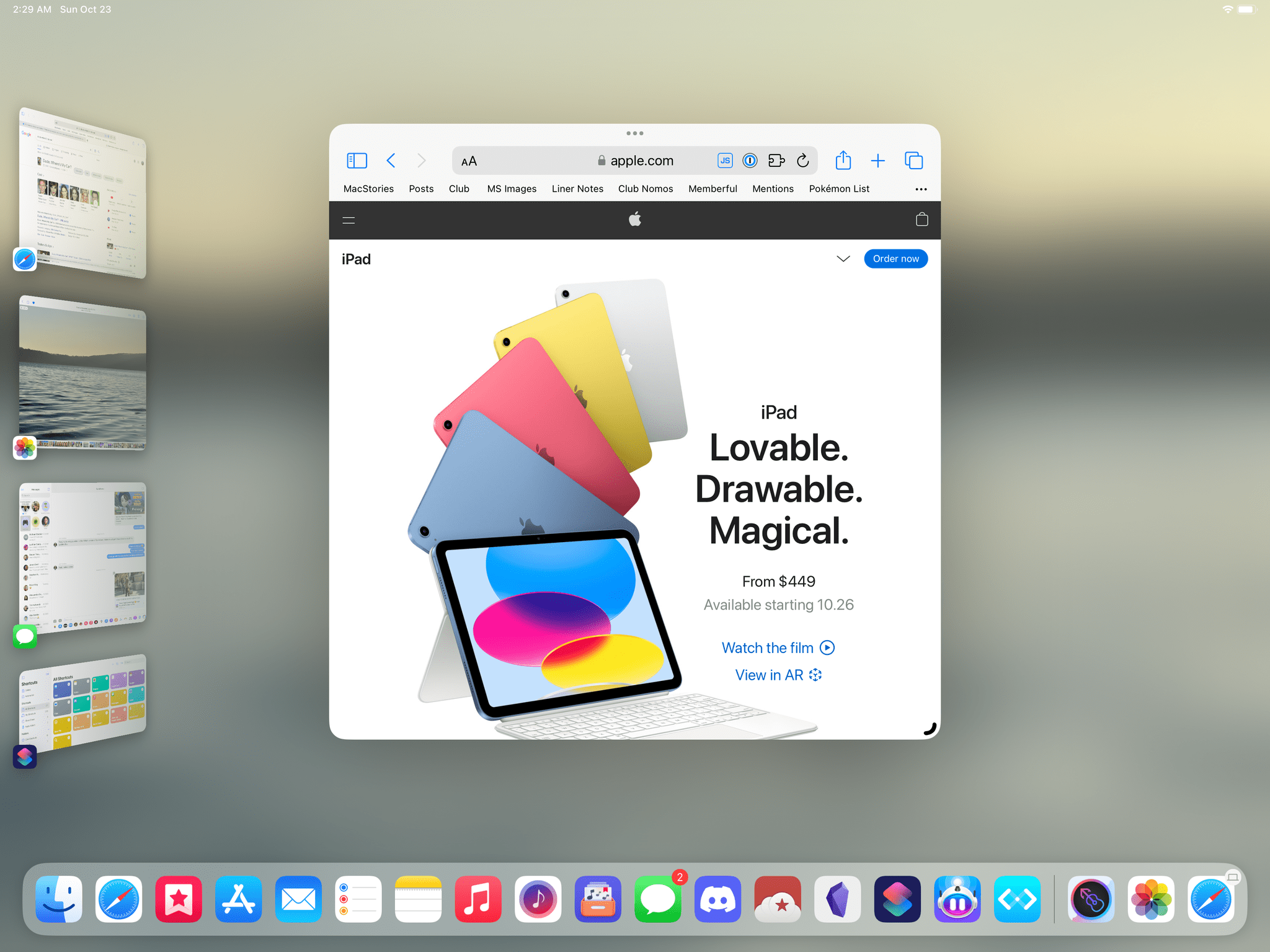
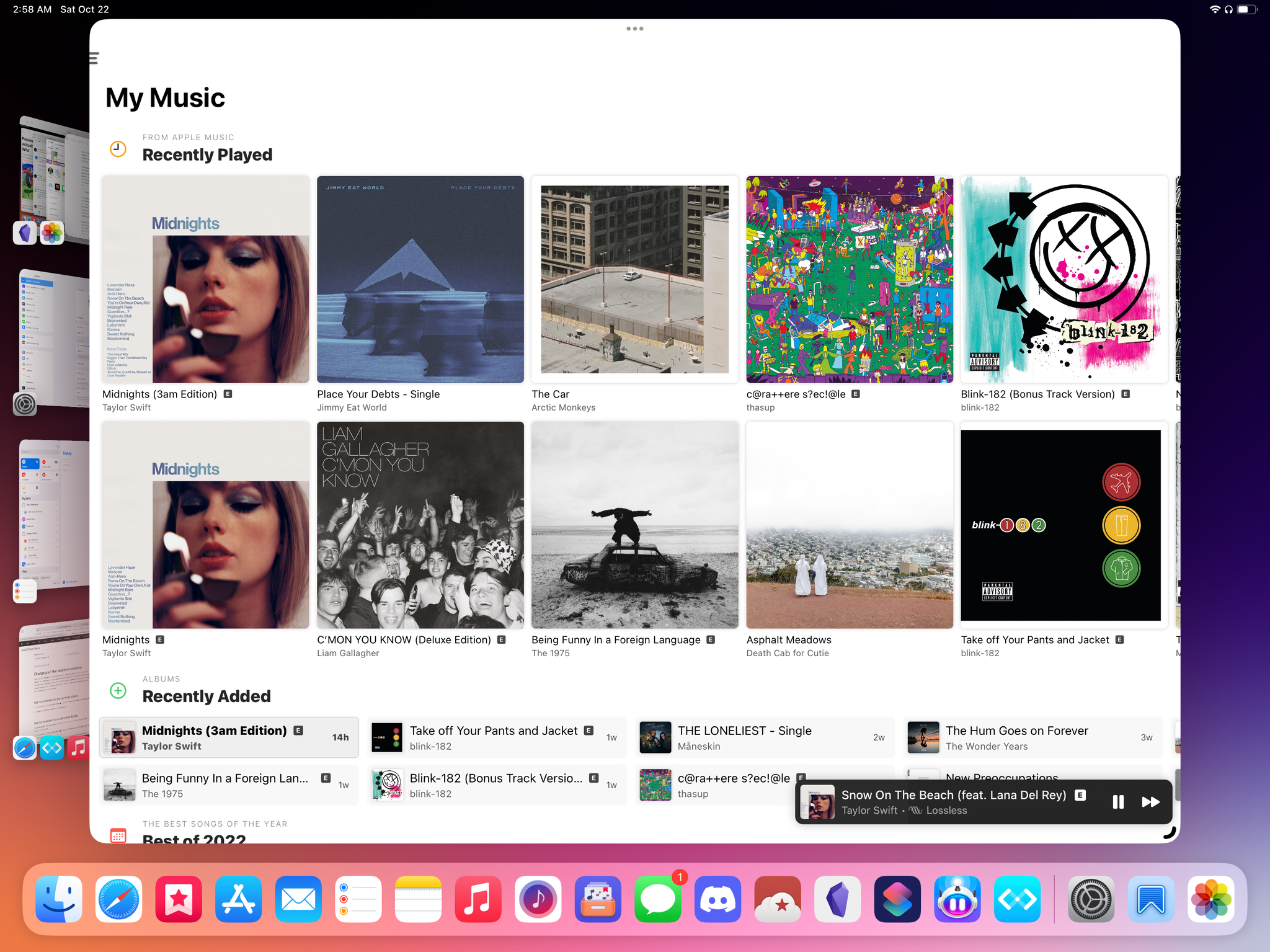
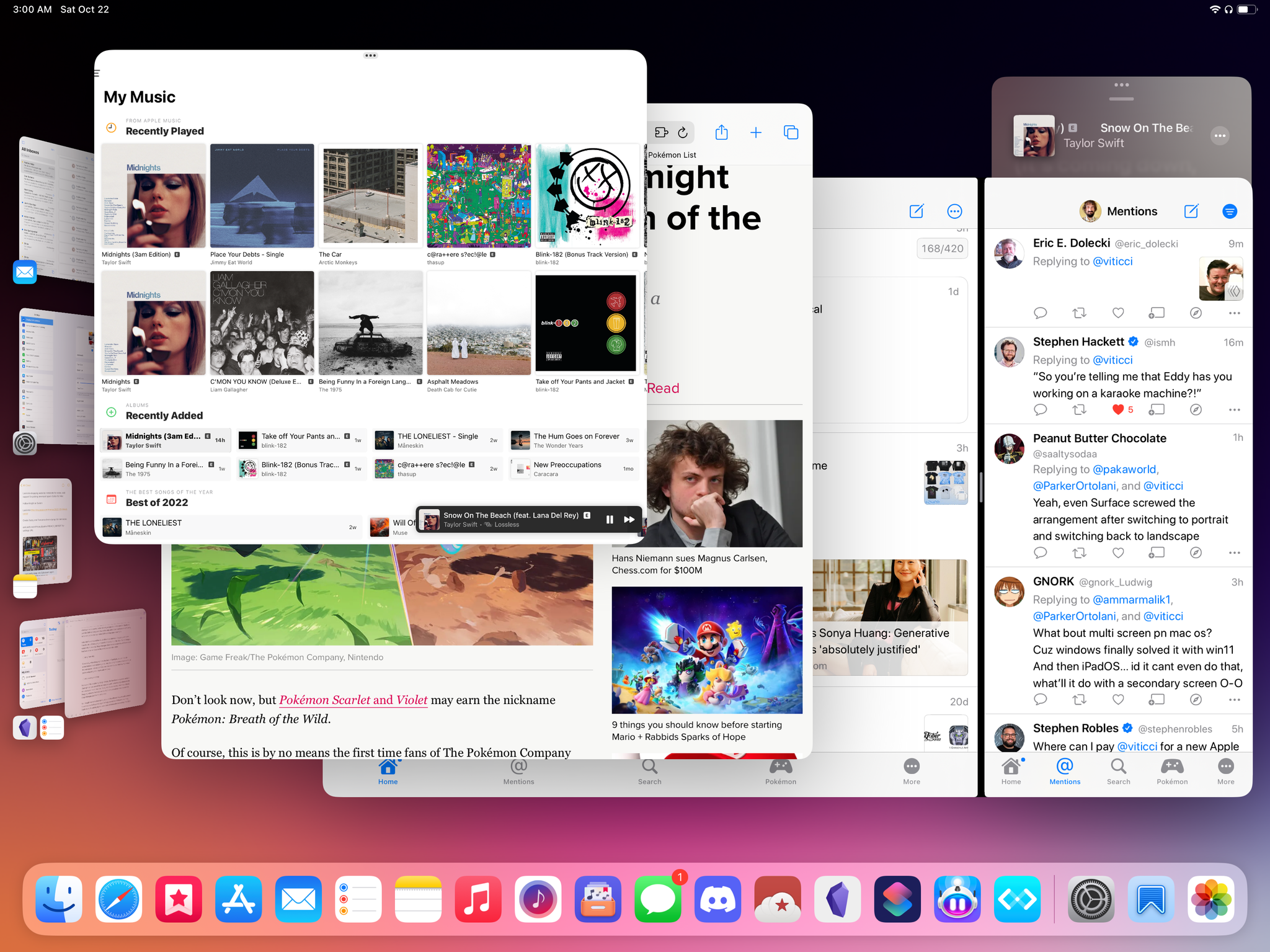
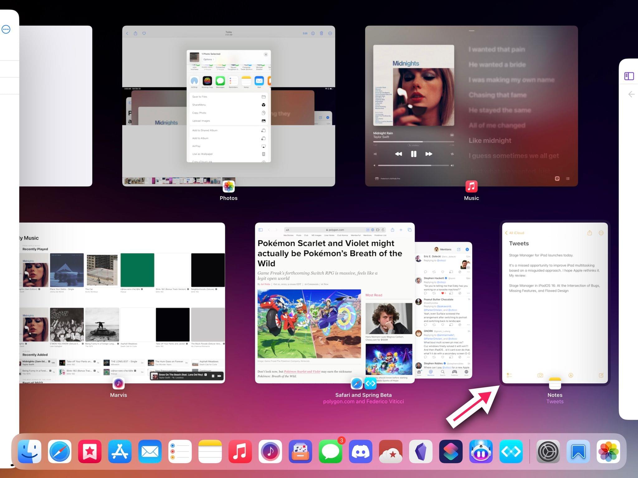
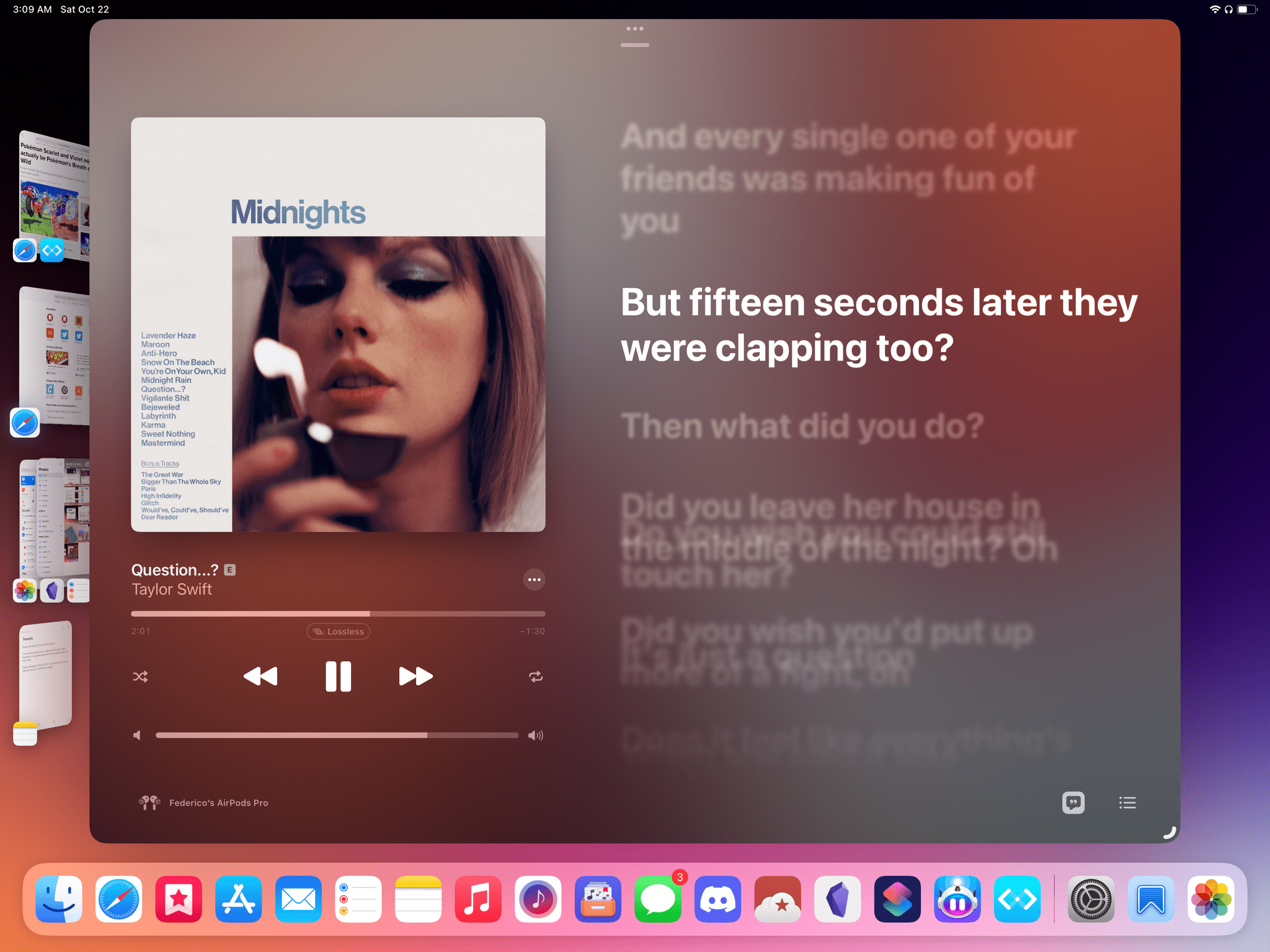
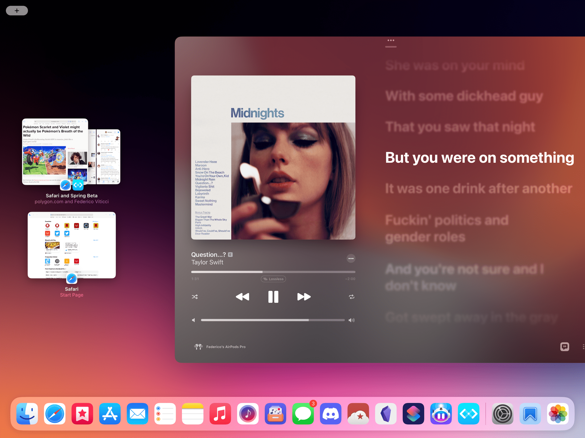
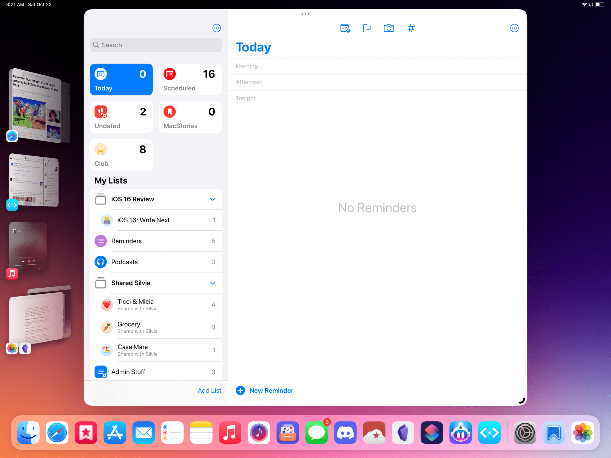
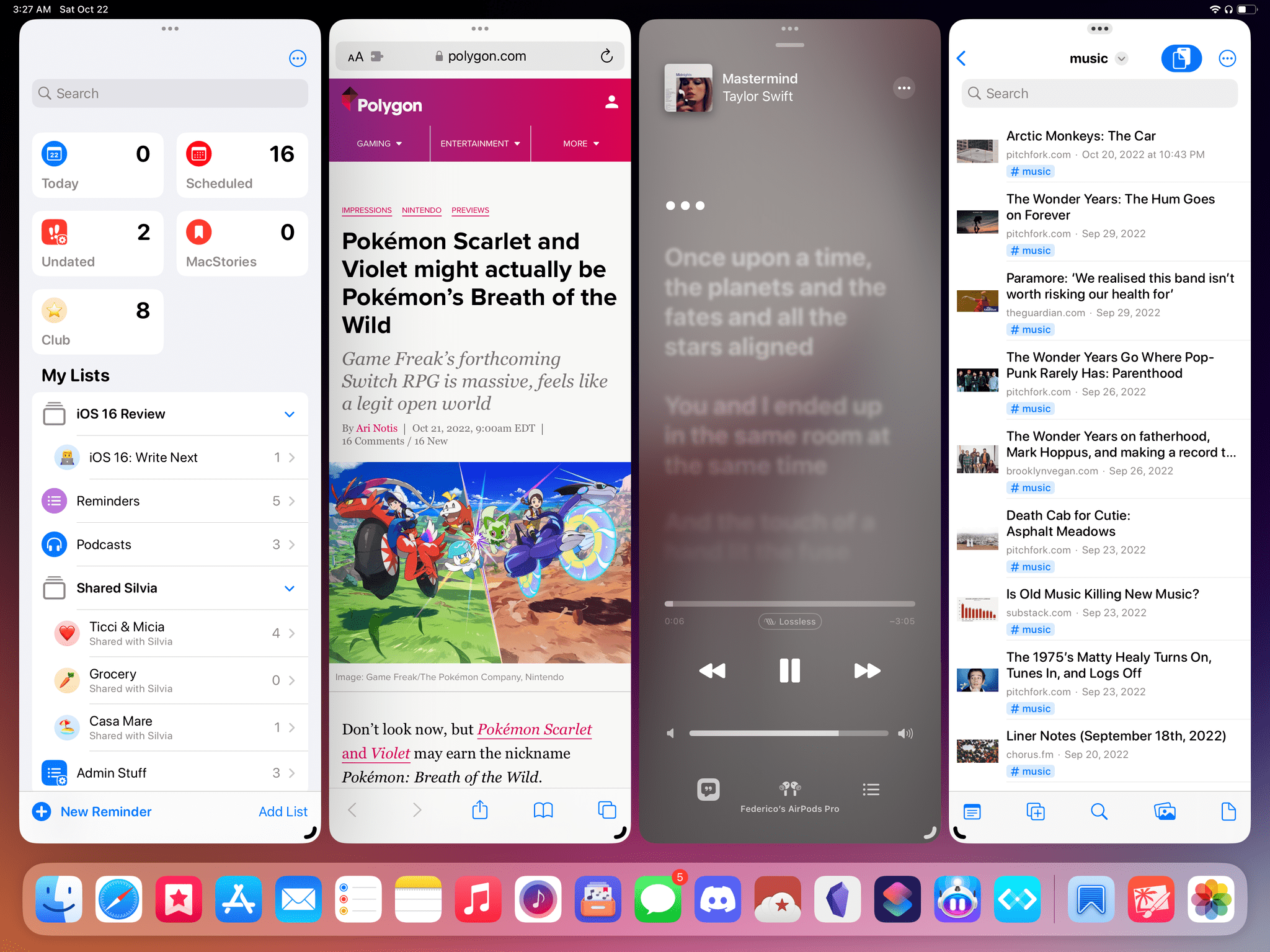
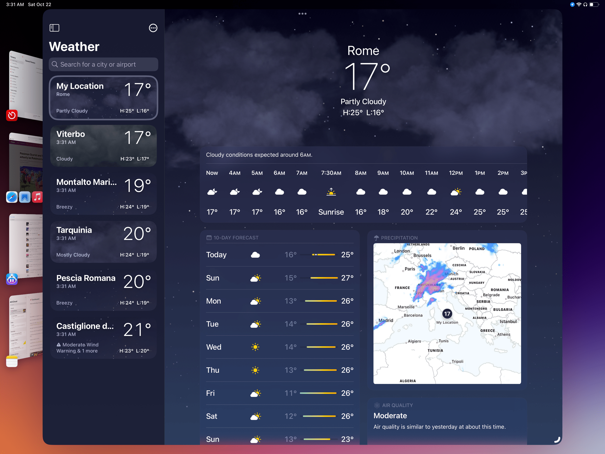
By default, a Stage Manager workspace is comprised of three distinct parts: the actual workspace with your app window(s) in it; the classic iPadOS dock at the bottom; and a vertical strip of recently used apps and workspaces displayed as live thumbnails on the left edge of the screen. The strip is, along with overlapping windows, one of the defining visual characteristics of Stage Manager, acting as an extension of the regular app switcher (which is still around in iPadOS 16) to give you fast access to up to four recently used apps/workspaces.
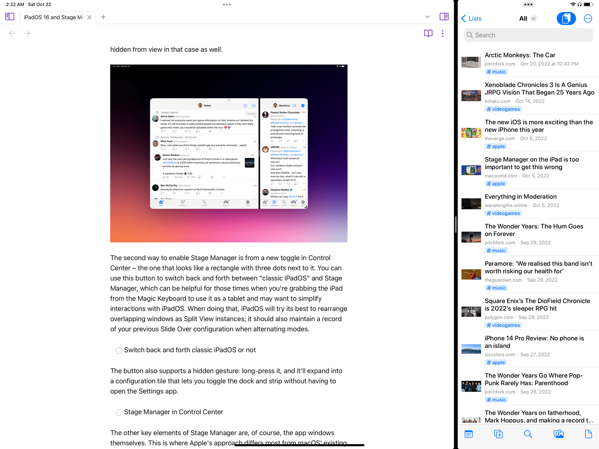
Both the dock and strip can be individually disabled in iPadOS 16 when Stage Manager is active. When you do that, you gain more screen real estate for your windows, and you can invoke both elements by “bumping” the pointer into their respective edges of the screen, but you lose the ability to have persistent “quick launchers” for apps. Keep in mind that if the strip and dock are shown and you resize one of your windows to cover them, they’ll be hidden from view in that case as well.
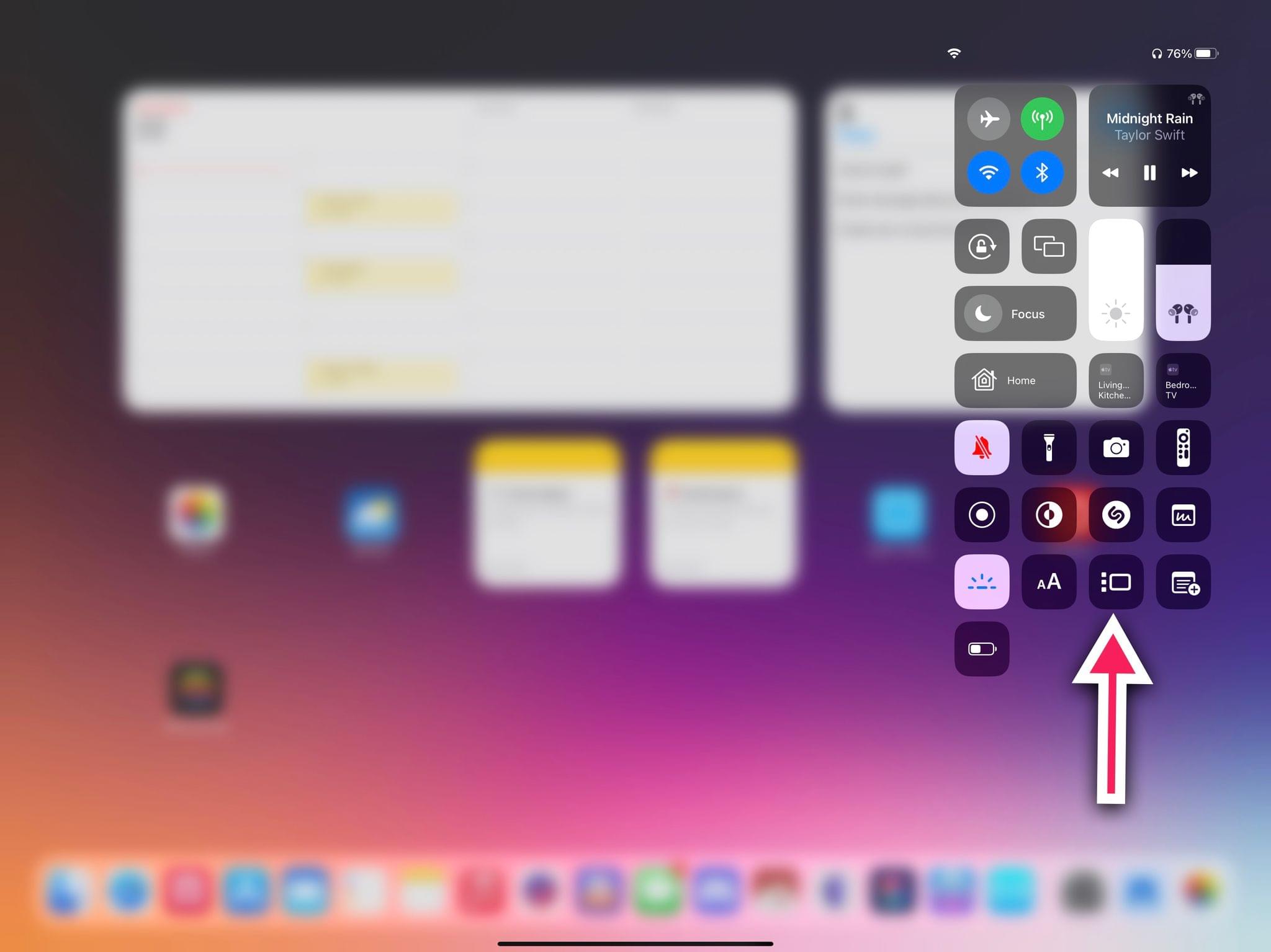
The second way to enable Stage Manager is from a new toggle in Control Center – the one that looks like a rectangle with three dots next to it.
You can use this button to switch back and forth between “classic iPadOS” and Stage Manager, which can be helpful for those times when you’re grabbing the iPad from the Magic Keyboard to use it as a tablet and may want to simplify interactions with iPadOS. When doing that, iPadOS will try its best to rearrange overlapping windows as Split View instances; it should also maintain a record of your previous Slide Over configuration when alternating modes.
The button also supports a hidden gesture: long-press it, and it’ll expand into a configuration tile that lets you toggle the dock and strip without having to open the Settings app.
The other key elements of Stage Manager are, of course, the app windows themselves. This is where Apple’s approach differs most from macOS’ existing windowing environment and where, ultimately, you’ll have to draw the line as to whether you like working with Stage Manager or not.
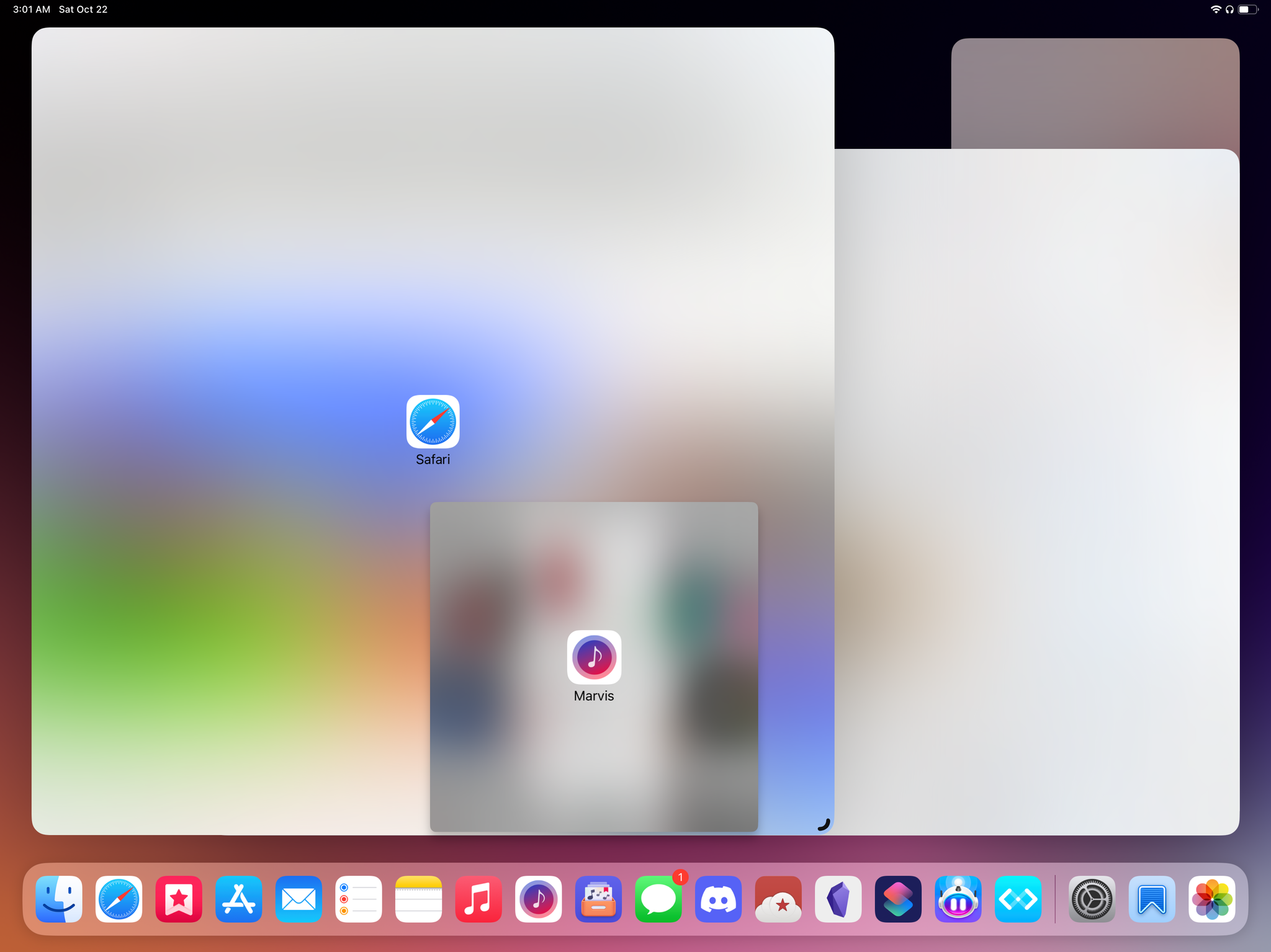
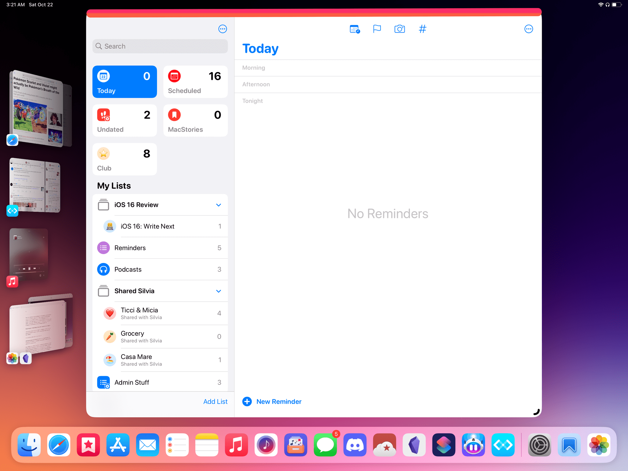
When Stage Manager is active, iPad apps do not gain any new UI chrome around them to, say, display a fixed title bar or ‘traffic light’ buttons like on the Mac. Instead, they get rounded corners, keep the multitasking menu (the three dots) at the top of the window, and start floating above a blurred version of your Home Screen wallpaper. Unlike macOS, you do not see your ‘desktop’ underneath nor are the windows floating atop the Home Screen because you can grab a file from it and drop it into a window, or vice versa. Windows simply float and overlap because they’re resizable, and because Apple decided this was the way to accommodate more than two active windows onscreen at the same time. If you’re using one window in a workspace and make it extra small, you’ll get a fog of blurred emptiness behind it.
The floating and overlapping nature of windows in Stage Manager is entirely disjointed from the layer underneath them, which is one of the key differences to understand when comparing Stage Manager itself between macOS Ventura and iPadOS. But there’s more.
In recent years, Apple has historically shown a penchant for bringing existing macOS features to iPadOS and adapt them to the platform with a unique twist. Think of this as the “gimmick” that defines each generation of iPadOS – a unique adaptation that, when Apple does the job well, blends the tradition of macOS and the novelty of iPadOS into something new that is greater than the sum of its parts. If you’re a Pokémon fan, it’s useful to think of these adaptations (the Files app; Slide Over before real floating windows; the pointer; the keyboard cheat sheet, etc.) as the generational battle gimmicks Game Freak is well known for adding to each of their games.
This time around, the unique twist of Stage Manager is twofold. The first part is about how you bring in new app windows onto a workspace. Unlike classic macOS, where clicking an app (or launching it from Spotlight) to open it usually spawns a new window somewhere onscreen, in Stage Manager you have to intentionally create workspaces of multiple windows. Stage Manager doesn’t want you to manage windows too much by constantly piling new ones onto the same workspace as soon as you click an app icon; instead, you have to manually add each window to a workspace, signaling your intention to work with specific app windows one at a time.
This is what I meant by “drawing a line” in terms of whether you like Stage Manager’s design ethos or not. Stage Manager is all about creating discrete workspaces across the system. By default, when you click an icon in the dock or launch an app from Spotlight, it doesn’t get added to your existing workspace in iPadOS 16. Instead, Stage Manager creates a standalone, single-window workspace for it; if you want, you’ll have to add that window to another workspace later.
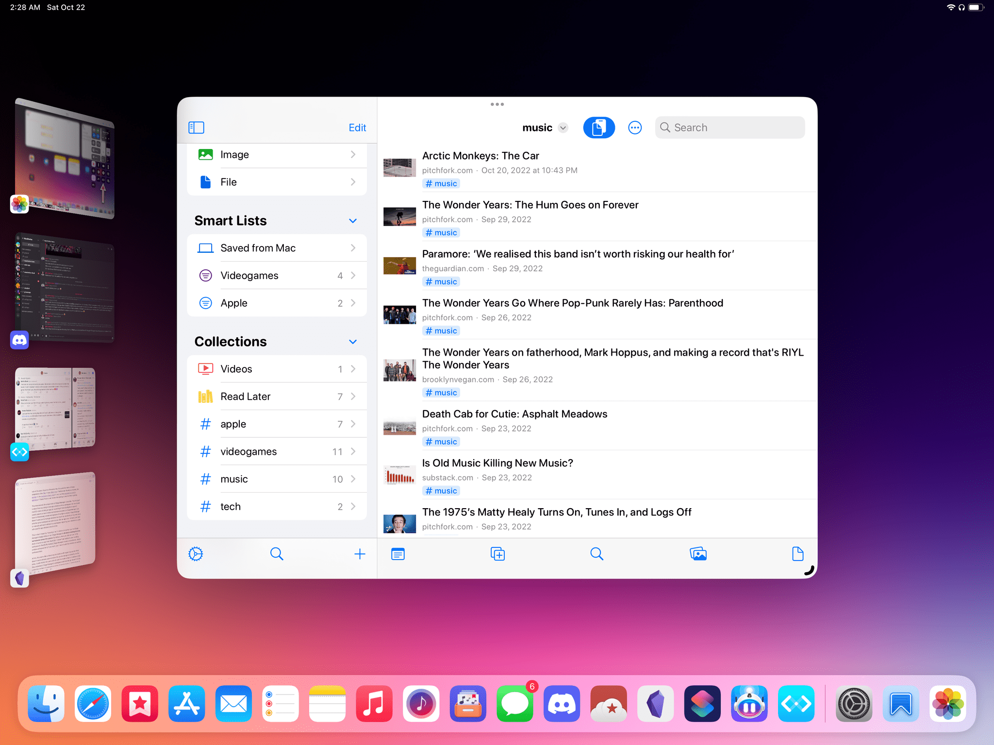
Every time you click on an app, Stage Manager creates a separate workspace for it instead of opening it alongside your other apps.
At first, this seems like a clever way to create a self-organizing system that doesn’t stack windows upon windows for you to manage constantly; on the other, it adds friction for users who do want to create a mess of windows that they understand. Stage Manager’s workspace-oriented design doesn’t fix the underlying problem of managing windows: it merely swaps it. Now instead of managing windows, you’ll be managing a long list of separate workspaces.
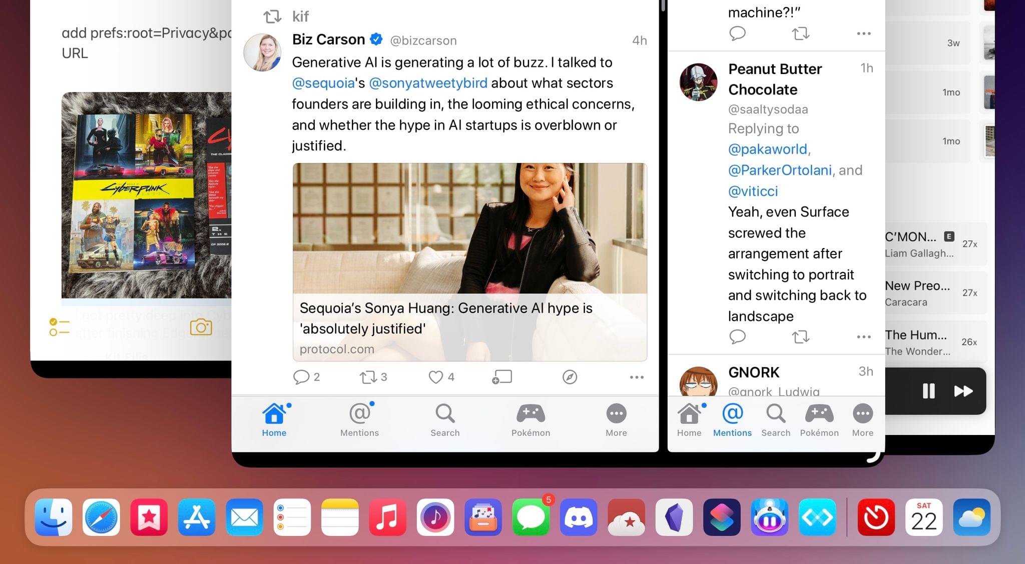
There are ways to circumvent this limitation, which I’ll explain in a bit, but they’re not enough; Stage Manager’s fixation on creating standalone workspaces is one of my biggest frustrations with it. For now, you should keep in mind that Stage Manager supports up to four windows at the same time; as soon as you bring in a fifth one, the “oldest” one in the workspace gets removed and thrown back into the strip/app switcher as a standalone workspace.
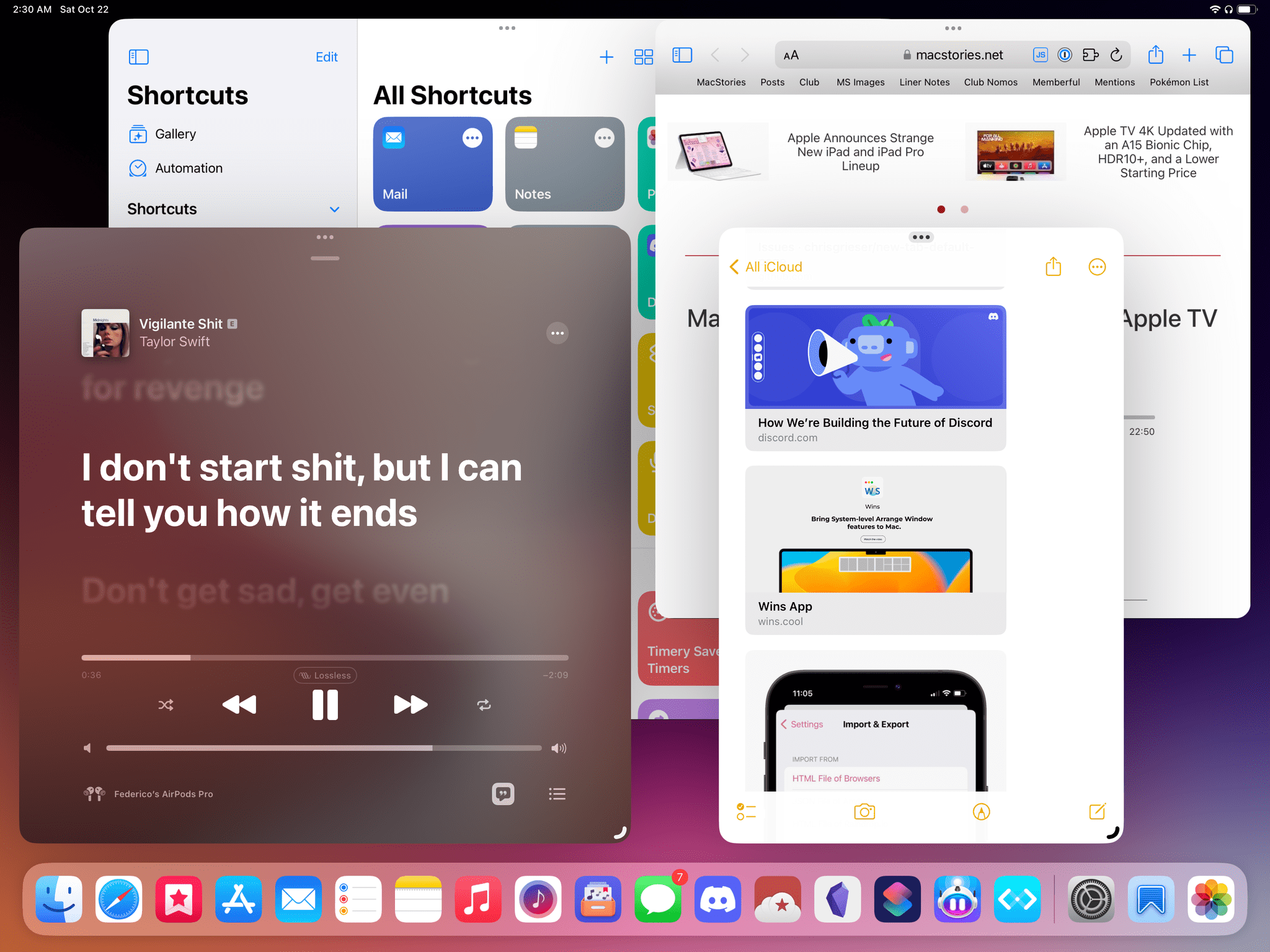
In this case, I have four windows open. As soon as I drag in something new, the oldest of the four will be replaced.
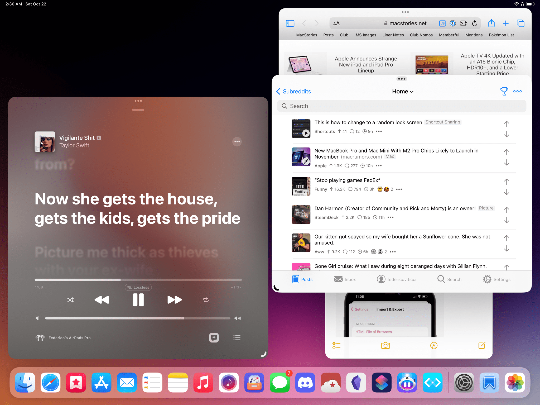
When I dragged in Apollo from the dock, Shortcuts was removed from the workspace and put back into the strip (which is hidden).
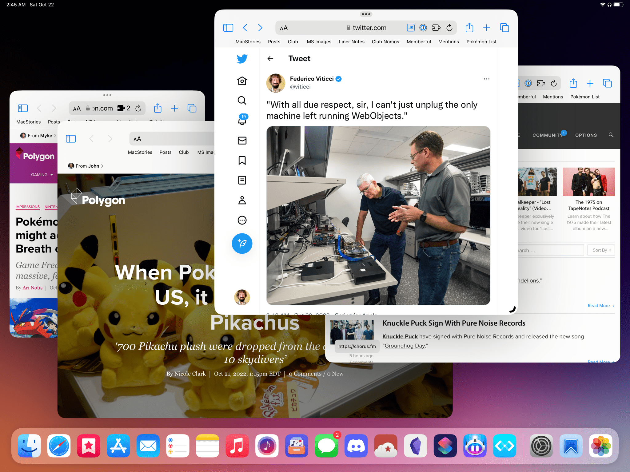
Stage Manager’s limitation is four windows in a workspace, not four different apps. In this screenshot, you can see I have four Safari windows open. Dragging in a fifth one would replace the oldest Safari window.
The second part of Stage Manager’s twist on multiwindowing is about resizing and placing windows. For multiple decades now, any desktop OS that offers a windowing environment has offered free-form placement and resizing of your app windows. You usually grab a window, place it wherever you want, and make it as big or small as you want within a threshold of minimum and maximum sizes. As I wrote in the past, I’ve never been a fan of manually resizing overlapping windows myself: after a while, I always find that grabbing and resizing windows becomes a chore – yet another thing I need to manage on my computer. That’s why I’ve long preferred tiling systems for multitasking or, alternatively, using launchers and automations that let me resize windows to preset sizes with one keystroke.
Apple seems to agree that managing overlapping windows is a layer of complexity most people shouldn’t need to fret over, but their proposed solution with Stage Manager is an odd hybrid of free-form resizing and presets that, in my opinion, will require months of refinements in the future.
Stage Manager is windowing on rails. First, there’s no pixel-based resizing of windows: when you grab a window from any of its edges or the pull indicator displayed at the bottom of a window, you can only resize it based on a predetermined set of dimensions based on size classes. You cannot precisely control the exact size of a window; you can only move it along a scale of fixed smaller or bigger sizes. A video explains this well:
Resizing a window in Stage Manager.Replay
As someone who’s gotten used to working with two sizes of Split View for several years, even though I’m surprised by Apple’s decision, I can live with it. The visual effect you get when resizing iPad windows isn’t as jarring as it used to be in earlier betas of Stage Manager; it’s just a bit odd to realize you’re forced to choose between preset sizes that are a byproduct of how iPad apps are written. On a 12.9” iPad Pro, windows tend to support up to 7 sizes on the horizontal axis and 5 vertically, but the numbers may change depending on the combination of the two and type of app you’re using.
Where Stage Manager’s…opinionated design comes up as a sticking point is in how you make multiple windows overlap in the same workspace. You see, the reason it’s called1 Stage Manager is that in addition to managing how many windows go into a workspace, it also wants to manage the placement of windows on the, well, stage. In practice, this means that Stage Manager does not offer you real, entirely user-controlled free-form window placement: rather, you can signal your intention as to where, more or less, you’d like a window to go, but Stage Manager will always intervene and adjust the position of overlapping windows based on its own criteria.
Basically: the thing moves windows around on your behalf.
Trying to move windows around in Stage Manager.Replay
As soon as you drag in a second window, your existing one gets resized by Stage Manager. There’s no way to stop this behavior.Replay
According to Apple, Stage Manager was designed like this to remove friction from users so they don’t have to think about carefully placing windows onscreen. The problem is that I believe there’s a fundamental misalignment between Stage Manager’s design and the users it’s been designed for. The people who are going to enable Stage Manager to use overlapping windows are, by and large, the kind of folks who want to carefully place windows onscreen. My concern is that Stage Manager dangles the allure of free-form window placement in front of you, only to take control away from you as soon as you try to arrange a workspace in a particular way you like that may not match Apple’s “guidelines”.
There are instances in which Stage Manager’s “automatic” window placement feels nice because it tries to keep as many windows visible as possible. However, after five months spent testing it in some form or another, I feel like Stage Manager gets in the way of getting work done more than it actually helps. In many ways, Stage Manager’s windowing behavior feels like the multitasking equivalent of the iPod shuffle without buttons: a sleek idea in theory, but a poor experience in everyday life.
As I’ll explore in the next sections, this is the most controversial aspect of this first version of Stage Manager: it seems to be designed for a middle segment of the professional iPad user base – people who want overlapping windows, but only just a smidge of them – that I’m not sure exists. But at the same time, if you learn how to cope with Stage Manager and take advantage of its core idea alone (four apps at once!) it can be useful and save you a time when jumping around between apps.
So, now that we’ve established what Stage Manager is, what does working with it actually feel like, and where does its implementation fall short?
Working with Stage Manager
When it comes to discussing Stage Manager’s potential for iPad productivity, it’s important to note how much this feature was designed to take advantage of iPadOS 16’s new display scaling tech.
On supported models, display scaling lets you increase your iPad’s virtual pixel density so you end up with smaller text and UI elements, but also more space onscreen for apps and content. Available in Settings ⇾ Display & Brightness ⇾ View, the option is indeed labeled ‘More Space’ and is reminiscent of the functionality Macs have offered for decades.
Display scaling can be used with regular Split View as well2, but I think it shines with Stage Manager given that you’re going to be placing multiple windows onscreen and thus will benefit from a larger content area. Let me break down some interesting numbers and details of Apple’s implementation.
When display scaling is enabled on a 12.9” iPad Pro, its resolution increases from 2732x2048 pixels in landscape mode to 3180x2384.3 That’s 16% more space on either side of the device, allowing you to fit more and denser elements along the horizontal and vertical edges of the screen. Here’s where it gets fun. Consider a workspace in Stage Manager with a single app window that’s resized to be as big as it can without covering the strip and dock, like this:
This is the default size that new windows will use when they’re opened in a new workspace. When display scaling is set to ‘More Space’, the default size of an app window is 2732x2064 – almost exactly the native resolution of the iPad’s entire display. This means that in Stage Manager with display scaling enabled, it’s almost as if a stage contains the iPad’s entire display, with additional content surrounding it on four sides. This is some nice math on Apple’s part and I find how these numbers work together quite pleasing.
I enabled display scaling on my iPad Pro months ago and I haven’t looked back. Regardless of Stage Manager, if your eyesight allows you to use smaller and denser interface elements, my recommendation is to try the ‘More Space’ setting and see how you like it. I recently disabled display scaling to take screenshots for this story, and I was shocked by how large and wasteful apps looked when set at the iPad’s native resolution.
When working with Stage Manager on my iPad Pro, the action I find myself repeating most often on a daily basis is adding windows to an existing workspace. There are multiple ways to do this but, unfortunately, the one method I would have liked to use isn’t supported. There are also some odd inconsistencies that I’ll try my best to cover here.
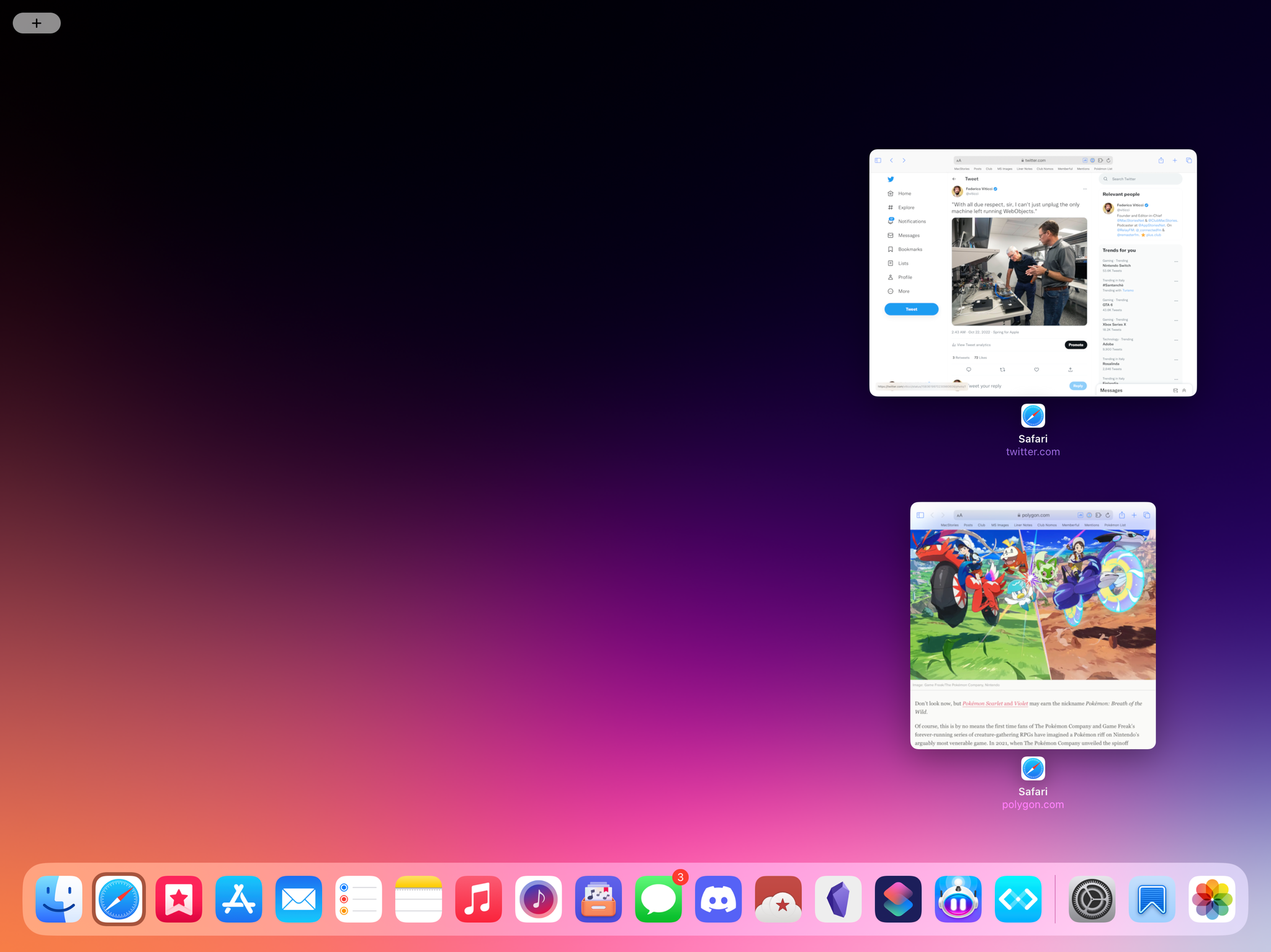
First, there’s the regular app switcher, which you can still access with a three-finger swipe up or Globe+Up on a Magic Keyboard. The app switcher in iPadOS 16 shows you a live preview of your workspaces (good) but doesn’t let you drag and drop windows between workspaces (bad). This is one of the many missing features from Stage Manager at the moment, and it’s especially odd given that you can combine windows in the app switcher when using classic Split View.
Then you have the strip. Tap and hold a window thumbnail in the strip, drag it away, and it’ll morph with a cute 3D animation into a live preview of the window that you can drop into your workspace. As you’re dragging a window around, you’ll have live previews for all the other windows in the workspace too, which will bounce around as per Stage Manager’s way of placing things onscreen for you.
Dragging windows from the strip.Replay
What if you don’t want to use drag and drop? The strip has you covered there too: hold Shift, then click a window thumbnail, and instead of taking you to that window’s separate workspace, the selected window will be immediately added to your existing workspace. Using the Shift key as a modifier for Stage Manager’s behavior when clicking windows is a good idea that, unfortunately, has only been implemented in the strip.
As I’ve mentioned above, you may be in the situation where the strip is hidden (whether because you hid it or a window is covering it) and want a faster way to bring an app into the workspace you’re in. This is where good old drag and drop comes in.
In a somewhat ironic turn of events, the fastest way to add any app you want to a workspace in Stage Manager is the same method we’ve been using since iOS 11 in 2017: pick up an icon from the dock or Spotlight and use drag and drop to add it to your workspace. When you do, the most recently used window from that app will be added to the stage.
Adding windows to a stage with drag and drop from the dock and Spotlight.Replay
This method works, and I’ve been using it a lot, but I feel like I shouldn’t be doing this: there should be new and better ways to search for an app and immediately add it to a workspace. For instance, I don’t understand why Shift-clicking is not supported when clicking an app icon in the dock or Spotlight. Just like Shift-clicking a window in the strip adds it to a workspace right away, so too should be the case when Shift-clicking apps elsewhere.
I also don’t understand the visual differences between dragging a window from the strip VS dragging an icon from Spotlight or the dock. When I drag a window from the strip, Stage Manager shows me a live preview of the window itself and other windows in the workspace remain visible:
Conversely, when dragging from the dock or Spotlight, you get the old-school behavior: all windows get blurred, including the ones already sitting in the workspace – almost as if live previews aren’t supported anymore when you’re using drag and drop to add windows.
Because of this perplexing design choice, the functionally-superior solution (Spotlight lets you search for any app you want) is technically-inferior to the strip because it’s not the latest fancy tech Apple created, which is a shame. Dragging windows from dock or Spotlight should maintain live previews in Stage Manager, just like the strip does.
You thought we were done talking about all the different ways to add windows to workspaces in Stage Manager? Wrong assumption. If there’s one thing Apple loves, it’s adding layers upon layers of interaction to existing iPadOS UI conventions; Stage Manager follows this unfortunate tradition.
But first, another brief aside on the improved and redesigned multitasking menu in iPadOS 16.
Still with me? Alright. As I was saying, there is a new ‘Add Another Window’ button in the redesigned multitasking menu, which activates the…
scrolls document back up
counts
…fifth way to add a window to a workspace in Stage Manager. Click the button, and your workspace will open with a curtain-like animation that reveals the system app switcher in between your windows.4
Adding windows to a stage from the app switcher.Replay
This transition is pretty slick, and I like that I can also invoke it from the keyboard using a hotkey. There is, however, another complication worth observing here. Let’s say you’re hovering with the pointer over a group of windows rather than an individual one; despite the fact that you can seemingly choose which one you want to add to your workspace by selecting it with the pointer, the whole stack of windows will be added to your current stage instead. Meaning: if you select a workspace with two windows in it, two windows will be added to your current workspace – not one.
Speaking of the keyboard: it may not seem like it, but the windows in between the “curtains” support keyboard selection too. Use the arrow keys to navigate them and click Return to choose a window you want to add. It’s easy to miss, but you’ll notice that windows get a gray highlight around them when they’re selected from the keyboard:
We’re about halfway through this story and, as you can see, I’ve already brought my fair share of practical examples of aspects of Stage Manager that aren’t working right, are inconsistent, or are just oddly implemented.
I’ll tell you: there’s more of that coming in the next two sections.
But at the same time, I have to be honest: over the past two weeks, once I was able to get Stage Manager to work on my M1 iPad Pro, there have been times when working with up to four apps at the same time has been useful and, ultimately, nice.
Working with Stage Manager is unmistakably different from the primitive windowing experiences we had in iPadOS 15 in the form of center windows (which now spawn as regular windows in Stage Manager) and Quick Note (which is unchanged). Stage Manager tries to position windows onscreen for you (and very rarely succeeds at that) and gives you minimal controls to adjust your workspace the way you want it. When the combination of these two aspects worked as intended, I had an okay time with Stage Manager.
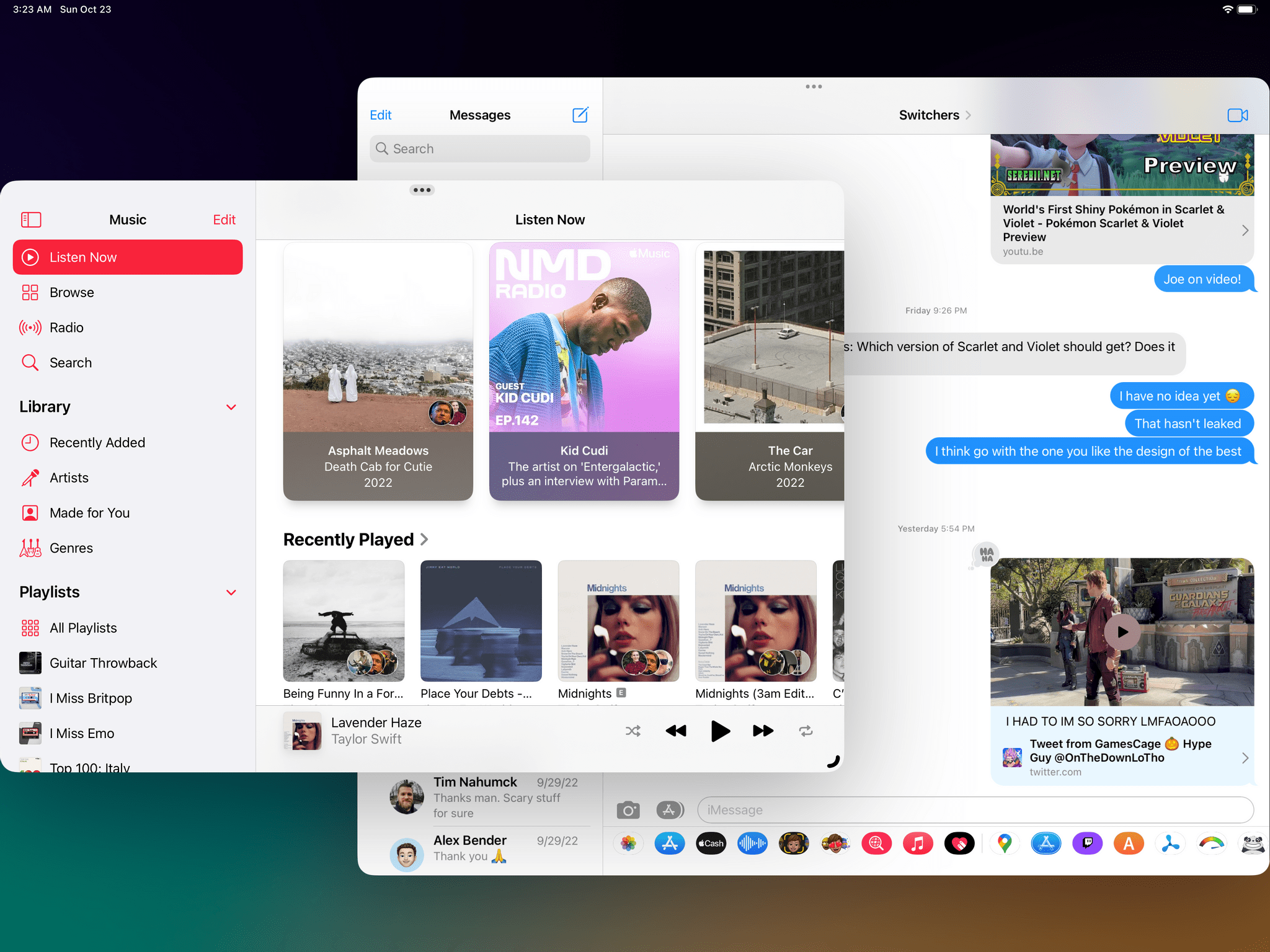
Last week, I was keeping an eye on Apple’s announcements for the new iPads and I had Obsidian, Messages, Spring, and Safari in the same workspace. That’s something I could never achieve with Split View and Slide Over before. Stage Manager arranged the Messages window so a part of it would peek through from behind Obsidian, and thanks to the floating nature of windows, I could see that new texts from my friends were coming in while I was doing something else because the window was active in the background and chat bubbles were moving in the transcript. I could see that happening in real-time on the side of my workspace, and that was great because I didn’t have to constantly switch between different instances of Split View.
The same applies for when I’m researching an article for MacStories or building a shortcut: I can leave Safari, Obsidian, Files, and Shortcuts in the same workspace, drag and drop content between those windows with touch or the pointer, and take advantage of some of the new keyboard integrations in iPadOS 16. For example, if a window is in the background but a part of it is visible, I can hold ⌘ and click UI elements in it (like, say, liking a tweet in Spring) without bringing it in the foreground – just like on macOS.
Like on macOS, you can click items in background windows by holding ⌘.Replay
Or take context menus: in iPadOS, you can Control-click any item to instantly bring up its associated menu without having to long-press it or right-click it from the trackpad. iPadOS 16 is full of small, yet convenient desktop-class enhancements (which I’ll cover in a future story) that, when paired with Stage Manager in the right conditions, truly yield a hybrid tablet-laptop experience that I’ve always wanted from my iPad Pro. The list of examples goes on and on, but I don’t need to describe the benefits of multiple windows in fine detail to the MacStories audience.
All this to say: desktop-style windowing undeniably has its advantages on iPadOS too, which I’ve been able to experience myself in my regular usage of the iPad Pro. The core idea behind Stage Manager is useful to me; the problem is the actual implementation of it.
This first version of Stage Manager is plagued by several misguided design choices, a confused direction, and the general sense that this entire functionality has been rushed and slimmed down to meet a marketing deadline.
The Strip’s Failures
Speaking of misguided design in Stage Manager, allow me to go through the flaws of one of its key visual elements: the recent apps strip.
App pickers on iPadOS are the equivalent of Google’s messaging apps: a new one comes out every couple of years, lasts a couple of years without changes, then either gets replaced or abandoned and the cycle starts again. With the Stage Manager strip, Apple wasted an opportunity to create a simplified app picker that could scale well for intermediate and advanced users alike; instead, they launched a feature that is both too confusing for non-expert users and too limited for pros. There are multiple layers to this, so let me get through each one.
For starters, the implementation of Stage Manager itself works against the very premise of the strip. The strip was seemingly designed to act as a handy, always-visible preview tool and launcher for your workspaces. But on iPadOS 16, Stage Manager has an inexplicable tendency to hide the strip by either resizing windows or moving them around because it thinks that’s what you want. So on the one hand, you may find yourself wanting to keep the strip visible at all times, but on the other Stage Manager will make it downright impossible to keep it pinned there.
Don’t take my word for it: go ahead and try using Stage Manager with the strip always enabled. Even when you have two windows open – and, therefore, technically enough space to make them overlap and see the strip – Stage Manager will cover it. This goes back to Stage Manager’s insistence on “taking care” of windows for you – except here it goes against one of its own features, sort of like an immune system rejecting something it doesn’t know.
Trying to keep the strip shown with two apps in Stage Manager. It shouldn’t be this hard.Replay
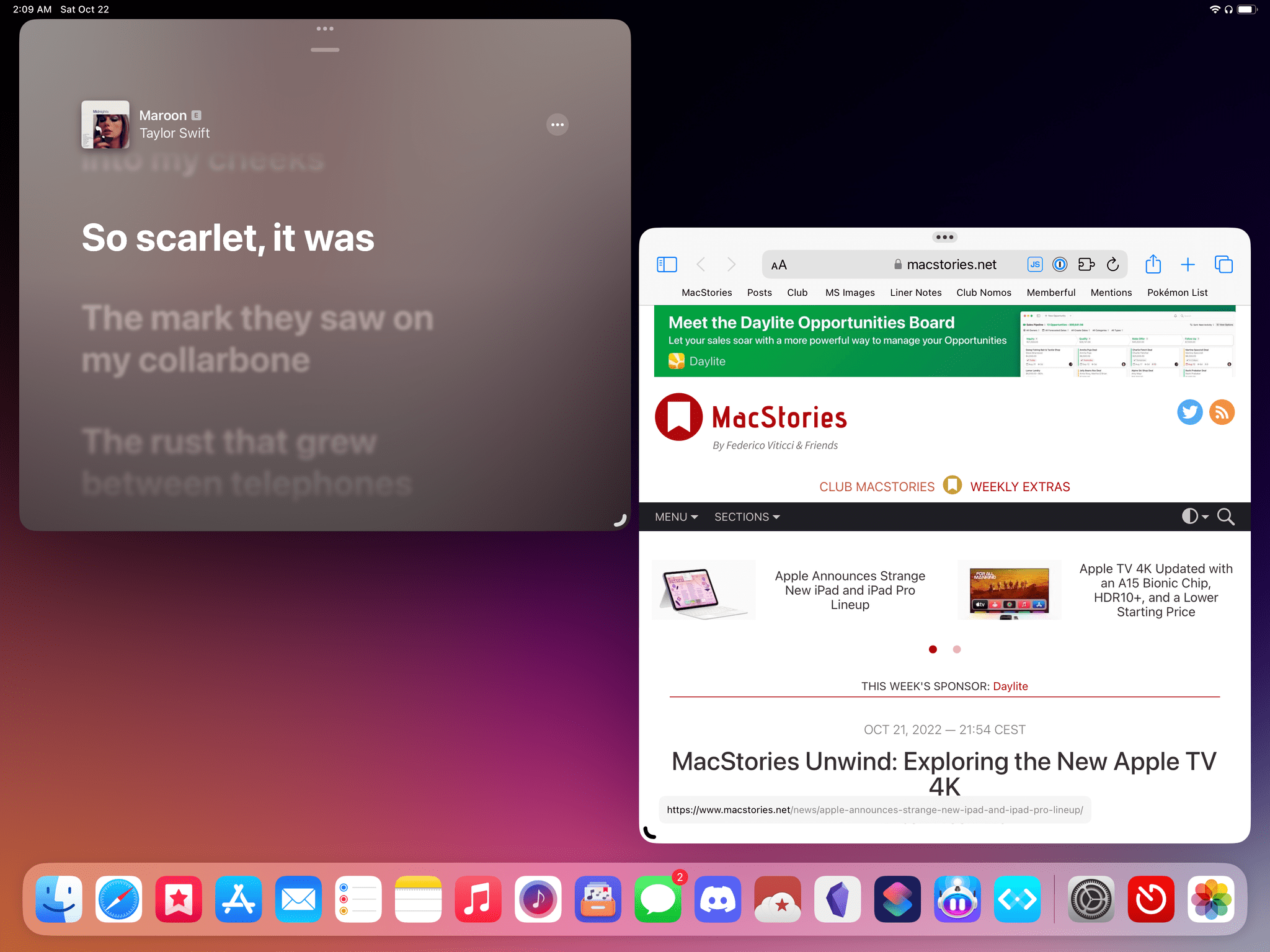
In this configuration, the strip gets hidden, and there is no way for me to make these two windows overlap to regain more space onscreen. Stage Manager will not allow them to overlap.
The fundamental misdirection of the strip sits deeper at a design level: it is both overstuffed with hidden options based on invisible gestures, and it doesn’t cover the obvious basics at all.
For example: the strip doesn’t show you the names of apps and windows; it doesn’t support closing windows or quitting apps contained in it; despite being a new feature of iPadOS, it doesn’t support modern interactions like, say, displaying a context menu when right-clicking a window. Apple could have used an easy-to-discover context menu in the strip to close the selected app, or add it to the stage, or find all windows belonging to it, and they decided against it.
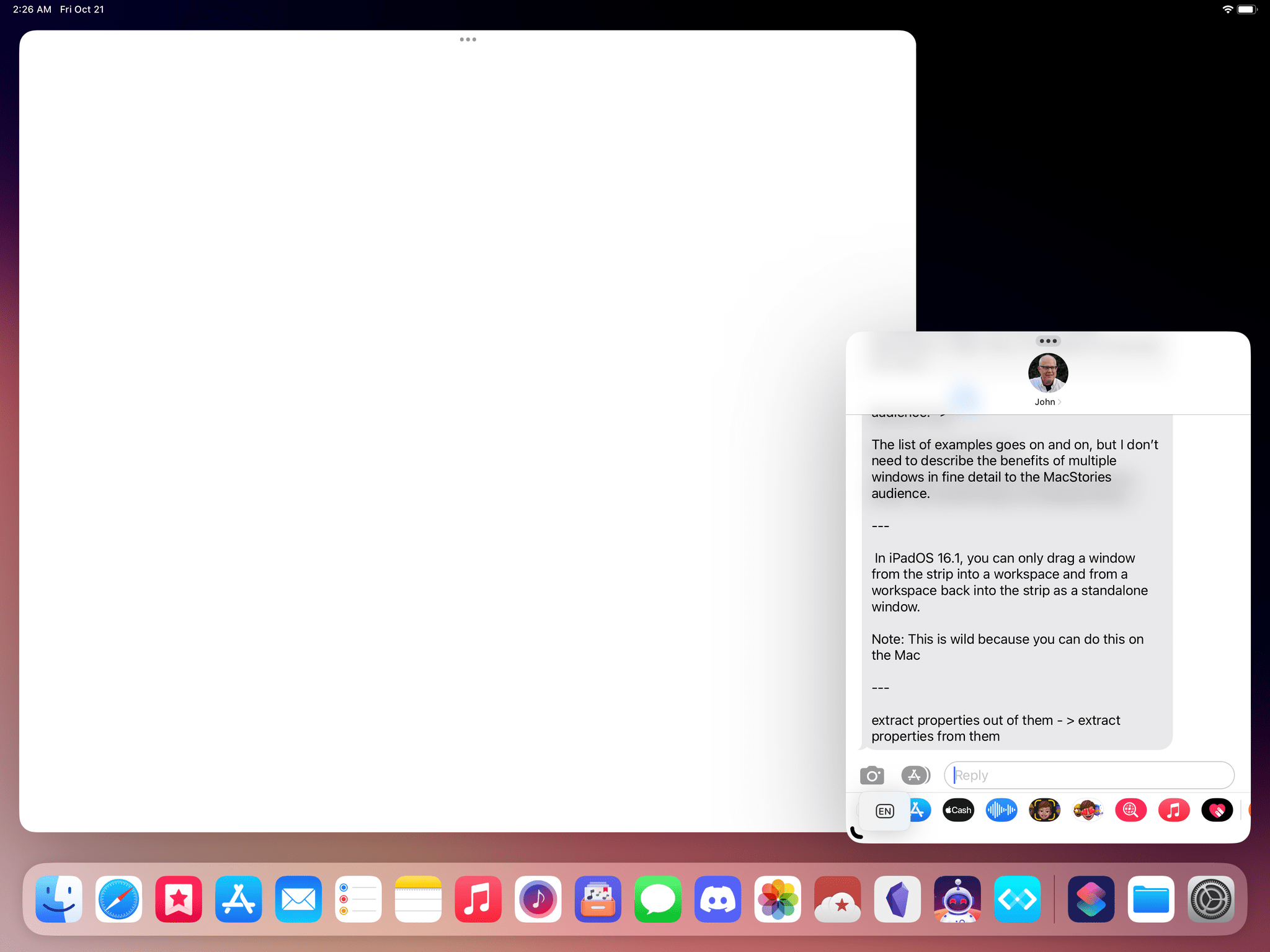
But the worst aspect of the strip, in my opinion, is that despite its tactile nature, it only supports one-way dragging of windows. In iPadOS 16.1, you can only drag a window from the strip into a workspace and from a workspace back into the strip as a standalone window. You cannot drag a window from a workspace on top of another window in the strip, forming a new workspace on the fly; similarly, you cannot combine windows from the strip itself by dragging window thumbnails on top of each other. As a result, creating workspaces in iPadOS 16 feels clunky and laborious: you always need to remove a window, switch to another workspace, then drag the previous window in from the strip.
Instead of refining the strip’s direct manipulation, Apple crammed all sorts of window management functionalities into it – some of which are inconsistent with each other. Strap in: we’re going deep into the rabbit hole of window management in iPadOS 16 here.
When Stage Manager is active, you lose access to the Shelf – the interface element Apple debuted in iPadOS 15 to view all open windows for the same app. The strip doubles as an Exposé-like window picker, with a collection of semi-related implementations. If you want to see all the windows a particular app has open across the system, you have to press Globe-Down (the same hotkey that activates the Shelf) or click on the icon of an app in the strip. Doing this will “filter” the strip to show you all the workspaces where an app has windows open. From here, you can grab a window and drag it into your workspace or click it to open it.
You can also get to this screen by right-clicking an icon in the dock and selecting ‘Show All Windows’ but, as I mentioned above, you can’t right-click a window thumbnail in the strip itself. You can also view open windows for an app by clicking it once in the dock but only if that app is the one in the foreground.
Still with me? I hope so because more exceptions are coming.
Occasionally, you may notice that the strip will display multiple windows for the same app as a 3D stack rather than standalone items. Like this:
Apparently, this is called a “pile”. Stage Manager does this when the same app has multiple windows open across the system but only if they’re single-window workspaces. I’m guessing this was designed so that you can quickly cycle through windows in the stack, but this is my personal speculation. I don’t understand the motivation behind this design; the “pile” terminology is also not explained at all in iPadOS 16.
Parts of the strip also bleed into the classic app switcher (i.e. the grid of open apps). In iPadOS 16, if you click on the tiny app icons underneath window thumbnails in the app switcher, you’ll get a filtered view similar to the strip that shows you all the windows currently open for the selected app. The only problem: in the public version of iPadOS 16.1, sometimes you may click one of those small icons and find yourself staring at an empty screen:
As it turns out, a bug causes this view to be scrolled, hiding your windows. Swipe right on the trackpad, and your windows will appear:
Lastly, the strip also serves as the area where the only iPadOS UI element to create new windows for an app exists. The only problem: this is another half-baked feature that has been implemented exactly backwards from the way I would expect it.
In iPadOS 16.1, there is no system-wide keyboard shortcut accepted by all apps to ‘Create New Window’. Instead, the only way to reliably create a new window is to ‘Show All Windows’ first, then click a ‘+’ button displayed at the top of the strip:
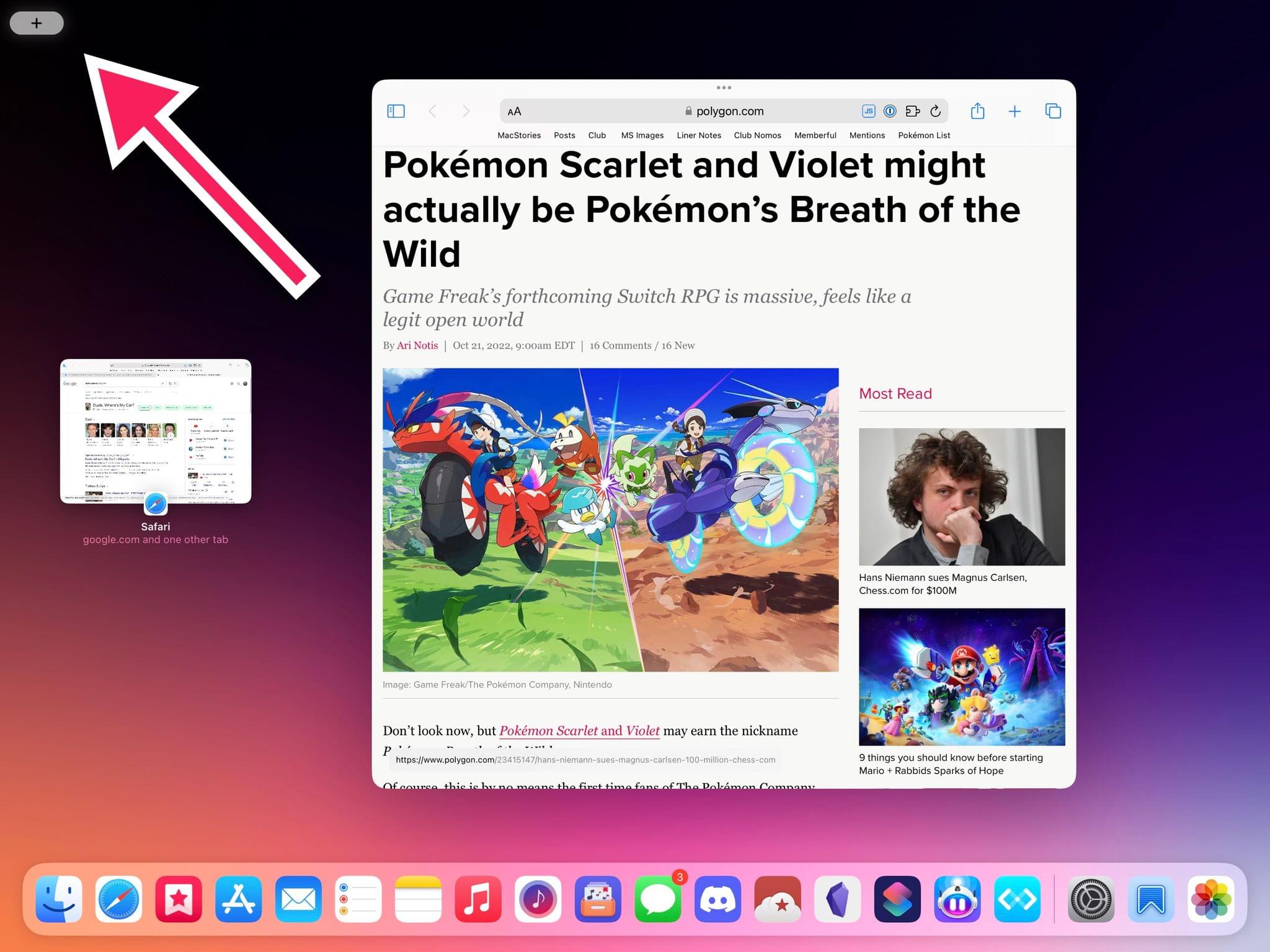
The only button to create new windows for a feature based on windowing is hidden in a sub-menu nobody is going to discover.
That’s right: to create a new window for an app, you have to find its other windows first and – of course – the window gets created in a separate workspace, losing your current context. Given the fresh start that Stage Manager presented, Apple could have gone for a new system-wide keyboard shortcut, or a more discoverable ‘Create New Window’ button in an app’s context menu, or, heck, even a Shortcuts action; instead, they hid the button to create a new window behind a filtered view of the strip. Who’s going to find it?
This is how I feel about the Stage Manager strip: it doesn’t do what I’d expect it to do as a pro user, and the things it does are either inconsistent, in the wrong place, or too difficult to discover. From a design and functional standpoint, it feels like it gets pulled in too many directions with no clear vision behind it. Credit where credit’s due, I suppose: at the very least, that perfectly encapsulates the current state of Stage Manager in iPadOS 16.1.
Stage Manager’s Flawed Design, Bugs, and Litany of Missing Features
I don’t think I’ve made it obvious enough to understand the sheer amount of technical issues and challenges I’ve encountered while trying to work with Stage Manager.
For context and posterity, let me lay them all out. What follows is a list of fundamental design problems that Apple will need to rethink, features that are missing from Stage Manager right now, and bugs that made it to the shipping version of Stage Manager in iPadOS 16.1.
Grabbing windows is too difficult. Five months into Stage Manager, I still struggle to perform one of its most basic actions: grabbing windows with the pointer to move them around.
Stage Manager was added to iPadOS as a mode that was meant to “just work” with the existing design of iPad apps with no further optimizations in terms of design and developer technologies. As a friend recently put it: windows happen to iPad apps under Stage Manager. Developers have no idea that their apps are running in windowed mode, and they cannot specifically optimize their app’s experience or design for Stage Manager.
Visually speaking, this means that iPad apps in Stage Manager do not change their appearance to accommodate a title bar that serves as a clear anchor point for users to place their fingers/pointer and grab a window. Per Apple’s HIG parlance, iPad windows in Stage Manager don’t have a frame.
Instead, you have to guess that the “title bar” you can use to pick a window up and move it around is the invisible area around the multitasking menu that is not delimited by anything. There is no visual indicator that tells you “this is where you can grab a window”. You could grab the multitasking dots as a shortcut, and that sometimes work, but you also risk accidentally triggering the multitasking menu if you do that, which is not ideal.
Once again, it comes down to the fact that Stage Manager was tacked onto the existing design of iPad apps without a redesign of the UI chrome that goes around windows – because, typically, there is none on iPadOS. Apple could have created an API for developers to add a title bar with proper multitasking controls to their apps, but they didn’t. They could have supported the “sloppy” gestures of the Quick Note floating panel to move windows around with two-finger swipes, but they didn’t. With Stage Manager windows, Apple wants to have their cake and eat it too: they’re hoping that Stage Manager’s automatic window placement will eschew the need to move windows around manually, but, at the same time, they’re also hoping that users will somehow figure out where windows are supposed to be grabbed.
This approach is not good enough.
Sometimes when I grab a window to place it on the left of the screen, I activate the strip instead. Speaking of moving windows around, I’ve noticed that I frequently activate the strip by accident when trying to place a window on the left side of the screen. The best part? If you accidentally trigger the strip, the animation will reset the window size you set for the item you’re dragging, forcing you to resize the window manually again.
Trying to place a window in the top-left corner of the screen and failing to do so because of the strip, which also resets the dimensions of my window.Replay
You can “freely” move windows around, but only horizontally, and only in the right conditions. Speaking of moving windows: Stage Manager does support pixel-based repositioning to place a window exactly where you want it, but this method only works on the x-axis and only if a window in the background is covering “enough space” to justify this necessity.
There doesn’t seem to be a a precise rule here, and it’s difficult to describe this in an article. A good way to understand what I mean, however, is the following: make a window as large as it can be, then place a floating window on top of it. In this case, because the background window is covering a lot of space, the foreground one can be moved with pixel-precision, but only horizontally.
If the background window is large enough, the one in front of it can be moved with pixel precision. As you can see, I kept accidentally triggering the multitasking menu when trying to grab a window.Replay
This half-baked, obscure system is not good enough either.
Creating a new window for an app in the same workspace is impossible. Imagine that you’re on a Mac, you’re using Safari, and you want to create a new, separate Safari window next to the current one. It’s easy enough: you can either click File ⇾ New Window in the menu bar or press a keyboard shortcut to do the same. The window will open in front of you, without losing your current context.
Creating a new Safari window next to the current one in macOS. It’s that easy.Replay
With Stage Manager in iPadOS, it’s impossible to do this with a single action.
If you want to create a new window for an app already in your workspace, you have to click ‘Show All Windows’ and hit the ‘+’ button, but the new window gets thrown into its own, separate workspace – which also becomes the active one, so you get taken out of your existing workspace. At that point, you have to switch back to the previous workspace, grab that window from the strip, and drag it where you wanted it in the first place.
Creating a new Safari window next to the current one with Stage Manager in iPadOS 16.1. You’ll have to repeat this dance every time.Replay
This is madness: all these operations just to create a new blank window for an app in the same workspace. To which some of you may reply with: but what about drag and drop?
Oh yes, you could use drag and drop to create a new Safari window in the same workspace: grab the Safari icon from the dock or Spotlight, drop it in the workspace, and there you go – another Safari window just spawned. Except that doesn’t work if Safari already had other windows open elsewhere in iPadOS: in that case, drag and drop will pick up the most recently used window of that group and move it to your current workspace. So, drag and drop is not a reliable, consistent way to create a new window for the same app in the same workspace either.
Even with the current design of the strip and Stage Manager, there could have been ways to avoid this scenario: a setting to always create new windows in the same workspace instead of a separate one (macOS Ventura has it); a system-wide keyboard shortcut to create new windows (macOS has it); forcing drag and drop to always create new windows instead of having a mixed behavior. None of these potential solutions were adopted by Apple in five months.
As it stands now, creating new empty windows for the same app is too convoluted. Apple should rethink this aspect of Stage Manager on iPad.
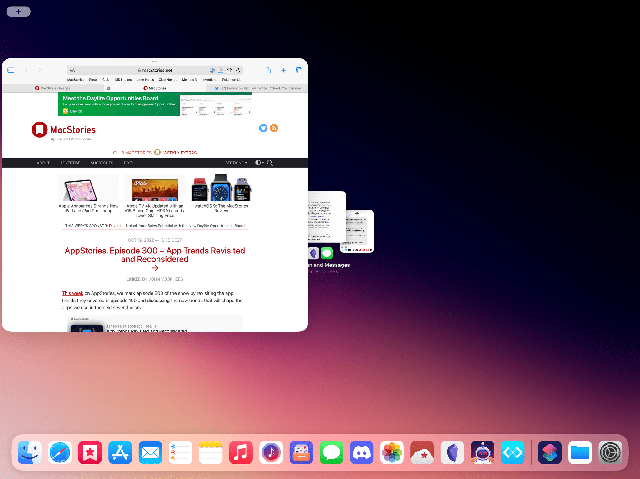
Here’s a bonus one: sometimes, when I drag an existing window from the window picker in the strip onto a workspace, my current windows shrink…
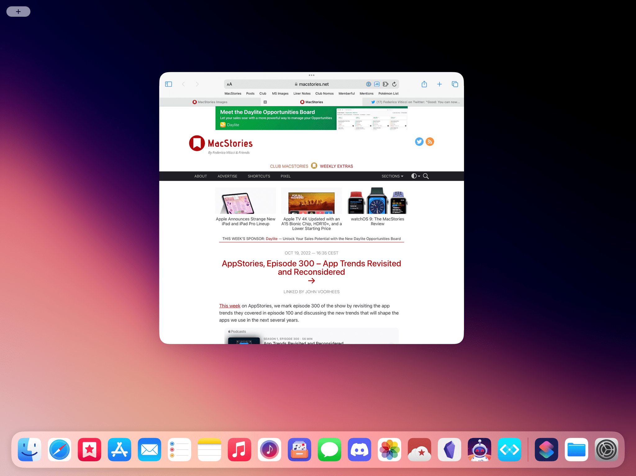
…so if I drag too much, I end up covering all of them, and I have no idea where I’m dropping the new window.
Stage Manager is obsessed with creating new workspaces. I mentioned this multiple times in the story, but it bears repeating here: Apple needs to fix this Stage Manager obsession with opening apps in new, separate workspaces rather than adding them to your existing one.
This is a problem that is shared with Stage Manager on macOS Ventura too: every time you launch an app from Spotlight, or the dock, or follow a link to an app – whatever method you use to open an app, Stage Manager defaults to opening it in a standalone workspace. As a result, you’re forced to do the dance of switching back and forth between workspaces to re-add an app from the strip, which is a slow, tedious operation that gets old after a few days of working with Stage Manager on iPadOS.
As I mentioned above, there should either be a setting to alter the ‘app open’ behavior in Stage Manager or a keyboard modifier (Shift-clicking app icons), or, ideally, both.
There’s no way to quickly preview all the windows in a workspace. One of the unsung heroes of classic macOS windowing is Mission Control: with a single gesture or keyboard shortcut, you can “explode” your windows and get a useful bird’s-eye view of all the open windows on your system. It’s a genuinely good idea that I use dozens of times every day.
There’s no equivalent for previewing all windows contained in a Stage Manager workspace. So if your windows are overlapping and some of them are hidden and you want to confirm what’s behind the foreground one, the only way is to manually cycle through them all, one by one, with a keyboard shortcut. Or, God forbid, try to resize them all so you can see a portion of each window onscreen. That is, until Stage Manager decides to shuffle your carefully-constructed window layout around for you.
You cannot combine windows from the app switcher or strip. I also mentioned this before: direct manipulation of windows is nowhere to be found in the app switcher or strip when Stage Manager is active. You cannot grab windows and drop them onto other ones to create workspaces from the strip or app switcher, which is a missed opportunity – especially considering that the app switcher supports creating regular Split Views with drag and drop.
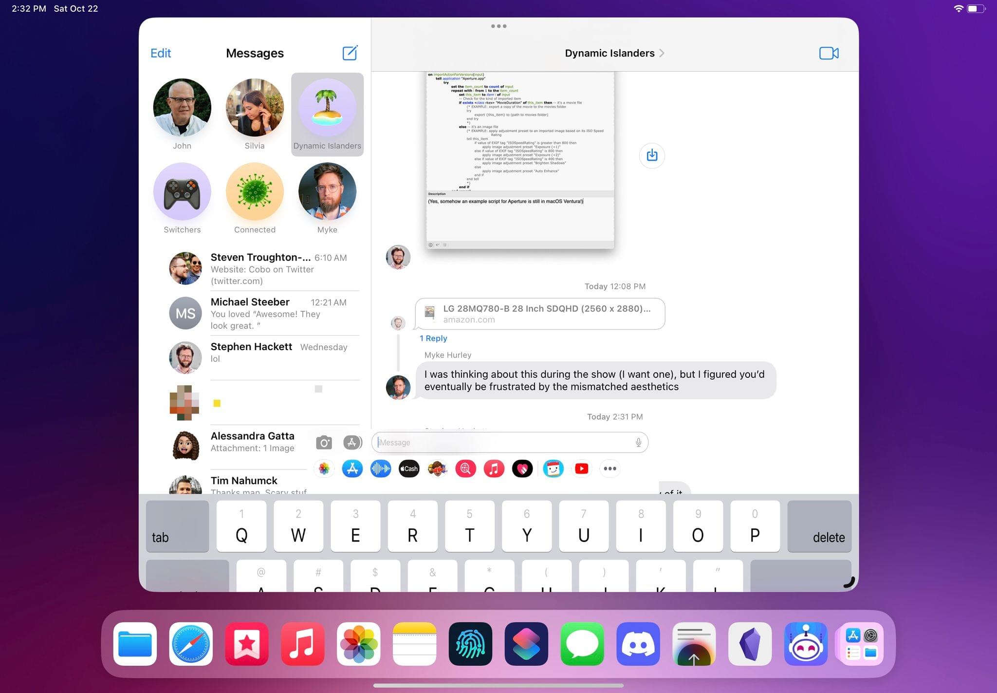
To use Stage Manager, I have to disable Predictive Text in keyboard settings. This is perhaps the worst Stage Manager-related bug I’ve encountered to date, and it’s still here in the shipping version of iPadOS 16: if I want to use Stage Manager, I have to disable Predictive Text in Settings ⇾ General ⇾ Keyboard.
For whatever reason, if QuickType predictions are enabled, my Magic Keyboard often stops typing into text fields of third-party apps, doesn’t trigger keyboard shortcuts, or generates a random collection of layout- and keyboard-related bugs in apps. The only way I was able to write this story on my iPad with Stage Manager was by disabling this setting; I can’t even imagine what the experience will be like for iPad users who don’t know about this and decide to try Stage Manager.
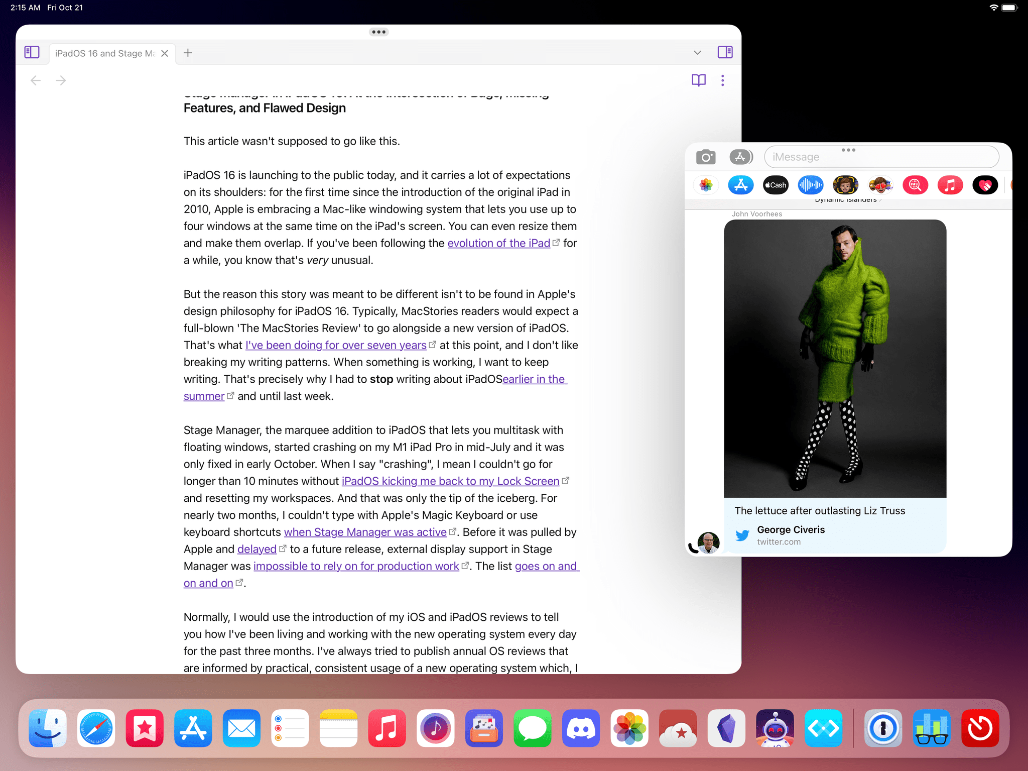
A slightly different flavor of Magic Keyboard + QuickType bugs involves the Messages app. It comes in many shapes and forms. One of them is the Compose field floating in the title bar of the Messages window.
Stage Manager’s automatic window placement makes it impossible to use four apps at once in a grid. The title says it all: due to how Stage Manager is built on top of an invisible grid and how it enforces specific window sizes, you can’t turn a 12.9” iPad Pro into a grid that shows four active apps at once as quadrants. Try as you might, you won’t be able to create such layout – even if you decide to hide the strip and dock.
The only way to place four windows onscreen without making them overlap is the following:
Stage Manager loses your context when you close the last window in a workspace. In the current version of Stage Manager, when you close the last window in a workspace, you’ll be unceremoniously kicked back to the Home Screen with no further explanation. I find this behavior inelegant and confusing. Given Stage Manager’s love affair with workspaces, perhaps it would have been preferable to remain in an empty workspace with the strip next to it, or switch you back to the most recently used workspace, or show the app switcher. Anything, really, except bouncing you back to the Home Screen with no additional explanation.
Windows randomly cover the dock, strip, or both. I also mentioned this multiple times in the story: Stage Manager very often decides to cover the recent apps strip or dock just…randomly, forcing you to re-adjust the size of a window to bring them back. I’m not kidding when I say I probably have to do this hundreds of times each day.
There are layout bugs when you switch your iPad orientation. When you rotate your iPad from landscape to portrait, windows in Stage Manager will gain a black bar along the bottom edge. The only way to make these black bars go away is to manually resize a window.
Oh, and when you switch orientations, your window layout is reset, too.
You cannot cycle through full-screen and floating layout for a window anymore. One of my favorite aspects of the Stage Manager betas this summer has been removed in the public release of iPadOS 16.1: you can no longer repeatedly press Globe-F to cycle through a window in full-screen or floating mode.
I loved that keyboard shortcut as a way to temporarily focus on a full-screen window and then return it to floating mode; for whatever reason, this is not possible anymore. It makes sense that the one thing I liked about Stage Manager was removed.
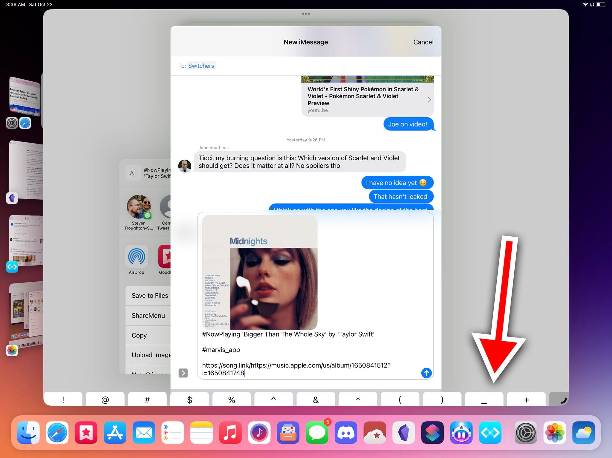
A phantom software keyboard appears when sharing items with the share sheet. When sharing photos, links, text, or documents with the share sheet in Stage Manager while using a hardware keyboard, a part of the software keyboard appears at the bottom of an app’s window:
The share sheet, Stage Manager, and a phantom software keyboard. iPadOS 16.1 RC. pic.twitter.com/OYVaWt3LZu
— Federico Viticci (@viticci) October 18, 2022
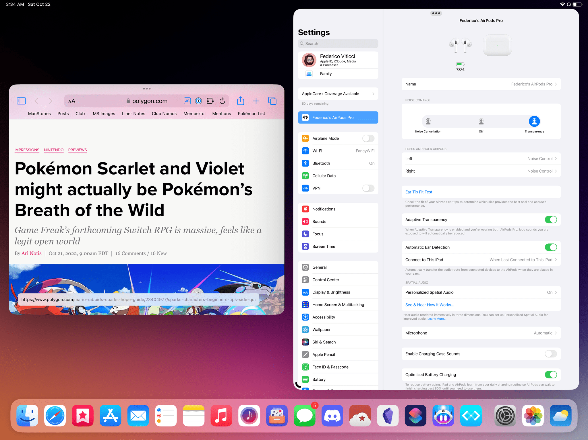
Full-screen apps like Settings do not work well with Stage Manager. If you come across an app that was never optimized for Split View and Slide Over, like Apple’s own Settings app, prepare to have an…interesting time with it in Stage Manager.
The best way to describe this is that legacy full-screen apps do not support being resized to different dimensions; the only “size” you can switch Settings to while in landscape mode is, basically, the app’s portrait mode. Which of course means that you’ll be looking at some very small text and UI elements with apps that are still built this way.
The Camera app – another legacy full-screen one – has a similar issue, but with even more hilarious consequences:
Resizing Apple’s Camera app in Stage Manager. When you make it smaller, the camera view is flipped. iPadOS 16.1 RC. pic.twitter.com/bcRZq1sA5N
— Federico Viticci (@viticci) October 20, 2022
Where is external display support? What was, arguably, the main reason why many of us were looking forward to Stage Manager and windowing on iPadOS – native support for external displays – is not launching today alongside iPadOS 16.1.
As I noted in July, external display integration was extremely buggy and based on another set of wrong design assumptions, so I’m glad Apple was able to see the problems with this feature and delay it until later in the year. Still, I can’t help but think that this was a missed opportunity on Apple’s part to present a coherent, unified vision for desktop-like windowing on iPad, which greatly reduces the potential applications for Stage Manager for power users who have long wanted to go beyond a single-screen experience. For now, we’re back to pillarboxing on external display mirroring.
There are no Shortcuts actions for Stage Manager. I saved the saddest missing aspect of Stage Manager for last: there is no integration whatsoever with Shortcuts to open, resize, and move windows in Stage Manager.
Since last year, Apple has offered Shortcuts actions on macOS to find windows, extract properties from them, and resize them. This has allowed Mac power users to create useful automations that deal with moving windows around and quickly assembling their favorite workspaces and layout modes. The ‘Find Windows’ and ‘Resize Window’ actions are completely absent from Shortcuts in iPadOS 16.1, which continues to have no knowledge of multiple windows for the same app.
This is another missed opportunity on Apple’s part; I hope it’s something that gets rectified soon in the iPadOS 16 cycle.
A Shaky Foundation Meets a Rushed Launch
At the end of all this, here’s how I feel about Stage Manager: Apple started from a good idea – make the iPad more useful by using more apps at once – and botched the execution in iPadOS 16.1 with an over-designed, poorly tested, muddled constellation of missing features, bugs, and confusing interactions.
The first version of Stage Manager fails to make iPad multitasking more intuitive for newcomers and more flexible for power users. Today, I struggle to understand what kind of market Stage Manager is supposed to serve.
There’s the seed of a valid idea behind Stage Manager: create a continuum between the Mac and iPad that allows power users to go beyond what iPadOS has offered thus far. But that idea has been paired with the worst technical implementation of multitasking I’ve seen from Apple in the several years I’ve been using and writing about the iPad.
Windowing on iPadOS can work and be useful; Stage Manager fails to make it so. The underlying idea is sound; the delivery system, in its current form, is not.
It’s been five months since we first saw Stage Manager on iPadOS, and instead of having answers, I’m left with more questions. What happened to the team that created Slide Over, pointer support, context menus, and which tastefully adapted longstanding macOS conventions to a modern, hybrid platform? Has anyone at Apple tried working with Stage Manager on their iPad Pro for longer than 30 minutes? Are they genuinely happy with it? Is there an iPad equivalent of the Pro Workflow team at Apple? How will new iPad users who enable Stage Manager and have no idea of its intricacies react to its obscure design and limitations? And:
Why do I get the sense that Stage Manager was designed in a vacuum to “look good” on macOS5 and later ported, without much thought, to iPadOS?
Like I said before, there have been moments in my tests with Stage Manager when I felt like it could be something that would make me more productive. But that’s because, after five months of iPadOS 16, I’ve realized that I like windowing more than I like Stage Manager. Stage Manager doesn’t make it easy to be a feature that iPad users can rely on – let alone “love”. At least not in this buggy, unfinished version.
As it stands now, I don’t know if I’ll keep Stage Manager enabled on my iPad Pro because I’m not sure it’s worth the aggravation. This feature does not meet the high bar Apple set with its previous iPadOS functionalities. I do encourage MacStories readers and iPad users to try Stage Manager; at the moment, however, my recommendation is to not use it for production work or other critical tasks on your iPad.
The single question that is looming over Stage Manager is this: can it be salvaged in its current form?
I think so, but not unless Apple is willing to understand the problem. The company needs to take a long, hard look at Stage Manager’s shortcomings and start acting on a long list of fundamental design problems right away. There are several places where Apple could start, and there’s a lot of work to do. Still, there is potential for iPadOS to be a platform where you can use windows or Split View or full-screen apps, where you can seamlessly move between keyboard and touch input, and where you can have an experience that is consistent with macOS, but vastly more portable. I just don’t think Stage Manager, in this version debuting in iPadOS 16.1, is the right vessel to carry that vision forward.
That, ultimately, is my biggest gripe with Stage Manager: it lacks a cohesive, grand vision behind it that was instead there in previous versions of iPadOS. Stage Manager makes iPadOS feel disjointed and broken, an erratic OS confusingly looking for an identity that used to be within reach.
In the short term, Apple will probably justify the issues of Stage Manager by saying that it’s a specific mode for a small subset of users, that it’s disabled by default, and that they’re working on it. All those things are true. But I also have the feeling that Apple underestimated how hungry iPad users were for a new take on multitasking on their $1200 portable computers that would finally take advantage of the iPad’s powerful hardware.
(Plus, a shipped feature, even if disabled by default, is still your feature: you should be proud enough of it to put your name on it.)
My hope is that Apple will be open to this feedback, iterate on Stage Manager in the iPadOS 16 cycle, and go back to the drawing board for real iPadOS windowing and a developer API next year. There’s a long list of fixes and design tweaks that should be implemented in the meantime; but if the future of iPadOS involves the coexistence of full-screen apps and windowed apps, it’s the foundation itself that has to be rebuilt. I can’t stress this enough: like on macOS, developers need to have a proper framework to optimize their iPad apps for windowing. As I’ve explained in the story, this would benefit Apple’s own apps, too.
Right now, Stage Manager is just another mode that was tacked onto existing iPad apps, disabled by default, slimmed down in scope, and shipped with a plethora of bugs. It’s disheartening to see Apple fumble this opportunity so badly, and one has to wonder why it was even necessary to keep pushing for Stage Manager in 2022, but that’s a story for another time.
I still strongly believe in the iPad as a platform that needs to exist in my life. Despite the incredible renassaince the Mac is living at the moment, the iPad continues to be the only device that gives me that unique sense of power and computing freedom when I can sit down with a keyboard on my lap, grab the screen and use it as a tablet, or place it on my desk. That magic never went away.
Stage Manager was a chance to propel the iPad’s vision forward and onto its logical conclusion: desktop-class windowing. But in iPadOS 16.1, Stage Manager’s “windowing” is far from desktop-class. Apple shouldn’t lose track of its North Star for iPadOS and the iPad’s modularity, but this?
This isn’t it.
- Although, I think I like my conspiracy theory better. ↩︎
- Apple itself wrote on the iPadOS 16 preview website that display scaling is “particularly helpful when using Split View”. ↩︎
- Fun fact: this resolution at the same ppi count works out exactly for a 15” iPad Pro. I’m not saying Apple will use this resolution for a future iPad Pro, but the numbers are fascinating. ↩︎
- This animation is similar to the one seen in iPadOS 15 to add another app to a Split View from the multitasking menu. Except in that case, the app would slide to the side to reveal your Home Screen instead of the app switcher. ↩︎
- Historical evidence suggests that Stage Manager may have started as a Mac OS X feature a long time ago. ↩︎


