Every once in a while, I come across a new app whose design, feature set, or combination of the two redefines my expectations for a particular category of software. The new Arc Search app for iPhone, which is launching today on the App Store as a separate app from The Browser Company’s previous Arc Companion utility, is one of those experiences.
From the first moment I tried Arc Search for iOS, I knew I wanted to use it as my default iPhone browser. And the reason isn’t because Arc Search does more than Safari (there’s actually a long list of missing features that I’ll cover below), but because despite offering less functionality, the essence of how Arc Search rethinks one-handed web browsing on a phone is so refined and thoughtful, going back to another browser feels like a downgrade.
Arc Search has a long way to go to become a full-featured, mature browser for iOS, and it doesn’t even come with an iPad counterpart yet. But, at the same time, it’s the best take on mobile web browsing I’ve seen in years.
Browsing with Arc Search
Let me be clear upfront: I’m not a die-hard Arc fan like our Jonathan is. In fact, before Arc Search, I wasn’t an Arc user at all: Arc is only available on macOS, and my main computer, as you know, is the iPad Pro.
I started testing Arc Search from the perspective of someone who’s been observing The Browser Company’s work with a mix of fascination and skepticism. On the one hand, I love how they’re willing to rethink every single interaction we take for granted in web browsers by adding features other companies would never dream of (easels, anyone?); on the other, I’m not so sure I want to spend my life working inside a browser. I love native apps and have made a living out of reviewing and talking about them.
What made Arc Search an intriguing subject for me is that the last interesting thing that happened in the mobile browser space was Apple’s redesign of Safari for iPhone and iPad in 2021. Heavily criticized at the time for its initial shortcomings and eventually improved by Apple following community feedback, Safari’s bottom-facing address bar went on to become a de-facto industry standard that can now be found in other mobile browsers, including Chrome. There have been other innovations in web browsers in recent years, such as profiles and tab groups in Safari or AI-based features in Edge. While welcome, none of those have fundamentally reimagined what browsing the web on a smartphone should feel like as much as the Safari for iPhone redesign did almost three years ago. The most interesting changes in browsers have been happening on desktop1 (including Arc itself), so you can see why I think that Apple was the last company to really rethink mobile browsing.
When it comes to mobile browser UIs, Safari walked so the new Arc Search app could run. Here’s the deal: the new Arc Search app is an iPhone-only browser focused on finding things as fast as possible; it provides you with a series of bottom-oriented controls that mostly stay out of the way but, when invoked, let you search and reopen your favorite websites very quickly. It comes with built-in blocking for ads, trackers, and cookie consent notices and offers native summarization of web results via AI.
Oh, and its tab UI looks like an iPhone app switcher.
An easy pitch for Arc Search would be: it’s Safari, but slimmed down, and with the bottom UI taken to its extreme conclusion. That’s why the app instantly clicked with me in spite of its extensive list of missing features. It does less than other browsers, but when it comes to mobile web browsing, Arc Search covers the basics better than anything else.
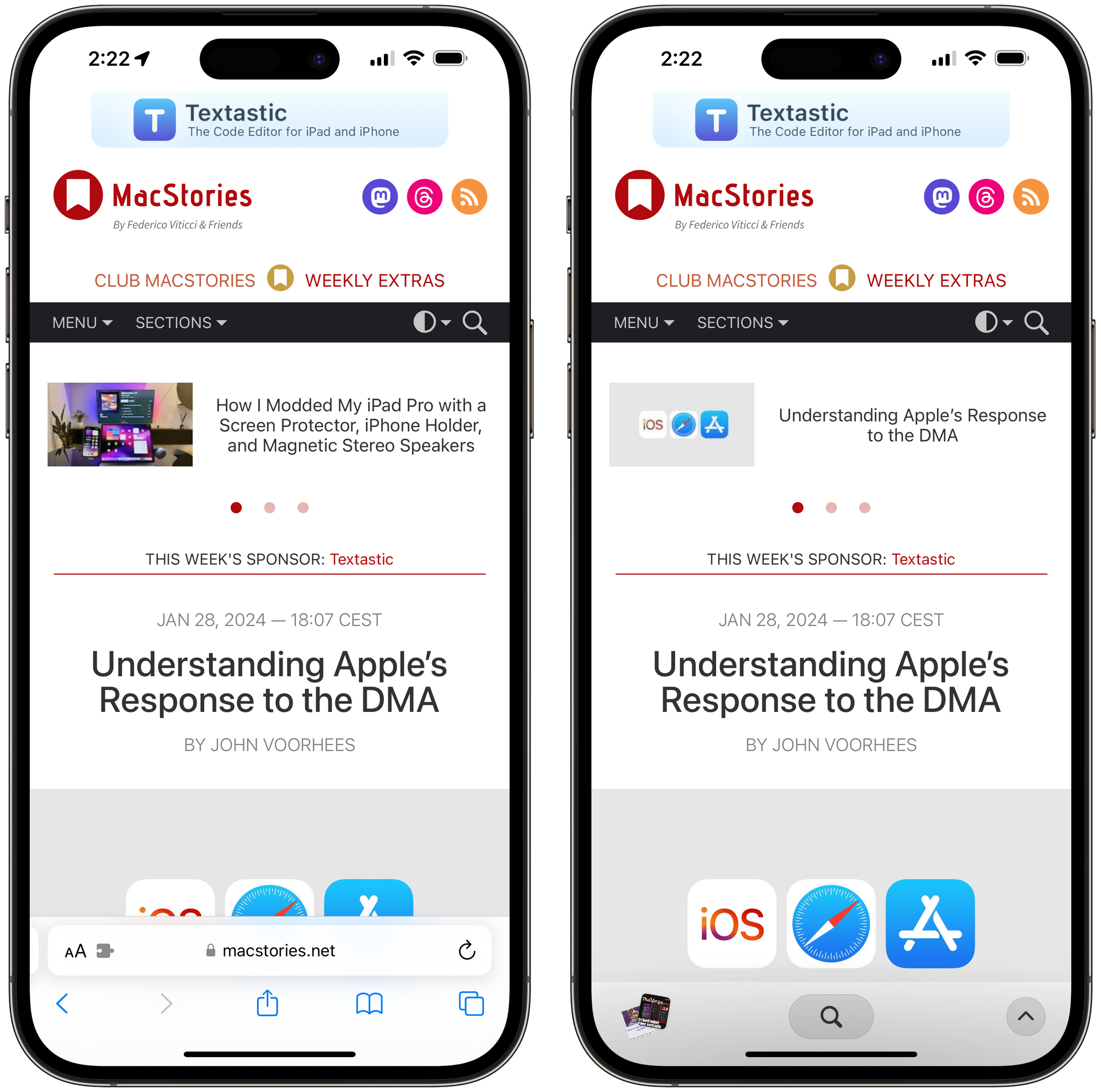
By default, the Arc Search interface stays out of your way with a minimized toolbar docked at the bottom of the screen, similar to Safari. Unlike Apple’s app, Arc doesn’t display the address bar in this collapsed state; it only shows buttons to view tabs, search, and open a menu with actions for the current webpage.
What I find so intelligent about this approach is that Arc’s toolbar boils down common user actions to three buttons: one for searching and going to other websites; one for performing actions on the current one; another for viewing the other pages you have open.
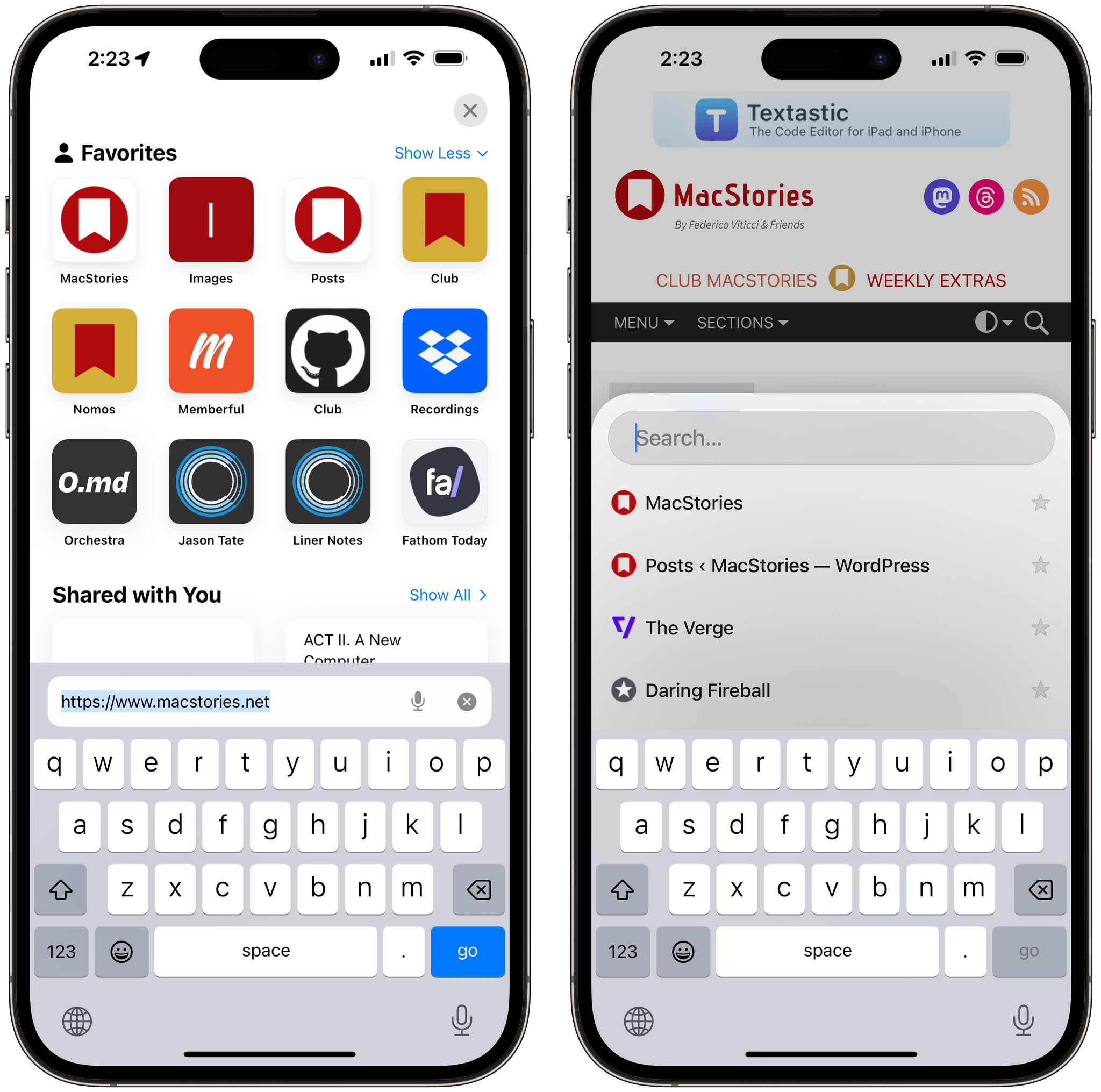
The search button is the one I found myself reaching for the most. Tapping it opens an integrated search screen that, similar to Safari, displays your favorites but also lets you search; as you search, favorites are replaced onscreen by suggested search results, which you can select and open in a new tab. While Arc clearly was inspired by Safari for iPhone here, there’s a small change that has made a big difference for me: favorites are displayed immediately above the keyboard, making them very easy to reach with your thumb. As a result, opening Arc, tapping the search button, and checking one favorite after the other feels faster than doing the same in Safari.

Safari’s approach to favorites (left) is more visually impactful, but Arc’s is easier and faster to use with one thumb.
A sense of speed and one-handed efficiency permeates Arc Search and is the strongest aspect of the app. The animations, besides being lovely to see (not a surprise given The Browser Company’s exquisite taste in UI design), are fast. Consider the tab switcher: open the tab grid in Safari for iPhone, then do the same in Arc Search. Visual differences aside, Safari feels like it’s operating in slow motion. The transitions in Arc Search are fluid and snappy, which is the ideal outcome for a mobile browser that needs to give you answers in a few seconds.
Safari (left) has much slower tab animations than Arc Search.Replay
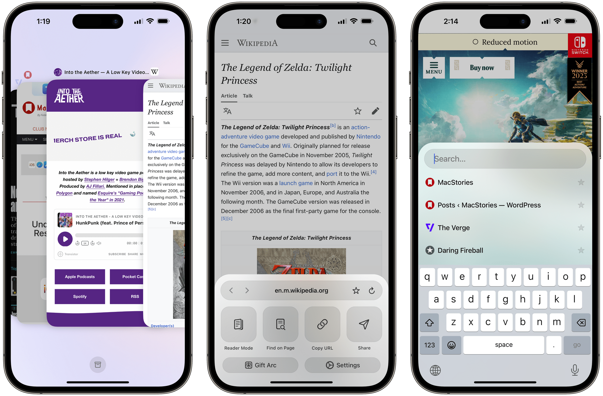
I should note that the tab picker, modeled after the typical multitasking UI of modern smartphones, is another delightful touch I appreciate it. Yes, its information density is lower than Safari’s tab grid and you won’t find the versatility of Vivaldi for iPhone’s desktop-style tabs on mobile here. But boy is it fast and fun to use. You can use the tab switcher just like the app switcher on your iPhone: you can scroll the gallery of recent tabs in chronological order (from oldest to newest left to right) and, just like with apps, you can swipe up to close a page. The automatic tab archival feature of Arc desktop has found its way to Arc Search: with an archive button at the bottom of the tab switcher, you can view and search among all the pages that were automatically archived by the browser.2
There’s one more thing I want to mention about the tab switcher. As you can see, it displays thumbnails for the two most recently visited webpages. At any point, you can flick up on the thumbnails to instantly toggle between the current webpage and the one you opened before it. I love this gesture because it makes it so easy to alternate between two pages, and it quickly became second nature for me. Of course I should be able to toggle between two pages in my iPhone’s browser, I’ve kept thinking for the past week. The gesture does sometimes conflict with the iPhone’s Home indicator at the bottom of the screen, which is why it takes a while to get used to it. To overcome that issue, I wish The Browser Company would also add a double-tap gesture in addition to the aforementioned vertical swipe.
The chevron button in the bottom-right corner opens a more standard menu with a set of essential options. This is where you can view the address bar, mark a website as favorite, view website settings, and access large and comfortable buttons for opening reader mode, finding text on the current page, copying the URL, and sharing a link via the share sheet. In a nice touch, if you want to share links more quickly, you can tap and hold the chevron to immediately open the share sheet.
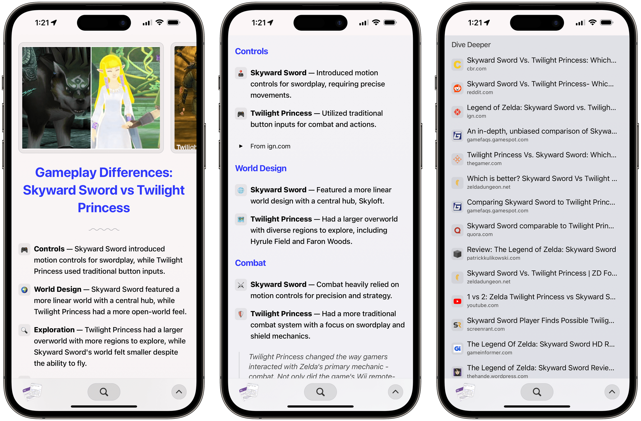
I’m not a big believer in AI tools that can summarize webpages for you since I’m a bit of a control freak and want to check each webpage myself, with my own eyes. That said, Arc’s ‘Browse For Me’ feature is pretty neat. When searching, you can press the ‘Browse For Me’ button next to a search suggestion and the app will put together a personalized page for you with key takeaways for the query you were searching for, extracted from different websites.

Unlike other AI tools, Arc Search can actually browse the web looking for news about current events and summarize them.
The summary makes good use of sections and lists all the sources it used, which you can tap to open in separate tabs. This is not a feature I personally used much, but I can see why it may turn out to be a hit with the general public. Interestingly, ‘Browse For Me’ may also show us a glimpse of Arc moving beyond traditional Google search to embrace results aggregated, summarized, and presented by AI inside the browser – Google’s worst nightmare.
A Solid Debut with Lots of Missing Features
As I wrote at the outset, there is a long list of features that are currently missing from Arc Search.
The biggest one is that, much to my surprise, Arc Search does not sync with your Arc account from the desktop app, so you’ll be starting from scratch with this app. I’m told sync is on the roadmap, but I find the omission at launch quite peculiar since it creates an unnecessary fragmentation of the user experience that’s directly opposed to Arc’s whole ethos. Oddly enough, Arc Search doesn’t offer the same functionalities as the previous Arc Companion app either, and I’m left wondering if features of that original app will be gradually rolled into Arc Search now. Whatever the strategy is, I hope The Browser Company is going to build proper Arc experiences for iPhone and iPad in the future, joining the existing Mac and Windows apps (the latter one is currently in closed beta).
The list is much longer, though. Besides the lack of an iPad app and integration with Arc desktop, there are no Shortcuts actions or widgets for Arc Search; there is no equivalent to Safari’s excellent ‘Paste and Go’ and ‘Paste and Search’ address bar actions; you cannot rename your favorites or sort them into folders; there is no built-in reading list; you can’t download files; 1Password auto-fill sometimes doesn’t work. If you get a lot of work done on your iPhone using Safari and if that work includes relying on extensions (which Arc doesn’t support) or features shared across platforms (such as tab groups, profiles, or shortcuts), it’d be hard to recommend Arc Search right now.
So why am I using Arc Search as my iPhone’s default browser? It’s a fast, delightful app that lets me find stuff and navigate to my favorites quickly; it’s comfortable to use with one hand and it’s refreshingly intuitive compared to other browsers. Put simply: it’s the distillation of what I want from a mobile browser.
Arc for Mac and Arc Search for iPhone are, on the surface, diametrically opposed: one rethinks what the browser should do thanks to all its features designed for spending as much time as possible being productive inside a browser; the other reimagines what a browser that swiftly gets out of your way should feel like. The trick that The Browser Company pulled off, however, is that both apps have one characteristic in common: they’re fun. Arc Search, just like Tweetie, Reeder, Things, Ivory, and other illustrious predecessors on iOS, has that special something that we love to see at MacStories, which tends to be hard to quantify and is often best conveyed with: “It’s fun”.
Perhaps my hope is misplaced, and The Browser Company won’t evolve Arc Search farther than this. Perhaps they’ll never build out an ecosystem of browsers with feature parity across Mac, iPhone, and iPad. I don’t know what their exact plans are, but judging from their recent expansion on Windows and their CEO’s status updates, it sounds like the company doesn’t want to stop at being just a fancy web browser for Mac with a watered-down iPhone companion app.
What I know today is that, for the first time in years, I’ve found a browser for iPhone that is compelling enough for me to switch from Safari. Arc Search is an excellent 1.0 version of an app that wants to reimagine how we browse the web on our iPhones; I just want to believe it won’t stop here.
Arc Search is a free download on the App Store.
- There’s an obvious reason for that on Apple platforms: the inability for developers to offer mobile browsers that weren’t mere reskins of Safari. This will begin to change with the arrival of non-WebKit browsers for European users starting with iOS 17.4. ↩︎
- I chose to archive mine after 12 hours in the app’s settings. ↩︎


