I’m always excited when a new weather app is released, especially when it’s a weather app that looks different from most of its counterparts. Looks Like Rain by Thinkbits is beautifully designed, and it certainly looks different, to say the least. The layout of the app is clean, the elements are well-spaced, and the color palette has clearly been composed with care. Most importantly, though, I’m absolutely loving its unique approach to visualizing the weather forecast on a color-coded timeline.
I’ve been using this brand-new weather app for the past few weeks on the iPhone, the iPad, and the Mac, and it has already earned a permanent place in the rotation of my favorite weather apps.
Let’s check it out.
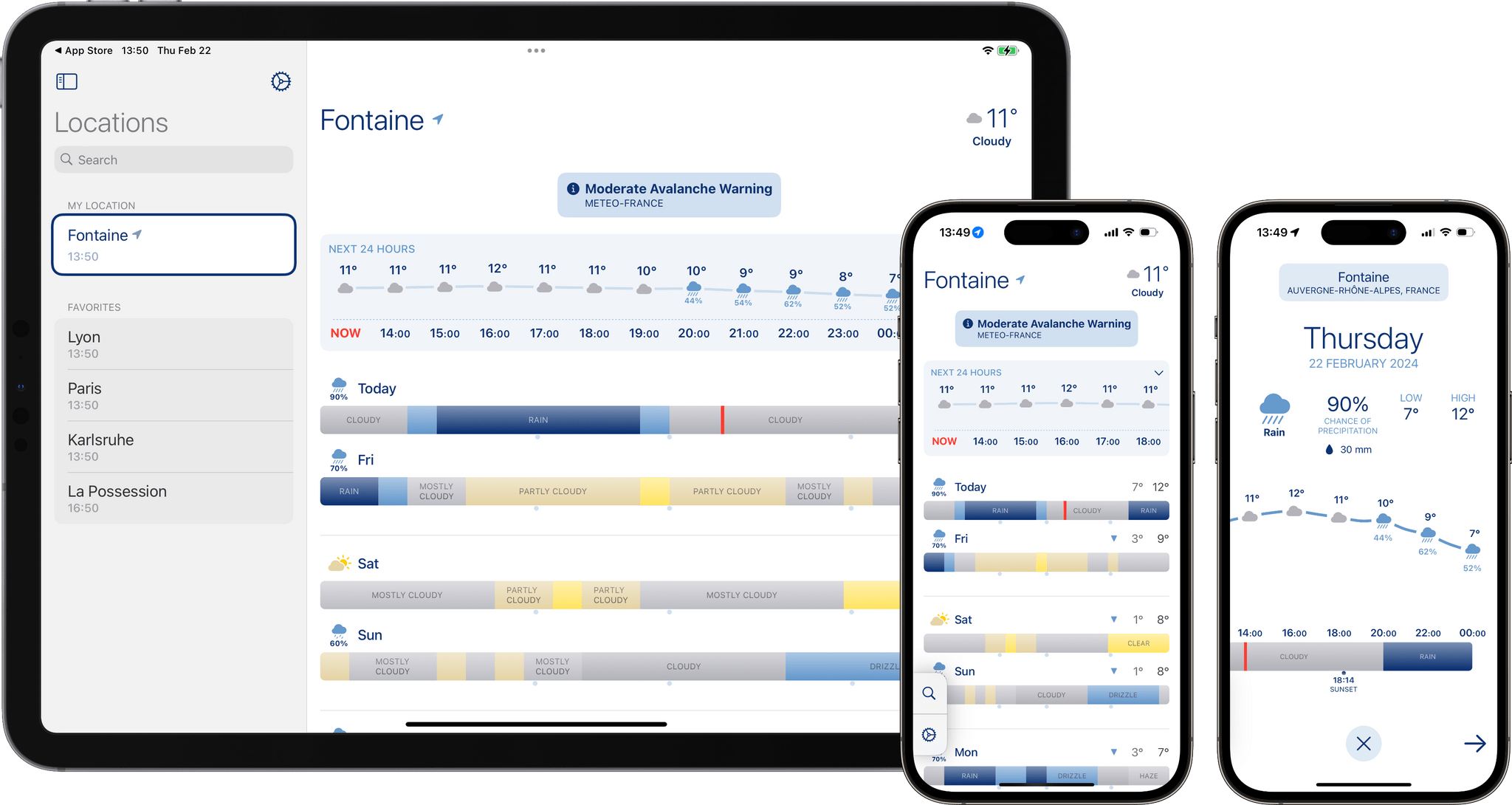
The forecast for each 24-hour day is represented on a timeline bar, which at first immediately reminded me of how Apple displays storage usage in the Settings app on iOS and macOS. This visualization allows you to easily determine at a glance whether the sky will be clear or cloudy throughout the day, and when it will start and stop raining. Every weather condition is signaled by a specific shade of blue or grey, which varies depending on the intensity. Tapping on a day lets you zoom in on the timeline, view it alongside a temperature graph, and see a handful of additional weather data points.
The result is an easy-to-read timeline of how the sky is going to look outside.
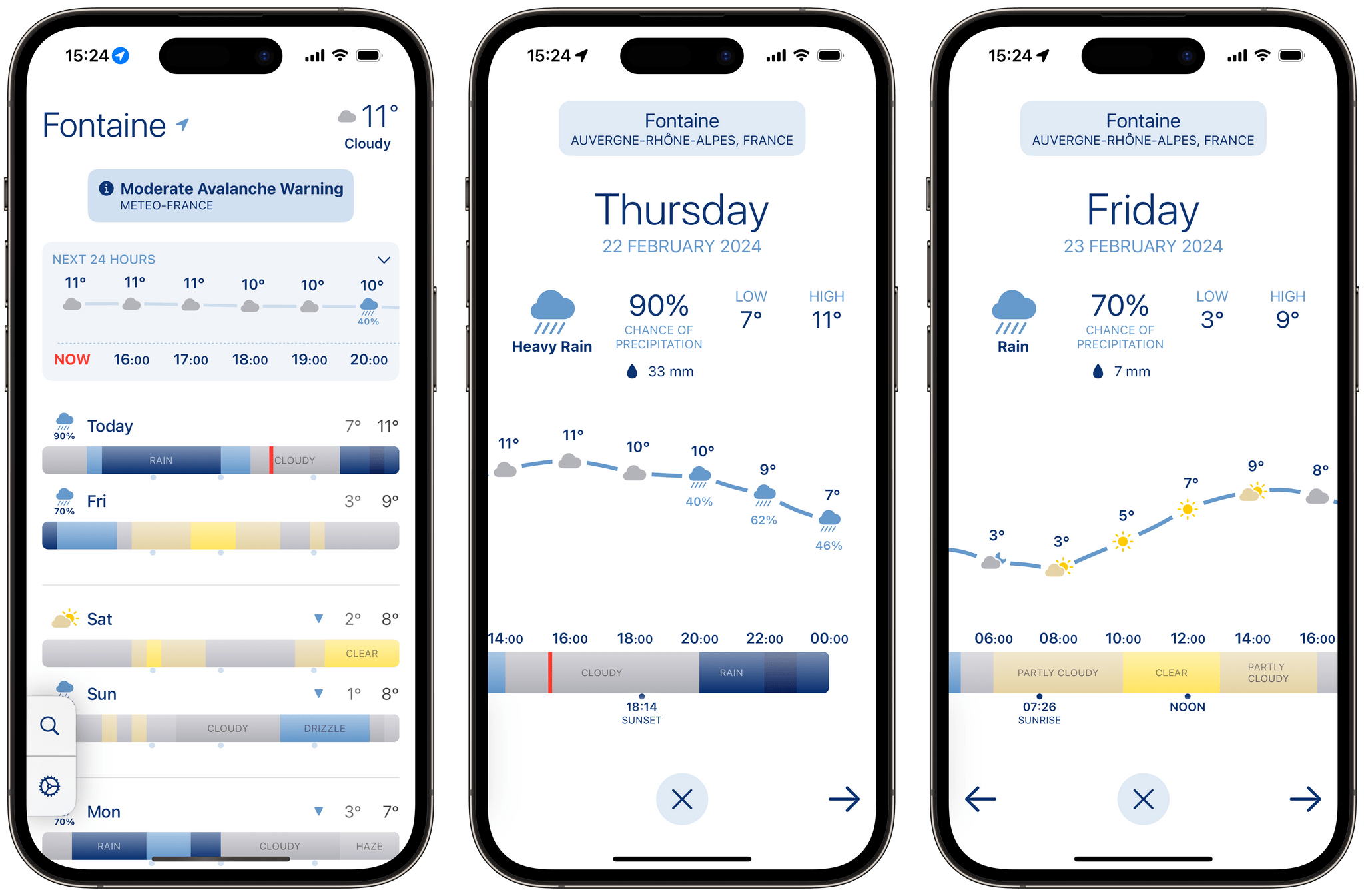
Looks Like Rain displays a color-coded timeline for each upcoming day. Tapping on a day lets you zoom in on the timeline, and view it alongside a temperature graph.
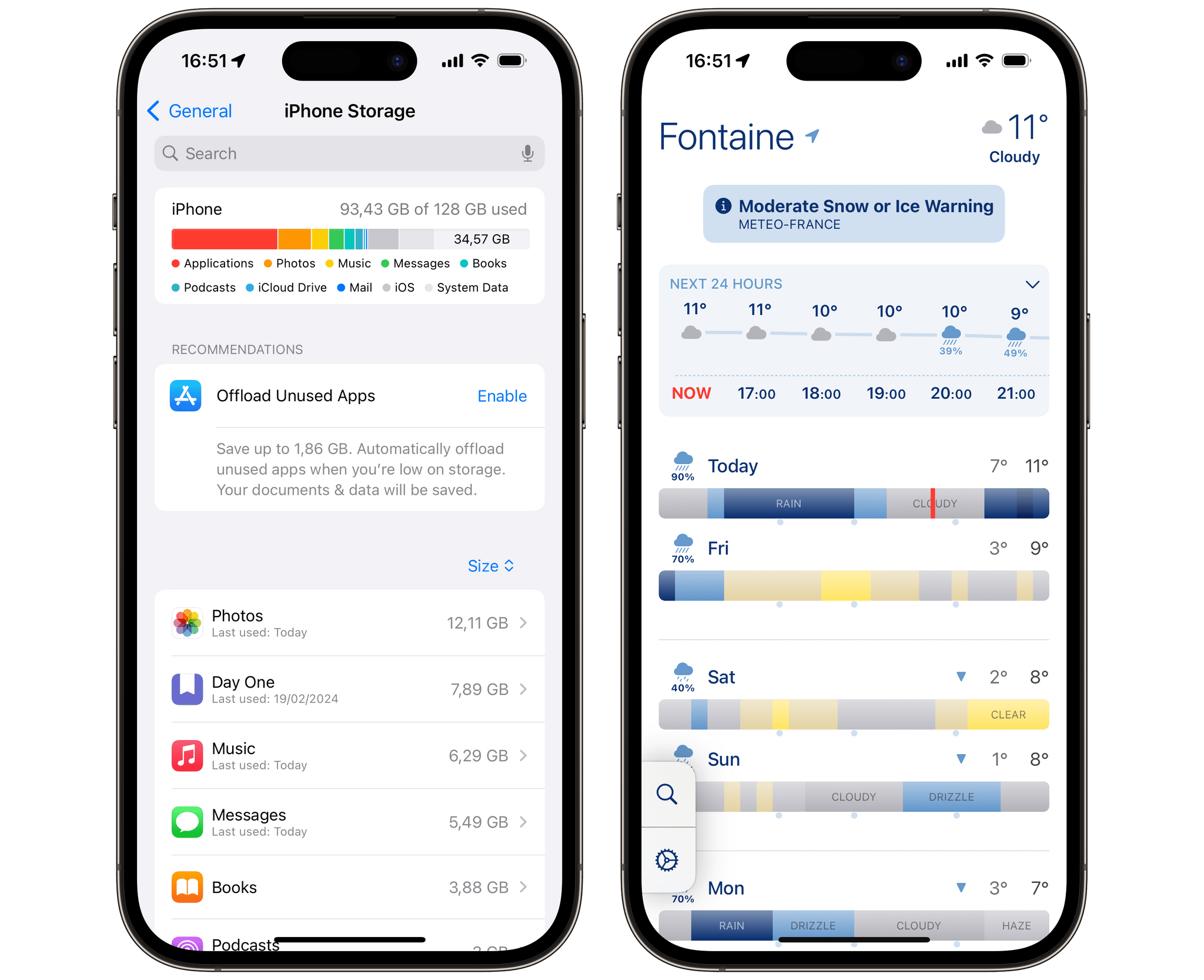
At first, Looks Like Rain’s timeline bars (Right) reminded me of how Apple displays storage usage in the Settings app on iOS (Left)
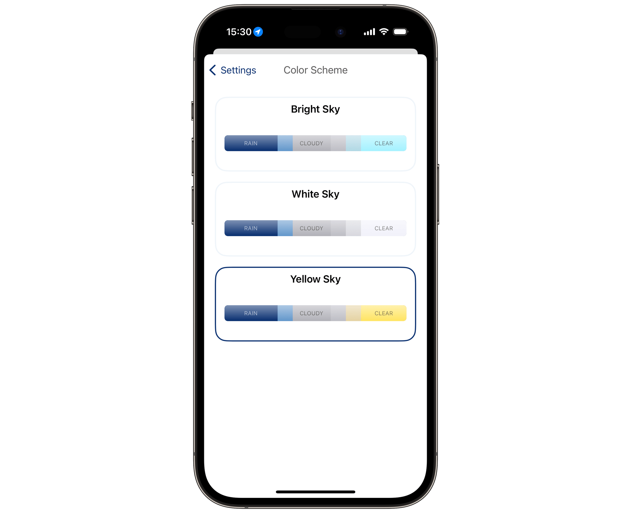
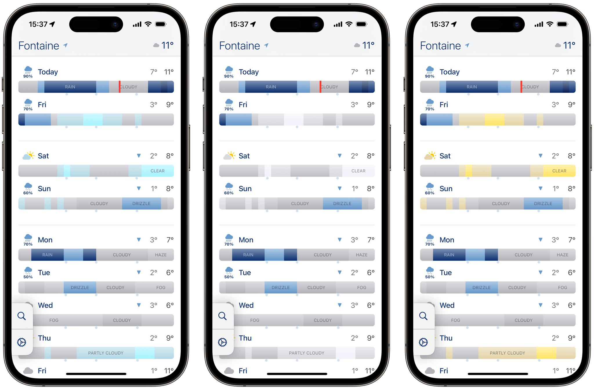
By default, ‘Heavy Rain’ is a deep shade of blue, ‘Rain’ is a lighter shade of blue, ‘Cloudy’ is grey, and ‘Clear’ is turquoise. This looks nice, but since I mostly associate turquoise with water and rain, I quickly found it difficult to tell whether it meant it was going to be rainy or sunny outside.
Fortunately, Looks Like Rain lets you choose between three color schemes. The only difference between the three is how you want the color of the sky to be reflected. My favorite option is by far ‘Yellow Sky’, which makes it very obvious to me when the sky is going to be sunny and clear, but you can also choose the ‘White Sky’ option, which admittedly looks slightly less overwhelming.
In addition to featuring forecasted weather conditions, Looks Like Rain’s color-coded timeline bars are also lined with a handful of useful daily indicators. Along with the daily temperature range, you can read the sunrise and sunset times below the timeline, and arrows pointing up or down above the timeline let you know at a glance if the temperature is rising or falling compared to the previous day.
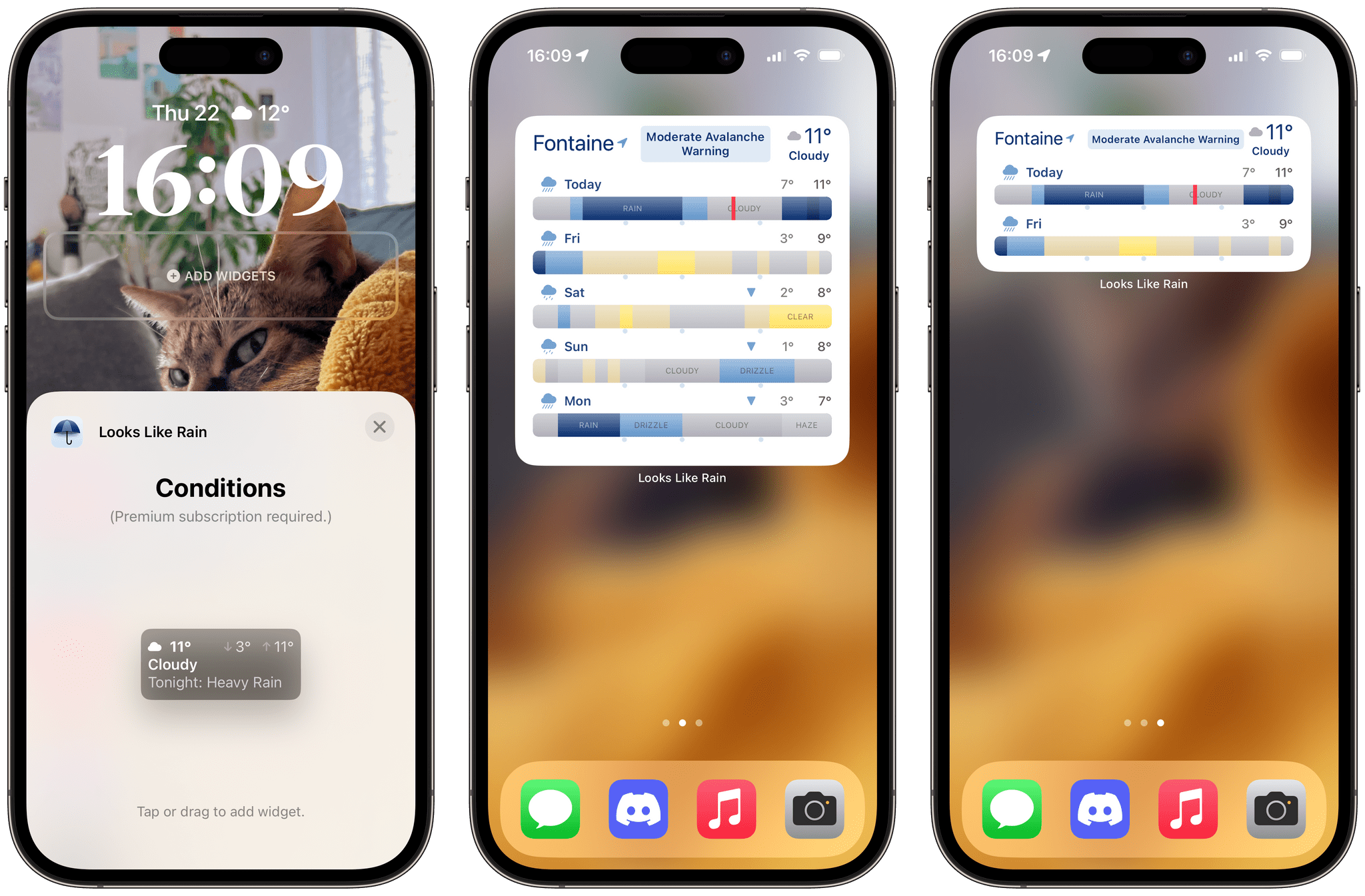
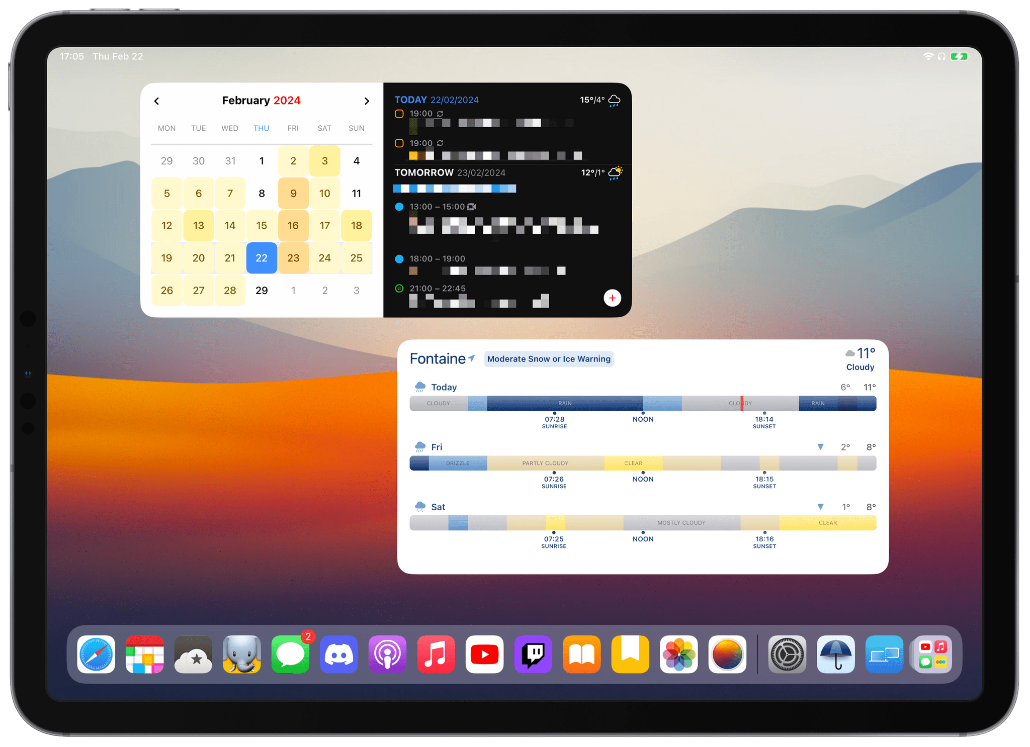
What I appreciate the most about Looks Like Rain are its available Home Screen widgets. Because they look exactly like the main view of the app, I’ve found them perfect to keep in the Today view on my iPhone. The medium-sized widget, in particular, is limited to viewing the forecast for today and the next day. I think it nicely complements my large Fantastical widget, allowing me to quickly check on the weather for the day while reviewing my upcoming events.
Looks Like Rain is very comfortable to read on an iPad. The app’s timeline bars are well suited for a wide layout. The developer has taken advantage of the available space to display more condition labels on the main view of the app, without needing to zoom in on a day.
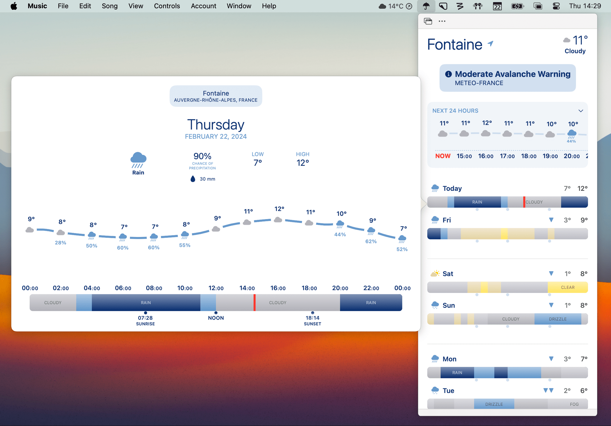
The same can be said for the macOS version of the app, which includes an optional menu bar popup. If you enable it, you can click a small umbrella icon in the menu bar to reveal a fully-featured mini version of Looks Like Rain. Each day can even be clicked to zoom in on a timeline bar. My only wish would be to have the menu bar icon display the current temperature and weather condition.
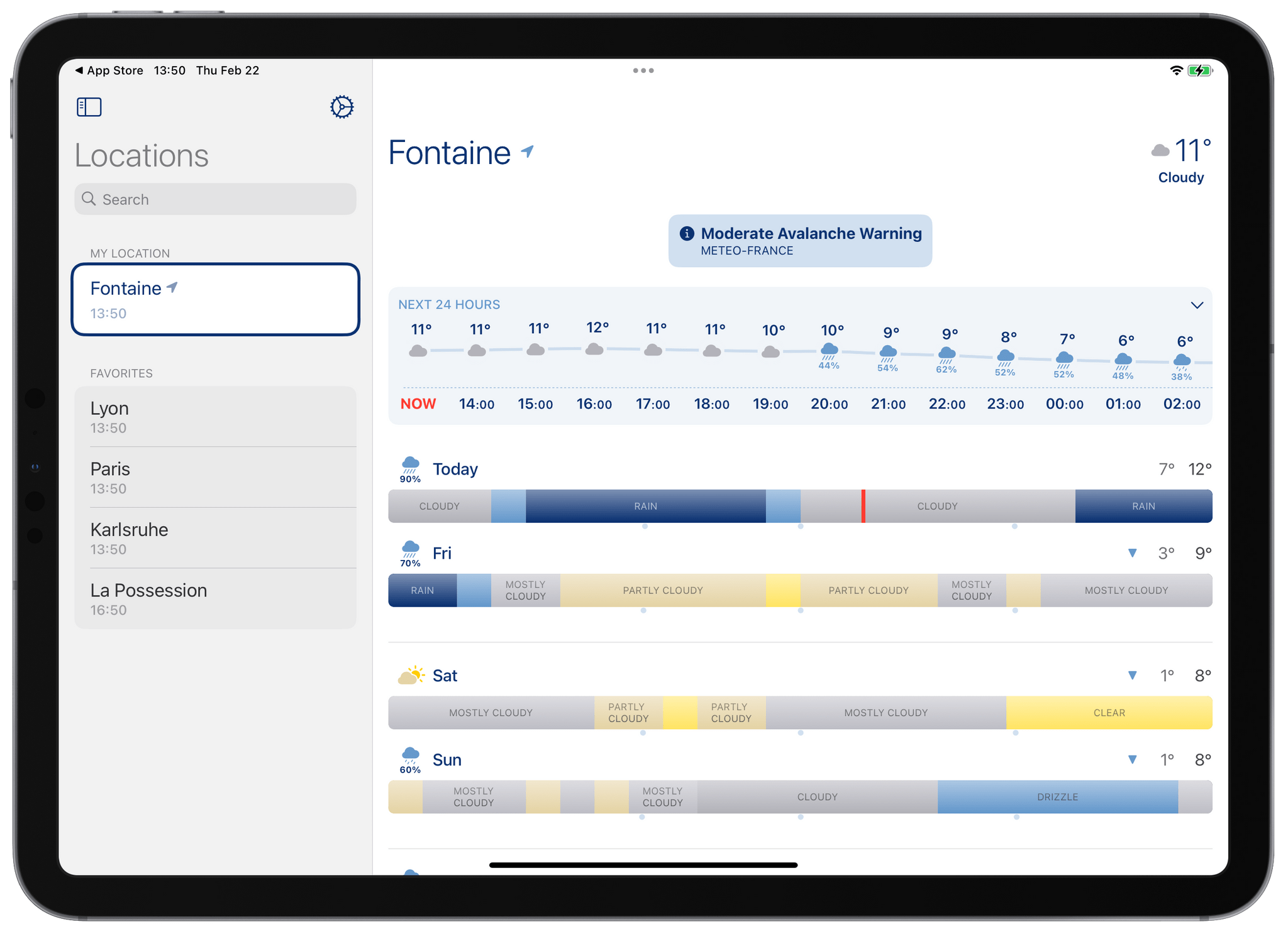
Looks Like Rain takes advantage of the available space on the iPad to display more condition labels on the main screen.
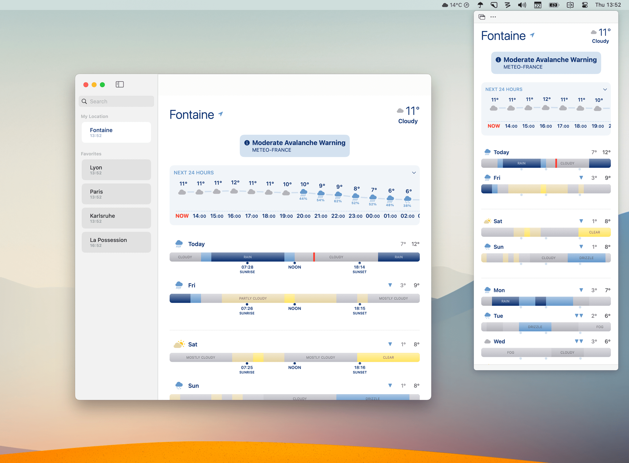
On the Mac, you can add Looks Like Rain to the menu bar, and open a fully-featured mini version of the app inside a popup.
I do have a tiny wish list for Looks Like Rain:
- While Apple Weather is a decent weather data source for where I live in France, I hope the app will add support for alternative sources, like Open-Meteo for more accurate forecasts.
- Looks Like Rain’s color palette is well thought out, but I think there is room here for more vibrant color scheme options.
- I believe the app’s visual approach could be applied on other time scales. Perhaps it could be used to represent the weather throughout the upcoming week, on a single line. I think it could even work really well to represent other data points entirely, like air quality, wind, or atmospheric pressure.
Still, this 1.0 release of Looks Like Rain is fantastic and checks a lot of boxes. Even if I can’t wait to see the app grow in functionality, I’m glad the app exists today. If you want to freshen up your weather-checking habits, I wholeheartedly recommend giving Looks Like Rain a try.
Looks Like Rain is available for free on the App Store for iOS, iPadOS, and macOS, with an optional $2 monthly (or $10 yearly) subscription to unlock widgets on the Home Screen, and the ability to save multiple favorite locations.


