My experience with iOS 18 and iPadOS 18, launching today in public beta for everyone to try, has been characterized by smaller, yet welcome enhancements to Apple’s productivity apps, a redesign I was originally wrong about, and an emphasis on customization.
There’s a big omission looming over the rollout of these public betas, and that’s the absence of any Apple Intelligence functionalities that were showcased at WWDC. There’s no reworked Siri, no writing tools in text fields, no image generation via the dedicated Image Playground app, no redesigned Mail app. And that’s not to mention the AI features that we knew were slotted for 2025 and beyond, such as Siri eventually becoming more cognizant of app content and gaining the ability to operate more specifically inside apps.
As a result, these first public betas of iOS and iPadOS 18 may be – and rightfully so – boring for most people, unless you really happen to care about customization options or apps.
Fortunately, I do, which is why I’ve had a pleasant time with iOS and iPadOS 18 over the past month, noting improvements in my favorite system apps and customizing Control Center with new controls and pages. At the same time, however, I have to recognize that Apple’s focus this year was largely on AI; without it, it feels like the biggest part of the iOS 18 narrative is missing.
As you can imagine, I’m going to save a deeper, more detailed look at all the visual customization features and app-related changes in iOS and iPadOS 18 for my annual review later this year, where I also plan to talk about Apple’s approach to AI and what it’ll mean for our usage of iPhones and iPads.
For now, let’s take a look at the features and app updates I’ve enjoyed over the past month.
Apps
There are lots of app-related improvements in iOS 18, which is why I’m looking forward to the next few months on AppStories, where we’ll have a chance to discuss them all more in-depth. For now, here are my initial highlights.
Reminders and Calendar, Together At Last
I almost can’t believe I’m typing this in 2024, but as things stand in this public beta, I’m very excited about…the Calendar app.
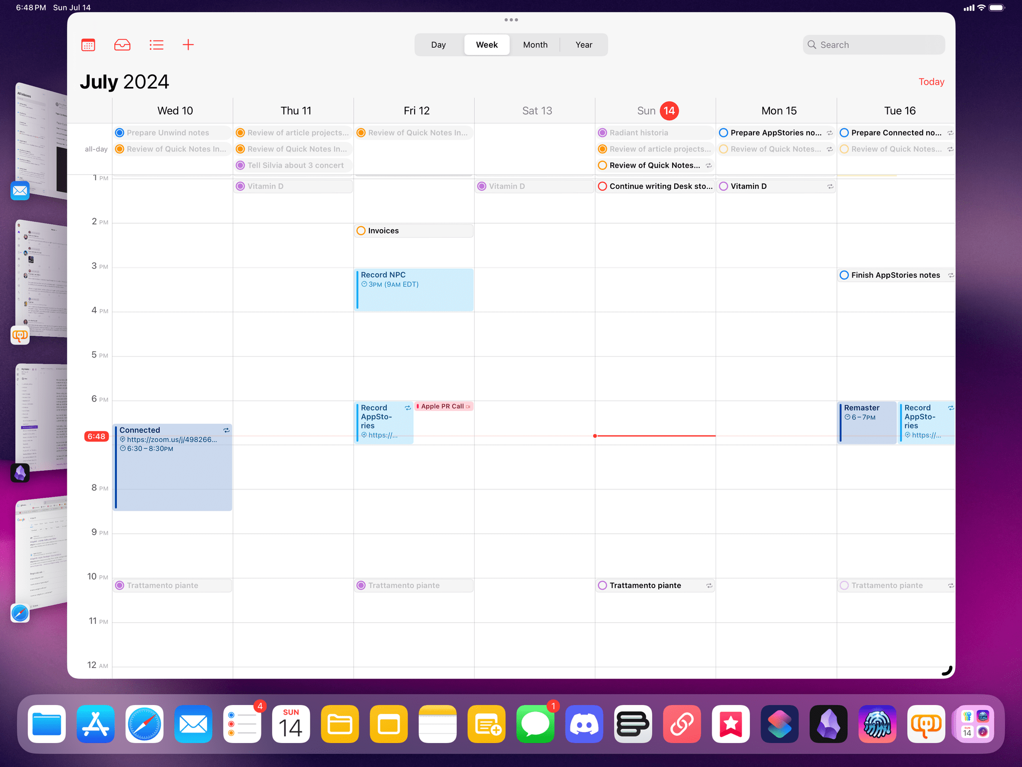
In iOS and iPadOS 18, the Calendar app is getting the ability to show your scheduled reminders alongside regular calendar events. I know, I know: that’s not the most incredible innovation since apps like Fantastical have been able to display events and tasks together for over a decade now. The thing is, though, with time I’ve realized that I don’t need a tool as complex as Fantastical (which is a great app, but its new business-oriented features are something I don’t need); I’m fine with Apple’s built-in Calendar app, which does everything I need and has an icon on the Home Screen that shows me the current date.
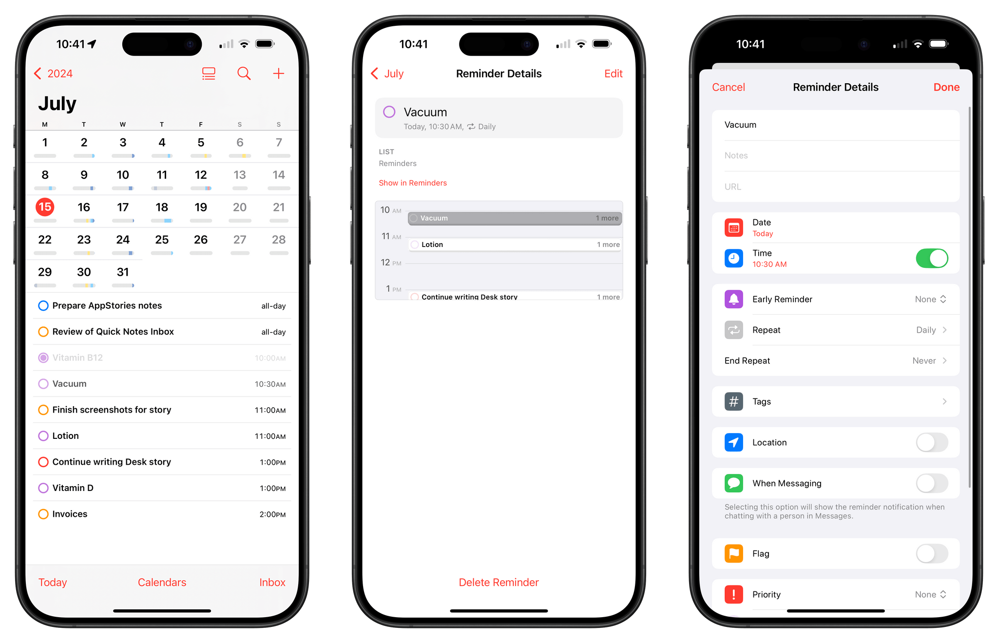
By enabling the ‘Scheduled Reminders’ toggle in the app’s Calendars section, all your scheduled tasks from the Reminders app will appear alongside events in the calendar. You can click a reminder inside Calendar to mark it as complete or use drag and drop to reschedule it to another day. As someone who creates only a handful of calendar events each week but gives every task a due date and time, I find it very helpful to have a complete overview of my week in once place rather than having to use two apps for the job.
The integration even extends to Calendar’s Home Screen widgets, including the glorious ‘XL’ one on iPad, which can now show you reminders and events for multiple days at a glance.
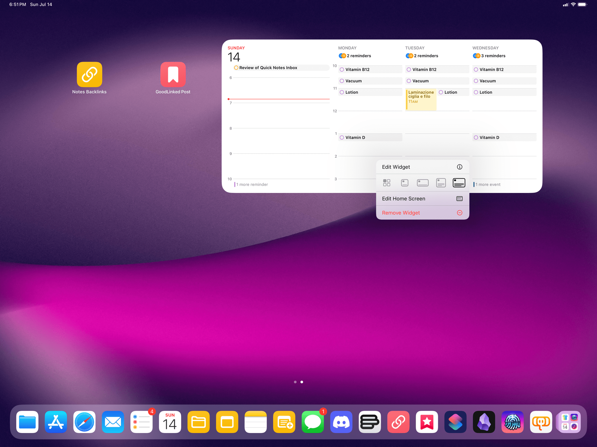
Reminders are also displayed in the XL Calendar widget on iPad. iOS and iPadOS 18 also include the ability to resize widgets without deleting and re-adding them from scratch every time.
Historically speaking, this is not the first time we’ve seen a direct, two-way communication between Apple apps on iOS: in iOS 12, Apple brought News articles to the Stocks app, which I covered in my review at the time as an exciting opportunity for system apps to cross-pollinate and for Apple to provide iOS users with an experience greater than the sum of its parts. This year, the company is going to much greater lengths with the same idea. Not only is Reminders data appearing inside Calendar, but tasks are interactive in the Calendar app, to the point where you can access the full-blown Reminders task creation UI from inside Calendar:
Does this mean the Calendar app has become the one productivity app to rule them all for me? Obviously not, since there are still plenty of reasons to open the standalone Reminders app, if only to browse my various lists and smart lists or use specific features like tagging and rich links. But the idea of providing a common ground between the two apps is solid, and as a result, I find myself spending more time managing my week inside the Calendar app now.
As we’ll see later this year, these two apps aren’t the only ones becoming capable of talking to each other in iOS 18: Notes and Calculator will also get the ability to share Math Notes and allow users to edit the same document in two distinct places. This is a trend worth keeping an eye on.
Speaking of Reminders, there are a handful of improvements in the app I want to mention.
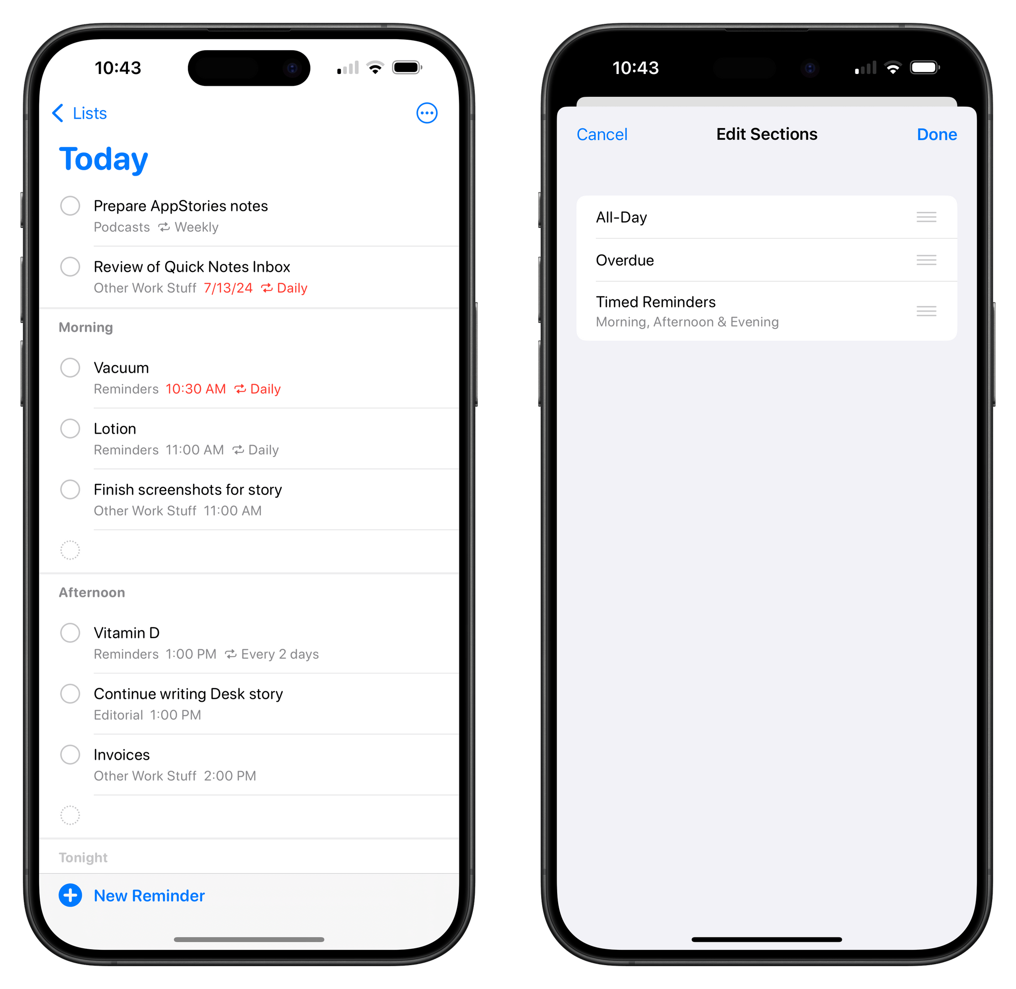
For starters, subtasks now appear in the ‘Today’ and ‘Scheduled’ lists as well as custom smart lists. Previously, reminders nested within a parent reminder would be hidden from those special views, which – again, as someone who schedules everything in his task manager – hindered the utility of subtasks in the first place. To give you a practical example, I have an automation that creates a new list for the next issue of MacStories Weekly every week (which I adapted from my Things suite of shortcuts), and one of the tasks inside that list is an ‘App Debuts’ parent reminder. When I come across an interesting app or update during the week, I save it as a subtask of that reminder. In iOS and iPadOS 18, those subtasks can appear in the ‘Today’ view on Saturday morning, when it’s time to assemble MacStories Weekly.
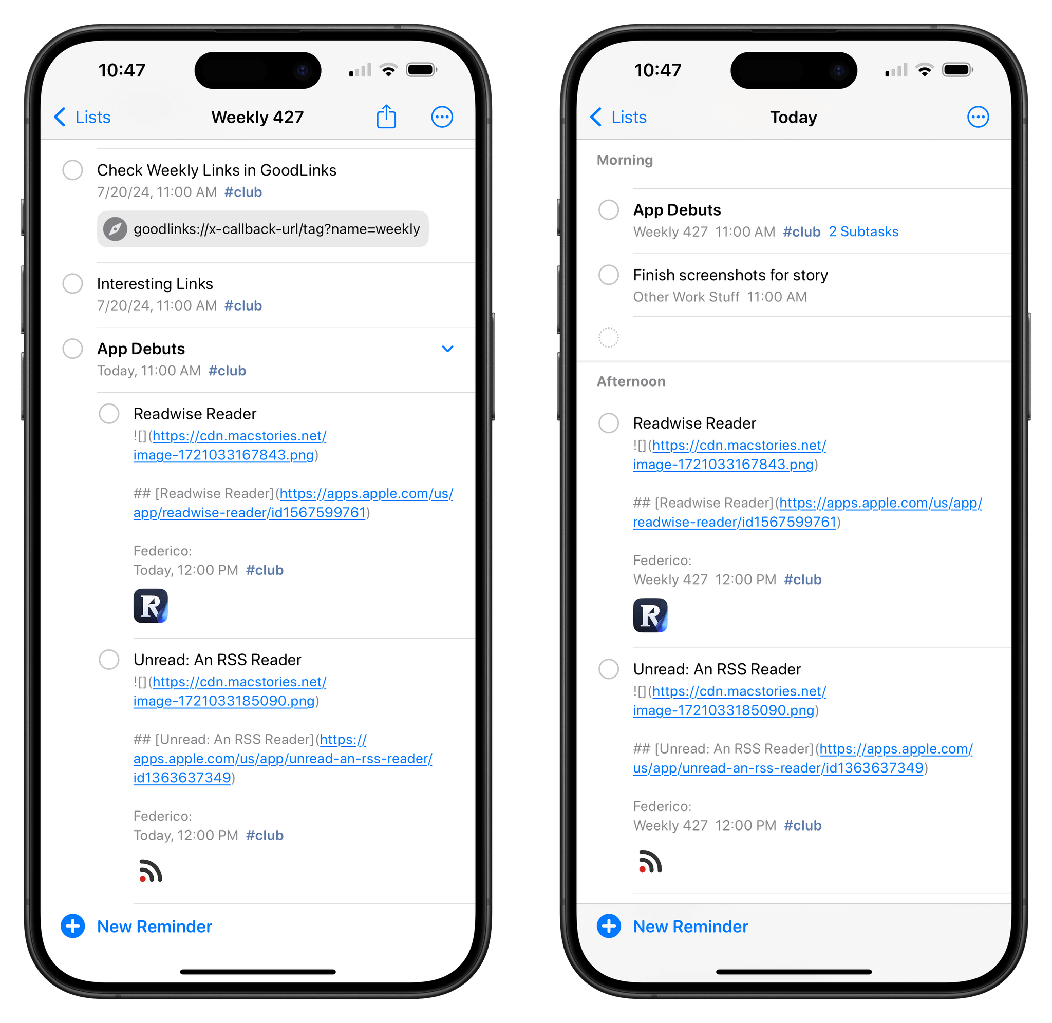
Subtasks for a reminder in a specific list (left) can now appear in the Today page and other smart lists.
Although the ‘Today’ default smart list still doesn’t support columns, it now lets you customize the order of its default sections: all-day, overdue, and timed reminders.
I’m also intrigued by Apple’s promise of new Shortcuts actions for Reminders, though I suspect the work is unfinished and we’re only seeing partial results in this public beta. There is a new ‘Create Reminder’ action in Shortcuts (which I can only see on my iPhone, not on the iPad) that exposes more options for task creation than the old ‘Add New Reminder’ action.
Namely, this action now lets you enter properties for a list’s sections and assignees; strangely enough, the action doesn’t contain an option to enter a URL attachment for a task, which the previous action offered. I’m guessing that, as part of Apple Intelligence and with the ultimate goal of making Siri more integrated with apps, Apple is going to retool a lot of their existing Shortcuts actions. (It’s about time.) I wouldn’t be surprised if more apps follow Reminders in modernizing their Shortcuts integrations within the iOS 18 cycle because of Apple Intelligence.
Passwords: The “Finally” of the Year
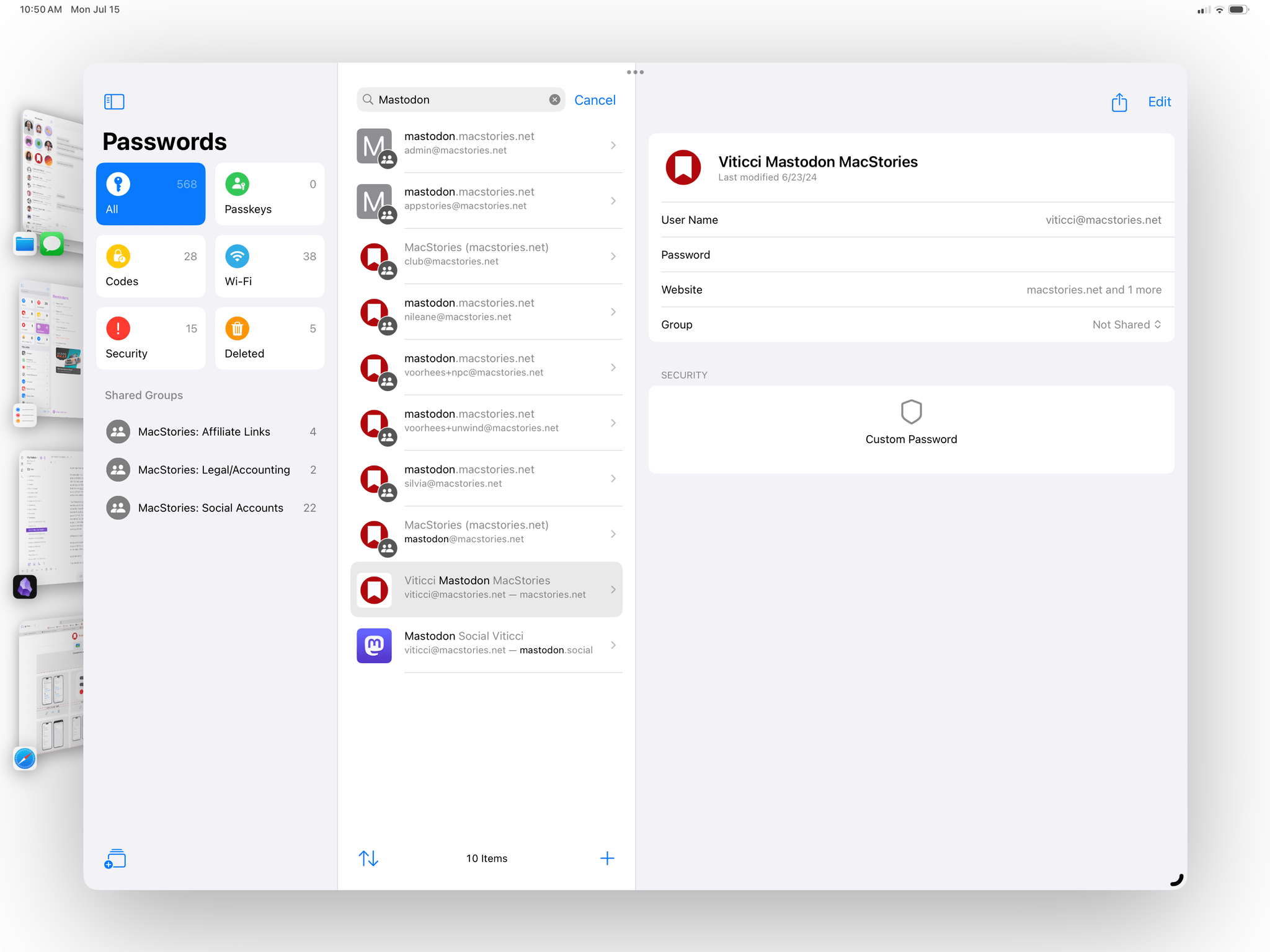
At long last – and the finally is deserved here – Apple has made a standalone Passwords app for iOS, iPadOS, and macOS. I (and many others) have been arguing in favor of cutting password management out of Settings to let it blossom into a full-blown app for years now; I’m not kidding when I say that, on balance, the addition of the Passwords app has been the most important quality-of-life improvement in iOS 18 so far.
I moved all of my passwords out of 1Password and into iCloud Keychain just before WWDC (following Simon’s excellent guide). As soon as I updated to iOS 18, they were all transferred to the Passwords app, and I didn’t have to do anything else. iCloud Keychain already supported key password management features like verification codes; with the Passwords app, you don’t need to go hunt for them inside Settings anymore thanks to a more intuitive UI that also adds some welcome options.
The Passwords app has a design that’s reminiscent of Reminders, with pinned sections at the top for passkeys, logins that have one-time codes, Wi-Fi networks, security recommendations, and deleted items. With the exception of the Wi-Fi section, these aren’t new features, but the presentation makes them easier to find. These sections are followed by your shared groups, which aren’t new either, but are more discoverable and prominent. The design of login item pages is consistent with iOS 17’s old iCloud Keychain UI, but the app now supports multiple URLs for the same login; the main list view also includes sorting options.
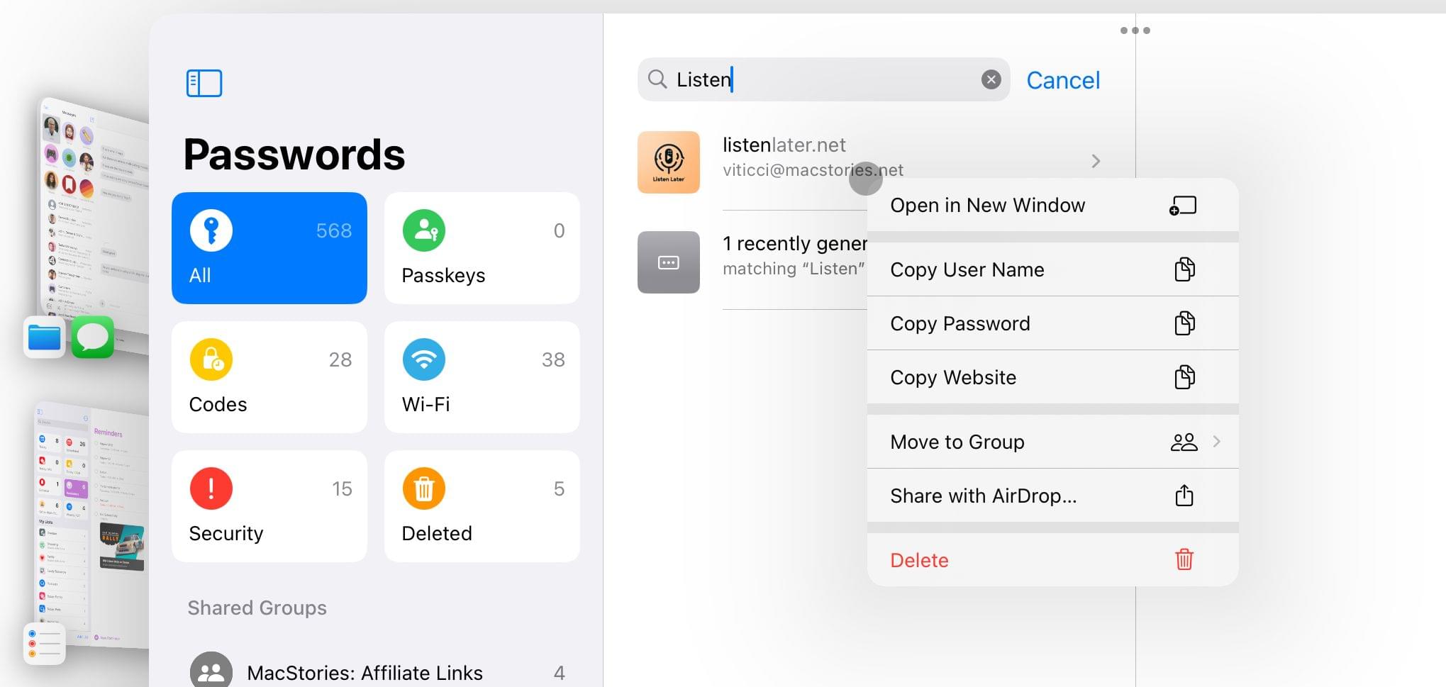
My favorite detail of the Passwords app, however, is this: if you need to quickly copy an item’s username, password, code, or URL, you can simply right-click it in the main view and copy what you need:
The best thing I can say about Passwords is that it obliterated a particular kind of frustration from my life. With Apple’s app, I don’t need to worry about my password manager not working anymore. In fact, I’d argue that Passwords’ strongest quality is that you never think about it that much, and that means it’s doing its job.
Those who, like me, come from more than a decade of using 1Password and have witnessed the app’s slow descent into instability know what I’m talking about: having to constantly worry about the app’s Safari extension not working, search not bringing up results inside the app, or the extension auto-filling the wrong information on a page. With Passwords, all these issues have evaporated for me, and I can’t describe how happy it makes me that I just don’t have these thoughts about my password manager anymore.
Don’t get me wrong; there are features of 1Password that Apple’s Passwords app can’t match yet, and that I’m guessing will be the reason why some folks won’t be able to switch to it just yet. The biggest limitation, in my opinion, is the lack of secure attachments: if you want to store a file (like, say, a PDF document or an encryption key) associated with a login item, well, you can’t with Passwords yet.
These limitations need to be addressed, and now that Passwords is a standalone experience, I’m more confident that Apple will have the headroom to do so rather than having to cram everything into a Settings page. Moving from 1Password to the Passwords app has been one of the most useful tech-related migrations I’ve made in recent memory; if you’re on the verge and primarily use Apple devices, I highly recommend taking the time to do it.
The New Photos App: Tradition, Discovery, and Customization
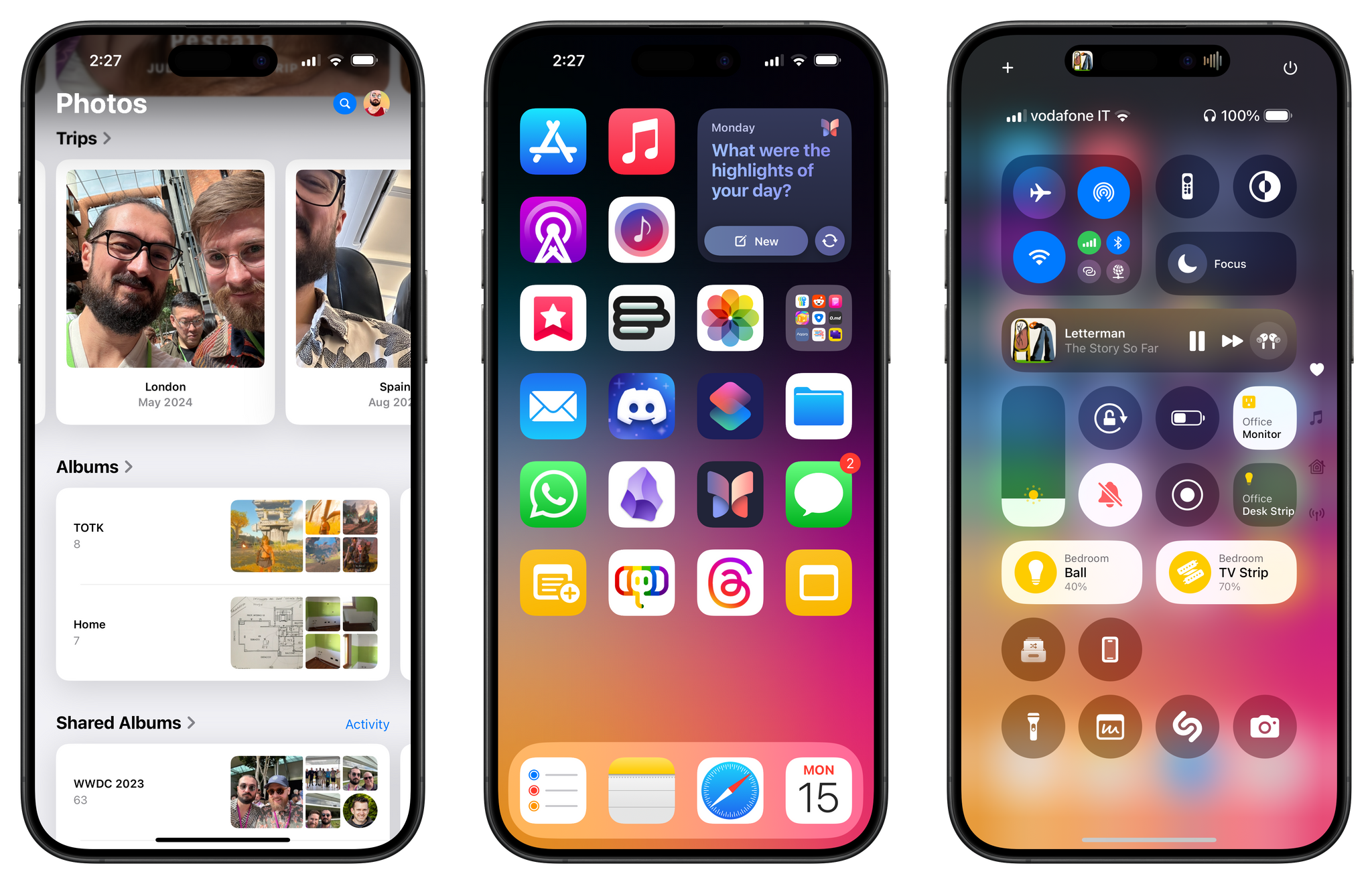
Beyond Apple Intelligence, I’d argue that the most important change of iOS 18 – and something you can try right now, unlike AI – is the redesigned Photos app. As I shared on MacStories a couple of weeks ago, I was initially wrong about it. Having used it every day for the past month, not only do I think Apple is onto something with their idea of a single-page app design, but, more importantly, the new app has helped me rediscover old memories more frequently than before.
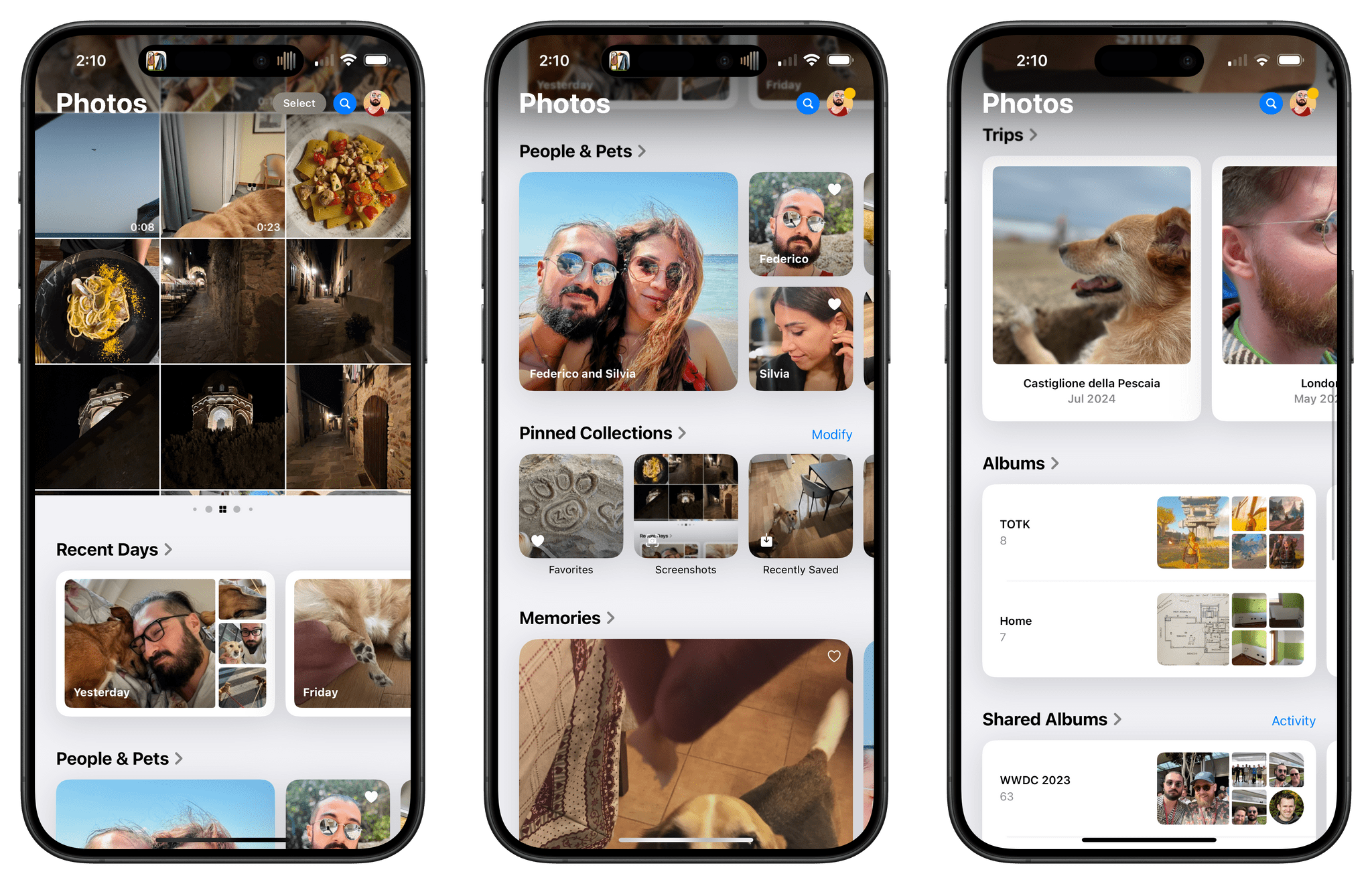
The concept behind the new Photos app is fairly straightforward to grasp, yet antithetical to decades of iOS UI conventions: rather than organize different app sections into tabs, everything has been collapsed into a single page that you can scroll to move from your library to various kinds of collections and suggestions. And that’s not at all; this fluid, single-page layout (which is powered by SwiftUI) is also highly customizable, allowing users to fine-tune which sections they want to see at the top in the main carousel and which pinned collections, albums, or trips they want to see further down the page.
It’s easy to understand why the move from a tabbed interface to a unified single-page design may – at least in theory – bolster discovery inside the app: if people aren’t using the app’s other sections, well, let’s just move all those sections into the screen we know they’re using. Or, think about it this way: we already spend hours of our lives discovering all kinds of digital information – news, music, memes, whatever – by scrolling. Why not use the same gesture to rediscover photos in our libraries, too? (The opposite of doomscrolling, if you will.)
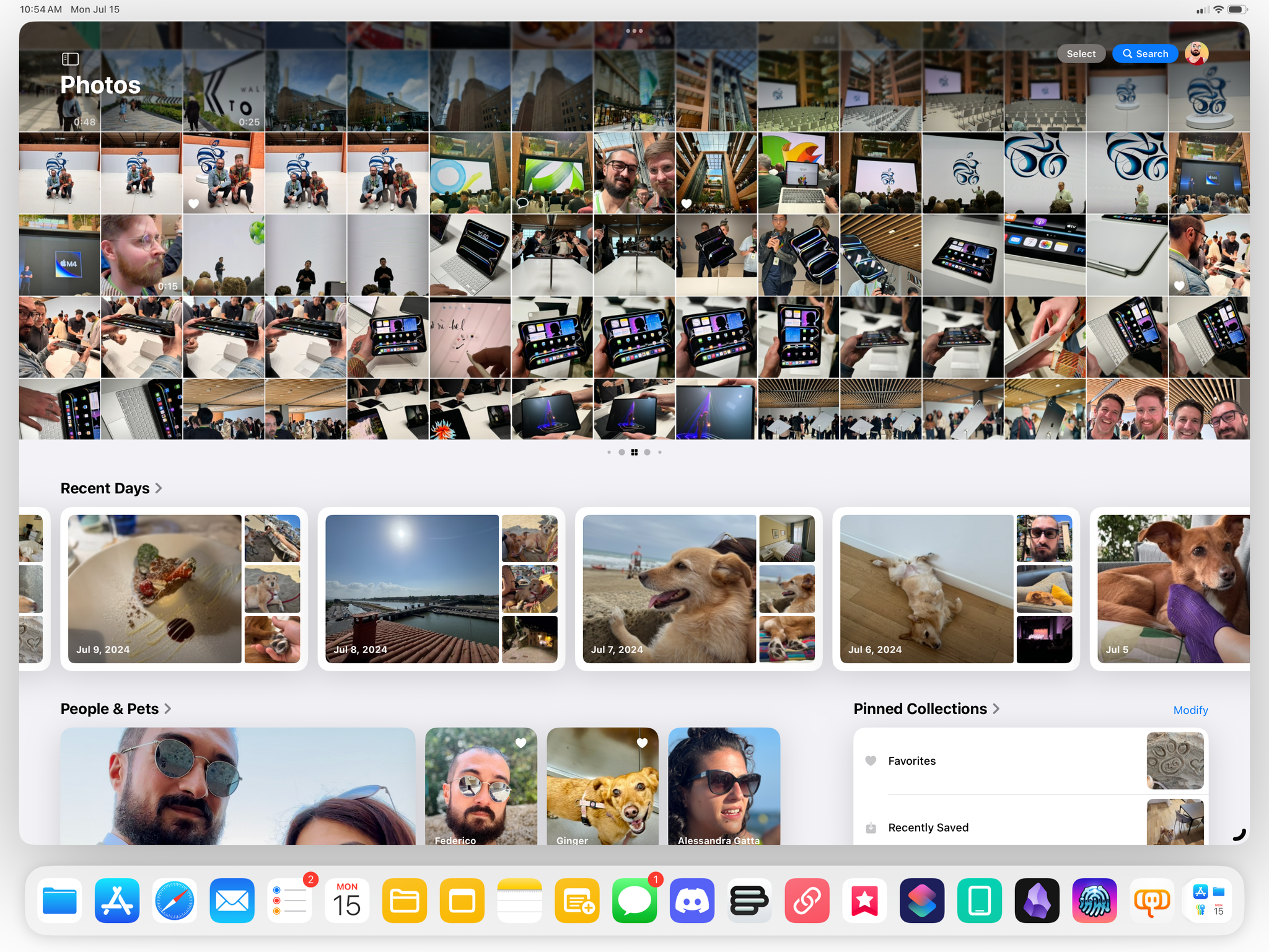
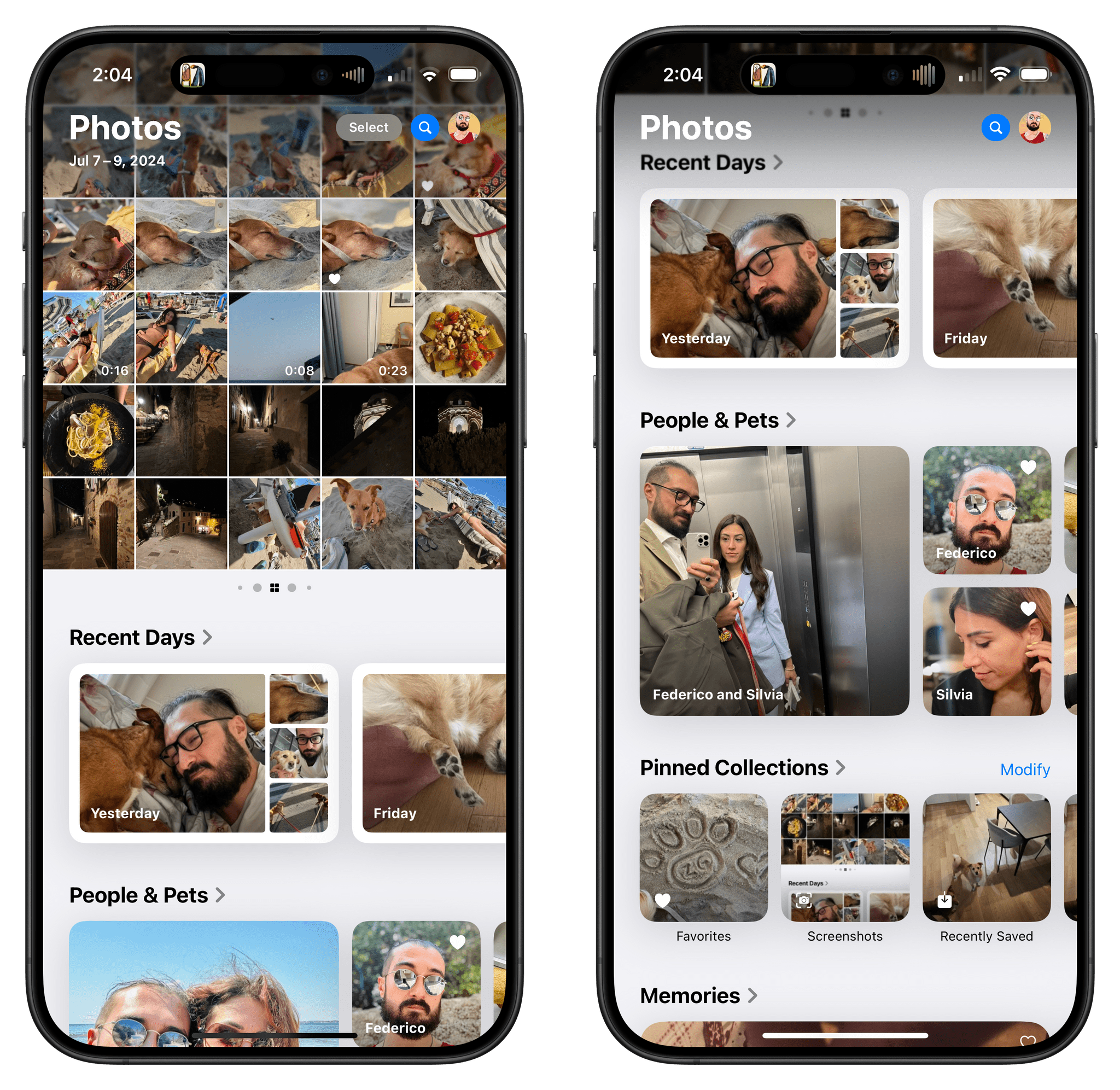
What I think Apple designers have achieved with the new Photos app – and what I will explore more in-depth later this year in my review – is balance between tradition, discovery, and customization. By default, the new Photos app shows your usual grid of recent photos and videos at the top, occupying roughly 60% of the screen on iPhone. Immediately below, the app will automatically compile smart collections for recent days (where only the best shots are highlighted, removing stuff like screenshots and receipts) as well as your favorite people and pets. So if you’re looking for the photo you just took, you can still find it in the grid, but there’s also a chance something else may catch your eye down the page.
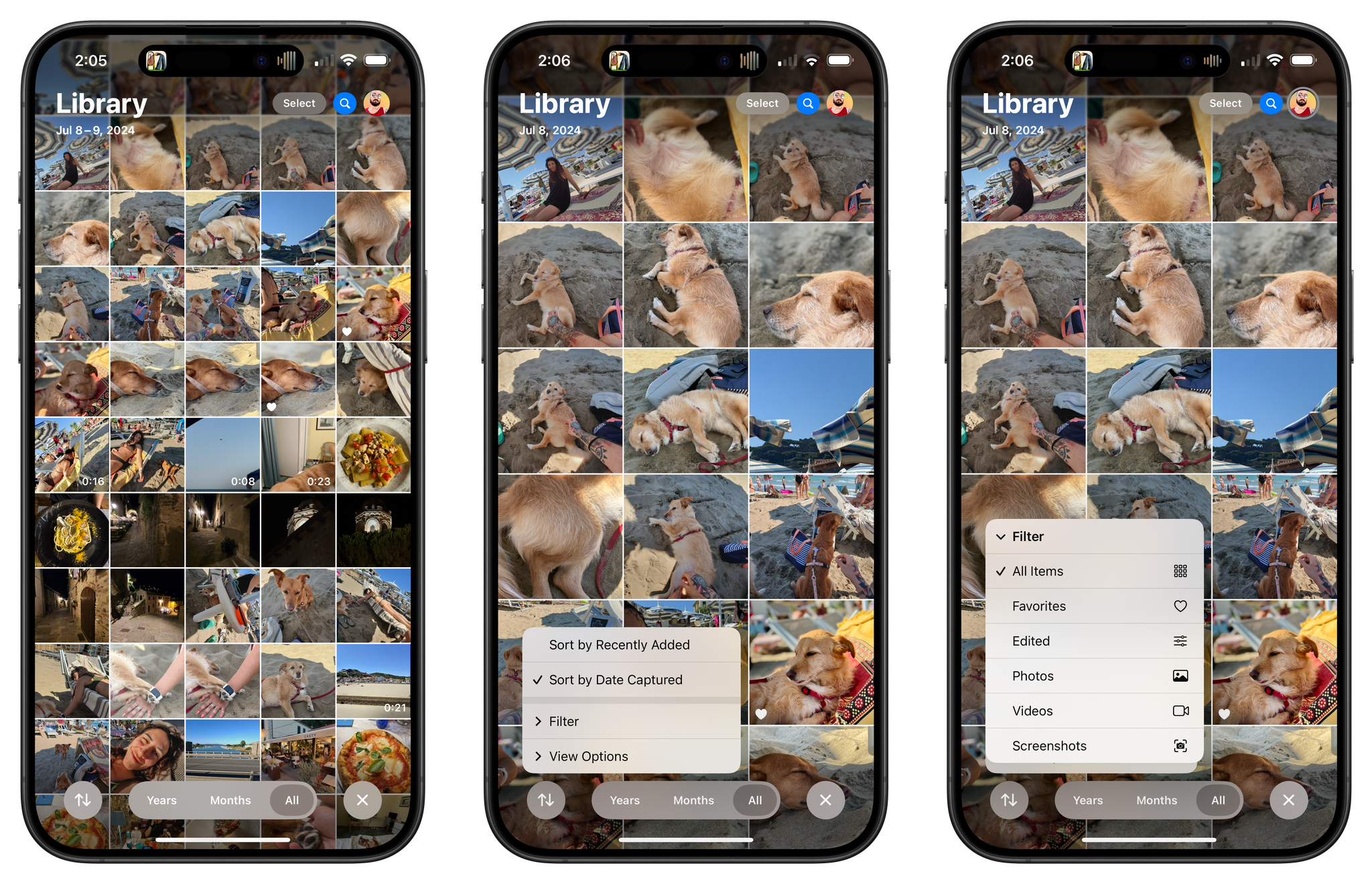
The grid can be expanded to full-screen with a swipe, which reveals a new segmented control to enable the Years and Months views as well as a menu for sorting options and new filters to exclude media types such as screenshots and videos. The transition from half-grid to full-grid is incredibly smooth and pleasant to look at.
So that’s tradition: if you want to keep using the Photos app as a grid of photos, you can, and the app supports all the features you know and love in the grid, such as long presses to show context menus and drag and drop. This is where Photos bifurcates from the past, though: if you want, at this point, you can also keep scrolling to discover more, or you can spend some time customizing the look of the app to your needs and preferences.
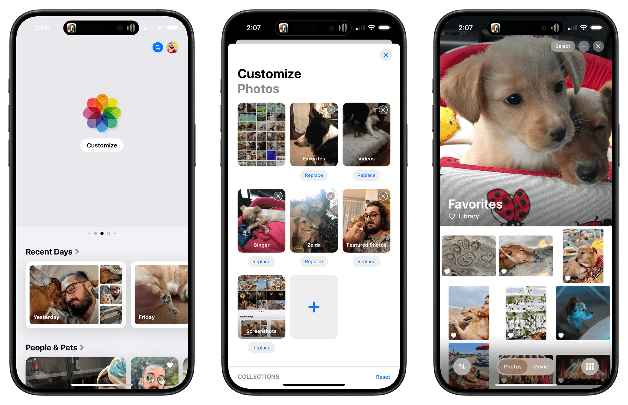
There are a lot of recommended sections (and more coming with AI in the future) and customization options – too many for me to cover in this preview article today. Allow me to highlight just a few. The main grid at the top of the app? That’s actually a carousel that you can swipe horizontally to move from the grid to other “pinned” sections, and you can customize which collections are displayed in here. In my app, I put my favorites, videos, photos of my dogs, featured photos, and screenshots (in this order) after the grid. This way, I can move to the right if I want to discover old favorites and memories, or I can quickly move the left to find all my screenshots quickly. Once again: it’s all about tradition, discovery, and customization.
I’ve become a huge fan of Recent Days, which is a section that follows the grid, automatically groups photos by day, and sort of serves as a visual calendar of your life. Apple’s algorithm, in my experience, does a great job at picking a key photo from a particular day, and more often than not, I find myself swiping through this section to remember what I did on any given day.
I also like the ability to customize Pinned Collections, which is another section on the page and, effectively, a user-customizable space for shortcuts to your Photos library. You can pin anything in here: media types, specific albums, specific trips (which are curated by iOS 18), photos of your pets, photos of people and groups of people (also new in iOS 18), and more.
I’ll save more comments and tidbits on the redesigned Photos app for my iOS and iPadOS 18 review later this year. For now, though, I’ll say this: a month ago, I thought Apple was going to revert this drastic redesign like they did with Safari three years ago; now, I think Apple has created something special, and they should be diligent enough to iterate and listen to feedback, but also stick to their ideas and see this redesign through. The new Photos app allows me to see recently-taken pictures like before; at the same time, it gives me an easier, less disorienting way to discover forgotten moments and memories from my library that are continuously surfaced throughout the app. And at any point, I can choose to customize what I see and shape the app’s experience into something that is uniquely mine.
I was skeptical about iOS 18’s Photos app at first, but now I’m a believer.
User Customization: Home Screen Icons and Control Center
Apple’s progressive embrace of user customization on its mobile platforms isn’t new. (We could trace the company’s efforts back to iOS 12’s rollout of Shortcuts and, of course, iOS 14’s Home Screen widgets.) For the first time in years, however, I feel like a part of Apple’s customization features in iOS 18 aren’t meant for people like me at all. Fortunately, there’s another aspect to this story that is very much up my alley and, in fact, the area of iOS 18 I’m having the most fun tweaking.
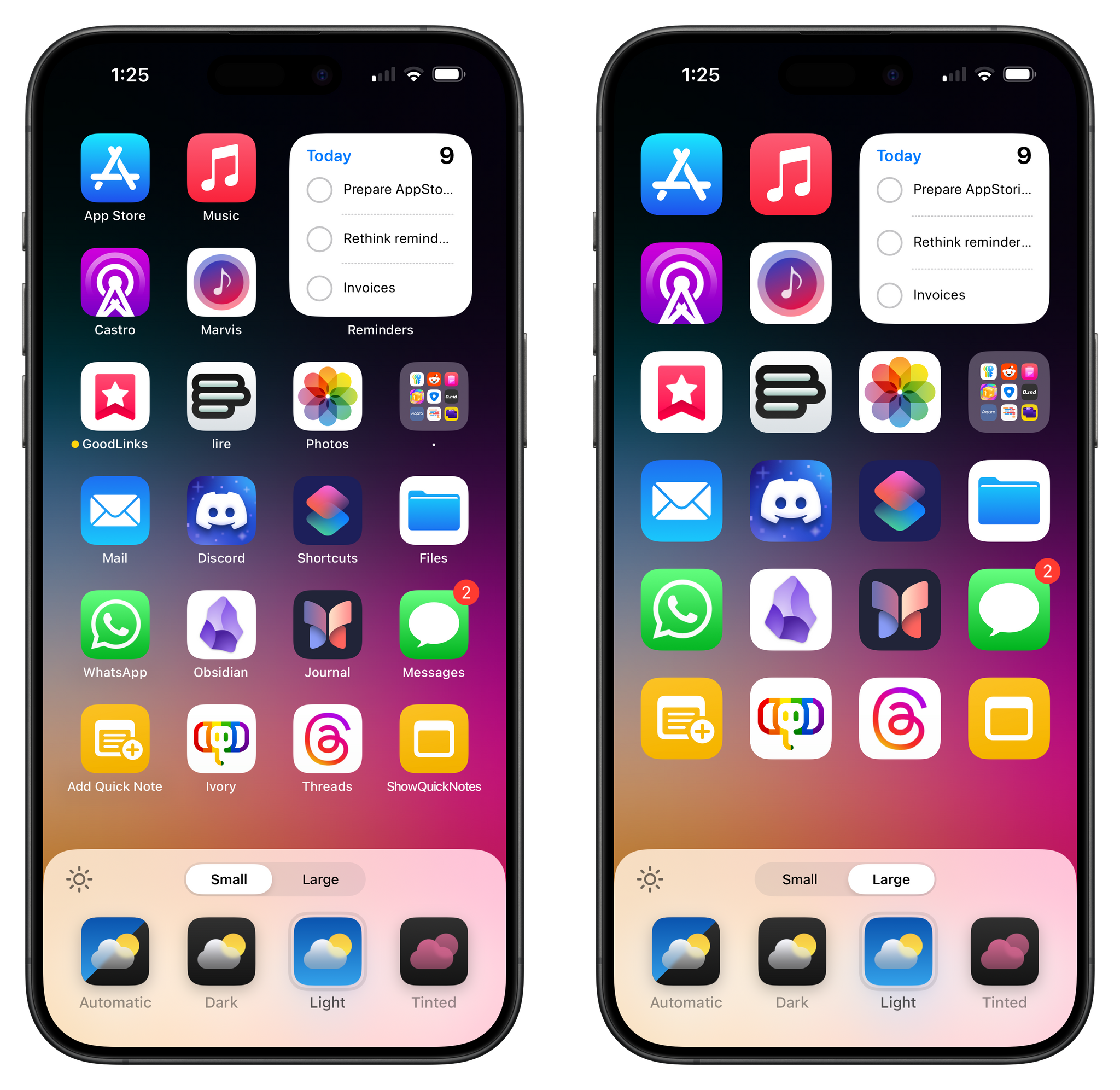
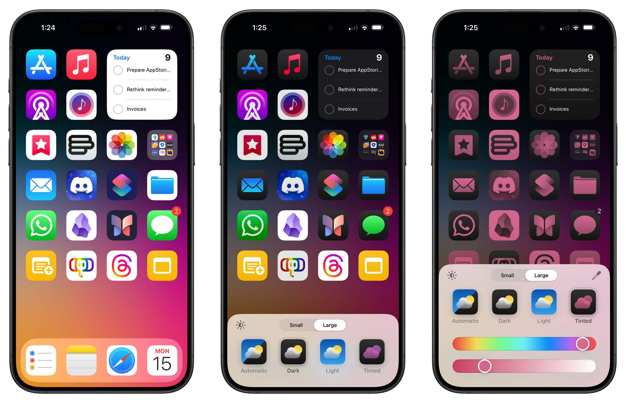
Let’s start with the part that’s not for me this year: Home Screen customization and icon theming. At a high level, Apple is bringing three key changes to the Home Screen in iOS 18:
- You can now place app icons and widgets anywhere, leaving empty spaces around them.
- You can make app icons larger, hiding their text labels in the process.
- You can switch app icons to a special dark mode version, as well as apply any color tint you like to them.
Of these three changes, I’ve only been using the setting that makes icons larger and hides their labels. I think it makes my Home Screen look more elegant and less crowded by getting rid of app and shortcut titles underneath their icons.
As for the other two changes…they’re really not my kind of thing. I think the ability to freely rearrange icons on the Home Screen, going beyond the limitation of the classic grid, is long overdue and something that a lot of folks will joyfully welcome. Years ago, I would have probably spent hours making dynamic layouts for each of my Home Screen pages with a particular flow and order to their icons. These days, however, I like to use a single Home Screen page, with Spotlight and the App Library filling the gaps for everything else. And – as you’ve seen above – I like filling that Home Screen page to the brim with icons for maximum efficiency when I’m using my phone.
I don’t foresee a scenario in which I voluntarily give up free space on my Home Screen to make it more “aesthetic” – including on my iPad, where this feature is also supported, but I’d rather use the extra space there for more widgets. At the same time, I know that literally millions of other iPhone users will love this feature, so Apple is right in adding support for it. As a meme would put it, in this case, I think it’s best if people like me shut up and let other people enjoy things.
It’s a similar story with icon tinting, which takes on two distinct flavors with iOS 18. Apps can now offer a dark mode icon, a great way to make sure that folks who use their devices in dark mode all the time have matching dark icons on their Home Screens. Generally speaking, I like what Apple is doing with their system apps’ icons in dark mode, and I appreciate that there are ways for developers to fine-tune what their icons should look like in this mode. My problem is that I never use dark mode – not even at night – since I find it too low-contrast for my eyes (especially when reading), so I don’t think I’m ever going to enable dark icons on my Home Screen.
The other option is icon tinting using a color picker, and…personally, I just don’t think it looks good at all. With this feature, you can effectively apply a color mask on top of every app icon and change the intensity of the color you’ve selected, thus completely disregarding the color palettes chosen by the app’s creator. To my eyes, the results look garish, to the point where even Apple’s promotional examples – historically, images that are meant to make the new version of iOS appear attractive – look awful to me. Are there going to be people out there who will manage to make a tinted layout that looks nice and that they’re going to love? I’m sure. And this is why user customization is important: we all have different tastes and needs, and I think it’s great when software doesn’t judge us for what we like (or dislike) and lets us shape the computer however we want.
I want to wrap up this story with the one customizable feature that I adore in iOS 18, and which I know is going to define my summer: the new Control Center.
In iOS 18, Control Center is becoming a multi-page, customizable affair. Controls now come in multiple sizes, and they’re powered by the same technologies that allow developers to create widgets and Shortcuts actions (WidgetKit and App Intents). This rewrite of Control Center has some deep ramifications: for the first time, third-party apps can offer native controls in Control Center, controls can be resized like widgets, and there is a Controls Gallery (similar to the Widget Gallery on the Home and Lock Screens) to pick and choose the controls you want.
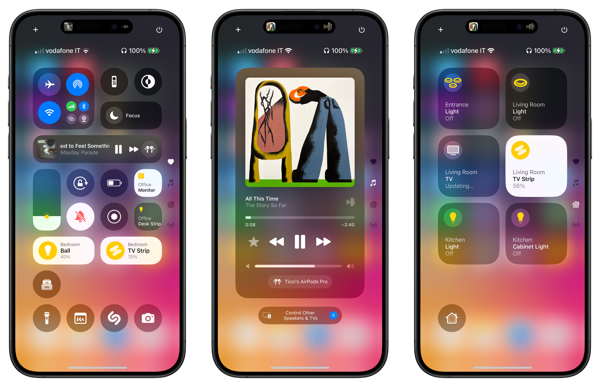
The new Control Center can span multiple pages with support for resizable controls and third-party ones.
Given the breadth of options at users’ disposal now, Apple decided to eschew Control Center’s single-page approach. System controls have been split across multiple Control Center pages, which are laid out vertically (rather than horizontally, as in the iOS 10 days); plus, users can create new pages to install even more controls, just like they can create new Home Screen pages to use more widgets.
Basically, Apple has used the existing foundation of widgets and app intents to supercharge Control Center and make it a Home Screen-like experience. It’s hard for me to convey in an article how much I love this direction: app functionalities that maybe do not require opening the full app can now be exposed anywhere (including on the Lock Screen), and you get to choose where those controls should be positioned, across how many pages, and how big or small they should be.

You can customize Control Center sort of like the Home Screen by rearranging and resizing controls. There is a Controls Gallery (center) and controls can be configured like widgets, too.
If you know me, you can guess that I’m going to spend hours infinitely tweaking Control Center to accommodate my favorite shortcuts (which you can run from there!) as well as new controls from third-party apps. I’m ecstatic about the prospect of swapping the camera and flashlight controls at the bottom of the Lock Screen (which are now powered by the same tech) with new, custom ones, and I’m very keen to see what third-party developers come up with in terms of controls that perform actions in their apps without launching them in the foreground. A control that I’m testing now, for instance, starts playing a random album from my MusicBox library without launching the app at all, and it’s terrific.
So far, the new Control Center feels like peak customization. Power users are going to love it, and I’m looking forward to seeing what mine will look like in September.
iOS and iPadOS 18
There’s a lot more I could say about iOS 18 and its updated apps today. I could mention the ability to create colored highlights in Notes and fold sections, which I’m using on a daily basis to organize my iOS and iPadOS research material. I could point out that Journal is receiving some terrific updates across the board, including search, mood logging based on Health, and integration with generic media sources (such as third-party podcast apps and Spotify, though this is not working for me yet). I could cover Messages’ redesigned Tapbacks, which are now colorful and finally support any emoji you want.
But I’m stopping here today, because all of those features deserve a proper, in-depth analysis after months of usage with an annual review this fall.
Should you install the iOS and iPadOS 18 public betas today? Unless you really care about new features in system apps, the redesigned Photos app, or customization, probably not. Most people will likely check out iOS 18 later this year to satisfy their curiosity regarding Apple Intelligence, and that’s not here yet.
What I’m trying to say, though, is that even without AI, there’s plenty to like in the updated apps for iOS and iPadOS 18 and the reimagined Control Center – which, given my…complicated feelings on the matter is, quite frankly, a relief.
I’ll see you this fall, ready, as always, with my annual review of iOS and iPadOS.
You can also follow our 2024 Summer OS Preview Series through our dedicated hub, or subscribe to its RSS feed.


