Cody Fink

1547 posts on MacStories since January 2010

Former MacStories contributor.

This Week's Sponsor:

1Blocker

A Cleaner, Faster, and More Private Web Experience


iPhone 4S Now Available for Pre-order

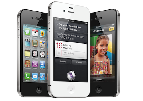
The iPhone 4S is now avaialble for pre-order at Apple.com | UPDATE: store.apple.com is struggling to process orders due to high demand. See below for carrier websites as alternatives.

  • AT&T: We’re hearing reports that their site isn’t any better off than Apple’s. You can give it shot — we also hear that due to the volume of requests, Apple is sending customers reservation #’s to complete their orders at a later time.
  • Sprint: When we last checked, Apple was telling new Sprint customers to visit retail stores (only previous customers are eligible to upgrade to the iPhone 4S). Sprint’s website, however, is taking orders for new customers and offers AppleCare+ for $99, and will ship Oct 14th - 15th if you get in.
  • Verizon: Verizon’s site is holding up well (you can probably check out now without issues), but they don’t offer the $99 AppleCare+ plan (there are monthly Verizon equipment plans instead, and you can decline insurance).

It’s dangerous to go alone. With Siri, it’s like having your own Navi in your cap. It understands natural speech, and has the capability to learn your voice over time. Siri is your personal assistant, and is only avaialble on the iPhone 4S.

With the 4S, available in white and black in 16 GB, 32 GB, and 64 GB models ($199, $299, $399 respectively) on AT&T, Sprint, and Verizon, you’re bound to find adventure with limitless access to the world’s GSM networks no matter what carrier you choose. But no sword is good without a shield. Apple’s AppleCare+ will give you up to two occurrences of aciddental damage for quick repairs.

The iPhone 4S is everything you could have wanted in the iPhone 5. Dual-core 1 GHz A5 processor. 8 MP camera customed designed to give you the sharpest pictures. A brand new antenna that switches to give you the best signal. And the best part? It’ll be on your doormat in a week.

*  *  *

On the fence? I personally consider the iPhone 4S to be a significant upgrade in both hardware and software. iOS 5 may be old news for the geeks “beta-testing” the software over the summer, but in reality it’s brand new software that adds many layers of functionality to Apple’s mobile devices. Combined with the the iPhone 4S, you’re getting everything you wanted in the iPhone 5, sans the screen you were promised by wild rumors and speculation, and not by Apple.

Remember the 3GS update? It was a serious update, and we’re seeing the same thing happen to the 4S. If you have an iPhone 3G or 3GS, I wholeheartedly recommend the update. It’s everything you love about your Apple phone, but better. If you’re hung up on the plan, I suggest reading our very brief rundown. TiPb says that the iPhone 4S upgrade is a no-brainer for anything less than the iPhone 4.

If you need additional convincing, Jim Dalrymple can help.


iPhone 4S Voice and Data Plans: AT&T vs. Sprint vs. Verizon

iPhone 4S Voice and Data Plans: AT&T vs. Sprint vs. Verizon

If you’re looking for the cheapest possible monthly deal, Sprint wins, with a total monthly cost of $99.99 for 900 minutes, unlimited texting, and unlimited data.

Excellent roundup of plan prices from PC Magazine. Contrary to the above, what I’ve found is that you can get the cheapest plan on AT&T, but you’re only going to get 450 minutes and 200 MB of data without a text messaging plan to pull it off. No frills here, but you’d only have to pay $55 a month. If you’re on WiFi a majority of the time, your friends have iPhones (for iMessage), and have good AT&T coverage, this is your budget plan.

The best overall plan would go to Sprint. The nights and weekends given are good, 450 minutes, and unlimited data and text messaging will net you a solid plan for $80 a month. Pricey, but cheaper than AT&T and Verizon for similar upgrades. Keep in mind the “unlimited data” is around 5 GB, though this was true for Verizon as well when they carried unlimited plans.

If you want the best coverage, Verizon is likely going to be your choice. I have never had a signal problem with Verizon no matter where I ended up in my travels, although call quality is lacking in my opinion. Verizon is a good choice if you want better text message flexibility (250 messages for example) where AT&T gives you none, although you don’t have the same choices with data use.

[via OS X Daily]

Permalink

Keep it Memorable, Stupid!

Image credit: Done by Emily Carlin on Flickr

KIMS, unlike KISS (Keep it simple, Stupid!), is removing the notion that we have to toss out our complicated, but memorable systems in favor of simple workflows. I think throwing away what works is the wrong way to go about changing your workflow or lifestyle for the better.

In looking for a simpler way to do something you’ll be presented with tools, pitched ideas, and told that your quality of life will be better if you take this system you have now and simplify it. I think the big problem is that people tend to confuse the words simple and minimalism. To say I should simplify my workflow is to say I should throw out my system because it’s inefficient. That might be true if I was to compare how productive I am to how productive you are. However, our jobs are likely different and even if they were the same, it’s like comparing how well I run to a guy who’s been running in marathons for the last twenty years. You can only accurately measure and reference yourself!

Where I make my case is that you shouldn’t toss a memorable system for the sake of minimalism. Text files for example are extremely minimal, but not many people want to go commando and start setting up areas of focus in Dropbox, when tags and journals in Evernote are much easier to manage for lots of people. You’re told you should do this thing because you’ll ultimately be more productive or you’ll remove a point of stress and clutter in your life, but I have a feeling that the transition and “attempt” (because you’ll never really stick with this minimal system) is going to be a point of stress itself.

Read more


TV Show Tracker 2.1 Giveaway: You’re Gonna Need More Shows to Watch

If you watch a lot of TV, live on the Internet, and can’t remember when House airs, then you’re probably already using TV Show Tracker right? We’ve been covering the big updates all along, and I gotta say that there’s lots of new goodies to chew on. Take the Watch List for example. Everything you missed watching will be stored in one convenient place so you can check it off once you get down mowing down the bag of half baked doritos in front of the TiVo. Those unwatched episodes will also show up as application badges (because it’s pretty critical if you miss out on the first episode of The Office). Tapping on a show in your favorites list now takes you directly to their show page, and in the preferences you have the app open into the schedule so you don’t miss a thing. Combine that with a new icon, and the latest update to TV Show Tracker just makes finding dramas on the boob tube pretty easy.

So how much does it cost? It’s on sale for $0.99 until Saturday evening — it’s super useful to see when your favorite two political comedians are coming back from vacation as well.

But we’re giving away five copies to you delightful, handsome (beautiful for the lady-girls out there) MacStorians, so you’ll want click past the break for the full rundown.

Read more


Marked 1.2: Rewritten from the Ground Up

This one goes out to all the Markdown nerds out there (I’m one of them). Marked 1.2 is out, and it’s packed with tons of new features. The interface should be pretty familiar, although you have to like the new persistant word count that you can toggle on and off. CSS styles have been changed up a bit (if you’re not using your own — I used Horizon which is similar to the multi-column style), but asides from the tweaks on the surface of Marked, we have some usability improvements that should make everyone really happy.

Directly interact with the preview and source code using standard highlighting and copy shortcuts to grab text and quickly paste it in the application or web service of your choice. Bundled inside is a new MultiMarkdown 3 binary that’s efficient and better handles big files (for those writing another “Hitchhikers Guide to Markdown” manual), along with web document presentation and compatibility for everything from HTML and ERB (that’s Ruby shenanigans for those wondering). Hit command+E to edit text in your favorite editor, or find where you put down the Master Sword with command+R to bring the file into view from the Finder. Not geeky enough? Marked does a better job of knowing where you are in the document, and will even follow along if you’ve reached the bottom of the page. You can limit text width in the preview, supress link highlighting if you’re going to print (yes, printers till exist), and opening new preview windows can be opened to float on the desktop.

That’s just scratching the surface of what’s available in Marked if you write in Markdown — I use it on a daily basis here at MacStories, and I’m sure you fellow Geekstorians will find it just as useful. Check out the changelog to Marked (it is MASSIVE), read Brett Terpstra’s update, and check it out on the Mac App Store (it’s only $2.99).


OmniOutliner for iPad 1.1: Text Search, Row Splits, Line Breaks, and More

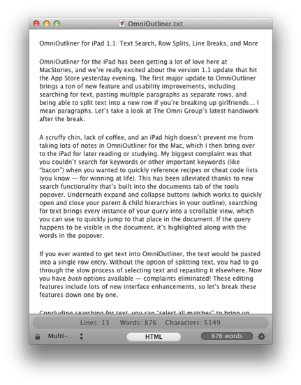
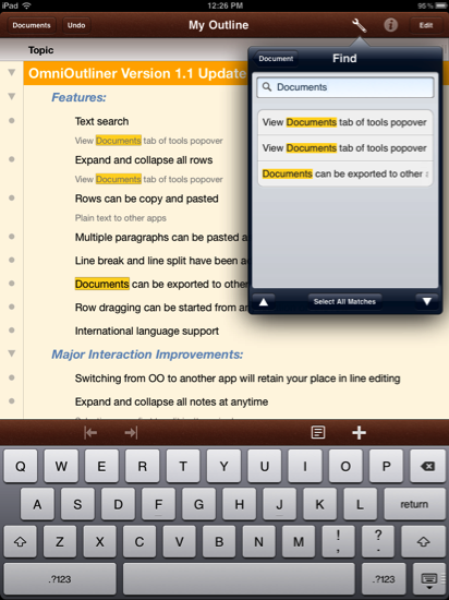
OmniOutliner for the iPad has been getting a lot of love here at MacStories, and we’re really excited about the version 1.1 update that hit the App Store yesterday evening. The first major update to OmniOutliner brings a ton of new feature and usability improvements, including searching for text, pasting multiple paragraphs as separate rows, and being able to split text into a new row if you’re breaking up girlfriends… I mean paragraphs. Let’s take a look at The Omni Group’s latest handiwork after the break.

Read more


Tweetbot 1.5: Muting is Forever


Well, it’s finally here. You asked for it — you wagged your finger about it — you hate the people you follow on Twitter so much that you don’t want to hear another peep out of them, yet deep down you don’t really want to get in one of those uncomfortable, “Why did you unfollow me!?” moments. Or maybe someone’s had a little too much caffeine and you just need a break. With Tweetbot 1.5, you can mute those pesky over-tweeters and keep meme-esque hashtags from cluttering your #pantsfree timeline. Although I hear there’s a self desctruction mechanism built in if you ever mute #tweetbot.

Read more


From the boneheaded design file: Browsing Versions in Lion

From the boneheaded design file: Browsing Versions in Lion

While some knew of the feature, and were anxious to use it, they couldn’t find it. I would have expected a function that deals with a file to be on the File menu. Nope. Apple has it in the title bar, just where you are sure to miss it. […] When you finally do figure out how to browse your versions, your entire desktop changes, and you wind up in the Time Machine GUI (which Apple calls “The Star Field”), even though you never invoked Time Machine. As my colleague Erica Sadun points out, why introduce another system?

Mel Martin on TUAW discusses how Versions (and similiarly the Auto Save functions in the titlebar of an application) are confusing to use and hard to find compared to the already intuitive menubar (the second place people look after they can’t find something in the toolbar). Let’s talk about Mel’s points real quick: why did Apple make versions so… spacey?

The biggest reason is because it simply draws parallels with Time Machine. Apple wants to associate anything that has do with recovering files with the paradigm of literally being able to travel back in time and pull in old documents (in Versions’ case, pull in old bits of text or images you initially revoked which is both very hands-on and extremely powerful). The separate UI exists so you visually see old changes and only bring back what you need — browsing a list with timestamps then manually merging two versions of the same document from your desktop doesn’t sound better either (especially since you then can’t see what changes were made without opening each old version).

I do think Versions would be good as a menubar item. I agree that new Mac users won’t look to the titlebar for accessing this feature (unless they’ve vigorously read Apple’s Lion pages). When people look to try out new features (and don’t know where to find them), I imagine they try to search for the menu item through Help as I often do. In Versions’ case, it’s nowhere to be found. I think Versions’ UI itself is okay, albeit sometimes buggy and slow which will be improved, but getting there can be the issue.

Permalink

Steve Jobs Biography Gets A Classic Cover

There are many pictures of Steve Jobs, and perhaps one of the most iconic is the scraggly bearded CEO posing for the camera, hand up to his chin as he imagines Apple’s next greatest device (at least I like to think that). The image will also be making an appearence on the cover of Walter Isaacson’s biography of Jobs (previously: The Book of Jobs), can be seen on the Barnes & Noble storefront with a publication date set for November 21st. You can currently preorder the hardcover for $20.40 (list price is $32.50), with B&N’s digital eBook availalbe for $14.99.

[via AllThingsD]