Lukas Hermann

69 posts on MacStories since April 2012

Former MacStories contributor.

This Week's Sponsor:

PowerPhotos

The Ultimate Toolbox for Photos on the Mac


Review: Magellan Virtual Analog iPad Synthesizer

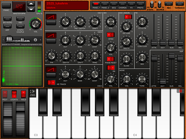
In my post about the current state of music-making and discovery on the iPad, I concluded with a roundup of the best, most sophisticated software to professionally create music on the iPad. As I did with shuffler.fm and discovery, I would today like to add a new app to the list of the best software synths available for the iPad. The app that I found worthy of being added is the newest product by music software company Yonac Inc, called Magellan.

Yonac made a name for itself by producing an extensive amount of music-related apps since early 2010. One of their most elaborate and popular efforts has been the Shredder guitar synth to create analog and digital synth leads or pads by playing guitar into the iPad through an interface like the IK Multimedia iRig or the Apogee JAM. The company was also right there when the iPad got unveiled. They developed and promoted one of the very first synth software for the iPad, the Yonac miniSynth.

Magellan is their new masterpiece. It’s a fully fleshed-out virtual analog synth with a lot of power. Let me sum up its basic feature set: two synthesizer engines running at the same time, each of them equipped with three oscillators for basic sound generation, frequency modulation, a step sequencer, and two filters plus eight effects. The app has got an easy to understand interface and produces an immense variety of sounds in very high audio quality. This review not only judges the quality and usability of Magellan, I will also give so detailed instructions and tricks so that you immediately can start making sophisticated music tracks with the app right after you’ve downloaded it. So, if you are curious, stay a while and let me explain you how Magellan works and why it may become a strong competitor to other high-end iPad synths like the KORG iMS-20 or the Sunrizer.

Read more


Flip’s Escape Offers Tons Of Pixel Fun For iOS

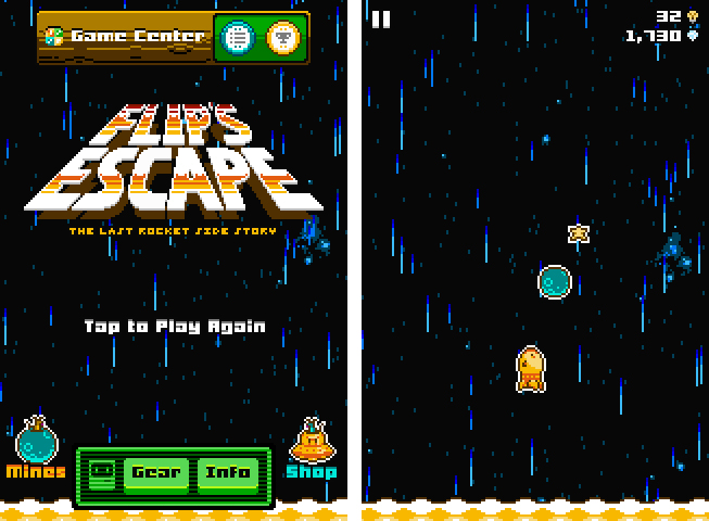
Last week, Shaun Inman (creator of the popular statistics and RSS server software Mint and Fever)’s newest game, Flip’s Escape, got approved by Apple. It ties in with the loose storyline of The Last Rocket after escaping from the collapsing factory. Flip, the rocket you play the game as, needs to flee from the shockwave which resulted from a large explosion. At the same time Flip has to avoid colliding with asteroids during his epic escape. Read more


Review: Things 2 With Cloud Sync

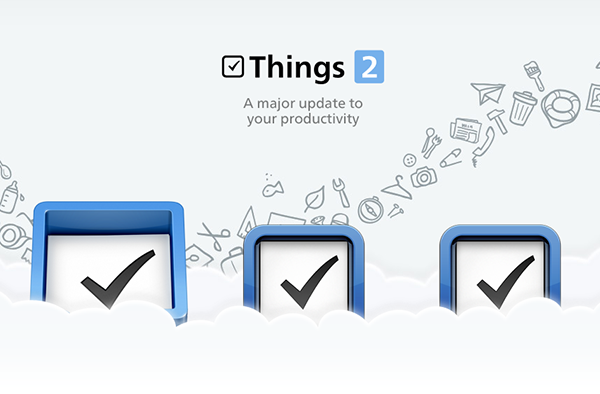
Things by Cultured Code, a developer company based in Stuttgart, Germany, has been around since the day the App Store and iOS 2.0 were unveiled. The app is famous for its minimalist, iconic interface and features which are a perfect mix of simplicity and serious business from the very first version on. It’s the perfect example for the ethos of “If 1.0 sucks, all other versions will suck as well”, it was done right the day it came out.

Yet, the first Things just didn’t work for me — I don’t know why, but it didn’t stick. I’ve never tried out other solutions, neither complex workhorse that is OmniFocus, nor have I tried a basic to-do app like Remember The Milk. The last three years, I was a Simplenote guy. I’m really into minimalism; in fact, that’s the reason why I initially desperately wanted to try out Things. But Simplenote worked better than Things for me. You could paste anything into it and the new content would be immediately available across all your devices, and on the web. My notes were always with me. And after I found Notational Velocity for Mac, a Simplenote desktop client, I completely stopped searching for other solutions.

But now, Things have changed. After over a year of beta testing, Things 2 with Cloud sync has finally arrived, and besides its big syncing feature, it’s got a bunch of other cool refinements and new possibilities along the way. Read more


Shuffler.fm Is The Perfect Tool For Genre-Specific Music Discovery

About a month and a half ago, I published a post about the current state of music making and discovery on the iPad. In the first part of that post I listed, described, and analyzed some prominent apps for discovering new music on the iPad. I concluded that these apps are state of the art when it comes to discovering music. Last week, while searching for music integration features for a music blog I run as a side project, I stumbled upon shuffler.fm. And after using it for some days now, I wish I could rewind time and add this service to the list in my music editorial, because it does something the other apps like Aweditorium or even radio apps like Tuner do not offer: it combines genre-specific music discovery with reviews and critical opinion. Read more


Ecoute Is The Best Music Player For iOS. Period.

Since I started to write about UI design and iOS apps again 5 months ago, I became more and more disappointed with the native music player on my iPod touch. During my research, I found many innovative modifications of the iOS table view, and I often wished that Apple will integrate some of them into their system apps, especially their music player. But since Apple is a company that believes in radical minimalism and coherence throughout its ecosystem, this never happened and also won’t likely happen in the future. I tried out many alternatives like GoodMusic, but no app was able to satisfy both my design and usability needs on my iPod touch. Until yesterday. Yesterday, Pixiapps released Ecoute for iOS.

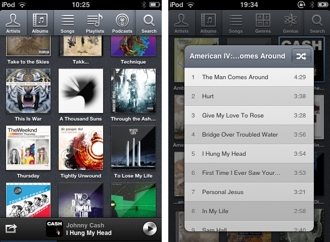
Ecoute for Mac has been the app Pixiapps focused on during the last years. It is a minimalist, easy to use iTunes replacement with iconic UI and many cool hotkey and playback features. I’m still an iTunes guy, because I need a reliable solution for managing my over-1100-record digital music collection. But Ecoute for Mac was the first app which really made me think about switching my desktop music player. And now, Ecoute debuts on the iPhone. Although the app is promoted as “Ecoute for iOS”, there is no iPad version available yet. For me this is not really a problem — I like the semi-skeuomorphic design of the iPad music player very much and was never seriously thinking about replacing it. But when I opened up Ecoute on my iPod for the first time, I immediately knew that this was exactly what I’ve been searching for. I basically want three things in a mobile music player: easy navigation, intelligent gesture integration for flawless in-app movement, and a focus on album artwork. Except for some flaws in terms of navigation, Ecoute measures up to all these requirements. Read more


It’s Getting Partly Cloudy On Your iPhone

Yes, here’s another weather app review for you. Instead of inventing new intros for these posts, I would like you to think about that special day when an iOS developer combines all of the single ideas of the new weather apps available - from minimalist UI elements over cool animations to perfectly displayed and visualized data - into one single application. We could finally purchase the perfect weather app for our iOS devices, and we no longer need weather app reviews like this one.

But we still desperately search for and find new, special, almost perfect weather apps with features every month, download them, try them out, and then what? We send them back into the black app hole of washed-out, used apps after some weeks, just because they do not fit our individual needs and style, and then the cycle starts again. If I’m right, this will always be the case, especially when it comes to iPhone weather apps. I believe that no UI concept in the world could visualize all important weather data possibly needed while still having a totally intuitive and simple UI on such a small screen size. On the iPad, the situation is a bit different. My personal weather app of choice for the iPad is now Weather HD 2, which I recently reviewed, because of its stunning animations, which make impressive use of the device’s Retina display. Although I won’t go away from Weather HD, there are also many other apps for people with a different taste in UI design, like minimeteo for lovers of minimalist UI or Aelios for fans of polished interfaces.

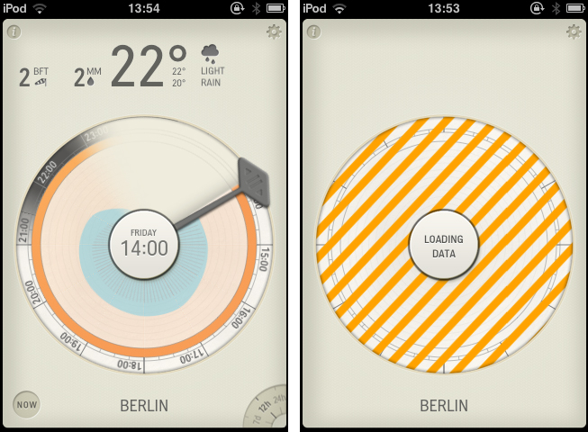
Today’s subject, Partly Cloudy, an iPhone app by German development cave Raureif, is perfectly suited for data visualization geeks. The app displays a rather limited set of weather information: temperature, wind speed (measured using the Beaufort wind force scale), precipitation and the overall current outlook. Its forecast view can be set to 12 hours, 24 hours and 7 days. All other imaginable features, like cloud movements or visibility range apps like WeatherSnitch advertise with, were completely left aside in order to provide space for Partly Cloudy’s most interesting feature: the radial clock visualization diagram.

Read more


Kuvva — Beautiful Art For Your Desktop. Automated.

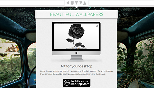
Currently, in the San Francisco Museum Of Modern Art, you can visit an exhibition with works of Japanese photographer Naoya Hatekayama. He has a very extensive portfolio of stunning landscapes, buildings, and Tokyo underground photography, which reach very high auction prices. One of his underground photos really caught my eye, and I dreamed of having it as a homescreen wallpaper for my iPad. I desperately tried to find digital copies of his works, regardless of whether I could get them for free or had to spend some money. But usually, professional photographers, including Hatekayama, only show their work to the public through museum exhibitions and printed photo books, not digitally. This way of publishing art has both advantages and disadvantages: on one hand, printing is the only effective way of keeping the copyright handling of your pictures and piracy of digital copies somewhat under control. Yet, it also means that many people interested in photography, especially those who do not live in big cities with renowned museums exhibiting photography, don’t have access to it. And obviously they cannot be used as wallpapers (although this would be for private, non-commercial use).

On the other hand, art which was created digitally is most of the time solely distributed digitally, hence it’s often available as a free download. However, when it comes to wallpapers for both OS X and iOS, I personally prefer photos over digital art. Of course, real pixel lovers need good resources for both kind of background images to ensure their displays are always a pleasure to look at. Websites like InterfaceLift or Poolga may completely satisfy your needs for photographic and digitally crafted backgrounds, but you always need to rely on multiple resources, which means you have to spend a lot time searching, saving, and organizing. Kuvva, founded by @djbradfield and @Nalden and based in Amsterdam, is a new web-based application project that tries to solve this problem by building up an extensive resource of handpicked photographs and digital wallpapers you have fast and easy access to. Read more


I Want A Simple Event-Planning App. Pronto!

There are many people in the Apple community who dislike the native Reminders app on iOS. When it was introduced in October last year, location-based alerts, the promise of flawless iCloud Calendar and alert syncing, and even its skeuomorphic UI seemed to be a pretty good deal. However, until the release of Reminders for Mountain Lion at the end of July, syncing with iCloud consistently led to annoying problems like doubled or missed alerts, and sometimes even data losses. And the recent debate on Apple and skeuomorphism made many people change their mind about the interface as well. Hence, just like with notes, weather, and stocks apps, there is still a healthy environment for third-party todo, reminders and event organization apps although Apple offers a native system app solution. Personally, the only thing that really struck me about the native Reminders app was its simplicity and visual minimalism. Simplicity is always a very important aspects when I think about replacing system apps with third-party solutions. Pronto by Createful is one that meets these requirements. Plus it looks great.

Pronto is a simple iPhone app for planning and organizing events. Before I dive in deeper into its feature set, it’s important to say that the app does not feature any syncing service like iCloud or Dropbox, not even with the iOS calendar app  (as is the case with Clear by Realmac Software). It’s an app suited for people who solely want to use their iPhone (or iPod touch) for calendaring and event planning. So if you’re often switching between devices and want to keep your events and alerts in sync, Pronto is no solution for you.

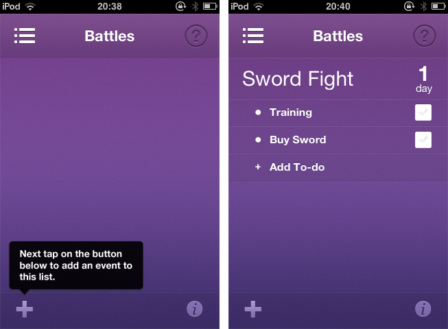
When you launch Pronto for the first time, you catch sight of the app’s main (and only) screen. Here you can create and organize categories to sort your events in, e.g.: birthdays, vacation, or work. You do so using the plus button in the lower left corner of the screen. After you created a list with several categories, tap one and you’ll get to the list of events in the respective category, beautified with a smooth slide effect. Now you can start creating single events. Just tap the plus-button again and start typing in the keyboard panel, which immediately pops up. Then set a date using a a nicely customized wheel panel, and your event is created.

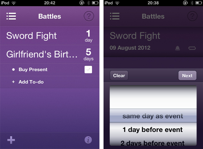
More or less every event needs some preparation. Pronto helps you to remember everything you have to handle before the event takes place with a simple event todo list connected to it. Tap on any event in the list, then on “Add To-do” in the bulleted list that faded in to create a new task. You can add as many as you like, and check them on the right side of the list after completion. You won’t forget anything; no more birthday partys without cakes and candles. Additionally, you can swipe over any event to edit it: you can rename it, delete it, enable system-wide reminder alerts (set to 1 to 30 days before the event), and make it a recurrent event (monthly or annually). This is Pronto’s whole feature set. As you can see, it is pretty limited, and there are definitely many apps out there with more useful features for just a little more money. If you search for complex but detailed functionality in your new digital event planning companion, Pronto is not suited for you.

But if you’re after cool use of gestures and inspiring UI design, you should definitely take a look at it. Pronto’s violet single-color design is very eye-friendly and “anti-skeuomorphic”. It features nice, big typography, and the background gradient subtly supports the 3D effect of the list elements, which is very nifty. The little details, like the checkboxes, the modified buttons above the wheel pickers, and the pictograms in the editing panels, really made my day. The design also makes the UI very transparent, sometimes even invisible. There are moments when you forget that you’re using a hardware device — your fingers and the app work so perfectly together. All UI effects are smoothly rendered and synced with your taps and swipes. And the already mentioned transitions and fading in elements look gorgeous, even on usually considered old devices like my iPod touch 3rd Gen which has rather low graphics performance.

So, if you’re a pixel nerd, go ahead and download Pronto for free from the App Store. Right now. And if you’re not, but you are searching for an event planning app for your iPhone, I urge you to try it, too. Maybe its minimalist feature set fits better to you than the complex functionality of tools like Things or Omnifocus.


Apple by CLOG — A Book Review

I usually do not read books about Apple, the web, or design related topics. There are enough weblogs and people on Twitter linking to all kinds of content about more or less everything, so I usually don’t need additional resources in the form of printed paper. When I need to delve into the technical details of a particular topic, I’ll pick up a book so that I can soak up that in-depth knowledge. And it usually is safer to buy technical books, because you can ensure that the text it contains is professionally well researched, written, and edited by people who care about the subject, thus the chance of reading erroneous information is quite low. I especially want that kind of comfort when it comes to quite precarious subjects like art (and its “subgenres” like typography and architecture) or company ethics and philosophies. You need a strong education in history, development, current techniques, and standards of creation in the respective fields to discuss them precisely. Call me conservative, but I want to read such explanations on printed paper, written by people with years of experience and knowledge.

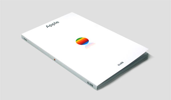
During the last three weeks, I was on a circular trip throughout the United States. It was my first time I got to see the country. Besides stunning cities and beautiful landscapes, I also got to see many Apple location highlights, including the 5th Avenue Store in New York City and the Yerba Buena Center Of The Arts in San Francisco, which in my mind will always feature the colorful Apple banner promoting the iPad presentation in 2010. Just blocks down the road from the YBCA, inside the San Francisco Museum of Modern Art museum store, I found the book I’m about to present now: “Apple” by CLOG.

Read more