Lukas Hermann

69 posts on MacStories since April 2012

Former MacStories contributor.


Review: Found

“cmd” + “space”. This is by far the most common and important keyboard shortcut in Mac OS X; opening Spotlight for quick file access. More or less every sophisticated Mac user types this key combination multiple times a day. What if now a developer says “let’s replace Spotlight with a new app that not only scans local data, but Dropbox and Google accounts as well”. Many might find that idea disconcerting and even scary, but for those of you who are interested in an alternative to Spotlight searching on the Mac, you might like Found by Found Software Inc.

After installing the app, Found can be, (attention, bad pun) found behind a menu bar icon. Clicking on it brings up an iOS Notification Center-like interface with an activated search panel at the top, which slides in on the left side of the screen (this means it also works great when in full-screen mode on OS X Lion). Found can also be toggled using a double tap on the ‘control’ key. I know, many people dislike double taps, especially on “real” keyboards, but I personally found it pretty useful, since it is faster to tap twice on one button than using a special key combination while typing. The result of all this was that it flawlessly integrated itself into my writing workflow - Found’s first big advantage compared to Spotlight. The second advantage was that this super quick method allowed me to quickly search and find the name of a song I desperately wanted to hear - much quicker than disrupting my work to go to iTunes and fumble around finding it there.

Read more


Just Type, And You’ll Get Your Perfect Quick Note-Taking Companion

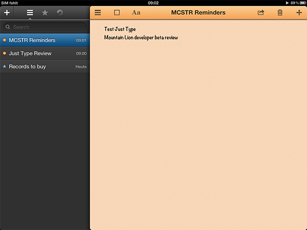
When it comes to notetaking, I’m a Simplenote guy. I work a lot on the road and love typing on my iPad, so I need a syncing service to have all my notes constantly updated on all my devices. Apple incorporated iCloud syncing in their own Notes.app in iOS 5, but I totally detest the app’s interface and standard note typefaces like Marker Felt, or please forgive me the mention, Comic Sans (not in Apple’s notes app of course, but in really bad third-party ones). When I discovered Just Type by Shubham Kedia on Beautiful Pixels yesterday I also immediately checked, if it has any cloud syncing service, and yes, it’s iCloud compatible, but there is no Simplenote support. Because of this, at first didn’t want to test it at all, since I use apps after the “never touch a running system”-method —meaning I’m always afraid when switching from a reliable app to a new one. After some investigation of app screenshots, I decided to install it on my iPad, and thank god I did. Its UI contains some of the best graphic elements I’ve ever seen (Just Type is an universal app, but I’ll only cover the iPad version today).

Read more


PaintCode Automatically Transforms Vectors Into Valid Code

Many developers have problems with designing their apps due to the lack of knowledge on how to transform their graphics into valid and working Objective C code. Because of this, many semi-professional designers either choose iOS-preset interface elements or they design just badly colored, two-dimensional fields. This obviously leads to many incoherent, poorly designed apps no one wants to buy. If you are not able to do better but still want to offer something in the App Store, this is the only way to do so - even if it’s a very malicious one for pixel lovers.

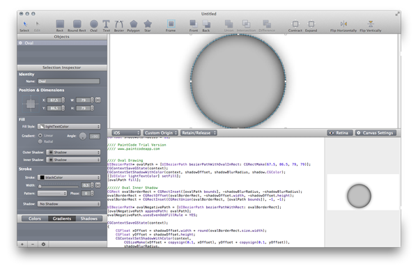
To give developers an edge, Pixelcut is now offering PaintCode for Mac. It combines detailed and full-featured vector creation with a powerful code compiler to immediately convert your created UI elements into valid Objective-C code, which is ready for copy & paste implementation in Xcode. When starting a new design, you can set for which device and canvas, in which code language and which canvas the app has to compile your design. Then you can start creating, for instance, a button with the various shapes the app offers (traingle, star, rectangle and much more), and optionally apply new colors or even gradients to it using the upcoming selection inspector. With every change and addition you make to your graphics, the code will instantly update in the small editor panel in the bottom of the app window. To see the immense amount of time the tool can save, have a look at the screenshot below. I tried the demo version of PaintCode and started out with a simple oval area, with a light outer and inner shadow applied (usually used to make an object seem plastic). Just these two small UI features need more than 40 lines of standard iOS ObjC code. For more complex (and better-looking) elements, this app is a outstanding time saver.

PaintCode is a tool every busy UI designer and app developer should consider buying. It has an immense feature set and works fast and reliable. You can check out and investigate the Xcode files of various design examples created and coded with PaintCode on the app’s website; there’s also a demo video of the app. If PaintCode seems useful to you then, get it on the Mac App Store for a quite expensive, but still justified, $99.99.


Apple Silently Updates The Mac Pro

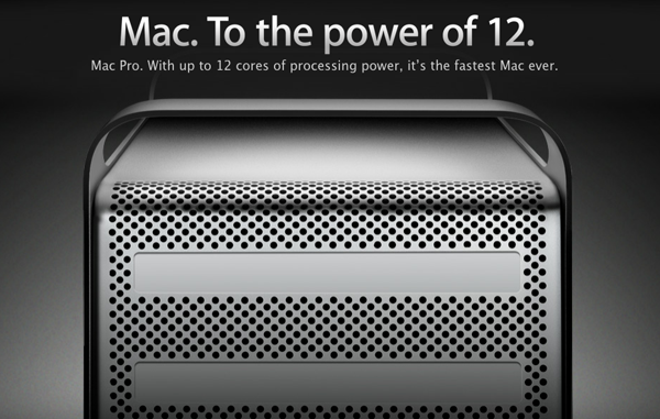
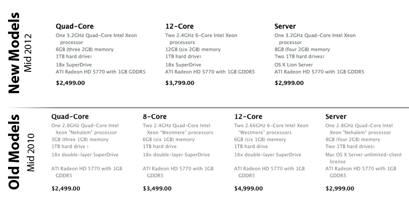
While presenting new MacBook Pro models with Retina display as their main stage act, Apple silently upgraded their Mac Pro line, which waited for an update for two years now. The basic model now features a 3.2 GHz Quad-Core Xeon processor, 6GB of RAM, with the rest of the specs remaining the same, priced at $2499, just like the old model.

Apple discontinued the 8-Core model. The new 12-Core model features two 2.4GHz 6-Core Xeons, twice as much RAM (12GB), with the rest of the specs remaining the same as well. Due to the slightly less powerful processor, Apple managed to immensely drop the price from $4999 to just $3799 for this new high-end Mac Pro model.

The Mac Pro Server with OS X Lion Server also got a small update: for the same $2999 price it now features a 3.2 GHz Quad-Core Xeon instead of a 2.8GHz model.

Check out a comparison with the old Mac Pro below.


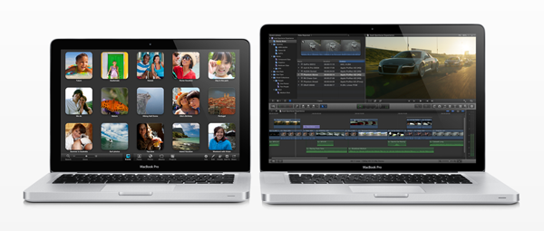
Apple Updates MacBook Pro Lineup: Ivy Bridge, USB 3, New Kepler GT650M, and More

Apple announced a major update to their MacBook Pro line at today’s WWDC 2012 opening keynote.

Featuring an nVidia GeForce 650M with the Kepler architecture and up to 1 GB of video memory, graphics performance improves over 60%. Connection possibilities include two USB 3.0 slots, FireWire 800, Gigabit Ethernet, a Thunderbolt port, audio line in/out (separated in the 15” model), SDXC card slot, and a 8x SuperDrive (they cancelled the Superdrive for the NextGen MacBook Pro with Retina display). In terms of wireless connectivity, Apple update the MacBook Pros to Bluetooth 4.0 and 802.11n as the remaining Wi-Fi standard.

The 13” starting model features a 2.5GHz dual-core i5 processor, 4GB of RAM, and a 500GB hard drive, starting at $1199. The second, bigger version comes with a 2.9GHz dual-core i5 processor, 8GB of memory and a 750GB hard drive starting at $1499.

The 15” starting model comes with a 2.3GHz quad-core i7. 4GB of memory, Intel HD4000 graphics and NVIDIA GeForce GT650M, and 500GB hard drive, starting at $1799. The upgraded 15” Macbook Pro features a 2.6GHz quad-core i7, 8GB of RAM, Intel HD4000 graphics and NVIDIA GeForce GT650M, and a 750GB hard drive starting at $2199.

Other extra configurations include faster i7 processors up to 2.7GHz, additional hard drive capacity up to 1TB, up to 8GB RAM, and SSDs up to 512GB. The 15” models can also get glare or antiglare displays with 1680-by-1050 resolution.

All these MacBook Pro models start shipping today. There is no 17” model. MacBook Pros, shipping today, come with Lion, and new customers will be able to upgrade to Mountain Lion for free. Below you can investigate the price and main hardware changes in comparison to the old MacBook Pro line (with the 17” model included). Past the break, we’ve also included the full press release.

Read more


Never Miss Cool Movies With Todo Movies

I suppose we all know that phenomenon: you’re watching a cool movie trailer and think “Boy, I just have to see this thing!” and then, several months later you realize that you forgot about it and it has already been released and everyone watched it in the cinema. To avoid that, I usually follow films or directors on Twitter or add them to my Facebook stream because those are the websites I visit every day. There are also some people who even set up reminders for release dates of things like books, music records or films. To outsource this reminding and give film lovers a companion to never forget any film you want to watch or miss a release date, Taphive introduced Todo Movies for iPhone.

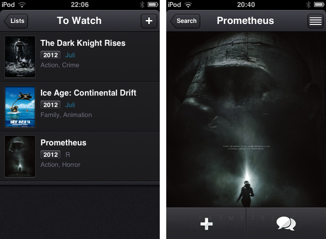
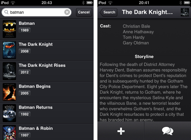
The app just serves the purpose of searching for movies using a simple search through the TMDb movie database, and afterwards adds those films to a list containing all the movies you want to watch. The search works seamlessly, but there is no live search while typing and until you hit the “search” button, you get a “no results” below the entering panel, which is always a bit confusing.

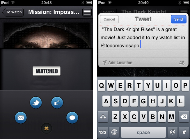
When you found a film you want to add to your list, tap on it to bring up the single movie window, which is almost completely filled up with a Retina-ready film poster, a move I really like, since this view transports the atmosphere of the respective film very well. From here you can either directly add it to your “To Watch”-list, or investigate its details a bit more by tapping the list button in the top right corner. If you do so, the screen flips and you can look at the film details like main actors, director, or a small summarization of its storyline.

The evolving lists of movies to watch and those you’ve already watched can then be sorted alphabetically, and after adding or release date. Optionally, you can let the app display the “unwatched” count as an icon badge using the apart from that nonexistent settings. If a movie you add is still about to be released in the future, you can let Todo Movies notify you using an iOS notification, when it’s finally out. The still awaited movies are also highlighted using a slight blue colored month info right besides the year they are released; this sets it apart from the otherwise monochrome UI.

Which brings me to (at least to me) the coolest feature of Todo Movies: its UI. You’ve already seen some screenshots of it, and I have to say that it’s way better when you use it. I very rarely cannot say anything bad about an app’s design, but this time, I couldn’t find any styling flaw at all. The transitions between windows are smooth, and the buttons are perfectly combined in both look and colorization. And the highlight for all UI fanatics lies within the sharing options, which can be brought up by tapping the speech bulb button in the single movie window. I deliberately did not mention this until now, because it’s one of the coolest thing I’ve seen to date: the sharing buttons for Twitter, mail, Facebook and iMessage are arranged around a central dismiss. When you tap that “x” dismiss button, they smoothly start rotating and this way roll back into the center; afterwards, the buttons hide and up comes the main investigation window again.

This feature alone showed me that Todo Movies was worth of my time. Not just its UI, but also its feature set justifies the app’s price. The only feature besides the search confusion I mentioned above I could imagine the devs to add is a kind of a “hot” or “coming soon” page as a starting points for new users or less nerdy people who remember every trailer they saw. But otherwise, I recommend this app to every movie lover out there. It looks gorgeous, works flawlessly and works the way it’s supposed to do. You can purchase Todo Movies for just $0.99 on the App Store.


New iPhone UI Concept Shows Mission Control, Dynamic Notification Badges, And More

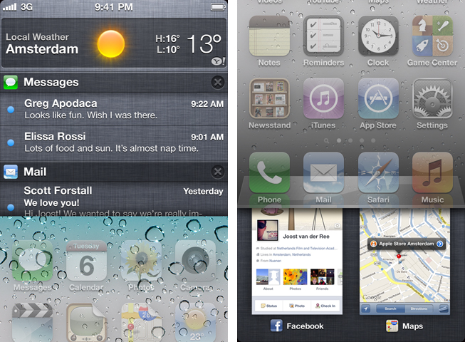
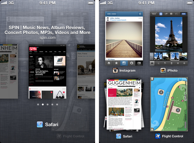
It’s pre-WWDC speculation time. This year, like most, many people think about what new features and capabilities the next version of iOS could include. After watching some concept videos (including one by Jan Micheal Cart) and reading some iOS 6 wish lists, designer Joost van der Ree also decided to present some of his ideas on how Apple could improve the usability of iOS in a short YouTube video.

Read more


Melo Simplifies Scrobbling to Last.FM

In times of paid music streaming services with more and more people using Spotify or rdio, the concept of last.fm seems outdated. Sharing music on a network not called Facebook, without having the ability of having music, friends and sharing options in a single, easy to use app has become less intriguing. But still, I consider the idea of last.fm a very striking one; always seeing the whole music archive of your friends provides a huge basis for discovering new music and artists, more than Spotify and its limited discovering options via friends and “apps” like the Domino Records showcasing. For actually listening to music, last.fm is still not the right choice. And this new menubar app called Melo for last.fm is not going to change that, but it simplifies the most basic feature of last.fm: archiving all played songs, called scrobbling.

Melo is solely connected to iTunes and the devices connected to it (Apple TV, iPod, iPad etc.). Using it with other services like Spotify is still not possible. Every song you play in iTunes (or imported from the devices and is then synced back to the Mac) automatically gets scrobbled by Melo. Its interface only consists of a drop down window with a bright grey frame, displaying the name and artist of the currently playing track. Additionally, using the two big, nicely pictogrammed button left and right to the track information, you can love the current track (this way it is not just scrobbled, but also added to your favorite song list on last.fm), and reach out to your own profile, which is then opened in your browser for deeper investigation of its status.

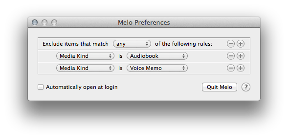
In the app’s Preferences, which are opened using the small button on the right side of the center area, you can exclude media from being scrobbled (presets include audio books and voice memos) using an Automator-like workflow; you can choose if the app should be automatically opened at start, and from here you can quit Melo, too. That’s it. Melo is not reinventing anything, it just eases up scrobbling with last.fm. It looks very nice, it’s intuitive, and it works flawlessly. If you dislike the native last.fm app, or are just using the scrobbling feature without being interested in any other feature of the service, Melo is for you. The only problem with the app is, its price may be a bit too steep for what it does. Melo can be purchased on the Mac App Store for $3.99


Fancy: A Social Network Curating Contemporary Product Design

Why exactly is creating new social networks still hip? In times where Facebook and Twitter are the central points in our social web life, new competitors seem to be doomed to fail the second they are unveiled. You need a huge, mind-blowing new idea with new UI features and ideas to be really unique and not seem to just copy and rename existing features like sharing options, like buttons, retweets, and followers. To be honest, I’ve never seen a product reaching this. And although it features great content and a quite elaborate iPad app environment, the network called Fancy (it’s been around since 2010, but still did not rise to real big prominence) is not an exception from that.

So why writing a post on Fancy, if it’s nothing new concerning UI and customer features? Because sometimes you don’t have to be unique in designing nice interfaces – you just let your content speak for you. On the interface side , Fancy follows the Facebook/Twitter concept of having friends, liking (here called “Fancying”) stuff, and saving it for later. But the service distinguishes itself via the content and the idea of combining the advantages of social networks with selling products to create a special mobile shopping experience.

Read more